. 2022 Jun 21;3(6):100652.
doi: 10.1016/j.xcrm.2022.100652. Epub 2022 May 17.

Mature neutrophils and a NF-κB-to-IFN transition determine the unifying disease recovery dynamics in COVID-19

Affiliations

Mature neutrophils and a NF-κB-to-IFN transition determine the unifying disease recovery dynamics in COVID-19

Amit Frishberg et al. Cell Rep Med. .

Abstract

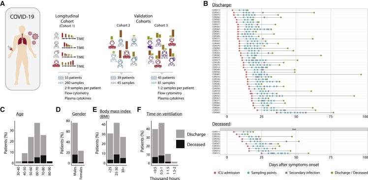
Disease recovery dynamics are often difficult to assess, as patients display heterogeneous recovery courses. To model recovery dynamics, exemplified by severe COVID-19, we apply a computational scheme on longitudinally sampled blood transcriptomes, generating recovery states, which we then link to cellular and molecular mechanisms, presenting a framework for studying the kinetics of recovery compared with non-recovery over time and long-term effects of the disease. Specifically, a decrease in mature neutrophils is the strongest cellular effect during recovery, with direct implications on disease outcome. Furthermore, we present strong indications for global regulatory changes in gene programs, decoupled from cell compositional changes, including an early rise in T cell activation and differentiation, resulting in immune rebalancing between interferon and NF-κB activity and restoration of cell homeostasis. Overall, we present a clinically relevant computational framework for modeling disease recovery, paving the way for future studies of the recovery dynamics in other diseases and tissues.

Keywords: COVID-19; cell deconvolution; disease modeling; disease recovery; gene regulation; immunology; medicine; systems biology; viral infection.


Conflict of interest statement

Declaration of interests F.J.T. reports receiving consulting fees from ImmunAI and ownership interest in Dermagnostix. S.S.S.-O. holds equity and is a consultant of CytoReason.

Figures

None
Graphical abstract
Figure 1
Figure 1
Severe COVID-19 patient cohorts (A) An illustration of COVID-19 patient cohorts used for the study, including the main cohort 1 and validation cohorts 2 and 3. Bar heights and colors represent the molecular state of the disease, ranging from severe (high, red) to recovered (low, green) states. (B) A detailed description of discharged (top) and deceased (bottom) patients from cohort 1 over the course of their stay in the ICU (x axis). Each row represents a single patient, starting from ICU admission and ending with either release from the ICU or death. Patients’ sampling points and secondary infections also appear along the line. (C–G) Bar plot of age (C), gender (D), body mass index (E), time of ventilation (F), and the appearance of a secondary infection (G) across patients from cohort 1 (gray, discharged; black, deceased).
Figure 2
Figure 2
Modeling COVID-19 recovery over time (A) An illustration of the COVID-19 recovery TimeAx modeling and pseudotime inference using longitudinal cohort 1 and pseudotime predicted for validation cohorts 2 and 3. Bar heights and colors represent the molecular state of the disease, ranging from severe (high, red) to recovered (low, green) states. (B) A comparison between chronological time (time from onset of symptoms, x axis) and pseudotime (y axis) in four different patients. (C) Associations between pseudotime and chronological time with known COVID-19 severity markers, including CRP, creatinine, IL-6, and GCSF, in cohort 1 (n = 260), shown as a heatmap (left) and scatterplots (right; trend line appears in orange). (D) Association between pseudotime (left) and chronological time (right) (x axis) with the meta-virus score in cohort 1 (y axis) (n = 260). Trend line appears in red. (E) Distribution of pseudotime (x axis) across different WHO score categories (y axis), for patients in validation cohort 2 (n = 45). Boxes represent the 25th, 50th, and 75th percentiles; whiskers show maxima and minima. p value was calculated based on a linear regression. (F) Difference in gene associations with either the pseudotime or the chronological time, across all genes. Here, positive and negative values relate to stronger associations using pseudotime and chronological time, respectively. (G) Gene association (–log10 transformed, FDR corrected, Q values) comparison between chronological time (x axis) and pseudotime (y axis), using a Q value threshold of 0.01 (dashed lines). (H) Stronger associations for pseudotime, compared with chronological time, with genes, in cohort 1, shown as a heatmap (left) and scatterplot for the known IL-17RA disease marker (right; trend line appears in orange; n = 260). For the heatmaps in (C) and (H), negative to positive associations are colored in a blue to red color scale.
Figure 3
Figure 3
An unregulated recovery process is associated with clinical worsening (A) An illustration of the modeling framework for differing between COVID-19 recovery and worsening. Bar heights and colors represent the molecular state of the disease, ranging from severe (high, red) to recovered (low, green) states. (B) Grouping of patients (n = 55) based on their recovery model scores (x axis) and the worsening model scores (y axis), colored differently for each group. (C–E) Comparison of different metadata features across the recovering, stable, and worsening groups (x axis) (n = 55). (C) Patient demographics, including the rate of patients above the age of 70 (left), the percentage of males (middle) and patients’ BMI (right). (D) Medical history. The rate of different metabolic diseases, including diabetes (left), cardiovascular diseases (middle), and hypertension (right). (E) Ratio of deceased patients. (F) The level of change between the first and the second pseudotime values per patient (n = 55). (G) Difference between patients’ time reaching minimal and maximal pseudotime (x axis and y axis, respectively), colored by patient groups. In (C)–(G), group colors are the same as in (B). Bar plot p values are calculated using Fisher’s exact test. In boxplots, boxes represent the 25th, 50th, and 75th percentiles; whiskers show maxima and minima. Boxplot p values are calculated based on a regression analysis. Barplot p values are calculated based on Fisher's exact test.
Figure 4
Figure 4
Altered neutrophil dynamics distinguish between recovery and fatal outcome (A and B) Analysis of whole-blood count (WBC) of samples from cohort 1. (A) Distribution of pseudotime (x axis) in three lymphocyte range groups, including lymphocytopenia, normal lymphocyte count, and lymphocytosis (y axis) (n = 186). P value is calculated based on a regression analysis. (B) Association of neutrophil/lymphocyte ratio (y axis; log10 transformed) with the pseudotime (x axis) based on WBC (n = 141). Trend line appears in blue. (C) Heatmap of the associations between the pseudotime and the deconvolved cell-type compositions in cohorts 1–3 (left), as well as scatterplots (right; trend line appears in orange) demonstrating the associations of pseudotime (x axis) with MME neutrophils, CD14+ monocytes and MAIT cells (y axis). In the heatmap, negative to positive associations are colored in a blue to red color scale. (D) An illustration of the disrupted model (model 3), integrating deceased patients during the modeling, disrupting the assumption of patient recovery. (E) Cell-type associations with the pseudotime, for either the recovery model (x axis) or the disrupted model (y axis). (F and G) Change in deconvolved cell compositions for neutrophils (F), lymphocytes (G) (left), and the neutrophil/lymphocyte ratio (G) (right), between the first and second time point for each patient, for either the recovering or the worsening patient groups (x axis) (n = 55). In (A), (F), and (G), boxes represent the 25th, 50th, and 75th percentiles; whiskers show maxima and minima.
Figure 5
Figure 5
Downregulation of molecular activation pathways is associated with recovery progress and different outcomes, unrelated to changes in cell compositions (A) An illustration of the comparison between the global gene expression data and composition-based gene expression data. (B) Comparison between the significance of gene associations with the pseudotime based on the global data (x axis) and the composition-based data (y axis). Genes with different patterns of associations are colored differently. (C) Heatmap of the associations between the pseudotime and genes, showing prominent associations in the global data and no associations or opposite associations in the composition-based data in cohorts 1–3 (left). Changes in associations are also demonstrated as scatterplots for specific genes, including STAT5A and KDM2A (right), where pseudotime is shown on the x axis and the gene expression levels on the y axis, while the trend line appears in orange. (D) Heatmap with enrichment scores of selected gene sets, using the global data (left column) or the composition-based data (right column). Here, stronger enrichment scores are colored in darker shades of purple. (E) Heatmap of the associations between the pseudotime and the gene expression values of interferon and NF-κB genes in the global data of cohorts 1–3. (F) Heatmap of gene associations with the pseudotime in the global data from cohorts 1–3, as well as their association with the disrupted pseudotime (column 4). Shown are genes that gain or lose their associations. T cell activation regulatory genes are in bold. For the heatmaps in (C), (E), and (F), negative to positive associations are colored in a blue to red color scale.

References

    1. Silvin A., Chapuis N., Dunsmore G., Goubet A.-G., Dubuisson A., Derosa L., Almire C., Hénon C., Kosmider O., Droin N., et al. Elevated calprotectin and abnormal myeloid cell subsets discriminate severe from mild COVID-19. Cell. 2020;182:1401–1418.e18. doi: 10.1016/j.cell.2020.08.002. - DOI - PMC - PubMed
    1. Schulte-Schrepping J., Reusch N., Paclik D., Baßler K., Schlickeiser S., Zhang B., Krämer B., Krammer T., Brumhard S., Bonaguro L., et al. Severe COVID-19 is marked by a dysregulated myeloid cell compartment. Cell. 2020;182:1419–1440.e23. doi: 10.1016/j.cell.2020.08.001. - DOI - PMC - PubMed
    1. Aschenbrenner A.C., Mouktaroudi M., Krämer B., Oestreich M., Antonakos N., Nuesch-Germano M., Gkizeli K., Bonaguro L., Reusch N., Baßler K., et al. Disease severity-specific neutrophil signatures in blood transcriptomes stratify COVID-19 patients. Genome. Med. 2021;13:7. doi: 10.1186/s13073-020-00823-5. - DOI - PMC - PubMed
    1. Stephenson E., Reynolds G., Botting R.A., Calero-Nieto F.J., Morgan M.D., Tuong Z.K., Bach K., Sungnak W., Worlock K.B., Yoshida M., et al Single-cell multi-omics analysis of the immune response in COVID-19. Nat. Med. 2021;27:904–916. doi: 10.1038/s41591-021-01329-2. - DOI - PMC - PubMed
    1. Su Y., Chen D., Yuan D., Lausted C., Choi J., Dai C.L., Voillet V., Duvvuri V.R., Scherler K., Troisch P., et al. Multi-Omics resolves a sharp disease-state shift between mild and moderate COVID-19. Cell. 2020;183:1479–1495.e20. doi: 10.1016/j.cell.2020.10.037. - DOI - PMC - PubMed

Publication types