Review
. 2022 Aug 15;51(16):6875-6892.
doi: 10.1039/d1cs00884f.

Trusting our machines: validating machine learning models for single-molecule transport experiments

Affiliations
Review

Trusting our machines: validating machine learning models for single-molecule transport experiments

William Bro-Jørgensen et al. Chem Soc Rev. .

Abstract

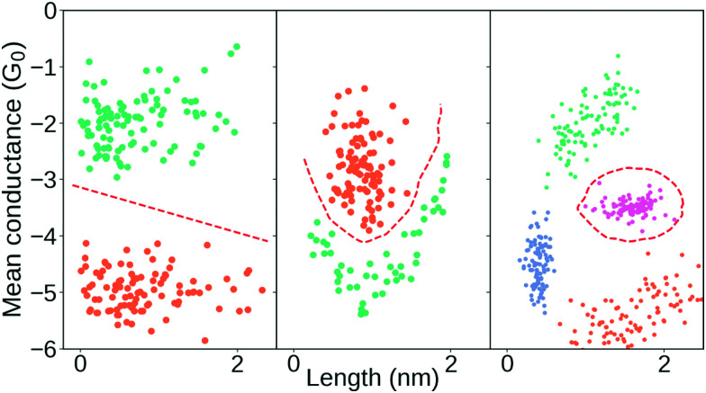
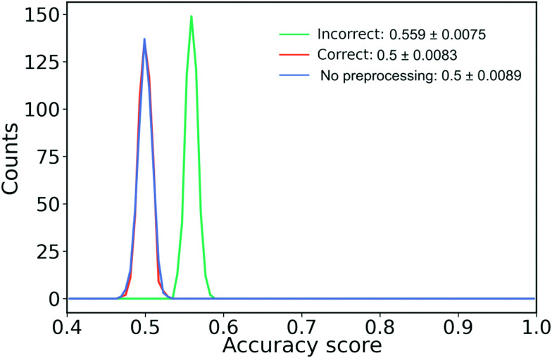
In this tutorial review, we will describe crucial aspects related to the application of machine learning to help users avoid the most common pitfalls. The examples we present will be based on data from the field of molecular electronics, specifically single-molecule electron transport experiments, but the concepts and problems we explore will be sufficiently general for application in other fields with similar data. In the first part of the tutorial review, we will introduce the field of single-molecule transport, and provide an overview of the most common machine learning algorithms employed. In the second part of the tutorial review, we will show, through examples grounded in single-molecule transport, that the promises of machine learning can only be fulfilled by careful application. We will end the tutorial review with a discussion of where we, as a field, could go from here.


Conflict of interest statement

There are no conflicts to declare.

Figures

Fig. 1
Fig. 1. Illustration of a junction with and without a molecule bridging the electrodes. The blue traces are from a mechanically controllable break junction experiment with a molecule added and the red traces are from a similar blank experiment where no molecule has been added. In the right column, we show the full data set as 1D-histograms. Axes scales are arbitrary units. Conductance is normally on the order of nano Siemens and displacement is on the order of nanometers.
Fig. 2
Fig. 2. Three distinct ways to use ML to analyse single-molecule transport data. The first two examples uses unsupervised methods and the last one uses a supervised method. Top row: Each trace is parameterised by a series of linear segments that best describe each trace and subsequently a clustering algorithm is used to produce a hierarchical clustering structure where the linear segments that cluster together can be extracted. Middle row: By converting each trace to a 1D-histogram, principal components analysis (PCA) can be applied to the full data set. By then projecting each sample onto one of the first principal components, traces from two different molecules can be distinguished in an experimental mixture. Bottom row: The raw trace is pushed through a 1D-convolutional neural network trained on synthetic mixtures of two molecules. Traces from an experimental mixture of the same molecules can then be separated by the network.
Fig. 3
Fig. 3. Examples of different ways to extract features from a conductance trace. Starting from the top right and going clockwise: Length of the molecular plateau; the mean of the conductance values; the median of the conductance values; 1D-histogram of conductance values; 2D-histogram of conductance values; approximating the conductance trace with several linear segments; a question mark to represent that, depending on the problem at hand, other features might have to be generated.
Fig. 4
Fig. 4. Illustration of three different decision boundaries in synthetic data. Points from the same class have the same colour and the red dashed lines correspond to hypothetical decision boundaries. Left: Linear decision boundary which, here in 2-D, consists of a line. Middle and right: Examples of non-linear decision boundaries.
Fig. 5
Fig. 5. An example of over- and underfitting by fitting increasingly higher-order polynomials to simple, synthetic data. The data has been generated from a 3rd order polynomial with Gaussian noise subsequently added. Left column: Predictions from a 1st (green line), 3rd (orange line) and 8th order polynomial (dark blue line) vs. the true value. Red crosses are samples that each model was trained on, blue dots are the samples that the model is tested on. Right column: Error on the training set (blue) and error on the test set (red) for fits of increasingly higher-order polynomials. The horisontal dashed grey line indicates the lowest test set error.
Fig. 6
Fig. 6. How choice of metrics impact subsequent analysis: the case of separating molecular and tunnelling traces. (A) False positive rate (FPR) vs. true positive rate (TPR) (green line) and FPR vs. accuracy (orange line). The three crosses and their corresponding dashed lines (grey, pink and light green) represent three different decision threshold levels: conservative, balanced and aggressive. The percentages in the legend lists the accuracy at each threshold. (B) Histograms of traces labelled “molecular”. Four 2D conductance vs. electrode separation histograms (from left to right) for the conservative, balanced, aggressive decision threshold and the true distribution, respectively. The red, dashed ellipsis highlights that a significant number of tunnelling traces have been misclassified as molecular. Final plot shows 1D conductance histograms at each decision threshold and for the true distribution. (C) Distribution of lengths of the molecular traces at each decision threshold at their respective colours and for the true distribution in black. The solid lines are fitted Gaussians with mean (μ), standard deviation (σ) and standard error for each given in the legend text.
Fig. 7
Fig. 7. Clustering results for a one-molecule data set using complete-linkage and three different distance metrics: Euclidean, city block and cosine. The top row shows the hierarchical clustering as a dendrogram and the bottom row shows the 1D-histograms for each cluster (coloured lines) and the original dataset (black, dashed line). For visual clarity, we omit some of the lower nodes to condense the dendrogram. This omission has no impact on the clustering result.
Fig. 8
Fig. 8. Illustration of how different clustering techniques split normally distributed data. The top row shows each sample (green) and the full dataset (black). The bottom row shows the resulting clusters (green and orange) using three different clustering techniques: Projection of each sample onto the first principal component and determining whether the score of each sample is higher/lower than 0; using a Gaussian mixture model with two components; using a simple threshold.
Fig. 9
Fig. 9. Feature selection can help our understanding. Top: 1D-histogram of the 4K-BPY data set where each trace was labelled manually. The green line is tunnelling traces, the orange line is molecular traces and the black, dashed line is the combined 1D-histogram of both tunnelling and molecular traces. Beneath the 1D-histogram are shown four barcode plots. “Baseline” is the full set of features; “ANOVA F-value” is the remaining features after filtering according to the ANOVA F-value between each feature and the target label; “χ2” is the remaining features after filtering according to the χ2 – value between each feature and the target label; “RFE” is recursive feature elimination where the classifier is recursively trained with a smaller and smaller subset of the original set of features. Each iteration removes the k lowest ranked features (in this example k = 2). To the left of the barcode plots is shown a table of the AUROC and accuracy for each set of features. For all three examples, we used a random forest classifier with default settings. The original set of features was 256 bins thinned to 96 bins. Both the classifier and the filtering functions can be found in the Python package scikit-learn.
Fig. 10
Fig. 10. Illustration of the correct and incorrect way to do feature selection. (left) The correct way to perform feature filtering where the data set is split into a training and test set before filtering is performed. (right) The incorrect way to perform feature filtering where filtering is performed on the full data set before it is split into training and test set. The red columns mark features that have been removed and the black-white gradient illustrates that information from the test set has leaked into the training set.
Fig. 11
Fig. 11. How information leakage from filtering features might lead to biased results. 12k samples drawn from a Gaussian distribution with a dimension of 32 × 32 are randomly assigned to class A or B leading to 6k samples in each class. “Wrong” (green line) perform feature filtering and scaling before splitting into test and training set, “Right” (orange line) splits the data, applies preprocessing on the training data and applies the learned preprocessing on the test data while “No preprocessing” (blue line) only splits the data into a training and test set. We perform 500 runs.

References

    1. Voulodimos A. Doulamis N. Doulamis A. Protopapadakis E. Comput. Intell. Neurosci. 2018;2018:7068349. - PMC - PubMed
    1. Young T. Hazarika D. Poria S. Cambria E. IEEE Comput. Intell. Mag. 2018;13:55–75.
    1. Baghernejad M. Manrique D. Z. Li C. Pope T. Zhumaev U. Pobelov I. Moreno-García P. Kaliginedi V. Huang C. Hong W. Lambert C. Wandlowski T. Chem. Commun. 2014;50:15975–15978. doi: 10.1039/C4CC06519K. - DOI - PubMed
    1. Reed M. A. Zhou C. Muller C. J. Burgin T. P. Tour J. M. Science. 1997;278:252–254. doi: 10.1126/science.278.5336.252. - DOI
    1. Muller C. J. van Ruitenbeek J. M. de Jongh L. J. Phys. Rev. Lett. 1992;69:140–143. doi: 10.1103/PhysRevLett.69.140. - DOI - PubMed

LinkOut - more resources