. 2022 Jun 28;119(26):e2112182119.
doi: 10.1073/pnas.2112182119. Epub 2022 Jun 13.

Quantifying the importance and location of SARS-CoV-2 transmission events in large metropolitan areas

Affiliations

Quantifying the importance and location of SARS-CoV-2 transmission events in large metropolitan areas

Alberto Aleta et al. Proc Natl Acad Sci U S A. .

Abstract

Detailed characterization of severe acute respiratory syndrome coronavirus 2 (SARS-CoV-2) transmission across different settings can help design less disruptive interventions. We used real-time, privacy-enhanced mobility data in the New York City, NY and Seattle, WA metropolitan areas to build a detailed agent-based model of SARS-CoV-2 infection to estimate the where, when, and magnitude of transmission events during the pandemic's first wave. We estimate that only 18% of individuals produce most infections (80%), with about 10% of events that can be considered superspreading events (SSEs). Although mass gatherings present an important risk for SSEs, we estimate that the bulk of transmission occurred in smaller events in settings like workplaces, grocery stores, or food venues. The places most important for transmission change during the pandemic and are different across cities, signaling the large underlying behavioral component underneath them. Our modeling complements case studies and epidemiological data and indicates that real-time tracking of transmission events could help evaluate and define targeted mitigation policies.

Keywords: COVID-19; location; mobility; superspreading event.


Conflict of interest statement

Competing interest statement: A.V., M.C., and A.P.y.P. report grants from Metabiota, Inc., outside of the submitted work; M.A. received research funding from Seqirus; and M.E.H. reports grants from the National Institute of General Medical Sciences during the conduct of the study; The authors declare no other relationships or activities that could appear to have influenced the submitted work.

Figures

Fig. 1.
Fig. 1.
Network components, New York and Seattle metropolitan areas population and social contacts dynamics at the community layer over time. (A) A schematic illustration of the weighted multilayer and temporal network for our synthetic population built from mobility data. There are four different layers; the school and household layers are static over time, and the combined workplace and community layers have a daily temporal component. (B) The geographic penetration (fraction of mobile devices by population) from our mobility data compared to the total population for the New York and Seattle metropolitan areas. (C) The average daily number of contacts in the community layer for both metropolitan areas.
Fig. 2.
Fig. 2.
Evolution of the first wave. (A) Weekly number of deaths in New York (NY) and Seattle (ST) metro areas. The dots/triangles represent the reported surveillance data used in the calibration of the models. The lines represent the median of the model ensemble for each location and the shaded areas the 95% CI of the calibrated model (17). (B) Evolution of the effective reproduction number according to the output of the simulation. The solid (dashed) line represents the median of the model ensemble and the shaded areas the 95% CI of the model. (C) Estimated prevalence in our model (median represented with solid/dashed lines and 95% CI with the shaded area) and values reported by the CDC (dots/triangles represent New York and Seattle data, respectively) (18). (D) Estimated number of deaths if the NPIs had been applied in New York 1 wk earlier/later. Solid (dashed) lines represent the median of the model ensemble and the shaded areas the 95% CI. (E) Estimated evolution of the effective reproduction number if the measures had been applied in New York 1 wk earlier/later. Solid (dashed) lines represent the median of the model ensemble. (F) Estimated prevalence in New York (Left) and Seattle (Right) if the NPIs had been applied in New York 1 wk earlier/later and in Seattle 1 wk later. The height of the bars represents the median of the model ensemble, while the vertical error bars represent the 95% CI. The dot/triangle shows the value reported by the CDC for the last week of April 2020.
Fig. 3.
Fig. 3.
Spatial spreading of the disease. (A and D) The share of infections across layers in New York (A) and Seattle (D). (B and E) The estimated location where the infections took place for New York (B) and Seattle (E) in the community layer. Note that the y axis is 20 times smaller in Seattle. The evolution has been smoothed using a rolling average of 7 d. (C and F) The distributions are normalized over the total number of daily infections, showing how infections were shared across categories in the community layer. The evolution has been smoothed using a rolling average of 7 d.
Fig. 4.
Fig. 4.
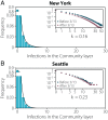
Behavioral superspreading events. (A and B) Distribution of the number of infections produced by each individual in New York (A) and Seattle (B) up to the declaration of National Emergency. The distribution is fitted to a negative binomial distribution yielding a dispersion parameter of k = 0.163 [0.159 to 0.168] 95% CI and k = 0.232 [0.224 to 0.241] 95% CI, respectively. Insets represent the same distribution on the log scale and distinguishing infections that took place before the declaration of National Emergency on 13 March and after that date.
Fig. 5.
Fig. 5.
Dynamics of SSEs. Risk evolves with time as a function of the behavior of the population and policies in place. (A and B) Risk posed by each category per week, defined using the corresponding map below. As a reference, the gray area on top shows the estimated weekly incidence. (C and D) The x axis represents the fraction of total infections that are associated with each category, while the y axis accounts for the share of those infections that can be attributed to SSEs in each category. Note that the fraction of infections is normalized over all the infections produced in all the social settings throughout the whole period. This defines a continuous-risk map in which places with few infections and low contribution from SSEs will be situated on the bottom left corner. Places where the number of infections is high but the contribution from SSEs is low are situated in the bottom right corner. Conversely, places with large contribution from SSEs but a low amount of infections are situated in the top left corner. Finally, places with both a large number of infections and an important contribution from SSEs are situated in the top right corner. The color associated to each tile in A and B is extracted from the position of the point in the plane defined in C and D. The points in C and D show the evolution of the position of the categories arts/museum and grocery for each week, with the arrows indicating the time evolution.

References

    1. Kraemer M. U. G., et al. .; Open COVID-19 Data Working Group, The effect of human mobility and control measures on the COVID-19 epidemic in China. Science 368, 493–497 (2020). - PMC - PubMed
    1. Badr H., et al. ., Social distancing is effective at mitigating COVID-19 transmission in the United States. medRxiv [Preprint] (2020). 10.1101/2020.05.07.20092353. Accessed 17 December 2020. - DOI
    1. Wu J. Y., et al. ., Changes in reproductive rate of SARS-CoV-2 due to non-pharmaceutical interventions in 1,417 U.S. counties. medRxiv [Preprint] (2020). 10.1101/2020.05.31.20118687. Accessed 17 December 2020. - DOI
    1. Cintia P., et al. ., The relationship between human mobility and viral transmissibility during the COVID-19 epidemics in Italy. arXiv [Preprint] (2020). 10.48550/arXiv.2006.03141. Accessed 17 December 2020. - DOI
    1. Dehning J., et al. ., Inferring change points in the spread of COVID-19 reveals the effectiveness of interventions. Science 369, eabb9789 (2020). - PMC - PubMed

Publication types