. 2021 Sep;16(3):719-744.
doi: 10.1214/20-ba1223. Epub 2020 Jul 15.

Improving multilevel regression and poststratification with structured priors

Affiliations

Improving multilevel regression and poststratification with structured priors

Yuxiang Gao et al. Bayesian Anal. 2021 Sep.

Abstract

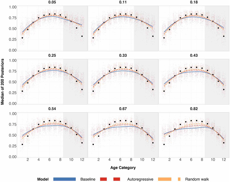
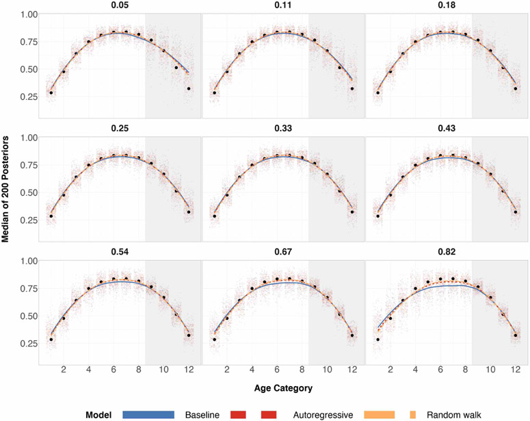
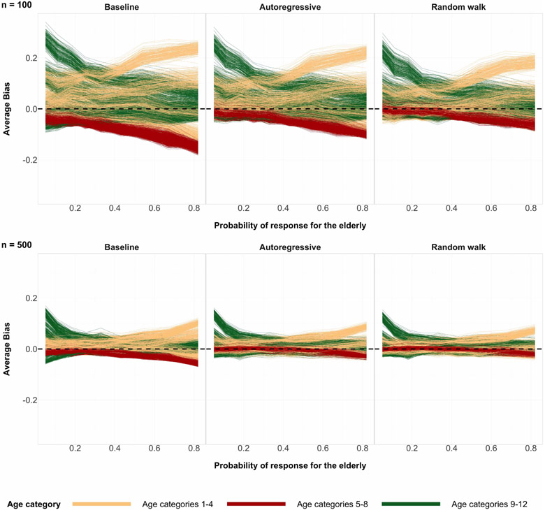
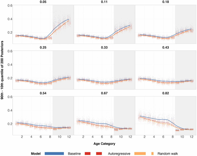
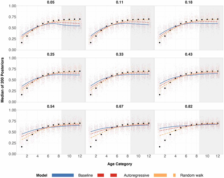
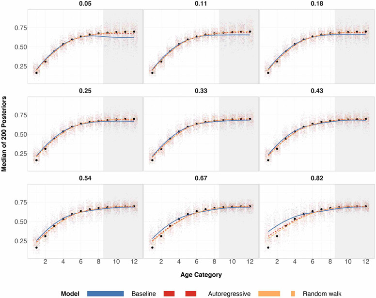
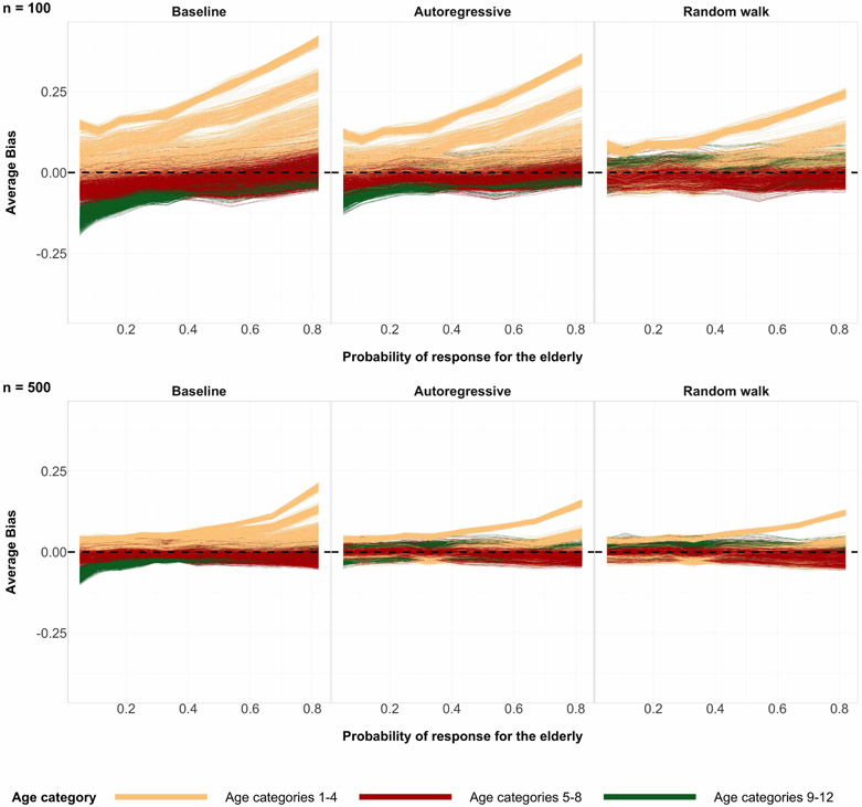
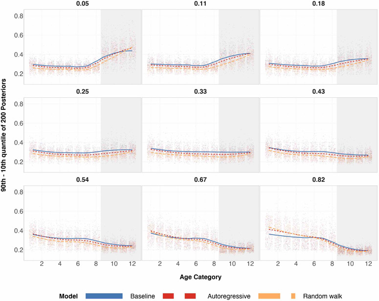
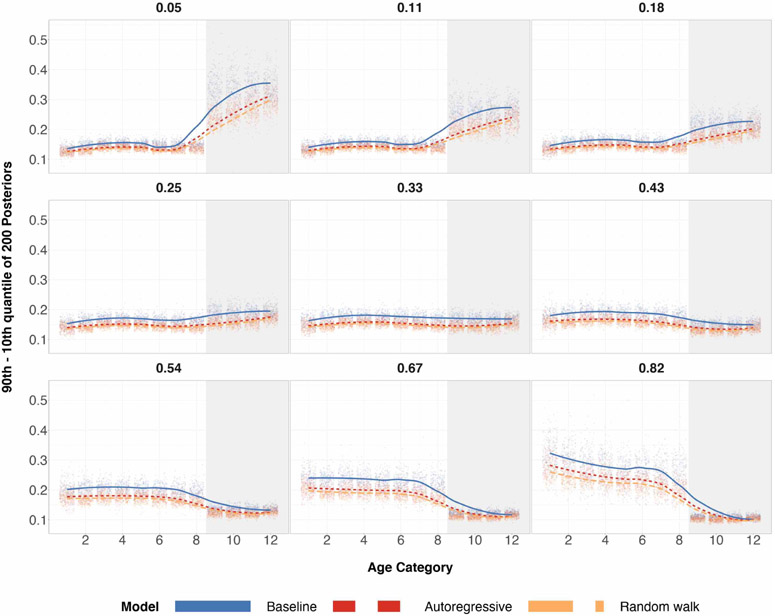
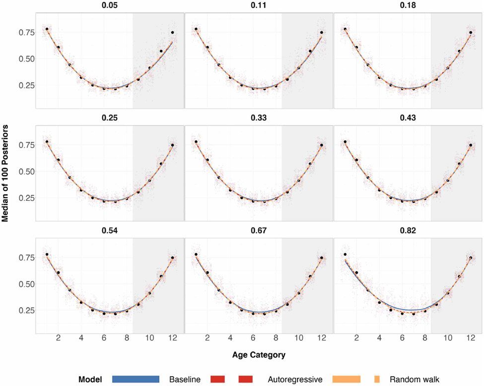
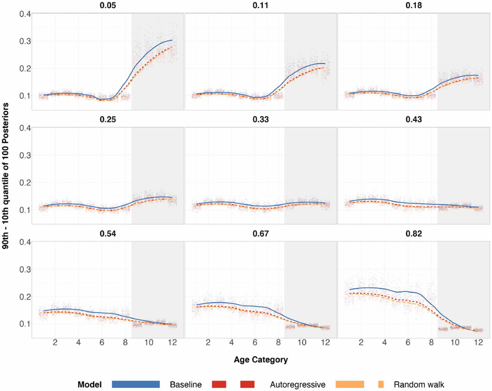
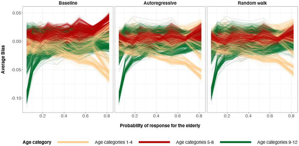
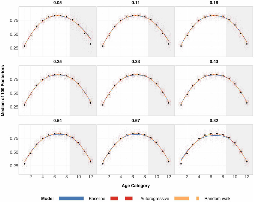
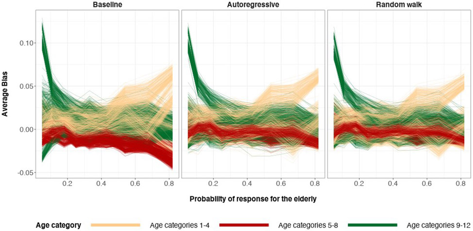
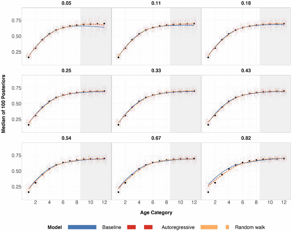
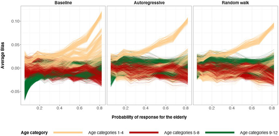
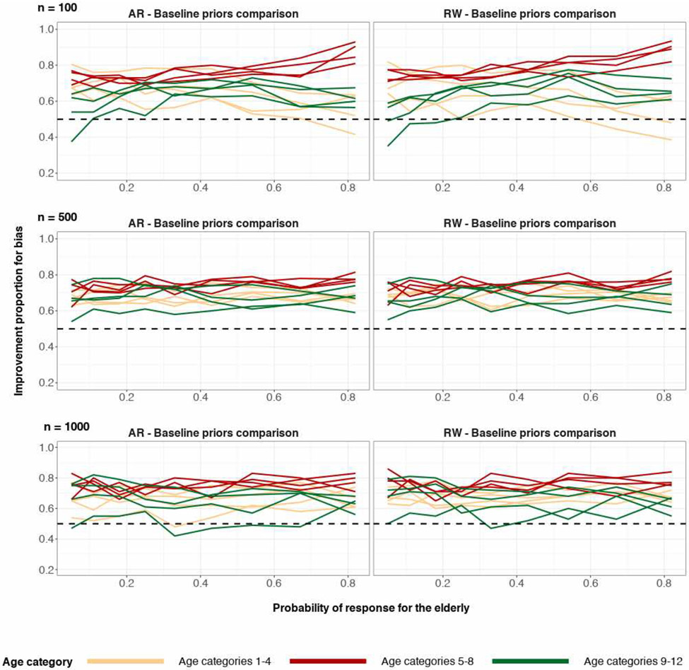
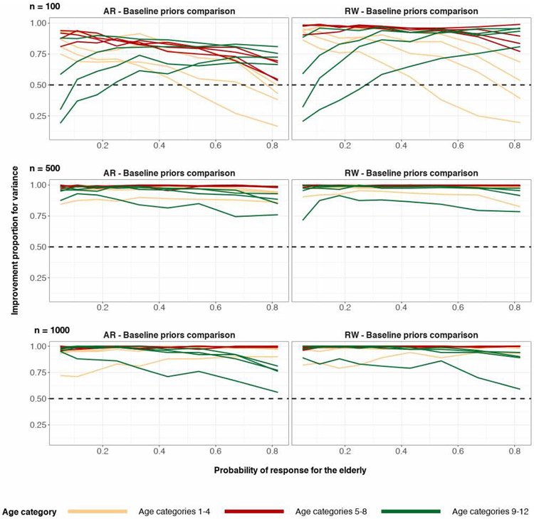
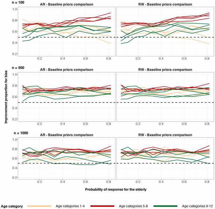
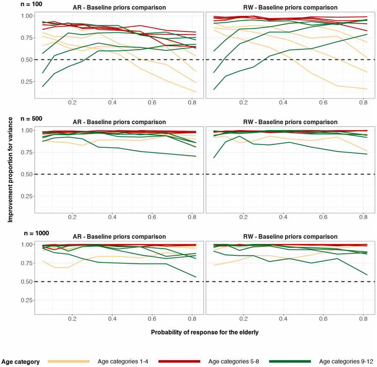
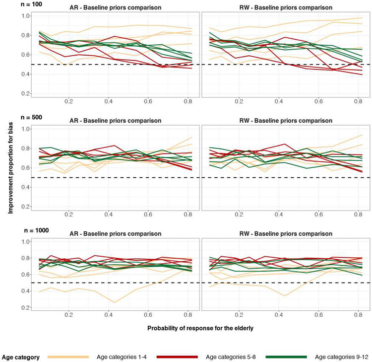
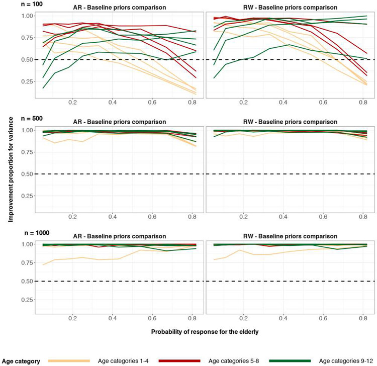
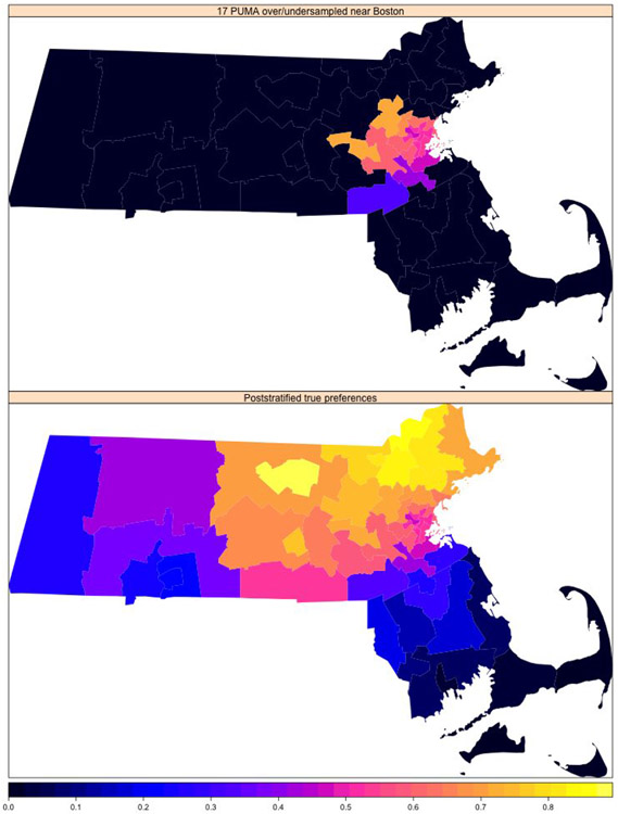
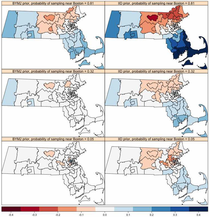
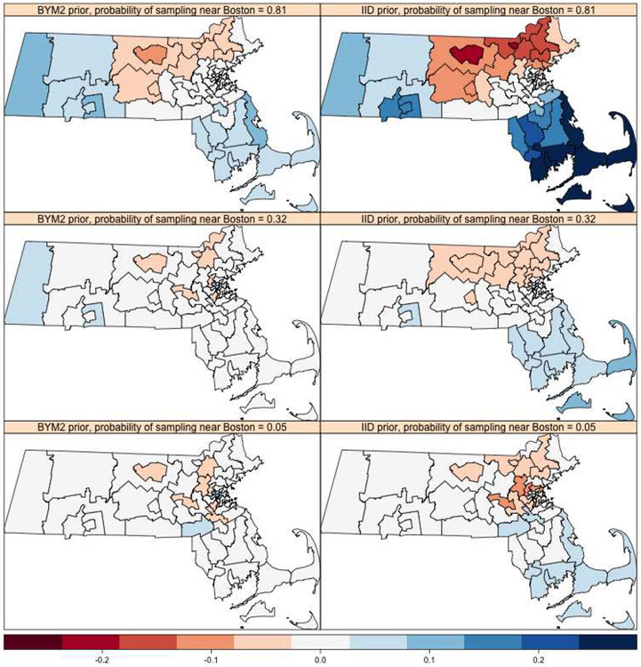
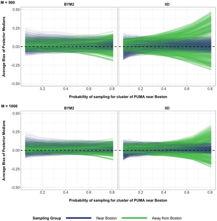
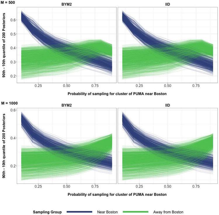
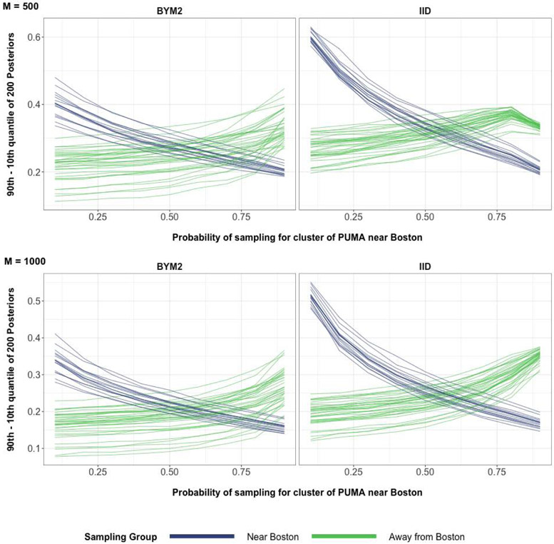
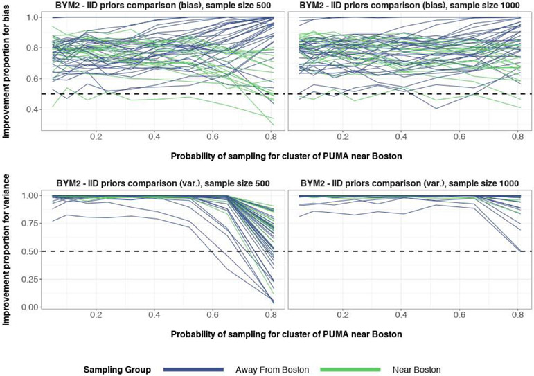
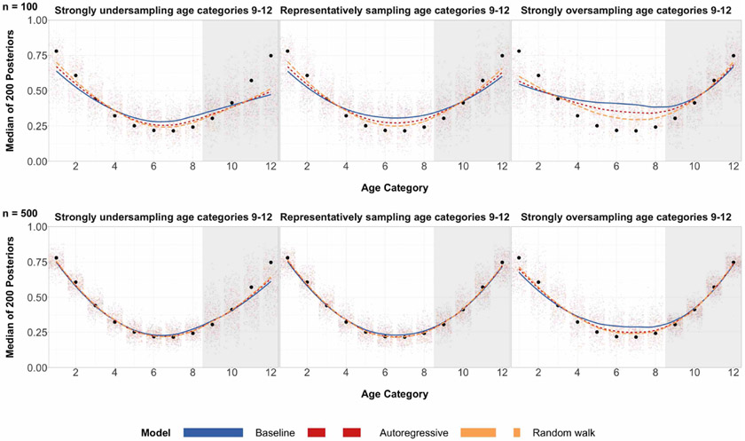
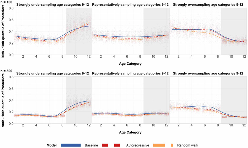
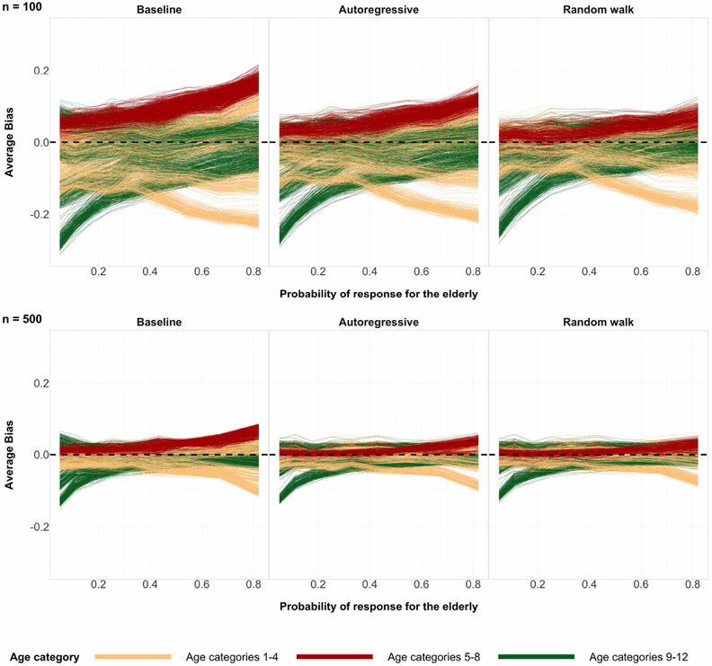
A central theme in the field of survey statistics is estimating population-level quantities through data coming from potentially non-representative samples of the population. Multilevel regression and poststratification (MRP), a model-based approach, is gaining traction against the traditional weighted approach for survey estimates. MRP estimates are susceptible to bias if there is an underlying structure that the methodology does not capture. This work aims to provide a new framework for specifying structured prior distributions that lead to bias reduction in MRP estimates. We use simulation studies to explore the benefit of these prior distributions and demonstrate their efficacy on non-representative US survey data. We show that structured prior distributions offer absolute bias reduction and variance reduction for posterior MRP estimates in a large variety of data regimes.

Keywords: INLA; Multilevel regression and poststratification; Stan; bias reduction; non-representative data; small-area estimation; structured prior distributions.


Figures

Figure 6:
Figure 6:
Percentage proportions of data in every state for the Annenberg survey (top) and Annenberg percentage proportions - ACS percentage proportions (bottom). The proportions in both surveys were rounded to two decimal places. A state with green hues in the bottom heatmap corresponds to the Annenberg survey underrepresenting that particular state. A state with blue hues in the bottom heatmap corresponds to the Annenberg survey overrepresenting that particular state.
Figure 7:
Figure 7:
Posterior medians for 200 simulations for each age group, where true age preference is U-shaped and sample size n = 100. Black circles are true preference probabilities for each age group. The numerical index for the 9 plots correspond to the expected proportion of the sample that are older adults (also known as the probability of sampling the subpopulation group with age categories 9-12). The shaded gray region corresponds to the age categories of older individuals for which we over/under sample. The center of the grid represents completely random sampling and representative sampling for age categories. Local regression is used for the smoothed estimates amongst the three prior specifications.
Figure 8:
Figure 8:
Posterior medians for 200 simulations for each age group, where true age preference is U-shaped and sample size n = 500. Black circles are true preference probabilities for each age group. The numerical index for the 9 plots correspond to the expected proportion of the sample that are older adults (also known as the probability of sampling the subpopulation group with age categories 9-12). The shaded gray region corresponds to the age categories of older individuals for which we over/under sample. The center of the grid represents completely random sampling and representative sampling for age categories. Local regression is used for the smoothed estimates amongst the three prior specifications.
Figure 9:
Figure 9:
Differences in the 90th and 10th posterior quantiles for every age category when true age preference is U-shaped and n = 100 for 200 simulations. The numerical index for the 9 plots correspond to the expected proportion of the sample that are older adults (also known as the probability of sampling the subpopulation group with age categories 9-12). The shaded gray region corresponds to the age categories of older individuals for which we over/under sample. The center of the grid represents completely random sampling and representative sampling for age categories. Local regression is used for the smoothed estimates amongst the three prior specifications.
Figure 10:
Figure 10:
Differences in the 90th and 10th posterior quantiles for every age category when true age preference is U-shaped and n = 500 for 200 simulations. The numerical index for the 9 plots correspond to the expected proportion of the sample that are older adults (also known as the probability of sampling the subpopulation group with age categories 9-12). The shaded gray region corresponds to the age categories of older individuals for which we over/under sample. The center of the grid represents completely random sampling and representative sampling for age categories. Local regression is used for the smoothed estimates amongst the three prior specifications.
Figure 11:
Figure 11:
Posterior medians for 200 simulations for each age group, where true age preference is cap-shaped and sample size n = 100. Black circles are true preference probabilities for each age group. The numerical index for the 9 plots correspond to the expected proportion of the sample that are older adults (also known as the probability of sampling the subpopulation group with age categories 9-12). The shaded gray region corresponds to the age categories of older individuals for which we over/under sample. The center of the grid represents completely random sampling and representative sampling for age categories. Local regression is used for the smoothed estimates amongst the three prior specifications.
Figure 12:
Figure 12:
Posterior medians for 200 simulations for each age group, where true age preference is cap-shaped and sample size n = 500. Black circles are true preference probabilities for each age group. The numerical index for the 9 plots correspond to the expected proportion of the sample that are older adults (also known as the probability of sampling the subpopulation group with age categories 9–12). The shaded gray region corresponds to the age categories of older individuals for which we over/under sample. The center of the grid represents completely random sampling and representative sampling for age categories. Local regression is used for the smoothed estimates amongst the three prior specifications.
Figure 13:
Figure 13:
The average bias values coming from 200 simulations of posterior medians of the 2448 poststratification cells. The possible values of average bias are in the interval (−1, 1). Sample size n = 100 (top) and n = 500 (bottom). The true preference curve for age is cap-shaped. The horizontal dashed line at y = 0 represents zero bias.
Figure 14:
Figure 14:
Differences in the 90th and 10th posterior quantiles for every age category when true age preference is cap-shaped and n = 100 for 200 simulations. The numerical index for the 9 plots correspond to the expected proportion of the sample that are older adults (also known as the probability of sampling the subpopulation group with age categories 9–12). The shaded gray region corresponds to the age categories of older individuals for which we over/under sample. The center of the grid represents completely random sampling and representative sampling for age categories. Local regression is used for the smoothed estimates amongst the three prior specifications.
Figure 15:
Figure 15:
Differences in the 90th and 10th posterior quantiles for every age category, when true age preference is cap-shaped and n = 500 for 200 simulations. The numerical index for the 9 plots correspond to the expected proportion of the sample that are older adults (also known as the probability of sampling the subpopulation group with age categories 9–12). The shaded gray region corresponds to the age categories of older individuals for which we over/under sample. The center of the grid represents completely random sampling and representative sampling for age categories. Local regression is used for the smoothed estimates amongst the three prior specifications.
Figure 16:
Figure 16:
Posterior medians for 200 simulations for each age group, where true age preference is increasing-shaped and sample size n = 100. Black circles are true preference probabilities for each age group. The numerical index for the 9 plots correspond to the expected proportion of the sample that are older adults (also known as the probability of sampling the subpopulation group with age categories 9–12). The shaded gray region corresponds to the age categories of older individuals for which we over/under sample. The center of the grid represents completely random sampling and representative sampling for age categories. Local regression is used for the smoothed estimates amongst the three prior specifications.
Figure 17:
Figure 17:
Posterior medians for 200 simulations for each age group, where true age preference is increasing-shaped and sample size n = 500. Black circles are true preference probabilities for each age group. The numerical index for the 9 plots correspond to the expected proportion of the sample that are older adults (also known as the probability of sampling the subpopulation group with age categories 9–12). The shaded gray region corresponds to the age categories of older individuals for which we over/under sample. The center of the grid represents completely random sampling and representative sampling for age categories. Local regression is used for the smoothed estimates amongst the three prior specifications.
Figure 18:
Figure 18:
The average bias values coming from 200 simulations of posterior medians of the 2448 poststratification cells. The possible values of average bias are in the interval (−1, 1). Sample size n = 100 (top) and n = 500 (bottom). The true preference curve for age is increasing-shaped. The horizontal dashed line at y = 0 represents zero bias.
Figure 19:
Figure 19:
Differences in the 90th and 10th posterior quantiles for every age category when true age preference is increasing-shaped and n = 100 for 200 simulations. The numerical index for the 9 plots correspond to the expected proportion of the sample that are older adults (also known as the probability of sampling the subpopulation group with age categories 9–12). The shaded gray region corresponds to the age categories of older individuals for which we over/under sample. The center of the grid represents completely random sampling and representative sampling for age categories. Local regression is used for the smoothed estimates amongst the three prior specifications.
Figure 20:
Figure 20:
Differences in the 90th and 10th posterior quantiles for every age category when true age preference is increasing-shaped and n = 500 for 200 simulations. The numerical index for the 9 plots correspond to the expected proportion of the sample that are older adults (also known as the probability of sampling the subpopulation group with age categories 9–12). The shaded gray region corresponds to the age categories of older individuals for which we over/under sample. The center of the grid represents completely random sampling and representative sampling for age categories. Local regression is used for the smoothed estimates amongst the three prior specifications.
Figure 21:
Figure 21:
Posterior medians for 100 simulations with 12 age groups, where true age preference is U-shaped and sample size n = 1000. Black circles are true preference probabilities for each age group. The numerical index for the 9 plots correspond to the expected proportion of the sample that are older adults (also known as the probability of sampling the subpopulation group with age categories 9–12). The shaded gray region corresponds to the age categories of older individuals for which we over/under sample. The center of the grid represents completely random sampling and representative sampling for age categories. Local regression is used for the smoothed estimates amongst the three prior specifications.
Figure 22:
Figure 22:
Differences in the 90th and 10th posterior quantiles for every age category when true age preference is U-shaped and n = 1000 for 100 simulations. The numerical index for the 9 plots correspond to the expected proportion of the sample that are older adults (also known as the probability of sampling the subpopulation group with age categories 9–12). The shaded gray region corresponds to the age categories of older individuals for which we over/under sample. The center of the grid represents completely random sampling and representative sampling for age categories. Local regression is used for the smoothed estimates amongst the three prior specifications.
Figure 23:
Figure 23:
The average bias values coming from 100 simulations of posterior medians of the 2448 poststratification cells. The possible values of average bias are in the interval (−1, 1). Sample size n = 1000. The true preference curve for age is U-shaped. y = 0 represents zero bias.
Figure 24:
Figure 24:
Posterior medians for 100 simulations with 12 age groups, where true age preference is cap-shaped and sample size n = 1000. Black circles are true preference probabilities for each age group. The numerical index for the 9 plots correspond to the expected proportion of the sample that are older adults (also known as the probability of sampling the subpopulation group with age categories 9–12). The shaded gray region corresponds to the age categories of older individuals for which we over/under sample. The center of the grid represents completely random sampling and representative sampling for age categories. Local regression is used for the smoothed estimates amongst the three prior specifications.
Figure 25:
Figure 25:
Differences in the 90th and 10th posterior quantiles for every age category when true age preference is cap-shaped and n = 1000 for 100 simulations. The numerical index for the 9 plots correspond to the expected proportion of the sample that are older adults (also known as the probability of sampling the subpopulation group with age categories 9–12). The shaded gray region corresponds to the age categories of older individuals for which we over/under sample. The center of the grid represents completely random sampling and representative sampling for age categories. Local regression is used for the smoothed estimates amongst the three prior specifications.
Figure 26:
Figure 26:
The average bias values coming from 100 simulations of posterior medians of the 2448 poststratification cells. The possible values of average bias are in the interval (−1, 1). The possible values of average bias are in the interval (−1, 1). Sample size n = 1000. The true preference curve for age is cap-shaped. y = 0 represents zero bias.
Figure 27:
Figure 27:
Posterior medians for 100 simulations with 12 age groups, where true age preference is increasing-shaped and sample size n = 1000. Black circles are true preference probabilities for each age group. The numerical index for the 9 plots correspond to the expected proportion of the sample that are older adults (also known as the probability of sampling the subpopulation group with age categories 9–12). The shaded gray region corresponds to the age categories of older individuals for which we over/under sample. The center of the grid represents completely random sampling and representative sampling for age categories. Local regression is used for the smoothed estimates amongst the three prior specifications.
Figure 28:
Figure 28:
Differences in the 90th and 10th posterior quantiles for every age category when true age preference is increasing-shaped and n = 1000 for 100 simulations. The numerical index for the 9 plots correspond to the expected proportion of the sample that are older adults (also known as the probability of sampling the subpopulation group with age categories 9–12). The shaded gray region corresponds to the age categories of older individuals for which we over/under sample. The center of the grid represents completely random sampling and representative sampling for age categories. Local regression is used for the smoothed estimates amongst the three prior specifications.
Figure 29:
Figure 29:
The average bias values coming from 100 simulations of posterior medians of the 2448 poststratification cells. The possible values of average bias are in the interval (−1, 1). Sample size n = 1000. The true preference curve for age is increasing-shaped. y = 0 represents zero bias.
Figure 30:
Figure 30:
The proportion of the time that structured priors have lower absolute posterior median bias when compared to baseline priors, for each age category. True age preference is U-shaped. Sample size n = 100 (top), n = 500 (middle), n = 1000 (bottom). The top and middle rows are based on 200 simulation runs and the bottom row is based on 100 simulation runs. The right column corresponds to comparison of the random-walk prior and the baseline prior for age category. The left column corresponds to comparison of the autoregressive prior and the baseline prior for age category. The horizontal dashed line y = 0.5 represents equal proportion.
Figure 31:
Figure 31:
The proportion of the time that structured priors have lower posterior variance when compared to baseline priors, for each age category. True age preference is U-shaped. Sample size n = 100 (top), n = 500 (middle), n = 1000 (bottom). The top and middle rows are based on 200 simulation runs and the bottom row is based on 100 simulation runs. The right column corresponds to comparison of the random-walk prior and the baseline prior for age category. The left column corresponds to comparison of the autoregressive prior and the baseline prior for age category. The horizontal dashed line y = 0.5 represents equal proportion. The difference of the 90th and 10th posterior quantiles is used as a measure for posterior variance.
Figure 32:
Figure 32:
The proportion of the time that structured priors have lower absolute posterior median bias when compared to baseline priors, for each age category. True age preference is cap-shaped. Sample size n = 100 (top), n = 500 (middle), n = 1000 (bottom). The top and middle rows are based on 200 simulation runs and the bottom row is based on 100 simulation runs. The right column corresponds to comparison of the random-walk prior and the baseline prior for age category. The left column corresponds to comparison of the autoregressive prior and the baseline prior for age category. The horizontal dashed line y = 0.5 represents equal proportion.
Figure 33:
Figure 33:
The proportion of the time that structured priors have lower posterior variance when compared to baseline priors, for each age category. True age preference is cap-shaped. Sample size n = 100 (top), n = 500 (middle), n = 1000 (bottom). The top and middle rows are based on 200 simulation runs and the bottom row is based on 100 simulation runs. The right column corresponds to comparison of the random-walk prior and the baseline prior for age category. The left column corresponds to comparison of the autoregressive prior and the baseline prior for age category. The horizontal dashed line y = 0.5 represents equal proportion. The difference of the 90th and 10th posterior quantiles is used as a measure for posterior variance.
Figure 34:
Figure 34:
The proportion of the time that structured priors have lower absolute posterior median bias when compared to baseline priors, for each age category. True age preference is increasing-shaped. Sample size n = 100 (top), n = 500 (middle), n = 1000 (bottom). The top and middle rows are based on 200 simulation runs and the bottom row is based on 100 simulation runs. The right column corresponds to comparison of the random-walk prior and the baseline prior for age category. The left column corresponds to comparison of the autoregressive prior and the baseline prior for age category. The horizontal dashed line y = 0.5 represents equal proportion.
Figure 35:
Figure 35:
The proportion of the time that structured priors have lower posterior variance when compared to baseline priors, for each age category. True age preference is increasing-shaped. Sample size n = 100 (top), n = 500 (middle), n = 1000 (bottom). The top and middle rows are based on 200 simulation runs and the bottom row is based on 100 simulation runs. The right column corresponds to comparison of the random-walk prior and the baseline prior for age category. The left column corresponds to comparison of the autoregressive prior and the baseline prior for age category. The horizontal dashed line y = 0.5 represents equal proportion. The difference of the 90th and 10th posterior quantiles is used as a measure for posterior variance.
Figure 36:
Figure 36:
True poststratified preference for 52 PUMA in Massachusetts is the bottom heatmap, which is the vector XPUMA. The top heatmap corresponds to the 17 PUMA near Boston that are over/undersampled. The true poststratified preference for PUMA j ∈ {1, … , 52} is defined as kSjNkθkkSjNk, where Sj corresponds to the index set for PUMA j and θk is the true preference for poststratification cell k.
Figure 37:
Figure 37:
Average bias of posterior medians for every PUMA based off 200 simulations and binary response sample size is 500. The possible values of average bias are in the interval (−1, 1). The left column corresponds to the BYM2 spatial prior for PUMA effect. The right column corresponds to an IID prior for PUMA effect. The probabilities 0.81, 0.32 and 0.05 in the top, middle and bottom rows respectively correspond to the probability of sampling an individual in Group 1, the cluster of 17 PUMA around Boston.
Figure 38:
Figure 38:
Average bias of posterior medians for every PUMA based off 200 simulations and binary response sample size is 1000. The possible values of average bias are in the interval (−1, 1). The left column corresponds to the BYM2 spatial prior for PUMA effect. The right column corresponds to an IID prior for PUMA effect. The probabilities 0.81, 0.32 and 0.05 in the top, middle and bottom rows respectively correspond to the probability of sampling an individual in the cluster of 17 PUMA near Boston.
Figure 39:
Figure 39:
The average bias values coming from 200 simulations of posterior medians of the 1872 poststratification cells for the spatial MRP simulation. The possible values of average bias are in the interval (−1, 1). M is the number of binary responses in every simulated data set. The top row corresponds to 500 binary responses used to define binomial responses for every simulation iteration. The bottom row corresponds to 1000 binary responses used to define binomial responses for every simulation iteration. The horizontal dashed line at y = 0 represents zero bias.
Figure 40:
Figure 40:
Average differences in the 90th and 10th posterior quantiles of the 1872 post-stratification cells for the spatial MRP simulation. M is the number of binary responses in every simulated data set. The top row corresponds to 500 binary responses used to define binomial responses for every simulation iteration. The bottom row corresponds to 1000 binary responses used to define binomial responses for every simulation iteration.
Figure 41:
Figure 41:
Average differences in the 90th and 10th posterior quantiles of the 52 PUMA for the spatial MRP simulation. M is the number of binary responses in every simulated data set. The top row corresponds to 500 binary responses used to define binomial responses for every simulation iteration. The bottom row corresponds to 1000 binary responses used to define binomial responses for every simulation iteration.
Figure 42:
Figure 42:
The top row corresponds to the proportion of the time that spatial BYM2 priors have lower absolute posterior median bias when compared to IID baseline priors, for each PUMA. The bottom row corresponds to the proportion of the time that spatial BYM2 priors have lower posterior variance when compared to IID baseline priors, for each PUMA. The left column corresponds to 500 binary responses in the sample. The right column corresponds to 1000 binary responses in the sample. The horizontal dashed line y = 0.5 corresponds to equal proportion. The difference of the 90th and 10th posterior quantiles is used as a measure for posterior variance.
Figure 1:
Figure 1:
Posterior medians for 200 simulations for each age group under three different regimes of data, where true age preference is U-shaped. The top row corresponds to a sample size of 100 and the bottom row corresponds to a sample size of 500. Black circles are true preferences for each age group. The shaded grey region corresponds to the age categories of older individuals for which we over/undersample. The left column has a probability of sampling age categories 9-12 equal to 0.05. The middle column has a probability of sampling age categories 9-12 equal to 0.33, which is completely random sampling and representative sampling for all age categories. The right column has a probability of sampling age categories 9-12 equal to 0.82. Local regression is used for the smoothed estimates amongst the three prior specifications. For the same plots involving different probabilities of sampling, refer to Table 3 in the appendix.
Figure 2:
Figure 2:
Differences in the 90th and 10th posterior quantiles for every age category when true preference is U-shaped for 200 simulations. The top row corresponds to a sample size of 100 and the bottom row corresponds to a sample size of 500. The shaded grey region corresponds to the age categories of older individuals for which we over/undersample. The left column has a probability of sampling age categories 9-12 equal to 0.05. The middle column has a probability of sampling age categories 9-12 equal to 0.33, which is completely random sampling and representative sampling for all age categories. The right column has a probability of sampling age categories 9-12 equal to 0.82. Local regression is used for the smoothed estimates amongst the three prior specifications. For the same plots involving different probabilities of sampling, refer to Table 4 in the appendix.
Figure 3:
Figure 3:
The average bias values coming from 200 simulations of posterior medians of the 2448 poststratification cells. The possible values of average bias are in the interval (−1, 1). Sample size n = 100 (top) and n = 500 (bottom). The true preference curve for age is U-shaped. The horizontal dashed line at y = 0 represents zero bias.
Figure 4:
Figure 4:
The average bias values coming from 200 simulations of poststratified estimates for the 52 PUMA areas. The possible values of average bias are in the interval (−1, 1). M is the number of binary responses in every simulated data set. The top row corresponds to 500 binary responses used to define binomial responses for every simulation iteration. The bottom row corresponds to 1000 binary responses used to define binomial responses for every simulation iteration. The horizontal dashed line at y = 0 represents zero bias.
Figure 5:
Figure 5:
12 (top), 48 (middle) and 72 (bottom) age categories. Red points in the top three plots are the empirical mean. The upper and lower bands in the top three plots correspond to the 95-percent and 5-percent posterior quantiles for every age category, and the middle solid line contains the posterior median for every age category. The density plot of ages in the ACS are coming from a random sample based off the 5-year ACS, where sampling is conducted with replacement using person weights given by the ACS. This random sample size is the same size as the 2008 Annenberg phone survey, and is assumed to be representative of the overall population defined by the 5-year ACS. 2000 iterations for 4 chains were run, for each prior specification and for age discretized into 12, 48 and 72 categories. The burn-in was set to 50 percent.

References

    1. Annenberg Center (2008). “The Annenberg Public Policy Center’s National Annenberg Election Survey 2008 Phone Edition (NAES08-Phone) [Data file and code book].” Available from https://www.annenbergpublicpolicycenter.org/tag/data-sets/.
    1. Besag J (1975). “Statistical analysis of non-lattice data.” Journal of the Royal Statistical Society: Series D (The Statistician), 24(3): 179–195.
    1. Bisbee J (2019). “BARP: MRP - Multilevel + BART.” URL https://github.com/jbisbee1/BARP/blob/master/vignettes/BARP.pdf
    1. Carpenter B, Gelman A, Hoffman MD, Lee D, Goodrich B, Betancourt M, Brubaker M, Guo J, Li P, and Riddell A (2017). “Stan : A Probabilistic Programming Language.” Journal of Statistical Software, 76(1). - PMC - PubMed
    1. Chen T and Guestrin C (2016). “Xgboost: A scalable tree boosting system.” In Proceedings of the 22nd acm sigkdd international conference on knowledge discovery and data mining, 785–794.

LinkOut - more resources