

Virtual reality for the observation of oncology models (VROOM): immersive analytics for oncology patient cohorts
- PMID: 35790803
- PMCID: PMC9256599
- DOI: 10.1038/s41598-022-15548-1
Virtual reality for the observation of oncology models (VROOM): immersive analytics for oncology patient cohorts
Abstract
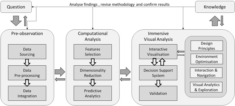
The significant advancement of inexpensive and portable virtual reality (VR) and augmented reality devices has re-energised the research in the immersive analytics field. The immersive environment is different from a traditional 2D display used to analyse 3D data as it provides a unified environment that supports immersion in a 3D scene, gestural interaction, haptic feedback and spatial audio. Genomic data analysis has been used in oncology to understand better the relationship between genetic profile, cancer type, and treatment option. This paper proposes a novel immersive analytics tool for cancer patient cohorts in a virtual reality environment, virtual reality to observe oncology data models. We utilise immersive technologies to analyse the gene expression and clinical data of a cohort of cancer patients. Various machine learning algorithms and visualisation methods have also been deployed in VR to enhance the data interrogation process. This is supported with established 2D visual analytics and graphical methods in bioinformatics, such as scatter plots, descriptive statistical information, linear regression, box plot and heatmap into our visualisation. Our approach allows the clinician to interrogate the information that is familiar and meaningful to them while providing them immersive analytics capabilities to make new discoveries toward personalised medicine.
© 2022. The Author(s).
Conflict of interest statement
The authors declare no competing interests.
Figures


Similar articles
-
Understanding cancer patient cohorts in virtual reality environment for better clinical decisions: a usability study.BMC Med Inform Decis Mak. 2023 Dec 20;23(1):295. doi: 10.1186/s12911-023-02392-0. BMC Med Inform Decis Mak. 2023. PMID: 38124044 Free PMC article.
-
Visual Analytics of Genomic and Cancer Data: A Systematic Review.Cancer Inform. 2019 Mar 13;18:1176935119835546. doi: 10.1177/1176935119835546. eCollection 2019. Cancer Inform. 2019. PMID: 30890859 Free PMC article. Review.
-
Evaluating Usability Aspects of a Mixed Reality Solution for Immersive Analytics in Industry 4.0 Scenarios.J Vis Exp. 2020 Oct 6;(164). doi: 10.3791/61349. J Vis Exp. 2020. PMID: 33104068
-
A Study on Immersion and Presence of a Portable Hand Haptic System for Immersive Virtual Reality.Sensors (Basel). 2017 May 17;17(5):1141. doi: 10.3390/s17051141. Sensors (Basel). 2017. PMID: 28513545 Free PMC article.
-
Applications and advances of immersive technology in cardiology.Curr Probl Cardiol. 2024 Oct;49(10):102762. doi: 10.1016/j.cpcardiol.2024.102762. Epub 2024 Jul 26. Curr Probl Cardiol. 2024. PMID: 39067719 Review.
Cited by
-
Blending space and time to talk about cancer in extended reality.NPJ Digit Med. 2024 Sep 29;7(1):261. doi: 10.1038/s41746-024-01262-x. NPJ Digit Med. 2024. PMID: 39343807 Free PMC article. Review.
-
Technologies for whole-cell modeling: Genome-wide reconstruction of a cell in silico.Dev Growth Differ. 2023 Dec;65(9):554-564. doi: 10.1111/dgd.12897. Epub 2023 Nov 8. Dev Growth Differ. 2023. PMID: 37856476 Free PMC article. Review.
-
Understanding cancer patient cohorts in virtual reality environment for better clinical decisions: a usability study.BMC Med Inform Decis Mak. 2023 Dec 20;23(1):295. doi: 10.1186/s12911-023-02392-0. BMC Med Inform Decis Mak. 2023. PMID: 38124044 Free PMC article.
-
Implications of immersive technologies in healthcare sector and its built environment.Front Med Technol. 2023 Sep 20;5:1184925. doi: 10.3389/fmedt.2023.1184925. eCollection 2023. Front Med Technol. 2023. PMID: 37799269 Free PMC article.
-
Visualization and exploration of linked data using virtual reality.Database (Oxford). 2024 Feb 22;2024:baae008. doi: 10.1093/database/baae008. Database (Oxford). 2024. PMID: 38554132 Free PMC article.
References
-
- Gough P. From the analytical to the artistic: A review of literature on information visualization. Leonardo. 2017;50:47–52. doi: 10.1162/LEON_a_00959. - DOI
-
- Rind A, et al. Interactive information visualization to explore and query electronic health records. Found. Trends Hum. Comput. Interact. 2013;5:207–298. doi: 10.1561/1100000039. - DOI
-
- Wu L-H, Hsu P-Y. An interactive and flexible information visualization method. Inf. Sci. 2013;221:306–315. doi: 10.1016/j.ins.2012.09.038. - DOI
Publication types
MeSH terms
LinkOut - more resources
Full Text Sources
Medical
