. 2022 Sep 2;38(17):4238-4242.
doi: 10.1093/bioinformatics/btac453.

Flashfm-ivis: interactive visualization for fine-mapping of multiple quantitative traits

Affiliations

Flashfm-ivis: interactive visualization for fine-mapping of multiple quantitative traits

Feng Zhou et al. Bioinformatics. .

Abstract

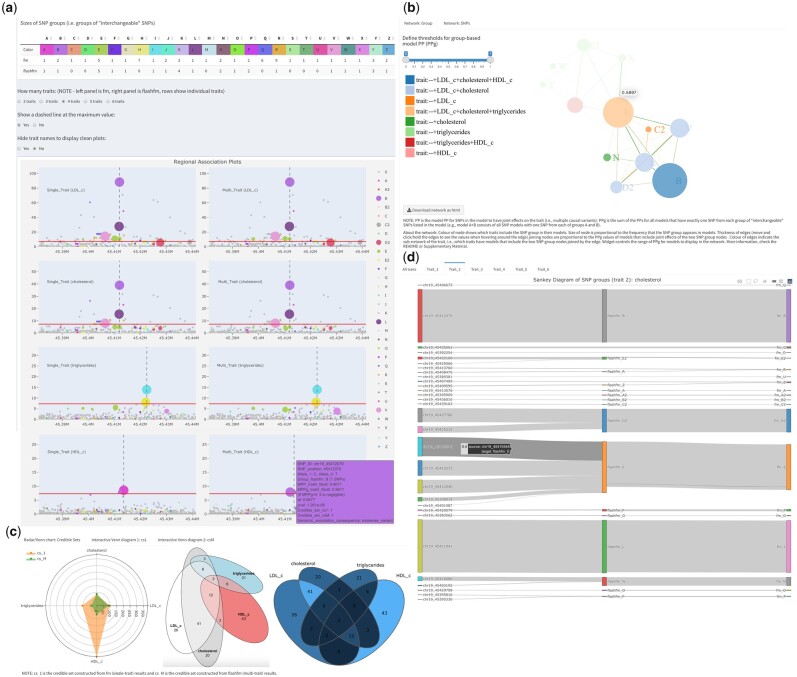
Summary: flashfm-ivis provides a suite of interactive visualization plots to view potential causal genetic variants that underlie associations that are shared or distinct between multiple quantitative traits and compares results between single- and multi-trait fine-mapping. Unique features include network diagrams that show joint effects between variants for each trait and regional association plots that integrate fine-mapping results, all with user-controlled zoom features for an interactive exploration of potential causal variants across traits.

Availability and implementation: flashfm-ivis is an open-source software under the MIT license. It is available as an interactive web-based tool (http://shiny.mrc-bsu.cam.ac.uk/apps/flashfm-ivis/) and as an R package. Code and documentation are available at https://github.com/fz-cambridge/flashfm-ivis and https://zenodo.org/record/6376244#.YjnarC-l2X0. Additional features can be downloaded as standalone R libraries to encourage reuse.

Supplementary information: Supplementary information are available at Bioinformatics online.


Figures

Fig. 1.
Fig. 1.
Selected flashfm-ivis interactive plots for four lipid traits from Ugandan GWAS data (Gurdasani et al., 2019) in the APOE region (Hernandez et al., 2021). (A) Interactive and linked regional association plots with integrated fine-mapping results. Four lipid traits [LDL-cholesterol, total cholesterol (TC), triglycerides (TG) and HDL-cholesterol] were single- (left panel) and multi-trait (right panel) fine-mapped; the rows correspond to each trait: LDL, TC, TG and HDL. The regional association plots (−log10(p) against variant position) integrate the variant MPPs (see Section 2.2) from fine-mapping, by displaying the diameter of each variant point as proportional to its MPP. Colours indicate variant groups, which consist of variants in high LD and could be treated as interchangeable in the causal models. Users may click on particular groups to focus on (or to remove) in all plots or they may draw their selection of points in one plot as a focus for all plots. Hovering over a variant gives information such as allele frequency, most severe consequence [VEP, version 85 (McLaren et al., 2016; http://www.nealelab.is/uk-biobank)] and fine-mapping PP results. Genes within the region are also displayed. (B) Network diagram of variant group causal models. Variant group models are displayed for the four lipid traits. Each node represents a variant group and edges between nodes indicate variant groups that appear together in a model; only models with PPg (as defined in Section 2.4) within the range of the widget selection are included. The colours of the nodes indicate which traits include the variant group in their models, and their diameter is proportional to the frequency that they appear in models over all traits. Edge colours indicate which traits include the pair of variant groups in a model, while edge thickness is proportional to the PPg values. (C) Radar Chart and Venn diagrams of credible sets for traits. These plots show and compare the number of variants that appear in multiple credible sets for different methods and traits. For example, in the Venn diagram, the four traits share two variants in their credible sets constructed from flashfm (easily seen in area-proportional Venn diagram), while the Radar chart compares the total number of variants based on FINEMAP (cs_1) and flashfm (cs_M). Hovering on a segment in the interactive Venn diagram shows the variant ids and details of each segment are in a downloadable table. (D) Sankey diagram connects individual variant ids and their groups in flashfm or FINEMAP (fm). This links the individual variants and their groups in different methods. The size of the edge reflects the MPP value of the variant in each trait (e.g. trait_2 cholesterol here, users can interact with the plots to show the values)

References

    1. Benner C. et al. (2016) FINEMAP: efficient variable selection using summary data from genome-wide association studies. Bioinformatics, 32, 1493–1501. - PMC - PubMed
    1. Boughton A.P. et al. (2021) LocusZoom.js: interactive and embeddable visualization of genetic association study results. Bioinformatics, 37, 3017–3018. - PMC - PubMed
    1. Claussnitzer M. et al. (2020) A brief history of human disease genetics. Nature, 577, 179–189. - PMC - PubMed
    1. George G. et al. (2020) PheGWAS: a new dimension to visualize GWAS across multiple phenotypes. Bioinformatics, 36, 2500–2505. - PMC - PubMed
    1. Gurdasani D. et al. (2019) Uganda genome resource enables insights into population history and genomic discovery in Africa. Cell, 179, 984–1002.e36. - PMC - PubMed

Publication types