. 2022 Jul 8:11:e66873.
doi: 10.7554/eLife.66873.

Genome-wide association study in quinoa reveals selection pattern typical for crops with a short breeding history

Affiliations

Genome-wide association study in quinoa reveals selection pattern typical for crops with a short breeding history

Dilan S R Patiranage et al. Elife. .

Abstract

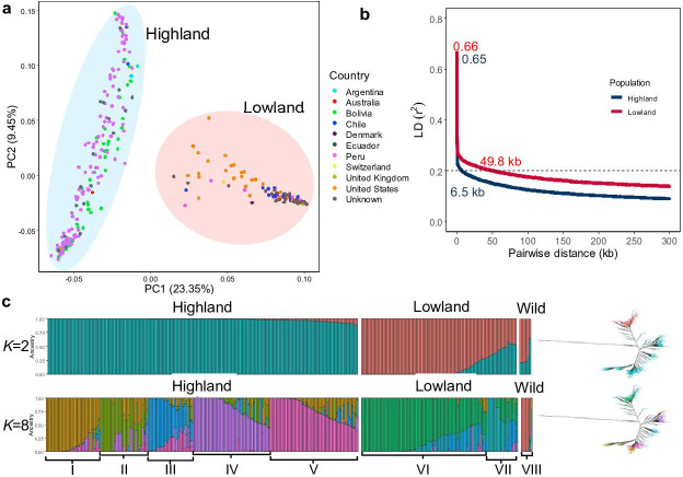
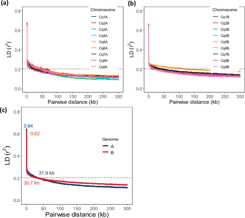
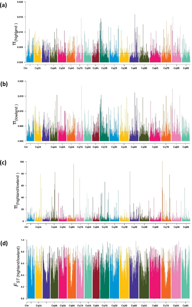
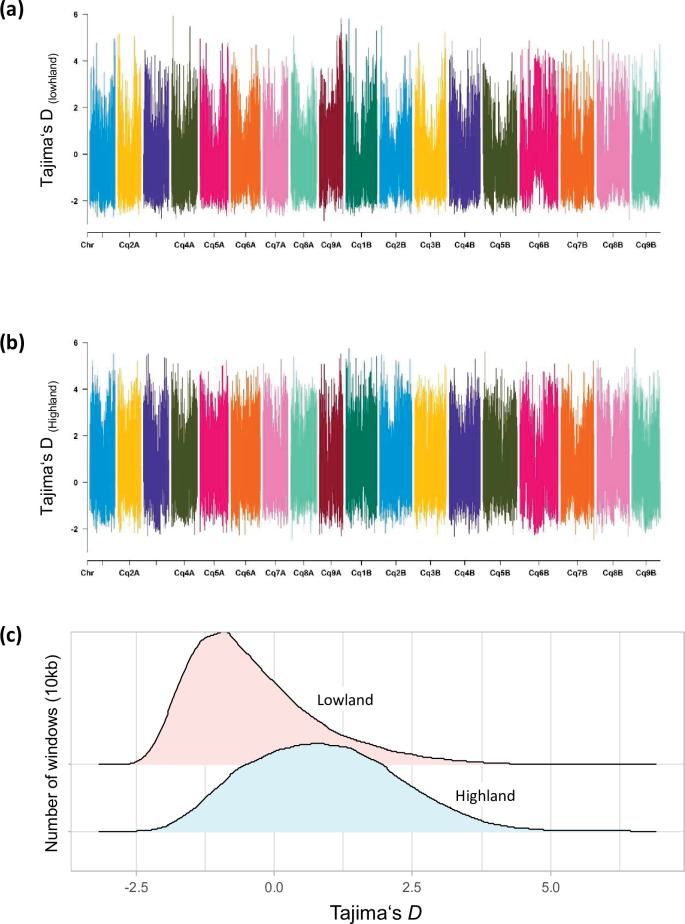
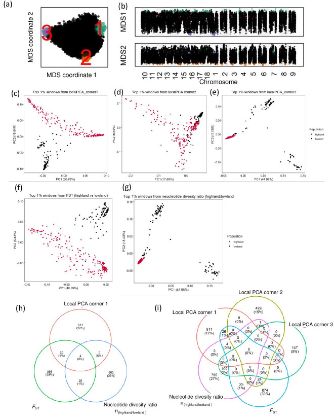
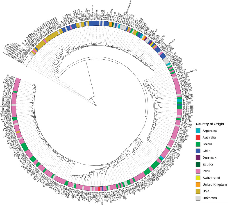
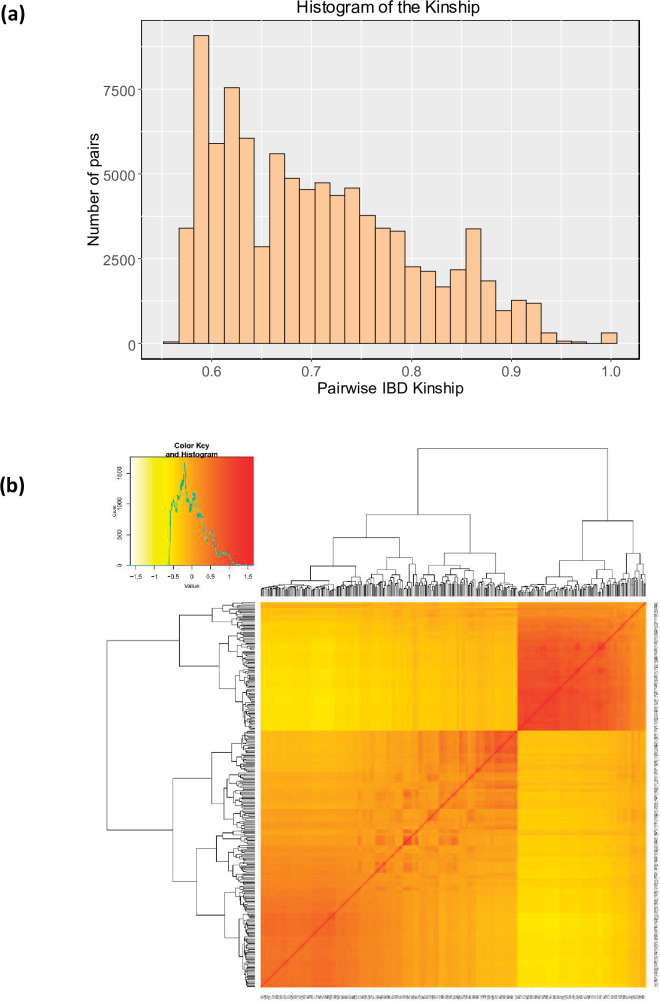
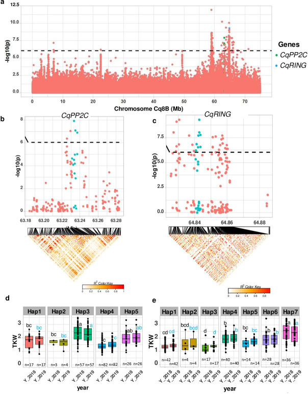
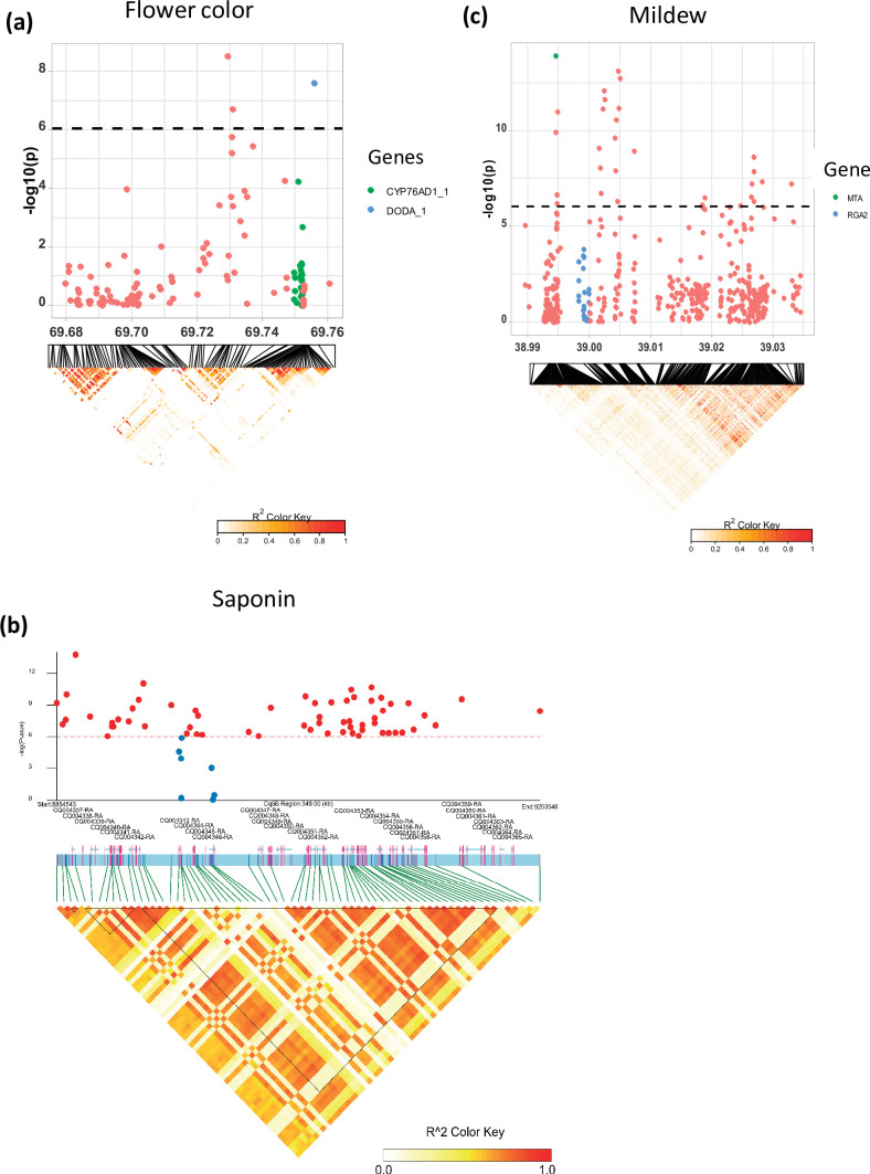
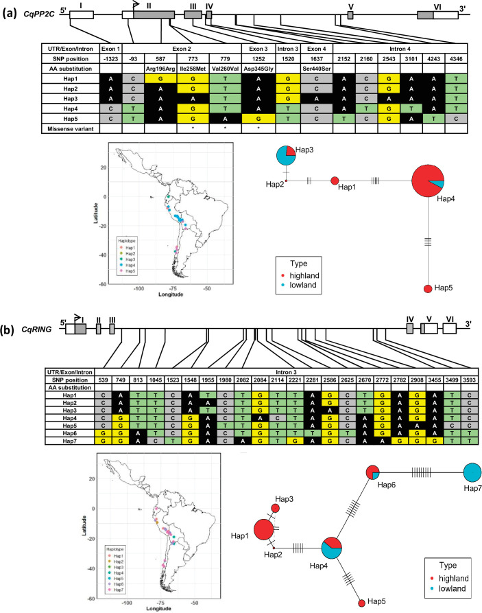
Quinoa germplasm preserves useful and substantial genetic variation, yet it remains untapped due to a lack of implementation of modern breeding tools. We have integrated field and sequence data to characterize a large diversity panel of quinoa. Whole-genome sequencing of 310 accessions revealed 2.9 million polymorphic high confidence single nucleotide polymorphism (SNP) loci. Highland and Lowland quinoa were clustered into two main groups, with FST divergence of 0.36 and linkage disequilibrium (LD) decay of 6.5 and 49.8 kb, respectively. A genome-wide association study using multi-year phenotyping trials uncovered 600 SNPs stably associated with 17 traits. Two candidate genes are associated with thousand seed weight, and a resistance gene analog is associated with downy mildew resistance. We also identified pleiotropically acting loci for four agronomic traits important for adaptation. This work demonstrates the use of re-sequencing data of an orphan crop, which is partially domesticated to rapidly identify marker-trait association and provides the underpinning elements for genomics-enabled quinoa breeding.

Keywords: Chenopodium quinoa; adaptation; domestication; genetic variation; genetics; genomics; plant breeding; re-sequencing.

Plain language summary

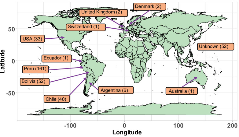
As human populations grow and climate change tightens its grip, developing nutritious crops which can thrive on poor soil and under difficult conditions will become a priority. Quinoa, a harvest currently overlooked by agricultural research, could be an interesting candidate in this effort. With its high nutritional value and its ability to tolerate drought, frost and high concentrations of salt in the soil, this hardy crop has been cultivated in the Andes for the last 5,000 to 7,000 years. Today its commercial production is mainly limited to Peru, Bolivia, and Ecuador. Pinpointing the genetic regions that control traits such as yields or flowering time would help agronomists to create new varieties better suited to life under northern latitudes and mechanical farming. To identify these genes, Patiranage et al. grew 310 varieties of quinoa from all over the world under the same conditions; the genomes of these plants were also examined in great detail. Analyses were then performed to link specific genetic variations with traits relevant to agriculture, helping to pinpoint changes in the genetic code linked to differences in how the plants grew, resisted disease, or produced seeds of varying quality. Candidate genes likely to control these traits were then put forward. The study by Patiranage et al. provides a genetic map where genes of agronomical importance have been precisely located and their effects measured. This resource will help to select genetic profiles which could be used to create new quinoa breeds better adapted to a changing world.


Conflict of interest statement

DP, ER, NE, GW, KS, SS, MT, CJ No competing interests declared

Figures

Figure 1.
Figure 1.. Genetic diversity and population structure of the quinoa diversity panel.
(a) Principal component analysis (PCA) of 303 quinoa accessions. PC1 and PC2 represent the first two analysis components, accounting for 23.35% and 9.45% of the total variation, respectively. The colors of dots represent the origin of accessions. Two populations are highlighted by different colors: Highland (light blue) and Lowland (pink). (b) Subpopulation-wise linkage disequilibrium (LD) decay in Highland (blue) and Lowland population (red). (c) Population structure is based on 10 subsets of SNPs, each containing 50,000 single nucleotide polymorphisms (SNPs) from the whole-genome SNP data. Model-based clustering was done in ADMIXTURE with different numbers of ancestral kinships (K=2 and K=8). K=8 was identified as the optimum number of populations. Left: Each vertical bar represents an accession, and color proportions on the bar correspond to the genetic ancestry. Right: Unrooted phylogenetic tree of the diversity panel. Colors correspond to the subpopulation.
Figure 1—figure supplement 1.
Figure 1—figure supplement 1.. Geographical origin of the accessions forming the quinoa diversity panel.
Figure 1—figure supplement 2.
Figure 1—figure supplement 2.. The SNP distribution in quinoa genome.
(a) Single nucleotide polymorphism (SNP) density heatmap across the 18 quinoa chromosomes. Different colors depict SNP density. (b) Scatter plot between mean depth and heterozygosity of accessions. Dots represent 310 different accessions.
Figure 1—figure supplement 3.
Figure 1—figure supplement 3.. The effect of read depth on genotype quality for homozygous and heterozygous SNPs.
(a) Histograms of mean read depth (DP) for unfiltered and filtered single nucleotide polymorphisms (SNPs), and the comparison of genotype quality (GQ) between high and low DP samples for (b) homozygous SNPs (filtered and unfiltered) and (c) heterozygous SNPs (filtered and unfiltered).
Figure 1—figure supplement 4.
Figure 1—figure supplement 4.. Chromosome-wide linkage disequilibrium (LD) decay in genome A (a) and genome B (b).
Colors depict different chromosomes. (c) Genome-wide average LD decay of the A subgenome (blue) and B subgenome (red). Pairwise distance at r2=0.20 is defined as the threshold for genome-wide LD decay (dashed line).
Figure 1—figure supplement 5.
Figure 1—figure supplement 5.. Single nucleotide polymorphism (SNP)-based principal component analysis (PCA) across all 18 quinoa chromosomes.
Red circles depict the two clusters of Lowland accessions.
Figure 1—figure supplement 6.
Figure 1—figure supplement 6.. population structure analysis in quinoa.
(a) ADMIXTURE ancestry coefficients for K ranging from 3 to 7 and 9. Each vertical bar represents an accession, and the color proportions on the bar correspond to the genetic ancestry. (b) Cross-validation error in ADMIXTURE run.
Figure 1—figure supplement 7.
Figure 1—figure supplement 7.. Diversity of populations along chromosomes measured based on 10 kb non-overlapping windows.
Nucleotide diversity (π) distribution of 10 kb windows in population Highland (a) and Lowland (b). (c) Nucleotide diversity ratios (π Lowland/ π Highland). (d) Pairwise genome-wide fixation index (FST) between Highland and Lowland. The broken horizontal line represents the top 1% threshold.
Figure 1—figure supplement 8.
Figure 1—figure supplement 8.. Distribution of Tajima’s D along chromosomes in Lowland (a) and Highland (b) populations.
(c) Density distribution of Tajima’s D between populations. Different colors represent the quartiles.
Figure 1—figure supplement 9.
Figure 1—figure supplement 9.. Local principal component analysis (PCA) and identification of candidate genes using diversity parameters.
(a) Relationship between genomic windows visualized using multidimensional scaling (MDS). (b) Two MDS coordinates of each window along the quinoa genome, candidate genomic regions are marked in different colors, which correspond with the colors on figure a. candidate regions are identified as the closest 1% window with the most extreme MDS coordinates. (c, d, e, f, and g) PCA using single nucleotide polymorphisms (SNPs) located within the candidate genomic regions identified by different analyses. (h and i) Venn diagrams represent the comparison of candidate genes identified by different analyses.
Figure 2.
Figure 2.. Maximum likelihood tree of 303 quinoa and 7 wild Chenopodium accessions from the diversity panel.
Colors depict the geographical origin of accessions.
Figure 2—figure supplement 1.
Figure 2—figure supplement 1.. Genetic relationships between quinoa accessions.
(a) Histogram representing the distribution of pairwise IBS kinship estimated using EMMAX. The same kinship matrix was used to represent the relationship among individuals in the GWAS analysis. (b) The heatmap of the pairwise kinship relationship was estimated using the Van Raden method using GAPIT software (Tang et al., 2016).
Figure 3.
Figure 3.. Genomic regions associated with important agronomic traits.
(a) Significant marker-trait associations (MTAs) for days to flowering (DTF), days to maturity (DTM), plant height (PH), and panicle density on chromosome Cq2A. Red color arrows indicate the single nucleotide polymorphism (SNP) loci pleiotropically acting on all four traits. (b) Boxplots showing the average performance for four traits over 2 years, depending on single nucleotide variation (C or G allele) within locus Cq2A_ 8093547. The P-values written above the boxplot are from Wilcoxon mean comparisons test (unpaired) between C and G allele. (c) Local Manhattan plot from region 8.04–8.14 Mb on chromosome Cq2A associated with PC1 of the DTF, DTM, PH, and panicle length (PL), and local linkage disequilibrium (LD) heatmap (bottom). The triangle below is the LD heatmap and the colors represent the pairwise correlation (r2) between individual SNPs. On top of the triangle, gene models are represented. Green color dots represent the strongest MTA (Cq2A_ 8093547).
Figure 3—figure supplement 1.
Figure 3—figure supplement 1.. Overview of the field experiment and exemplary images demonstrating phenotypic traits.
(a and b) Overview of the field and phenotypic variation among accession; (c): bolting (BBCH51) and (d) flowering (BBCH60) stage; glomerulate (e) and amarantiform (f) panicle shapes; red (g) and green (h) stem color; red (i) and green (j) flower/inflorescence; growth type 1 (k) and type 5 (l); (m) plant height and maturity variation between two accessions.
Figure 3—figure supplement 2.
Figure 3—figure supplement 2.. Graphical presentation of correlations between years among 12 traits.
Pearson correlation value (R) with p-values are shown. DTB: days to bolting (inflorescence emergence), DTF: days to flowering, days to bolting to days to flowering: days between bolting and flowering, DTM; days to maturity, PH: plant height (cm), PL: panicle length (cm), PD: panicle density (cm), NoB: number of branches, STL: stem lying, Saponin: saponin content as foam height (mm), Seed yield: seed yield per plant (g), TSW: thousand seed weight (g),.
Figure 3—figure supplement 3.
Figure 3—figure supplement 3.. Pearson correlations among 12 quinoa traits.
Best linear unbiased estimates across 2 years were used. Below the diagonal, scatter plots are shown with the fitted line in red. Above the diagonal, the Pearson correlation coefficients are shown with significance levels, ***=p < 0.001, **=p < 0.01.
Figure 3—figure supplement 4.
Figure 3—figure supplement 4.. Principal component analysis (PCA) of 12 quantitative phenotypes.
(a) Individual factor map colored according to populations identified from single nucleotide polymorphism (SNP) analysis. (b) Variables factor map of the PCA.
Figure 3—figure supplement 5.
Figure 3—figure supplement 5.. Principal component analysis (PCA) of four quantitative traits (days to flowering, days to maturity, plant height, and panicle length).
(a) Individual factor map, (b) variables factor map of the PCA, (c) distribution of the first three principal components used for GWAS analysis. Type I: Highland population, Type II: Lowland population.
Figure 3—figure supplement 6.
Figure 3—figure supplement 6.. GWAS analysis of principal components, PC1 (a), PC2 (b), PC3 (c): Manhattan plots (left), and quantile-quantile plots (right).
The blue horizontal line in the Manhattan plots indicates the suggestive threshold -log10 (8.98E-7). The red horizontal line indicates the significance threshold (Bonferroni correction) -log10 (1.67e-8).
Figure 3—figure supplement 7.
Figure 3—figure supplement 7.. The effect of repetitive sequences on identification of marker-trait associations in quinoa.
(a) GWAS with two different single nucleotide polymorphism (SNP) data sets, one encompassing all SNP from whole-genome sequencing and one SNP set after removing repetitive sequences. The number of marker-trait association (MTA) identified by each analysis are given in the Venn diagram. (b) Comparison of GWAS analysis (Manhattan plots) of principal component PC1 between whole-genome SNP set (WG) and repeat masked SNP set (RM). The blue horizontal line in the Manhattan plots indicates the suggestive threshold -log10 (8.98E-7). The red horizontal line indicates the significance threshold (Bonferroni correction) -log10 (1.67e-8). (c) Comparison of local Manhattan plots from region 8.04–8.14 Mb on chromosome Cq2A associated with days to flowering (DTF), days to maturity (DTM), plant height (PH), and panicle length (PL) between whole-genome SNP set (WG) and repeat masked SNP set (RM).
Figure 4.
Figure 4.. Identification of candidate genes for thousand seed weight.
(a) Manhattan plot from chromosome Cq8B. Green and blue dots depict the CqPP2C5 and the CqRING gene, respectively. (b) Top: Local Manhattan plot in the neighborhood of the CqPP2C gene. Bottom: Linkage disequilibrium (LD) heatmap. (c) Top: Local Manhattan plot in the neighborhood of the CqRING gene. Bottom: LD heatmap. Differences in thousand seed weight between five CqPP2C (d) and seven CqRING haplotypes (e). ANOVA was performed for each year separately to determine significance among haplotypes and grouping of pairwise multiple comparison was obtained using Tukey’s test. (blue and black colour letters are for different years).
Figure 4—figure supplement 1.
Figure 4—figure supplement 1.. Local Manhattan plots for (a) flower color, (b) saponin content, and (c) mildew infection.
Candidate genes are shown in the color legend. Linkage disequilibrium (LD) heatmaps are placed at the bottom. The colors of the heatmap represent the pairwise correlation between individual single nucleotide polymorphisms (SNPs). SNPs with significant p-values and SNPs on candidate genes were used to create the heatmap for the saponin content. Gene models and names are given on top of the heatmap. Haplotype blocks were identified using the Gabriel method in LDBlockShow software (Dong et al., 2021).
Figure 4—figure supplement 2.
Figure 4—figure supplement 2.. Haplotypes of two genes, CqPP2C (a) and CqRING (b), associated with seed size in quinoa.
The geographical origin of the accessions and haplotype networks are displayed below the gene structure. The frequency of haplotypes is correspondent to the circle size. The color of the pie chart depicts the population. Cross-lines represent the number of nucleotide polymorphisms between haplotypes.

Similar articles

Cited by

References

    1. Abrouk M, Ahmed HI, Cubry P, Šimoníková D, Cauet S, Pailles Y, Bettgenhaeuser J, Gapa L, Scarcelli N, Couderc M, Zekraoui L, Kathiresan N, Čížková J, Hřibová E, Doležel J, Arribat S, Bergès H, Wieringa JJ, Gueye M, Kane NA, Leclerc C, Causse S, Vancoppenolle S, Billot C, Wicker T, Vigouroux Y, Barnaud A, Krattinger SG. Fonio millet genome unlocks African orphan crop diversity for agriculture in a changing climate. Nature Communications. 2020;11:4488. doi: 10.1038/s41467-020-18329-4. - DOI - PMC - PubMed
    1. Abugoch James LE. Quinoa (Chenopodium quinoa Willd.): composition, chemistry, nutritional, and functional properties. Advances in Food and Nutrition Research. 2009;58:1–31. doi: 10.1016/S1043-4526(09)58001-1. - DOI - PubMed
    1. Alexander DH, Novembre J, Lange K. Fast model-based estimation of ancestry in unrelated individuals. Genome Research. 2009;19:1655–1664. doi: 10.1101/gr.094052.109. - DOI - PMC - PubMed
    1. Auge GA, Penfield S, Donohue K. Pleiotropy in developmental regulation by flowering-pathway genes: is it an evolutionary constraint? The New Phytologist. 2019;224:55–70. doi: 10.1111/nph.15901. - DOI - PubMed
    1. Bates D, Mächler M, Bolker B, Walker S. Fitting linear mixed-effects models using lme4. J Stat Soft. 2015;67:48. doi: 10.18637/jss.v067.i01. - DOI

Publication types