. 2022 Jul;12(7):672-676.
doi: 10.1038/s41558-022-01371-z. Epub 2022 Jun 16.

Increasing surface runoff from Greenland's firn areas

Affiliations

Increasing surface runoff from Greenland's firn areas

Andrew J Tedstone et al. Nat Clim Chang. 2022 Jul.

Abstract

At high elevations of ice sheets, melting snow generally percolates and refreezes, so does not contribute to the shrinking of the ice sheet. Here, we systematically map the runoff area of the Greenland ice sheet, using surface rivers visible on satellite imagery. Between 1985 and 2020, the maximum runoff elevation rose by 58-329 metres, expanding the runoff area by 29% (-8%/+6%). Excess melt beyond the refreezing capacity of pores in snowfall has created near-impermeable ice slabs that sustain surface runoff even in cooler summers. We show that two surface mass balance models over-estimate the runoff area by 16-30%. Once restricted to our observed areas they indicate that 5-10% of recent runoff likely comes from the expanded runoff area. Runoff from higher elevations is sensitive to projected warming as further increases in the runoff limit will increase the runoff area disproportionately.


Conflict of interest statement

Competing Interests Statement The authors declare that they have no competing interests

Figures

Extended Data Figure 1
Extended Data Figure 1. Extraction of hydrological features from Landsat images.
The sequence of principal image processing steps which are undertaken to identify and extract hydrological features, shown here for a region of a Landsat 8 product acquired on 13 August 2019 (LC08_L1TP_006013_20190813_20190820_01_T1; Extended Data Fig. 2e shows location). The names above each panel in the sequence correspond to those described in the Methods.
Extended Data Figure 2
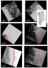
Extended Data Figure 2. Example runoff limit retrievals.
Individual runoff limit retrievals are shown in red, on top of their source Landsat near-infrared image. Inset map shows the location of each image. Landsat product identifiers are:
  1. a

    LT05_L1TP_020001_1995071_20180221_01_T1 (no retrievals).

  2. b

    LT05_L1TP_035003_19950705_20180221_01_T1.

  3. c

    LT05_L1GS_021006_19970809_20180221_01_T2.

  4. d

    LE07_L1TP_011010_20090812_20161218_01_T1.

  5. e

    LC08_L1TP_006013_20190813_20190820_01_T1.

  6. f

    LE07_L1TP_005015_20110808_20161207_01_T1.

Extended Data Figure 3
Extended Data Figure 3. Aggregation of runoff limit retrievals.
a All runoff limit retrievals made in SW-1 (see Fig. 1) during 2019. Land areas are shown in light grey and ice areas in white. Dotted lines show limit of SW-1 and the dark grey region shows the slice enlarged in panel c. Circles correspond to individual runoff limit retrievals, coloured by the 8 clusters identified in this box during 2019. b Landsat product LC08_L1TP_006013_20190813_20190820_01_T1 (Extended Data Fig. 2e) with detected runoff limit positions (orange circles), which belong to the orange cluster in panel (a). Also shown is the median runoff limit during 2019 (dashed line), ±1MAD (dotted lines). c Inset of the middle slice (S) of SW-1, showing only the runoff limit retrievals within S. The median of the highest-elevation cluster (black circle) defines the annual runoff limit. The red circle shows the estimated maximum runoff limit in 2019 (see e,f). d Density histogram of all runoff limit retrievals made in SW-1 during 2019 (colours correspond to the clusters in panels a and c, and saturation shows observation density). The runoff limit picked for S in panel c is shown by the black circle. e The polynomial adjusted to intercept 2019’s runoff limit (black circle and in panel c) estimates that the maximum likely runoff limit was slightly higher (red circle and in panel c).
Extended Data Figure 4
Extended Data Figure 4. Observation availability by elevation.
a-g Counts (N) of the mean number of cloud-free observations made in each 100 m elevation bin of each region. Bins with more than 10 observations are shaded dark blue. Orange crosses indicate the runoff limit at 100 m resolution.
Extended Data Figure 5
Extended Data Figure 5. Comparison between observed and maximum likely runoff limits.
Left Annual box plots for each region show the difference between observed and maximum likely runoff limits. Each boxplot depicts the differences for all 1 km slices which compose the region. Medians are denoted by black horizontal lines and the inter-quartile range (IQ = Q3 − Q1) by the coloured box. Whiskers correspond to Q1 − 1.5IQ and Q3 + 1.5IQ. All differences are positive, i.e the estimated maximum is always equal to or higher than the observed runoff limit. Right Polynomial curves describing the seasonal relative elevation (metres) in each region. Background shading shows relative density of the data (in 20 m bins) to which each curve was fitted. d, right Two curves are shown. The dashed curve is fitted to all data. The solid curve is fitted only to data before day 230 and is used to derive the differences shown in the box-plots.
Extended Data Figure 6
Extended Data Figure 6. Break-year identification statistics.
a,b Two-tailed D’Agostino’s K2 test for normality. p > 0.05 indicates that the null hypothesis (H0), that the data are drawn from a normal distribution, cannot be rejected. a K2 values for the part of the time series before the specified break date. b K2 values for the part of the time series after the specified break date. c Two-tailed t-test of whether each runoff limit time series can be separated into early versus late periods by the specified break-year. p < 0.01 indicates that the break-year is significant. Each chosen break-year has the largest T-statistic at p < 0.01, and the early and late periods can be considered normal (as panels a and b show that H0 could not be rejected).
Extended Data Figure 7
Extended Data Figure 7. Correspondence of visible runoff limits with ice slab locations.
1985- 1992 (blue) and 2013-2020 (pink) runoff areas overlaid with ice slab locations (black outlines) mapped by using airborne Accumulation Radar. Grey lines show the flight lines of the Operation IceBridge flights on which the Accumulation Radar was flown.
Extended Data Figure 8
Extended Data Figure 8. Estimates of runoff area from regional climate models.
The sensitivity of modelled runoff area depending on the chosen threshold value above which annual runoff contributes to runoff area, over the range 1 to 20 mm w.e. a-1. Results in the main text use 10 mm w.e. a-1. a, c Estimates for MAR. b, d Estimates for RACMO. a, b Runoff area at each threshold. c, d For the threshold values 5, 10 and 20 mm w.e. a-1, the percentage difference to the area calculated at the 1 mm w.e. a-1 threshold.
Extended Data Figure 9
Extended Data Figure 9. Regional esimates of modelled runoff area and volume.
Regions are colour-coded according to Fig. 1. Upper panels: Correspondence between observed and modelled runoff area. Values >100% indicate that the modelled area is larger than the observed area. Lower panels: Annual runoff volume (gigatonnes, Gt) from RACMO (dashed lines) and MAR (solid lines), (i) from above the 1985−1992 limit up to that year’s limit (black lines) and (ii) integrating all modelled runoff occurring above the 1985−1992 limit (grey lines). Vertical bars indicate ±1MAD.
Figure 1
Figure 1. Rising runoff limits around the Greenland Ice Sheet.
a The runoff area during 1985−1992 (blue) and the additional area during 2013−2020 (pink). Firn aquifers mapped by Operation Ice Bridge in green. Ice surface contours every 500 metres and ice sheet outline from the Greenland Ice Sheet Mapping Project. Analysis is divided into several regions delineated by dotted lines. Numbers refer to rows in panel c. Runoff limits in two small areas adjacent to the NW and NE borders were mapped manually, for the 1985-1992 and 2013-2020 periods only (see Methods). The positions of Camp Century (CC), the Expéditions Glaciologiques Internationales au Groenland (EGIG) line and the K-Transect are also shown. b Ice-sheet-wide change in runoff area between 1985−1992 (blue) and 2013−2020 (pink). Vertical bars show the median runoff area, shading ±1 MAD. Squares show the maximum likely runoff area (see Methods). c Elevation of the runoff limit in each 100 km zone, grouped by region. Hatching indicates less than 25% spatial coverage. d Regional runoff limits ±1MAD (solid lines and shading) and corresponding linear regression weighted by MAD (dashed lines and text labels).
Figure 2
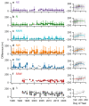
Figure 2. Relationships between excess melt and the runoff limit.
a The break-years which divide the runoff limit time series of each region (by colour). b-h In each region, mean annual excess melt computed from RACMO (Me) is compared with the difference (Δ) of the annual runoff limit to its 1985−2020 mean. Circle size shows 10-year running average excess melt, Me10y. Shading denotes whether point is before the region’s break-year in runoff limit behaviour (light) or after (dark). Lines show linear regression before the break-year (gray) and after (black), with associated R2 values (p > 0.05 in italics).
Figure 3
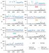
Figure 3. Impact of expanding runoff area on modelled runoff volumes.
a Comparison between the observed and modelled runoff areas. Modelled runoff area includes all pixels in the model domain which contribute >10 mm w.e. a-1. Values >100% indicate that the modelled runoff area is larger than observed. b Annual runoff volume (gigatonnes, Gt) from above the 1985−1992 runoff limit up to each year’s observed runoff limit. c, d Cumulative annual runoff volume since 1985 (Gt) from above the 1985-1992 runoff limit up to each year’s observed runoff limit, by region, c by MAR and d by RACMO.

References

    1. Enderlin EM, Howat IM, Jeong S, Noh M-J, van Angelen JH, van den Broeke MR. An improved mass budget for the Greenland ice sheet. Geophysical Research Letters. 2014;41(3):866–872.
    1. The IMBIE Team. Mass balance of the Greenland Ice Sheet from 1992 to 2018. Nature. 2019;579(7798):233–239. - PubMed
    1. Aschwanden A, Fahnestock MA, Truffer M, Brinkerhoff DJ, Hock R, Khroulev C, Mottram R, Khan SA. Contribution of the Green-land Ice Sheet to sea level over the next millennium. Science Advances. 2019;5(6):eaav9396. - PMC - PubMed
    1. Box JE, Fettweis X, Stroeve JC, Tedesco M, Hall DK, Steffen K. Greenland ice sheet albedo feedback: thermodynamics and atmosphericdrivers. The Cryosphere. 2012;6(4):821–839.
    1. Fausto RS the PROMICE team. The Greenland ice sheet - snowline elevations at the end of the melt seasons from 2000 to 2017. Geological Survey of Denmark and Greenland Bulletin. 2018;41:71–74.