. 2022 Nov;94(11):5304-5324.
doi: 10.1002/jmv.28012. Epub 2022 Jul 30.

Single-cell transcriptomic atlas reveals distinct immunological responses between COVID-19 vaccine and natural SARS-CoV-2 infection

Affiliations

Single-cell transcriptomic atlas reveals distinct immunological responses between COVID-19 vaccine and natural SARS-CoV-2 infection

Yi Wang et al. J Med Virol. 2022 Nov.

Abstract

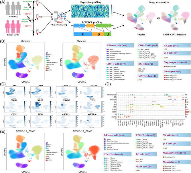
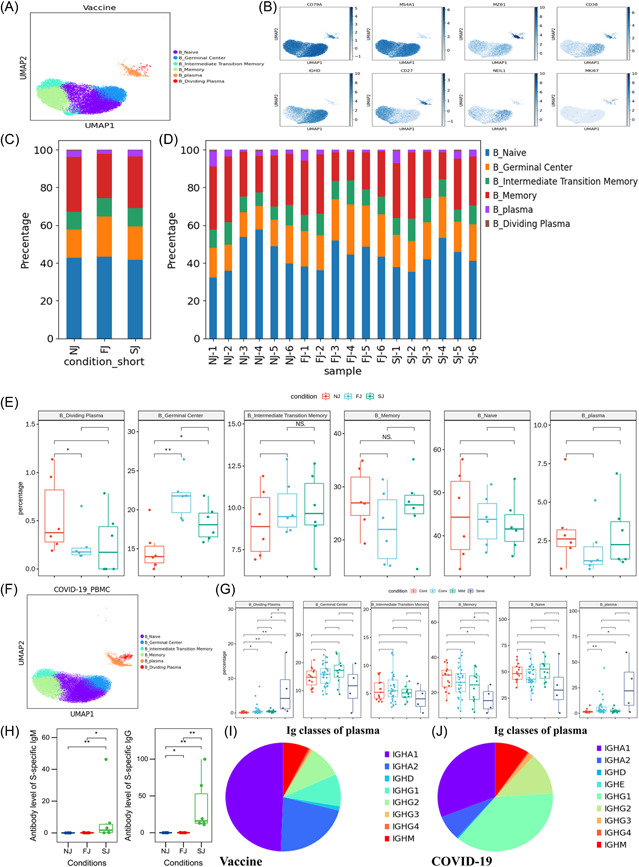
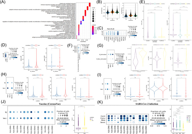
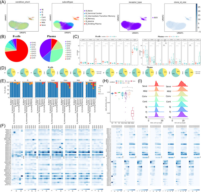
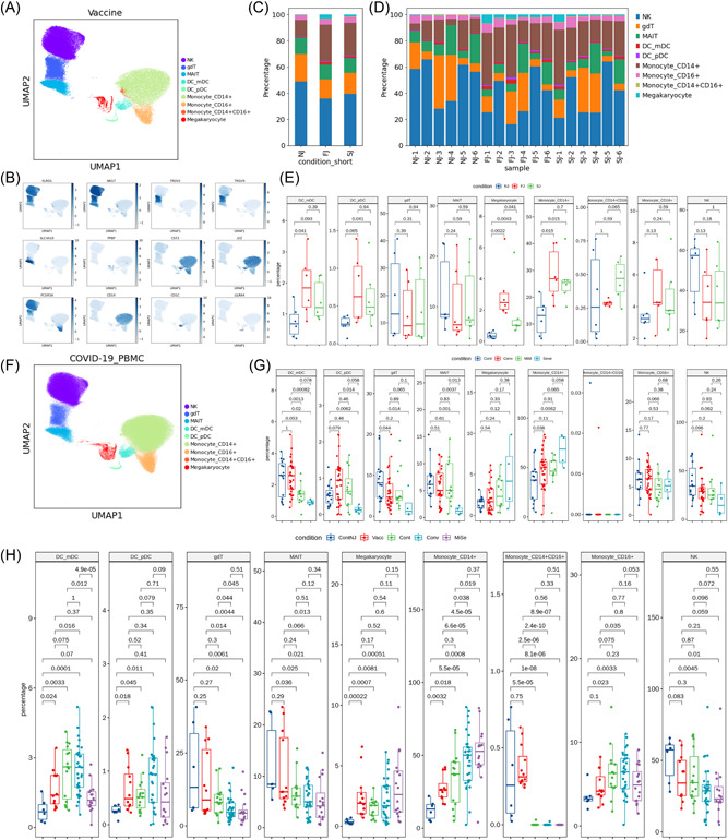
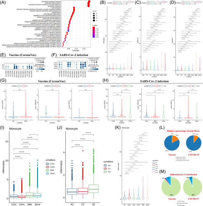
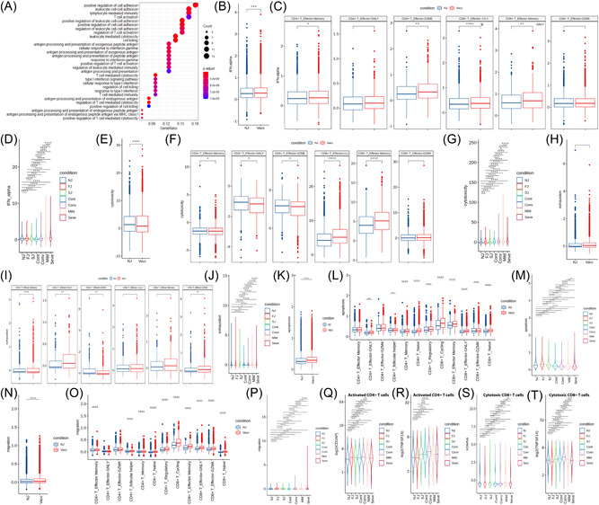
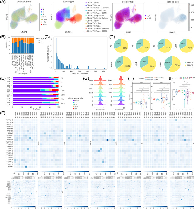
To control the ongoing coronavirus disease-2019 (COVID-19) pandemic, CoronaVac (Sinovac), an inactivated vaccine, has been granted emergency use authorization by many countries. However, the underlying mechanisms of the inactivated COVID-19 vaccine-induced immune response remain unclear, and little is known about its features compared to (Severe acute respiratory syndrome coronavirus 2) SARS-CoV-2 infection. Here, we implemented single-cell RNA sequencing (scRNA-seq) to profile longitudinally collected PBMCs (peripheral blood mononuclear cells) in six individuals immunized with CoronaVac and compared these to the profiles of COVID-19 infected patients from a Single Cell Consortium. Both inactivated vaccines and SARS-CoV-2 infection altered the proportion of different immune cell types, caused B cell activation and differentiation, and induced the expression of genes associated with antibody production in the plasma. The inactivated vaccine and SARS-COV-2 infection also caused alterations in peripheral immune activity such as interferon response, inflammatory cytokine expression, innate immune cell apoptosis and migration, effector T cell exhaustion and cytotoxicity, however, the magnitude of change was greater in COVID-19 patients, especially those with severe disease, than in immunized individuals. Further analyses revealed a distinct peripheral immune cell phenotype associated with CoronaVac immunization (HLA class II upregulation and IL21R upregulation in naïve B cells) versus SARS-CoV-2 infection (HLA class II downregulation and IL21R downregulation in naïve B cells from severe disease individuals). There were also differences in the expression of important genes associated with proinflammatory cytokines and thrombosis. In conclusion, this study provides a single-cell atlas of the systemic immune response to CoronaVac immunization and revealed distinct immune responses between inactivated vaccines and SARS-CoV-2 infection.

Keywords: COVID-19; CoronaVac; SARS-CoV-2; immunological responses; inactivated vaccine; single-cell sequencing.


Conflict of interest statement

The authors declare no conflict of interest.

Figures

Figure 1
Figure 1
Study design and overall results of single‐cell transcriptomic profiling of PBMCs isolated from vaccine recipients without COVID‐19 infection. (A) A schematic diagram of the overall study design. The PBMCs from six recipients, three male and three female adults, and across three conditions were subjected to scRNA‐seq gene expression profiling, TCR and BCR profiling analyses. The data set was integrated with a published COVID‐19 scRNA‐seq data set comprised of 64 fresh PBMC samples. (B) Cell populations identified and 2‐D visualization. The UMAP projection of 180k single cell transcriptomes from NJ (n = 6), FJ (n = 6) and SJ (n = 6) samples, showing the presence of 10 major clusters and 27 smaller clusters with their respective colors. Each dot corresponds to a single cell, colored according to the annotated major cell type (left panel) or subtype (right panel). (C) Canonical single cell RNA markers were used to label major clusters by cell identity as expression level on the UMAP plot. Cells are colored according to log transformed and normalized expression levels of 12 genes (CD3D, CD8A, CD40LG, etc.). (D) Expression distribution of cell identity specific RNA markers of vaccine cohort samples. The rows represent 10 cell clusters labeled with different colors and the columns represent log transformed gene expression of the RNAs. The distribution of a gene in a cluster is shown as one small violin plot. (E) Similar to Figure 1B, Cell populations identified and 2‐D visualization of 410k single cell transcriptomes from Cont (Control), Conv (Convalescence), Mild (Mild), and Seve (Severe) samples from Ren et al. BCR, B cell receptor; PBMCs, peripheral blood mononuclear cells; scRNA‐seq, single‐cell RNA sequencing; TCR, T cell receptor; UMAP, uniform manifold approximation and projection.
Figure 2
Figure 2
Characterization of B cell composition differences in individuals across vaccination and infection conditions (A) UMAP projection of all B cells from NJ, FJ, and SJ conditions. Each dot corresponds to a single cell, colored by its cell subtype. (B) Expression levels of canonical B cell RNA markers were used to identify and label major cell clusters on the UMAP plot. Cells are colored according to log transformed and normalized expression levels of eight genes. Cells are from NJ, FJ, and SJ conditions (C) Average proportion of each B cell subtype derived from NJ, FJ, and SJ groups. (D) Proportion of each B cell subtype derived from NJ, FJ, and SJ individual samples. (E) The box plot shows the composition of B cells before (NJ) and after vaccination (FJ and SJ) at a single sample level. (F) UMAP projection of all B cells from Cont, Conv, Mild, and Seve conditions. Each dot corresponds to a single cell, colored by its cell subtype. (G) Proportion of each B cell subtype derived from Cont, Conv, Mild, and Seve individual samples. (H) IgM and IgG antibody levels from NJ, FJ, and SJ conditions in serum. (I) The composition of Ig classes in the vaccine cohort identified by BCR single cell sequencing. (J) The composition of Ig classes in the COVID‐19 infected cohort identified by BCR single cell sequencing. All pairwise differences with p < 0.05 using two‐sided unpaired Mann–Whitney U‐test are marked to show significance levels.BCR, B cell receptor; FJ, first injection; NJ, no injection; SJ, second injection; UMAP, uniform manifold approximation and projection.
Figure 3
Figure 3
Characterization of gene expression differences in B cells in individuals across vaccination and infection conditions. (A) GO enrichment analysis of diDEGs identified by comparing before‐ and after‐ vaccination conditions. DEGs refer to genes with Benjamini–Hochberg adjusted p value (two‐sided unpaired Mann–Whitney U‐test) ≤0.01 and average log2 fold change ≥1 in both FJ/NJ and SJ/NJ comparisons. (B) Violin plots of B cell expression activities in three vaccine conditions. Cells are grouped and colored by conditions. Y axis represents the normalized expression score of gene sets related to B_CELL_ACTIVATION_INVOLVED_IN_IMMUNE_RESPONSE (GO:0002312) and B_CELL_ACTIVATION (GO:0042113). (C) Dot plots of the gene expression level of naïve B cells in three vaccine conditions. Rows represent conditions; columns represent genes. Dots are colored by mean expression levels in each condition. (D) (Left) Dot plots of IL4R and IL21R expression level in naïve B cells between pre‐vaccination and postvaccination. Rows represent conditions; columns represent genes. Dots are colored by mean expression levels in each condition. (Right) Violin plots show the expression level of the two genes in before‐ and after‐vaccination conditions. (E) Violin plots of the expression level of IL4R and IL21R genes in naïve B cells, activated B cells and memory B cells. (F) Dot plots of gene expression level of memory B and intermediate transition memory B cells in vaccine cohort. Rows represent genes (TBX21, ZEB2, TFEC, ZBTB32, and YBX3); columns represent B cell subtypes. Dots are colored by mean expression levels in each group. (G) PRDM1, XBP1, and IRF4 gene expression level of activated B cells and other B cells in the vaccine cohort. Dot plots (Left) and violin plots (Right) are used for visualization. (H) PAX5, BCL6, and BACH2 gene expression level of B cells in before‐ and after‐vaccination conditions. Dot plots (Left) and violin plots (Right) are used for visualization. I. CXCR5, CXCR4, and CCR6 gene expression level of B cells in before‐ and after‐vaccination conditions. Dot plots (Left) and violin plots (Right) are used for visualization. (J) Gene expression level of HLA‐II genes in B cells in before‐ and after‐vaccination conditions. Dot plots (Left) show individual genes and violin plots (Right) show normalized average expression of the HLA‐II gene set. (K) Gene expression level of HLA‐II genes in B cells in Cont, Conv, Mild, and Seve conditions. Dot plots (Left) show individual genes and violin plots (Right) show normalized average expression of the HLA‐II gene set. All pairwise differences with p < 0.05 using two‐sided unpaired Mann–Whitney U‐test are marked to show significance levels. DEGs, differentially expressed genes; FJ, first injection; GO, Gene Ontology; NJ, no injection; SJ, second injection.
Figure 4
Figure 4
Changes in BCR clones and selective usage of V(D)J genes. (A) UMAP projection of B cells derived from PBMCs. Cells are colored by conditions (Panel 1), B cell subtypes (Panel 2), if BCR detection was successful (Panel 3) and clone‐type expansion size (panel 4). (B) Pie graph showing the distribution of IGHA, IGHD, IGHG and IGHM in B cells and plasma cells. (C) Box plot showing the percentages IGHA, IGHD, IGHG and IGHM in B cells and plasma cells under each condition. (D) Pie graph showing the distribution of light chain IGK and IGL in B cells and plasma cells under each condition. (E) Stacked bar plots showing the clone state of each B cell subtype in each condition. (F) Heat maps showing differential IGH/K/L rearrangement. Prevalent IGHV‐IGHJ combination pairs (left) and IGKV‐IGKJ combination pairs (right) are compared across conditions. Usage percentage are sum normalized by column. (H) Box plot showing the alpha diversity of clonotypes in each PBMC sample. Data points are colored by condition. (I) Density curve plots showing the distribution shift of IGK/L and IGH chain CDR3 region length in BCR clone types for each condition. BCR, B cell receptor; IGHA, immunoglobulin A heavy chain; IGHG, immunoglobulin G heavy chain; IGHM, immunoglobulin M heavy chain; PBMCs, peripheral blood mononuclear cells; UMAP, uniform manifold approximation and projection.
Figure 5
Figure 5
Characterization of innate cell composition differences in individuals across vaccination and infection conditions. (A) UMAP projection of all innate cells from NJ, FJ, and SJ conditions. Each dot corresponds to a single cell, colored by its cell subtype. (B) Expression levels of canonical innate cell RNA markers were used to identify and label major cell clusters on the UMAP plot. Cells are colored according to log transformed and normalized expression levels of eight genes. Cells are from NJ, FJ, and SJ conditions. (C) Average proportion of each innate cell subtype derived from NJ, FJ, and SJ groups. (D) Proportion of each innate cell subtype derived from NJ, FJ, and SJ individual samples. (E) The box plot shows the composition of innate cells in NJ, FJ, and SJ conditions at a single sample level. (F) UMAP projection of all innate cells from Cont, Conv, Mild, and Seve conditions. Each dot corresponds to a single cell, colored by its cell subtype. (G) Proportion of each innate cell subtype derived from Cont, Conv, Mild, and Seve individual samples. (H) Proportion of each innate cell subtype derived from ContNJ(NJ), Vacc(FJ + SJ), Conv, MiSe (Mild and Seve) individual samples. All pairwise differences with p < 0.05 using two‐sided unpaired Mann–Whitney U‐test are marked to show significance levels. FJ, first injection; NJ, no injection; SJ, second injection; UMAP, uniform manifold approximation and projection.
Figure 6
Figure 6
Characterization of gene expression differences in innate immune cells from vaccine and COVID‐19 infected cohort samples. (A) GO enrichment analysis of DEGs identified by comparing the before and after vaccination conditions. DEGs refer to genes with Benjamini–Hochberg adjusted p value (two‐sided unpaired Mann–Whitney U‐test) ≤0.01 and average log2 fold change ≥1 in both FJ/NJ and SJ/NJ comparisons. (B−D) Expression activity of IFN‐alpha, apoptosis and migration pathways in innate immune cells of NJ, FJ, SJ, Cont, Conv, Mild and Seve conditions shown as violin plots and colored by sample conditions. (E) Heatmap dot plot of HLA‐II gene expression in innate immune cells of NJ, FJ, and SJ conditions. (F) Heatmap dot plot of HLA‐II gene expression in innate immune cells of Cont, Conv, Mild, and Seve conditions, (G) Violin plot showing normalized expression levels of P2RX1, TBXA2R, and P2RY1 in megakaryocytes (Mega) from NJ and Vaccine (FJ + SJ) conditions. (H) Violin plot of normalized expression of P2RX1, TBXA2R and P2RY1 in megakaryocytes (Mega) from Cont, Mild and Seve conditions. (I) Expression activity of inflammatory pathways in monocytes from NJ, FJ, and SJ conditions shown as box plots. Boxes are colored by sample conditions. (J) Expression activity of inflammatory pathways in monocytes from Cont, Conv, Mild, and Seve conditions shown as box plots. Boxes are colored by sample conditions. (K) Expression activity of inflammatory pathways in monocytes from NJ, Vacc, Cont, Conv, Mild, and Seve conditions shown as violin plots. Violins are colored by sample conditions. (L) Pie graph of relative percentage for CD14+ monocytes, CD16+ monocytes, CD14+CD16+monocytes in the vaccine and COVID‐19 cohort. (M) Pie graph of inflammatory scores from CD14+ monocytes, CD16+ monocytes, CD14+CD16+monocytes in the vaccine and COVID‐19 cohort. DEGs, differentially expressed genes; FJ, first injection; GO, Gene Ontology; IFN, Interferon; NJ, no injection; SJ, second injection.
Figure 7
Figure 7
Characterization of gene expression differences in activated T cells from vaccine and COVID‐19 infected cohort samples. (A) GO enrichment analysis of  DEGs identified by comparing the before and after vaccination conditions. DEGs refer to genes with Benjamini–Hochberg adjusted p value (two‐sided unpaired Mann–Whitney U‐test) ≤0.01 and average log2 fold change ≥1 in both FJ/NJ and SJ/NJ comparisons. (B and C) Expression activity of IFN‐alpha pathways in activated T cells (B) and subtypes (C) of NJ and Vacc (FJ and SJ) conditions shown as box plots and are colored by sample conditions. (D) Expression activity of IFN‐alpha in activated T cells of NJ, FJ, SJ, Cont, Conv, Mild and Seve conditions shown as violin plots and colored by sample conditions. (E and F) Expression activity of cytotoxicity pathways in activated T cells (E) and subtypes (F) of NJ and Vacc (FJ and SJ) conditions shown as box plots and are colored by sample conditions. (G) Expression activity of cytotoxicity pathways in activated T cells of NJ, FJ, SJ, Cont, Conv, Mild, and Seve conditions shown as violin plots and colored by sample conditions. (H and I) Expression activity of exhaustion genes in activated T cells (H) and subtypes (I) of NJ and Vacc (FJ and SJ) conditions shown as box plots and are colored by sample conditions. (J) Expression activity of exhaustion genes in activated T cells of NJ, FJ, SJ, Cont, Conv, Mild, and Seve conditions shown as violin plots and colored by sample conditions. (K and L) Expression activity of apoptosis pathways in T cells (K) and subtypes (L) of NJ and Vacc (FJ and SJ) conditions shown as box plots and are colored by sample conditions. (M) Expression activity of apoptosis pathways in activated T cells of NJ, FJ, SJ, Cont, Conv, Mild, and Seve conditions shown as violin plots and colored by sample conditions. (N and O), Expression activity of migration pathways in activated T cells (N) and subtypes (O) of NJ and Vacc (FJ and SJ) conditions shown as box plots and are colored by sample conditions. (P) Expression activity of migration pathways in activated T cells of NJ, FJ, SJ, Cont, Conv, Mild, and Seve conditions shown as violin plots and colored by sample conditions. (Q and R) Gene expression level of CD2AP (Q) and TNFSF14 (R) in activated CD4 + T cells in NJ, FJ, SJ, Cont, Conv, Mild, and Seve conditions. Violin plots showed normalized average expression of CD2AP (Q) and TNFSF14 (R). (S and T) Gene expression level of KDM5A (S) and TNFSF14 (T) in cytotoxic CD8+ T cells in NJ, FJ, SJ, Cont, Conv, Mild, and Seve conditions. Violin plots showed normalized average expression of KDM5A (S) and TNFSF14 (T). All pairwise differences with p < 0.05 using two‐sided unpaired Mann–Whitney U‐test are marked to show significance levels. DEGs, differentially expressed genes; FJ, first injection; GO, Gene Ontology; IFN, Interferon; NJ, no injection; SJ, second injection.
Figure 8
Figure 8
Changes in TCR clones and selective usage of V(D)J genes. (A) UMAP projection of T cells derived from PBMCs. Cells are colored by conditions (Panel 1), T cell subtypes (Panel 2), if TCR detection was successful (Panel 3) and clonotype expansion size (panel 4). (B) Stacked bar plot shows the TCR detection success rate for each T cell subtype. (C) Histogram shows the negative correlation between the number of T cell clones and the number of cells per clonotype. Y axis is log10 scaled. (D) Pie graph showing the distribution of TRBC1 and TRBC2 in T cells under each condition. (E) Stacked bar plots showing the clone state of each T cell subtype in each condition. (F) Heat maps showing differential TRBV‐J and TRAV‐J rearrangement. Prevalent TRBV‐J combination pairs (top) and TRAV‐J combination pairs (bottom) are compared across conditions. Usage percentage are sum normalized by column. (G) Density curve plots showing the distribution shift of TRA and TRB chain CDR3 region length in TCR clone types from each condition. (H) Box plot showing TRBC1 and TRBC2 percentages in NJ, FJ, SJ, Cont, Conv, Mild, and Seve conditions. (I) Box plot showing the alpha diversity of TCR clonotypes in each PBMC sample. Data points are colored by condition. FJ, first injection; NJ, no injection; PBMCs, peripheral blood mononuclear cells; SJ, second injection; TCR, T cell receptor; UMAP, uniform manifold approximation and projection.

Similar articles

Cited by

References

    1. Cevik M, Kuppalli K, Kindrachuk J, Peiris M. Virology, transmission, and pathogenesis of SARS‐CoV‐2. BMJ. 2020;371:371. - PubMed
    1. Mehra MR, Desai SS, Kuy S, Henry TD, Patel AN. Cardiovascular disease, drug therapy, and mortality in Covid‐19. N Engl J Med. 2020;382(25):e102. - PMC - PubMed
    1. Amanat F, Krammer F. SARS‐CoV‐2 vaccines: status report. Immunity. 2020;52(4):583‐589. - PMC - PubMed
    1. Dong Y, Dai T, Wei Y, Zhang L, Zheng M, Zhou F. A systematic review of SARS‐CoV‐2 vaccine candidates. Signal Transduct Target Ther. 2020;5(1):1‐14. - PMC - PubMed
    1. Poland GA, Ovsyannikova IG, Kennedy RB. SARS‐CoV‐2 immunity: review and applications to phase 3 vaccine candidates. Lancet. 2020;20:531‐532. - PMC - PubMed

Publication types