. 2022 Aug;54(8):1192-1201.
doi: 10.1038/s41588-022-01141-9. Epub 2022 Aug 5.

Cancer cell states recur across tumor types and form specific interactions with the tumor microenvironment

Affiliations

Cancer cell states recur across tumor types and form specific interactions with the tumor microenvironment

Dalia Barkley et al. Nat Genet. 2022 Aug.

Abstract

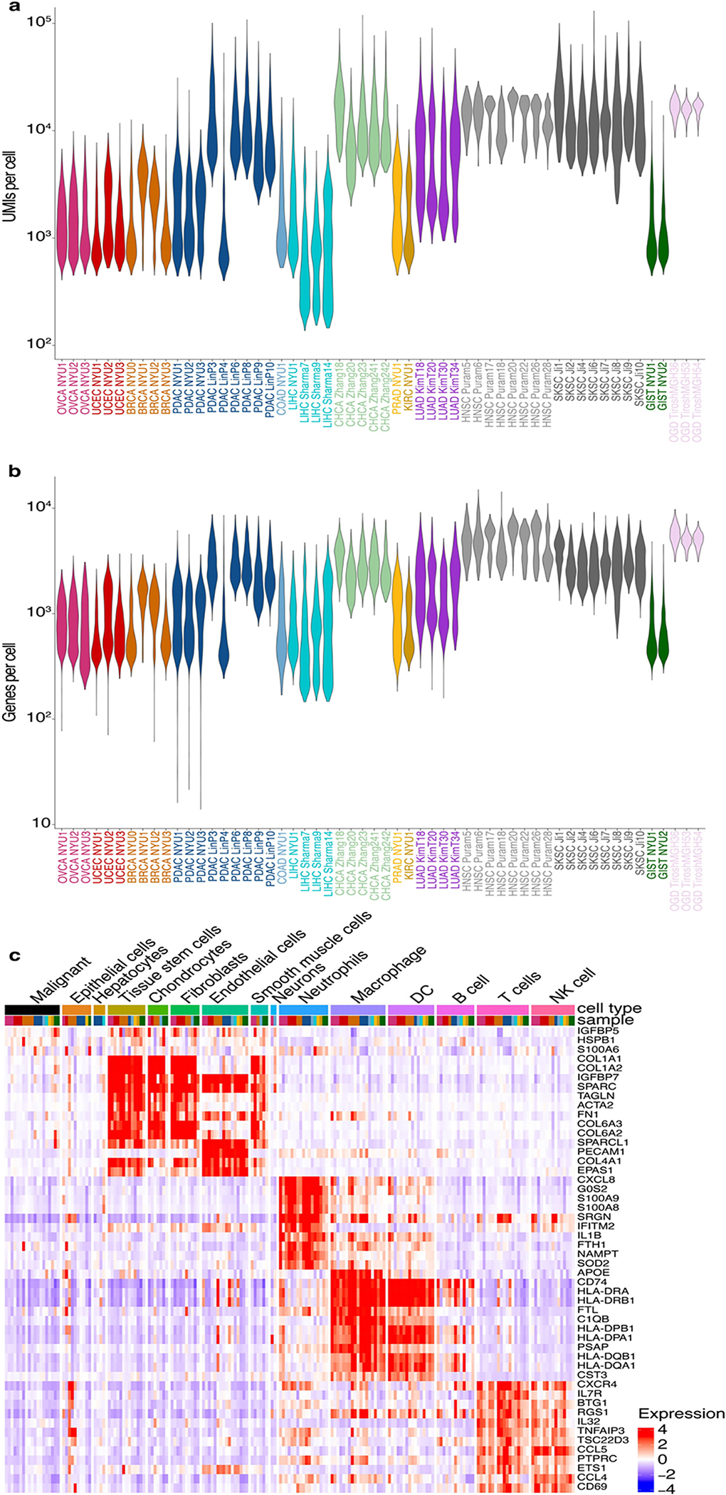
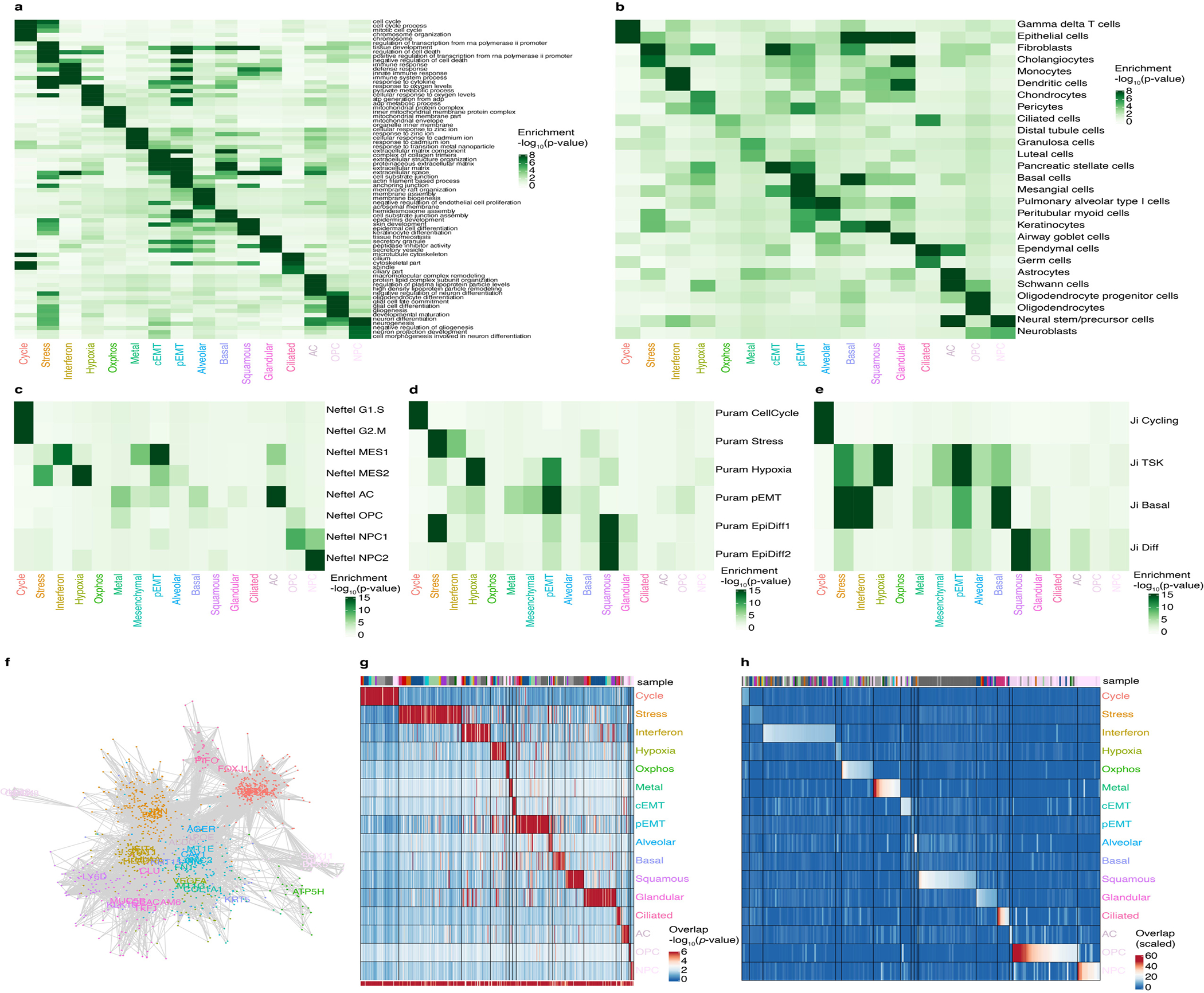
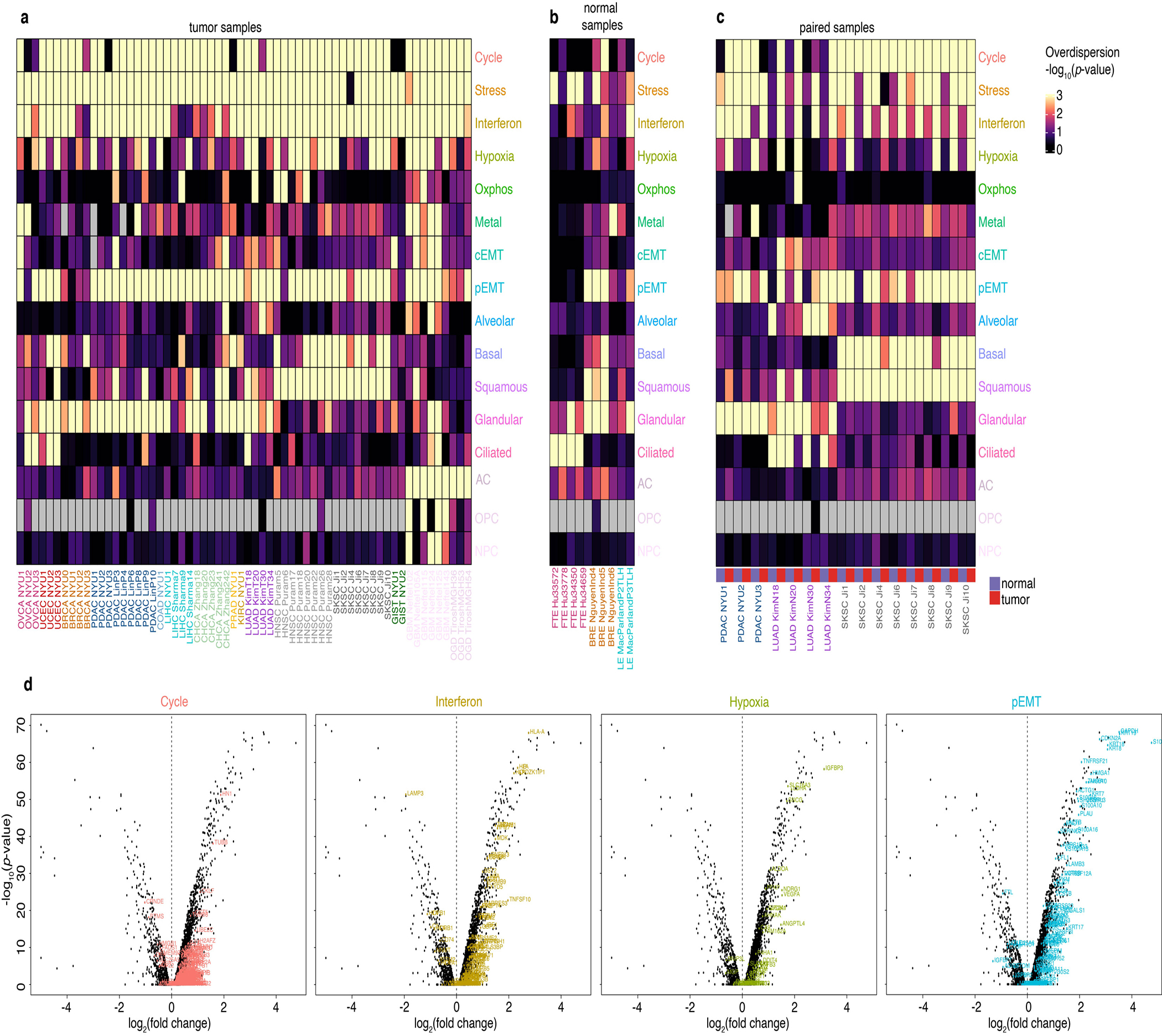
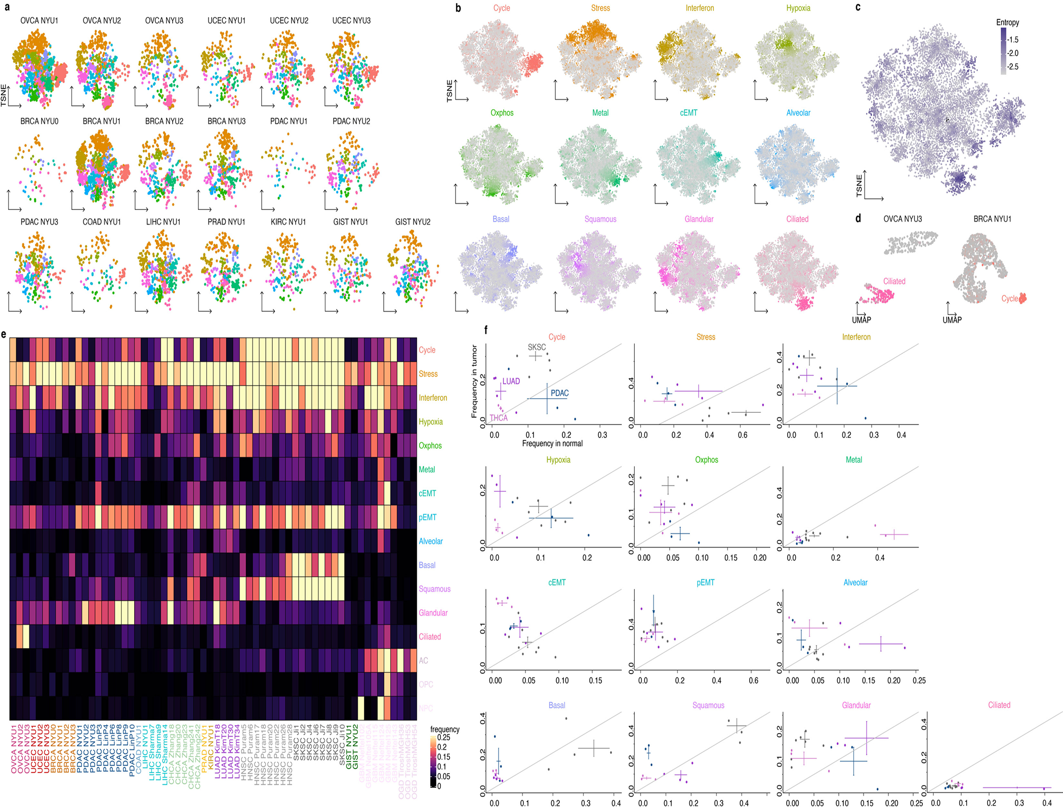
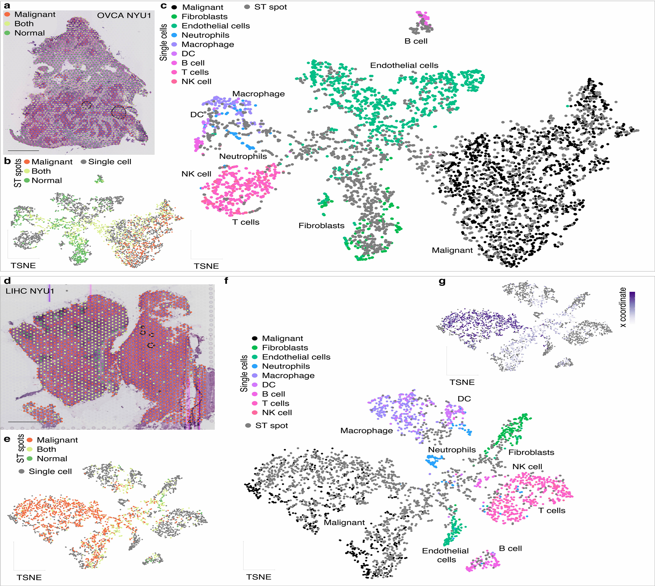
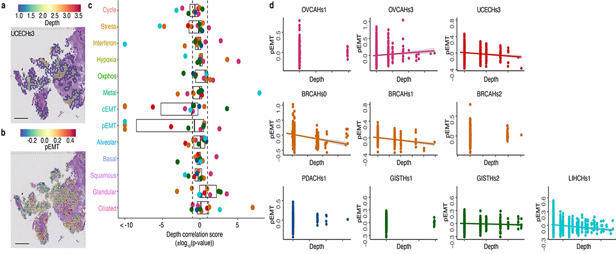
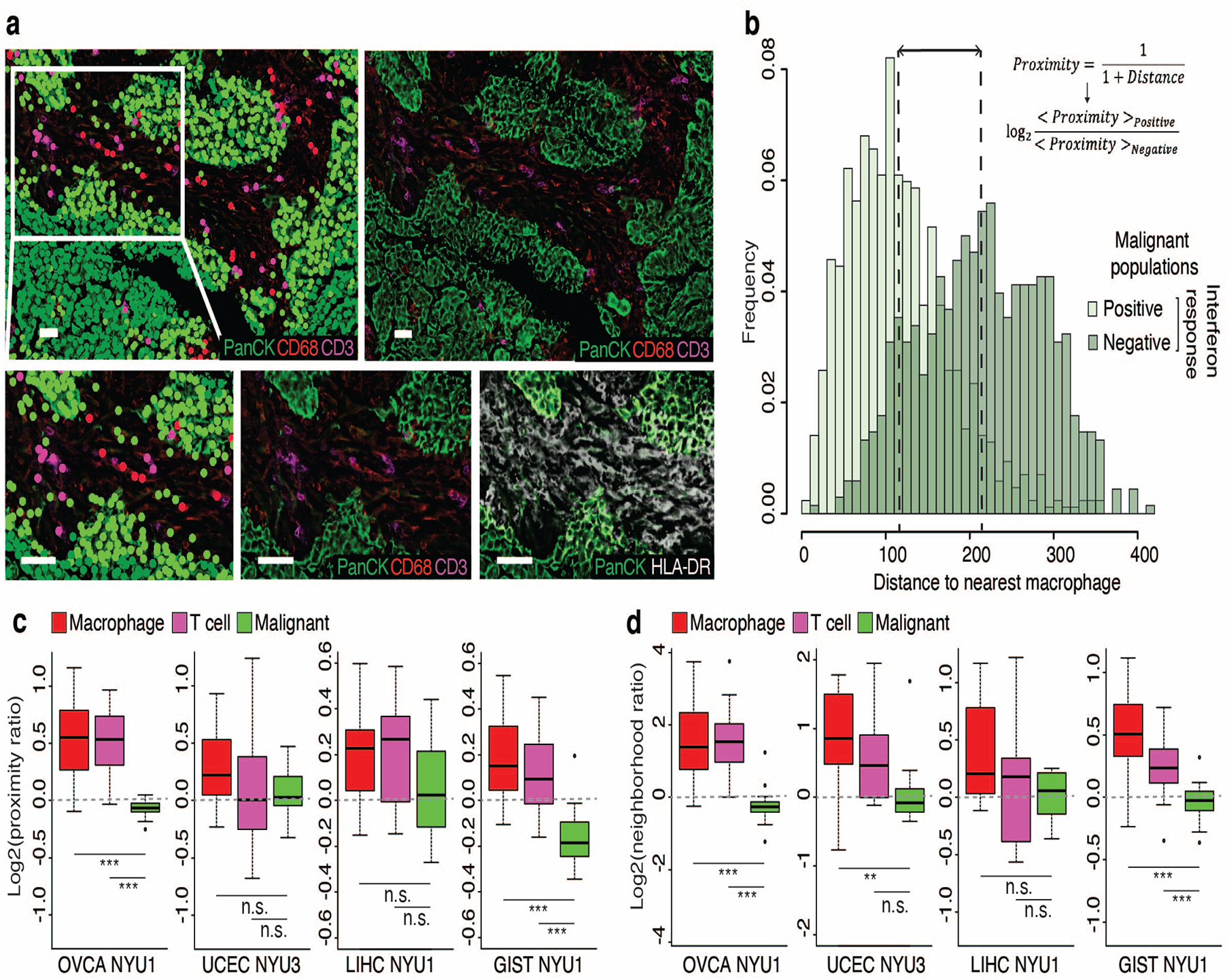
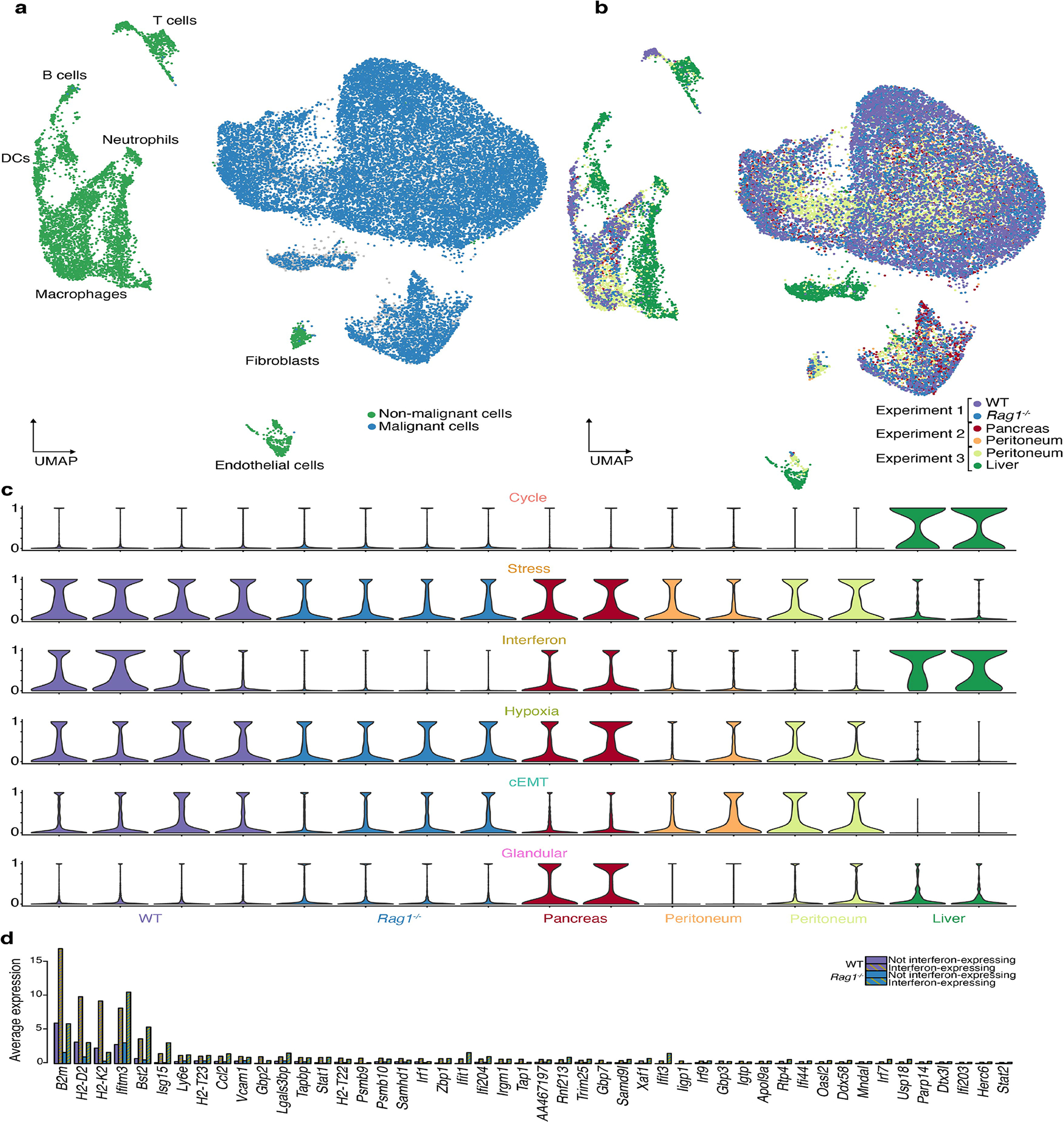
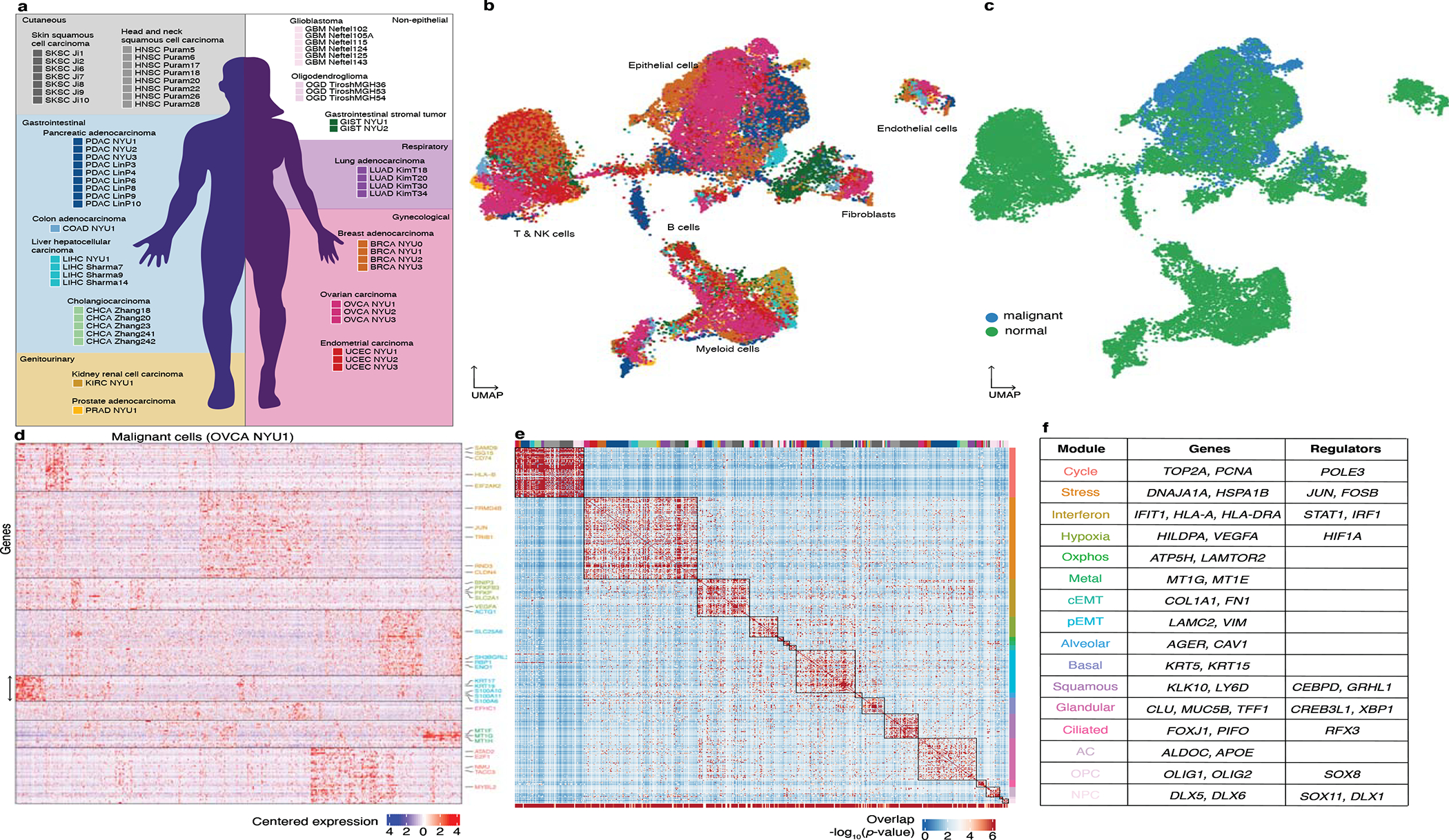
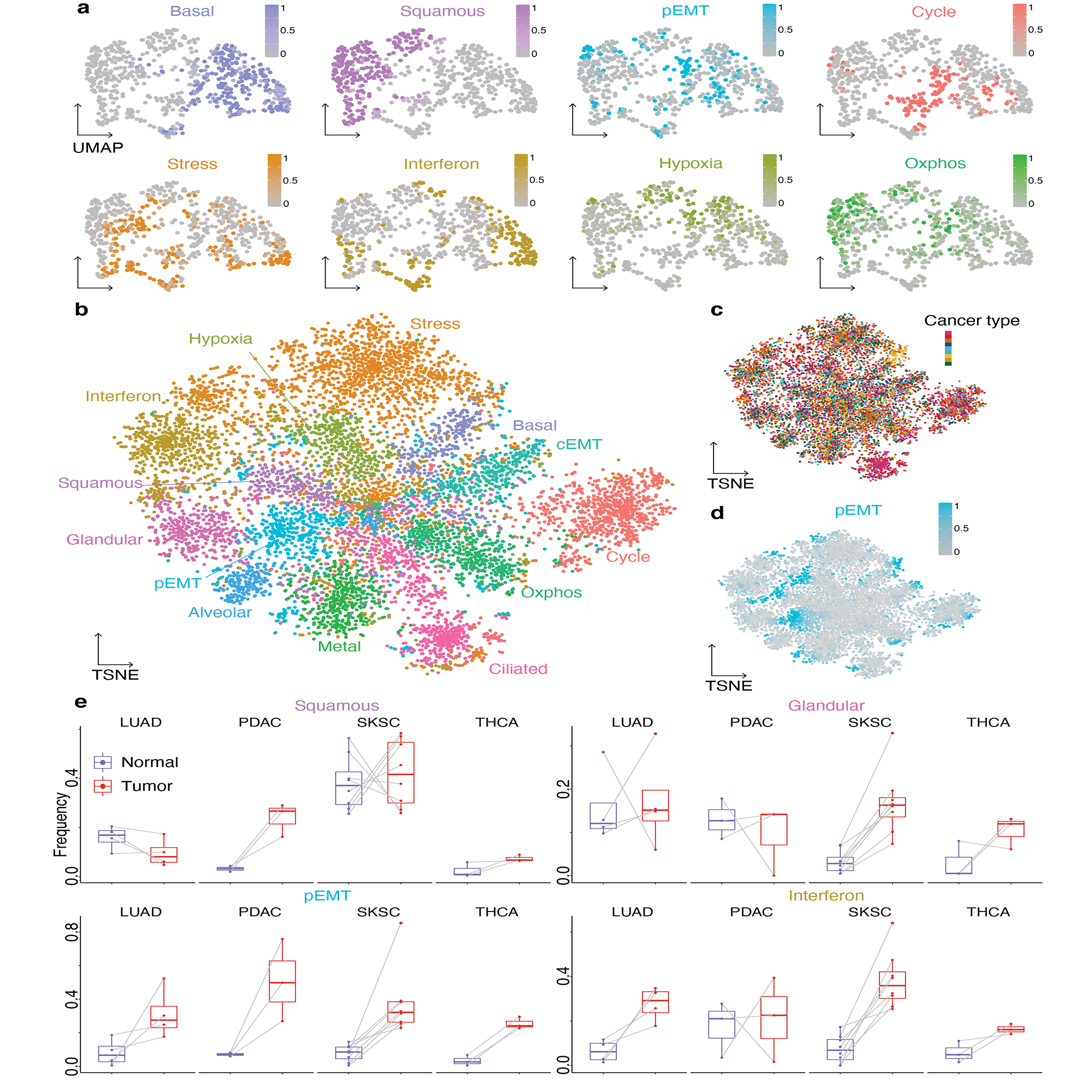
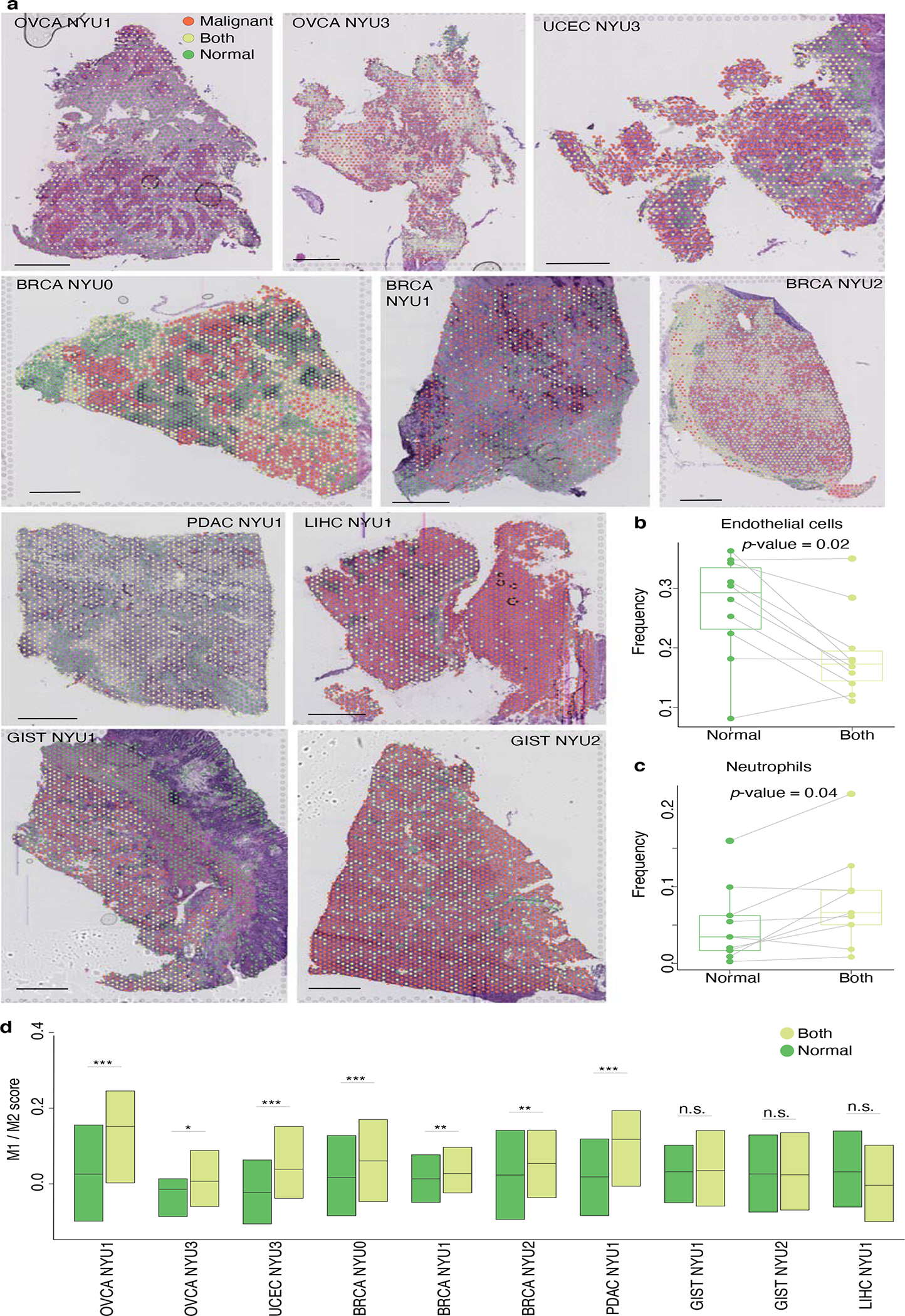
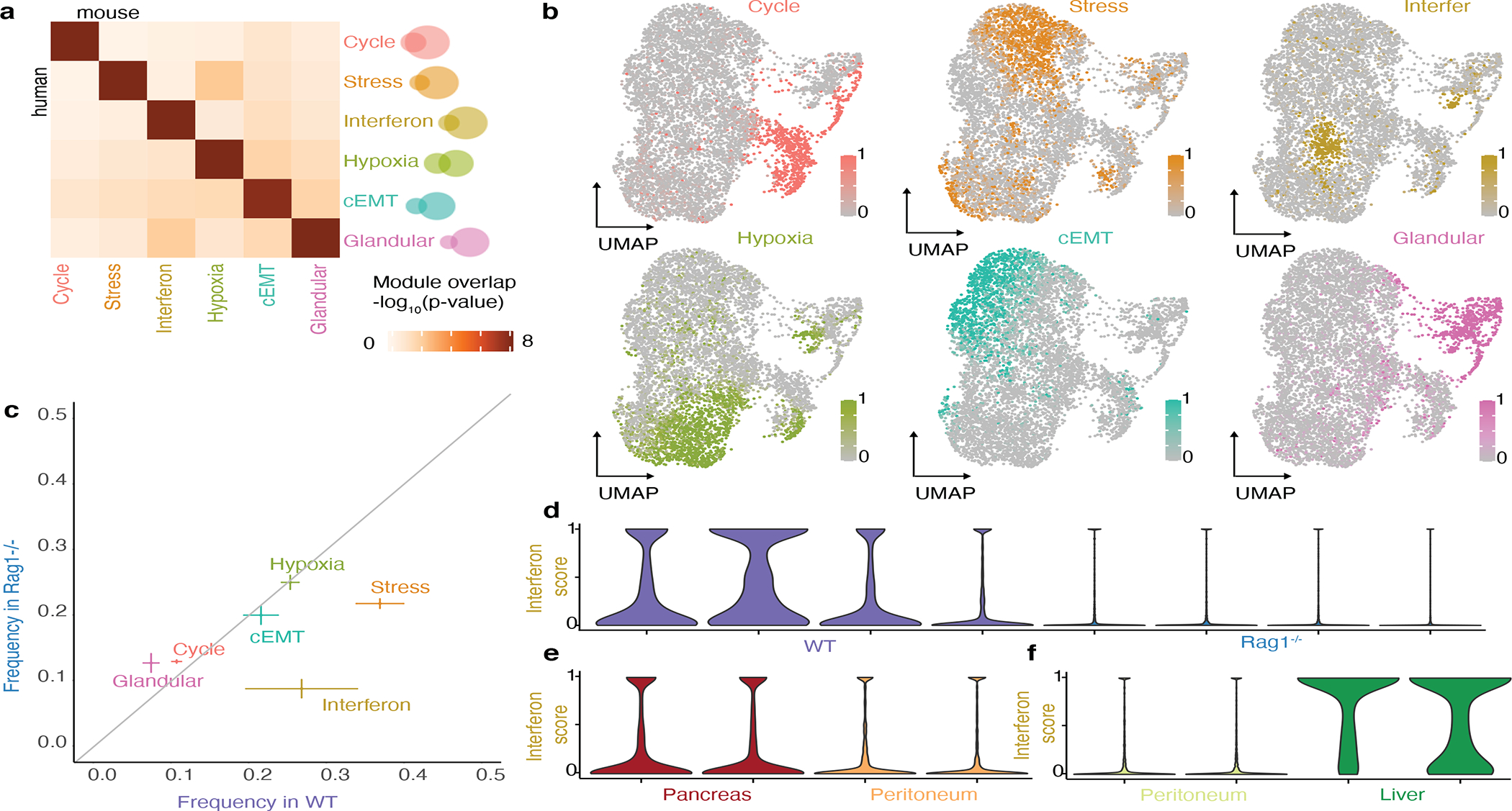
Transcriptional heterogeneity among malignant cells of a tumor has been studied in individual cancer types and shown to be organized into cancer cell states; however, it remains unclear to what extent these states span tumor types, constituting general features of cancer. Here, we perform a pan-cancer single-cell RNA-sequencing analysis across 15 cancer types and identify a catalog of gene modules whose expression defines recurrent cancer cell states including 'stress', 'interferon response', 'epithelial-mesenchymal transition', 'metal response', 'basal' and 'ciliated'. Spatial transcriptomic analysis linked the interferon response in cancer cells to T cells and macrophages in the tumor microenvironment. Using mouse models, we further found that induction of the interferon response module varies by tumor location and is diminished upon elimination of lymphocytes. Our work provides a framework for studying how cancer cell states interact with the tumor microenvironment to form organized systems capable of immune evasion, drug resistance and metastasis.


Conflict of interest statement

Conflict of interests statement: The authors declare that they have no conflict of interest relating to this work.

Figures

Extended Data Fig. 1
Extended Data Fig. 1. Quality control and cell type annotation in the single-cell RNA-Seq data.
a. Violin plots of the number of UMIs per cell in each tumor sample. b. Violin plots of the number of genes per cell in each tumor sample. c. Heatmap of average scaled gene expression per cell type per sample. Top bar represents cell type (colored as indicated) and sample (colored as in Figure 1a).
Extended Data Fig. 2
Extended Data Fig. 2. Control analysis for purity of single-cell RNA-Seq data.
a. UMAP embeddings of cells annotated as malignant per cancer type or organ system, colored by sample. b. Control analysis for annotations of cells as malignant, using the method described by Kim et al.. Briefly, inferred CNV profiles (from the scRNA-Seq data) were scored as the sum of the squared values (shown as the x-axis). The cells with the top scores are assumed to be malignant and each cell is then correlated with their averaged profile (y-axis). In tumors with CNVs these two measures are consistent. Color indicates the annotation as malignant or normal cells, per sample.
Extended Data Fig. 3
Extended Data Fig. 3. Additional analyses for the derivation of the cancer gene modules catalog.
a-e. Heatmap of the significance of overlap (hypergeometric test) of the consensus modules across (a) the indicated Gene Ontology terms, (b) cell type markers, (c) signatures derived by Neftel et al., (d) signatures derived from Puram et al., and (e) signatures derived from Ji et al.. f. Network of genes belonging to the consensus modules, colored as in Figure 1f. Lines connect genes that are found together in at least 2 individual tumor modules (see Methods). g. Heatmap of the significance of the overlap between consensus modules and individual tumor modules (hypergeometric test). The bottom bar indicates the significance of the overlap with consensus modules (hypergeometric test). The top bar indicates the identity of the tumor samples, colored as in Figure 1a. h. Heatmap of the Jaccard similarity (intersect/union) between consensus modules and SCENIC regulons obtained for individual tumors. The bar indicates the identity of the tumor samples, colored as in Figure 1a. To test whether the catalog of 16 modules can also be detected using an independent approach, we used SCENIC, a method that identifies genes that are both correlated in their expression and regulated by the same transcription factor. We found that each module of our catalog had significant overlap with several SCENIC regulons (Supplementary Table 4, see Methods). For instance, the interferon response module overlapped with several SCENIC regulons annotated with the transcription factors STAT1 and IRF1.
Extended Data Fig. 4
Extended Data Fig. 4. Pattern of presence and absence of the catalog gene modules across malignant and normal epithelial cells.
a-c. Heatmap of the significance of the presence of each module (see Methods) in the malignant cells of each tumor sample (a), in epithelial cells of normal samples (b), and for malignant and epithelial cells from paired normal and tumor samples (c). Grey indicates a complete lack of gene expression of the module. FTE: Fallopian tube epithelium. BRE: Breast epithelium. LE: Liver epithelium. d. Volcano plots of differential gene expression between malignant and normal epithelial cells from paired LUAD samples (Kim et al. T20 vs. N20). Each panel highlights genes from the indicated module.
Extended Data Fig. 5
Extended Data Fig. 5. Cell states across tumors.
a-c. Module score TSNE embedding of the cancer cells of all 19 tumors, colored by the most highly expressed module (a), by module score as in Figure 1f (b) and by entropy of tumor of origin (c). d. Gene expression UMAP embedding of the cancer cells of OVCA NYU3 and BRCA NYU1, colored by module score for the Ciliated and Cycle module respectively. Unlike other modules, the cycle and cilium module were expressed by cells forming discrete clusters. These clusters are also identified when examining tumors individually in gene expression-based dimensionality reductions, and are therefore not artifacts of the module score dimensionality reduction (Extended Data Fig. 6d). e. Heatmap of the frequency of expression of each module in the malignant cells of each sample. f. Module expression frequencies in normal vs malignant epithelia. Points represent individual samples, bars indicate mean +/− standard error calculated across individual tumors of the same cancer type.
Extended Data Fig. 6
Extended Data Fig. 6. Spatial organization of the tumor microenviron ment.
a. OVCA NYU1 H&E image with spots colored by annotation (scale bar represents 1mm). b-c. Joint dimensionality reduction after mutual nearest neighbor integration (MNN) of single-cell and ST spots for the OVCA NYU1 sample, with (b) single-cell transcriptomes in gray and ST spots colored according to their annotation and (c) spots in gray and single-cell transcriptomes colored by their annotated cell type. The single cells form clusters at the periphery, indicating distinct cell types. The ST spots are either mixed with individual single-cell clusters, indicating a pure population, or bridge multiple clusters, indicating a combination of cell types. Specifically, ‘Malignant’ spots are mixed with the malignant cell cluster, ‘Normal’ spots are in the region of non-malignant cell types, and ‘Both’ spots span both malignant and non-malignant single-cell clusters. d. LIHC NYU1 H&E image with spots colored by annotation as in a. (scale bar represents 1mm). e-g. Joint dimensionality reduction of single-cell and ST spots for the LIHC NYU 1 sample, with (e) single-cell transcriptomes in gray and ST spots colored according to their annotation, (f) spots in gray and single-cell transcriptomes colored by their annotated cell type and (g) spots colored according to their coordinate along the x-axis. This sample has two spatially distinct tumor nodules, with the left having substantial mixing between malignant and nonmalignant cells and the right consisting of almost only malignant cells. The joint dimensionality reduction analysis reflects the two corresponding malignant clusters, which were not distinct when considering the single-cell dimensionality reduction alone.
Extended Data Fig. 7
Extended Data Fig. 7. Validation of spot annotation and module presence using PDX samples.
a. UMAP of single-cell RNA-Seq data for sample 1, colored by the number of UMIs corresponding to human (left) or mouse (right) genes. b. Heatmap of module presence in malignant cells of sample 1 (see Extended Data Fig. 4a–c and Methods) c-d. Spatial transcriptomic spots colored by the number of UMIs corresponding to human (left) or mouse (right) genes for sample 1 (c) and sample 2 (d). Scale bar represents 1mm. e-f. Spatial transcriptomic spots colored by annotation as ‘Malignant’, ‘Both’ or ‘Normal’ using the NNLS method on the full transcriptome (left) or on human orthologs (right) in sample 1 (e) and sample 2 (f). To test the accuracy of the NNLS method to annotate spots, we performed paired scRNA-Seq and ST on two patient-derived melanoma xenografts (PDX). In this setting, only malignant cells are of human origin and therefore express human genes, enabling us to reliably identify malignant cells or spots. Using the NNLS method on the full mouse and human transcriptomes, we first established a ‘ground truth’ for spot identities. We then simulated the patient samples by converting mouse genes to their human orthologs, thereby removing the species information. This resulted in specificity of 99% (sample 1) and 89% (sample 2) specificity. g-h. ‘Malignant’ spatial transcriptomic spots colored by expression score for the cycle, stress, hypoxia and pEMT modules for sample 1 (g) and sample 2 (h). To establish the validity of scoring ‘Malignant’ spots for gene modules, we scored the ‘Malignant’ spots for the expression of modules. Since human malignant cells can unambiguously be distinguished from mouse TME cells in this system, we first used the single cell data to confirm that the modules are differentially expressed by malignant cells themselves and rule out the possibility of an artifact stemming from TME contamination. For example, the pEMT module includes genes normally expressed by fibroblasts, but we detected its presence in the malignant cells.
Extended Data Fig. 8
Extended Data Fig. 8. Relationship between pEMT and cancer spot depth.
a. Sample UCEC NYU3, ‘Malignant’ only spots colored by their depth: the distance to the nearest spot containing non-malignant cells. b. Sample UCEC NYU3, ‘Malignant’ only spots colored by pEMT module score. c. Boxplots of correlation scores (±log10(p-value)) between module scores and depth of malignant spots across 10 samples, colored as in Figure 1a. For each boxplot, the line indicates the median, the box indicates the 1st and 3rd quartile, the whiskers indicate the minimum and maximum values. Positive scores correspond to positive correlations. Dashed lines indicate pvalue=0.05. Plots of the relationship between the pEMT module score and depth in the 10 ST samples, colored as in Figure 1a. Lines are drawn for correlations with p-value<0.05.
Extended Data Fig. 9
Extended Data Fig. 9. CODEX analysis of samples from four cancer types supporting a proximity of interferon responseexpressing malignant cells to macrophages and T cells.
a. Cell populations and marker expression in a region of OVCA NYU1. Top row displays an entire tile, bottom row displays an enlargement. Top and bottom left: Colored by populations as defined in Extended Data Fig. 15. Top right and bottom center: Colored by expression of markers used to define cell types, as indicated. Bottom right: Colored by expression of PanCK and of HLA-DRA, used to define interferon response positive and negative malignant cells. Scale bar represents 50μm. b. For the tile shown in a., histogram showing the distance between malignant cells and the nearest macrophage, for interferon-response positive (light green) and negative (dark green) malignant cells. Lines indicate the mean distance for each population, used to calculate the log2(proximity ratio). c-d. Boxplots of the distribution of log2(proximity ratio) (c) and log2(neighborhood ratio) (d) of macrophages, T cells and malignant cells across tiles of each sample (*, p-value<0.05; ***, p-value<0.001; two-sided t-test). For each boxplot, the line indicates the median, the box indicates the 1st and 3rd quartile, the whiskers indicate the minimum and maximum values.
Extended Data Fig. 10
Extended Data Fig. 10. Additional experiments
a. UMAP embedding of cells from 16 orthotopic pancreatic tumors across relating to the orthotopic and heterotopic mouse experiments. the 3 experiments, colored by annotation as malignant or non-malignant cells. b. Same as a, colored by sample. c. Violin plots of module expression scores in individual tumors across the 3 experiments. Barplots of the average expression of the interferon response module genes in cancer cells in the WT and Rag1−/− tumors according to their interferon response expression.
Figure 1:
Figure 1:. A catalog of recurrent cancer gene modules.
a. Schematic indicating the tumors collected in this study and tumors included from previous reports for joint analysis. The background color indicates the organ system of origin: cutaneous (grey), gastrointestinal (blue), gynecological (red) and genitourinary (yellow). White background indicates non-epithelial tumors. b-c. UMAP embedding of cells from the 19 tumors collected in this study spanning a total of 9 cancer types, colored as in a (b) and colored by annotation as malignant or non-malignant (c). d. Heatmap of expression levels for 241 genes in the malignant cells of the ovarian tumor OVCA NYU1. Genes are ordered by their module membership (horizontal lines) and the colors of the indicated genes correspond to their consensus module annotation. e. Heatmap of the significance of the overlap between individual tumor modules (hypergeometric test p-value). The bottom bar indicates the significance of the overlap with consensus modules (hypergeometric test p-value). The top bar indicates the identity of the tumor samples, colored as in a. Extended Data Figure 3h indicates the significance of the overlap of each consensus module with each tumor specific gene module. f. Table of consensus modules, selected genes and putative regulators identified using SCENIC (regulators identified in at least 2 tumors are shown), colored as in d. See also Extended Data Figure 3h and Supplementary Table 4.
Figure 2:
Figure 2:. Expression of gene modules underlies cancer cell states.
a. Gene expression UMAP embedding of malignant cells of SKSC Ji1, colored by module score for the 8 indicated modules. b-d. Module score TSNE embedding of the 8613 malignant cells of all 19 tumors, colored by the most high scoring module (b), by cancer type as in Figure 1a (c) and by pEMT module score (d). e. Boxplots of the expression frequency (fraction of cells with module score greater than 0.5) of the squamous, glandular, pEMT and interferon response modules in paired normal and tumor samples. For each boxplot, the line indicates the median, the box indicates the 1st and 3rd quartile, the whiskers indicate the minimum and maximum values. Gray lines connect data points from the same patient. LUAD: n=4; PDAC: n=3, SKSC: n=8; THCA: n=3.
Figure 3:
Figure 3:. Spatial organization of the tumor microenvironment.
a. H&E images for the 10 indicated patient tumors overlaid with the locations of the spatial transcriptomic spots colored according to their annotation as ‘Malignant’, ‘Both’, or ‘Normal’. Bar plots indicate the fraction of non-malignant cell types in the ‘Normal’ and ‘Both’ spots for each sample. Scale bar represents 1mm. b-d. Boxplots of the fractions of endothelial cells (b), neutrophils (c) and M1/M2 score (d) in ‘Normal’ and ‘Both’ spots for each sample (n=10; *, p-value<0.05; ***, p-value<0.001; two-sided Wilcoxon test). For each boxplot, the line indicates the median, the box indicates the 1st and 3rd quartile, the whiskers indicate the minimum and maximum values.
Figure 4.
Figure 4.. Mapping cancer cell states and their interactions with the TME.
a. Scoring ST spots for module expression. Top: Schematic of spots colored by their annotation as ‘Malignant’, ‘Both’ and ‘Normal’; ‘Malignant’ spots are scored for expression of each module. Bottom: BRCA NYU2 sample with ‘Malignant’ spots colored by their expression of the indicated modules. Scale bar represents 1mm. b. Characterizing spots by cell type neighborhood. Top: Schematic with grey spots indicating the presence of the cell type of interest, orange indicating ‘Malignant’ spots, and dashed lines indicating their surrounding spots. Bottom: BRCA NYU2 sample with ‘Malignant’ spots colored by neighborhood macrophage score. Scale bar represents 1mm. c. Characterizing ST spots by cell type proximity. Top: Schematic colored as in b with arrows indicating the distance to the closest spot containing the cell type of interest. Bottom: BRCA NYU2 sample with ‘Malignant’ spots colored by macrophage proximity score. Scale bar represents 1mm. d. Heatmap of correlations (Pearson) between module scores and cell type neighborhood for BRCA NYU2 ‘Malignant’ spots. Boxes indicate clusters. e-f. Plot of the relationship between the interferon response module score and macrophage neighborhood score (e) or proximity score (f) in the BRCA NYU2 ‘Malignant’ spots. Line and grey area represent linear regression and standard error. g. Boxplot of correlation scores (±log10(p-value), Pearson) between module scores and macrophage neighborhood scores across 10 samples, colored as in Figure 1a. For each boxplot, the line indicates the median, the box indicates the 1st and 3rd quartile, the whiskers indicate the minimum and maximum values. Positive scores correspond to positive correlations. Dashed lines indicate p-value=0.05. h-i. Map of correlations between module expression and cell type neighborhoods (h) and cell type proximity (i). Color represents the median ±log10(p-value) of the correlation (Pearson). Point size represents the fraction of samples in which the correlation is of the same sign as the median correlation. Black outlines indicate relationships with (1) median ±log10(p-value) greater than 0.75 and (2) fraction of samples greater than 0.5 - using both the neighborhood and proximity metrics.
Figure 5:
Figure 5:. Cancer cell states in perturbed tumor microenvironments.
a. Heatmap of the significance of the overlap between modules obtained by NMF in an orthotopic model of pancreatic cancer and modules obtained in patient samples in Figure 1f (hypergeometric test p-value). b. UMAP embedding of malignant cells from orthotopic pancreatic tumors, colored according to the expression score of the six modules shown in a. c. Module expression frequencies in WT mice vs Rag1−/− mice (mean ± standard error obtained from 4 biological replicates per condition). d-f. Violin plots of interferon module expression score in WT mice vs Rag1−/− mice (d), pancreas versus peritoneum (e), peritoneum versus liver (f).

Comment in

References

    1. Easwaran H, Tsai H-C & Baylin SB Cancer epigenetics: tumor heterogeneity, plasticity of stem-like states, and drug resistance. Mol. Cell 54, 716–727 (2014). - PMC - PubMed
    1. McGranahan N & Swanton C Clonal Heterogeneity and Tumor Evolution: Past, Present, and the Future. Cell 168, 613–628 (2017). - PubMed
    1. Marusyk A & Polyak K Tumor heterogeneity: Causes and consequences. Biochimica et Biophysica Acta (BBA) - Reviews on Cancer vol. 1805 105–117 (2010). - PMC - PubMed
    1. Heppner GH & Miller BE Tumor heterogeneity: biological implications and therapeutic consequences. Cancer Metastasis Rev. 2, 5–23 (1983). - PubMed
    1. Alizadeh AA et al. Toward understanding and exploiting tumor heterogeneity. Nat. Med. 21, 846–853 (2015). - PMC - PubMed

Publication types