

The Effect of the COVID-19 Pandemic on the Elderly: Population Fatality Rates, COVID Mortality Percentage, and Life Expectancy Loss
- PMID: 35936928
- PMCID: PMC9351604
The Effect of the COVID-19 Pandemic on the Elderly: Population Fatality Rates, COVID Mortality Percentage, and Life Expectancy Loss
Abstract
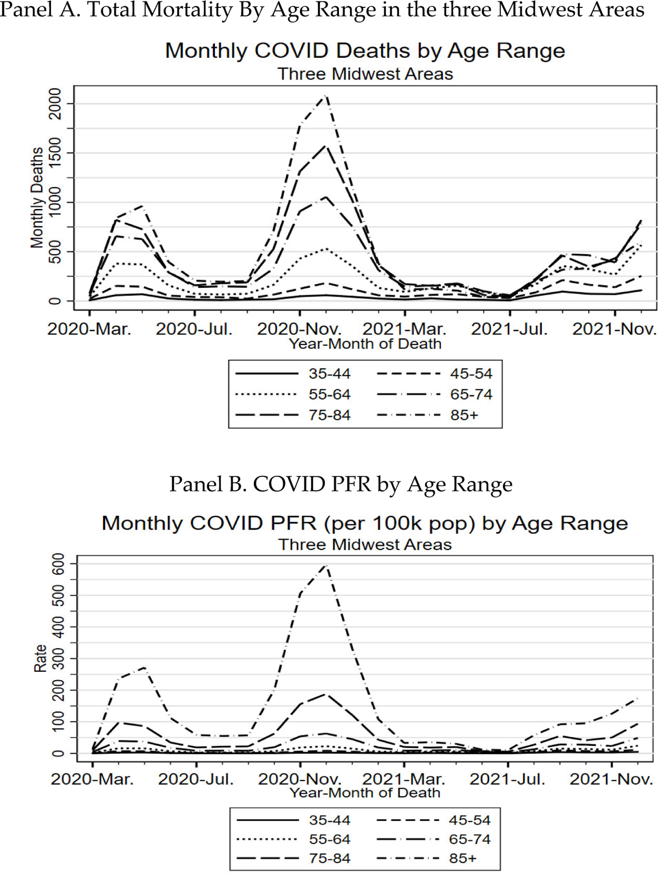
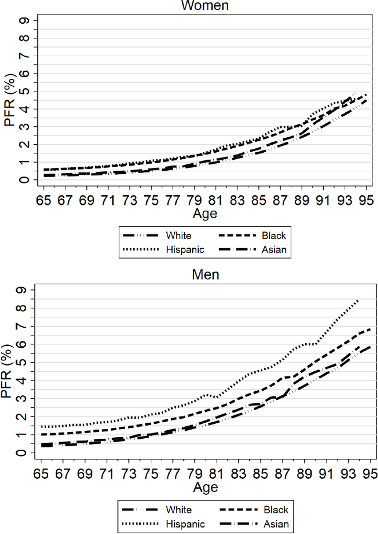
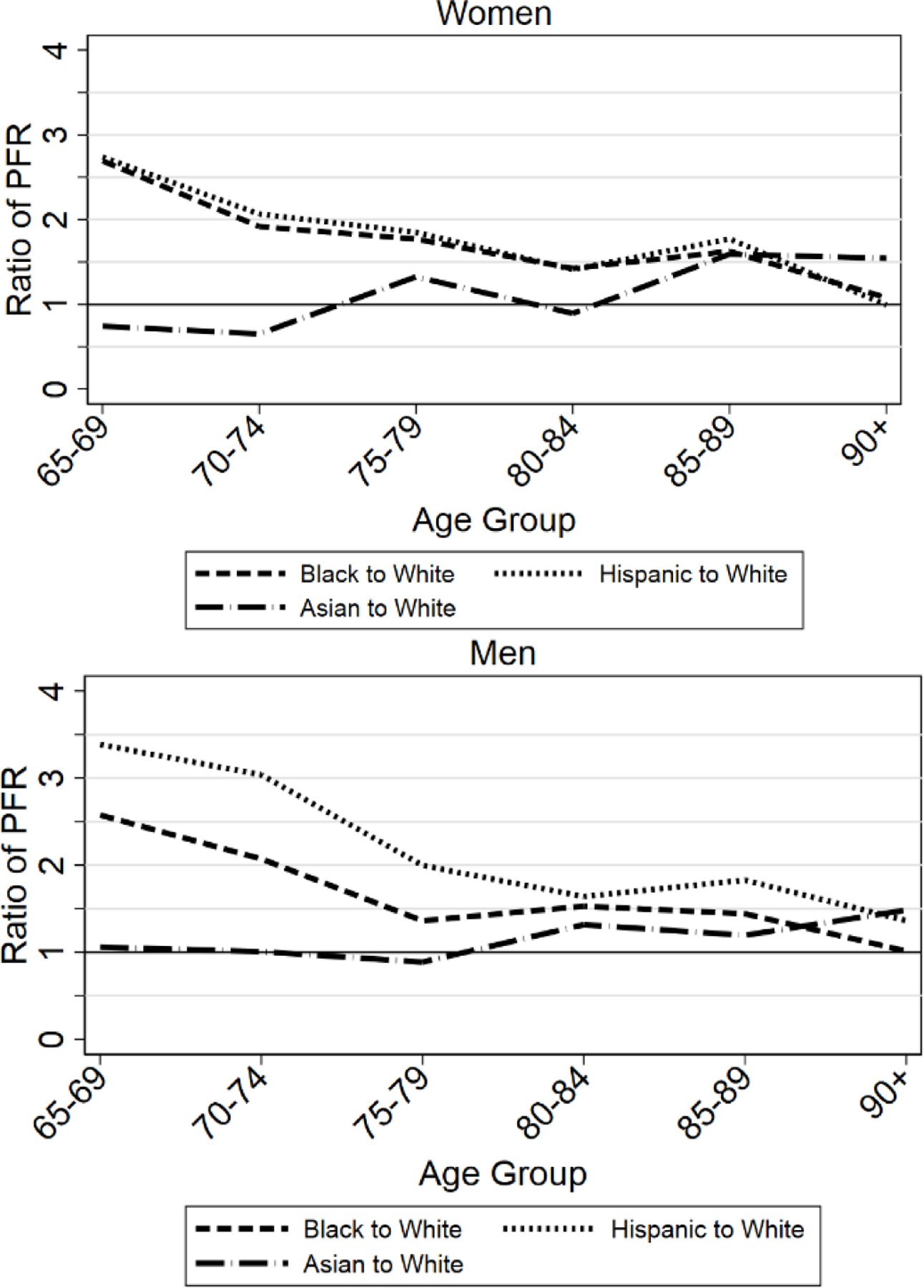
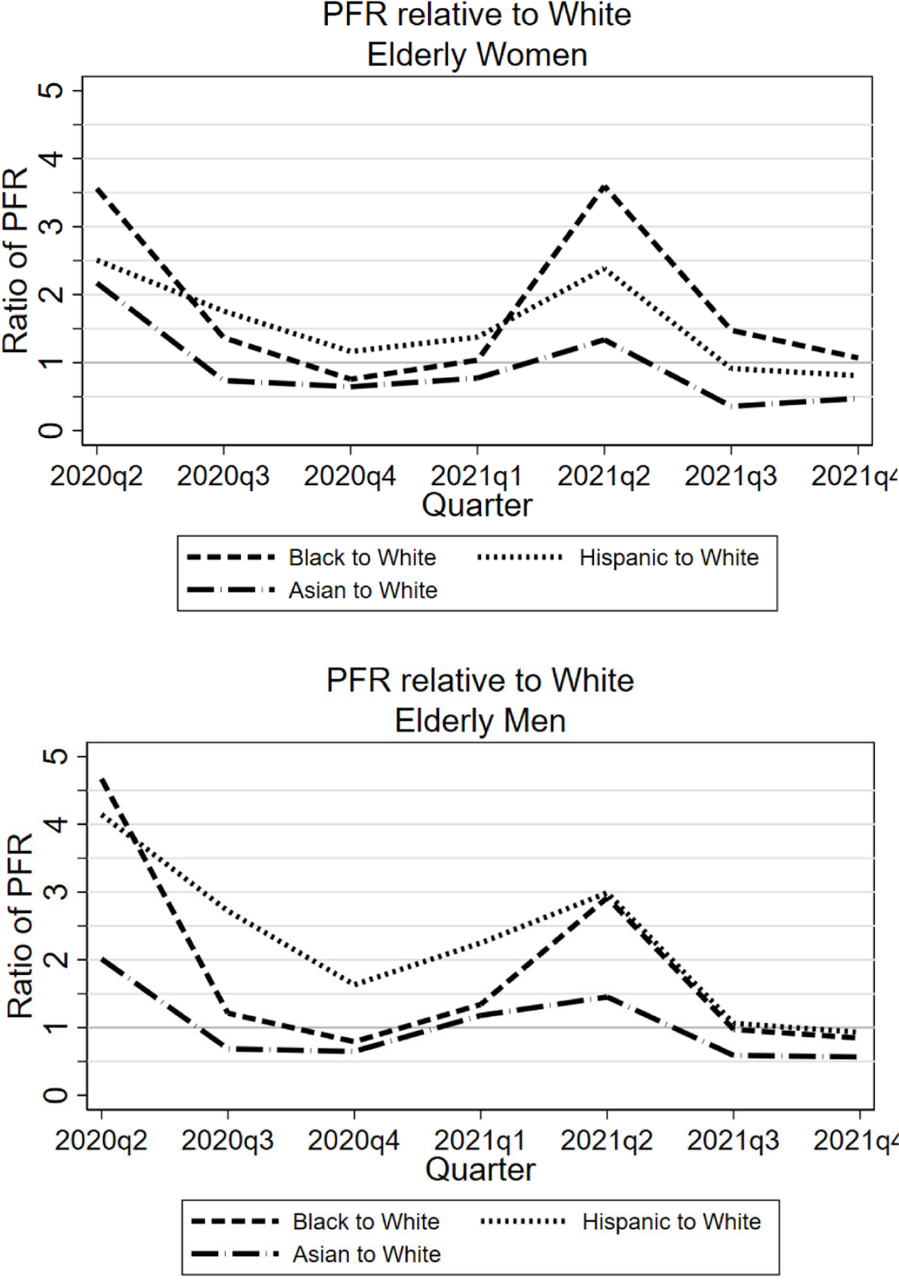
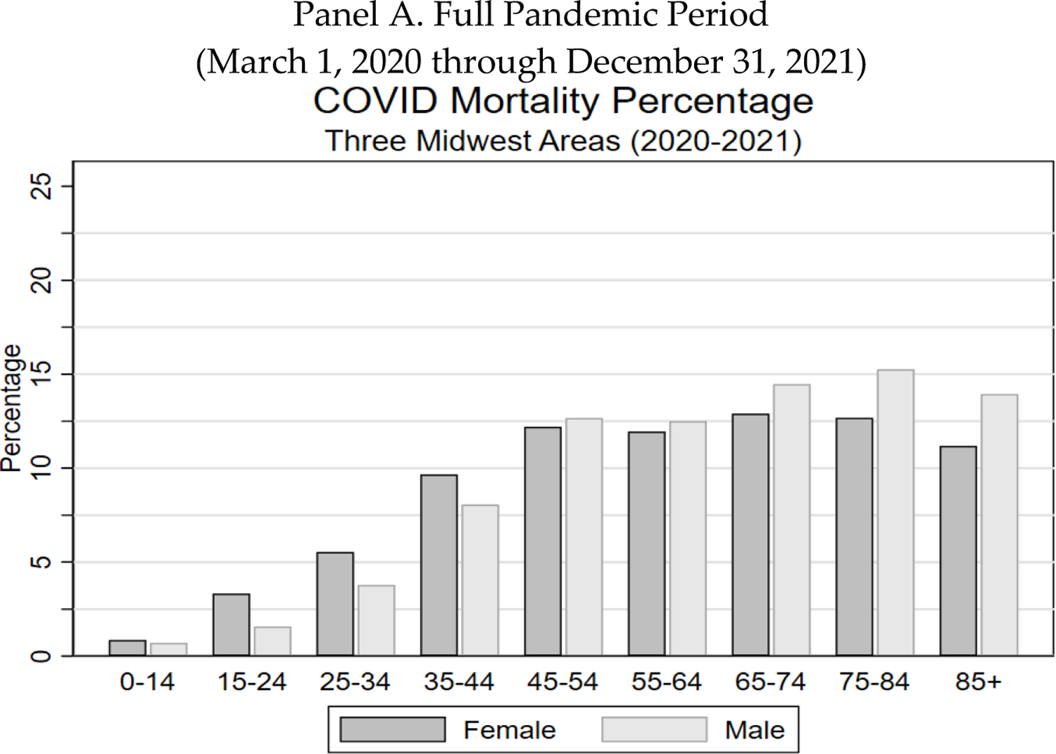
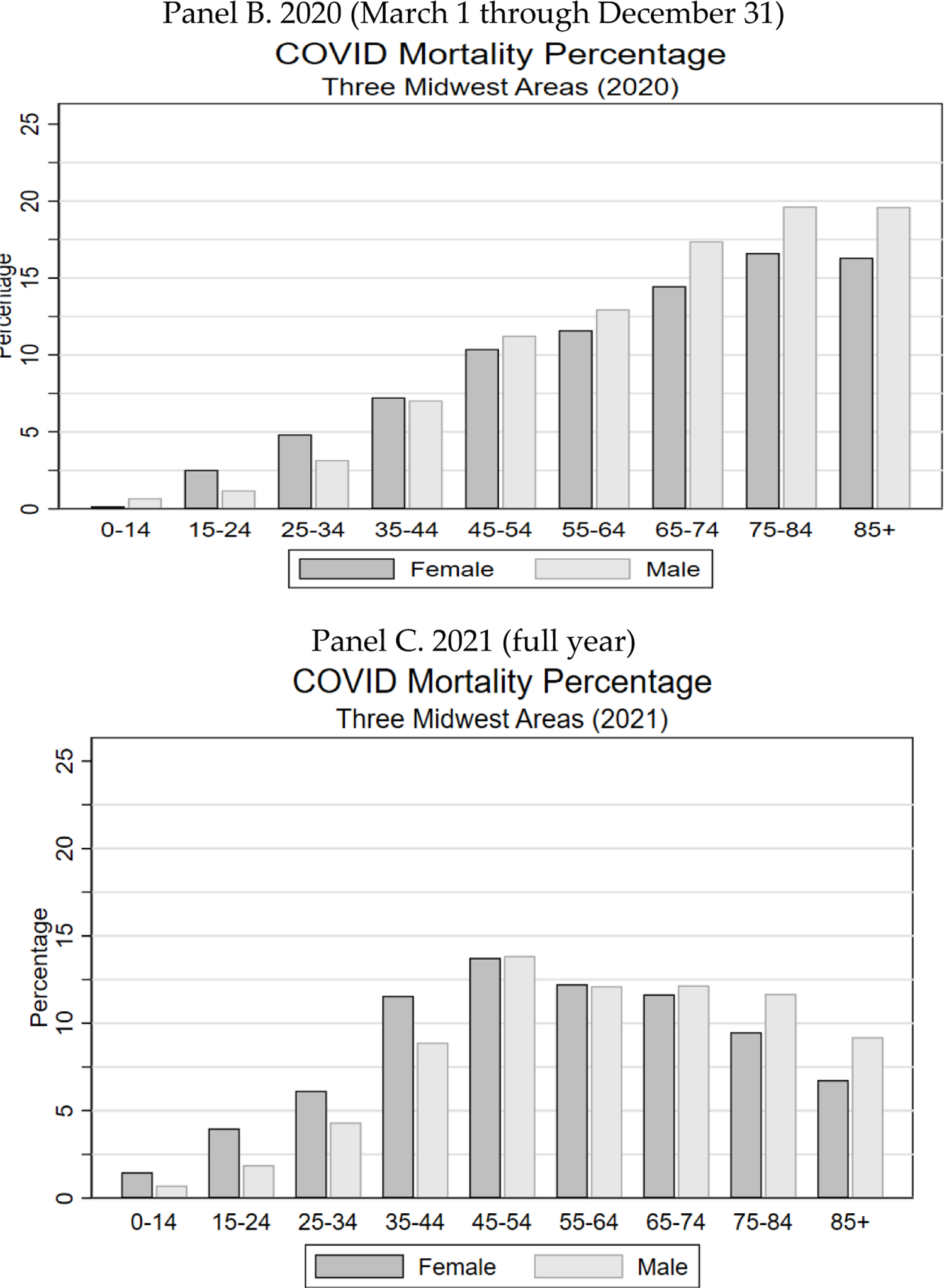
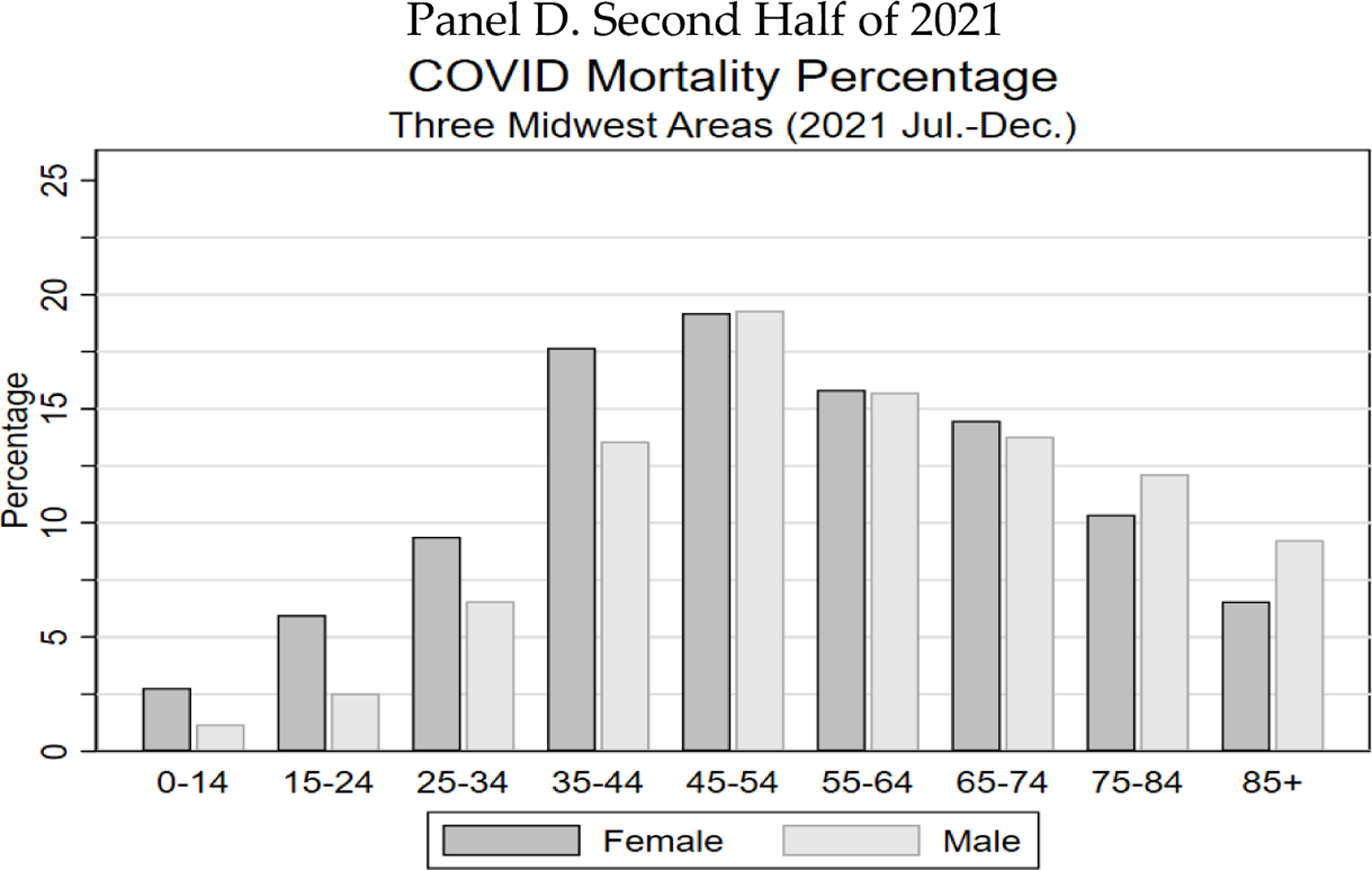
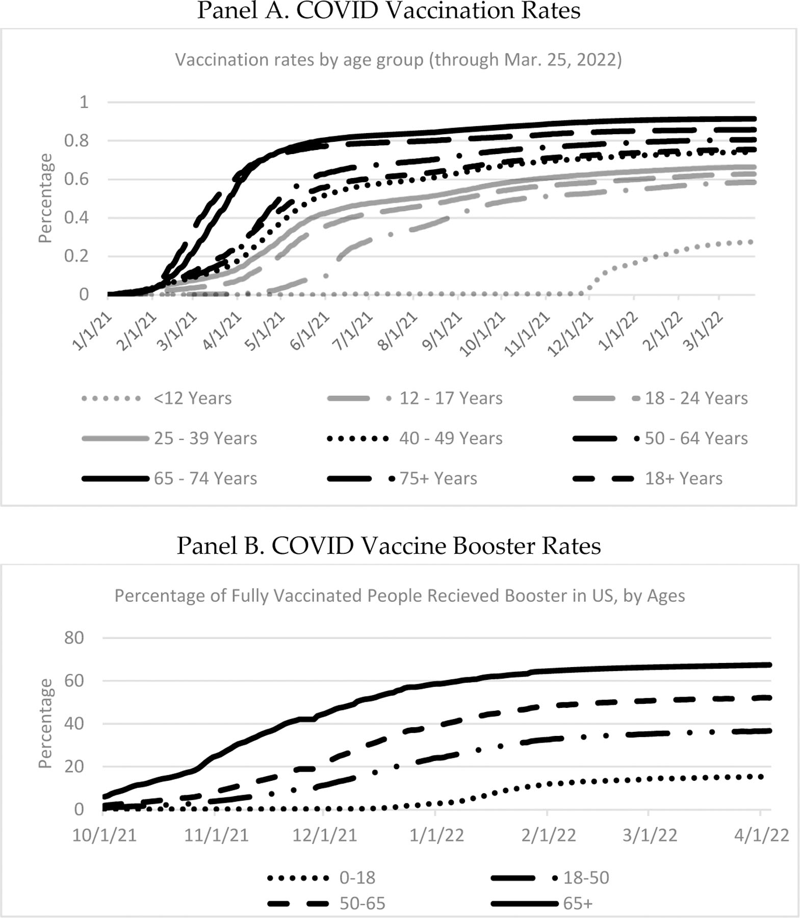
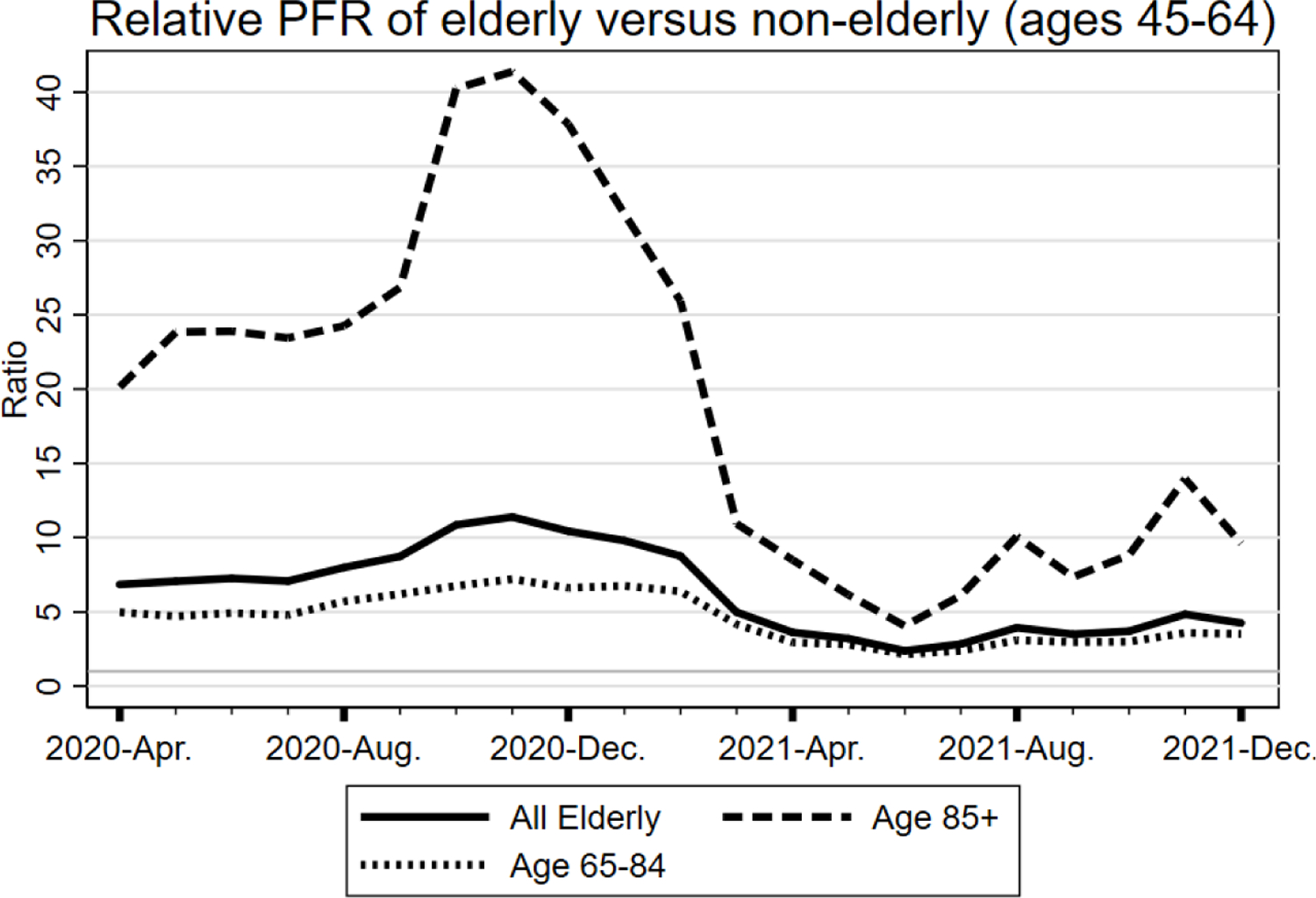
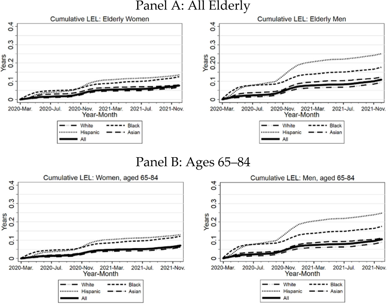
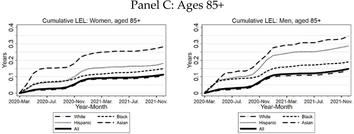
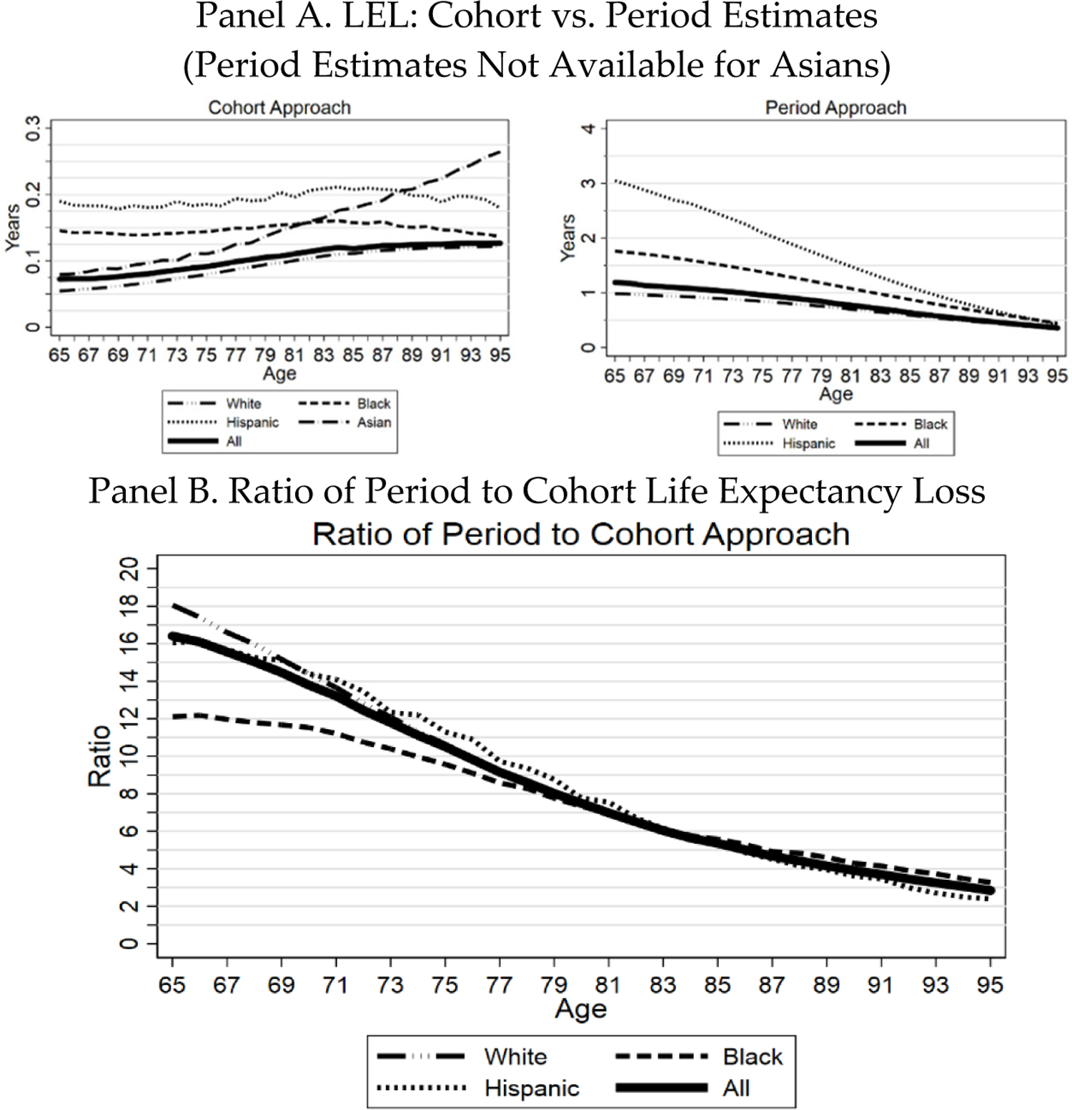
The COVID-19 pandemic has disproportionately affected the elderly. This Article provides a detailed analysis of those effects, drawing primarily on individual-level mortality data covering almost three million persons aged 65+ in three Midwest states (Indiana, Illinois, and Wisconsin). We report sometimes surprising findings on population fatality rates ("PFR"), the ratio of COVID to non-COVID deaths, reported as a percentage, which we call the "Covid Mortality Percentage," and mean life expectancy loss ("LEL"). We examine how these COVID-19 outcomes vary with age, gender, race/ethnicity, socio-economic status, and time period during the pandemic. For all persons in the three Midwest areas, COVID PFR through year-end 2021 was 0.22%, mean years of life lost ("YLL") was 13.0 years, the COVID Mortality Percentage was 12.4%, and LEL was 0.028 years (eleven days). In contrast, for the elderly, PFR was 1.03%; YLL was 8.8 years, the COVID Mortality Percentage was 13.2%, and LEL was 0.091 years (thirty-four days). Controlling for gender, PFR and LEL were substantially higher for Blacks and Hispanics than for Whites at all ages. Racial/ethnic disparities for the elderly were large early in the pandemic but diminished later. Although COVID-19 mortality was much higher for the elderly, the COVID Mortality Percentage over the full pandemic period was only modestly higher for the elderly, at 13.2%, than for non-elderly adults aged 25-64, at 11.1%. Indeed, in 2021, this ratio was lower for the elderly than for the middle-aged, reflecting higher elderly vaccination rates.
Keywords: COVID mortality rates; COVID-19; life expectancy.
Conflict of interest statement
Competing Interest Statement: The authors have no competing interests.
Figures
Similar articles
-
Evidence on COVID-19 Mortality and Disparities Using a Novel Measure, COVID excess mortality percentage: Evidence from Indiana, Wisconsin, and Illinois.PLoS One. 2024 Jan 31;19(1):e0295936. doi: 10.1371/journal.pone.0295936. eCollection 2024. PLoS One. 2024. PMID: 38295114 Free PMC article.
-
Structural racism and COVID-19 response: higher risk of exposure drives disparate COVID-19 deaths among Black and Hispanic/Latinx residents of Illinois, USA.BMC Public Health. 2022 Feb 15;22(1):312. doi: 10.1186/s12889-022-12698-9. BMC Public Health. 2022. PMID: 35168585 Free PMC article.
-
Excess years of life lost to COVID-19 and other causes of death by sex, neighbourhood deprivation, and region in England and Wales during 2020: A registry-based study.PLoS Med. 2022 Feb 15;19(2):e1003904. doi: 10.1371/journal.pmed.1003904. eCollection 2022 Feb. PLoS Med. 2022. PMID: 35167587 Free PMC article.
-
Racial and Ethnic Disparities in Years of Potential Life Lost Attributable to COVID-19 in the United States: An Analysis of 45 States and the District of Columbia.Int J Environ Res Public Health. 2021 Mar 12;18(6):2921. doi: 10.3390/ijerph18062921. Int J Environ Res Public Health. 2021. PMID: 33809240 Free PMC article.
-
Racial disparities in COVID-19 pandemic cases, hospitalisations, and deaths: A systematic review and meta-analysis.J Glob Health. 2021 Jun 26;11:05015. doi: 10.7189/jogh.11.05015. J Glob Health. 2021. PMID: 34221360 Free PMC article.
Cited by
-
A Model-Based Cost-Effectiveness Analysis of Long-Acting Monoclonal Antibody (Tixagevimab and Cilgavimab: Evusheld) Preventive Treatment for High-Risk Populations Against SARS-CoV-2 in Korea.J Korean Med Sci. 2023 Aug 14;38(32):e250. doi: 10.3346/jkms.2023.38.e250. J Korean Med Sci. 2023. PMID: 37582500 Free PMC article.
-
Understanding racial/ethnic disparities in COVID-19 mortality using a novel metric: COVID excess mortality percentage.Am J Epidemiol. 2024 Jun 3;193(6):853-862. doi: 10.1093/aje/kwae007. Am J Epidemiol. 2024. PMID: 38375671 Free PMC article.
-
The COVID-19 Infection Did Not Aggravate the Mortality of Long-Term Care Facility Residents Under Strict Infection Control and with Immediate Anti-Viral Treatment: Real-World Analysis.Viruses. 2025 Apr 26;17(5):625. doi: 10.3390/v17050625. Viruses. 2025. PMID: 40431636 Free PMC article.
-
Selection Effects and COVID-19 Mortality Risk after Pfizer vs. Moderna Vaccination: Evidence from Linked Mortality and Vaccination Records.Vaccines (Basel). 2023 May 11;11(5):971. doi: 10.3390/vaccines11050971. Vaccines (Basel). 2023. PMID: 37243075 Free PMC article.
-
Mortality and healthcare assessment among patients with chronic disease over 2 years of COVID-19: a population-based study in a large hard-hit Italian region.BMJ Open. 2023 Dec 7;13(12):e073477. doi: 10.1136/bmjopen-2023-073477. BMJ Open. 2023. PMID: 38149421 Free PMC article.
References
-
- Aburto José Manuel, Jonas Schöley Ilya Kashnitsky, Zhang Luyin, Rahal Charles, Missov Trifon I., Mills Melinda C., Dowd Jennifer B, & Kashyap Ridhi (2021), Quantifying impacts of the COVID-19 pandemic through life-expectancy losses: a population-level study of 29 countries, 51 INT’L J. EPIDEMIOLOGY (Feb. 2022), doi: 10.1093/ije/dyab207. - DOI - PMC - PubMed
-
- Arias Elizabeth, United States Life Tables, 2000, NAT’L VITAL STATS. REPS 51, No. 3 (2002), https://www.cdc.gov/nchs/data/nvsr/nvsr51/nvsr51_03.pdf. - PubMed
-
- Arias Elizabeth, Betzaida Tejada-Vera Fariday Ahmad, & Kochanek Kenneth D., Provisional Life Expectancy Estimates for 2020, VITAL STATS. RAPID RELEASE REP 15 (July 2021).
-
- Arias Elizabeth, & Xu Jiaquan, United States Life Tables, 2018, 69(12) NAT’L VITAL STATS. REPS (Nov. 17, 2020). - PubMed
Grants and funding
LinkOut - more resources
Full Text Sources
Miscellaneous