. 2022 Aug 8:11:e71345.
doi: 10.7554/eLife.71345.

Estimation and worldwide monitoring of the effective reproductive number of SARS-CoV-2

Affiliations

Estimation and worldwide monitoring of the effective reproductive number of SARS-CoV-2

Jana S Huisman et al. Elife. .

Abstract

The effective reproductive number Re is a key indicator of the growth of an epidemic. Since the start of the SARS-CoV-2 pandemic, many methods and online dashboards have sprung up to monitor this number through time. However, these methods are not always thoroughly tested, correctly placed in time, or are overly confident during high incidence periods. Here, we present a method for timely estimation of Re, applied to COVID-19 epidemic data from 170 countries. We thoroughly evaluate the method on simulated data, and present an intuitive web interface for interactive data exploration. We show that, in early 2020, in the majority of countries the estimated Re dropped below 1 only after the introduction of major non-pharmaceutical interventions. For Europe the implementation of non-pharmaceutical interventions was broadly associated with reductions in the estimated Re. Globally though, relaxing non-pharmaceutical interventions had more varied effects on subsequent Re estimates. Our framework is useful to inform governments and the general public on the status of epidemics in their country, and is used as the official source of Re estimates for SARS-CoV-2 in Switzerland. It further allows detailed comparison between countries and in relation to covariates such as implemented public health policies, mobility, behaviour, or weather data.

Keywords: SARS-CoV-2; epidemiology; global health; human; infectious disease; microbiology; public health surveillance; reproductive number; viruses.

Plain language summary

Over the past two and a half years, countries around the globe have struggled to control the transmission of the SARS-CoV-2 virus within their borders. To manage the situation, it is important to have an accurate picture of how fast the virus is spreading. This can be achieved by calculating the effective reproductive number (Re), which describes how many people, on average, someone with COVID-19 is likely to infect. If the Re is greater than one, the virus is infecting increasingly more people, but if it is smaller than one, the number of cases is declining. Scientists use various strategies to estimate the Re, which each have their own strengths and weaknesses. One of the main difficulties is that infections are typically recorded only when people test positive for COVID-19, are hospitalized with the virus, or die. This means that the data provides a delayed representation of when infections are happening. Furthermore, changes in these records occur later than measures that change the infection dynamics. As a result, researchers need to take these delays into account when estimating Re. Here, Huisman, Scire et al. have developed a new method for estimating the Re based on available data records, statistically taking into account the above-mentioned delays. An online dashboard with daily updates was then created so that policy makers and the population could monitor the values over time. For over two years, Huisman, Scire et al. have been applying their tool and dashboard to COVID-19 data from 170 countries. They found that public health interventions, such as mask requirements and lockdowns, did help reduce the Re in Europe. But the effects were not uniform across the globe, likely because of variations in how restrictions were implemented and followed during the pandemic. In early 2020, the Re only dropped below one after countries put lockdowns or other severe measures in place. The Re values added to the dashboard over the last two years have been used pro-actively to inform public health policies in Switzerland and to monitor the spread of SARS-CoV-2 in South Africa. The team has also recently released programming software based on this method that can be used to track future disease outbreaks, and extended the method to estimate the Re using SARS-CoV-2 levels in wastewater.


Conflict of interest statement

JH, JS, DA, JL, MM, SB, TS No competing interests declared, RN Reviewing editor, eLife

Figures

Figure 1.
Figure 1.. Evaluation of the pipeline on simulated data.
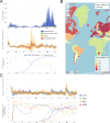
(A) The specified Re trajectory (black line) was used to stochastically simulate 100 trajectories of observed cases. From each trajectory, we estimated Re (yellow boxplots) and constructed a 95% confidence interval (purple boxplots of the lower/upper endpoint). (B) Fraction of simulations for which the true Re value was within the 95% confidence interval. The dashed red line indicates the nominal 95% coverage. (C) Root mean squared relative error for every time point. (D) Fraction of simulations for which Re is estimated to be significantly above or below one, depending on the true value of Re.
Figure 2.
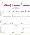
Figure 2.. Stability of the Swiss Re estimates based on confirmed COVID-19 cases, upon adding additional days of observations.
(A) Line segments correspond to 3 weeks of estimates made with the same input data (e.g. data up to December 1st). The segments were assigned an arbitrary colour for ease of distinction. For each day, Re estimates and associated 95% confidence intervals (CIs) are overlaid, from the first possible estimate for that day up to estimates including 3 additional weeks of data. The latter, always the left end of a line segment, corresponds to the stable estimate. (B) Percentage of the first estimated CI that is contained in the stable CI based on data from 30 April 2021. This percentage was calculated as the width of the intersection of both CIs, divided by the width of the first CI. The colour indicates whether the stable Re estimate was contained in the first reported CI. In both rows, the left column shows uncertainty intervals from EpiEstim on the original data, and the right our improved 95% CIs. Both columns use the same pipeline, and differ only in the construction of the uncertainty intervals.
Figure 3.
Figure 3.. Comparison of published Re estimates for three countries.
Point estimates are presented with a solid line and 95% confidence intervals are presented as coloured ribbons.
Figure 4.
Figure 4.. Example panels from the online dashboard.
(A) Swiss case incidence with evidence of weekly testing patterns (top row), Re estimates with associated 95% confidence intervals from four types of observation data (middle row), and timeline of stringency index and vaccination coverage (bottom row). (B) World map of incidence per 100’000 inhabitants over the last 14 days. One can also display the worldwide Re estimates instead. (C) Comparison of Re estimates across four countries (Austria, Chile, India and Morocco), with timelines of stringency indices and vaccination coverage. All panels were extracted on May 12, 2022. Dashboard url: https://ibz-shiny.ethz.ch/covid-19-re-international.
Figure 5.
Figure 5.. The association between the implementation or lifting of non-pharmaceutical interventions and changes in Re until May 2021.
(A) The change in the estimated Re at the same time as (R(t)) or following (R(t+7) and R(t+14)) the implementation (above x-axis) or lifting (below x-axis) of NPIs in a given week. (B) The change in the estimated Re related to the change in mobility in the same week. The error bars indicate the Q1 and Q3 quartiles.
Appendix 2—figure 1.
Appendix 2—figure 1.. Schematic of the effect of smoothing on the ability to estimate when Re=1.
The true Re is indicated by the black solid line, the black dashed line shows a linear approximation of the smoothed Re. Instead of crossing 1 at t0, this line crosses 1 at t0+s.
Appendix 3—figure 1.
Appendix 3—figure 1.. Performance of our method on simulated scenarios with differing slopes.
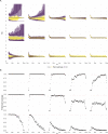
(A) The specified Re trajectory (black line; see Methods) was used to simulate a trajectory of reported cases (with Swiss case observation noise) 100 times. From each trajectory we estimated Re (yellow boxplots), and constructed a 95% confidence interval (purple boxplots of the lower/upper endpoint). We varied the time it took to change from one Re value to the next, t{7,14,28} (columns). Larger values of t correspond to less abrupt changes. (B) The fraction of simulations where the true Re value was within the 95% confidence interval. The dashed red line indicates the nominal 95% coverage. (C) The root mean squared relative error for every time point. (D) The fraction of simulations where we estimate Re is significantly above or below one, depending on the true value of Re. We see that the method closely tracks the true Re in all scenarios, although the error is greater for steeper slopes. In the case of steeper changes in Re the overall size of the epidemic is also smaller, which explains the larger confidence intervals.
Appendix 3—figure 2.
Appendix 3—figure 2.. Performance of our method, modified to skip the smoothing step in the pipeline, on simulated scenarios with observation noise.
The specified Re trajectory (black line; see Methods) was used to simulate a trajectory of reported cases (with varying country-specific noise profiles; rows) 100 times. From each trajectory we estimated Re (yellow boxplots), and constructed a 95% confidence interval (purple boxplots of the lower/upper endpoint). Contrary to our normal pipeline, the observations were not smoothed prior to the deconvolution and Re estimation. We see that the estimates are highly variable.
Appendix 3—figure 3.
Appendix 3—figure 3.. Performance of our method on simulated scenarios with observation noise.
The columns differ in the method used to construct confidence intervals: EpiEstim reports the 95% HPD of EpiEstim on the original data, estimateR refers to our method, Quantiles and Reverse Quantiles use the 5 and 95% quantiles of the estimated Re to construct the CIs. (A) The specified Re trajectory (black line; see Methods) was used to simulate a trajectory of reported cases (with varying country-specific noise profiles; rows) 100 times. From each trajectory we estimated Re (yellow ribbons represent the estimated mean ± sd across 100 simulations), and constructed a 95% confidence interval (purple ribbons represent the mean ± sd of the estimated lower/upper endpoint). (B) The fraction of simulations where the true Re value was within the 95% confidence interval. The dashed red line indicates the nominal 95% coverage.
Appendix 3—figure 4.
Appendix 3—figure 4.. Performance of our method on simulated scenarios with varying population size, using confidence intervals from EpiEstim.
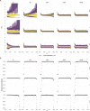
(A) We specified a constant Re{0.8,1,1.5} value (black line; rows) to simulate a trajectory of reported cases (with Swiss case observation noise) 100 times. From each trajectory we estimated Re (yellow boxplots), and constructed a 95% confidence interval (purple boxplots of the lower/upper endpoint). The simulated scenarios had differing initial incidence of I0{10,100,1000,5000,10000} infections per day (columns). In the top row, Re<1 so the epidemic is decreasing. In the middle row, Re=1, the epidemic is constant, and in the bottom row, Re>1, the epidemic is increasing. The bias at the start is due to the initialisation of the simulation. (B) The fraction of simulations where the true Re value was within the 95% confidence interval. The dashed red line indicates the nominal 95% coverage. We see that the EpiEstim coverage strongly declines with increased epidemic size.
Appendix 3—figure 5.
Appendix 3—figure 5.. Performance of our method on simulated scenarios with varying population size, using the Union of EpiEstim and Block bootstrap 95% confidence intervals.
(A) We specified a constant Re{0.8,1,1.5} value (black line; rows) to simulate a trajectory of reported cases (with Swiss case observation noise) 100 times. From each trajectory we estimated Re (yellow boxplots), and constructed a 95% confidence interval (purple boxplots of the lower/upper endpoint). The simulated scenarios had differing initial incidence of I0{10,100,1000,5000,10000} infections per day (columns). In the top row, Re<1 so the epidemic is decreasing. In the middle row, Re=1, the epidemic is constant, and in the bottom row, Re>1, the epidemic is increasing. The bias at the start is due to the initialisation of the simulation. (B) The fraction of simulations where the true Re value was within the 95% confidence interval. The dashed red line indicates the nominal 95% coverage. We see that for a wide range of infection incidences, our 95% confidence interval is informative and covers the true value of Re.
Appendix 3—figure 6.
Appendix 3—figure 6.. Performance of our method on simulated scenarios using a fixed shift versus the deconvolution to infer infection incidence.
The fixed shift method shifts the observations back by the mean of the delay distribution (here assumed to correspond to confirmed cases). (A) The specified Re trajectory (black line; see Methods) was used to simulate a trajectory of reported cases (with Swiss case observation noise) 100 times. From each trajectory we estimated Re (yellow boxplots), and constructed a 95% confidence interval (purple boxplots of the lower/upper endpoint). (B) The fraction of simulations where the true Re value was within the 95% confidence interval. The dashed red line indicates the nominal 95% coverage. The average coverage in this scenario was 0.90 with deconvolution and 0.78 with the fixed shift. (C) The root mean squared relative error for every time point. The average (cumulative) RMSE in this scenario was 0.0706 (25.4) with deconvolution and 0.0726 (26.6) with the fixed shift.
Appendix 3—figure 7.
Appendix 3—figure 7.. Performance of our method on simulated scenarios with misspecified delay distributions.
When estimating Re, we misspecified the mean of the delay distribution (5.5 for symptom-onset to case confirmation) by the numbers above the columns. (A) The specified Re trajectory (black line; see Methods) was used to simulate a trajectory of reported cases (with Swiss case observation noise) 100 times. From each trajectory we estimated Re (yellow boxplots), and a 95% confidence interval (purple boxplots of the lower/upper endpoint). (B) The fraction of simulations where the true Re value was within the 95% confidence interval. The dashed red line indicates the nominal 95% coverage. The average coverage in this scenario was 0.72, 0.85, 0.88, 0.90, 0.90, 0.89, 0.82, 0.69 from –5 to 10. (C) The root mean squared relative error for every time point. The average (cumulative) RMSE in this scenario was 0.0989 (36.0), 0.0807 (29.2), 0.0746 (26.9), 0.0706 (25.4), 0.0701 (25.2), 0.0726 (26.0), 0.0909 (32.3), 0.134 (47.0) from –5 to 10.
Appendix 3—figure 8.
Appendix 3—figure 8.. Performance of our method on simulated scenarios with time-varying delay distributions.
The observations were simulated with a time-varying delay distribution for (A,B,C) confirmed cases, or (D,E,F) deaths (see Methods), and then estimated with (right column) or without (left column) taking the time-varying distributions into account. (A, D) The specified Re trajectory (black line; see Methods) was used to simulate a trajectory of reported cases or deaths (with Swiss case observation noise) 100 times. From each trajectory we estimated Re (yellow boxplots), and a 95% confidence interval (purple boxplots of the lower/upper endpoint). (B, E) The fraction of simulations where the true Re value was within the 95% confidence interval. The dashed red line indicates the nominal 95% coverage. For the cumulative cases, the average coverage in this scenario was 0.89 without and 0.89 with time variation. For the deaths, the average coverage was 0.83 without and 0.92 with time variation. (C, F) The root mean squared relative error for every time point. For the cumulative cases, the average (cumulative) RMSE was 0.0728 (26.2) without and 0.0783 (28.5) with time variation. For the deaths, the average (cumulative) RMSE was 0.113 (39.5) without and 0.0861 (30.8) with time variation.
Appendix 4—figure 1.
Appendix 4—figure 1.. Stability of Re estimates at present.
We estimated Re through time repeatedly on 4 scenarios. With each new iteration, we added one new data point at present. Each Re trajectory is presented with its own colour. Purple trajectories are iterations for which the last known case data point was furthest in the past, yellow trajectories are trajectories for which the last known case data point was closest to the present. In each panel and for each Re trajectory, 100 simulation replicates were aggregated. The median of mean estimates are presented with lines and medians of upper and lower bounds of 95% confidence intervals are shown with translucent ribbons. For each scenario, two panels are presented. Each time the right panel correspond to raw estimates and the left panel corresponds to the same estimates with the last 4 Re values removed from each Re trajectory. (A) Stable Re. (B) Gradual increase in Re. (C) Gradual decrease in Re. (D) Abrupt decrease in Re.
Appendix 4—figure 2.
Appendix 4—figure 2.. Mean delay in Switzerland between onset of symptoms and reporting.
For each date, the mean is taken over the last 300 reports with known symptom onset date, based on line list data from the FOPH. For early dates, before 300 reports are available, the mean is taken over the first 300 reports.
Appendix 4—figure 3.
Appendix 4—figure 3.. Comparison of the Re estimates with or without accounting for known symptom onset dates and for time-variability on reporting delays.
The comparison is based on time series of confirmed cases in Switzerland, from line list data provided by the FOPH. Both the inclusion of known symptom onset dates and of the time-variability of reporting delay distributions have an effect on the Re estimates, in particular for early estimates in this case. The fraction of cases with known symptom onset date has drastically reduced since November 2020, hence the overlap in curves with and without symptom onset data for later dates. For each trajectory the point estimate is shown with a line, and the translucent ribbon indicates the 95% confidence interval.
Appendix 4—figure 4.
Appendix 4—figure 4.. Effective reproductive number estimates with or without accounting for known imports.
The comparison is based on time series of confirmed cases in Switzerland, from line list data provided by the FOPH. The analysis ignoring imports is unbiased if the number of imports equals the number of exports. Since the analysis accounting for imports is not accounting for exports, the results are a lower limit for the effective reproductive number. Very few imported cases were reported since November 2020, hence the complete overlap in the curves after that date. For each trajectory the point estimate is shown with a line, and the translucent ribbon indicates the 95% confidence interval.
Appendix 5—figure 1.
Appendix 5—figure 1.. Square root and log transformations to stabilise the variance of residuals.
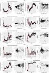
Each row corresponds to the results of observations from Switzerland (CHE), China (CHN), France (FRA), New Zealand (NZL) and the United States (USA), respectively. The first and last two plots correspond to the result of square root transformation and log transformation, respectively.
Appendix 5—figure 2.
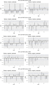
Appendix 5—figure 2.. Autocorrelation function (ACF) and partial autocorrelation function (PACF) plots of the observations from five different countries.
In each row, the two plots are the ACF and PACF plots of the observations from Switzerland (CHE), China (CHN), France (FRA), New Zealand (NZL) and the United States (USA), respectively.
Appendix 5—figure 3.
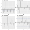
Appendix 5—figure 3.. Autocorrelation function (ACF) and partial autocorrelation function (PACF) plots of observations from Switzerland and the fitted ARIMA model.
The two plots on the upper row are the ACF and PACF plots of the observations from Switzerland. The two plots on the lower row are the ACF and PACF plots of the residuals of the fitted ARIMA model.
Appendix 5—figure 4.
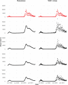
Appendix 5—figure 4.. Simulated observations with and without noise.
The upper row shows the real observations from Switzerland (twice the same). The other four rows show simulated observations, the left column shows simulations without the noise term (D~t in Section 4.7), and the right the simulated observations with the noise term (Dt in Section 4.7).
Appendix 5—figure 5.
Appendix 5—figure 5.. Estimated Re with different smoothing windows.
For each trajectory the point estimate is shown with a yellow line, and the purple ribbon indicates the 95% confidence interval.
Appendix 5—figure 6.
Appendix 5—figure 6.. Estimated Re with different block sizes.
The ribbons indicate the 95% confidence interval.

Similar articles

Cited by

References

    1. Abbott S, Hellewell J, Sherratt K, Gostic K, Hickson J, Badr HS, DeWitt M, Thompson R, Funk S. EpiNow2: estimate real-time case counts and time-varying epidemiological parameters. Zenodo. 2020a doi: 10.5281/zenodo.5036949. - DOI
    1. Abbott S, Hellewell J, Thompson RN, Sherratt K, Gibbs HP, Bosse NI, Munday JD, Meakin S, Doughty EL, Chun JY, Chan YWD, Finger F, Campbell P, Endo A, Pearson CAB, Gimma A, Russell T, Flasche S, Kucharski AJ, Eggo RM, Funk S, CMMID COVID modelling group Estimating the time-varying reproduction number of SARS-cov-2 using national and subnational case counts. Wellcome Open Research. 2020b;5:112. doi: 10.12688/wellcomeopenres.16006.2. - DOI
    1. Abbott S, Hellewell J, Thompson RN, Sherratt K, Gibbs HP, Bosse NI, Munday JD, Meakin S, Doughty EL, Chun JY, Chan YWD, Finger F, Campbell P, Endo A, Pearson CAB, Gimma A, Russell T. Temporal variation in transmission during the covid-19 outbreak. 2022. [May 10, 2022]. https://epiforecasts.io/covid/
    1. Ali ST, Wang L, Lau EHY, Xu X-K, Du Z, Wu Y, Leung GM, Cowling BJ. Serial interval of SARS-cov-2 was shortened over time by nonpharmaceutical interventions. Science. 2020;369:1106–1109. doi: 10.1126/science.abc9004. - DOI - PMC - PubMed
    1. Alimohamadi Y, Taghdir M, Sepandi M. Estimate of the basic reproduction number for COVID-19: A systematic review and meta-analysis. Journal of Preventive Medicine and Public Health = Yebang Uihakhoe Chi. 2020;53:151–157. doi: 10.3961/jpmph.20.076. - DOI - PMC - PubMed

Publication types