. 2022 Aug 8;13(1):4622.
doi: 10.1038/s41467-022-32103-8.

Unified classification and risk-stratification in Acute Myeloid Leukemia

Affiliations

Unified classification and risk-stratification in Acute Myeloid Leukemia

Yanis Tazi et al. Nat Commun. .

Abstract

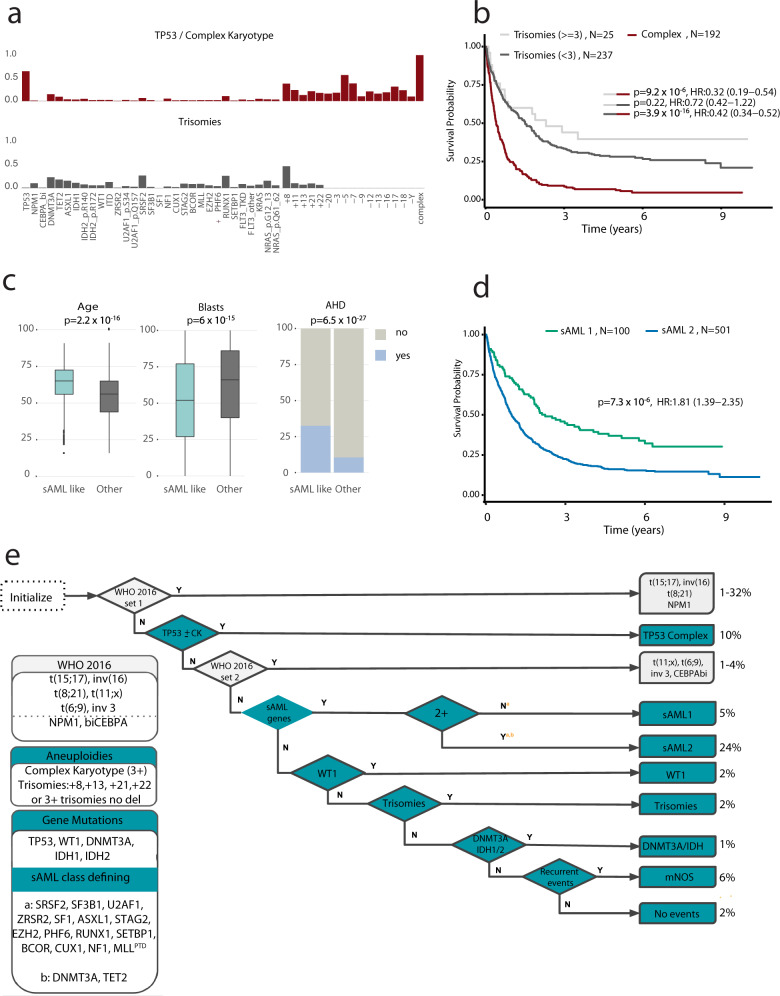
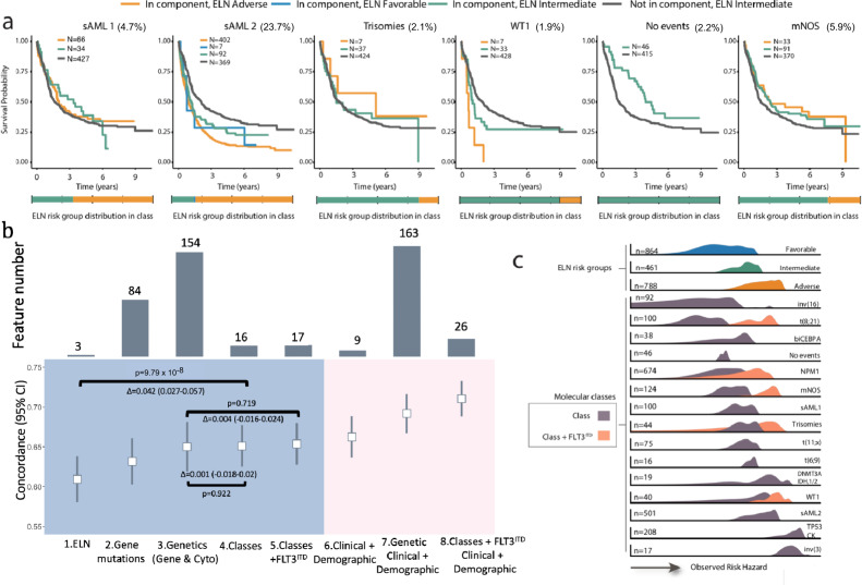
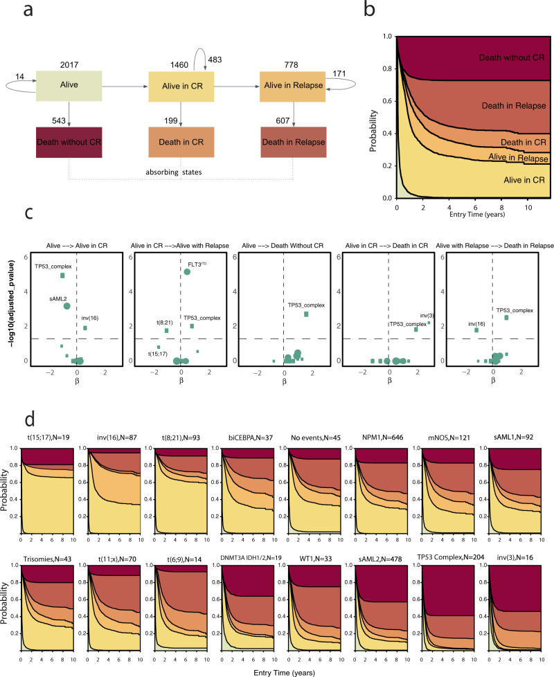
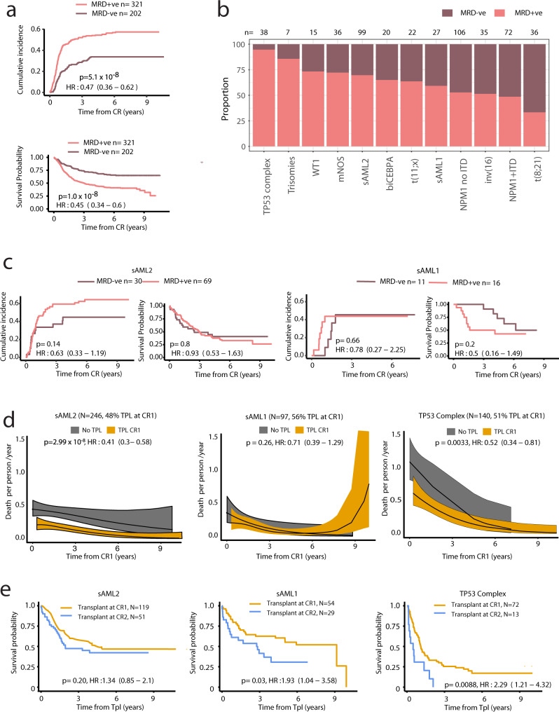
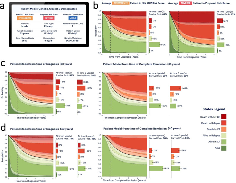
Clinical recommendations for Acute Myeloid Leukemia (AML) classification and risk-stratification remain heavily reliant on cytogenetic findings at diagnosis, which are present in <50% of patients. Using comprehensive molecular profiling data from 3,653 patients we characterize and validate 16 molecular classes describing 100% of AML patients. Each class represents diverse biological AML subgroups, and is associated with distinct clinical presentation, likelihood of response to induction chemotherapy, risk of relapse and death over time. Secondary AML-2, emerges as the second largest class (24%), associates with high-risk disease, poor prognosis irrespective of flow Minimal Residual Disease (MRD) negativity, and derives significant benefit from transplantation. Guided by class membership we derive a 3-tier risk-stratification score that re-stratifies 26% of patients as compared to standard of care. This results in a unified framework for disease classification and risk-stratification in AML that relies on information from cytogenetics and 32 genes. Last, we develop an open-access patient-tailored clinical decision support tool.


Conflict of interest statement

E.P. is a founder, equity holder and has a fiduciary role in Isabl, a cancer whole genome sequencing analytics company. The remaining authors declare no competing interests.

Figures

Fig. 1
Fig. 1. Molecular classification in AML.
a Repartition of two patterns of chromosomal aneuploidies to include TP53 and complex and trisomies. The y-axis represents the fraction of patients carrying each driver event (on the x-axis) for each of the two subgroups (training, n = 2113). b Kaplan–Meier overall survival curves for overall survival curves for patients with trisomies (<3)(gray), trisomies(≥3)(lightgrey) and complex karyotype (burgundy) in the training cohort (n =  2113). Log-rank tests compared the survival distributions between complex and MDS related cytogenetics and between complex and trisomies not complex subgroups. c Comparison of age (years), bone marrow blasts (%) and AHD (antecedent hematologic disorder) distributions for sAML like subgroups (N = 601) to other AML in AML NCRI cohort (N = 1512). Two-sided p-values on the boxplots used either a Wilcoxon rank-sum test or a Fisher’s exact test. d Kaplan–Meier overall survival curves for the secondary AML like classes (sAML1 and sAML2) in the training cohort (n = 2113). Annotated P-values are from two-sided log-rank tests. e Hierarchical classification schema. Hierarchy rules for AML class assignment, biomarkers for hierarchy implementation and class range proportions. sAML2 comes before biCEPBA in the hierarchy (Supplementary Appendix for more details). WHO 2016 set1 and WHO 2016 set2 display classifications for more than one group. For those 2 specific boxes, we displayed range values representing the proportions of the smallest class and largest class in that subset. For all other sets, the values represent the proportion of patients in the cohort for that particular class.
Fig. 2
Fig. 2. Prognostic relevance of molecular subgroups.
a Kaplan–Meier overall survival curves for the sAML1, sAML2, trisomies, WT1, no event and mNOS subgroups, separated by ELN2017 scores. A bar plot representing ELN2017 repartition for each class is included in the lower panel. b Estimates of the concordance index (C-index) derived from Cox regression with a ridge penalty that consider (1) ELN2017 strata, (2) gene mutations, (3) molecular classes, (4) molecular classes + FLT3ITD, (5) genetic data (gene mutations and cytogenetics), (6) clinical and demographic, (7) genetic, clinical and demographic and (8) classes, FLT3ITD, clinical and demographic features using internal 5 fold cross-validation for penalty selection. Top panel includes barplots representing the number of features/categories considered in each model (i.e. 3 for ELN). The centers of the error bars represent the mean; the lower and upper whiskers represent the 95% CIs. Annotated P-values are from two-sided t score test. c Density plots representing the scaled observed hazard (0–1) for the ELN2017 risk categories and the proposed molecular classes. In purple we show the density of risk for each class, in orange we present the subset of cases in class that also have FLT3ITD. We omitted the density plot for class t(15;17) due to small numbers. The hazard is depicted for overall survival. In all boxplots, the median is indicated by the horizontal line and the first and third quartiles by the box edges. The lower and upper whiskers extend from the hinges to the smallest and largest values, respectively, no further than 1.5 × interquartile range from the hinges.
Fig. 3
Fig. 3. Multi-state model for disease progression in the AML NCRI Cohort (n = 2017).
a Representation of patient transitions (in numbers) across clinical endpoints (alive (meaning received induction chemotherapy); alive in complete remission; alive in relapse; death without complete remission; death in complete remission; death in relapse).The arrows represent the number of transitioning patients. Circle arrows correspond to number of patients that do not transition. b Stacked transition probabilities (y-axis) across time (x-axis). c Cox volcano plots depicting the association between state transitions and molecular classes and FLT3ITD. The horizontal dotted curve corresponds to the p-value threshold of 0.05 and the vertical one corresponds to β = 0 on the x-axis. Highlighted predictors have a significant effect or have large β coefficients (p-value greater than the threshold: 0.05 here or p-value close to threshold and |β | >1.5). The size of each point corresponds to the frequency of the event. The reference class in the Cox transition models is no events. Wald test p-values are adjusted to correct for multiple comparisons. d Stacked transition probabilities for each class (y-axis) across time (x-axis). The bold lines represent the transition states. We omitted n = 96 patients from the multi-state model for disease progression (2113–96 = 2017) due to missing timepoints.
Fig. 4
Fig. 4. Implications for measurable residual disease surveillance and transplant outcomes.
a Cumulative incidence of relapse and Kaplan–Meier overall survival curves for patients that attained CR in AML17 trial subset, stratified by MRD status post course 1 (n = 523). Two-sided Gray’s test and the logrank test were used to compare the relapse incidence and survival, respectively. b Barplots indicating proportion of patients in each molecular class with flow MRD +ve (any detectable MRD) or MRD−ve status post course 1. Restricted to the AML17 trial subset (n = 523) and to classes with at least five patients in the MRD + ve subset. c Incidence of relapse and OS by MRD status for the sAML2, sAML1 subgroups. A test for interaction between sAML1 vs sAML2 and MRD (Interaction HR: 1.90 (0.55–6.49), p-value: 0.31) was not significant. The analysis provided in c is limited to AML17 patients with MRD data available. Two-sided Gray’s test and the logrank test were used to compare the relapse incidence and survival, respectively. d Nonparametric estimated curves of the hazard rate (deaths per person-year; y-axis) across time (x-axis) for the sAML2, sAML1 and TP53 complex subgroups in the combined dataset (UK-NCRI and AMLSG). Curves display the hazard for patients transplanted (TPL) in CR1 to the non-transplanted patients. Tests of association were modeling transplant as a time-dependent covariate adjusted for age and performance status. A test for interaction between sAML1 vs sAML2 and transplant was borderline significant (Interaction HR: 0.57 (0.30–1.08), p-value: 0.08). 95% CIs are shown in the shaded areas. e Kaplan–Meier overall survival curves comparing patients who have been transplanted in CR1 to patients transplanted in CR2 for the selected classes. P-values are computed using the log-rank test. The analysis in d, e is limited to the patients to 2244 intensively treated patients in the UK-NCRI (n = 1095) and AMLSG (total n = 1149) that achieved CR, 759 patients were transplanted in CR1 and 436 after relapse (Total n = 1195).
Fig. 5
Fig. 5. Establishment of a new risk proposal based on the AML classes.
a Class assignment into one of three proposed risk categories (FavorableP, IntermediateP, AdverseP) is based on class membership and FLT3ITD status, whereby the presence of NPM1 and FLT3ITD in the FavorableP, the presence of FLT3ITD in the IntermediateP groups shifts one risk category to the IntermediateP and AdverseP respectively. NPM1 FLT3ITD Patients classified as intermediate by class membership with the presence of FLT3ITD shift to adverse. The dotted arrow refers to the risk transition for patients with both NPM1 and FLT3ITD mutations from favorable to intermediate. The solid arrow refers to the risk transition for patients with FLT3ITD from intermediate to adverse. b Kaplan–Meier overall survival curves comparing each of the proposed risk strata (FavorableP, IntermediateP, AdverseP) by the presence of NPM1 and FLT3ITD status for the FavorableP and by FLT3ITD status for the IntermediateP and AdverseP in the training AML NCRI cohort (n = 2113) and the validation AML SG cohort (n = 1540) validate the rationale for the FLT3ITD shift in risk. Annotated P-values are from two-sided log-rank tests. The estimated improvement in the concordance index (C-index) and pseudo-variance explained (R2) for the two classifiers in the training AML NCRI Cohort (n = 2113) and validation AML SG Cohort (n = 1540). 95% confidence intervals were generated by bootstrap resampling for the C-index. In all boxplots, the median is indicated by the horizontal line and the first and third quartiles by the box edges. The lower and upper whiskers extend from the hinges to the smallest and largest values, respectively, no further than 1.5×interquartile range from the hinges. Annotated P-values are from two-sided t score test.
Fig. 6
Fig. 6. Example presentation of personalized clinical decision support tool for molecular classification and risk stratification.
The calculator is derived using the multi-state models that consider data from (n = 3201 total patients, UK-NCRI and AMLSG) all intensively treated. a Input parameters to include cytogenetic, genetic, clinical and demographic are considered to (b) display each patient’s ELN2017 score alongside with the proposed risk group developed in this study. To further improve interpretation confidence, we provided confidence intervals for each sediment plot and probability estimate transitions. The lower and upper whiskers represent the 95% CIs. Stacked sediment plots for each patient represent the likelihood to transition between clinical endpoints across time. X-axis indicates time from diagnosis in years. Y-axis indicates probability for each transition. Black line indicates probability of survival across time. Vertical dotted line indicates the 1 year time frame. Horizontal barplots indicate the probability of attaining each one of these endpoints at selected time (vertical dotted line). c, d Adjacent barplots show the relative contribution of each covariate (molecular, clinical, demographic) on each transition. Estimates can be dynamically derived for the time of diagnosis or upon attainment of Complete Remission (CR) and across timepoints (i.e. Year 1 post diagnosis or CR, Year 3 post diagnosis or CR etc). To further improve interpretation confidence, we provided confidence intervals for each sediment plot and probability estimate transitions. The lower and upper whiskers represent the 95% CIs. Stacked sediment plots for each patient represent the likelihood to transition between clinical endpoints across time. X-axis indicates time from diagnosis in years. Y-axis indicates probability for each transition. Black line indicates probability of survival across time. Vertical dotted line indicates the 1 year time frame. Horizontal barplots indicate the probability of obtaining each one of these endpoints at selected time (vertical dotted line) and at 3 years.

References

    1. Arber DA, et al. The 2016 revision to the World Health Organization classification of myeloid neoplasms and acute leukemia. Blood. 2016;127:2391–2405. doi: 10.1182/blood-2016-03-643544. - DOI - PubMed
    1. Döhner H, et al. Diagnosis and management of AML in adults: 2017 ELN recommendations from an international expert panel. Blood. 2017;129:424–447. doi: 10.1182/blood-2016-08-733196. - DOI - PMC - PubMed
    1. Burd, A. et al. Precision medicine treatment in acute myeloid leukemia using prospective genomic profiling: feasibility and preliminary efficacy of the Beat AML Master Trial. Nat. Med. 10.1038/s41591-020-1089-8 (2020). - PMC - PubMed
    1. DiNardo CD, et al. Azacitidine and venetoclax in previously untreated acute myeloid leukemia. N. Engl. J. Med. 2020;383:617–629. doi: 10.1056/NEJMoa2012971. - DOI - PubMed
    1. Bose P, Vachhani P, Cortes JE. Treatment of relapsed/refractory acute myeloid leukemia. Curr. Treat. Options Oncol. 2017;18:17. doi: 10.1007/s11864-017-0456-2. - DOI - PubMed

Publication types

MeSH terms

Substances

LinkOut - more resources