. 2022 Sep 6;19(5):10.1088/1741-2552/ac889f.
doi: 10.1088/1741-2552/ac889f.

Transcranial ultrasound neuromodulation induces neuronal correlation change in the rat somatosensory cortex

Affiliations

Transcranial ultrasound neuromodulation induces neuronal correlation change in the rat somatosensory cortex

Sandhya Ramachandran et al. J Neural Eng. .

Abstract

Objective.Transcranial focused ultrasound (tFUS) is a neuromodulation technique which has been the focus of increasing interest for noninvasive brain stimulation with high spatial specificity. Its ability to excite and inhibit neural circuits as well as to modulate perception and behavior has been demonstrated, however, we currently lack understanding of how tFUS modulates the ways neurons interact with each other. This understanding would help elucidate tFUS's mechanism of systemic neuromodulation and allow future development of therapies for treating neurological disorders.Approach.In this study, we investigate how tFUS modulates neural interaction and response to peripheral electrical limb stimulation through intracranial multi-electrode recordings in the rat somatosensory cortex. We deliver ultrasound in a pulsed pattern to induce frequency dependent plasticity in a manner similar to what is found following electrical stimulation.Main Results.We show that neural firing in response to peripheral electrical stimulation is increased after ultrasound stimulation at all frequencies, showing tFUS induced changes in excitability of individual neuronsin vivo. We demonstrate tFUS sonication repetition frequency dependent pairwise correlation changes between neurons, with both increases and decreases observed at different frequencies.Significance.These results extend previous research showing tFUS to be capable of inducing synaptic depression and demonstrate its ability to modulate network dynamics as a whole.

Keywords: frequency dependent plasticity; neuromodulation; tFUS; transcranial focused ultrasound.


Figures

Figure 1:
Figure 1:. Illustration of ultrasound delivery and electrode insertion.
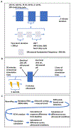
(A) Illustrations of the positioning of the ultrasound collimator relative to the rat and the electrode, shown in gray. On the left, the true ultrasound condition setup is shown, and on the right the sham positioning is shown, with the collimator delivering stimulation approximately 3 mm to the side of the original position. (B) Diagram of the electrode insertion depth relative to the estimated depth of each layer of the rat somatosensory cortex. (C) Hydrophone peak-to-peak pressure amplitude scan resulting from the ultrasound parameters used and angled incidence.
Figure 2.
Figure 2.. Diagram of Experimental Protocol.
(A) Diagram of ultrasound waveform and pulsing parameters used during the 5-minute stimulation duration. The sinusoidal blocks represent the fundamental frequency of ultrasound, which is delivered in pulses shown on the middle level, and the blue blocks represent a series of those pulses. These blocks are also delivered in a pulsed mode at a frequency titled the ‘Sonication Repetition Frequency (SRF)’. SRF was the parameter focused on in this study. (B) Diagram of the overall experimental timeline, with the line representing recording time with electrical stimulation being delivered, and the blue block representing the delivery of ultrasound stimulation. Below, a diagram showing the delivery of peripheral electrical stimulation, with the lightning bolts representing the stimulation. (C) Data processing pipeline diagram, showing the general steps in the first line, and then diverging into the firing response analysis and the correlation analysis in the second and third lines respectively.
Figure 3:
Figure 3:. Spiking Response Change following Ultrasound Stimulation.
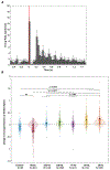
(A) Characteristic peri-stimulus time histogram of the response to hind limb electrical stimulation of a neuron’s firing over trials, averaged over 120 trials before ultrasound stimulation. The solid black line represents the mean of the distribution fit to baseline, taken from the values in the half second before electrical stimulus which is marked by the vertical red line. The dashed lines show a standard deviation above and below the mean. Error bars show the standard error of the mean over the trials included in each time bin. (B) Violin plot of the changes in spiking response to hind limb electrical stimulation following tFUS stimulation at S1 in each experimental condition. The average number of spikes caused by electrical stimulation is taken over the 120 trials before and after ultrasound, and the difference between them is taken for each neuron (see details in Methods). Each black dot represents a neuron from a recording under the labeled SRF. The black asterisk marks show the mean of each group. The darker color is a traditional box plot, with the ends of the boxes marking the 1st and 3rd quartile, and the middle black line showing the median. The notches show 95% confidence intervals on the median. The ends of the narrow rectangle show the mean plus and minus one standard deviation. The lighter color shadow over the data shows the probability distribution of the data collected. The ends of that distribution mark the 1st and 99th percentile of the data. The number of neurons included in each analysis is shown in the X-axis below the condition label. (C-D) Characteristic plots of the average spiking response calculated relative to baseline over time during an experiment for a true ultrasound condition, with 100 Hz SRF shown specifically in (C), and in a sham condition in (D). The black line shows the average value of 31 neurons in this recording, with the standard deviation shown in gray. Each point is the average over 5 minutes of the difference of the number of spikes from baseline in the half-second time bin following peripheral electrical stimulation. The 5-minute duration of ultrasound stimulation is shown by the blue box. Negative values result from calculating the difference from baseline in neurons which show suppression on average following electrical stimulus.
Figure 4:
Figure 4:. Correlation Change following Ultrasound Stimulation.
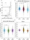
(A) A violin plot plotting correlation change, the difference in correlation metric (STTC) between the 10 minutes before and after ultrasound stimulation, between pairs of neurons in each experimental condition. The dashed line marks three standard deviations outside of the mean of the sham group. The sham condition shows minimal correlation changes, with the group tightly clustered around 0. By contrast, all other groups except 10 Hz show changes in correlation between many neurons. 75 Hz and above show generally positive correlation changes, while 50Hz and below show generally negative correlation changes. The number of neuron pairs analyzed in each group is shown in the X-axis below the condition label. (B) A bar plot showing the ratio of positive and negative correlation changes at each SRF, with a positive change showed in maroon and a negative one in blue. (C-E) Characteristic plots of correlation over the time of an experiment at 100 Hz SRF (A), 50 Hz SRF (B), and in the sham condition (C). Here the neuron pairs are broken into 3 subgroups, those that did not change significantly following ultrasound stimulation, those that increased in correlation, and those that decreased in correlation, shown in gray, blue, and maroon, respectively. In each group, the line plotted shows the average over all included neuron pairs of the correlation (STTC) value measured over five-minute time intervals. In the upper right corner, the number of neuron pairs included in each group is shown. (F-H) Characteristic heatmaps of the change in correlation metric following ultrasound at 100Hz, 50Hz, and sham. The difference is calculated between the 10 minutes before ultrasound, and the 10 minutes after ultrasound. Each small square represents a pair of neurons, with the same values reflected over the diagonal starting at the top left. The squares on the diagonal would represent a neuron paired with itself, and are given a value of 0. Increases in correlation shown in maroon, and decreases shown in blue following the color map on the right of the figures.
Figure 5:
Figure 5:. Layer Analysis of Correlation Change.
(A) A plot showing the instantaneous firing rate at each depth in the cortex, assisting in demarcating the boundaries between layers by showing the different rates common in different layers. The instantaneous firing rate is calculated during spontaneous activity with no stimulation. (B-D) Violin plots with each point plotting correlation change between neuron pairs following ultrasound. In (B), the neuron pairs within Layer 2/3, Layer 4, and Layer 5 are shown for the 100Hz condition. (C) the 50Hz condition, and (D) the sham condition.

Similar articles

Cited by

References

    1. Ashkan K, Rogers P, Bergman H, & Ughratdar I (2017). Insights into the mechanisms of deep brain stimulation. In Nature Reviews Neurology (Vol. 13, Issue 9, pp. 548–554). Nature Publishing Group. 10.1038/nrneurol.2017.105 - DOI - PubMed
    1. Bair W, Zohary E, & Newsome WT (2001). Correlated Firing in Macaque Visual Area MT: Time Scales and Relationship to Behavior. The Journal of Neuroscience, 21(5), 1676. 10.1523/JNEUROSCI.21-05-01676.2001 - DOI - PMC - PubMed
    1. Bikson M, & Rahman A (2013). Origins of specificity during tDCS: Anatomical, activity-selective, and input-bias mechanisms. Frontiers in Human Neuroscience, 0(OCT), 688. 10.3389/FNHUM.2013.00688/BIBTEX - DOI - PMC - PubMed
    1. Blackmore J, Shrivastava S, Sallet J, Butler CR, & Cleveland RO (2019). Ultrasound Neuromodulation: A Review of Results, Mechanisms and Safety. In Ultrasound in Medicine and Biology (Vol. 45, Issue 7, pp. 1509–1536). Elsevier USA. 10.1016/j.ultrasmedbio.2018.12.015 - DOI - PMC - PubMed
    1. Boyden ES, Zhang F, Bamberg E, Nagel G, & Deisseroth K (2005). Millisecond-timescale, genetically targeted optical control of neural activity. Nature Neuroscience 2005 8:9, 8(9), 1263–1268. 10.1038/nn1525 - DOI - PubMed

Publication types

LinkOut - more resources