. 2022 Aug;608(7924):766-777.
doi: 10.1038/s41586-022-05060-x. Epub 2022 Aug 10.

Spatial multi-omic map of human myocardial infarction

Affiliations

Spatial multi-omic map of human myocardial infarction

Christoph Kuppe et al. Nature. 2022 Aug.

Abstract

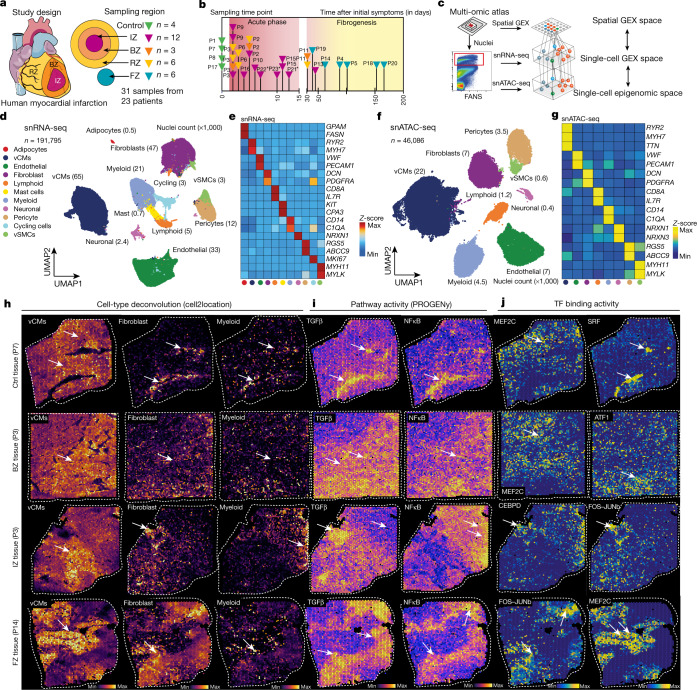
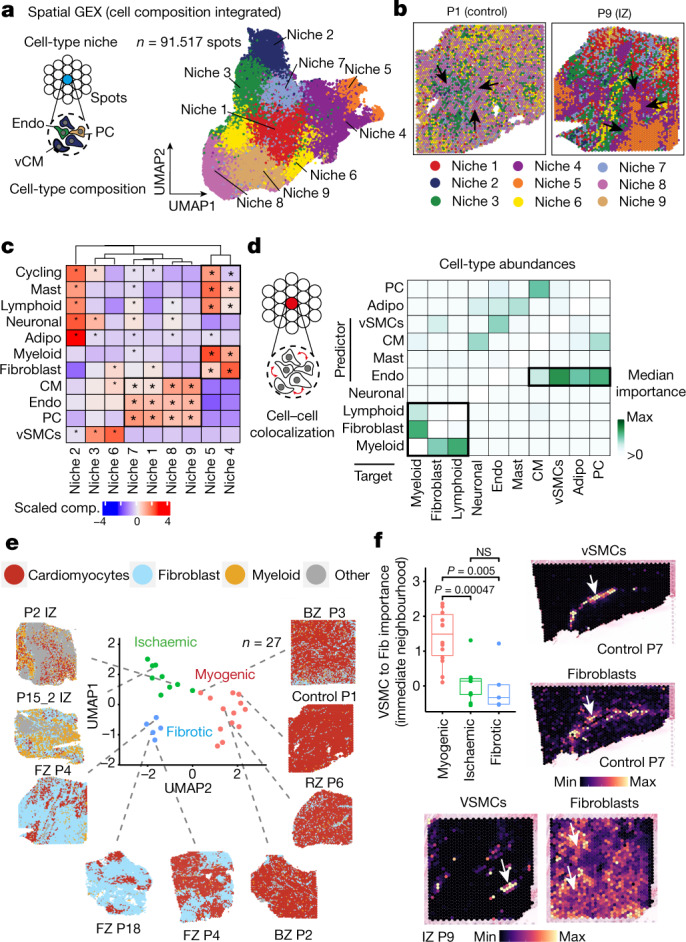
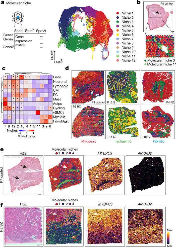
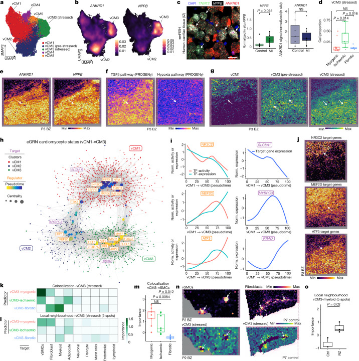
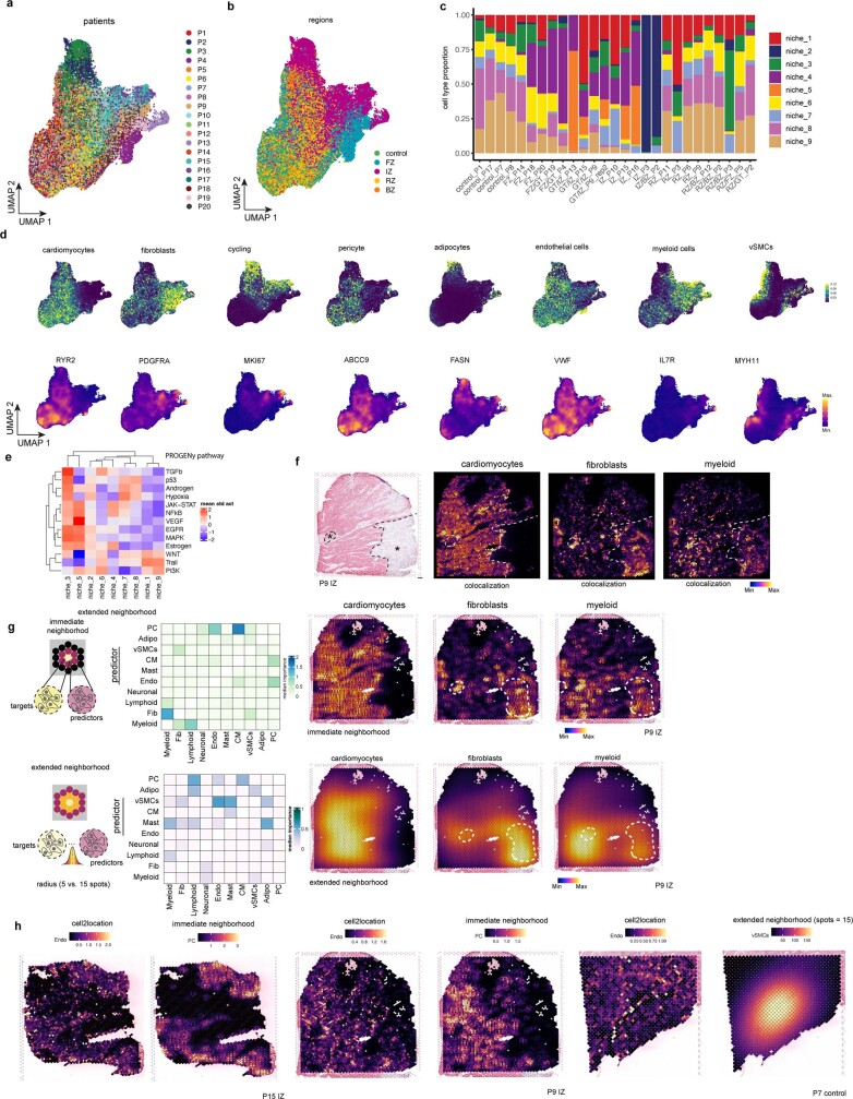
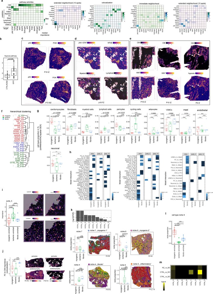
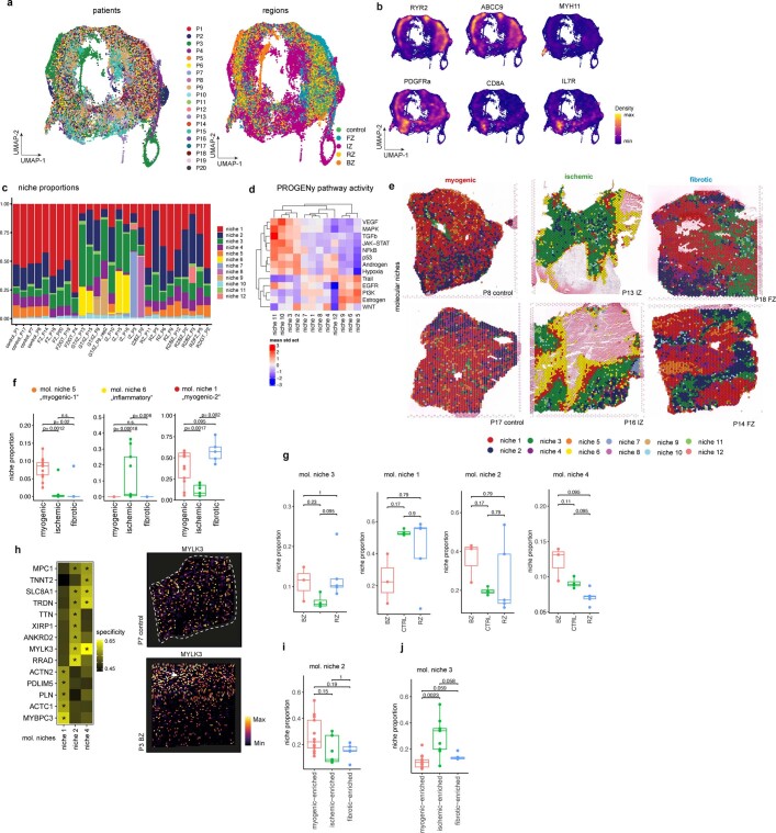
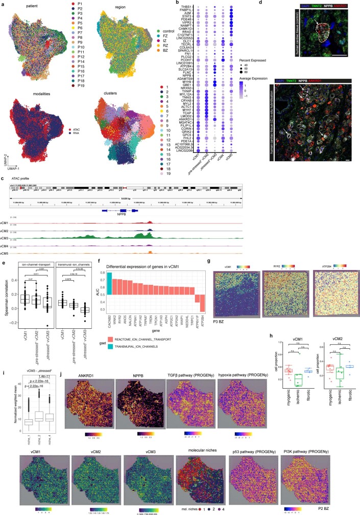
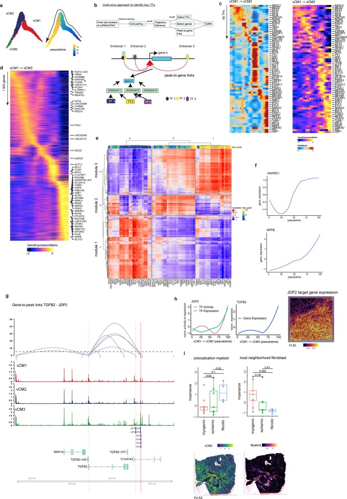
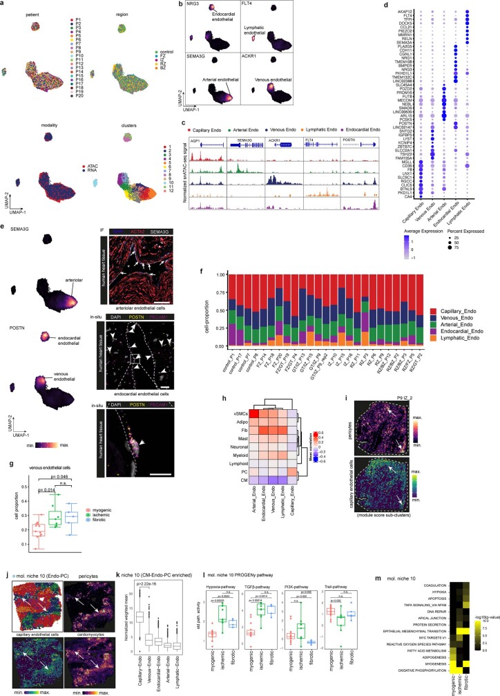
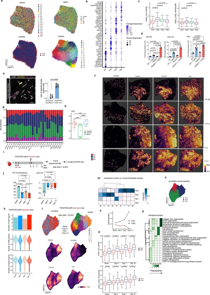
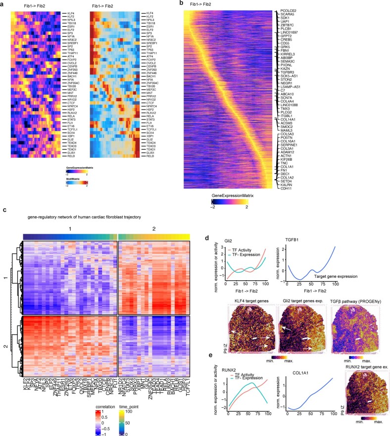
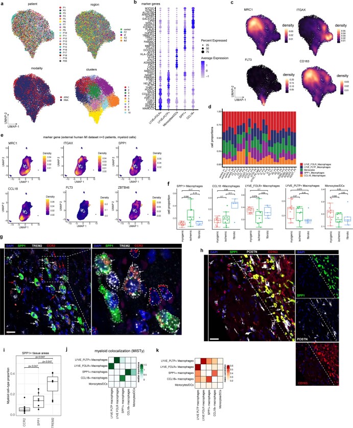
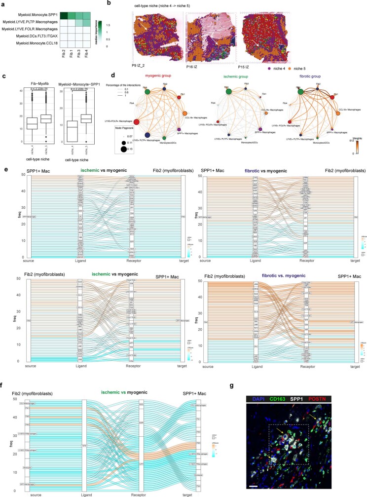
Myocardial infarction is a leading cause of death worldwide1. Although advances have been made in acute treatment, an incomplete understanding of remodelling processes has limited the effectiveness of therapies to reduce late-stage mortality2. Here we generate an integrative high-resolution map of human cardiac remodelling after myocardial infarction using single-cell gene expression, chromatin accessibility and spatial transcriptomic profiling of multiple physiological zones at distinct time points in myocardium from patients with myocardial infarction and controls. Multi-modal data integration enabled us to evaluate cardiac cell-type compositions at increased resolution, yielding insights into changes of the cardiac transcriptome and epigenome through the identification of distinct tissue structures of injury, repair and remodelling. We identified and validated disease-specific cardiac cell states of major cell types and analysed them in their spatial context, evaluating their dependency on other cell types. Our data elucidate the molecular principles of human myocardial tissue organization, recapitulating a gradual cardiomyocyte and myeloid continuum following ischaemic injury. In sum, our study provides an integrative molecular map of human myocardial infarction, represents an essential reference for the field and paves the way for advanced mechanistic and therapeutic studies of cardiac disease.


Conflict of interest statement

The authors declare no competing interests directly related to this work. The authors however disclose unrelated funding, honorariums and ownership as follows: R.K. has grants from Travere Therapeutics, Galapagos, Chugai and Novo Nordisk and is a consultant for Bayer, Pfizer, Novo Nordisk and Gruenenthal. J.S.-R. reports funding from GSK and Sanofi and fees from Travere Therapeutics and Astex Therapeutics. K.L. has grants from Novartis and Amgen and receives consulting fees from Medtronic and Implicit Biosciences. I.G.C. has a grant from Illumina. L.S. has received grants from Bayer, Boehringer Ingelheim and Nattopharma, is consultant for ImmunoDiagnostics Systems (IDS) and is a shareholder in Coagulation Profile. L.W.V.L. reports consultancy fees to UMCU from Abbott, Medtronic, Vifor and Novartis.

Figures

Fig. 1
Fig. 1. Spatial multi-omic profiling of human myocardial infarction.
a, Study schematic. RZ, remote zone; BZ, border zone; IZ, ischaemic zone; FZ, fibrotic zone. b, Sampling time points. P indicates patient number. Asterisks indicate snRNA-seq samples that were used for validation only (P21–P23). c, Data modalities. GEX, gene expression. d, UMAP of snRNA-seq data from all samples (n = 191,795). vCMs, ventricular cardiomyocytes. vSMCs, vascular smooth muscle cells. e, Average marker gene expression after z-score transformation. Colours along the bottom correspond to the cell types in d. f, Uniform manifold approximation and projection (UMAP) of snATAC-seq data for all samples (n = 46,068). g, Chromatin accessibility of marker genes after z-score transformation. Colours along the bottom correspond to the cell types in d. hj, Characterization of spatial transcriptomics data using cell-type deconvolution (h), pathway activity (i) and transcription factor (TF) binding activity (j) for control (Ctrl), border zone, ischaemic zone and fibrotic tissue samples. Max, maximum; min, minimum. Source data
Fig. 2
Fig. 2. Characterization of tissue organization using spatial transcriptomics data.
a, Schematic of cell-type niche definition and UMAP of spatial transcriptomics spots based on cell-type compositions. b, Mapping of cell-type niches in a control and an ischaemic zone sample. Arrows show niche 8 (left) and niche 4 (right). c, Scaled median cell-type compositions (comp.) within each niche. Asterisks indicate increased composition of a cell type in a niche compared with other niches (one-sided Wilcoxon rank sum test, adjusted (adj.) P < 0.05). Bold asterisks and outlines show the tissue modules discussed in the main text.  d, Median importance of cell-type abundance in the prediction of abundances of other cell types within a spot. e, UMAP of all patient samples from spatial transcriptomics and visualization of abundance of the major cell types in myogenic (control, remote zone and border zone), ischaemic and fibrotic groups. f, Top left, importance of vSMC abundance in the immediate neighbourhood for prediction of fibroblast (Fib) abundance in myogenic, ischaemic and fibrotic groups (adj. P-value using a two-sided Wilcoxon rank-sum test is shown). In all box plots in this Article, the centre line corresponds to the median, the bottom and top hinges delineate the first and third quartiles, respectively, the top whisker extends from the hinge to the largest value no further than 1.5× the inter-quartile range (IQR) from the hinge and the bottom whisker extends from the hinge to the smallest value at most 1.5× IQR from the hinge; data beyond the end of the whiskers are outlying points and are plotted individually. Myogenic group: n = 14, ischaemic group: n = 9, fibrotic group: n = 5. Deconvoluted vSMCs and fibroblast abundance in a myogenic sample (top right) and in an ischaemic sample (bottom). For details on visualization, statistics and reproducibility, see Methods. NS, not significant. Adipo, adipocytes; CM, cardiomyocytes; PC, pericytes; Endo, endothelial cells. Source data
Fig. 3
Fig. 3. Characteristic tissue structures inferred from spatial transcriptomics data.
a, Schematic of molecular niche definition and UMAP of spatial transcriptomics spots based on gene expression. b, Spatial mapping of molecular niches. Arrows highlight molecular niche 11 (enriched in MYH11+ vSMCs) surrounded by molecular niche 3 (enriched in PDGFRA+ fibroblasts). c, Scaled median cell-type compositions within each molecular niche. Asterisks indicate increased composition of a cell type in a niche compared with other niches (one-sided Wilcoxon rank-sum test, adj. P < 0.05). d, Distribution of molecular niches in three different patient groups. Note the differential abundance of molecular niches 1 (red) and 6 (yellow). e,f, Haematoxylin and eosin (H&E) staining and visualization of molecular niches 1, 2 and 4 and gene expression (MYBPC3 and ANKRD2) of a control (e) and a border zone (f). Scale bars, 10 mm. For details on visualization, statistics and reproducibility, see Methods. Source data
Fig. 4
Fig. 4. Sub-clustering of cardiomyocytes.
a, Sub-clustering of cardiomyocytes. b, Gene expression of ANKRD1 and NPPB. c, Left, smFISH staining of vCM3 marker genes. Scale bar, 50 µm. Right, quantification of NPPB and ANKRD1 signal relative to the TNNT2 signal. Two-sided Wilcoxon rank-sum test (control donors: n = 7, patients with myocardial infarction (MI): n = 10).  d, Proportion of stressed vCM3 cells. Wilcoxon rank-sum test (unpaired, two-sided; myogenic: n = 13 myogenic, ischaemic: n = 7, fibrotic: n = 4). eg, Expression of ANKRD1 and NPPB (e), TGFβ and hypoxia signalling activities (f) and expression of vCM-state marker genes (g) in a border zone sample. h, eGRN analysis including vCM1, vCM2 and vCM3. Each node represents a transcription factor (regulator) or a gene (target). i, Transcription factor activity and expression over pseudotime. Norm., normalized. j, Expression of transcription factor target genes in the border zone sample, as in e. k,l, Mean importance of the abundance of major cell types within a spot (k) and the local neighbourhood (within a 5-spot radius) (l) in the prediction of vCM3 in spatial transcriptomics. m, Importance of vSMC abundance predict vCM3 in myogenic, ischaemic and fibrotic groups within a spot (adj. P-value, two-sided Wilcoxon rank-sum test; myogenic: n = 9, ischaemic: n = 7, fibrotic: n = 4). n, Deconvoluted abundance of vSMCs or fibroblasts and vCM3 state scores in a border zone (left) and a control human heart (right). o, Importance of myeloid cell abundance in the local neighbourhood for predicting vCM3 in control and remote zone samples (two-sided t-test; controls: n = 3, remote zones: n = 3). For details on visualization, statistics and reproducibility, see Methods. Source data
Fig. 5
Fig. 5. Sub-clustering of endothelial cells.
a, Sub-clusters of human endothelial (endo) cells using the integrated snRNA-seq and snATAC-seq data. b, Comparison of capillary endothelial cells and lymphatic endothelial cell proportion between donor and patient groups. Wilcoxon rank-sum test (unpaired, two-sided; myogenic: n = 13, ischaemic: n = 7, fibrotic: n = 4). c, Median importance of the abundance of major cell types within a spot (left) and the local neighbourhood (effective radius of 5 spots) (right) in the prediction of endothelial cell-state scores in spatial transcriptomics. d, Spatial distribution of the abundance of vSMCs and the state score of arterial endothelial cells in an ischaemic (left) and control (right) sample. Arrows point at colocalization events. For details on visualization, statistics and reproducibility, see Methods. Source data
Fig. 6
Fig. 6. Characterization of mesenchymal–myeloid interaction.
a, UMAP of human cardiac fibroblasts (integrated snRNA-seq and snATAC-seq data). b, Expression of SCARA5, COL1A1, POSTN and FN1. c, Visualization of the markers in spatial transcriptomics data. d, Comparison of Fib1 and Fib2 compositions. Wilcoxon rank-sum test (unpaired, two-sided; myogenic: n = 13; ischaemic: n = 8, fibrotic: n = 5). e, Diffusion map of Fib1 and Fib2 populations. Colours refer to pseudotime points. f, Same as e, with colours referring to ECM score. g, eGRN analysis, including Fib1 and Fib2. Each node represents a transcription factor (regulator) or gene (target). Targets are coloured by clustering results and regulators are coloured by pseudotime with maximum transcription factor activity. The size of regulator nodes represents centrality. h, Transcription factor activity and expression over pseudotime and their corresponding target gene over pseudotime. i, Visualization of KLF4 and TEAD3 target genes and TGFβ pathway activity in a remote zone (left) and ischaemic zone (right) sample. j, UMAP of sub-clusters of human cardiac myeloid cells using the integrated snRNA-seq and snATAC-seq data. cDC, classical dendritic cell; MQ, macrophage. k, Gene expression of LYVE1, CCL18, ZBTB46 and SPP1. l, Median importance of myeloid cell states in the local neighbourhood in the prediction of fibroblast cell states. m, Cell-state scores of myofibroblasts (Fib2) and SPP1+ MQs in a remote zone sample. Arrows point to regions where there is an observed colocalization. n, In situ staining of CD163, POSTN and SPP1 on human cardiac myocardial infarction tissue. Arrows indicate CD163+SPP1+ macrophages near myofibroblasts. Scale: 10 µm. Quantification of SPP1+ macrophages relative to CD163+ macrophages from the in situ hybridization images (adj. P-value from a two-sided Wilcoxon rank-sum test, n = 8 control group, n = 6 fibrotic group, n = 12 ischaemic group). For details on visualization, statistics and reproducibility, see Methods. Source data
Extended Data Fig. 1
Extended Data Fig. 1. Computational workflow and snRNA-Seq data analysis.
a, Schematic of the computational workflow for the main analyses of snRNA-seq, snATAC-seq, and spatial transcriptomics data. b, UMAP embedding of snRNA-seq data from all samples for patients, regions, and clusters. c, UMAP embedding of snRNA-seq data showing G2-M-phase cell-cycle score (left) and S-phase score (right). d, Barplots showing cell-type proportions of snRNA-seq data across all samples. Colours indicate different major cell types. e, Comparison of the generated snRNA-seq atlas to a previously published human heart cell atlas (HCA) for molecular profiles (left) and cell-type proportion (right). Left panel shows the adjusted P-value of the overlap of top gene markers of each cell-type between the different data sets (hypergeometric test). Right panel shows the Pearson correlation between the median proportion of each shared cell-type of the reference atlas and our control, border zone, and remote zone samples. f, UMAP embedding and annotation of an external dataset of three ischaemic zone samples following MI. g, Comparison of the generated snRNA-seq atlas to the external ischaemic data for molecular profiles (left) and cell-type proportion (right). Left panel shows the adjusted P-value of the overlap of top gene markers of each cell-type between the different data sets (hypergeometric test). Right panel shows the Pearson correlation between the median proportion of each shared cell-type of the external data set and our ischaemic samples.
Extended Data Fig. 2
Extended Data Fig. 2. snATAC-seq and spatial transcriptomics data analysis.
a, UMAP showing snATAC-seq data for all patients, regions, and clusters. b, Validation of snATAC-seq cell type annotation using snRNA-seq data. Left: UMAP showing the predicted labels for snATAC-seq data. Right:  heatmap showing evaluation results by adjusted rand index (ARI). c, snATAC-seq cell-type proportions of all samples. d, Spearman correlations of cell-type compositions of samples estimated from snRNA-seq and and snATAC-Seq. Box-Whisker plots showing median and IQR (n = 3 for BZ, n = 4 for control, n = 4 for RZ, n = 5 for FZ, and n = 9 for IZ) e, Cell type detection for snRNA-seq and snATAC-seq data across samples. The colour represents in which modality was cell type detected: snRNA-seq and snATAC-seq, snRNA-seq only, or not recovered. f, Transcription factor (TF) binding and TF target expression per major cell type based on the snATAC-seq and snRNA-seq data. g, Overrepresented spatially variable biological processes (myocardium related, immune related and fibrosis related) across regions. Each cell contains the mean adjusted P-value of a hypergeometric test across all spatial transcriptomics samples belonging to each region. h, Spearman correlations of cell-type compositions of samples estimated from spatial transcriptomics and snRNA-seq (left) or snATAC-seq (right). Box-Whisker plots showing median and IQR (n = 3 for BZ, n = 4 for control, n = 4 for RZ, n = 5 for FZ, and n = 9 for IZ). i, GWAS SNP enrichment score across major cell types. j, Visualization of GWAS ll SNP enrichment (left ventricular ejection fraction) in spatial transcriptomics data. In d,h, each spot is a patient sample (n = 3 for borderzone (BZ), n = 4 for controls, n = 6 for fibrotic zone (FZ), n = 9 for ischaemic zone (IZ), n = 5 for remote zone (RZ)). Data are represented as boxplots where the middle line is the median, the lower and upper hinges correspond to the first and third quartiles, the upper whisker extends from the hinge to the largest value no further than 1.5 × IQR from the hinge (where IQR is the inter-quartile range) and the lower whisker extends from the hinge to the smallest value at most 1.5 × IQR of the hinge, while data beyond the end of the whiskers are outlying points that are plotted individually. In a-c the number of spots of the bottom panels correspond to the barplots in the upper panel.
Extended Data Fig. 3
Extended Data Fig. 3. Cell-type niches and spatially contextualized views analysis.
a-b, UMAP embedding of spatial transcriptomics (ST) spots based on major cell-type compositions coloured by the patient (a) or region (b). c, Cell-type niche compositions across patient sample. d, UMAP embedding of ST spots based on major cell-type compositions colored by the compositions of cycling cells, pericytes, adipocytes, endothelial cells and myeloid cells and their respective marker genes (RYR2 cardiomyocytes, PDGFRA fibroblasts, MKI67 cycling cells, ABCC9 pericytes, FASN adipocytes, VWF endothelial cells, IL7R myeloid cells, and MYH11 vSMCs). e, Standardized mean PROGENy pathway activities across different niches. f, H&E staining and cell2location cell-type abundance estimations of cardiomyocytes, fibroblasts and myeloid cells. Delineated areas represent myogenic or fibroblast/myeloid cell enriched tissue areas. g, Median standardized importances (> 0) of cell-type abundances in the prediction of other cell types within the immediate neighbourhood (upper part) and the extended neighbourhood (effective radius of 15 spots) (lower part) inferred from spatially contextualized models. Cell-type abundances of the immediate (upper panels) and extended neighbourhood of cardiomyocytes, fibroblasts and myeloid cells. h, Visualization examples of the  dependencies between the abundance of endothelial cells and the abundance of pericytes in the immediate neighborhood, and vascular smooth muscle cells in the extended neighbourhood (effective radius of 15 spots) visualized on three tissues.
Extended Data Fig. 4
Extended Data Fig. 4. Spatial pathway and cell type dependency analysis.
a, Median standardized importances (> 0) of cell-type abundances within the spot and in the extended neighbourhood (effective radius = 15), and PROGENy pathway activities within a spot, and in the immediate or extended neighbourhood on the prediction of pathway activities inferred from spatially contextualized models. b, Standardized importances of cardiomyocyte abundances in the extended neighbourhood (radius of 15 spots) in predicting hypoxia pathway activity. Comparison was performed between two sample groups: control, border and remote zones samples (n = 10), and fibrotic and ischaemic samples (n = 15). Two-sided Wilcoxon rank sum test. c–e, Visualization examples of pathway to pathway and pathway to cell-type dependencies in spatial transcriptomics. (c) p53 and PI3K spatial pathway distribution. (d) JAK-STAT and NFkB activities’ dependencies to myeloid and lymphoid cells’ abundance. (e) Cardiomyocyte to WNT and hypoxia pathway dependency. f,  Hierarchical clustering of the pseudo-bulk transcriptional profile of spatial transcriptomics slides of patient samples. Colour represents the three major sample groups. g, Comparisons of patient mean major cell-type proportions (inferred from snRNA, snATAC-seq data, and spatial transcriptomics) between myogenic, ischaemic and fibrotic groups. Two-sided Wilcoxon rank sum test. Each dot represents a patient sample (n=13 for myogenic group, n=9 for ischaemic group, n=5 for fibrotic group). h, Pairwise comparison between patient groups of the standardized importances of cell-type abundances within the same spot (intra), and in the immediate (juxta) or extended neighborhood (para) to predict other cell types’ abundances (two-sided Wilcoxon rank sum test). Myogenic vs ischaemic (left), myogenic vs fibrotic (middle), fibrotic vs ischaemic (right). * = adj. P-value <= 0.15. i, Comparison of standardized importances of lymphoid cells’ abundances in the immediate neighborhood (juxta) to predict myeloid cells between myogenic, ischaemic, and fibrotic groups (two-sided Wilcoxon rank sum test). Visualization of lymphoid and myeloid cells in an ischaemic (up) and control (down) sample. j, Comparison of standardized importances of pericytes’ abundances to predict cardiomyocytes’ abundances within the same spot (two-sided Wilcoxon rank sum test). Each dot represents a sample (n = 14 for myogenic group, n=9 for ischaemic group, n = 5 for fibrotic group). Spatial distributions of pericyte and cardiomyocytes abundances estimated from deconvolution in a myogenic sample (left) and a fibrotic sample (right). Arrows in the fibrotic enriched sample show a strong colocalization event. k, Comparison of the compositions of cell-type niches between myogenic, fibrotic, and ischaemic groups (Kruskal-Wallis test, line denotes an adj. P-value < 0.1). Comparison of the proportions of cell-type niches 4, 5, 7, and 8 between groups (adj. P-value estimated from two-sided Wilcoxon rank sum test) and visualization example. Each dot represents a patient sample (n for myogenic group = 13, n for ischaemic group = 7, n for fibrotic group = 5). l, Comparison of the proportions of cell-type niche 9 between groups (two-sided Wilcoxon rank sum test). Each dot represents a patient sample (n for myogenic group = 13, n for ischaemic group = 7, n for fibrotic group = 5). m, Pairwise comparison of the compositions of the cell-type niches between control, border and remote zone samples (two-sided Wilcoxon rank sum test). * = reflect changes with adj. P-value <  0.1, n for CTRL = 4, n for RZ = 5, n for BZ = 3. In b, g, i, j, k, l data are represented as boxplots where the middle line is the median, the lower and upper hinges correspond to the first and third quartiles, the upper whisker extends from the hinge to the largest value no further than 1.5 × IQR from the hinge (where IQR is the inter-quartile range) and the lower whisker extends from the hinge to the smallest value at most 1.5 × IQR of the hinge, while data beyond the end of the whiskers are outlying points that are plotted individually.
Extended Data Fig. 5
Extended Data Fig. 5. Characterization of molecular niches.
a, UMAP embedding of ST spots based on gene expression coloured by patients (left) and regions (right). b, Gene expression of RYR2, ABCC9, MYH11, PDGFRa, CD8A and IL7R. Colours refer to gene-weighted kernel density as estimated by using R package Nebulosa. c, Bar plots visualizing molecular niches proportion per patient. d, Standardized mean PROGENy pathway activities across different molecular niches. e, Visualization of molecular niches in control, IZ, and FZ samples. f, Comparison between patient groups of the proportions of molecular niches 5, 6, and 1 (adj. P-value from a two-sided Wilcoxon rank sum test). Each dot represents a patient sample (n for myogenic group = 13, n for ischaemic group = 9, n for fibrotic group = 5). g, Comparison between control (CTRL), border zone (BZ) and remote zone (RZ) of the proportions of molecular niches 1, 2, 3, and 4 (adj. P-value, two-sided Wilcoxon rank sum test, Box-Whisker plots showing median and IQR. Maximum and minimum values as described previously). Each dot represents a patient sample (n for BZ = 3, n for CTRL = 4, n for RZ group = 4). h, Top five differentially upregulated genes between spots belonging to molecular niches enriched with cardiomyocytes. Summary area under the curve (AUC) is used as a size effect of comparing the expression of one molecular niche against the rest. * = reflect FDR < 0.05 and summary AUC > 0.55 (n for mol. niche 0 = 30,058, n for mol. niche 1 = 19,958, n for mol. niche 3 = 7,360). Spatial distribution of the expression of MYLK3 in a control slide (upper) and a border zone (lower)  i, Comparison between patient groups of the proportions of molecular niche 2 (adj. P-value, two-sided Wilcoxon rank sum test, Box-Whisker plots showing median and IQR. Maximum and minimum values as described previously). Each dot represents a patient sample (n for myogenic group = 13, n for ischaemic group = 9, n for fibrotic group = 5). j, Same as (i) for niche 3. In f, g, i, j data are represented as boxplots where the middle line is the median, the lower and upper hinges correspond to the first and third quartiles, the upper whisker extends from the hinge to the largest value no further than 1.5 × IQR from the hinge (where IQR is the inter-quartile range) and the lower whisker extends from the hinge to the smallest value at most 1.5 × IQR of the hinge, while data beyond the end of the whiskers are outlying points that are plotted individually.
Extended Data Fig. 6
Extended Data Fig. 6. Characterization of cardiomyocyte state clusters.
a, UMAP embedding of the integrated snRNA-seq and snATAC-seq data coloured by patients, regions, modalities, and clusters (resolution= 1). b, Dot plot showing the top 10 upregulated genes for each CM-state. c, State-specific pseudo bulk ATAC-seq profiles showing distinct chromatin accessibility for NPPB between different states. d, In situ RNA hybridization of NPPB, ANKRD1 and TNNT2 on human cardiac control tissue (upper panel). Note that only a single NPPB/ANKRD1 positive cardiomyocyte could be detected. (below) Representative image of the same in-situ staining of a human myocardial infarction sample. Note the NPPB and ANKRD1 expression in several cardiomyocytes (arrows). Scale bars: 25 µm (upper) + 50 µm (lower). e, Spearman correlation between the spatial expression of Ion-channel transport and transmural-ion channels related genes to the expression of the marker genes (state scores) of vCM1-3 (two-sided Wilcoxon rank sum test). Each dot represents a visium slide (n = 28). f, Differential gene expression of ion channel related genes in vCM1 contrasted to vCM3 cardiomyocytes (two-sided Wilcoxon rank sum test, area under the curve (AUC) is shown as size effect). Colours refer to the gene set membership of each gene. g, Visualization of vCM1 gene marker expression mapping (state scores) and the expression of RYR2 and ATP2B4 in a border zone sample. h, Comparison of vCM1 and vCM2 cell proportion between patient groups. P-values were calculated using Wilcoxon Rank Sum test (unpaired, two-sided). Each dot represents a sample (n = 13 for myogenic group, n = 7 for ischaemic group, and n = 4 for fibrotic group). i, Distribution of vCM3 marker gene expression (state-score) across molecular niche 1, 2, and 4. Each dot represents a spatial transcriptomics spot belonging to a molecular niche across samples (n = 30,058 for niche 1, n = 19,958 for niche 2, niche 4 = 7,360). Two-sided Wilcoxon rank sum test, adj. p-values (niche 1 vs niche 4 = 0, niche 2 vs niche 4 = 2e-09, niche 1 vs niche 2 = 0). j, Visualisation of the expression of ANKRD1 and NPPB, the spatial distribution of TGFβ, hypoxia, p53 and PI3K signaling activities, the spatial distribution of the expression of vCM-states marker genes (state score) for a border zone sample and the distribution of molecular niches 1,2, and 4. Box-Whisker plots showing median and IQR. Maximum and minimum values as described previously. In e, h, i data are represented as boxplots where the middle line is the median, the lower and upper hinges correspond to the first and third quartiles, the upper whisker extends from the hinge to the largest value no further than 1.5 × IQR from the hinge (where IQR is the inter-quartile range) and the lower whisker extends from the hinge to the smallest value at most 1.5 × IQR of the hinge, while data beyond the end of the whiskers are outlying points that are plotted individually. In a-c the number of spots of the bottom panels correspond to the barplots in the upper panel.
Extended Data Fig. 7
Extended Data Fig. 7. Cardiomyocyte pseudotime and gene-regulatory network analysis.
a, Diffusion map embedding of pseudotime cardiomyocyte clusters vCM1, vCM2 and vCM3. b, Computational workflow for building gene regulatory network (upper) and schematic of linking TF to target genes through peak-to-gene links and predicted TF binding sites (lower). c, Heatmap showing TF binding activity and gene expression along the pseudotime trajectory. d, Heatmap of gene expression across pseudotime vCM1-vCM3. e, Heatmap showing the correlation between TF binding activity and gene expression along the pseudotime trajectory from vCM1 to vCM3. Colors on the top refer to pseudotime point where the TF showed the highest binding activity. Clustering analysis identified three modules. f, ANKRD1 and NPPB CM-stress marker gene expression along pseudotime vCM1-vCM3. g, Peak-to-gene links showing that JDP2 regulates TGFB2. Each loop represents a putative link between TGFB2 and a peak. Loop height represents the significance of the correlation and dash line represents threshold of significance (P = 0.05). ATAC-seq tracks were generated from pseudo-bulk chromatin profiles of vCM1, vCM2, and vCM3. Binding sites of JDP2 are highlighted. h, Line plots showing TF activity and expression after z-score normalization (y-axis) over pseudotime (x-axis) for JDP2 (left), its corresponding target gene expression after z-score normalization (y-axis) over pseudotime (x-axis) for TGFB2 (middle), and visualization of all target genes in the BZ sample (right). i, Comparison of standardized importances of myeloid abundances within the spot and fibroblast abundances in the local neighbourhood (radius of 5 spots) to predict vCM3 between patient groups samples. Each dot represents a sample (n = 9 for myogenic group, n = 7 for ischaemic group, n = 4 for fibrotic group). (lower panel) Spatial distribution of the state score of vCM3 and myeloid cell abundances in a RZ slide with histological evidence of a scar. (Two-sided Wilcoxon rank sum test, Box-Whisker plots showing median and IQR. Maximum and minimum values as described previously.) Data are represented as boxplots where the middle line is the median, the lower and upper hinges correspond to the first and third quartiles, the upper whisker extends from the hinge to the largest value no further than 1.5 × IQR from the hinge (where IQR is the inter-quartile range) and the lower whisker extends from the hinge to the smallest value at most 1.5 × IQR of the hinge, while data beyond the end of the whiskers are outlying points that are plotted individually. In a-c the number of spots of the bottom panels correspond to the barplots in the upper panel.
Extended Data Fig. 8
Extended Data Fig. 8. Endothelial cell heterogeneity.
a. UMAP embedding of integrated snRNA-seq and snATAC-seq data coloured by patients, regions, modalities and clusters (resolution= 0.9). b, Gene expression of NRG3, FLT4, SEMA3G and ACKR1. Colours refer to gene-weighted kernel density as estimated by using R package Nebulosa. c, Sub-cluster-specific pseudo bulk ATAC-seq tracks showing the chromatin accessibility of the genes from (b). d, Marker dot plot showing the DEGs for each endothelial cells state and subtype. e, Gene expression of SEM3G and POSTN. Colors refer to gene-weighted kernel density as estimated by using R package Nebulosa. Immunofluorescence of SEMA3G and ACTA2 (upper image). In situ mRNA (RNAscope) for POSTN and PECAM1 (magenta). Arrows highlight endocardial endothelial cells. Scale bars: 75 µm (upper) and 10 µm (lower). f,  Endothelial cell state compositions across all patient samples. g, Comparison between patient groups of the venous endothelial cell proportion (two-sided Wilcoxon rank sum test). Each dot represents a patient sample (n for myogenic group = 13, n for ischaemic group = 9, n for fibrotic group = 5). h, Mean Pearson correlation between the abundance of major cell-types and endothelial cell-state scores across all spatial transcriptomics slides. i, Visualization of the spatial distribution of the abundances of pericytes and the state score of capillary endothelial cells sample. Arrows point at colocalization events. j, Visualization of the spatial distribution of molecular niches, the state score of capillary endothelial cells and the abundance of pericytes and cardiomyocytes. Arrows point at locations where molecular niche 10 is present together with high abundances of cardiomyocytes and pericytes. k, Endothelial cell state score distributions in all spots belonging to the molecular niche 10 across all slides (n = 1,874, P-value = 3.19e-298, obtained from a two sided Wilcoxon signed-rank test).  l, Mean signalling pathway activities in the molecular niche 10 across different patient groups (adj. P-value of two-sided Wilcoxon Rank Sum test). Each dot represents a slide (n = 14 for myogenic group, n = 9 for ischaemic group, n = 5 for fibrotic group). m, Overrepresented hallmark pathways in the differentially upregulated genes of molecular niche 10 across different patient groups (hypergeometric tests, adj. P-values). In g, k, l data are represented as boxplots where the middle line is the median, the lower and upper hinges correspond to the first and third quartiles, the upper whisker extends from the hinge to the largest value no further than 1.5 × IQR from the hinge (where IQR is the inter-quartile range) and the lower whisker extends from the hinge to the smallest value at most 1.5 × IQR of the hinge, while data beyond the end of the whiskers are outlying points that are plotted individually. In a–c the number of spots of the bottom panels correspond to the barplots in the upper panel.
Extended Data Fig. 9
Extended Data Fig. 9. Fibroblast heterogeneity and PDGFRb lineage tracing in murine MI.
a. UMAP embedding of integrated snRNA-seq and snATAC-seq data coloured by patients, regions, modalities and clusters (resolution = 0.9). b, Marker dot plot showing the DEGs for each fibroblast state. c, Box plots showing module score of NABA-collagen and NABA-core-matrisome score per fibroblast state. P-values were calculated using Wilcoxon rank sum (unpaired and two sided). d, Expression of COL1A1, ACTA2 and FN1 by RNA qPCR after RUNX1 overexpression with and without TGFβ compared to empty vector (EV) (n = 6). One-way ANOVA followed by Bonferroni correction. Error bars = S.D. e, In situ hybridization (RNAscope) on human myocardial tissue of SCARA5 and COL15a1 and quantification and comparison of SCARA5+/POSTN+ cells vs. POSTN+/COL1A1+ cells in human heart failure tissues (n = 7). Mann-Whitney test. Error bars = S.D. f,  Visualization of SCARA5, POSTN, COL1A1 and FN1 on spatial transcriptomics slides from IZ and FZ human MI samples. g, Cell-type state compositions across patient sample. h, Comparison of Fib3 cell proportion between patient groups. P-values were calculated using Wilcoxon Rank Sum test (unpaired, two-sided). Each dot represents a sample (n = 13 for myogenic group, n = 7 for ischaemic group, and n = 4 for fibrotic group). i, Time course of lineage tracing experiment using PDGFRβCreER-tdTomato mice. j, Results of echocardiographic measurements EF (in %), and global longitudinal strain (GLS, in %), for each of the time points. One-way-ANOVA. n=4 day 0, n=3 day 4, n=4 day 7, n=4 day 14. Error bars = S.D.  k, Quality measurements of single-cell RNA-Seq data from mouse MI experiment. l, UMAP representation of time points, cluster and gene expression (POSTN, SCARA5, COL1A1 and FN1) from mouse MI experiment. m, Confusion matrix comparing predicted fibroblasts states and obtained clusters for mouse dataset. n, UMAP representation of species cross-annotation of fibroblast clusters. o, Cell proportion of mouse fibroblast state Fib1 (SCARA5+) and Fib2 (POSTN+) per MI time-point. p, Box plots showing NABA collagens scores and NABA core matrisome score per fibroblast state (mouse Fib1 vs. Fib1) per time point. P-values were calculated using Wilcoxon rank sum (unpaired and two sided) (Sham: n = 578 for Fib1 and n = 685 for Fib2; Day 4: n = 1688 for Fib1 and n = 2498 for Fib2; Day 7: n = 203 for Fib1 and n = 330 for Fib2; Day 14: n = 2232 for Fib1 and n = 7684 for Fib2). q, Gene set enrichment analysis per human fibroblast-cell state. Scale bar: 10 µm. In c, d, h, k, p data are represented as boxplots where the middle line is the median, the lower and upper hinges correspond to the first and third quartiles, the upper whisker extends from the hinge to the largest value no further than 1.5 × IQR from the hinge (where IQR is the inter-quartile range) and the lower whisker extends from the hinge to the smallest value at most 1.5 × IQR of the hinge, while data beyond the end of the whiskers are outlying points that are plotted individually.
Extended Data Fig. 10
Extended Data Fig. 10. Gene regulatory network analysis of human cardiac fibroblasts.
a, Pseudotime heatmap showing gene expression (left) and TF binding activity (right) along the trajectory Fib1 to Fib2 (myofibroblasts). b, Pseudotime heatmap showing highly variable genes along the trajectory. c, Heatmap showing the correlation between TF binding activity and gene expression each TF from (a) and gene from (b). Each column represents a TF and each row represents a TF. Colours on the top refer to pseudotime labels for each TF estimated based on binding activity. d, Upper: line plots showing TF activity and expression after z-score normalization (y-axis) over pseudotime (x-axis) for GLI2 and their corresponding target gene expression after z-score normalization (y-axis) over pseudotime (x-axis) for TGFB1. Lower: visualization of target gene expression of KLF4 and GLI2, and TGFB pathway activity in the BZ sample. e, Line plots showing TF activity and expression after z-score normalization (y-axis) over pseudotime (x-axis) for RUNX2 and its corresponding target gene expression after z-score normalization (y-axis) over pseudotime (x-axis) for COL1A1. Visualization of RUNX2 target genes in the BZ sample (right).
Extended Data Fig. 11
Extended Data Fig. 11. Myeloid cell heterogeneity and spatial mapping in human myocardial infarction.
a, UMAP embedding of integrated snRNA-seq and snATAC-seq data coloured by patient contribution, region, modality and clusters (resolution= 1). b, Marker dot plot showing the DEGs for each fibroblast state. c, Gene expression of MRC1, ITGAX, FLT3 and CD163. Colors refer to gene-weighted kernel density as estimated by using R package Nebulosa. d, Bar plots visualizing myeloid cell sub-population proportion per patient. e, Gene expression of MRC1, ITGAX, SPP1, CCL18, FLT3, ZBTB46 in an external dataset of ischaemic patients. Colors refer to gene-weighted kernel density as estimated by using R package Nebulosa. f, Comparison of myeloid cell proportion between patient groups. P-values were calculated using Wilcoxon Rank Sum test (unpaired, two-sided) (n = 13 for myogenic, n = 8 for ischaemic, and n = 5 for fibrotic group). g, In situ hybridization of CCR2, SPP1 and TREM2 on human myocardial infarction section IZ. Arrows point to phagocytotic vacuoles in the magnification. h, In situ hybridization of SPP1, POSTN and CD163 on human myocardial infarction section IZ. Note that SPP1+ macrophages colocalized in distinct tissue regions and appeared to have an enlarged cell-size. i, In situ hybridization quantification of cell type proportion per tissue section. n=7 patient tissues. Adjusted P-values were calculated using Wilcoxon signed-rank test. j, Median standardized importances (>0) of the cell-state scores of myeloid cells within the spot in the prediction of other myeloid cell-state scores in spatial transcriptomics. k, Mean pearson correlation between myeloid cell’s state scores across all spatial transcriptomics slides. Data in f, i are represented as boxplots where the middle line is the median, the lower and upper hinges correspond to the first and third quartiles, the upper whisker extends from the hinge to the largest value no further than 1.5 × IQR from the hinge (where IQR is the inter-quartile range) and the lower whisker extends from the hinge to the smallest value at most 1.5 × IQR of the hinge, while data beyond the end of the whiskers are outlying points that are plotted individually.
Extended Data Fig. 12
Extended Data Fig. 12. Myeloid cell spatial modelling and cell-cell communication.
a, Median standardized importances (>0) of the cell-state scores of myeloid cells (colocalization) in the prediction of fibroblast cell-state scores in spatial transcriptomics. b, Spatial mapping of cell-type niches in a control and an ischaemic sample. Arrows in the IZ sample show niche 4 and how it surrounds niche 5. c, Distribution of myofibroblasts and SPP1+ macrophages marker gene expression (state-score) across cell-type niche 4 and 5. Each dot represents a spatial transcriptomics spot belonging to a molecular niche across samples (n = 12,427 for niche 4, n = 4,375 for niche 5) (two-sided Wilcoxon rank sum test, adj P-value = 6.02e-133 for myofibroblast, adj P-value = 0 for SPP1+ monocytes). Data are represented as boxplots where the middle line is the median, the lower and upper hinges correspond to the first and third quartiles, the upper whisker extends from the hinge to the largest value no further than 1.5 × IQR from the hinge (where IQR is the inter-quartile range) and the lower whisker extends from the hinge to the smallest value at most 1.5 × IQR of the hinge, while data beyond the end of the whiskers are outlying points that are plotted individually. d, Cell-cell communication network representing number of ligand-receptor interactions (edge richness), expression of ligand-receptor pairs (LR scores; colour gradients) and cell centrality (Pagerank; node size) as estimated in snRNA-seq of myogenic, ischaemic and fibrotic samples. e, Sankey plots summarizing the top 50 ligand-receptor interactions for selected source and target cells and contrast. These ligand-receptor pairs are selected by absolute value of the difference in LRscore, as provided by CellPhoneDB method implemented in Liana. f. Sankey plot summarizing top 50 TGFbeta ligand-receptor interactions from Fib2 to SPP1+ Mac. cells. g, In situ hybridization mRNA (RNAscope) staining of CD163 (myeloid), POSTN (myofibroblast) and SPP1 on human cardiac MI tissue (crop-out in Fig. 6n). Arrows indicate CD163+SPP1+ macrophages near myofibroblasts. Scale: 25 µm.

Comment in

References

    1. Wong ND. Epidemiological studies of CHD and the evolution of preventive cardiology. Nat. Rev. Cardiol. 2014;11:276–289. doi: 10.1038/nrcardio.2014.26. - DOI - PubMed
    1. Niccoli G, et al. Optimized treatment of ST-elevation myocardial infarction. Circ. Res. 2019;125:245–258. doi: 10.1161/CIRCRESAHA.119.315344. - DOI - PubMed
    1. Prabhu Sumanth D, Frangogiannis Nikolaos G. The biological basis for cardiac repair after myocardial infarction. Circ. Res. 2016;119:91–112. doi: 10.1161/CIRCRESAHA.116.303577. - DOI - PMC - PubMed
    1. Litviňuková M, et al. Cells of the adult human heart. Nature. 2020;588:466–472. doi: 10.1038/s41586-020-2797-4. - DOI - PMC - PubMed
    1. Wang L, et al. Single-cell reconstruction of the adult human heart during heart failure and recovery reveals the cellular landscape underlying cardiac function. Nat. Cell Biol. 2020;22:108–119. doi: 10.1038/s41556-019-0446-7. - DOI - PubMed