

Visualizing and Quantifying Longitudinal Changes in Verbal Fluency Using Recurrence Plots
- PMID: 35966770
- PMCID: PMC9372335
- DOI: 10.3389/fnagi.2022.810799
Visualizing and Quantifying Longitudinal Changes in Verbal Fluency Using Recurrence Plots
Abstract
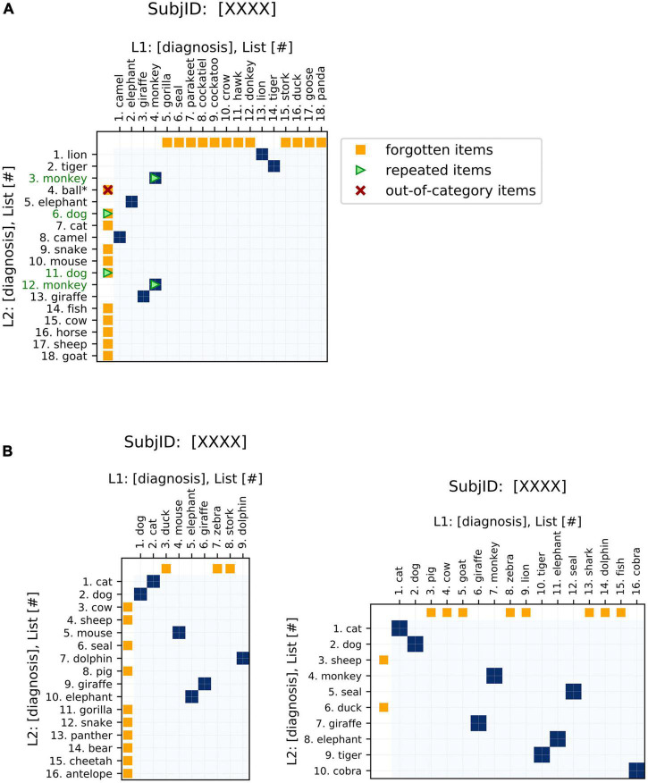
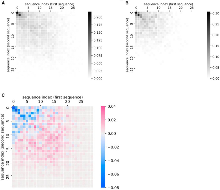
The verbal fluency task, where participants name as many instances of a specific semantic or phonemic category as possible in a certain time limit, is widely used to probe language and memory retrieval functions in research and clinical settings. More recently, interests in using longitudinal observations in verbal fluency to examine changes over the lifespan have grown, in part due to the increasing availability of such datasets, yet quantitative methods for comparing repeated measures of verbal fluency responses remain scarce. As a result, existing studies tend to focus only on the number of unique words produced and how this metric changes over time, overlooking changes in other important features in the data, such as the identity of the words and the order in which they are produced. Here, we provide an example of how the literature of recurrence analysis, which aims to visualize and analyze non-linear time series, may present useful visualization and analytical approaches for this problem. Drawing on this literature, we introduce a novel metric (the "distance from diagonal," or DfD) to quantify semantic fluency data that incorporates analysis of the sequence order and changes between two lists. As a demonstration, we apply these methods to a longitudinal dataset of semantic fluency in people with Alzheimer's disease and age-matched controls. We show that DfD differs significantly between healthy controls and Alzheimer's disease patients, and that it complements common existing metrics in diagnostic prediction. Our visualization method also allows incorporation of other less common metrics-including the order that words are recalled, repetitions of words within a list, and out-of-category intrusions. Additionally, we show that these plots can be used to visualize and compare aggregate recall data at the group level. These methods can improve understanding of verbal fluency deficits observed in various neuropsychiatric and neurological disorders.
Keywords: Alzheimer’s disease; data visualization; recall data; recurrence plots; verbal fluency.
Copyright © 2022 Maboudian, Hsu and Zhang.
Conflict of interest statement
The authors declare that the research was conducted in the absence of any commercial or financial relationships that could be construed as a potential conflict of interest.
Figures


Similar articles
-
Verbal Fluency Performance in Normal Adult Population in Iran: Norms and Effects of Age, Education, and Gender.Basic Clin Neurosci. 2022 Jan-Feb;13(1):129-138. doi: 10.32598/bcn.2021.363.1. Epub 2022 Jan 1. Basic Clin Neurosci. 2022. PMID: 36589021 Free PMC article.
-
Verbal fluency difficulties in aphasia: A combination of lexical and executive control deficits.Int J Lang Commun Disord. 2022 May;57(3):593-614. doi: 10.1111/1460-6984.12710. Epub 2022 Mar 23. Int J Lang Commun Disord. 2022. PMID: 35318784 Free PMC article.
-
Normative data for phonemic and semantic verbal fluency test in the adult French-Quebec population and validation study in Alzheimer's disease and depression.Clin Neuropsychol. 2016 Oct;30(7):1126-50. doi: 10.1080/13854046.2016.1195014. Epub 2016 Jun 9. Clin Neuropsychol. 2016. PMID: 27279436
-
Computerized Analysis of Verbal Fluency: Normative Data and the Effects of Repeated Testing, Simulated Malingering, and Traumatic Brain Injury.PLoS One. 2016 Dec 9;11(12):e0166439. doi: 10.1371/journal.pone.0166439. eCollection 2016. PLoS One. 2016. PMID: 27936001 Free PMC article.
-
Verbal fluency performance in dementia of the Alzheimer's type: a meta-analysis.Neuropsychologia. 2004;42(9):1212-22. doi: 10.1016/j.neuropsychologia.2004.02.001. Neuropsychologia. 2004. PMID: 15178173 Review.
References
-
- Anscombe F. J. (1973). Graphs in statistical analysis. Am. Stat. 27 17–21. 10.2307/2682899 - DOI
-
- Ardila A., Bernal B. (2006). Cognitive testing toward the future: the example of semantic verbal fluency (ANIMALS). Int. J. Psychol. 41 324–332. 10.1080/00207590500345542 - DOI
-
- Bertola L., Mota N. B., Copelli M., Rivero T., Diniz B. S., Romano-Silva M. A., et al. (2014). Graph analysis of verbal fluency test discriminate between patients with Alzheimer’s disease, mild cognitive impairment and normal elderly controls. Front. Aging Neurosci. 6:185. 10.3389/fnagi.2014.00185 - DOI - PMC - PubMed
Grants and funding
LinkOut - more resources
Full Text Sources
Research Materials