. 2022 Aug;608(7924):733-740.
doi: 10.1038/s41586-022-05046-9. Epub 2022 Aug 17.

Live-seq enables temporal transcriptomic recording of single cells

Affiliations

Live-seq enables temporal transcriptomic recording of single cells

Wanze Chen et al. Nature. 2022 Aug.

Abstract

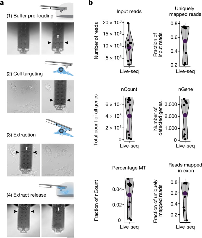
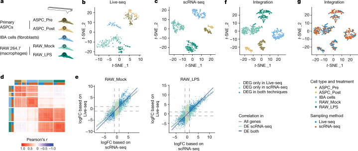
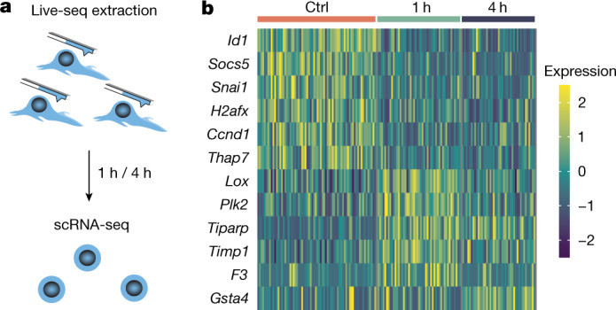
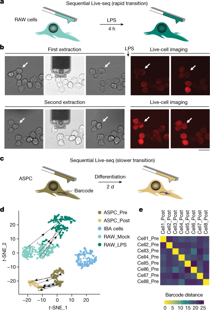
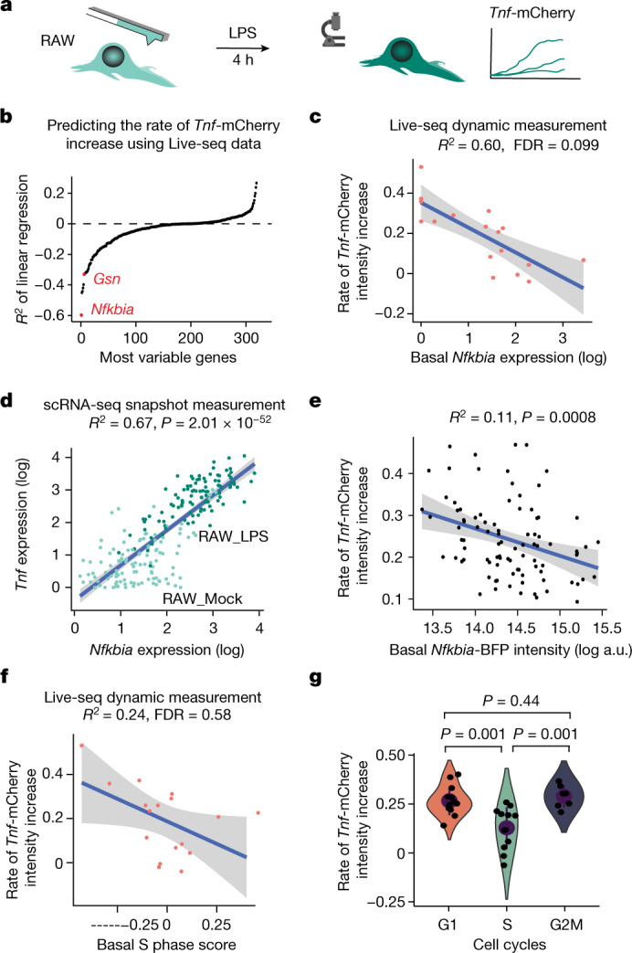
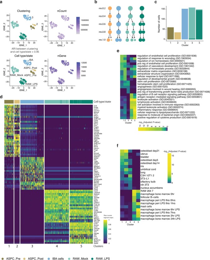
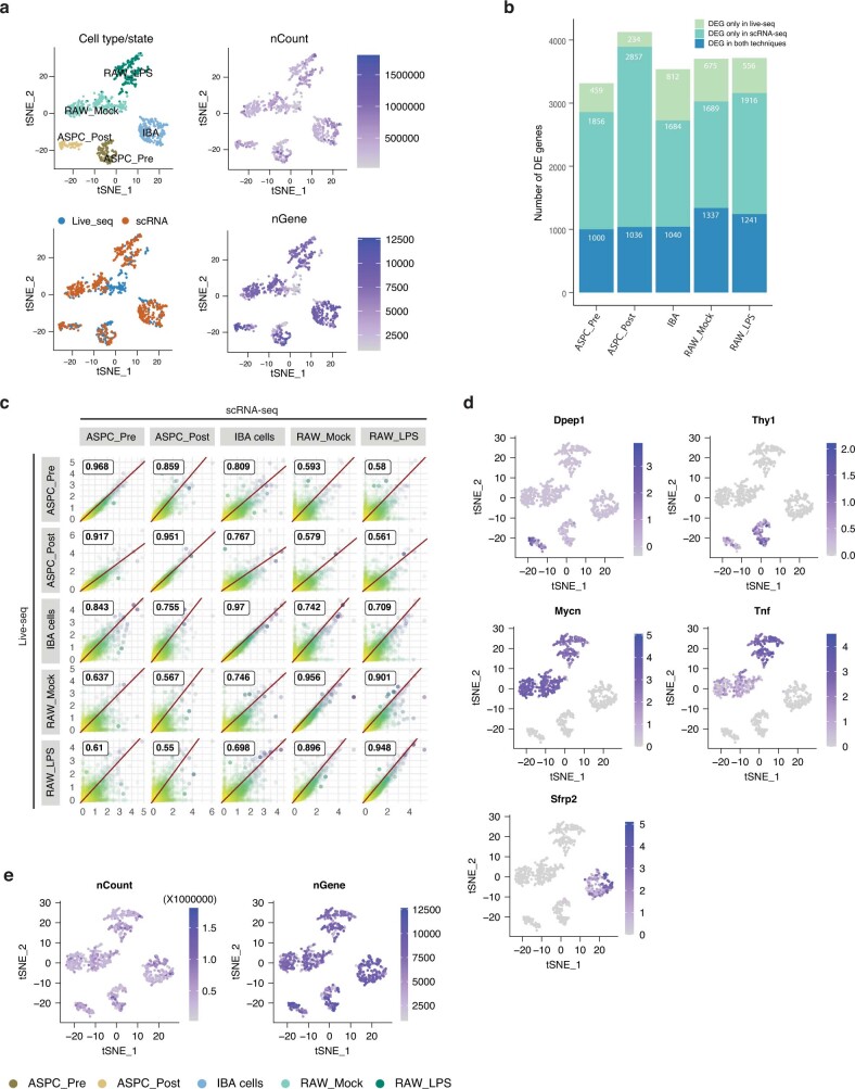
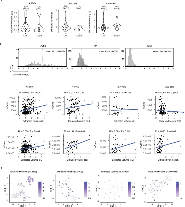
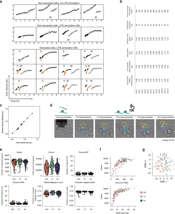
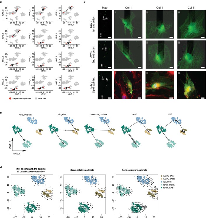
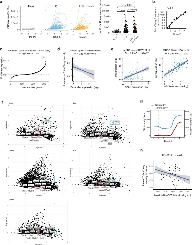
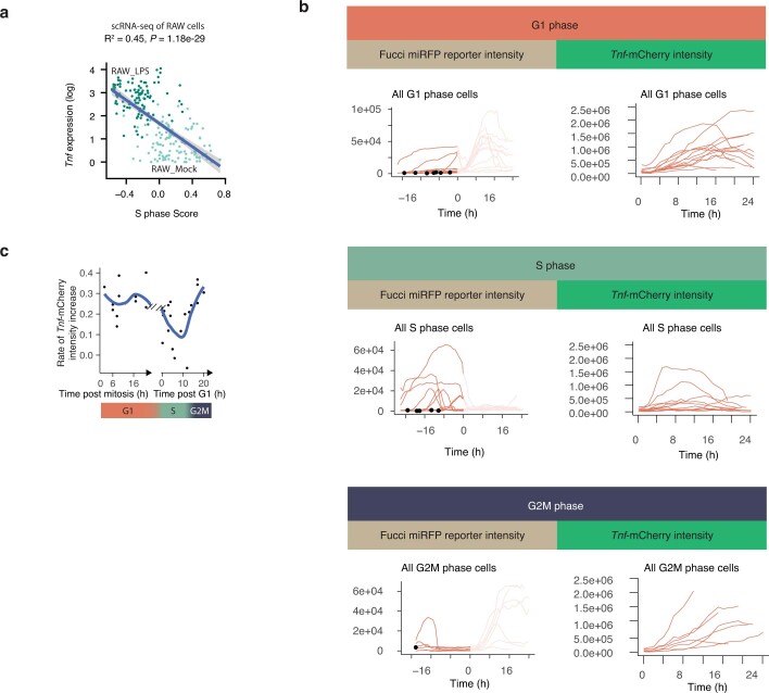
Single-cell transcriptomics (scRNA-seq) has greatly advanced our ability to characterize cellular heterogeneity1. However, scRNA-seq requires lysing cells, which impedes further molecular or functional analyses on the same cells. Here, we established Live-seq, a single-cell transcriptome profiling approach that preserves cell viability during RNA extraction using fluidic force microscopy2,3, thus allowing to couple a cell's ground-state transcriptome to its downstream molecular or phenotypic behaviour. To benchmark Live-seq, we used cell growth, functional responses and whole-cell transcriptome read-outs to demonstrate that Live-seq can accurately stratify diverse cell types and states without inducing major cellular perturbations. As a proof of concept, we show that Live-seq can be used to directly map a cell's trajectory by sequentially profiling the transcriptomes of individual macrophages before and after lipopolysaccharide (LPS) stimulation, and of adipose stromal cells pre- and post-differentiation. In addition, we demonstrate that Live-seq can function as a transcriptomic recorder by preregistering the transcriptomes of individual macrophages that were subsequently monitored by time-lapse imaging after LPS exposure. This enabled the unsupervised, genome-wide ranking of genes on the basis of their ability to affect macrophage LPS response heterogeneity, revealing basal Nfkbia expression level and cell cycle state as important phenotypic determinants, which we experimentally validated. Thus, Live-seq can address a broad range of biological questions by transforming scRNA-seq from an end-point to a temporal analysis approach.


Conflict of interest statement

The authors declare no competing interests.

Figures

Fig. 1
Fig. 1. Live-seq combines optimized FluidFM-based live-cell biopsy with enhanced Smart-seq2 RNA-seq.
a, Illustration and representative images of the Live-seq sampling procedure using FluidFM (here, applied on brown preadipocyte IBA cells). The white arrows indicate the application of under- or overpressure. The black arrows indicate the amount of buffer and extract in the probe. Scale bar, 20 μm. b, Quality control of Live-seq applied on IBA cells based on the parameters that are listed above each panel. n = 10 cells. nGene, number of detected genes; nCount, total count of all genes; percentage MT, percentage of counts from mitochondrial genes. Error bars represent mean ± s.d.
Fig. 2
Fig. 2. Live-seq enables the stratification of cell type and state (treatment).
a, Experimental setup. 100 nM LPS or PBS was used for RAW_LPS and RAW_Mock, respectively. A chemical cocktail was used to differentiate ASPCs (Methods). ASPC_Pre and ASPC_Post denotes ASPCs pre- and post- (2 days)-adipogenic differentiation induction. b, t-SNE projection of Live-seq data coloured by cell type/states. n = 61 for ASPC_Pre, n = 37 for ASPC_Post, n = 44 for IBA, n = 102 for RAW_Mock, n = 50 for RAW_LPS. c, t-SNE projection of scRNA-seq data (Smart-seq2) coloured by cell type or state. n = 60 for ASPC_Pre, n = 35 for ASPC_Post, n = 153 for IBA, n = 157 for RAW_Mock, n = 149 for RAW_LPS. d, Gene expression correlation (Pearson’s r) between all the cells from both scRNA-seq and Live-seq. e, A direct comparison of the log fold gene expression change derived from Live-seq and scRNA-seq data when comparing the cluster of cells corresponding to a focal cell state (here, left, RAW_Mock and left, RAW_LPS) to the rest of all the cells (Methods). For the correlation, P = 2.2 × 10−16 for all conditions (All genes, DE scRNA-seq and DE both), two-sided F-test. f, g, Visualization of Live-seq and scRNA-seq data after anchor-based data integration (Methods) reveals no obvious molecular differences. t-SNE projection of the integrated Live-seq and scRNA-seq data according to cell type and state (treatment) (f) and approach (g).
Fig. 3
Fig. 3. Live-seq induces few expression changes.
a, Schematic of the experimental design to evaluate putative transcriptomic changes after Live-seq extraction. IBA cells were first extracted after which they were collected and subjected to scRNA-seq 1 h and 4 h postextraction. Cells that were not extracted were included as controls. b, All of the genes (12) that were found DE between the control and Live-seq-sampled IBA cells from a.
Fig. 4
Fig. 4. Live-seq enables sequential single-cell transcriptomic sampling.
a, Schematic illustrating the sequential sampling procedure in a rapid cell state transition model: LPS stimulation of RAW cells. b, Time-lapse brightfield and mCherry fluorescence images of sequential Live-seq sampling in RAW cells (that is, sequential extractions). The white arrow points to the sequentially sampled cell. Representative images of one of the 24 sequentially sampled cells are shown. Scale bar, 20 μm. c, Schematic illustrating the sequential sampling procedure in a slower cell state transition model: adipogenic differentiation of ASPCs. d, t-SNE-based visualization of integrated Live-seq and scRNA-seq data, highlighting the direct trajectory of sequentially sampled cells (12 cells in total) from one state to another. e, Heatmap showing the Hamming distance of the tracking barcodes among the sequentially sampled ASPCs (Methods).
Fig. 5
Fig. 5. Live-seq links transcriptomic state with subsequent functional analysis on the same cells.
a, Schematic illustrating the coupling of Live-seq with live-cell imaging. RAW cells were first subjected to Live-seq and subsequently exposed to LPS while tracking Tnf-mCherry fluorescence by time-lapse imaging. b, A linear regression model was used to predict the slope (the rate of Tnf-mCherry fluorescence intensity increase) calculated from data shown in Extended Data Fig. 9b and Supplementary Fig. 7 on the basis of ground-state gene expression data recorded by Live-seq. The most variable genes from both Live-seq and scRNA-seq data were used, whereas genes with dispersion <0.1 in Live-seq samples were removed (Methods). c, Basal Nfkbia expression, as determined by Live-seq, anticorrelates with the rate of Tnf-mCherry fluorescence intensity increase. R2 and FDR are listed. d, The expression of Nfkbia and Tnf is highly correlated in conventional scRNA-seq data. P = 2 × 10−52, two-sided F-test. e, Validation of Nfkbia expression as a predictor of the extent by which a macrophage will respond to LPS using a Nfkbia-BFP reporter (Methods). n = 91, R2 = 0.11, P = 0.0008, two-sided F-test; Pearson’s r = −0.34, P = 0.0008. Another biological replicate is shown in Extended Data Fig. 9h. a.u., arbitrary units. f, The (basal) cell cycle S phase score of Live-seq samples (inferred from respective transcriptomes) anticorrelates with the rate of Tnf-mCherry fluorescence intensity increase, suggesting that cells in S phase respond weaker to LPS treatment. R2 and FDR values are listed. The error band (cf) represents the s.d. g, Validation of cells in S phase responding weaker to LPS exposure using a Fucci cell cycle indicator (Extended Data Fig. 10b,c and Methods). n = 32 cells over two independent experiments. Error bars represent the mean ± s.d. and P values were determined by a two-sided Wilcoxon rank-sum test.
Extended Data Fig. 1.
Extended Data Fig. 1.. Supporting data of Fig. 1.
(a) cDNA yields of different amounts of total RNA input using Smart-seq2. 10/10: 10% of the material reverse transcribed from 10 pg total RNA was used for PCR amplification. N = 3 replicates. P values determined by two-sided t-tests comparing each condition to 0 pg input RNA. (b) Enhanced Smart-seq2 is more sensitive than the original Smart-seq2 in the low input range (0.5–2 pg). N = 3 replicates for all conditions. P values determined by two-sided t-tests. Two and three distinct experiments were performed in a) and b), respectively, yielding consistent results. (c) Quality control of enhanced Smart-seq2 based on the parameters listed above each panel, comparing negative control (0 pg, N = 4 replicates) to IBA cell RNA (1 pg, N = 3 replicates). nGene: number of detected genes. nCount: total count of all genes. Percent MT: percentage of counts from mitochondrial genes. (d) Cumulative proportion of each library (y axis) assigned to the top-expressed genes (x axis). The top 20 genes absorb around 95% of all the reads in the negative control (N = 4 replicates), while the ~700 top genes take that same portion of reads in samples with 1 pg input RNA (N = 3 replicates). The dashed line indicates the 95% proportion. (e) Overview of the sequences overrepresented in the negative control, mostly from the oligo-dT and TSO. (f) Proportion of reads mapped to each gene in negative control samples. The top 20 genes account for more than 90% of all reads. (g) Human (HeLa) and mouse (IBA) cells were sampled alternatively with the same probe. The number of reads mapped to the human and mouse genomes were determined for each sample to assess potential cross-sample contamination. Error bars represent the mean +/− SD.
Extended Data Fig. 2
Extended Data Fig. 2. Quality control of Live-seq data, relative to Fig. 2.
(a) Number of input reads (input reads), the rate of reads uniquely mapped to the genome (uniquely mapped reads), the fraction of reads mapped to exons (Reads mapped in exon), total counts of all genes (nCount), number of detected genes (nGene) and the percentage of counts from mitochondrial genes (percent MT) are shown per cell type/state for Live-seq samples/libraries passing the quality control. N = 5 replicates, a total of 294 cells. (b) tSNE-based visualization of clusters, cell types/states, cell lines, replicates, number of genes (nGene), and number of counts (nCount) of the Live-seq data. The Adjusted Rand Index (ARI) between the clustering and cell type/state classification is indicated. (c) Clustering tree of the Seurat-based clustering results of the Live-seq data. It visualizes the relationship between clustering at increasing resolutions (top to bottom). The size of the circles represents the number of cells in that cluster, while the opacity of the arrows shows the proportion of the cells passing from one cluster to another at a different resolution. Note that the ASPCs do not split by treatment due to batch effect. The clustering was therefore independently adapted for the clustered ASPCs to correctly capture their state difference (see Methods). (d) Barplot showing the overlap in number of cells between the clustering (x-axis) and the ground truth, i.e., cell type/state, displayed in (b). (e-f) tSNE-based visualization of cell type/state, nGene, Clustering, nCount and batch for (e) ASPCs and (f) RAW cells. The ASPCs only contain one batch.
Extended Data Fig. 3
Extended Data Fig. 3. Evaluation of the cell identity as discovered by Live-seq, relative to Fig. 2.
(a) Heatmap showing the top 20 differentially expressed genes of each cluster of the Live-seq data. (b) GO term enrichment of each cluster using the top 100 marker genes. (c) Mouse gene atlas-based prediction of cell type/state of each cluster using the top 100 marker genes.
Extended Data Fig. 4
Extended Data Fig. 4. Quality control of scRNA-seq data, relative to Fig. 2.
(a) tSNE-based visualization of clusters, cell types/states, number of counts (nCount) and number of genes (nGene) of the scRNA-seq data. The Adjusted Rand Index (ARI) between the clustering and cell type/state classification is indicated. (b) Clustering tree of the Seurat-based clustering results of the scRNA-seq data. It visualizes the relationship between clustering at increasing resolutions (top to bottom). The size of the circles represents the number of cells in that cluster, while the opacity of the arrows shows the proportion of the cells passing from one cluster to another at a different resolution. Note that the ASPCs do not split by treatment due to batch effect. The clustering was therefore independently adapted for the clustered ASPCs to correctly capture their state difference (see Methods). (c) Barplot showing the overlap in number of cells between the clustering (x-axis) and the ground truth, i.e. cell type/state, displayed in (a). (d) Heatmap showing the top differentially expressed genes stratified according to the five scRNA-seq clusters. (e) GO term enrichment analysis of the five scRNA-seq clusters using the top 100 differentially expressed genes. (f) Mouse gene atlas-based prediction of cell type/state of each cluster using the top 100 marker genes.
Extended Data Fig. 5
Extended Data Fig. 5. Comparison of Live-seq and scRNA-seq data, relative to Fig.2.
(a) tSNE-based visualization of integrated scRNA-seq and Live-seq data according to cell type or treatment, approach, number of detected genes (nGenes), and total counts of all genes (nCount) without batch correction. (b) Barplot displaying the number of overlapping genes identified as differentially expressed in the Live-seq and scRNA-seq data for each cell type and state versus the rest. (c) The correlation between simulated bulk data (i.e. based on the aggregation of each scRNA-seq or Live-seq expression profile into bulk-like data) across cell type and state (treatment), which shows that the Live-seq and scRNA-seq data are highly correlated. The Pearson correlation value is shown inside each of the subpanels. (d) tSNE-based visualization of marker gene expression on integrated scRNA-seq and Live-seq data. (e) Additional quality controls relative to Fig. 2f: visualization of Live-seq and scRNA-seq data after anchor-based data integration (Methods) according to the number of detected genes and total gene expression count.
Extended Data Fig. 6
Extended Data Fig. 6. Evaluation of the cellular impact of extracting cytoplasm by Live-seq, relative to Fig. 3.
(a) Post-extraction viability as a function of the Live-seq-sampled volumes for ASPC (N = 33), IBA (N = 37) and RAW cells (N = 72). P = 0.44, 0.20, 0.18 for ASPC, IBA and RAW cells (two-sided Wilcoxon rank-sum test), respectively. The lower, centre and upper bounds of the box correspond to the first, second and third quartiles, respectively. The whiskers extend to the largest and smallest value no further than 1.5 inter-quartile range. (b) Cell volume distribution for ASPC (N = 277), IBA (N = 500), and RAW (N = 500) cell populations. (c) The correlations (R2 of linear regression and P value (two-sided F-test)) between extracted cytoplasmic volume and either the number of detected genes (nGene) or total counts (nCount) for each indicated category are shown. (d) tSNE plots of RAW, IBA, and ASPC cells colored by extracted cytoplasmic volume. NA: data not available. Relative to Fig. 2b and Extended Data Fig. 2e, f.
Extended Data Fig. 7
Extended Data Fig. 7. Live-seq preserves a cell’s growth, with additional controls relative to Fig. 3.
(a) Longitudinal measurements of RAW cell volumes. Cells were exposed to LPS at time 0 (vertical line). “X” indicates an extraction and “M” mitosis. After mitosis, both daughter cells were monitored (light and dark grey points). Volumes measured during cell recovery from Live-seq extraction are labeled as orange points. (b) The volume changes, extracted volumes, and recovery times of RAW cells, calculated based on the profiles in (a). (c) Correlation between the measured cell volume loss shown in (a) and the measured cell extract volumes that were measured in the FluidFM probe (see “Determination of the extracted volumes” section in Methods) (R2 = 0.99). (d) Representative time-lapse images showing the division of RAW cells post-Live-seq extraction. Three dividing cells are outlined in colored circles. The cell in the yellow circle was subjected to cytoplasmic extraction, while those in purple and blue were not. 49 extracted cells and 272 non-extracted cells were observed independently; 17 extracted and 54 non-extracted cells divided during 8 h of time-lapse imaging. (e) Quality control of the scRNA-seq data of the control IBA cells, as well as IBA cells 1 h and 4 h post Live-seq extraction, respectively. Relative to Fig. 3. (f) Plotted correlations between the number of detected genes on the one hand and respectively the total count of all genes (nCount, upper panel) and the cDNA yield (lower panel), were indistinguishable between the respective cell categories. (g) A tSNE projection of control IBA cell scRNA-seq (Smart-seq2) data (Ctrl, 70 cells) as well as 1 h (49 cells) and 4 h (43 cells) post Live-seq extraction scRNA-seq (Smart-seq2) data does not reveal clearly distinct clusters based on the top 500 most variable genes.
Extended Data Fig. 8
Extended Data Fig. 8. Supporting data for sequential Live-seq, relative to Fig. 4.
(a) Cell state transition trajectories as measured by sequential Live-seq. The two red dots in each panel represent the same cell. The arrow defines the respective cell state transition. (b) Sequential extraction of ASPCs. The left panels provide an overview of the entire cell culture area, enabling the localization of barcoded, GFP-expressing cells. Scale bars are 1000 μm. The right panels show three representative cells (out of 42 in 5 independent experiments) undergoing extraction at day 0 and day 2, and after nuclear (blue) and lipid staining (red) at day 7. Scale bars are 20 μm. The localization of each cell within the culture area (map) is indicated with a dashed square. (c) Trajectory predictions based on conventional scRNA-seq data using distinct approaches with default settings as contained in the dynverse package. (d) Trajectory prediction using the RNA velocity approach. Different strategies including “kNN pooling with gamma fit on extreme quantiles”, “Gene-relative estimate”, and “Gene-structure estimate” were tested.
Extended Data Fig. 9
Extended Data Fig. 9. Nfkbia basal expression predicts LPS-induced response in RAW cells, relative to Fig. 5.
(a) (Left panels) Overlaid mCherry intensity profiles of individual mock-treated (N = 23), LPS-treated (N = 122), or Live-seq-sampled and then LPS-treated (N = 77) cells. (Right panel) Area Under the Curve (AUC) values for all profiles shown in the left panels. P values were determined by a two-sided Wilcoxon rank-sum test. (b) Relative to Fig. 5a, linear relationship between the time post-LPS treatment (within a 3–7.5h window) and the Tnf-mCherry fluorescence intensity (log transformed) in one cell (see Supplementary Fig. 7 for all other cells). (c) Similar to Fig. 5b, a linear regression model was used to predict the intercept (basal Tnf-mCherry intensity) calculated from data shown in (b and Supplementary Fig. 7) based on ground-state Live-seq-recorded expression data. The Tnf gene is highlighted. (d) Basal Gsn expression anticorrelates with the rate of Tnf-mCherry fluorescence intensity increase. R2 and FDR values are listed. (e) Similar to Fig. 5d, but the expression correlation between Nfkbia and Tnf is shown separately for RAW_Mock and RAW_LPS cells. The R2 and P (F test) values of the linear regression model are shown. (f) Nfkbia is among the most variably expressed LPS-NF-kB pathway genes in primary macrophage cell populations. The expression and the variance of all expressed genes are shown, with genes of the KEGG NF-κB signaling pathway (downstream of the TLR4 receptor) highlighted. (g) Representative Tnf-mCherry and Nfkbia-BFP profiles from a single cell. Similar to endogenous Nfkbia, an in-house engineered Nfkbia-BFP reporter is induced by LPS treatment, synchronously with the Tnf-mCherry reporter, acting as a proxy for Nfkbia expression. LPS was applied at time 0 h (vertical dashed line). (h) Validation of Nfkbia expression as a predictor of a macrophage’s response to LPS (Methods). The basal Nfkbia level, here reflected by Nfkbia-BFP reporter intensity, negatively correlates with the rate of LPS-induced Tnf-mCherry intensity increase. Independent, biological replicate relative to Fig. 5e. R2 = 0.10, P = 0.005, F-test; Pearson’s r = −0.34, P = 0.005. The error band (d, e and h) represents the SD.
Extended Data Fig. 10
Extended Data Fig. 10. The LPS-induced response in RAW cells is weaker in S phase than those in other cell cycle phases, relative to Fig. 5.
(a) The S phase score anti-correlates with Tnf expression in conventional scRNA-seq data. The R2 and P (F test) values of the linear regression model are shown. (b) Cell cycle phases of individual cells were determined using the Fucci reporter miRFP-hCdt1. The Fucci reporter and LPS-induced Tnf-mCherry intensities of the cells assigned to a specific cell cycle phase are merged into one meta-plot, with the information of each cell shown in Supplementary Fig. 8. The time of LPS treatment is defined here as 0. Black dots indicate the mitosis time point. The curves of Fucci reporter after LPS treatment are not considered and are therefore shown in a lighter color. The G1/S boundary is inferred from the time point at which the Fucci reporter intensity drops. Cells that underwent mitosis but did not yet reach the G1/S boundary were annotated as G1 cells. Given the lack of a clearly discernable S/G2M boundary, cells were assigned to either the S or G2M phase based on the post G1/S boundary timing. (c) The rate of Tnf-mCherry fluorescence intensity increase (slope) between 3 to 7.5 h post-LPS treatment was calculated based on profiles in (b). The Fucci reporter was used to time cells based on the G1/S boundary. However, mitosis was used to specifically time G1 cells, as the latter did not yet reach the G1/S boundary (which can be detected using the Fucci reporter), rendering them more difficult to annotate.

Comment in

References

    1. Kolodziejczyk AA, Kim JK, Svensson V, Marioni JC, Teichmann SA. The technology and biology of single-cell RNA sequencing. Mol. Cell. 2015;58:610–620. doi: 10.1016/j.molcel.2015.04.005. - DOI - PubMed
    1. Meister A, et al. FluidFM: combining atomic force microscopy and nanofluidics in a universal liquid delivery system for single cell applications and beyond. Nano Lett. 2009;9:2501–2507. doi: 10.1021/nl901384x. - DOI - PubMed
    1. Guillaume-Gentil O, et al. Tunable single-cell extraction for molecular analyses. Cell. 2016;166:506–516. doi: 10.1016/j.cell.2016.06.025. - DOI - PubMed
    1. Gupta PB, et al. Stochastic state transitions give rise to phenotypic equilibrium in populations of cancer cells. Cell. 2011;146:633–644. doi: 10.1016/j.cell.2011.07.026. - DOI - PubMed
    1. Eling N, Morgan MD, Marioni JC. Challenges in measuring and understanding biological noise. Nat. Rev. Genet. 2019;20:536–548. doi: 10.1038/s41576-019-0130-6. - DOI - PMC - PubMed

MeSH terms