. 2022 Aug 18;12(1):14046.
doi: 10.1038/s41598-022-18380-9.

Utilising low-cost, easy-to-use microscopy techniques for early peritonitis infection screening in peritoneal dialysis patients

Affiliations

Utilising low-cost, easy-to-use microscopy techniques for early peritonitis infection screening in peritoneal dialysis patients

Mark Buckup et al. Sci Rep. .

Abstract

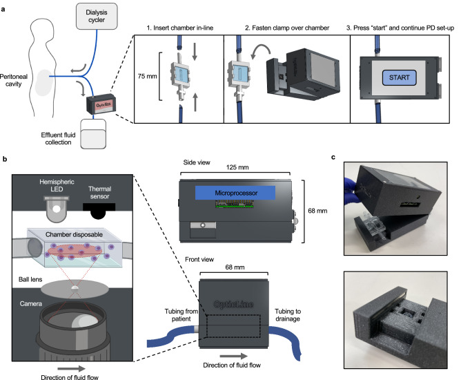
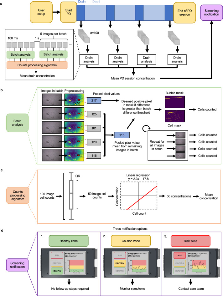
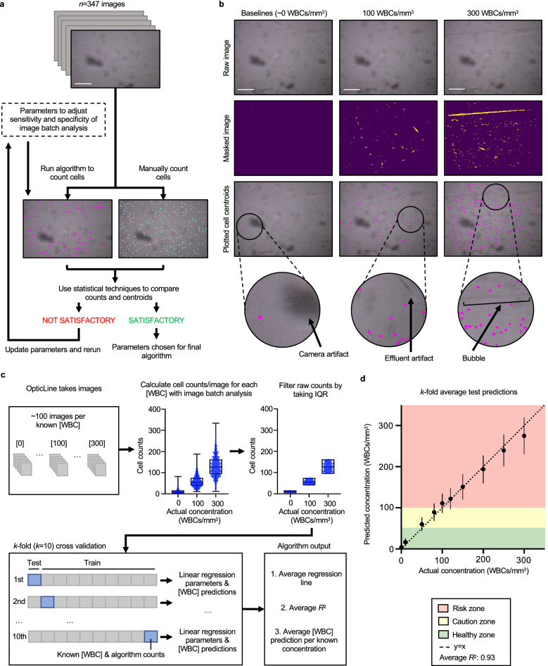
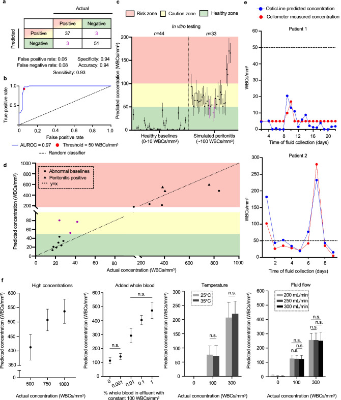
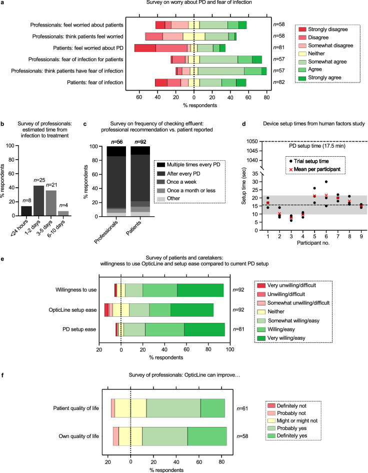
Peritoneal dialysis (PD) patients are at high risk for peritonitis, an infection of the peritoneum that affects 13% of PD users annually. Relying on subjective peritonitis symptoms results in delayed treatment, leading to high hospitalisation costs, peritoneal scarring, and premature transition to haemodialysis. We have developed and tested a low-cost, easy-to-use technology that uses microscopy and image analysis to screen for peritonitis across the effluent drain tube. Compared to other technologies, our prototype is made from off-the-shelf, low-cost materials. It can be set up quickly and key stakeholders believe it can improve the overall PD experience. We demonstrate that our prototype classifies infection-indicating and healthy white blood cell levels in clinically collected patient effluent with 94% accuracy. Integration of our technology into PD setups as a screening tool for peritonitis would enable earlier physician notification, allowing for prompt diagnosis and treatment to prevent hospitalisations, reduce scarring, and increase PD longevity. Our findings demonstrate the versatility of microscopy and image analysis for infection screening and are a proof of principle for their future applications in health care.


Conflict of interest statement

The authors declare the following competing interests: M.B., J.K., A.B., and E.G. are inventors on a Patent Cooperation Treaty (PCT) international patent covering the microscopy-based white blood cell detection method and the device’s mechanical and computational design (International Publication No. WO 2022/165270), which was published on August 4, 2022. The following authors declare no competing interests: R.V., A.J., S.S., C.W., and K.S.

Figures

Figure 1
Figure 1
Overview of OpticLine use and mechanical construction. (a) The OpticLine chamber is inserted in-line with the drainage tubing, between the drain line and effluent fluid collection, when the patient is setting up for their peritoneal dialysis (PD) session. The OpticLine clamp then clamps over the chamber and images effluent as it flows through the clamp during drain times. The user interacts with the device via a touchscreen on the top of the clamp, and presses “Start” when they begin their PD session. Created with Onshape.com. (b) As labelled on front and side views, the clamp is 125 mm long, 68 mm wide, and 68 mm tall. The top part of the clamp contains the microprocessor. The expanded view on the left shows the clamp’s optical components in relation to the viewing chamber. The top part of the clamp contains a hemispheric LED that provides backlight for the lens, and a thermal sensor that detects fluid flow through the chamber and signals to the microprocessor that the camera should begin capturing images. The bottom part of the clamp contains the camera, which is connected to the microprocessor, and a ball lens that magnifies the camera’s view 140×. Created with Onshape.com and BioRender.com. (c) Photographs of an OpticLine prototype. The top photo shows the entire clamp with the chamber inserted. The bottom photo is a close-up of the clamp’s optical interface. The microscope lens is recessed in the square hole, and the four small rectangular divots mate with prongs on the chamber to prevent it from sliding during use.
Figure 2
Figure 2
Computational design. (a) During a peritoneal dialysis (PD) session, OpticLine captures 100 images during each drain in batches of 5 spaced 100 ms apart, with a gap of 1 s between batches. Each batch is independently analysed and fed into the counts processing algorithm, which calculates the mean white blood cell (WBC) concentration for each drain. These mean drain concentrations are then averaged to a final mean PD session concentration. This concentration, along with a “healthy, caution, or risk” notification is reported to the patient at the end of their PD session. (b) The images in each batch are preprocessed with a series of filters and blurs. The value of each pixel in each batch image is evaluated against the average value of the pooled pixels at the same (x, y) coordinates in the other four images of the batch. If the difference between the value of one pixel in an image and the average value of the pooled pixels at that location in the other four images is greater than the defined batch difference threshold, that pixel is marked as positive in the cell mask. This mask is analysed to calculate the number of cells. (c) Our algorithm takes the interquartile range (IQR) of the cell counts for each set of 100 images to eliminate outliers, leaving 50 cell counts for each drain. These 50 counts are then converted to concentrations with the linear regression model developed during algorithm training. These 50 concentrations are then averaged to report the mean WBC concentration for the drain. (d) Example screen displays. At the end of a PD session, OpticLine displays a graph of the patient’s WBC concentration throughout the duration of the session; the average, maximum, and minimum WBC concentration for the session; and a notification reporting whether the session’s mean WBC concentration falls in the healthy, caution, or risk zone. If the concentration is healthy, no follow-up steps are required; if in the caution zone, patients are advised to monitor their symptoms; if in the high-risk zone, the patient is recommended to contact their care team immediately for further testing.
Figure 3
Figure 3
White blood cell counting algorithm training and validation. (a) White blood cell (WBC) counts from the image batch analysis algorithm were compared to manual counts from one rater across concentrations 0, 10, 50, 100, 200, and 300 WBCs/mm3 to determine optimal parameters for maximising specificity and sensitivity using 347 images taken by OpticLine. No cell staining was used for manual counting. Parameter optimisation was iterative, and the final selected parameters produced algorithm cell counts that had the least significant difference with manual counts, evaluated with Wilcoxon signed-rank tests (with continuity correction) and Pearson correlation coefficients. Scale bar represents 200 μm. (b) Algorithm cell centroid outputs using optimal parameters for images of WBCs in patient effluent at concentrations of 0, 100, and 300 WBCs/mm3. Raw images (top row) are masked (middle row) and cell centroids are plotted on the raw images (bottom row). Arrows highlight artifacts from the camera and moving effluent. Scale bar represents 200 μm. (c) Batches of images (n = 100) of each tested WBC concentration were run through the image batch analysis algorithm to output raw cell counts. To limit noise, raw counts were filtered by taking the interquartile range (IQR), only keeping the middle 50% of the counts. k-fold cross validation (k = 10) was performed on the filtered counts to train and test predictions for WBC concentrations. Within each iteration, 10% of the data was used for testing and the remaining 90% was used for training an ordinary least squares linear regression model. An average regression line, R2, and WBC concentration predictions per known concentrations are output. (d) Graph of the k-fold average test predictions across k = 10 iterations of the cross validation vs. actual concentrations of the effluent samples. Error bars are s.d. The predicted and actual WBC concentrations were similar, falling close to one-to-one correlation as represented by the y = x line (dotted line) with average R2 across the k = 10 iterations of 0.93.
Figure 4
Figure 4
In vitro results using clinically collected patient effluent samples. (a) Confusion matrix for 94 peritoneal dialysis patient effluent samples using a 50 white blood cells (WBCs)/mm3 threshold separating “positive” for infection caution (yellow, red zones) from “negative” for infection caution (green zone). Some of the healthy baseline samples (0–10 WBCs/mm3) were spiked to a concentration of 100 WBCs/mm3 (n = 33). (b) The receiver operating characteristic (ROC) curve, evaluated by varying the binary classification threshold from 0 WBCs/mm3 to the maximum WBC concentration prediction in the dataset. The area under the ROC (AUROC) was 0.97. The red marker denotes the threshold balancing sensitivity and specificity (50 WBCs/mm3). The dotted line represents the ROC of a random classifier for comparison. (c) Predicted WBC concentrations for effluent samples with healthy baseline concentrations (n = 44) (left) and those spiked to about 100 WBCs/mm3 (n = 33) (right). Predicted concentrations were classified in the healthy zone if < 50 WBCs/mm3 (green), caution zone if between 50 WBCs/mm3 and 100 WBCs/mm3 (yellow), and in the risk zone if ≥ 100 WBCs/mm3 (red). False negatives are shown as purple markers. Error bars are s.d. (d) Predicted WBC concentrations of effluent samples with elevated baseline WBC concentrations above 10 WBCs/mm3 (n = 17) (circle markers), including three lab-confirmed peritonitis-positive samples (triangle markers). Most samples with concentration greater than 10 WBCs/mm3 are correctly classified; three false positives are shown as purple markers. (e) Comparison of predicted WBC concentrations in patient effluent collected over time from OpticLine (blue) and a lab-grade Cellometer (red). The dotted line represents the binary classification threshold of 50 WBCs/mm3. f, Predicted WBC concentrations across different sample levels for four potential confounders. High WBC concentrations were produced by spiking WBCs in patient effluent (left). Percent whole blood was added to effluent spiked to a concentration of 100 WBCs/mm3 (left, middle). Temperature (right, middle) and effluent flow rate (right) at sample measurement were also evaluated. For an actual concentration of 0 WBCs/mm3, OpticLine predicted concentrations of 0 WBCs/mm3 with no s.d. at both tested temperatures. Error bars are s.d. “n.s.” represents no statistically significant difference between the given samples.
Figure 5
Figure 5
Market research and human factors study results. Percentage of respondents shown on the x-axis (a, e, f) or y-axis (b, c) and number of respondents (n) shown on the right y-axis (a, e, f) or above each response bar (b, c). (a) Seven-point Likert scale results comparing opinions from professionals and current and past patients and caretakers on worry about peritoneal dialysis (PD) (top three), and fear of peritonitis (bottom three). Professionals were asked if they feel worried about patients and if they think patients feel worried right before, during, or right after a PD session. Similarly, professionals were asked if they are afraid for their patients and if they think their patients are afraid of potential infection when they set up or do PD. (b) Professional respondents who see patients selected time bins (x-axis) for estimated duration of a five-step process from peritoneal infection to treatment. Dark to light grey bars (left to right) represent shortest to longest time options, respectively. (c) Reported recommendation for frequency of chequeing effluent from professionals who see patients versus frequency reported by current and past patients and caretakers from both studies. Dark to light grey sections (top to bottom) represent highest to lowest frequency, respectively. (d) Device setup times (s) from the human factors study for nine participants. Black circles represent three individual trial times per participant. Red “x” markers represent mean setup time among trials for each participant. Mean setup time across all trials and participants (15.6 s) shown with bottom dotted line; grey bar represents ± s.d. (5.9 s). This compares to the average PD setup time of 1050 s or 17.5 min (top dotted line). (e) Seven-point Likert scale responses from past, current, and prospective patients and caretakers on willingness to use OpticLine (top bar), how difficult they think it would be to set up OpticLine (middle bar), and for current and past patients and caretakers, the difficulty of their PD setup (bottom bar). (f) Professional respondents ranked on a five-point Likert scale for thinking the device could significantly improve PD patients’ quality of life and their own quality of life.

Similar articles

Cited by

References

    1. Jain AK, Blake P, Cordy P, Garg AX. Global trends in rates of peritoneal dialysis. J. Am. Soc. Nephrol. 2012;23:533–544. doi: 10.1681/ASN.2011060607. - DOI - PMC - PubMed
    1. Aguirre AR, Abensur H. Protective measures against ultrafiltration failure in peritoneal dialysis patients. Clinics. 2011;66:2151–2157. doi: 10.1590/S1807-59322011001200023. - DOI - PMC - PubMed
    1. Li PK-T, et al. ISPD peritonitis recommendations: 2016 update on prevention and treatment. Perit. Dial. Int. J. Int. Soc. Perit. Dial. 2016;36:481–508. doi: 10.3747/pdi.2016.00078. - DOI - PMC - PubMed
    1. Sinnakirouchenan R, Holley JL. Peritoneal dialysis versus hemodialysis: Risks, benefits, and access issues. Adv. Chronic Kidney Dis. 2011;18:428–432. doi: 10.1053/j.ackd.2011.09.001. - DOI - PubMed
    1. Fried L, Abidi S, Bernardini J, Johnston JR, Piraino B. Hospitalization in peritoneal dialysis patients. Am. J. Kidney Dis. 1999;33:927–933. doi: 10.1016/S0272-6386(99)70428-2. - DOI - PubMed

Publication types