Review
. 2022 Nov;31(11):1140-1152.
doi: 10.1002/pds.5529. Epub 2022 Sep 9.

Visualizations throughout pharmacoepidemiology study planning, implementation, and reporting

Affiliations
Review

Visualizations throughout pharmacoepidemiology study planning, implementation, and reporting

Nicolle M Gatto et al. Pharmacoepidemiol Drug Saf. 2022 Nov.

Abstract

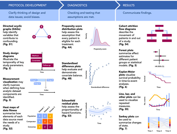
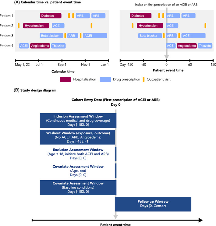
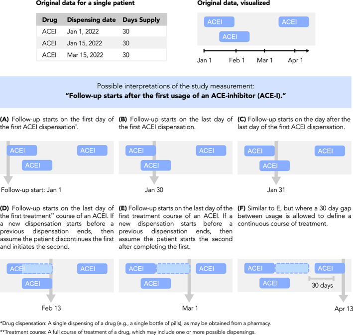
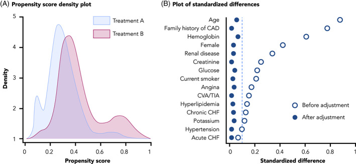
Transparency is increasingly promoted to instill trust in nonrandomized studies using real-world data. Graphics and data visualizations support transparency by aiding communication and understanding, and can inform study design and analysis decisions. However, other than graphical representation of a study design and flow diagrams (e.g., a Consolidated Standards of Reporting Trials [CONSORT] like diagram), specific standards on how to maximize validity and transparency with visualization are needed. This paper provides guidance on how to use visualizations throughout the life cycle of a pharmacoepidemiology study-from initial study design to final report-to facilitate rationalized and transparent decision-making about study design and implementation, and clear communication of study findings. Our intent is to help researchers align their practices with current consensus statements on transparency.

Keywords: data visualizations; graphs; pharmacoepidemiology.


Conflict of interest statement

Dr. Gatto, Ms. Mattox and Dr. Rassen are employees of Aetion, Inc., with stock options or existing equity. Dr. Gatto also owns stock in Pfizer Inc. Dr. Wang receives salary support as PI for investigator‐initiated grants to Brigham and Women's Hospital from Novartis, Johnson & Johnson, and Boehringer Ingelheim and is a consultant to Aetion for unrelated work. She is also PI on grants from the National Institute of Aging, Laura and John Arnold Foundation and the FDA Sentinel Initiative. She co‐directs the REPEAT Initiative, a non‐profit program with projects focused on increasing transparency and reproducibility of database studies. Dr. Murk is a contractor of and owns shares in Aetion, Inc., a technology company that provides analytic software and services to the healthcare industry. Dr. Brookhart serves on scientific advisory committees for Amgen, Astellas/Seagen, Atara Biotherapeutics, Brigham and Women's Hospital, Gilead, Kite, NIDDK, and Vertex; he receives consulting fees and owns equity in Target RWE. Dr. Bate is a full‐time employee of GSK and holds stock and stock options at Pfizer and GSK. Dr. Schneeweiss is participating in investigator‐initiated grants to the Brigham and Women's Hospital from Boehringer Ingelheim and UCB unrelated to the topic of this study. He is a consultant to Aetion Inc., a software manufacturer of which he owns equity. He is an advisor to Temedica GmbH, a patient‐oriented data generation company. His interests were declared, reviewed, and approved by the Brigham and Women's Hospital in accordance with their institutional compliance policies.

Figures

FIGURE 1
FIGURE 1
Visualizations throughout the life cycle of a pharmacoepidemiology study. Visualizations included in Figure 1 are simple illustrative examples of visualizations included in the paper and Appendix S1.
FIGURE 2
FIGURE 2
Calendar time, patient event time, and study design diagrams. A, Patient events for four different patients are visualized, arranged according to calendar time (left) or patient event time (right). Patient event time is defined relative to an index date, in this case the first prescription of an ACE‐inhibitor (ACEI) or angiotensin receptor blocker (ARB). Events recorded as spanning intervals of time (e.g., hospitalizations and drug prescriptions) are represented as boxes, while events recorded in a single moment of time (e.g., outpatient visits) are represented as lines. B, An example study design diagram. Source: Adapted from www.repeatinitiative.org/projects.html
FIGURE 3
FIGURE 3
Measurement visualization. Definitions of study measurements such as time anchors may be made ambiguous by insufficiently detailed textual descriptions or may be complicated by nuances of underlying data. For example, consider the definition “Follow‐up starts after the first use of an ACE‐inhibitor (ACE‐I).” Such a definition is ambiguous because “after the first usage” is not well‐defined, as shown here. Furthermore, periods of drug usage recorded in the data may overlap in time or have gaps between them, requiring the researcher to make assumptions about how a drug is used by a patient. Examples of this are shown here, depicting drug data for a single patient and how different interpretations of the follow‐up start date may be applied to it. Illustration of case examples of patient data and how a measurement definition accommodates them can help the researcher be more precise and take into account data nuances during protocol development
FIGURE 4
FIGURE 4
Visualizations to assess for positivity and confounder balance. A, A propensity score density plot, adapted from Webster‐Clark et al. B, A plot of standardized differences, adapted from Austin PC
FIGURE 5
FIGURE 5
Example and recommendations for forest plots
FIGURE 6
FIGURE 6
Example and recommendations for Kaplan–Meier plots
FIGURE 7
FIGURE 7
Sankey plots. A, An example of a Sankey plot, with colors representing transitions between all groups. B, The same plot but simplified, where colors are used only to highlight specific transitions of interest. In this case, transitions from Drug A to any other drug are highlighted. Other options to focus the presentation are also possible, such as highlighting transitions to higher lines of therapy (e.g., Drug A to B, B to C, A to C, etc.)
FIGURE 8
FIGURE 8
Improving the visual style of figures. A, Plots can be Simplified by removing design elements that do not contribute to understanding of the data, such as superfluous shading or line borders, as shown here. B, Redundant information should be removed from plots, such as repeated percentage signs on axis labels, or over‐abundant tick mark labels. C, Careful consideration should be given to the use of space in a plot. In this example of a forest plot, there is an over‐abundant amount of spacing between rows, columns, and the scale of the X‐axis on the forest plot. D, An example of the same plot but with improved use of space

References

    1. Orsini LS, Berger M, Crown W, et al. Improving transparency to build trust in real‐world secondary data studies for hypothesis testing—why, what, and how: recommendations and a road map from the real‐world evidence transparency initiative. Value Health. 2020;23(9):1128‐1136. doi:10.1016/j.jval.2020.04.002 - DOI - PubMed
    1. Wang SV, Schneeweiss S, Berger ML, et al. Reporting to improve reproducibility and facilitate validity assessment for healthcare database studies V1.0. Pharmacoepidemiol Drug Saf. 2017;26(9):1018‐1032. doi:10.1002/pds.4295 - DOI - PMC - PubMed
    1. Wang SV, Pinheiro S, Hua W, et al. STaRT‐RWE: structured template for planning and reporting on the implementation of real world evidence studies. BMJ. 2021;372:m4856. doi:10.1136/bmj.m4856 - DOI - PMC - PubMed
    1. Boers M. Designing effective graphs to get your message across. Ann Rheum Dis. 2018;77(6):833‐839. doi:10.1136/annrheumdis-2018-213396 - DOI - PubMed
    1. Wainer H. How to display data badly. Am Stat. 1984;38(2):137‐147. doi:10.1080/00031305.1984.10483186 - DOI

Publication types