. 2022 Sep 5;4(3):lqac062.
doi: 10.1093/nargab/lqac062. eCollection 2022 Sep.

Interpreting alignment-free sequence comparison: what makes a score a good score?

Affiliations

Interpreting alignment-free sequence comparison: what makes a score a good score?

Martin T Swain et al. NAR Genom Bioinform. .

Abstract

Alignment-free methods are alternatives to alignment-based methods when searching sequence data sets. The output from an alignment-free sequence comparison is a similarity score, the interpretation of which is not straightforward. We propose objective functions to interpret and calibrate outputs from alignment-free searches, noting that different objective functions are necessary for different biological contexts. This leads to advantages: visualising and comparing score distributions, including those from true positives, may be a relatively simple method to gain insight into the performance of different metrics. Using an empirical approach with both DNA and protein sequences, we characterise different similarity score distributions generated under different parameters. In particular, we demonstrate how sequence length can affect the scores. We show that scores of true positive sequence pairs may correlate significantly with their mean length; and even if the correlation is weak, the relative difference in length of the sequence pair may significantly reduce the effectiveness of alignment-free metrics. Importantly, we show how objective functions can be used with test data to accurately estimate the probability of true positives. This can significantly increase the utility of alignment-free approaches. Finally, we have developed a general-purpose software tool called KAST for use in high-throughput workflows on Linux clusters.


Figures

Figure 1.
Figure 1.
The fraction of correct protein ortholog predictions (based on top ranked hit) and AUC (area under the receiver-operator curve (ROC)) for the scoring metrics given in the key (centre of figure) with different k-mer lengths. ‘Yeasts’ involves S. pombe proteins compared to S. cerevisiae, and ‘Fly-worm’ involves C. elegans proteins compared to D. melanogaster.
Figure 2.
Figure 2.
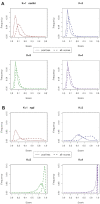
Score distributions showing the frequency of occurrence (y-axis) of each score (x-axis) for (A) the weakly performing Euclidian, and (B) strongly performing NGD metrics. K-mers ranging from 1 to 4 amino-acids are considered, with the distributions given for two data sets: (i) positives for the true positive-only scores (solid line); and (ii) all-scores (dashed line). These results are for the yeasts system. Note the overlap between the distributions increases for the Euclidian metric, for longer k-mers, while NGD retains significant separation between the distributions.
Figure 3.
Figure 3.
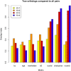
The overlapping index between the curves from the positive-only distribution (true protein orthologs) and the distribution of all-scores, for all protein pairs in the yeasts system. The smaller the overlap index, the better the predictive performance. The Euclidian, Chebyshev and Canberra metrics all give poor performance for k-mers 3 and 4 in particular.
Figure 4.
Figure 4.
The correlation between mean protein sequence length and the score of true positive sequence pairs, for the weakly performing Euclidian metric with different k-mer lengths. The test was performed with Spearman’s rank correlation and the values of Rho are given in the figure. In each case, the P-value is below 2.2e–16. Contour lines indicate the density of the dots. Large correlations are observed for longer k-mers, where performance is weakest for this metric.
Figure 5.
Figure 5.
The correlation between protein sequence length and score for different metrics and k-mer lengths are summarised, for the ‘positives’ data set. The test was performed with Spearman’s rank correlation and the values of rho are given by the correlation magnitude (absolute values of rho). In each case, the P-value is less than 2.2e–16. These data are from the fly-worm system. Correlations of higher absolute magnitude tend to associate with weaker performance.
Figure 6.
Figure 6.
Controlling protein sequence length may lead to improvements of performance. The black bar gives the fraction correct with no applied length constraints, whilst the coloured bars give the fraction correct when the sequence length is constrained using the fp parameter in KAST, as given in the legend. For example fp=0.75 may be interpreted as the smallest of the sequence pair having at least 75% of the length of the longest: only sequence pairs that meet this condition are scored and ranked. The Manhattan, D2, and Euclidian metrics in particular show improved performance. These data are from the fly-worm system with k-mer length 2 amino acids.
Figure 7.
Figure 7.
Selecting a cut-off score to optimise positive predictions. For protein sequence comparison, the ‘positives’ and ‘all-scores’ histograms are summed over the scores, from 0.0 to 1.0, to give the cumulative score frequencies. They are plotted as black lines (dots and solid, respectively). The ‘difference’ curve in red is the difference between these two curves. The peak of this curve suggests a score (given in the graph titles), such that the majority of true positive scores lie below this value, while true negatives tend to lie above it. The graphs for four different k-mer lengths are shown with the NGD metric. These data are from the fly-worm system.
Figure 8.
Figure 8.
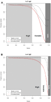
Mapping scores to fractions of correct predictions, to derive likelihoods or probabilities. Curves are shown for protein ortholog prediction for the NGD metric, with (A) k-mer length 3, and (B) k-mer length 4 amino acids, for the yeasts and fly-worm system. The black curves show the fraction of correct predictions when different cut-off scores are applied, while the red curves show how many correct predictions are excluded by applying the cut-off score. The difference between the black curves indicates the error that would be observed if we applied e.g. the yeast probabilities to scores from the fly-worm system. The area of the graph has been further divided into three areas corresponding to score ranges that correspond to high, variable or low accuracy predictions (based on the black curves).
Figure 9.
Figure 9.
The metric used is d2Star, and the comparison has been performed on both (A) the L-equal case (reference and query lengths are equal and given in the x-axis); and (B) L-unequal case (reference is a 250 kb fragment, the query length is given in the x-axis). Longer DNA fragments lead to more accurate predictions than those made with shorter fragments. Increasing k-mer length from 2 to 5 bp improves predictive accuracy for L-unequal, and also for the L-equal case (but not consistently e.g. see K = 5). Here, the species is predicted and the maximum possible accuracy is 74%.
Figure 10.
Figure 10.
Predictions using different metrics. In (A) the L-equal situation, predictions with different metrics and DNA fragments of equal size give similar results, with Chebyshev giving the poorest performance. The situation is more complex in (B) the L-unequal situation: d2Star tends to outperform the others, with Chebyshev again giving the poorest performance. NGD, BC and Canberra are very poor if fragments are not the same length, hence they are not shown for the L-unequal situation.
Figure 11.
Figure 11.
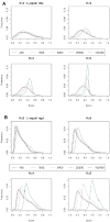
Frequency of occurrence (y-axis) of each score (x-axis) in the all-scores distribution. Results are given for two metrics: (A) d2S, and (B) NGD; with different DNA fragment sizes, and k-mer lengths. In both graphs the distribution is comprised from L-equal fragments, the sizes of which are given in the key. As the fragment sizes get longer, k-mer sampling improves, statistical noise is reduced, and the shapes of the distributions converge towards those of the longest fragments. For the shorter k-mers, the convergence occurs more quickly (i.e. with shorter fragments) than for the longer k-mers.
Figure 12.
Figure 12.
The overlapping index between the score distribution derived for the longest fragment (L = 102.4 kb), and the smaller fragment lengths given by the figure key, are shown. Results are given for four different k-mer lengths and for both the (A) L-equal and (B) L-unequal situations. The closer the overlap index is to 1.0, the better the k-mer sampling, leading to less noise (i.e. a stronger signal). Longer DNA fragments tend to provide better sampling of k-mers and more similar distributions, i.e. greater overlap. An exception occurs for the BC, NGD and Canberra metrics, which perform very badly in the L-unequal situation (when the reference and query sequences have dissimilar lengths).
Figure 13.
Figure 13.
Selecting a score to optimise positive predictions. For DNA sequence comparison, the positive-only or ‘positives’ and the all-scores histograms are summed over the scores, from 0.0 to 1.0 (up to 2.0 for Manhattan), to calculate the cumulative score frequencies. They are plotted as black lines (solid and dots, respectively). The ‘difference’ line in red is the difference between these two curves. The peak of this curve suggests a score (given in the graph titles), such that the majority of true positive scores lie below this value, while true negatives tend to lie above it. The k-mer length has been set to 4 bp, the query length to 25.6 kb, and these results are based on the L-unequal data set. Four different metrics are shown.
Figure 14.
Figure 14.
Mapping scores to fractions of correct predictions, to derive likelihoods or probabilities. The black curves show the fraction of correct predictions when different cut-off scores are applied, while the red curves show how many correct predictions are excluded by applying the cut-off score. Here DNA taxonomy prediction has been performed at two different levels (species and genus) with the Manhattan metric and k-mer lengths 4 bp. In each case, the scores are the same, but the objective function applied to determine true positives (i.e. the fraction correct) is different. Note two very similar red curves are plotted, corresponding to each taxonomic level.

References

    1. Altschul S.F., Madden T.L., Schäffer A.A., Zhang J., Zhang Z., Miller W., Lipman D.J.. Gapped BLAST and PSI-BLAST: a new generation of protein database search programs. Nucleic Acids Res. 1997; 25:3389–3402. - PMC - PubMed
    1. Needleman S.B., Wunsch C.D.. A general method applicable to the search for similarities in the amino acid sequence of two proteins. J. Mol. Biol. 1970; 48:443–453. - PubMed
    1. Smith T.F., Waterman M.S.. Identification of common molecular subsequences. J. Mol. Biol. 1981; 147:195–197. - PubMed
    1. Vinga S., Almeida J.. Alignment-free sequence comparison—a review. Bioinformatics. 2003; 19:513–523. - PubMed
    1. Zielezinski A., Vinga S., Almeida J., Karlowski W.M.. Alignment-free sequence comparison: benefits, applications, and tools. Genome Biol. 2017; 18:186. - PMC - PubMed