. 2022 Sep 9;13(1):5317.
doi: 10.1038/s41467-022-32958-x.

Traject3d allows label-free identification of distinct co-occurring phenotypes within 3D culture by live imaging

Affiliations

Traject3d allows label-free identification of distinct co-occurring phenotypes within 3D culture by live imaging

Eva C Freckmann et al. Nat Commun. .

Abstract

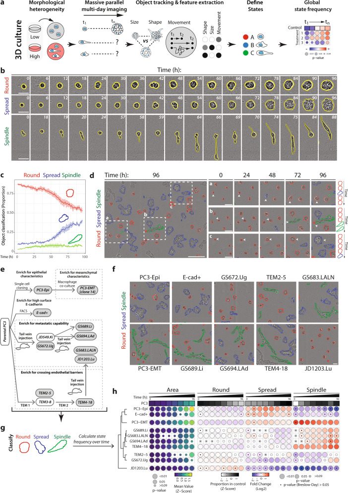
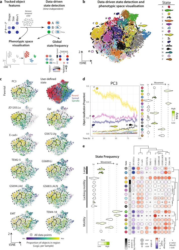
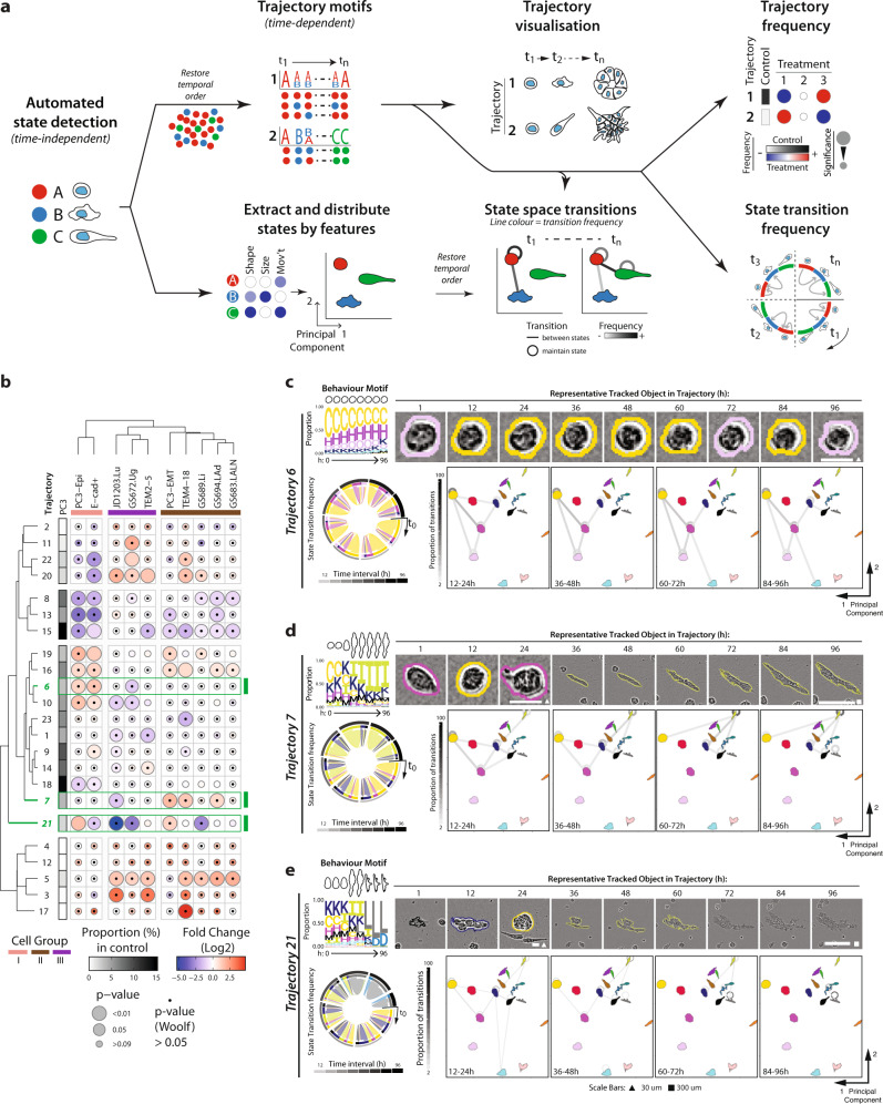
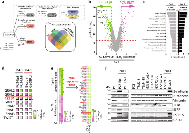
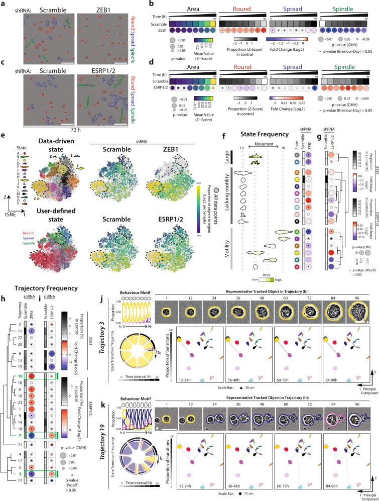
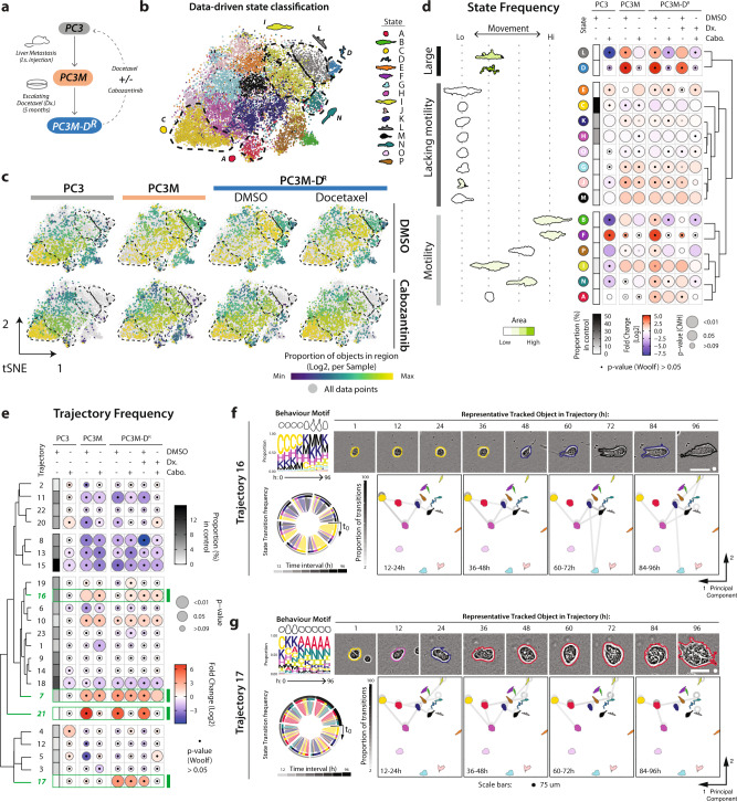
Single cell profiling by genetic, proteomic and imaging methods has expanded the ability to identify programmes regulating distinct cell states. The 3-dimensional (3D) culture of cells or tissue fragments provides a system to study how such states contribute to multicellular morphogenesis. Whether cells plated into 3D cultures give rise to a singular phenotype or whether multiple biologically distinct phenotypes arise in parallel is largely unknown due to a lack of tools to detect such heterogeneity. Here we develop Traject3d (Trajectory identification in 3D), a method for identifying heterogeneous states in 3D culture and how these give rise to distinct phenotypes over time, from label-free multi-day time-lapse imaging. We use this to characterise the temporal landscape of morphological states of cancer cell lines, varying in metastatic potential and drug resistance, and use this information to identify drug combinations that inhibit such heterogeneity. Traject3d is therefore an important companion to other single-cell technologies by facilitating real-time identification via live imaging of how distinct states can lead to alternate phenotypes that occur in parallel in 3D culture.


Conflict of interest statement

E.C.F. was supported by a University of Glasgow Industrial Partnership PhD scheme co-funded by Essen Bioscience, Sartorius Group. All other authors have no competing interests.

Figures

Fig. 1
Fig. 1. Alternate phenotypes occur in parallel within 3D cultures.
a Schema, heterogeneous spheroids imaged in high-throughput over time. Size, shape and movement characteristics extracted for thousands of spheroids. Machine learning used to classify user-defined phenotypic states, frequency of which was quantified over time. b Representative phase images of spheroids exhibiting variable morphology over time. n = 3 independent experiments, 3 wells/condition/experiment. Scale bars, 50μm. c Proportion of PC3 spheroids exhibiting user-defined classification states. Shaded region, s.e.m. across experiments. n = 3 independent experiments, 3 replicates/condition/experiment. Total number of spheroids quantified in Supplementary Table 3. d Representative phase images of spheroids. Outlines, user-defined state classification. Scale bar, 100μm. Time-lapse of boxed regions shown. Arrowheads and schema indicate changes in classification over time. Scale bars, 50 μm. n = 3 independent experiments, 3 wells/condition/experiment. e Schema of PC3 subline derivation. PC3 were selected in vitro for epithelial shape (PC3-Epi), high surface E-Cadherin (E-cad+) or mesenchymal characteristics after macrophage co-culture (PC3-EMT). PC3 were injected into murine tail veins and harvested from alternate metastatic sites; GS689.Li (liver), GS672.Ug (urogenital tract) and GS694.Lad (adrenal gland, after in vivo injection of PC3 JD549.Ki). Sublines were isolated after serial passage across endothelial barriers (TEM2-5 vs TEM4-18). TEM4-18 were injected into tail veins and cells harvested from lymph node (GS683.LALN) and lung mets (JD1203.Lu). f Representative phase images of PC3 subline spheroids, 72 h. Outlines, user-defined state classification. n = 3 independent experiments, 3 wells/condition/experiment. Scale bar, 100μm. g Representative outlines of phenotypes formed by PC3 sublines. h Quantitation of PC3 and sublines. Heatmap shows Area as mean of Z-score normalised values (purple to yellow), and classification into Round, Spread or Spindle as a Log2 Fold Change from control (PC3) (blue to red). Proportion of control at each timepoint is also Z-score normalised (white to black). Bubble size represents p-values, Student’s t-test (two-sided) and Cochran-Mantel-Haenszel test, Bonferroni adjusted, to compare Area and proportion of each classification to control respectively. Dot represents p-value, Breslow-Day test, Bonferroni-adjusted for homogeneity of odds ratio across experimental replicates. n = 3 independent experiments, 3 wells/condition/experiment. Number of spheroids quantified in Supplementary Table 3.
Fig. 2
Fig. 2. Identifying the repertoire of distinct states that occur in 3D cultures.
a Schema, analysis of heterogeneous spheroids, regardless of temporal order, enables data-driven subtype classification, visualisation of phenotypic space, and frequency relative to control. b t-SNE of states in PC3 and sublines. Plot points coloured by data-driven state classification. Black dashed lines highlight regions corresponding to data-driven states mentioned in text. Data comprised of each spheroid identified in each image of the experiment. Number of spheroids quantified in Supplementary Table 3. t-SNE analysis performed on 20,000 objects subsampled via GeoSketch, with iterations = 2000, theta = 0.5, perplexity = 50. c t-SNE of the relative distribution of spheroids for PC3 and sublines. Plot points coloured by user-defined state classifications, and data-driven state enrichment: purple-to-yellow shows per sample proportion of total objects in each data-driven state, quantified before t-SNE. Black dashed lines, highlight regions corresponding to data-driven states mentioned in text. Data comprised of each spheroid identified in each image of the experiment. Number of spheroids quantified in Supplementary Table 3. t-SNE analysis performed on 20,000 objects subsampled via GeoSketch, with iterations = 2000, theta = 0.5, perplexity = 50. d Proportion of PC3 spheroids exhibiting each data-driven state classification over time. Shaded region represents s.e.m. across experiments. n = 3 independent experiments with 3 wells/condition/experiment. Number of spheroids quantified in Supplementary Table 3. Representative outlines shown, arranged by average movement, and coloured by average size (green scale). e Quantitation of data-driven state classifications in PC3 subline pairs. Representative outlines shown, arranged and coloured (light to dark green) by average class motility and size, respectively. Heatmap shows classification of spheroids as a Log2 Fold Change from control (PC3) (blue to red). Proportion of control in each class is shown (white to black). Bubble size represents p values, Cochran-Mantel-Haenszel test (Bonferroni-adjusted), to compare each classification to control. Black dot represents p-value, Woolf test (Bonferroni-adjusted), for homogeneity of odds ratio across experiments. n = 3 independent experiments, 3 wells/condition/experiment, number of spheroids quantified in Supplementary Table 3.
Fig. 3
Fig. 3. Data-driven identification of distinct phenotypes occurring in parallel over time.
a Schema, illustrating analysis of temporal data to determine morphogenesis trajectories. Analysis of size, shape and movement characteristics, regardless of temporal order, enables classification of data-driven states. These states can be visualised by distributing them in 2-dimensional space based on mean features. By restoring temporal ordering of tracked spheroids, a sequence of state events for each spheroid can be generated. Recurring trajectories of state change over time are determined from this, and summarised as a state frequency motif over time. Using the most frequent state at each timepoint, a spheroid is selected to represent each trajectory. Transitions between states are quantified, before visualisation projected onto state space and as a chord diagram. b Heatmap shows quantitation of trajectory classification of spheroids as a Log2 Fold Change from control (PC3) (blue to red). Proportion of control in each trajectory is shown (white to black). Bubble size represents p-values (Cochran-Mantel-Haenszel test) comparing each classification to control. Black dots represent p value (Woolf test) testing homogeneity of odds ratio across experimental replicates. n = 3 independent experiments, 3 wells/condition/experiment. Spheroids quantified, after filtering, in Supplementary Table 5. Trajectories discussed in text, highlighted in green. Trajectories discussed in text highlighted in green. Cell Groups (I, pink; II, brown; III, purple) derived from dendrogram. c–e Trajectory visualisation. Colours represent previously identified states and correspond to those used in Fig. 2b. Behaviour motif depicting frequency (proportion) of states in 12-hour time intervals, with outline of the most abundant state shown at top. Using the most frequent state at each timepoint, a spheroid was selected to represent the trajectory, phase images shown, outline colour indicating state at given timepoint. Scale bars, 30 μm (triangle) and 300μm (square). Transitions between states shown globally as a chord diagram, with time interval in greyscale. PCA used to arrange states in 2-dimensional space; transitions (shown as proportion; greyscale) between (lines) and maintaining (circles) states are overlaid onto this for select time intervals.
Fig. 4
Fig. 4. Deconvolution of molecular pathways underpinning different phenotypes.
a Schema of PC3 subline pairs. Pair 1 is PC3 selected for epithelial shape (PC3-Epi) then made to undergo EMT by co-culture with macrophages (PC3-EMT). Pair 2 is PC3 FACS sorted for high surface E-cadherin (E-cad + ) vs PC3 harvested from a liver metastasis following in vivo selection (GS689.Li). Two PC3-EMT lines stably expressing ZEB1 shRNAs were also examined to identify ZEB1-influenced transcripts. Venn diagram summarizes RNAseq profiling which identifies 36 ZEB1-responsive genes upregulated in both Pair 1 and 2 and depleted upon ZEB1 shRNA-induced knockdown. b Comparison of transcript levels (shown as Log2 Fold Change) in Cell Pair 1 between epithelioid (PC3-Epi) vs invasive (PC3-EMT) samples. p-values shown as -Log10 (Negative Binomial GLM fitting and Wald statistics using DESeq2). c MetaCore analysis of pathways maps from RNAseq profiling of PC3-Epi and PC3-EMT (Pair 1) and E-cad+ and GS689.Li (Pair 2) identified pathways commonly upregulated across both cell pairs in PC3-EMT (vs PC3-Epi) and in GS869.Li (vs E-Cad + ). Molecular processes enriched in these data sets are ranked by p value (MetaCore version on 2017-10-26, -Log10). d Comparison of expression of EMT transcription factors (TFs; GRHL1-3, ZEB1, SNAI1-3, TWIST1) between PC3-Epi and PC3-EMT (Pair 1) and E-cad+ and GS689.Li (Pair 2) cells indicates that ZEB1 is the most upregulated EMT TF in both cell pairs (in PC3-EMT and GS689.Li). Data are presented in the heatmap as Log2 Fold Change from green to magenta. e Comparison of the top and bottom 50 most differentially expressed genes that were concordant between both cell pairs revealed that within the Top 50 epithelioid-associated genes, 20% of these transcripts were altered in expression upon shRNA targeting the transcriptional repressor ZEB1. ZEB1-responsive genes are indicated by red asterisk or red text. f Western blot analysis of PC3 sublines was performed using anti-E-cadherin, N-cadherin, vimentin, ZEB1, ESRP1, ESRP1/2 and GAPDH antibodies. GAPDH blot is loading control for vimentin and sample integrity control for other blots. Representative of n = 2 independent experiments. Note that ZEB1 had inverse expression compared to E-cadherin and ESRP1/2 in all PC3-derivative cell lines, except TEM2-5. Note that N-cadherin expression was not concordant with ZEB1.
Fig. 5
Fig. 5. ZEB1 controls 3D motility features, not cell shape.
ad Phase images and quantitation of PC3 spheroids expressing Scramble, (a, b) ZEB1 or (c, d) ESRP1/2 shRNA. Scale bars, 100μm. Heatmaps show Area and Round, Spread or Spindle quantitation as described in Fig. 1h. n = 2 or 3 independent experiments respectively, 4 wells/condition/experiment, quantified in Supplementary Table 3. e t-SNE of spheroids from a–d. Plot points coloured by data-driven and user-defined state classifications. Purple-to-yellow shows per sample proportion of total objects in data-driven states, quantified before t-SNE. Black dashed lines, highlight regions corresponding to data-driven states. Data comprised of each spheroid identified in each image frame. t-SNE performed on 20,000 objects subsampled via GeoSketch, with iterations = 5,000,000, theta = 0.25, perplexity = 25. f, g Quantitation of data-driven state classifications. Representative outlines shown, arranged and coloured (light to dark green) by average class motility and area, respectively. Heatmaps show classification as Log2 Fold Change from control (Scramble) (blue to red). Proportion of control in each class shown (white to black). Bubble size represents p-values (Cochran-Mantel-Haenszel test and Bonferroni adjusted), comparing classifications to control. Dots represent p value (Woolf test and Bonferroni-adjusted), for homogeneity of odds ratio across experiments. Row order and dendrograms match Fig. 2e. n described in a. h, i Heatmaps show trajectory classification as Log2 Fold Change from control (Scramble) (blue to red). Proportion of control is shown (white to black). p-values, Cochran-Mantel-Haenszel test to compare classifications to control, represented by bubble size. p-value, Woolf test for homogeneity of odds ratio across experimental replicates, represented by dots. n = 3 independent experiments, 3 wells/condition/experiment. Row order and dendrograms match Fig. 3b. n described in a and spheroids quantified in Supplementary Table 5. Trajectories discussed in text, highlighted in green. j, k Trajectory visualisation. Colours represent previously identified data-driven states and correspond to eg. Behaviour motif depicting frequency of states in 12-h intervals, with outline of most abundant state shown. Phase images representing trajectory shown with outlines indicating state. Scale bars, 30 μm (triangle) and 75 μm (circle). Transitions shown as chord diagram, time interval greyscale. PCA used to arrange states in 2-dimensional space; transitions (proportion; greyscale) between (lines), and maintaining (circles), states overlaid.
Fig. 6
Fig. 6. Data-driven analysis identifies distinct phenotypes with differential sensitivity to pharmacological treatment.
a Schema, subline derivation from liver metastases in nude mouse bearing splenic explant of PC3. PC3M cells were treated with escalating doses of Docetaxel (Dx.) until resistant (PC3M-DR) then treated with Cabozantinib. b, c t-SNE of spheroids treated with Cabozantinib and/or Docetaxel. Plot points in b coloured by data-driven state classifications. Purple-to-yellow in (c) shows per sample proportion of total objects in each data-driven state, quantified prior to t-SNE. Black dashed lines, highlights regions corresponding to data-driven states. Data comprised of each spheroid identified in each image frame. n = 3 independent experiments, 4 wells/condition/experiment. Spheroids quantified in Supplementary Table 3. Analysis performed on 20,000 objects subsampled via GeoSketch, with iterations = 5000, theta = 0.25, perplexity = 100. d Quantitation of data-driven state classifications. Representative outlines shown, arranged and coloured (light to dark green) by average class motility and size, respectively. Heatmap shows classification as Log2 Fold Change from control (PC3 + DMSO) (blue to red). Proportion of control in each class shown (white to black). Bubble size represents p values, Cochran-Mantel-Haenszel test (Bonferroni adjusted), to compare classifications to control. Black dot represents p-value, Woolf test (Bonferroni-adjusted), testing homogeneity of odds ratio across experiments. Row order and dendrograms match Fig. 2e. n described in b. e Heatmap shows trajectory classification as a Log2 Fold Change from control (PC3 + DMSO) (blue to red). Proportion of control is shown (white to black). Bubble size represents p-values, Cochran-Mantel-Haenszel, comparing classifications to control. Black dot represents p value, Woolf test, testing homogeneity of odds ratio across experiments. Row order and dendrograms match Fig. 3b. Spheroids quantified in Supplementary Table 5. Trajectories discussed in text, highlighted in green. f, g Trajectory visualisation. Colours represent previously identified states and correspond to b, d. Behaviour motif depicting frequency of states in 12-hour intervals, with outline of most abundant state shown. Phase images representing trajectory shown with outlines indicating state. Scale bars, 75μm (round (f)) and 30μm (triangle (g)). Transitions shown as chord diagram, time interval greyscale. PCA used to arrange states in 2-dimensional space; transitions (proportion; greyscale) between (lines), and maintaining (circles), states overlaid.

Similar articles

Cited by

References

    1. Wu, P. H. et al. Single-cell morphology encodes metastatic potential. Sci. Adv.6, aaw6938 (2020). - PMC - PubMed
    1. Phillip JM, Han K-S, Chen W-C, Wirtz D, Wu P-H. A robust unsupervised machine-learning method to quantify the morphological heterogeneity of cells and nuclei. Nat. Protoc. 2021;16:754–774. doi: 10.1038/s41596-020-00432-x. - DOI - PMC - PubMed
    1. Cooper S, Sadok A, Bousgouni V, Bakal C. Apolar and polar transitions drive the conversion between amoeboid and mesenchymal shapes in melanoma cells. Mol. Biol. Cell. 2015;26:4163–4170. doi: 10.1091/mbc.E15-06-0382. - DOI - PMC - PubMed
    1. Yin Z, et al. A screen for morphological complexity identifies regulators of switch-like transitions between discrete cell shapes. Nat. Cell Biol. 2013;15:860–871. doi: 10.1038/ncb2764. - DOI - PMC - PubMed
    1. Qin X, et al. Cell-type-specific signaling networks in heterocellular organoids. Nat. Methods. 2020;17:335–342. doi: 10.1038/s41592-020-0737-8. - DOI - PMC - PubMed

Publication types