Review
. 2023 Jan;29(1):559-569.
doi: 10.1109/TVCG.2022.3209398. Epub 2022 Dec 21.

Multi-View Design Patterns and Responsive Visualization for Genomics Data

Review

Multi-View Design Patterns and Responsive Visualization for Genomics Data

Sehi LYi et al. IEEE Trans Vis Comput Graph. 2023 Jan.

Abstract

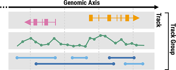
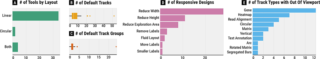
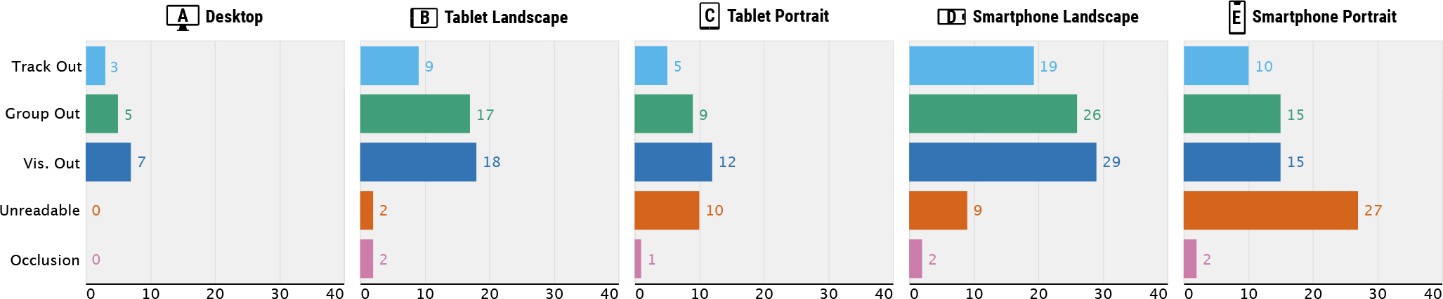
A series of recent studies has focused on designing cross-resolution and cross-device visualizations, i.e., responsive visualization, a concept adopted from responsive web design. However, these studies mainly focused on visualizations with a single view to a small number of views, and there are still unresolved questions about how to design responsive multi-view visualizations. In this paper, we present a reusable and generalizable framework for designing responsive multi-view visualizations focused on genomics data. To gain a better understanding of existing design challenges, we review web-based genomics visualization tools in the wild. By characterizing tools based on a taxonomy of responsive designs, we find that responsiveness is rarely supported in existing tools. To distill insights from the survey results in a systematic way, we classify typical view composition patterns, such as "vertically long," "horizontally wide," "circular," and "cross-shaped" compositions. We then identify their usability issues in different resolutions that stem from the composition patterns, as well as discussing approaches to address the issues and to make genomics visualizations responsive. By extending the Gosling visualization grammar to support responsive constructs, we show how these approaches can be supported. A valuable follow-up study would be taking different input modalities into account, such as mouse and touch interactions, which was not considered in our study.


Figures

Fig. 1.
Fig. 1.. The structure of genomics visualizations with tracks and track groups.
A track refers to a visualization that can be classified as one of visualization types. A track group represents a set of tracks that are aligned to the same genomic axis and coordinated for synchronized navigation with zooming and panning.
Fig. 2.
Fig. 2.. The descriptive survey results:
(A) The number of supported layouts, (B) the number of tracks shown by default, (C) the number of track groups shown by default, (D) the number of observed responsive designs, and (E) the number of track types that were unable to see within a screen.
Fig. 3.
Fig. 3.. The observed usability issues of genomics visualizations by five different resolutions.
Track Out, Group Out, and Vis. Out refer to issues where individual tracks, track groups, and entire visualizations, respectively, become larger than the viewport and cannot be displayed within a screen. Unreadable refers to an issue that marks become too small to interpret. Occlusion refers to an issue where multiple marks overlap.
Fig. 4.
Fig. 4.. A visual summary of four typical track composition patterns.
The light and dark grey rectangles (or arcs) represent tracks and track groups, respectively. Circles with four different colors represent different arrangement types. Three black dots between circles represent repetitions while a pair of numbers in a nearby grey ruler represents minimum and maximum numbers of tracks and track groups that can be composed together in the given tools. These repetitions visually illustrate the dynamic nature of genomics tools, i.e., how additional tracks are composed with the previous composition status. Thicker edges represent a higher number of supporting tools. The grey number next to each of track groups represents the number of supporting tools. The examples of actual visualizations that correspond to individual composition patters are shown in Figure 5.
Fig. 5.
Fig. 5.
Examples of four typical composition patterns reproduced using Gosling [42]: (A) Three track groups with different levels of details [48], (B) side-by-side track groups with multiple genomic locations of interest, (C) circular overview with an additional linear detail view, and (D) four comparative matrices that compose multiple bar charts on the top and the left of each matrix.
Fig. 6.
Fig. 6.. The visualization types with frequent usability issues:
(A) visualizations with text labels, (B) visualizations based on multiple quantitative values, (C) Visualizations with piled up visual marks (e.g., gene annotation and alignment tracks), and (D) regular and rotated matrices.
Fig. 7.
Fig. 7.. The summary of approaches to address usability issues of multi-track genomics visualization in smaller screens.
These approaches are structured by track composition patterns (first column), observed usability issues (second column), and types of comparison and summarization tasks (third column) that are related to the corresponding composition category and usability issue.
Fig. 8.
Fig. 8.
Examples of responsive multi-view visualizations implemented using the extended Gosling genomics visualization grammar [42]. Vertically long visualization with two track groups can use (A) horizontal juxtaposition for 1:1 locus-wise comparison or (B) track-wise juxtaposition to support N:N feature-wise comparison. For 1:N feature-wise comparison in a vertically long track group, (C) the reference track (e.g., gene annotations) can be pinned on the top to more effectively perform tasks by closely positioning target tracks for comparison. (D) Such information can be instead overlaid on the background of other tracks. (E) Circular visualizations with multiple bar charts can be converted into stacked bar charts to save space, which eventually use linear layout instead in a smaller screen.
Fig. 9.
Fig. 9.
An example of track-level responsive designs with a spec (top) and a corresponding visualization (bottom). A segregated bar chart switches to a compact visualization, i.e., stacked bar chart, in a smaller screen, focusing on showing the hotspots on the genomic axis.
Fig. 10.
Fig. 10.. An example of track group-level responsive designs.
Comparative matrices can be converted into a compact visualization in smaller screens, called complementary matrices [40].

References

    1. Andrews K. Responsive visualisation. In CHI 2018 Workshop on Data Visualization on Mobile Devices (MobileVis 2018), p. 4, 2018.
    1. Andrews K and Smrdel A. Responsive data visualisation. In EuroVis (Posters), pp. 113–115, 2017.
    1. Aurisano J, Reda K, Johnson A, Marai EG, and Leigh J. BactoGeNIE: a large-scale comparative genome visualization for big displays. BMC bioinformatics, 16(11):1–14, 2015. - PMC - PubMed
    1. Badam SK and Elmqvist N. Effects of screen-responsive visualization on data comprehension. Information Visualization, 20(4):229–244, 2021.
    1. Borkin MA, Vo AA, Bylinskii Z, Isola P, Sunkavalli S, Oliva A, and Pfister H. What makes a visualization memorable? IEEE Transactions on Visualization and Computer Graphics, 19(12):2306–2315, 2013. - PubMed

Publication types