. 2023 Jan;29(1):106-116.
doi: 10.1109/TVCG.2022.3209378. Epub 2022 Dec 16.

Visinity: Visual Spatial Neighborhood Analysis for Multiplexed Tissue Imaging Data

Visinity: Visual Spatial Neighborhood Analysis for Multiplexed Tissue Imaging Data

Simon Warchol et al. IEEE Trans Vis Comput Graph. 2023 Jan.

Abstract

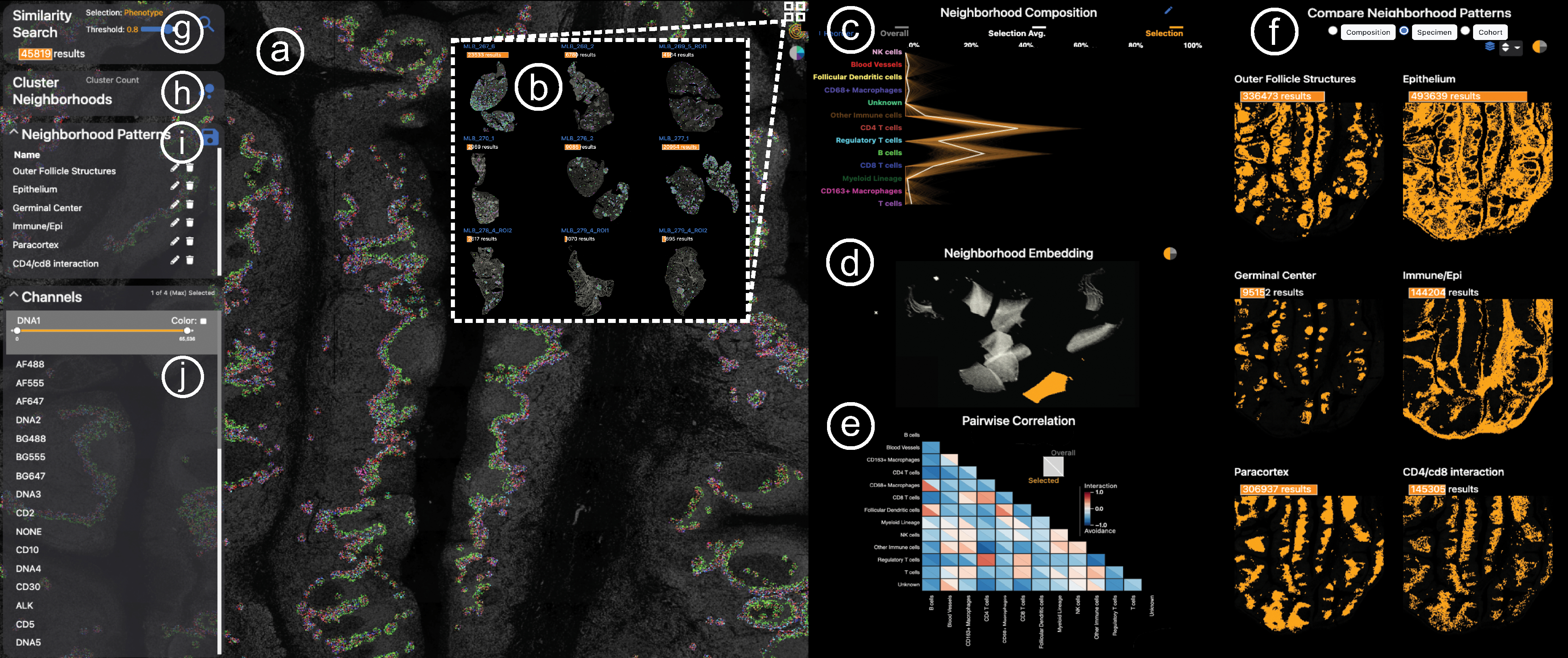
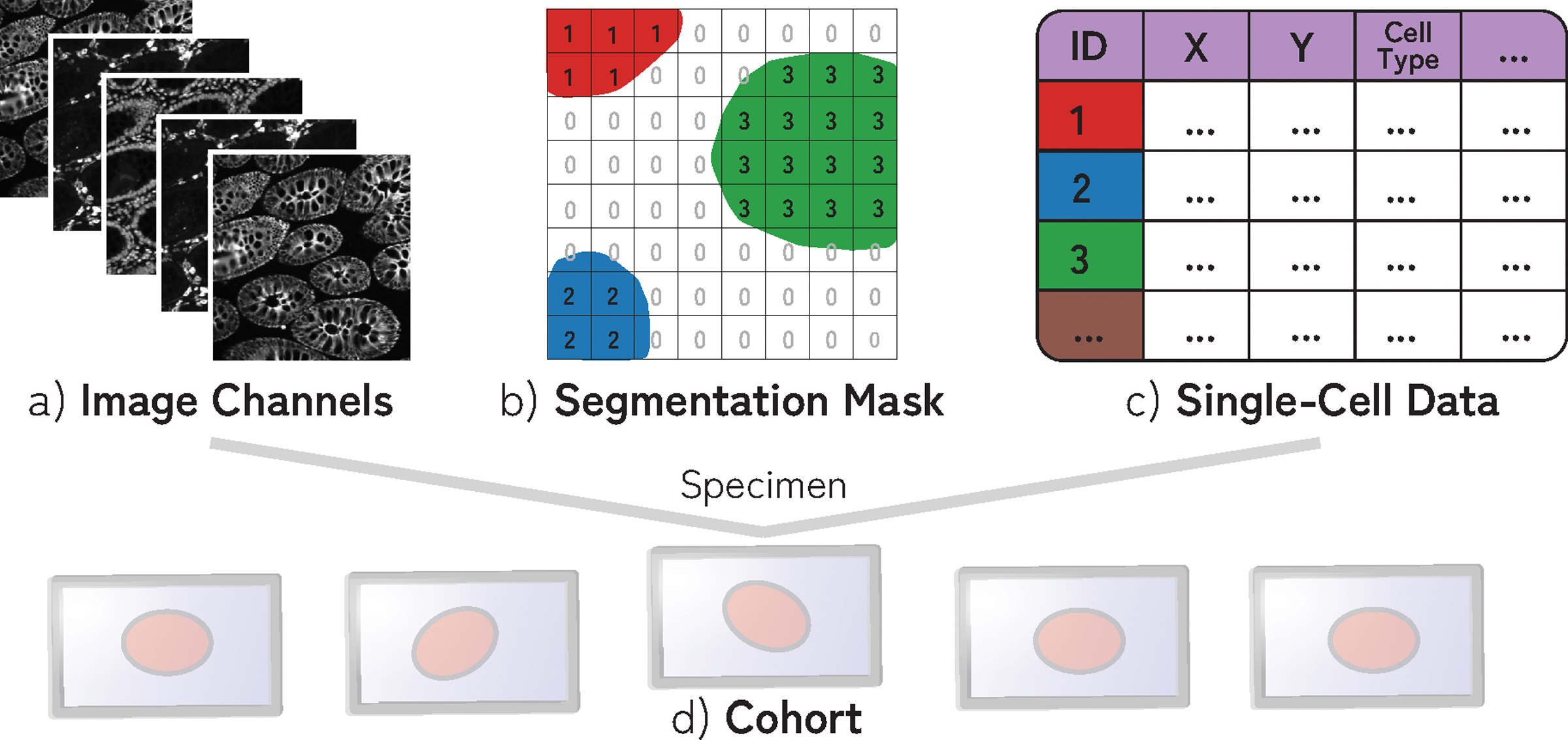
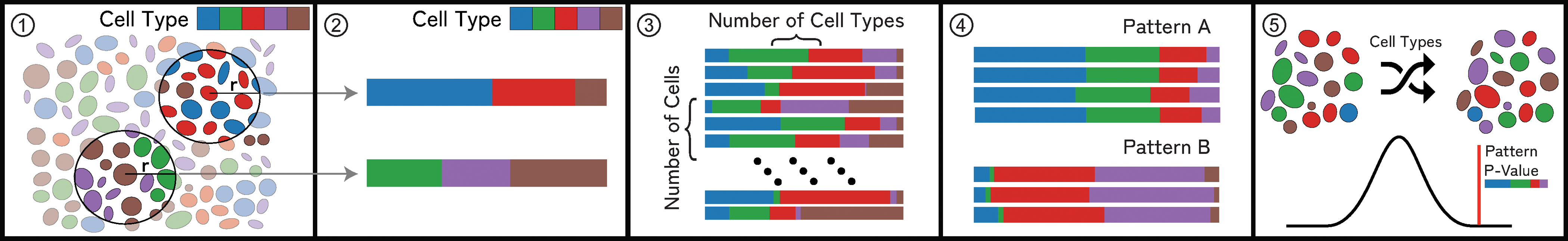
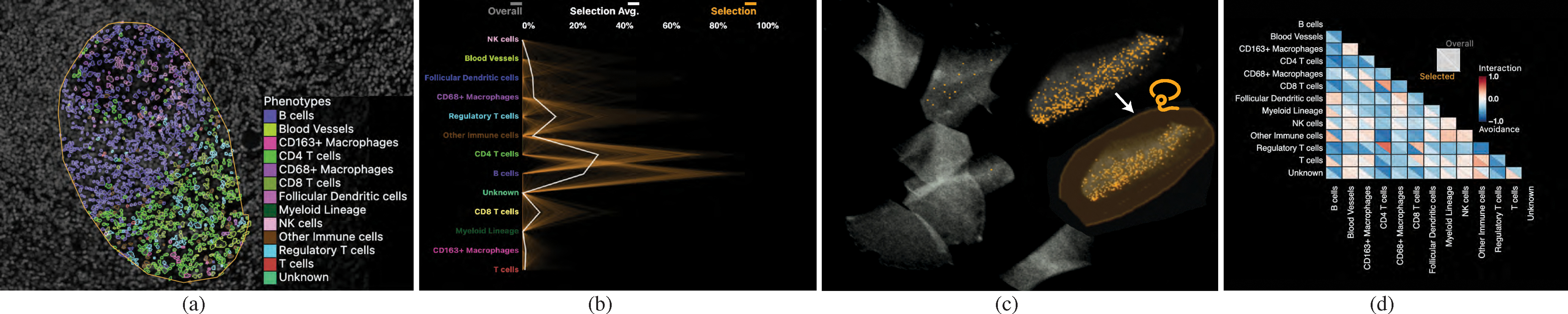
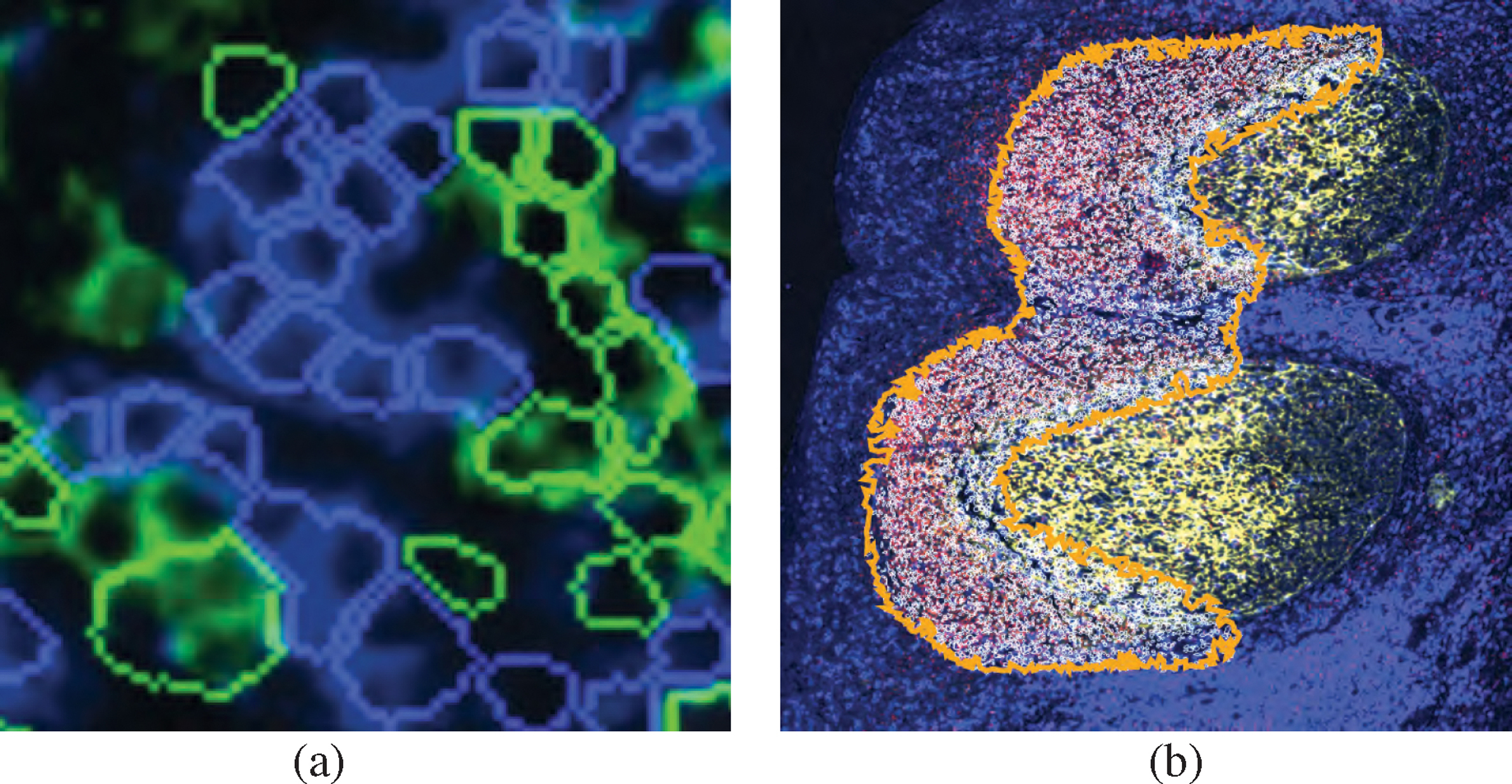
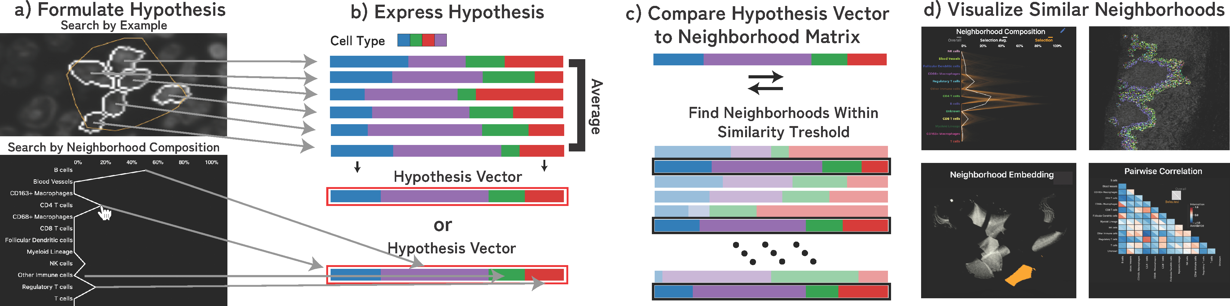
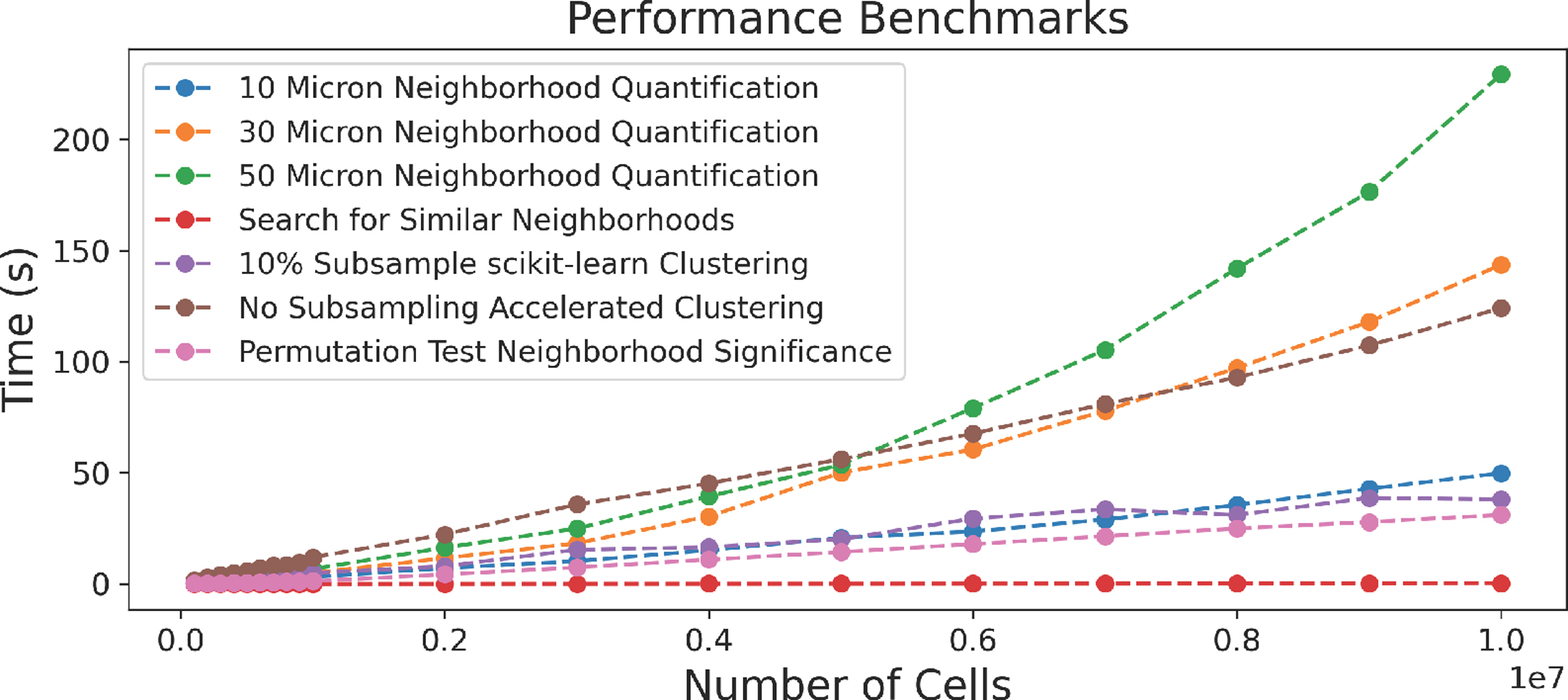
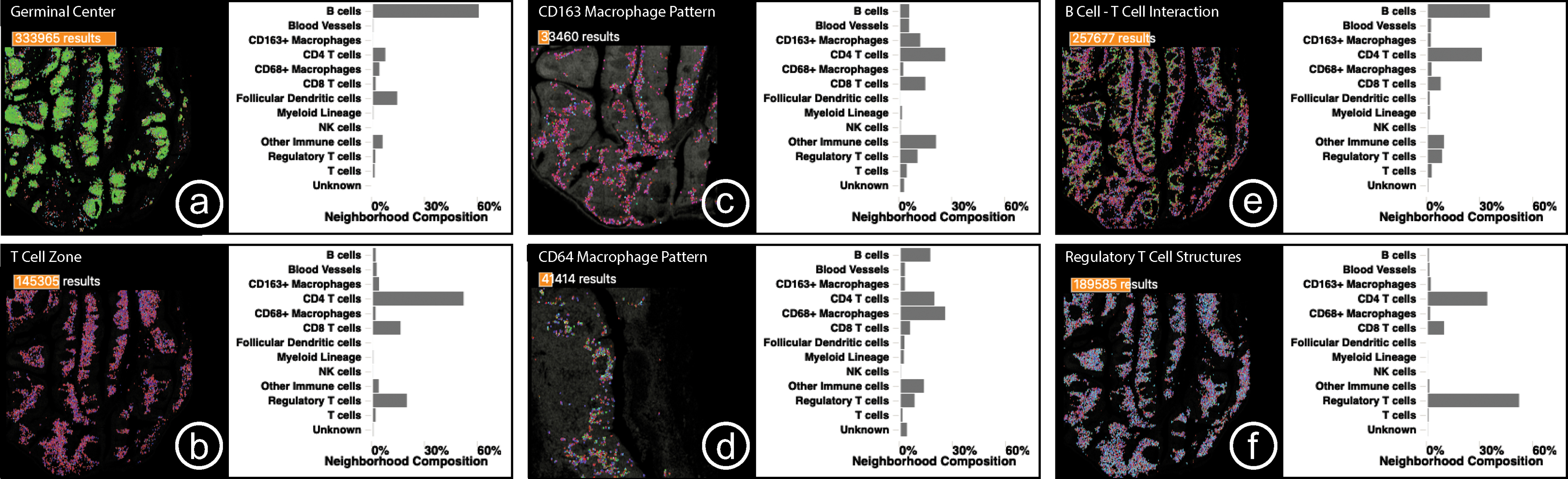
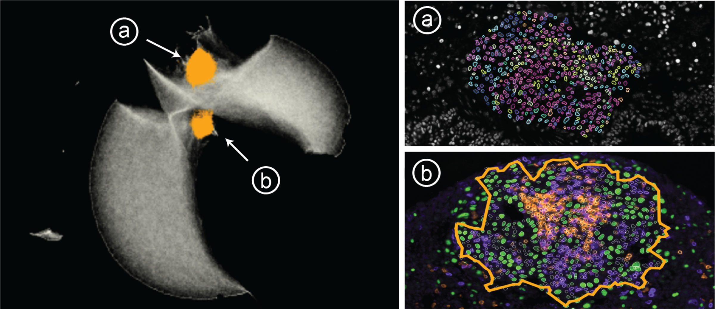
New highly-multiplexed imaging technologies have enabled the study of tissues in unprecedented detail. These methods are increasingly being applied to understand how cancer cells and immune response change during tumor development, progression, and metastasis, as well as following treatment. Yet, existing analysis approaches focus on investigating small tissue samples on a per-cell basis, not taking into account the spatial proximity of cells, which indicates cell-cell interaction and specific biological processes in the larger cancer microenvironment. We present Visinity, a scalable visual analytics system to analyze cell interaction patterns across cohorts of whole-slide multiplexed tissue images. Our approach is based on a fast regional neighborhood computation, leveraging unsupervised learning to quantify, compare, and group cells by their surrounding cellular neighborhood. These neighborhoods can be visually analyzed in an exploratory and confirmatory workflow. Users can explore spatial patterns present across tissues through a scalable image viewer and coordinated views highlighting the neighborhood composition and spatial arrangements of cells. To verify or refine existing hypotheses, users can query for specific patterns to determine their presence and statistical significance. Findings can be interactively annotated, ranked, and compared in the form of small multiples. In two case studies with biomedical experts, we demonstrate that Visinity can identify common biological processes within a human tonsil and uncover novel white-blood cell networks and immune-tumor interactions.


Figures

Fig. 1:
Fig. 1:
Visinity interface. a) Image viewer: multiplex whole-slide tissue images highlighting spatial cell arrangement; b) Cohort view: search, apply, compare spatial patterns across different specimens; c) Neighborhood composition view: visualizes cell types that make up cell neighborhoods; d) UMAP embedding view: encodes cells with similar neighborhood as dots close to each other; e) Correlation matrix: pairwise interactions between cells; f) Comparison & summary view: different small multiple encodings of extracted patterns; g) Neighborhood search: finds cells with similar neighborhood; h) Interactive clustering: automated detection of neighborhood patterns; i) Annotation panel: save and name patterns; j) Channel selection: color and combine image channels.
Fig. 2:
Fig. 2:
A specimen consists of (a) multi-channel image data, (b) segmentation mask of cells (often > 106 cells), and (c) single-cell data containing information about the position, cell type, and marker intensity values for each cell. (d) Specimens are often part of cohorts.
Fig. 3:
Fig. 3:. Visinity Workflow:
(a) Neighborhood quantification: users choose a spatial range triggering neighborhood vector computation; (b) Browse cohort: small multiples of specimen to gain an overview of neighborhood patterns; (c) Bottom-up analysis: explore spatial arrangements and cell-type composition of neighborhoods, generate hypotheses, cluster, and extract patterns; (d) Top-down analysis: two visual querying capabilities allow hypothesis generation and search for similar patterns; (e) Pattern annotation and comparison within and across datasets.
Fig. 4:
Fig. 4:. Neighborhood Quantification:
(1) For a cell in an example microenvironment, find all proximate cells within a specified radius. (2) Each cell’s neighborhood is a feature vector that represents the weighted presence of each cell type in the neighborhood. (3) Repeat this process for each cell, resulting in a neighborhood vector for each cell in an image. (4) Groups of similar neighborhood vectors correspond to spatial patterns. (5) Randomly permute cell types in an image to determine patterns’ significance.
Fig. 5:
Fig. 5:. Visual Exploration Through Linked Views:
(a) Selected ROI to investigate the spatial neighborhoods. Cell types are displayed with color-coded segmentation outlines. (b) Neighborhood composition in a PC plot - orange lines represent neighborhoods selected, exhibiting two discrete patterns. (c) Interactive 2D UMAP embedding of all neighborhood vectors in a specimen in grey; current selection visualized in orange. Users can select a region to explore similar neighborhoods. (d) Pairwise cell-cell interactions visualized as a correlation matrix.
Fig. 6:
Fig. 6:. Cell Outlines or Concave Hull:
Two view modes: (a) coloring cell outlines by cell type; (b) outlining patterns with a concave hull.
Fig. 7:
Fig. 7:. Hypothesis Testing through Visual Querying:
(a) Users can test spatial pattern hypotheses in the form of regions of interest or approximate neighborhood composition. (b) We formulate this hypothesis as a neighborhood vector and (c) compare that neighborhood to every neighborhood in the image. (d) Results above a set similarity threshold are visualized in each of the linked spaces.
Fig. 8:
Fig. 8:. Search By Neighborhood Composition:
(a) A user can sketch a custom neighborhood and increase/decrease the threshold to find more/less similar neighborhood patterns (b, c). Here, interactions between B cells (left) and T cells (right), outlining B cell follicles.
Fig. 9:
Fig. 9:
Runtime evaluation for steps in the neighborhood computation pipeline. Data size is increased gradually.
Fig. 10:
Fig. 10:. Case Study 1:
Small multiple comparison views summarize the biological structures and processes found in a human tonsil, including key interactions between B cells, T cells, and macrophages as well as unexpected regulatory T cell structures.
Fig. 11:
Fig. 11:. Case Study 2:
Distinct regions in the embedding represent (a) immune structures far from tumors and (b) tumors infiltrated with immune cells. Tumor cells (green), B cells (orange) and T cells (purple).

References

    1. About ArcGIS | Mapping & Analytics Software and Services, https://www.esri.com/en-us/arcgis/about-arcgis/overview, last accessed 3/30/2022.
    1. Indica Labs. HALO, https://indicalab.com/halo/, last accessed: 3/30/2022.
    1. An overview of the Spatial Statistics toolbox—Help | ArcGIS Desktop.
    1. Visinity codebase: https://github.com/labsyspharm/visinity, last accessed: 06/08/2022.
    1. Abdelaal T, de Raadt P, Lelieveldt BPF, et al. SCHNEL: scalable clustering of high dimensional single-cell data. Bioinformatics (Oxford, England), 36(Suppl 2):i849–i856, Dec. 2020. - PubMed

Publication types