. 2022 Nov 4;12(1):18659.
doi: 10.1038/s41598-022-22079-2.

The thresholding problem and variability in the EEG graph network parameters

Affiliations

The thresholding problem and variability in the EEG graph network parameters

Timofey Adamovich et al. Sci Rep. .

Abstract

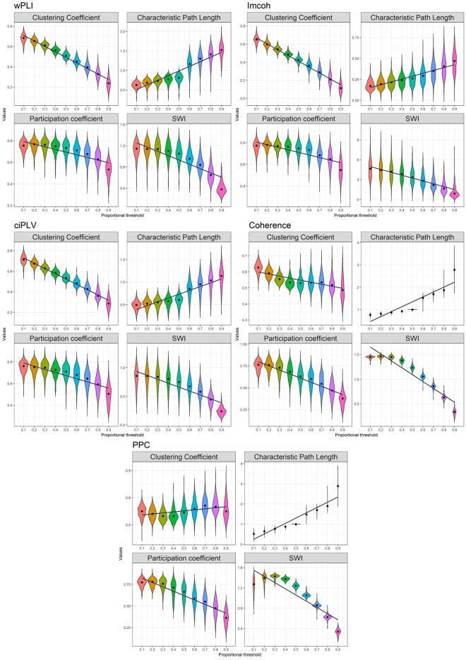
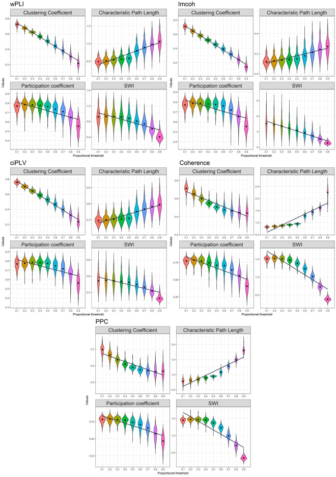
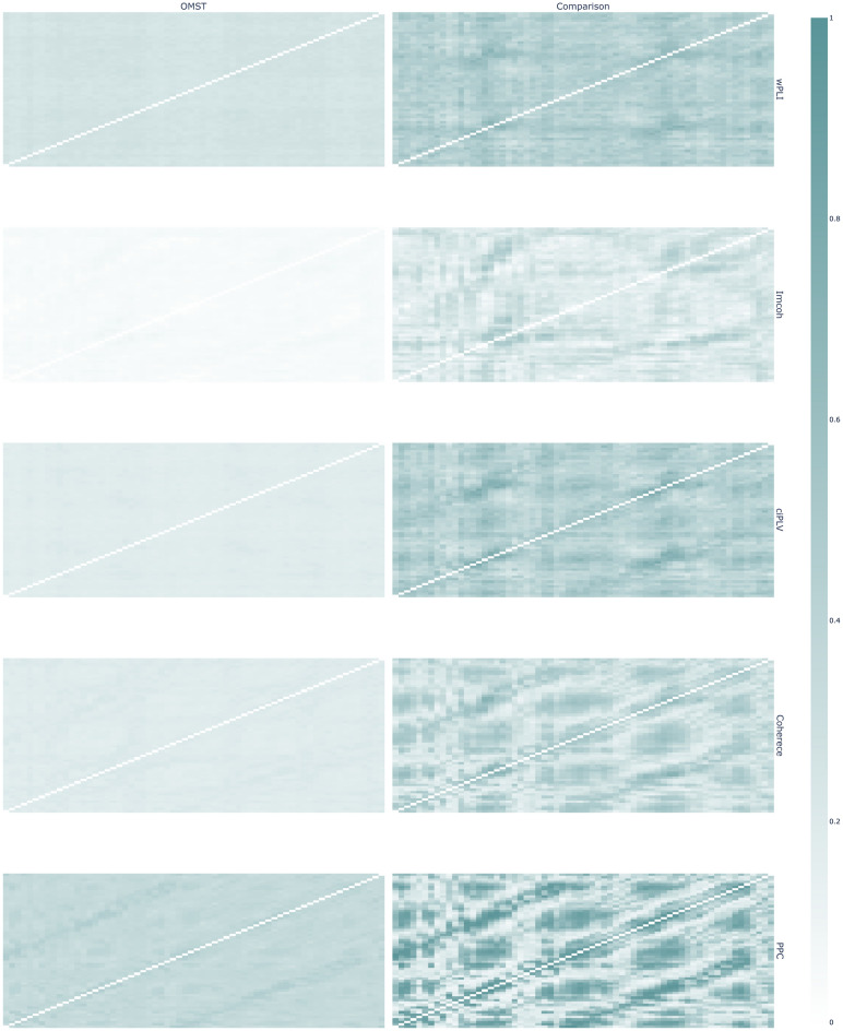
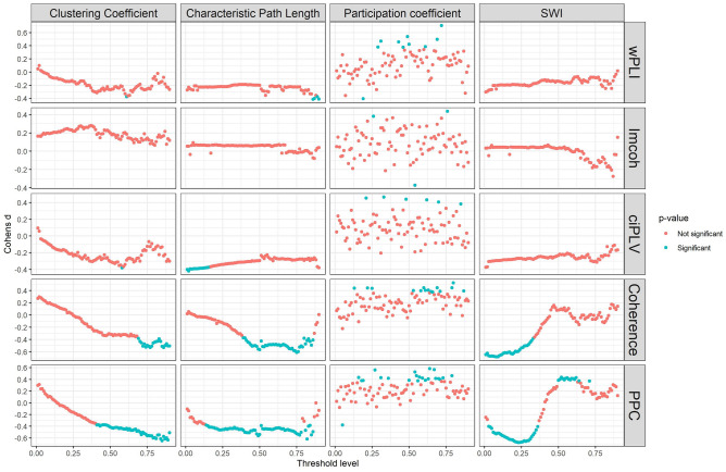
Graph thresholding is a frequently used practice of eliminating the weak connections in brain functional connectivity graphs. The main aim of the procedure is to delete the spurious connections in the data. However, the choice of the threshold is arbitrary, and the effect of the threshold choice is not fully understood. Here we present the description of the changes in the global measures of a functional connectivity graph depending on the different proportional thresholds based on the 146 resting-state EEG recordings. The dynamics is presented in five different synchronization measures (wPLI, ImCoh, Coherence, ciPLV, PPC) in sensors and source spaces. The analysis shows significant changes in the graph's global connectivity measures as a function of the chosen threshold which may influence the outcome of the study. The choice of the threshold could lead to different study conclusions; thus it is necessary to improve the reasoning behind the choice of the different analytic options and consider the adoption of different analytic approaches. We also proposed some ways of improving the procedure of thresholding in functional connectivity research.


Conflict of interest statement

The authors declare no competing interests.

Figures

Figure 1
Figure 1
Distribution of descriptives for connectivity measures in sensor and source space. ggplot2 3.3.6 (https://ggplot2.tidyverse.org/) was used to create this figure.
Figure 2
Figure 2
Effect of density thresholding on graph measures in sensor space. Five measures are presented in the following order (top-to-bottom): wPLI, imcoh, ciPLV, coherence, PPC On each plot four measures are presented (left-to-right, top-to-bottom): Clustering Coefficient, Characteristic PL, Participation Coefficient, SWI. The black line represents linear regression over the data. ggplot2 3.3.6 (https://ggplot2.tidyverse.org/) was used to create this figure.
Figure 3
Figure 3
Effect of density thresholding on graph measures in source space. Five measures are presented in the following order (left-to-right, top-to-bottom): wPLI, imcoh, ciPLV, coherence, PPC. On each plot, four measures are presented (left-to-right, top-to-bottom): Clustering Coefficient, Characteristic PL, Participation Coefficient, SWI. The black line represents linear regression over the data. ggplot2 3.3.6 (https://ggplot2.tidyverse.org/) was used to create this figure.
Figure 4
Figure 4
Correlation of graph measures on different thresholds. Five measures are presented in the following order (left-to-right, top-to-bottom): wPLI, imcoh, ciPLV, coherence, PPC. On each plot four measures are presented (left-to-right, top-to-bottom): Clustering Coefficient, Characteristic PL, Participation Coefficient, SWI. The utmost X-axis value on the right is the value obtained via OMST. Colored cells indicate the correlation between measures on two thresholds, purple color represents positive correlation, blue color represents negative correlation. White cells indicate absence of significant correlation. Transparency of color is related to the correlation strength, brighter color marks stronger correlations. ggplot2 3.3.6 (https://ggplot2.tidyverse.org/) was used to create this figure.
Figure 5
Figure 5
Edge probability graphs across different thresholds in sensor space. The thickness of edges reflects the relative probability of edge existence. Thicker edges are more frequent in the individual networks in the sample. The edge weights were scaled to the range [0, 1] across all thresholds. From top to bottom: wPLI, Imcoh, ciPLV, Coherence, PPC. Qgraph 1.9.2 (https://CRAN.R-project.org/package=qgraph) was used to create this figure.
Figure 6
Figure 6
Edge probability graphs across different thresholds in source space. The brightness of cells reflects the relative probability of edge existence. Brighter cells are more frequent in the individual networks in the sample. The edge weights were scaled to the range [0, 1] across all thresholds. Plotly 5.3.1 (https://plotly.com/python/) was used to create this figure.
Figure 7
Figure 7
Graph structure for OMST-derived graphs and thresholded graphs of equal density in sensor space. The left column is OMST-derived networks, right—thresholded networks. The brightness of cells reflects the relative probability of edge existence. Brighter cells are more frequent in the individual networks in the sample. Synchronization measures by row: wPLI, Imcoh, ciPLV, coherence, PPC. Plotly 5.3.1 (https://plotly.com/python/) was used to create this figure.
Figure 8
Figure 8
Graph structure for OMST-derived graphs and thresholded graphs of equal density in source space. The left column is OMST-derived networks, right—thresholded networks. The brightness of cells reflects the relative probability of edge existence. Brighter cells are more frequent in the individual networks in the sample. Synchronization measures by row: wPLI, Imcoh, ciPLV, coherence, PPC. Plotly 5.3.1 (https://plotly.com/python/) was used to create this figure.
Figure 9
Figure 9
The Cohen’s d of the gender comparison on the different thresholds in sensor space. A permutation t-test was used to estimate the differences between the two groups. The blue dots represents the effect as significant (p-value < 0.05), the red represents the non-significant effect (p-value > 0.05). ggplot2 3.3.6 (https://ggplot2.tidyverse.org/) was used to create this figure.
Figure 10
Figure 10
The Cohen’s d of the gender comparison on the different thresholds in source space. A permutation t-test was used to estimate the differences between two groups. The blue dots represent the effect as significant (p-value < 0.05), the red represents the non-significant effect (p-value > 0.05). ggplot2 3.3.6 (https://ggplot2.tidyverse.org/) was used to create this figure.

References

    1. Sadaghiani S, Brookes MJ, Baillet S. Connectomics of human electrophysiology. Neuroimage. 2022;247:118788. - PMC - PubMed
    1. Avena-Koenigsberger A, Misic B, Sporns O. Communication dynamics in complex brain networks. Nat. Rev. Neurosci. 2018;19:17–33. - PubMed
    1. Beaty RE, et al. Robust prediction of individual creative ability from brain functional connectivity. PNAS. 2018;115:1087–1092. - PMC - PubMed
    1. Finn ES, et al. Functional connectome fingerprinting: Identifying individuals based on patterns of brain connectivity. Nat. Neurosci. 2015;18:1664–1671. - PMC - PubMed
    1. Markett, S., Montag, C. & Reuter, M. Network neuroscience and personality. Personal Neurosci. 1, (2018). - PMC - PubMed