. 2022 Nov 11;8(45):eabp9961.
doi: 10.1126/sciadv.abp9961. Epub 2022 Nov 11.

High-temporal resolution profiling reveals distinct immune trajectories following the first and second doses of COVID-19 mRNA vaccines

Affiliations

High-temporal resolution profiling reveals distinct immune trajectories following the first and second doses of COVID-19 mRNA vaccines

Darawan Rinchai et al. Sci Adv. .

Abstract

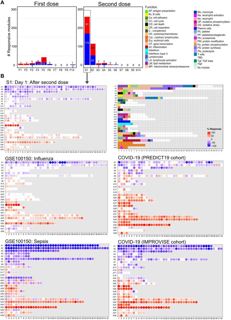
Knowledge of the mechanisms underpinning the development of protective immunity conferred by mRNA vaccines is fragmentary. Here, we investigated responses to coronavirus disease 2019 (COVID-19) mRNA vaccination via high-temporal resolution blood transcriptome profiling. The first vaccine dose elicited modest interferon and adaptive immune responses, which peaked on days 2 and 5, respectively. The second vaccine dose, in contrast, elicited sharp day 1 interferon, inflammation, and erythroid cell responses, followed by a day 5 plasmablast response. Both post-first and post-second dose interferon signatures were associated with the subsequent development of antibody responses. Yet, we observed distinct interferon response patterns after each of the doses that may reflect quantitative or qualitative differences in interferon induction. Distinct interferon response phenotypes were also observed in patients with COVID-19 and were associated with severity and differences in duration of intensive care. Together, this study also highlights the benefits of adopting high-frequency sampling protocols in profiling vaccine-elicited immune responses.


Figures

Fig. 1.
Fig. 1.. Antibody response to COVID-19 mRNA vaccination.
(A) Schematic representation of the study design. (B) The heatmap represents changes in abundance of antibodies specific to several SARS-CoV-2 antigens and control antigens relative to prevaccination levels. Red indicates a relative increase and green indicates a relative decrease in abundance. Columns represent subjects arranged by time point and have colored tracks at the top indicating whether the subjects were naïve or had previously been infected with SARS-CoV-2. The rows represent antibody reactivities arranged by antigen specificity. (C) Changes in antibody levels expressed as an “antibody index” are shown on the box plots, each corresponding to a given antibody type of a given specificity. Lines indicate changes for individuals previously infected with SARS-CoV-2 and who had recovered (in pink) and for naïve individuals (in green). Centerlines, box limits, and whiskers represent the median, interquartile range, and 1.5× interquartile range, respectively. Multiple pairwise tests (paired t test) were performed comparing antibody levels to baseline (F0). *P < 0.01, **P < 0.001, and ***P < 0.0001. Tests were run separately for naïve and recovered individuals, as indicated by the colors of the asterisks.
Fig. 2.
Fig. 2.. Characterization of the post–first dose interferon response signature.
(A) The bar graph shows the number of responsive modules (see Materials and Methods) at different days following the administration of the first dose of the vaccine (noted F1 to F14). The fingerprint grid plots represent the overall module responses on days 1 and 2 after the first dose (F1 and F2, respectively). Modules from the BloodGen3 repertoire occupy fixed positions on the fingerprint grids. They are arranged as rows based on membership to module aggregates (rows A1 to A38). Changes compared to the prevaccination baseline are indicated on the grid by red and blue spots of varying color intensity. The color key at the top indicates their assigned function. The line graph shows the average % of responsive transcripts for A28/interferon response modules across all the post–first dose time points. Centerlines, box limits, and whiskers represent the mean, interquartile range, and 1.5× interquartile range, respectively. We also ascertained the significance of changes measured after the first dose at the level of this module aggregate and at each time point (paired t test comparing module response at each time point relative to the prevaccination baseline; *P < 0.01, **P < 0.001, and ***P < 0.0001). (B) The heatmap represents the proportions of transcripts that changed within the six A28 modules at different time points and across different individuals compared to prevaccination baseline values. Columns represent samples grouped by time point and show profiles of individual subjects within each time point. (C) The heatmaps represent associations (Spearman correlation) between levels of module response measured at the prevaccination baseline (F0) and for each of the time points after the first dose (F1 to F9 and F14) and SARS-CoV-2 S1–specific antibody levels measured at the prevaccination baseline (F0) and at 14 days after the first dose (F14). Correlation coefficients are shown at the top (red-white-blue gradient) and respective P values are shown at the bottom (white-green gradient).
Fig. 3.
Fig. 3.. Characterization of responses on day 5 after the first dose.
(A) The bar graph shows the cumulative number of responsive modules at each time point following the administration of the first dose of the vaccine (noted F1 to F14). (B) The fingerprint grid plot shows changes observed at F5 (day 5 after the first dose). The position of the modules on the grid is fixed. The percent response of individual modules is represented on the grid by red and blue spots of varying color intensity denoting a predominant increase or decrease in abundance, respectively. The percentage response of a given module corresponds to the proportion of transcripts predominantly increased or decreased compared to baseline, meeting a significance cutoff of FDR < 0.1. The color key at the top indicates the various functions attributed to the modules that are represented on the grid. (C) The heatmap represents log2 average FC in abundance of transcripts on day 5 after the first dose (F5). Only modules associated with functional annotations were retained for this figure, and only genes showing significant differences at this time point are shown. Rows represent individual transcripts grouped according to the module aggregate they originate from, corresponding to the different rows on the fingerprint grid plot on the left. Each module aggregate is associated with a unique function, as indicated by the color key above. The columns on the heatmap represent individual subjects coded with the type of vaccine received (at the bottom of the heatmap: Pfizer BioNTech, PZB; Moderna, MDA).
Fig. 4.
Fig. 4.. Fingerprint grid plots mapping changes observed on day 1 after the second dose and across reference datasets.
(A) The bar graphs show the cumulative module response at the various time points after the first and second doses (noted F1 to F14 and S1 to S14, respectively). The y-axis values and numbers on the bars indicate the number of modules meeting the 15% response threshold (out of a total of 382 modules constituting the BloodGen3 repertoire, with percentage response corresponding to the proportion of transcripts predominantly increased or decreased compared to baseline, meeting a significance cutoff of DESeq2, FDR < 0.1). (B) The fingerprint grid plots show changes in transcript abundance for a given study group in comparison to baseline (prevaccination sample or uninfected control group), with the percent response of individual modules shown by red and blue spots of varying color intensity denoting predominant increase or decrease in abundance, respectively. Changes are shown in the top grid for subjects 1 day after receiving the second dose of COVID-19 mRNA vaccine in comparison with baseline prevaccination samples (this study). Grids in the middle and bottom positions show changes for patients with acute infections caused by influenza virus [earlier work (14), with data available in the NCBI GEO repository under accession number GSE100150] or SARS-CoV-2 (this study) and for patients with bacterial sepsis [earlier work (14), with data available in the NCBI GEO repository under accession number GSE100150]. The color key at the top indicates the various functions attributed to the modules that occupy a fixed position on the grid plot.
Fig. 5.
Fig. 5.. Characterization of the day 1 post–second dose interferon response signature.
(A) The fingerprint grid plot maps the modular response observed on day 1 after the second dose (% transcripts for a given module showing significant changes, DESeq2, FRD < 0.1). The six modules forming the A28 aggregate are highlighted. (B) The line graphs represent the summarized % module responses encompassing all study subjects (one line per module). Changes in abundance are shown after the first dose (top graphs) or after the second dose (bottom graphs) compared to baseline prevaccination levels, for two distinct sets of interferon response modules, A28/S1 and A28/S2 (left and middle, respectively). In addition, the averaged response for A28/S1 and A28/S2 is shown as well (right). Centerlines, box limits, and whiskers represent the mean, interquartile range, and 1.5× interquartile range, respectively. In addition, the significance of changes measured after vaccination (paired t test comparing module response at each time point relative to the prevaccination baseline in the graphs on the left and middle) was determined and the averaged A28/S1 and A28/S2 for each subject were compared (t test comparing averaged module response for A28/S1 relative to A28/S2 in the graphs on the right). For all tests: *P < 0.01, **P < 0.001, and ***P < 0.0001. (C) The heatmap represents the proportions of transcripts that changed within the six A28 modules at different time points and across different individuals compared to prevaccination baseline values. Columns represent samples grouped by time point and show profiles of individual subjects within each time point. (D) The heatmaps represent associations (Spearman correlation) between levels of module response measured at the prevaccination baseline (S0) and for each of the time points after the second dose (S1 to S9 and S14) and SARS-CoV-2 S1–specific antibody levels measured at the prevaccination baseline (S0) and at 14 days after the second dose (S14). Correlation coefficients are shown at the top (red-white-blue color gradient) and respective P values are shown at the bottom (white-green color gradient).
Fig. 6.
Fig. 6.. Characterization of post–second dose inflammation, erythroid cell, and plasmablast responses.
(A) The bar graph at the top represents the number of responsive modules at any given time point after the first and second doses. The fingerprint grid plots below map the modular response observed on day 1 after the second dose (left) and day 4 after the second dose (right). (B) The line graphs show the average percentage responses of A35, A37, and A27 modules across multiple time points (left, middle, and right, respectively). Each line represents the profile of the modules constituting a given aggregate. For all line graphs, centerlines, box limits, and whiskers represent the mean, interquartile range, and 1.5× interquartile range, respectively. The significance of changes measured after the second dose was determined at each time point and is shown on the graphs (paired t test comparing module response at each time point relative to the prevaccination baseline; *P < 0.01, **P < 0.001, and ***P < 0.0001). (C) The heatmaps represent associations between levels of module response measured at the prevaccination baseline (S0) and for each of the time points after the second dose (S1 to S9 and S14) and SARS-CoV-2 S1–specific antibody levels measured at the prevaccination baseline (S0) and at 14 days after the second dose (S14). Specifically, the heatmap at the top (blue-red color gradient) represents the correlation coefficients across multiple days and for each day across multiple subjects, with rows corresponding to the five A27 plasmablast modules. The heatmap below (green color gradient) represents the significance of the correlations shown on the heatmap at the top, with the same order of rows and columns.
Fig. 7.
Fig. 7.. Comparing patterns of interferon response in vaccinated individuals and a cohort of patients with COVID-19.
(A) The tSNE plot represents similarities in patterns of interferon response induction across the six modules forming aggregate A28 and among samples comprised in our vaccination cohort and one of our COVID-19 disease cohorts (PREDICT-19/Italy). COVID-19 samples are shown in red along with specific postvaccination time points [post–first dose days 1 and 2 (F1 and F2) and post–second dose days 1 and 2 (S1 and S2)]. (B) Samples from the consolidated cohorts were partitioned into eight clusters via k-means clustering, the distribution of which is shown on this tSNE plot. (C) Heatmaps show patterns of response for the six interferon response modules across the eight sample clusters. The red colors indicate that the abundance of transcripts for a given module is predominantly increased with the intensity representing the proportion of constitutive transcripts meeting a given threshold, which, at the level of individual samples, is a fixed FC and difference cutoff (|FC| > 1.5 and |difference| > 10 in a given sample over its respective prevaccination baseline). The blue color denotes a predominant decrease in abundance of constitutive transcripts compared to the same individual’s prevaccination baseline. Details are shown below for clusters 3, 5, and 8 in separate heatmaps.
Fig. 8.
Fig. 8.. Comparison of interferon response patterns of vaccinated individuals and a cohort of patients with COVID-19 with severe disease under intensive care.
(A) The tSNE plot represents similarities in patterns of interferon response induction among vaccinated subjects and subjects with COVID-19 (IMPROVISE cohort). Specific postvaccination time points (F1, F2, S1, and S2) and repeat samples from a patient with COVID-19 (TP1 to TP4) are shown. Samples from the consolidated cohorts were partitioned into eight clusters via k-means clustering (center). Length of ICU stay is shown on the right. (B) The fingerprint heatmap shows patterns of response for the six interferon response modules across the eight sample clusters defined by k-means clustering in (A). (C) The heatmap shows patterns of interferon responses for patients with COVID-19 upon ICU admission. Multiple clinical parameters are shown on the tracks above [extracorporeal membrane oxygenation (ECMO), hypertension (HTN), coronary artery disease (CAD), chronic kidney disease (CKD), and congestive heart failure (CHF)]. The histogram represents the length of stay in the hospital, in the ICU, and under mechanical ventilation (MV), in days. DM, diabetes mellitus. (D) The bar graph represents for different datasets the proportion of samples corresponding to IRTP I, II, or III, according to the following definition, which is based on the delineation of two distinct sets of interferon response modules: A28/S1 (M8.3, M15.127, M10.1) and A28/S2 (M13.17, M15.64, M15.86): IRTP I = (“S1++S2+,” “S1++S20,” and “S1+S20”); IRTP II = (S1++S2++); IRTP III = (“S1-S2++,” “S1-S2+,” “S10S2++”, and “S10S2+”). The datasets shown along the x axis include day 1 and day 2 post–first and post–second vaccine dose responses (F1, F2, S1, and S2, respectively; N = 23); the PREDICT-19 (N = 99 patients) and IMPROVISE (N = 40 patients) COVID-19 cohorts. Other datasets were derived from an earlier study (14) and include reference cohorts of patients with acute influenza infection (FLU; N = 25), HIV infection (N = 28), active pulmonary tuberculosis (PTB; N = 23), acute RSV infection (N = 70), bacterial sepsis (N = 33), and SLE (N = 55).
Fig. 9.
Fig. 9.. Summary.
This diagrammatic representation summarizes the temporal trajectories of blood transcriptional signatures elicited in response to the first and second doses of mRNA vaccines.

References

    1. Tregoning J. S., Flight K. E., Higham S. L., Wang Z., Pierce B. F., Progress of the COVID-19 vaccine effort: Viruses, vaccines and variants versus efficacy, effectiveness and escape. Nat. Rev. Immunol. 21, 626–636 (2021). - PMC - PubMed
    1. Gaucher D., Therrien R., Kettaf N., Angermann B. R., Boucher G., Filali-Mouhim A., Moser J. M., Mehta R. S., Drake D. R., Castro E., Akondy R., Rinfret A., Yassine-Diab B., Said E. A., Chouikh Y., Cameron M. J., Clum R., Kelvin D., Somogyi R., Greller L. D., Balderas R. S., Wilkinson P., Pantaleo G., Tartaglia J., Haddad E. K., Sékaly R.-P., Yellow fever vaccine induces integrated multilineage and polyfunctional immune responses. J. Exp. Med. 205, 3119–3131 (2008). - PMC - PubMed
    1. Querec T. D., Akondy R. S., Lee E. K., Cao W., Nakaya H. I., Teuwen D., Pirani A., Gernert K., Deng J., Marzolf B., Kennedy K., Wu H., Bennouna S., Oluoch H., Miller J., Vencio R. Z., Mulligan M., Aderem A., Ahmed R., Pulendran B., Systems biology approach predicts immunogenicity of the yellow fever vaccine in humans. Nat. Immunol. 10, 116–125 (2009). - PMC - PubMed
    1. Hagan T., Nakaya H. I., Subramaniam S., Pulendran B., Systems vaccinology: Enabling rational vaccine design with systems biological approaches. Vaccine 33, 5294–5301 (2015). - PMC - PubMed
    1. Arunachalam P. S., Scott M. K. D., Hagan T., Li C., Feng Y., Wimmers F., Grigoryan L., Trisal M., Edara V. V., Lai L., Chang S. E., Feng A., Dhingra S., Shah M., Lee A. S., Chinthrajah S., Sindher S. B., Mallajosyula V., Gao F., Sigal N., Kowli S., Gupta S., Pellegrini K., Tharp G., Maysel-Auslender S., Hamilton S., Aoued H., Hrusovsky K., Roskey M., Bosinger S. E., Maecker H. T., Boyd S. D., Davis M. M., Utz P. J., Suthar M. S., Khatri P., Nadeau K. C., Pulendran B., Systems vaccinology of the BNT162b2 mRNA vaccine in humans. Nature 596, 410–416 (2021). - PMC - PubMed