. 2022 Nov 16:11:e81849.
doi: 10.7554/eLife.81849.

Quantifying the impact of immune history and variant on SARS-CoV-2 viral kinetics and infection rebound: A retrospective cohort study

Affiliations

Quantifying the impact of immune history and variant on SARS-CoV-2 viral kinetics and infection rebound: A retrospective cohort study

James A Hay et al. Elife. .

Abstract

Background: The combined impact of immunity and SARS-CoV-2 variants on viral kinetics during infections has been unclear.

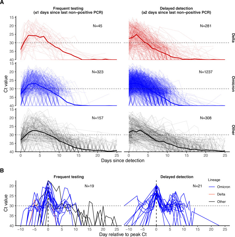
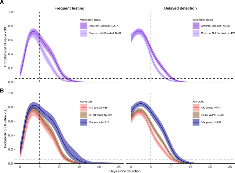
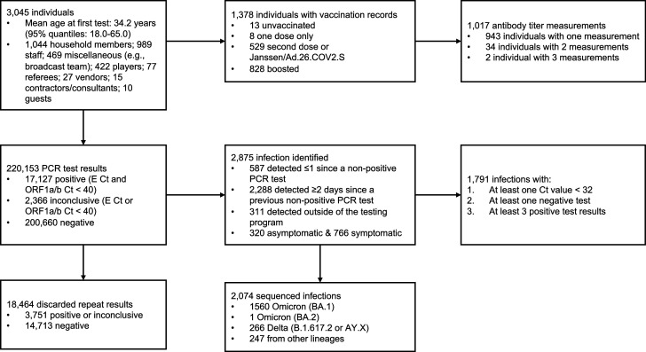
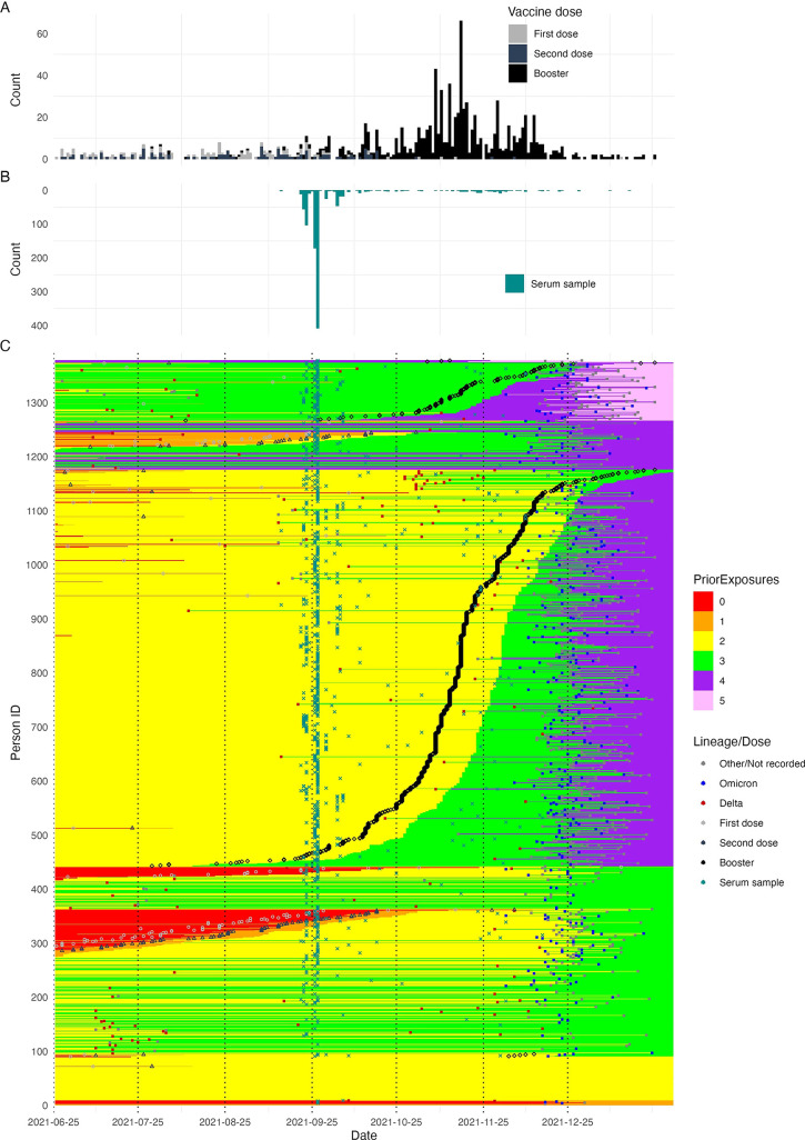
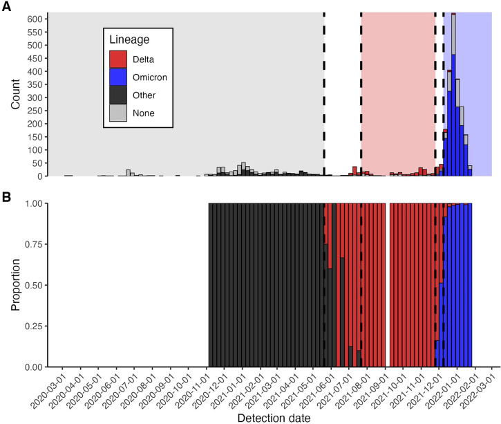
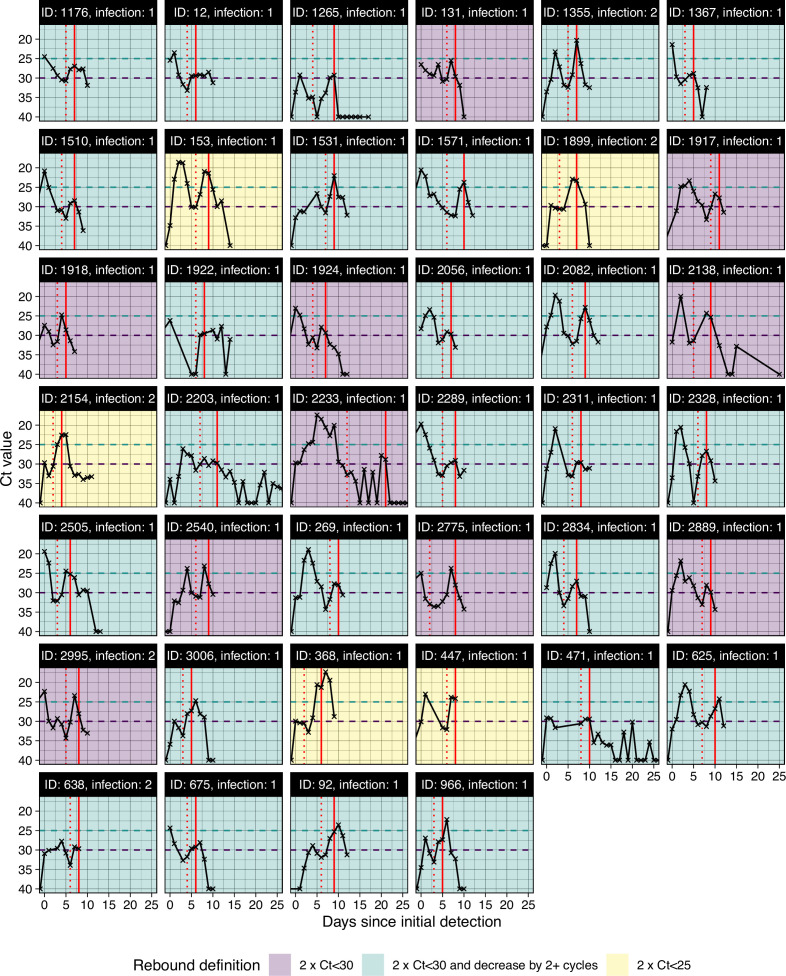
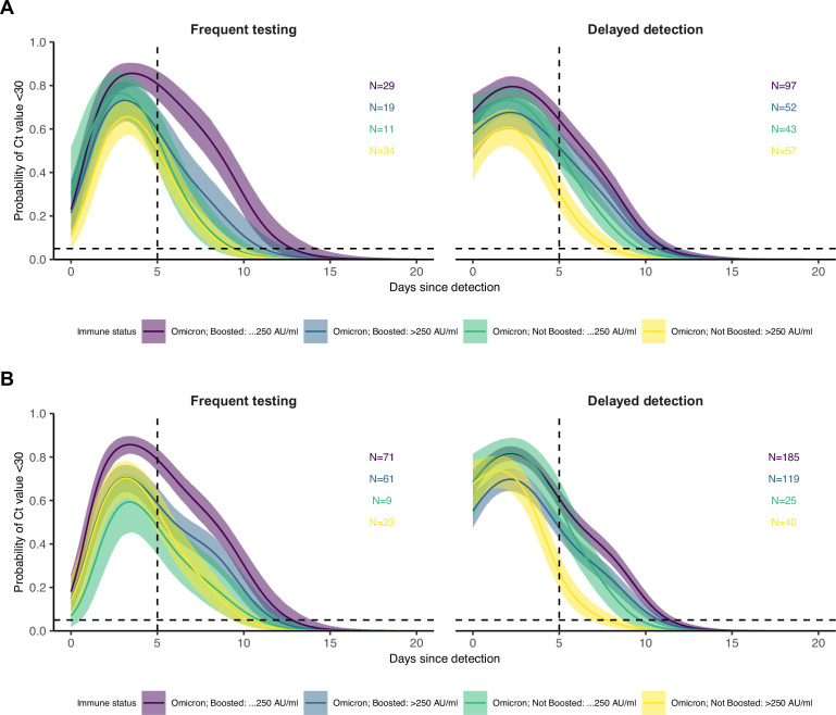
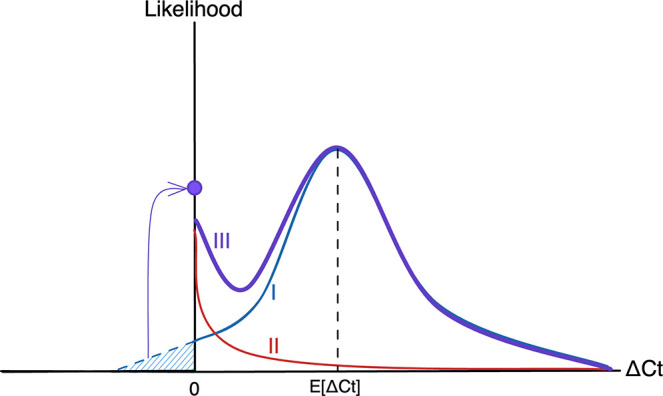
Methods: We characterized 1,280 infections from the National Basketball Association occupational health cohort identified between June 2020 and January 2022 using serial RT-qPCR testing. Logistic regression and semi-mechanistic viral RNA kinetics models were used to quantify the effect of age, variant, symptom status, infection history, vaccination status and antibody titer to the founder SARS-CoV-2 strain on the duration of potential infectiousness and overall viral kinetics. The frequency of viral rebounds was quantified under multiple cycle threshold (Ct) value-based definitions.

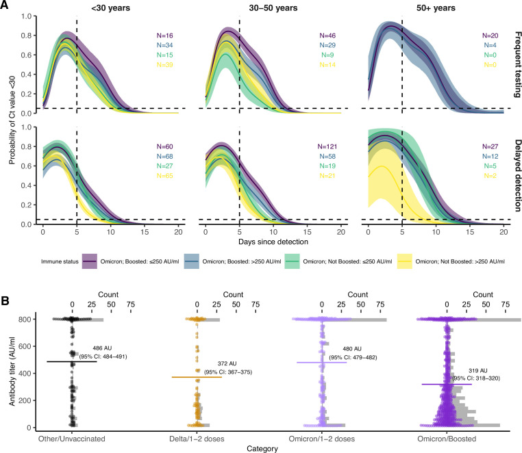
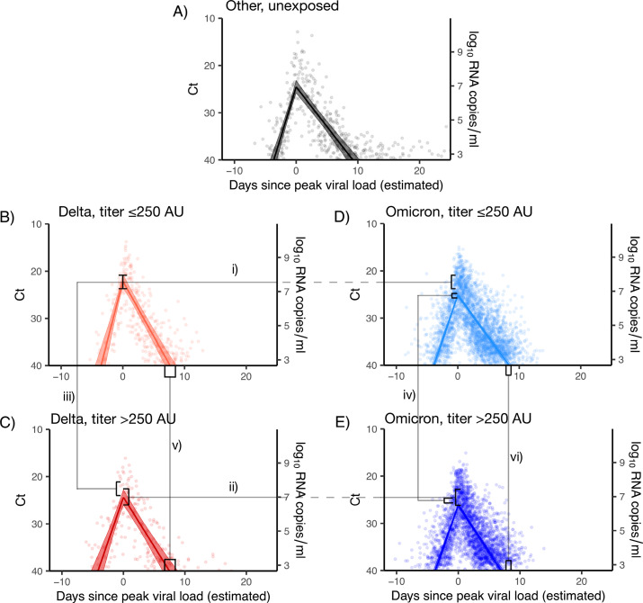
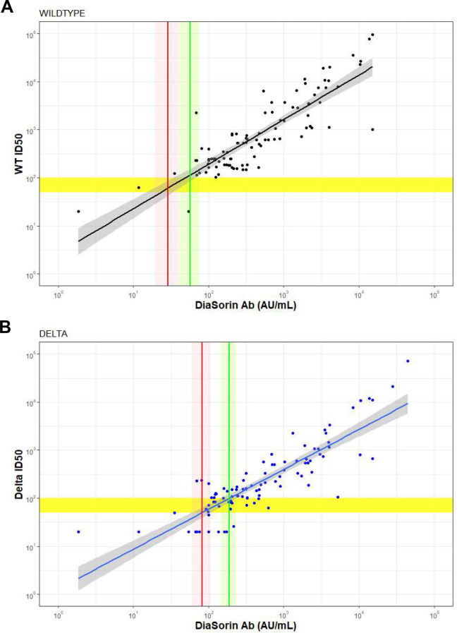
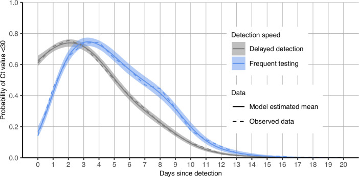
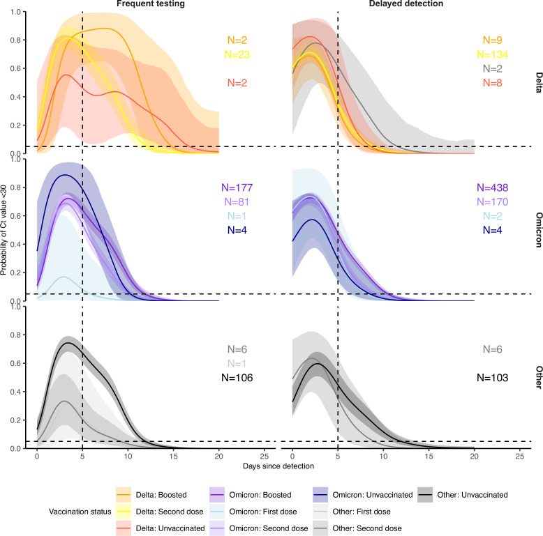
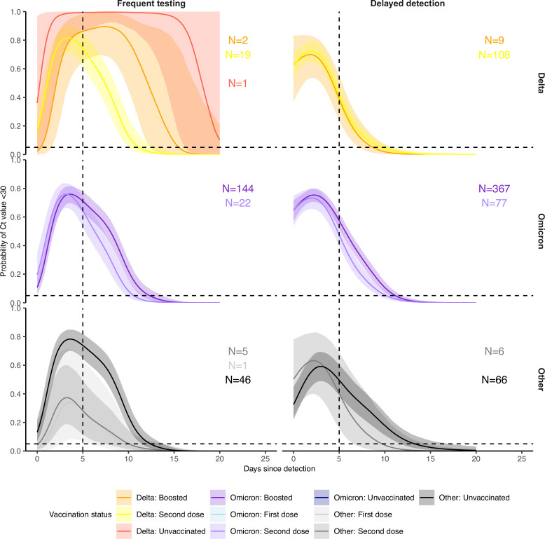
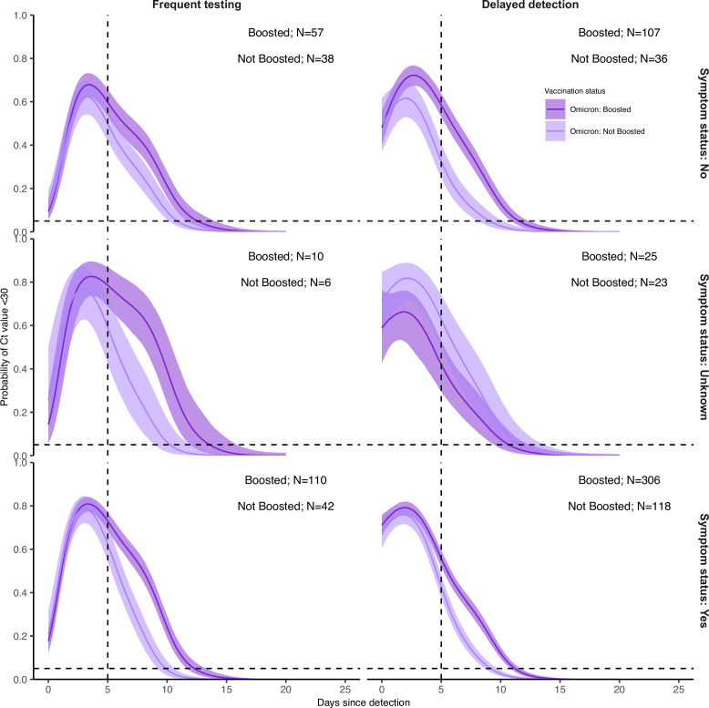
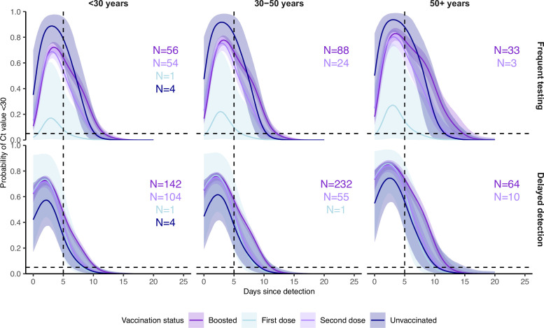
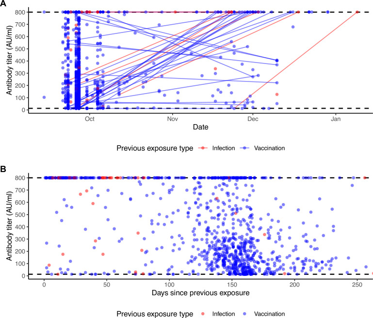
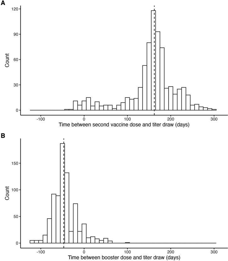
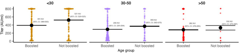
Results: Among individuals detected partway through their infection, 51.0% (95% credible interval [CrI]: 48.3-53.6%) remained potentially infectious (Ct <30) 5 days post detection, with small differences across variants and vaccination status. Only seven viral rebounds (0.7%; N=999) were observed, with rebound defined as 3+days with Ct <30 following an initial clearance of 3+days with Ct ≥30. High antibody titers against the founder SARS-CoV-2 strain predicted lower peak viral loads and shorter durations of infection. Among Omicron BA.1 infections, boosted individuals had lower pre-booster antibody titers and longer clearance times than non-boosted individuals.

Conclusions: SARS-CoV-2 viral kinetics are partly determined by immunity and variant but dominated by individual-level variation. Since booster vaccination protects against infection, longer clearance times for BA.1-infected, boosted individuals may reflect a less effective immune response, more common in older individuals, that increases infection risk and reduces viral RNA clearance rate. The shifting landscape of viral kinetics underscores the need for continued monitoring to optimize isolation policies and to contextualize the health impacts of therapeutics and vaccines.

Funding: Supported in part by CDC contract #200-2016-91779, a sponsored research agreement to Yale University from the National Basketball Association contract #21-003529, and the National Basketball Players Association.

Keywords: COVID-19; SARS-CoV-2; antibody; epidemiology; global health; human; immunity; immunology; inflammation; omicron; viral kinetics; viruses.


Conflict of interest statement

JH, MN, YH, DH No competing interests declared, SK SMK has a consulting agreement with the NBA, JF, NG has a consulting agreement for Tempus and receives financial support from Tempus to develop SARS-CoV-2 diagnostic tests, CM, CT, RS, SC is an employee of IQVIA, Real World Solutions, DA is co-owner of Infection Control Education for Major Sports, GK, MM, MP, SK, AM, IE, DS, TB, BH, JD, CM is an employee of Tempus Labs, JD is an employee of the NBA, YG has a consulting agreement with the NBA

Figures

Figure 1.
Figure 1.. PCR Ct value trajectories for confirmed and suspected infections.
(A) PCR Ct value trajectories for each acute Delta (red), Omicron BA.1 (blue), and other (black) infection. Individuals are grouped by the gap between detection and their most recent negative or inconclusive PCR test (Frequent testing vs. Delayed detection). Thick lines depict the mean Ct value over time, counting negative tests as Ct = 40. Thin lines depict individual level Ct values over time. The horizontal dotted lines mark Ct = 30, which we consider here as a proxy for possible infectiousness and antigen test positivity. (B) Subsets of PCR Ct value trajectories that were classified as rebounds, stratified by testing frequency group. Rebounds are defined here as any trajectory with an initial Ct value <30, followed by a sequence of two or more consecutive negative tests or tests with Ct value ≥30, and subsequently followed by two or more consecutive tests with Ct value <30.
Figure 2.
Figure 2.. Posterior estimates from a generalized linear model predicting probability of Ct value <30 with spline terms for the interaction between days since detection with age group and the interaction between days since detection with vaccination status and variant.
Shown are the marginal effects of (A) vaccination status and (B) age group on the proportion of individuals with Ct <30 on each day post detection after conditioning on being an Omicron BA.1 infection and (A) <30 years old (B) boosted at the time of infection. Solid colored lines and shaded ribbons show the posterior mean (solid line) and 95% credible intervals (shaded ribbon) of each conditional effect. Dotted horizontal and vertical lines mark 5% probability and day 5 post detection, respectively.
Figure 3.
Figure 3.. Effect of booster status, antibody titer against the founder SARS-CoV-2 strain and age group on the probability of Ct value <30 over days post detection.
(A) Proportion of Omicron BA.1 infections with Ct value <30 on each day post detection, stratified by age group and the interaction of booster status at the time of infection and antibody titer group. Shown are posterior estimates from a generalized linear model predicting probability of Ct <30 with a spline term on days since detection, conditional on titer/vaccination status category and age group. Solid lines show posterior mean and shaded ribbons show 95% credible intervals of each conditional effect. (B) Distribution of measured antibody titers (colored points) stratified by variant and vaccination status of each detected infection, with mean titers (horizontal lines) and bootstrapped 95% confidence intervals (CIs) shown in text. Note that the 95% CIs are very small relative to the range and are thus not plotted. Grey bars are histograms of antibody titer counts in bins of 10 arbitrary units (AU)/ml. Note also that stratification is by infection event and not individual, and that antibody titers were measured at a single point in time rather than near the time of infection. The Diasorin Trimeric Assay values are truncated between 13 and 800 AU/ml.
Figure 4.
Figure 4.. Estimated viral trajectories by variant and titer.
Points depict measured Ct values, lines depict the estimated population mean viral trajectories, and shaded regions depict the 95% credible intervals for the estimated population viral trajectories. (A) Non-Delta and non-Omicron infections in individuals who were previously unexposed (no prior record of vaccination or infection), (B) Delta infections with titer ≤250, (C) Delta infections with titer >250, (D) Omicron BA.1 infections with titer ≤250, (E) Omicron BA.1 infections with titer >250. Peak viral loads were higher for Delta infections than for Omicron BA.1 infections when stratifying by titer (i and ii), and titers ≤250 were associated with higher viral loads when stratifying by variant (iii and iv). Low titers were also associated with longer clearance times (v and vi).
Appendix 1—figure 1.
Appendix 1—figure 1.. Summary of cohort.
Top row describes cohort demographics and data on immune histories. Middle row describes infection data. Bottom row provides additional information on the infection data.
Appendix 1—figure 2.
Appendix 1—figure 2.. Summary of all infection and vaccination events over time, in addition to serum sample collection dates, included in the dataset.
(A) Histogram showing the distribution of vaccination dates (note that most first doses were administered prior to 2021-06-25), showing when in time the majority of individuals were vaccinated. (B) Histogram showing the timing of serum sample collections in the cohort. (C) Heatmap showing the entire time course of infection and vaccination histories for each individual in the cohort. Each row represents one individual and columns represent date. Each cell is shaded by the number of prior exposures at that date, showing how each individual’s cumulative exposure history increases over time. Points show the timing of each detected infection, recorded vaccination, and serum sample collection date. Points are colored by the variant or vaccination number of that exposure.
Appendix 1—figure 3.
Appendix 1—figure 3.. Frequency and proportion of SARS-CoV-2 variant detections.
(A) Frequency of sequenced and unsequenced detected infections over time by week. Vertical dashed lines and shaded backgrounds demarcate periods of variant dominance.
Appendix 1—figure 4.
Appendix 1—figure 4.. Correlation between authentic virus neutralization assay (ID50) and the Diasorin antibody titer against (A) wildtype and (B) Delta.
Horizontal yellow bar shows an ID50 titer of 50 and 100 respectively, Diagonal lines and shaded regions show mean and 95% confidence intervals (CI) for a linear regression between the Diason antibody titer and ID50 titer. Vertical line and shaded regions show point estimate and 95% CI for the Diasorin antibody titer corresponding to an ID50 titer of 50 (red) and 100 (green).
Appendix 1—figure 5.
Appendix 1—figure 5.. Distribution of delays from detection to symptom onset among individuals with known symptom status.
Dashed lines mark the median delay between detection and symptom onset. Solid lines mark the day of detection (0).
Appendix 1—figure 6.
Appendix 1—figure 6.. Distribution of delays from symptom onset to peak Ct values among individuals with known symptom status.
Dashed lines mark the median delay between detection and symptom onset. Solid lines mark the day of symptom onset (0).
Appendix 1—figure 7.
Appendix 1—figure 7.. Proportion of infections with Ct <30 on each day post detection stratified by detection speed.
Solid colored lines and shaded ribbons show posterior means and 95% credible intervals from a generalized linear model predicting probability of Ct <30 as a function of days since detection. Dashed lines show proportion with Ct <30 from the observed data.
Appendix 1—figure 8.
Appendix 1—figure 8.. All viral trajectories classified as rebound shown in Figure 1B.
Subplots are colored by the most stringent definition for rebound. To be included here, individuals must have 2+consecutive days of Ct ≥30 after an initial Ct <30. The vertical red dotted line marks this initial clearance time. Trajectories are then classified as rebounds following either two consecutive tests with Ct <30 (purple), two consecutive tests with Ct <30 but with at least a 2 Ct decrease (green), or two consecutive tests with Ct <25 (yellow). The vertical red line marks the timing of rebound detection. The horizontal dashed lines show the different Ct value thresholds for rebound classification. Panels are labeled by arbitrary person ID and infection number. (B) Proportion of sequenced infections attributable to Delta, Omicron BA.1 or other variants.
Appendix 1—figure 9.
Appendix 1—figure 9.. Proportion of infections with Ct <30 on each day post detection by confirmed or suspected variant, vaccination status and detection group, conditional on being in the <30 years age group.
Solid colored lines and shaded ribbons are posterior estimates from a generalized linear model predicting probability of Ct <30 as a function of days since detection and vaccination status, showing the posterior mean (solid line) and 95% credible intervals (shaded ribbon) of each conditional effect. Dashed horizontal and vertical lines show 5% probability and day 5 post detection respectively. Labels show sample size within each group. Note that data is unavailable for some variant and vaccination status combinations.
Appendix 1—figure 10.
Appendix 1—figure 10.. Identical to Appendix 1—figure 9, but after excluding data from all players.
Appendix 1—figure 11.
Appendix 1—figure 11.. Proportion of Omicron BA.1 infections, stratified by symptom status, with Ct <30 on each day post detection by booster status and detection group.
Solid colored lines and shaded ribbons are posterior estimates from a generalized linear model predicting probability of Ct <30 as a function of days since detection, variant (only BA.1 results shown) and vaccination status, showing the posterior mean (solid line) and 95% credible intervals (shaded ribbon) of each conditional effect. Dashed horizontal and vertical lines show 5% probability and day 5 post detection respectively. Note that age group is not included as an effect in this model.
Appendix 1—figure 12.
Appendix 1—figure 12.. Proportion of Omicron BA.1 infections with Ct <30 on each day post detection stratified by vaccination status, age group and detection group.
Solid colored lines and shaded ribbons are posterior estimates from a generalized linear model predicting probability of Ct <30 as a function of days since detection, vaccination status and variant, showing the posterior mean (solid line) and 95% credible intervals (shaded ribbon) of each conditional effect. Note that only Omicron BA.1 estimates are shown, though the model included data from Delta and pre-Delta infections. Dashed horizontal and vertical lines show 5% probability and day 5 post detection respectively.
Appendix 1—figure 13.
Appendix 1—figure 13.. Individual antibody titers to the ancestral SARS-CoV-2 spike over time.
(A) Measured antibody titers by date of sample collection. Lines show longitudinal samples from the same individual, colored by the most recent exposure at the time of sample collection. Lines going up therefore represent antibody boosting events, and lines going down represent waning. (B) Measured antibody titers by days since previous exposure at time of sample collection. Dashed lines show the limit of assay detection.
Appendix 1—figure 14.
Appendix 1—figure 14.. Histogram of time between (A) second vaccine dose and antibody titer measurement and (B) booster dose and antibody titer measurement.
Dashed line marks the median lag (162 days). 1 individual was infected between receiving their second vaccine dose and having a titer measurement taken (Delta infection). 42 individuals were infected between having their titer measurement taken and receiving their booster vaccine dose (32 Delta; 9 unsequenced; 1 confirmed Omicron BA.1).
Appendix 1—figure 15.
Appendix 1—figure 15.. Distribution of antibody titers among Omicron BA.1-infected individuals (colored points) stratified by age group and vaccination status at the time of infection.
Shown are mean titers (large black point) and bootstrapped 95% confidence intervals for the mean (black bars). Note that stratification is by infection and not individual, and that antibody titers were measured at a single point in time rather than near the time of infection. The Diasorin Trimeric Assay values are truncated between 13 and 800 AU/ml.
Appendix 1—figure 16.
Appendix 1—figure 16.. Proportion of BA.1 Omicron infections with Ct <30 on each day post detection stratified by the interaction of booster status at the time of infection and antibody titer group (note, not stratified by age group here due to small subgroup size).
Shown are posterior estimates from a generalized linear model predicting probability of Ct <30 with a spline term on days since detection, conditional on titer/vaccination status category. Solid lines show posterior mean and shaded ribbons show 95% credible intervals of each conditional effect. (A) Model estimates including only individuals who had antibody titers measured between 100 and 200 days following a known previous infection of vaccination. (B) Model estimates including only infections which occurred between 60 and 90 days after an antibody titer measurement.
Appendix 1—figure 17.
Appendix 1—figure 17.. Schematic diagram of the likelihood function for viral kinetic inference.
The plot depicts the likelihood as a function of ΔCt, the difference between the observed Ct value and the limit of detection, so that ΔCt = 0 (the origin) represents observations at the limit of detection, with viral load increasing toward the right-hand side of the plot. The likelihood function (III, purple) is made up of two fundamental components: the process likelihood (I, blue) and the false negative distribution (II, red). The main component of the process likelihood (I) is defined by a normal distribution with mean E[ΔCt], a function of the estimated viral kinetic parameters as defined by the viral kinetic model. Any mass of the process likelihood that extends below the limit of detection (blue hatched region) is instead added to a point probability mass at the origin, since viral loads below the limit of detection register at the limit of detection. The false negative distribution (II) is an exponential distribution with fixed rate to account for a small amount of noise near the limit of detection. Summing the process likelihood (I) and the false negative likelihood (I) using the mixing probability λ (=1 - sensitivity) yields the overall likelihood (III).

References

    1. Aksamentov I, Neher R. NextClade. The Journal of Open Source Software. 2021;6:3773. doi: 10.21105/joss.03773. - DOI
    1. BaseSpace Labs DRAGEN COVID lineage. 3.5.9Illumina. 2021 https://sapac.illumina.com/products/by-type/informatics-products/basespa...
    1. Boucau J, Marino C, Regan J, Uddin R, Choudhary MC, Flynn JP, Chen G, Stuckwisch AM, Mathews J, Liew MY, Singh A, Lipiner T, Kittilson A, Melberg M, Li Y, Gilbert RF, Reynolds Z, Iyer SL, Chamberlin GC, Vyas TD, Goldberg MB, Vyas JM, Li JZ, Lemieux JE, Siedner MJ, Barczak AK. Duration of shedding of culturable virus in SARS-cov-2 omicron (BA.1) infection. The New England Journal of Medicine. 2022a;387:275–277. doi: 10.1056/NEJMc2202092. - DOI - PMC - PubMed
    1. Boucau J, Uddin R, Marino C, Regan J, Flynn JP, Choudhary MC, Chen G, Stuckwisch AM, Mathews J, Liew MY, Singh A, Reynolds Z, Iyer SL, Chamberlin GC, Vyas TD, Vyas JM, Turbett SE, Li JZ, Lemieux JE, Barczak AK, Siedner MJ. Virologic Characterization of Symptom Rebound Following Nirmatrelvir-Ritonavir Treatment for COVID-19. medRxiv. 2022b doi: 10.1101/2022.05.24.22275326. - DOI - PMC - PubMed
    1. Brihn A, Chang J, OYong K, Balter S, Terashita D, Rubin Z, Yeganeh N. Diagnostic performance of an antigen test with RT-PCR for the detection of SARS-cov-2 in a hospital setting-Los Angeles County, California, june-august 2020. MMWR. Morbidity and Mortality Weekly Report. 2021;70:702–706. doi: 10.15585/mmwr.mm7019a3. - DOI - PMC - PubMed

Publication types

Supplementary concepts