. 2022 Nov 3:13:1027122.
doi: 10.3389/fimmu.2022.1027122. eCollection 2022.

Targeted proteomics identifies circulating biomarkers associated with active COVID-19 and post-COVID-19

Affiliations

Targeted proteomics identifies circulating biomarkers associated with active COVID-19 and post-COVID-19

Martijn Zoodsma et al. Front Immunol. .

Abstract

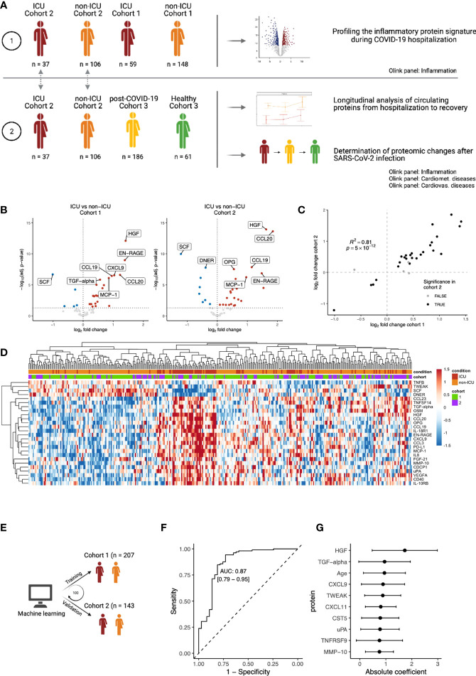
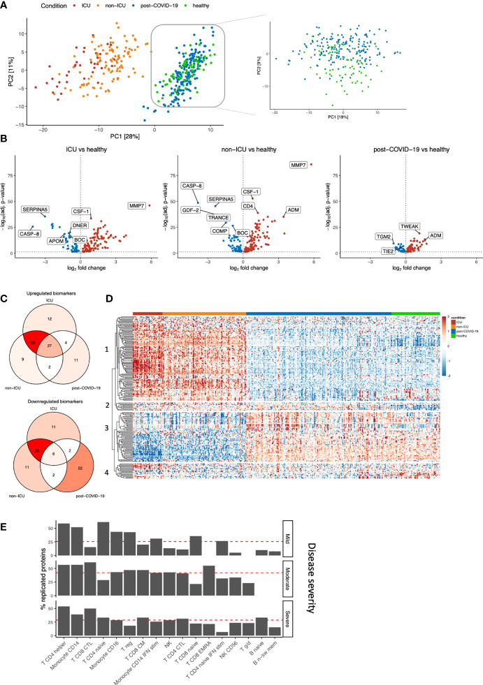
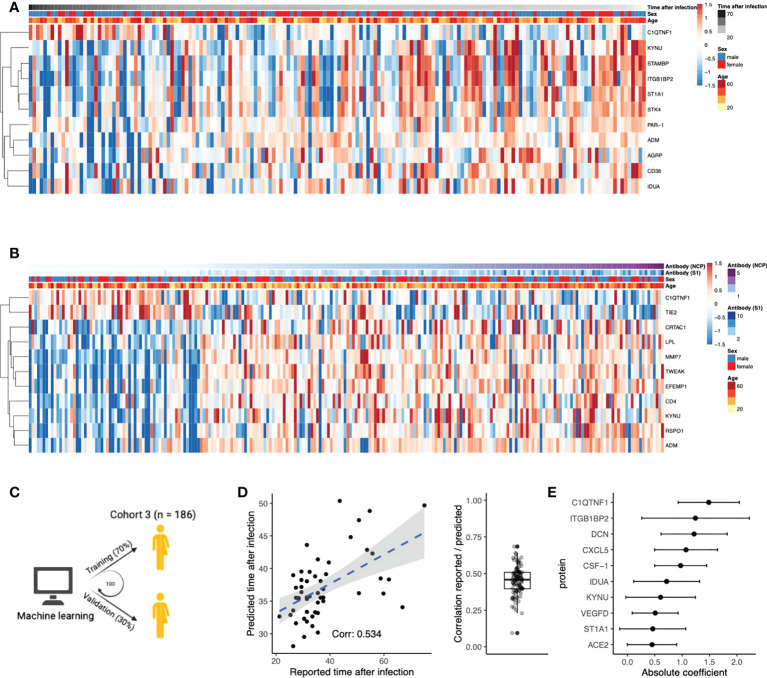
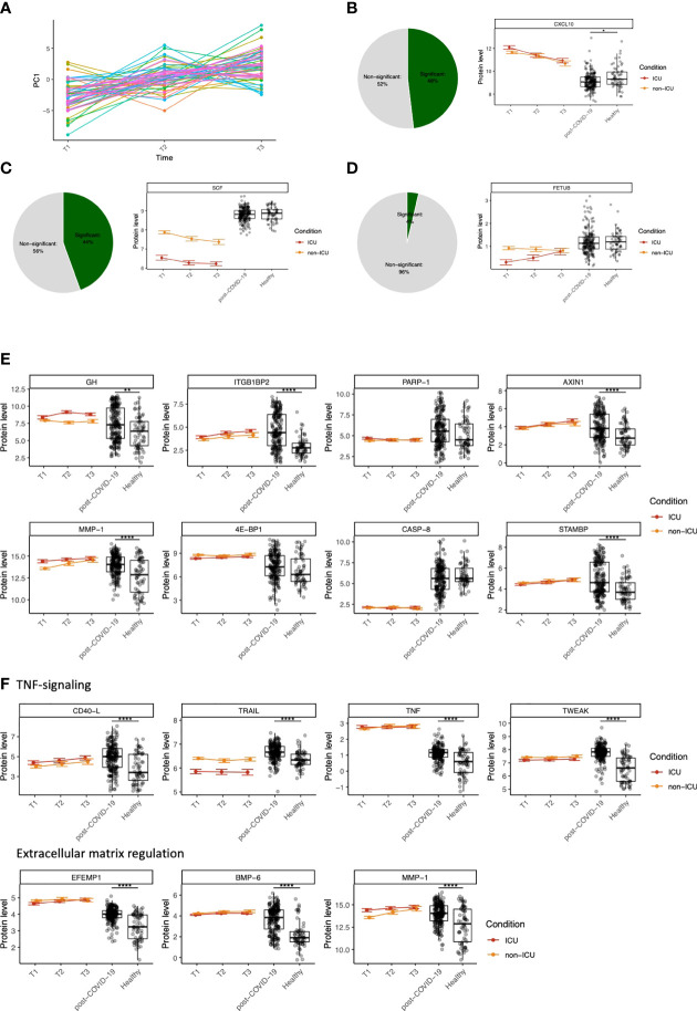
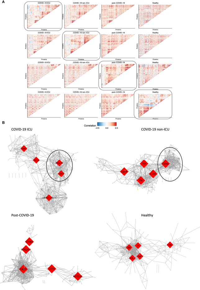
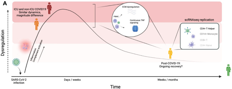
The ongoing Coronavirus Disease 2019 (COVID-19) pandemic is caused by the highly infectious Severe Acute Respiratory Syndrome Coronavirus-2 (SARS-CoV-2). There is an urgent need for biomarkers that will help in better stratification of patients and contribute to personalized treatments. We performed targeted proteomics using the Olink platform and systematically investigated protein concentrations in 350 hospitalized COVID-19 patients, 186 post-COVID-19 individuals, and 61 healthy individuals from 3 independent cohorts. Results revealed a signature of acute SARS-CoV-2 infection, which is represented by inflammatory biomarkers, chemokines and complement-related factors. Furthermore, the circulating proteome is still significantly affected in post-COVID-19 samples several weeks after infection. Post-COVID-19 individuals are characterized by upregulation of mediators of the tumor necrosis (TNF)-α signaling pathways and proteins related to transforming growth factor (TGF)-ß. In addition, the circulating proteome is able to differentiate between patients with different COVID-19 disease severities, and is associated with the time after infection. These results provide important insights into changes induced by SARS-CoV-2 infection at the proteomic level by integrating several cohorts to obtain a large disease spectrum, including variation in disease severity and time after infection. These findings could guide the development of host-directed therapy in COVID-19.

Keywords: SARS-CoV-2; biomarker; inflammation; post-COVID-19; targeted proteomics.


Conflict of interest statement

The authors declare that the research was conducted in the absence of any commercial or financial relationships that could be construed as a potential conflict of interest.

Figures

Figure 1
Figure 1
Inflammatory proteomic profile of hospitalized COVID-19 patients. (A) Schematic overview of the study design. (B) Differential abundance analysis on inflammation-related of ICU vs. non-ICU patients in cohorts 1 and 2, separately. Upregulation (red) indicates higher protein concentrations in ICU patients, whereas downregulation (blue) indicates downregulation in ICU patients. Proteins that are not significantly different are shown in grey. The vertical dotted line indicates log-fold change 0. The horizontal dotted line indicates significance at the adjusted p-value level. For both cohorts, only the first time-point per patient was considered. Since we focus on the inflammation-related proteins in this analysis, only proteins belonging to the Olink Inflammation panel are depicted. The complete differential abundance results are included in Table S2 . (C) Replication of the significantly regulated proteins from cohort 1 in cohort 2. The log-fold changes per protein are strongly correlated (Pearson’s r2: 0.81). Overall, 62 proteins overlapped between the cohorts. 30 proteins were significant in cohort 1, of which 26 were significantly replicated in cohort 2 (FDR<0.05 and the same direction of regulation, shown in black). (D) Heatmap of the 26 replicated proteins (FDR < 0.05 & same direction of regulation in cohorts 1 and 2). Each column represents a patient, whereas rows represent proteins. The column annotations indicate the condition of each patient and the cohort to which they belong. Samples were clustered based on correlation. (E) Schematic overview of the training process for an elastic net linear regression model to discriminate between COVID-19 disease severity. The larger cohort 1 was used as a training cohort, and the smaller cohort 2 for validation. 100 independent training iterations were performed and combined to avoid potential bias. (F) Receiver-operating characteristic curve produced by one random iteration of the classification model on the independent validation data from cohort 2. The AUC was 0.86 (sensitivity: 0.76, specificity: 0.86). (G) Mean coefficients per protein were calculated over 100 independent training runs for the model. The top ten proteins with the highest absolute mean coefficients are shown. Dots indicate the mean absolute mean coefficient per protein, and error bars indicate standard deviation.
Figure 2
Figure 2
Identification of biomarkers for COVID-19 severity and post-COVID-19. (A) PCA on the protein concentrations of COVID-19 hospitalized patients, post-COVID-19 individuals, and healthy individuals (left). We performed PCA-based dimensionality reduction on cohort 3 separately to highlight the differences between healthy and post-COVID-19 individuals (right). (B) Significantly different proteins in ICU, non-ICU and post-COVID-19 individuals compared to healthy individuals. Upregulation (red) indicates higher protein concentrations compared to healthy individuals, whereas downregulation (blue) indicates lower proteins concentrations compared to healthy individuals. Proteins that do not significantly differ are shown in grey. The vertical dotted line indicates log-fold change 0. The horizontal dotted line demonstrates significance at the adjusted p-value level. For ICU and non-ICU patients, only the first time-point per patient was considered. (C) Shared and exclusive significantly abundant proteins between the conditions, compared to healthy individuals. Venn diagrams are colored with respect to the number of proteins. (D) Heatmap of the significantly differentially abundant proteins. Each row represents a protein that is significantly different in any of the conditions: ICU, non-ICU or post-COVID-19 individuals compared to healthy. Columns represent patients, and the column annotations indicate the condition of each patient. For ICU and non-ICU patients, only the first time point was considered. (E) Barplot showing replication of the post-COVID-19 proteome signature in publicly available single-cell RNA sequencing data. We replicated the post-COVID-19 signature in post-COVID-19 patients who experienced three different COVID-19 severities: Mild, Moderate or Severe. Proteins were considered replicated when the corresponding gene was nominally significant compared to healthy individuals and directionally concordant with the proteome. Red lines indicate the average replication rate calculated over these cell types. Only the most abundant cell types are shown.
Figure 3
Figure 3
Circulating proteins predict COVID-19 recovery time. (A) Proteins significantly correlated to time the after infection in post-COVID-19 individuals. The time after infection is defined as the time between symptom offset and sampling and thus indicates the time after self-reported recovery per individual. Each row represents a protein, and each column represents a sample. Individuals are ordered by increasing time after recovery. (B) Proteins significantly correlated to either SARS-CoV-2 Spike 1 (S1) antibody or nucleocapsid protein (NCP) antibody concentrations in post-COVID-19 individuals. Each row represents a protein, and each column represents a sample. Samples are ordered in increasing NCP antibody concentrations. (C) Schematic overview of the training process for an elastic net linear regression model to predict time after SARS-CoV-2 infection. 70% of the data from post-COVID-19 individuals was used for training, and 30% for validation. Hundred independent training iterations were performed and combined to avoid potential bias. (D) Scatterplot showing the relation between the reported time after SARS-CoV-2 infection in days (x-axis) versus the predicted time after SARS-CoV-2 infection in days (y-axis) of one random run of the predictive model. The blue line represents a linear regression model fitted to the data, with standard error depicted in gray. Correlation between these values is a good indicator of the quality of the prediction. The boxplot shows the correlation between the predicted and reported values in the validation data over 100 independent runs. Boxplot center line: median, box limits: 1st and 3rd quartiles. Whiskers: 1,5 x interquartile range. (E) Mean coefficients per protein were calculated over 100 independent training runs for the model. The top ten proteins with the highest absolute mean coefficients are shown. Dots indicate the mean absolute mean coefficient per protein, and error bars indicate standard deviation.
Figure 4
Figure 4
Dynamic changes in circulating proteins can be used to monitor disease severity in COVID-19 and serve as potential therapeutic targets. (A) ANOVA-PCA on the protein concentrations of the first three time-points after COVID-19 hospitalization in cohort 2. The time-points are taken at 48-hour intervals, and thus represent the first six days after hospitalization. 61 patients were selected who were consistently samples three times. The mean protein abundance per patient was subtracted from the measurements for these patients. The first principal component of this data was plotted against the time. (B) Representative example of a protein (CXCL10) that significantly differs over time during COVID-19 hospitalization, both in ICU and non-ICU patients. The pie chart indicates the proportion of proteins found to be significant for this effect. Red and orange colors indicate protein concentrations in COVID-19 ICU patients and non-ICU patients, respectively. (C) Representative example of a protein (stem cell factor, SCF) that significantly differs between conditions (ICU and non-ICU). The pie chart indicates the proportion of proteins found to be significant for this effect. Red and orange colors indicate protein concentrations in COVID-19 ICU patients and non-ICU patients, respectively. (D) Representative example of a protein (fetuin B precursor, FETUB) that significantly differs over time and between conditions. The pie chart indicates the proportion of proteins found to be significant for this effect. Red and orange colors indicate protein concentrations in COVID-19 ICU patients and non-ICU patients, respectively. (E) Longitudinal dynamics of heterogeneous proteins in post-COVID-19 individuals. The variance of normalized protein abundance values was calculated and the top eight were selected for visualization. Five out of eight proteins were significantly upregulated in post-COVID-19 individuals as indicated by the significance stars. (F) Longitudinal dynamics of proteins related to TNF-signaling and regulation of the extracellular matrix. These proteins were selected based on their highly significant differential abundance in post-COVID-19 individuals compared to healthy individuals. In all figures, significance is shown when the protein is significantly differentially expressed in post-COVID-19 individuals compared to healthy individuals: *adj. p < 0.05, **adj. p < 0.01, ***adj. p < 0.001, ****adj. p. < 0.0001. Boxplot center line: median, box limits: 1st and 3rd quartiles. Whiskers: 1,5 x interquartile range. For the hospitalized patients, error bars indicate standard deviation.
Figure 5
Figure 5
Modules of co-expressed proteins change over conditions. (A) Visualization of modules of co-expressed proteins per condition. Protein-protein correlations were calculated for each condition separately. Hierarchical clustering was performed on the matrix of correlation values for one condition as indicated by the box. The same protein order was kept for all heatmaps in the same row to visualize how modules change over condition relative to one condition. This was performed systematically for all four conditions: COVID-19 ICU, non-ICU, post-COVID-19, and healthy individuals. (B) Co-expression network of each condition. The top five hub genes for each network are highlighted in red. Only the top 2.5% highest correlated connections are shown, corresponding to 576 edges.
Figure 6
Figure 6
Graphical summary of our findings. Graphical summary of the main findings in this study. By integrating a large disease spectrum including variation in disease severity, course and recovery we show the proteomic changes induced by SARS-CoV-2 infection during the acute phase and the post-COVID-19 phase.

Similar articles

Cited by

References

    1. World Health Organization . (2020)., in: Virtual press conference on COVID-19, , 11 March 2020. Available at: https://www.who.int/docs/default-source/coronaviruse/transcripts/who-aud....
    1. Ahmed H, Patel K, Greenwood DC, Halpin S, Lewthwaite P, Salawu A, et al. . Long-term clinical outcomes in survivors of severe acute respiratory syndrome (SARS) and middle East respiratory syndrome coronavirus (MERS) outbreaks after hospitalisation or ICU admission: a systematic review and meta-analysis. J Rehabil Med (2020) 52(5):1–11. doi: 10.2340/16501977-2694 - DOI - PubMed
    1. Huang C, Huang L, Wang Y, Li X, Ren L, Gu X, et al. . 6-month consequences of COVID-19 in patients discharged from hospital: a cohort study. Lancet (2021) 397:220–32. doi: 10.1016/S0140-6736(20)32656-8 - DOI - PMC - PubMed
    1. Guler SA, Ebner L, Beigelman C, Bridevaux PO, Brutsche M, Clarenbach C, et al. . Pulmonary function and radiological features four months after COVID-19: first results from the national prospective observational Swiss COVID-19 lung study. Eur Respir J (2021) 57:2003690. doi: 10.1183/13993003.03690-2020 - DOI - PMC - PubMed
    1. Carvalho-Schneider C, Laurent E, Lemaignen A, Beaufils E, Bourbao-Tournois C, Laribi S, et al. . Follow-up of adults with noncritical COVID-19 two months after symptom onset. Clin Microbiol Infection (2021) 27(2):258–63. doi: 10.1016/j.cmi.2020.09.052 - DOI - PMC - PubMed

Publication types