. 2022 Nov 25;13(1):7255.
doi: 10.1038/s41467-022-34638-2.

Immune phenotypes that are associated with subsequent COVID-19 severity inferred from post-recovery samples

Affiliations

Immune phenotypes that are associated with subsequent COVID-19 severity inferred from post-recovery samples

Thomas Liechti et al. Nat Commun. .

Abstract

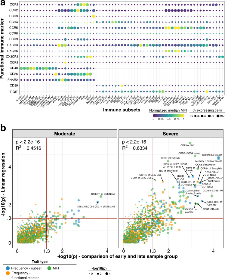
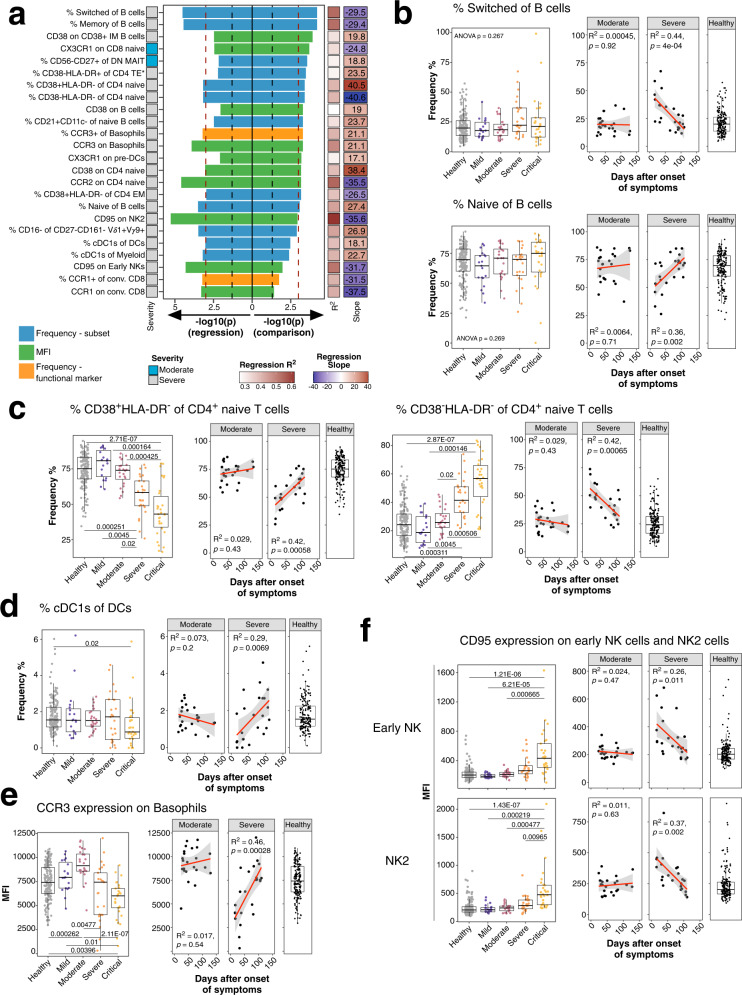
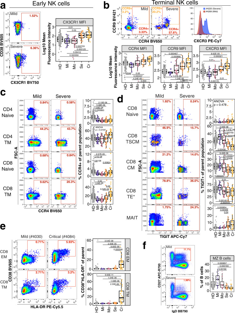
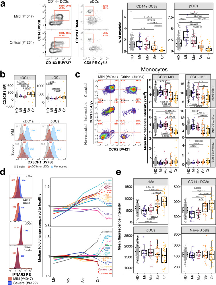
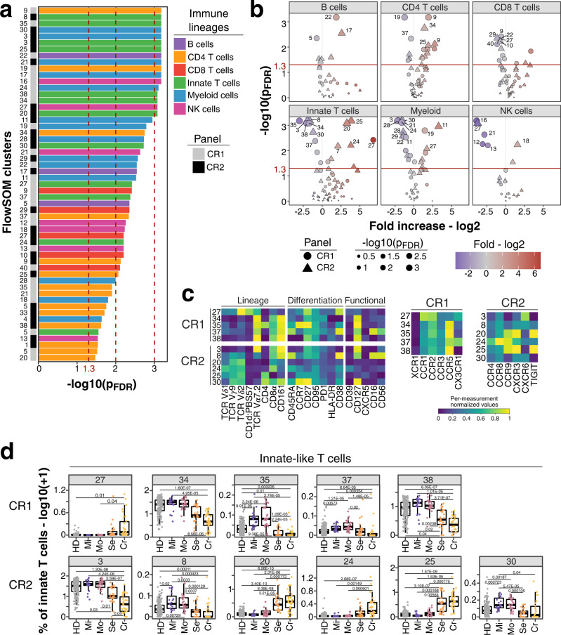
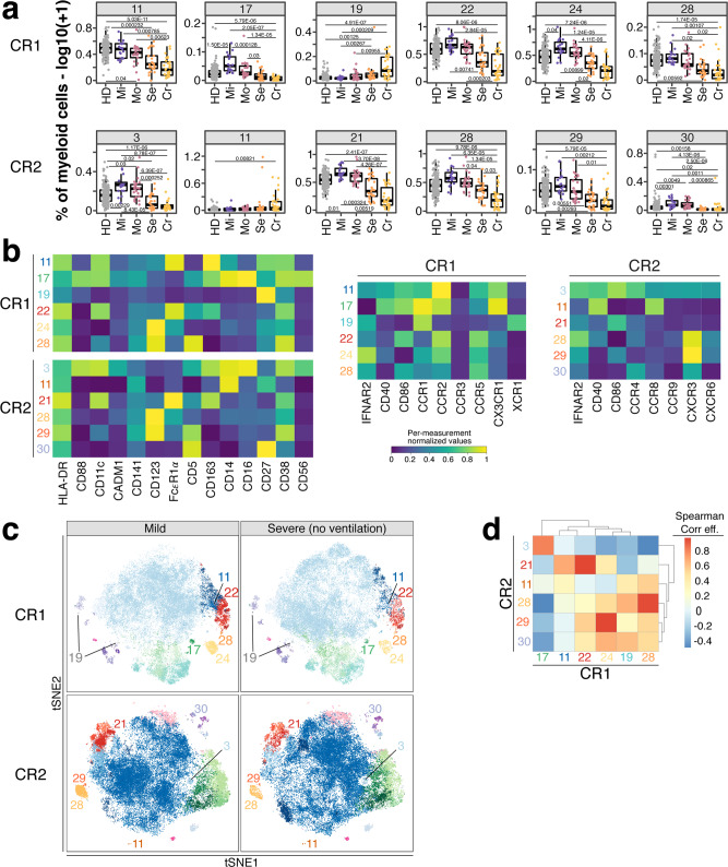
Severe COVID-19 causes profound immune perturbations, but pre-infection immune signatures contributing to severe COVID-19 remain unknown. Genome-wide association studies (GWAS) identified strong associations between severe disease and several chemokine receptors and molecules from the type I interferon pathway. Here, we define immune signatures associated with severe COVID-19 using high-dimensional flow cytometry. We measure the cells of the peripheral immune system from individuals who recovered from mild, moderate, severe or critical COVID-19 and focused only on those immune signatures returning to steady-state. Individuals that suffered from severe COVID-19 show reduced frequencies of T cell, mucosal-associated invariant T cell (MAIT) and dendritic cell (DC) subsets and altered chemokine receptor expression on several subsets, such as reduced levels of CCR1 and CCR2 on monocyte subsets. Furthermore, we find reduced frequencies of type I interferon-producing plasmacytoid DCs and altered IFNAR2 expression on several myeloid cells in individuals recovered from severe COVID-19. Thus, these data identify potential immune mechanisms contributing to severe COVID-19.


Conflict of interest statement

The authors declare no competing interests.

Figures

Fig. 1
Fig. 1. Expression of functional markers and temporal dynamics of immune traits in COVID-19.
a Expression of chemokine receptors, CD40, CD86, IFNAR2, CD39 and TIGIT (rows) on immune cell populations (columns) is depicted. Median of mean fluorescence intensities (MFI) derived from 173 unexposed healthy individuals is visualized by min-max normalized color gradient. Dot size corresponds to median percentage of cells expressing these markers. Missing dots indicate that marker was not measured. b Immune traits (N = 1758) at baseline or affected by long-term perturbations were distinguished in individuals recovered from moderate (left) and severe (right) COVID-19 cases. A combination of (I) linear regression analysis between immune traits and days between symptom onset and sample collection and (II) comparison of samples collected before and after 60 days of symptom onset using a two-sided Wilcoxon test was used as described in Online methods. Plot shows unadjusted −log10 P-values from both analyses. Dot size increases with significance from Wilcoxon test. Trait types are colored (Frequency of immune subset in blue, Frequency of expressing functional marker in orange and MFI values in green). Red line highlights threshold for unadjusted significance (P = 0.05). Source data are provided as a Source Data file.
Fig. 2
Fig. 2. Long-term perturbations of immune traits in COVID-19.
a Top immune traits affected by long-term perturbations are depicted. Traits are derived from analysis in Fig. 1b and selected for P-value < 0.001 in one of both analysis (linear regression and/or Wilcoxon test). Bars pointing to the left and right are derived from linear regression and Wilcoxon test, respectively, and are colored based on trait type (Frequency of immune subset in blue, Frequency of expressing functional marker in orange and MFI values in green). Colored bar on the left depicts severity group from which the significant trait is derived. R2 and slope from linear regression are shown as colored bars on the right. Values in the right bar are slope values from linear regression. Red and black dashed lines show P-value cut-off of 0.001 and 0.05, respectively. b Frequencies of switched (top row) and naïve (bottom row) B cells of total B cells are shown. Plot on the left shows frequencies as boxplots for unexposed healthy donors (gray) and individuals recovered from mild (purple), moderate (burgundy), severe (orange) or critical COVID-19 (yellow). The two plots on the right show the frequency of cells as a function of time between symptom onset and sample collection for individuals recovered from moderate and severe COVID-19. Far right plot shows the distribution of the traits in 173 unexposed healthy individuals. Similar to Fig. 2b, dynamics of c CD38+HLA-DR (left) and CD38HLA-DR of CD4 naive T cells (right), d frequencies of cDC1s of total DCs, e CCR3 MFI of basophils and f CD95 MFI of early NK and NK2 cells are shown. Age-corrected residuals from linear regression were used for statistical analysis. For comparison between groups, one-way ANOVA was used on residuals to test for overall significant difference prior to two-sided Wilcoxon test with Bonferroni correction. Boxplots depict median and interquartile range (IQR) and length of whiskers is 1.5 times IQR. Second and third plot show dot plots with linear regression (red line) and 95% confidence interval for individuals recovered from moderate and severe COVID-19, respectively. Source data are provided as a Source Data file.
Fig. 3
Fig. 3. Potential immune features at baseline predicting COVID-19 severity.
a Flow cytometry data (left) depicts CX3CR1 expression on early NK cells from an individual recovered from mild (top) and severe (bottom) COVID-19. Quantification of mean fluorescence intensity (MFI) of CX3CR1 on early NK cells is shown as boxplot for all study groups. b Flow cytometry dot plots on top row (left and middle plot) depicts expression of CCR4 and CCR9 for a mild and severe COVID-19 case. Histogram overlay shows CXCR3 expression for the same cell subset and donors. MFI values for the same receptors are shown as boxplots for all groups (bottom row). c Flow cytometry plot depicts expression of CCR4 on CD4+ naive (top row), CD4+ transitional memory (TM, second row), CD8+ naïve (third row) and CD8+ TM (bottom row) T cells from an individual recovered from mild (left column) or severe (right column) COVID-19. Quantification of these subsets in all study groups are shown as boxplots (right). d Flow cytometry plot depicts TIGIT expression on CD8+ naive (top row), CD8+ stem-cell like memory (TSCM, second row), CD8+ central memory (CM, third row), CD8+ terminal effector* (TE*, fourth row) T cells and MAIT cells (bottom row) from an individual recovered from mild (left column) and severe (right column) COVID-19. Quantification of these subsets in all study groups are shown as boxplots (right). e Flow cytometry data (left) depicts CD38 and HLA-DR expression on CD8 effector (EM; top) and terminal (TM; bottom) memory T cells from an individual recovered from mild (left) and critical (right) COVID-19. The gate defines CD38+HLA-DR+ activated T cells. Quantification of these subsets in all study groups are shown as boxplots (right). f Flow cytometry example data (left) for gating of marginal zone (MZ) B cells from total B cells in an individual recovered from mild and severe COVID-19 is shown. Boxplot (right) shows frequencies of MZ B cells of total B cells in all study groups. Residuals from linear regression between immune trait and age were used to calculate statistics on age-corrected data. ANOVA with subsequent two-sided Wilcoxon test and Bonferroni correction on residuals was performed for statistics highlighted in boxplots. Boxplots depict median and interquartile range (IQR) and length of whiskers is 1.5 times IQR. Study groups encompass healthy unexposed controls (HD) and individuals recovered from mild (Mi), moderate (Mo), severe (Se) and critical (Cr) COVID-19. Source data are provided as a Source Data file.
Fig. 4
Fig. 4. Innate immune signatures predict COVID-19 severity.
a Example flow cytometry data for frequencies of pDCs from dendritic cells and inflammatory CD14+ DC3s of total DC3s is shown from an individual recovered from mild (top) and critical (bottom) COVID-19. Corresponding enumeration for all donors based on study group and as percentage of total myeloid cells are shown as boxplots (right). Precise delineation of pDCs is shown in Supplementary Fig. 1c. b Mean fluorescence intensity (MFI) of CX3CR1 on cDC1s (left) and pDCs (right) is shown for all study groups as boxplot (top row). Example flow cytometry data for CX3CR1 signal (red peak) on cDC1s (first column) and pDCs (second column) is shown as histogram for an individual recovered from mild (top row) and severe (bottom row) COVID-19. B cells (gray) and Monocytes (blue) are overlaid as reference populations known to lack and express CX3CR1, respectively. Numbers in histogram plots highlight MFI. c Flow cytometry data (left) depicts CCR1 and CCR2 expression on classical (top), intermediate (middle) and non-classical (bottom) monocytes from a patient recovered from mild (left column) and critical (right column) COVID-19. Boxplots (right) show MFI values of CCR1 (first column) and CCR2 (second column) on the same monocyte populations for all study groups. d Expression of IFNAR2 from an individual recovered from mild (red) and severe (blue) COVID-19 is shown as overlaid histogram (left) for classical monocytes (top), CD14+ DC3s (second row), pDCs (third row) and naive B cells (bottom). Plot on the right depicts fold change of median IFNAR2 expression of each disease severity group compared to median IFNAR2 expression of unexposed healthy individuals on all defined myeloid (top) and non-myeloid (bottom) subsets. e Boxplots show IFNAR2 MFI for all study groups for classical monocytes, CD14 + DC3s, pDCs and naïve B cells. Residuals from linear regression between immune trait and age were used to calculate statistics on age-corrected data. ANOVA with subsequent two-sided Wilcoxon test and Bonferroni correction on residuals was performed for statistics highlighted in boxplots. Boxplots depict median and interquartile range (IQR) and length of whiskers is 1.5 times IQR. Study groups encompass healthy unexposed controls (HD) and individuals recovered from mild (Mi), moderate (Mo), severe (Se) and critical (Cr) COVID-19. Source data are provided as a Source Data file.
Fig. 5
Fig. 5. Unsupervised analysis of immune system in individuals recovered from non-severe and severe COVID-19.
a FDR-adjusted −log10 P-values of FlowSOM clusters (N = 55) which differ significantly (P < 0.05) between individuals recovered from non-severe (mild/moderate) and severe (severe/critical) COVID-19 are shown. Bars are colored based on lineage (B cells, purple; CD4 T cells, orange; CD8 T cells, red; innate-like T cells, green; myeloid cells, blue; NK cells, pink). Bar on the left indicates whether traits originate from chemokine receptor panel 1 (CR1, gray) or 2 (CR2, black). b Volcano plots show FDR-adjusted −log10 P-values and log2 fold change derived from comparison of FlowSOM clusters between individuals recovered from non-severe and severe COVID-19 cases. Main lineages are depicted in separated plots and contain FlowSOM clusters from both panels CR1 (circle) and CR2 (triangle). Data point size corresponds to −log10 P-values and color indicates log2 fold change. P-values from Fig. 5a and b derive from logistic regression analysis with correction for age and experiment batch. P-values were corrected for multiple testing using Benjamini-Hochberg false discovery rate. c Heatmap depicts normalized median fluorescence intensity (MFI) values for lineage, differentiation and functional markers from top significant innate-like T cell clusters (Fig. 5a, P < 0.01). Values derived from CR1 (top) and CR2 (bottom) panels are separated. Heatmaps on the right highlight expression of markers specific for CR1 and CR2 panels including chemokine receptors, co-stimulatory markers and IFNAR2. Values are normalized based on trimmed 1–99% percentile values. Complete heatmaps for all innate-like T cell clusters are shown in Supplementary Fig. 12a, b. d Frequencies for same clusters described in Fig. 5c are shown as boxplots based on study group. Values are log10(+1) transformed and plotted on linear scale. Logistic regression with correction for age and experiment batch was used to identify significant clusters between non-severe and severe COVID-19. Only FlowSOM clusters (N = 291) which did not show temporal changes within moderate and severe COVID-19 cases are shown as described in the Online methods section and results (Supplementary Fig. 13a). Residuals from linear regression between immune trait and age were used to calculate statistics on age-corrected data. ANOVA with subsequent Wilcoxon test and Bonferroni correction on residuals was performed for statistics highlighted in boxplots. Boxplots depict median and interquartile range (IQR) and length of whiskers is 1.5 times IQR. Study groups encompass healthy unexposed controls (HD) and individuals recovered from mild (Mi), moderate (Mo), severe (Se) and critical (Cr) COVID-19. Source data are provided as a Source Data file.
Fig. 6
Fig. 6. Myeloid cell populations from FlowSOM analysis as potential predictor for disease outcome.
a Frequencies (log10 + 1) of myeloid cell clusters among top hits (P < 0.01) described in Fig. 5a are shown for CR1 (top row) and CR2 panel (bottom row). Values are log10(+1) transformed and plotted on linear scale. Residuals from linear regression between immune trait and age were used to calculate statistics on age-corrected data. ANOVA with subsequent two-sided Wilcoxon test and Bonferroni correction on residuals was performed for statistics highlighted in boxplots. Boxplots depict median and interquartile range (IQR) and length of whiskers is 1.5 times IQR. Study groups encompass healthy unexposed controls (HD) and individuals recovered from mild (Mi), moderate (Mo), severe (Se) and critical (Cr) COVID-19. b Heatmaps showing normalized median fluorescence intensity (MFI) values for clusters described in Fig. 6a are shown. Heatmaps on the left show markers used to delineate immune cell subsets. On the right, heatmaps depict CR panel-specific markers. Values are normalized based on trimmed 1–99% percentile values. c tSNE plots with myeloid cells from individuals recovered from mild (left column) or severe (right column) COVID-19 are shown. Data from panels CR1 and CR2 are shown in the top and bottom row, respectively. Each plot contains 50,000 subsampled myeloid cells (gating shown in Supplementary Fig. 2d). Dots are colored based on FlowSOM cluster annotation and full data is shown in Supplementary Fig. 10a–c. Clusters described in Fig. 6a and b are annotated and highlighted. d Spearman analysis of normalized MFI values between clusters described in Fig. 6a is shown in order to estimate the phenotypic overlap between CR1 and CR2 panel. Heatmap depicts Spearman correlation coefficient.

Update of

References

    1. Karmakar M, Lantz PM, Tipirneni R. Association of social and demographic factors with COVID-19 incidence and death rates in the US. JAMA Netw. Open. 2021;4:e2036462. doi: 10.1001/jamanetworkopen.2020.36462. - DOI - PMC - PubMed
    1. Pairo-Castineira E, et al. Genetic mechanisms of critical illness in COVID-19. Nature. 2021;591:92–98. doi: 10.1038/s41586-020-03065-y. - DOI - PubMed
    1. Initiative C-HG. Mapping the human genetic architecture of COVID-19. Nature600, 472–477 (2021). - PMC - PubMed
    1. Roederer M, et al. The genetic architecture of the human immune system: a bioresource for autoimmunity and disease pathogenesis. Cell. 2015;161:387–403. doi: 10.1016/j.cell.2015.02.046. - DOI - PMC - PubMed
    1. Dyer DP. Understanding the mechanisms that facilitate specificity, not redundancy, of chemokine-mediated leukocyte recruitment. Immunology. 2020;160:336–344. doi: 10.1111/imm.13200. - DOI - PMC - PubMed

Publication types