. 2022 Nov 30;18(11):e1010726.
doi: 10.1371/journal.pcbi.1010726. eCollection 2022 Nov.

Cluster detection with random neighbourhood covering: Application to invasive Group A Streptococcal disease

Affiliations

Cluster detection with random neighbourhood covering: Application to invasive Group A Streptococcal disease

Massimo Cavallaro et al. PLoS Comput Biol. .

Abstract

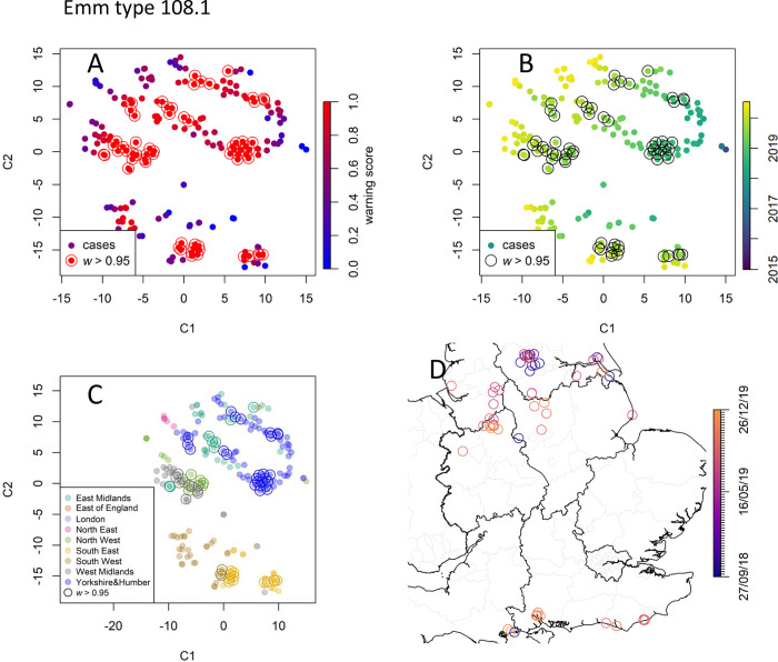
The rapid detection of outbreaks is a key step in the effective control and containment of infectious diseases. In particular, the identification of cases which might be epidemiologically linked is crucial in directing outbreak-containment efforts and shaping the intervention of public health authorities. Often this requires the detection of clusters of cases whose numbers exceed those expected by a background of sporadic cases. Quantifying exceedances rapidly is particularly challenging when only few cases are typically reported in a precise location and time. To address such important public health concerns, we present a general method which can detect spatio-temporal deviations from a Poisson point process and estimate the odds of an isolate being part of a cluster. This method can be applied to diseases where detailed geographical information is available. In addition, we propose an approach to explicitly take account of delays in microbial typing. As a case study, we considered invasive group A Streptococcus infection events as recorded and typed by Public Health England from 2015 to 2020.


Conflict of interest statement

The authors have declared that no competing interests exist.

Figures

Fig 1
Fig 1. Representation of random neighbourhood covering on a two-dimensional space.
A Black markers represent point events that are generated from an endemic baseline (blue shade). Circles are randomly drawn to cover the neighbourhoods of the events. The number of events in any circle is consistent with the endemic baseline prediction within statistical fluctuations. B Three point events (red markers) representing an unexpected outbreak are on the region delimited by the dashed line. Many circles (coloured in red) in this region contain significantly more points than the baseline prediction.
Fig 2
Fig 2. Simulation experiment.
A Synthetic baseline point events (black markers) for 1≤t≤9. Additional points representing an outbreak (red markers) are in the areas delimited in red. B Algorithm prediction. Episode markers are coloured by their warning scores, blue (w = 0) to red (w = 1). The algorithm assigns high warning scores to the events in the outbreak areas.
Fig 3
Fig 3. Timeliness.
As the time τ progresses and new cases and cylinders are added, the warning-score values of cases previously detected (here at t = 5,6,7, see also Fig 2) are updated. In fact, these converge quickly and even the earliest warning values are informative.
Fig 4
Fig 4
Relative frequency λm of selected emm types in England computed retrospectively over the observation times τ. A The fraction the total of three most common types (viz., 1.0, 89.0, and 12.0) is either overall declining or stable, yet they still account for more than 38% of all episodes at the end of the study. B Selected emm types show concerning relative growth (108.1 and 33.0) or stable pattern (44.0 and 94.0) over recent years.
Fig 5
Fig 5
Weekly number of iGAS infection cases (black solid line) and fitted temporal baseline function λtime (dashed red line, shaded area comprises 95% confidence interval). 2018 was a year of heightened transmission across England, as reported in [56]. The overall fitted trend is increasing, despite the sharp drop in 2020.
Fig 6
Fig 6. Simulation experiment on realistic baseline.
A The total number of synthetic epidemic cases increases slowly from t = 40 until it reaches a peak at week t = 48, thus simulating the emergence of an outbreak. B The retrospectively-computed warning scores w(x) for the epidemic cases (red markers) are typically larger than those for the endemic cases (blue markers); plotting these vs time highlights the epidemic cluster. C Simulated outbreak points are close in both time and space, but it is hard to naively detect the anomaly (see also S2 and S4 Figs); localising the cases with w(x)>0.95 (orange markers) identifies the outbreak epicentre; in the inset, the true outbreak cases are marked with a red cross and the area detected by SaTScan is circled for comparison. Map created with Sf [55] using shapefiles from the GADM database (https://gadm.org/maps/GBR_1.html) and the Ordnance Survey Data Hub (https://osdatahub.os.uk/downloads/open/BoundaryLine). D Warning scores of two random replicates with different cylinder volumes are strongly correlated, showing that outbreak detection is robust with respect to the cylinder volume choice. E Timeliness: updating a true-case warning score prospectively as new cases are added shows that it increases as the outbreak progresses, thus permitting detection earlier than the peak time t = 48 (colour shades are case dates as in A).
Fig 7
Fig 7. Data point embedding and cluster analysis for emm type 94.0.
A Each iGAS record, identified by its position in time and space, is embedded in a two-dimensional space of coordinates C1 and C2 according to the t-SNE method. The points are coloured by their warning scores (0 to 1, blue to red), thus showing the presence of a bright red cluster of points with high warning scores (w>0.95). Colouring the detected cases by their record time (B) and region (C) shows that t-SNE preserves the neighbourhoods. D The framed cluster corresponds to cases localised in the towns of Bournemouth and Weymouth. Map created with Sf [55] using shapefiles from the GADM database (https://gadm.org/maps/GBR_1.html) and the Ordnance Survey Data Hub (https://osdatahub.os.uk/downloads/open/BoundaryLine).
Fig 8
Fig 8. Data point embedding and cluster analysis for emm type 108.0. Keys as in Fig 7.
emm 108.0 is a concerning type due to its recent increase in the number of cases. The many cases tagged with high warning scores (A) occurred after 2018 (B) and are clustered around several geographical locations (C-D). Map created with Sf [55] using shapefiles from the GADM database (https://gadm.org/maps/GBR_1.html) and the Ordnance Survey Data Hub (https://osdatahub.os.uk/downloads/open/BoundaryLine).
Fig 9
Fig 9. Data point embedding and cluster analysis for emm type 44.0. Keys as in Fig 7.
The analysis detects a compact cluster localised in the East of England in 2019 (rectangle), with its embedded points mapped to their geographical location by the arrows. Map created with Sf [55] using shapefiles from the GADM database (https://gadm.org/maps/GBR_1.html) and the Ordnance Survey Data Hub (https://osdatahub.os.uk/downloads/open/BoundaryLine).
Fig 10
Fig 10. Data point embedding and cluster analysis for the rare emm type 33.0. Keys as in Fig 7.
Inspection suggests that these cases belong to a single diffused cluster that emerged in September 2019. Map created with Sf [55] using shapefiles from the GADM database (https://gadm.org/maps/GBR_1.html) and the Ordnance Survey Data Hub (https://osdatahub.os.uk/downloads/open/BoundaryLine).
Fig 11
Fig 11. Data point embedding for the common emm type 12.0.
No detected case is assigned a warning score higher than 0.95.
Fig 12
Fig 12. Prospective analysis for emm type 44.0.
A Warning scores retrospectively computed every week as new cases are included; some cases, corresponding to the cluster of March 2019 in the East of England, incur a sharp increase in their warning scores (top right lines, amber to violet colour indicate typing week). B The score of the first cluster case (detected and typed in the week of 21/03/19) increases rapidly during the first four weeks. C Observation counts (marker) and estimated baselines (lines) in the week of 18/06/20 for both typed (blue colour) and untyped (grey colour) cases. D Warning scores of selected cluster cases. These cases were initially recorded without any typing information. Using the untyped observations, it is possible to obtain early warning scores (grey colour). The samples are typed a week after detection and the warning scores are updated accordingly (amber to orange colour shade indicate type week).

References

    1. German R.R., Lee L. M., Horan J. M., Milstein R. L., Pertowski C. A., Waller M. N., et al.., Updated guidelines for evaluating public health surveillance systems: recommendations from the Guidelines Working Group. MMWR 2001. 50(RR-13): p. 1–35 - PubMed
    1. Elliot A.J., Harcourt S.E., Hughes H.E., Loveridge P., Morbey R.A., Smith S.,et al.., The COVID-19 pandemic: a new challenge for syndromic surveillance. Epidemiology and Infection, 2020. 148: p. e122. doi: 10.1017/S0950268820001314 - DOI - PMC - PubMed
    1. Marston H.D., Dixon D.M., Knisely J.M., Palmore T.N., Fauci A.S., Antimicrobial Resistance. Jama-Journal of the American Medical Association, 2016. 316(11): p. 1193–1204. doi: 10.1001/jama.2016.11764 - DOI - PubMed
    1. Martinez R., Lloyd-Sherlock P., Soliz P., Ebrahim S., Vega E., Ordunez P., et al.., Trends in premature avertable mortality from non-communicable diseases for 195 countries and territories, 1990–2017: a population-based study. Lancet Glob Health, 2020. 8(4): p. e511–e523. doi: 10.1016/S2214-109X(20)30035-8 - DOI - PubMed
    1. Brookmeyer R. and Stroup D.F. (eds),Monitoring the Health of Populations: Statistical Principles and Methods for Public Health Surveillance. 2004: Oxford University Press, New York, USA.

Publication types

MeSH terms