. 2022 Dec;54(12):1919-1932.
doi: 10.1038/s41588-022-01223-8. Epub 2022 Dec 5.

Enhancer-promoter interactions and transcription are largely maintained upon acute loss of CTCF, cohesin, WAPL or YY1

Affiliations

Enhancer-promoter interactions and transcription are largely maintained upon acute loss of CTCF, cohesin, WAPL or YY1

Tsung-Han S Hsieh et al. Nat Genet. 2022 Dec.

Abstract

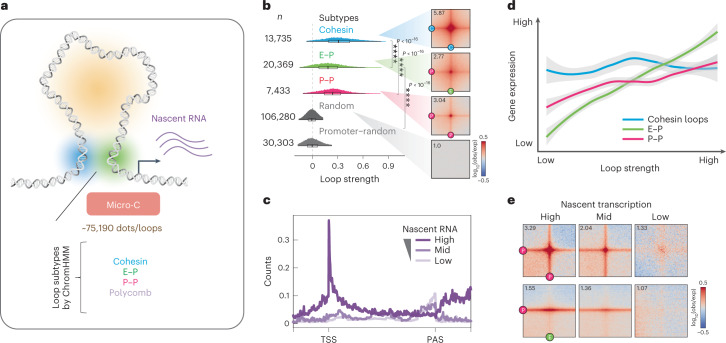
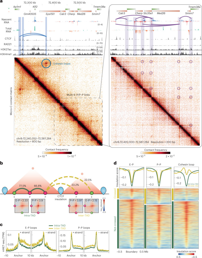
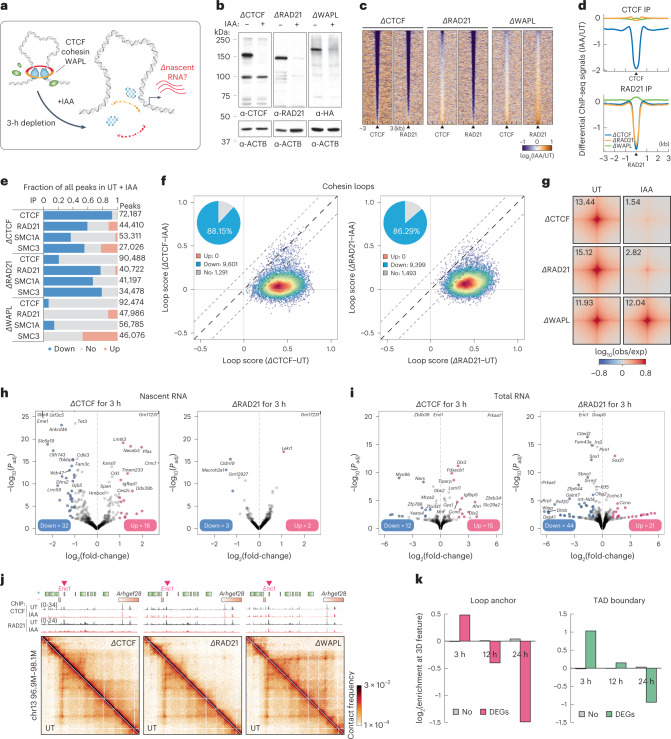
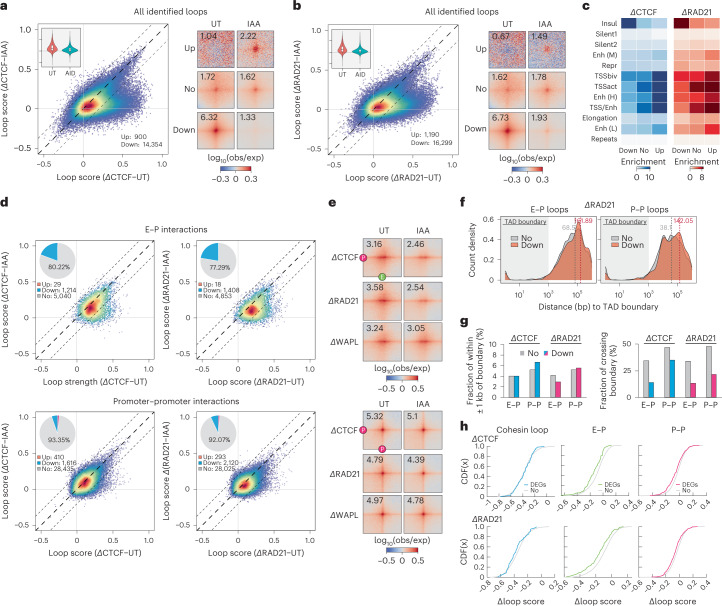
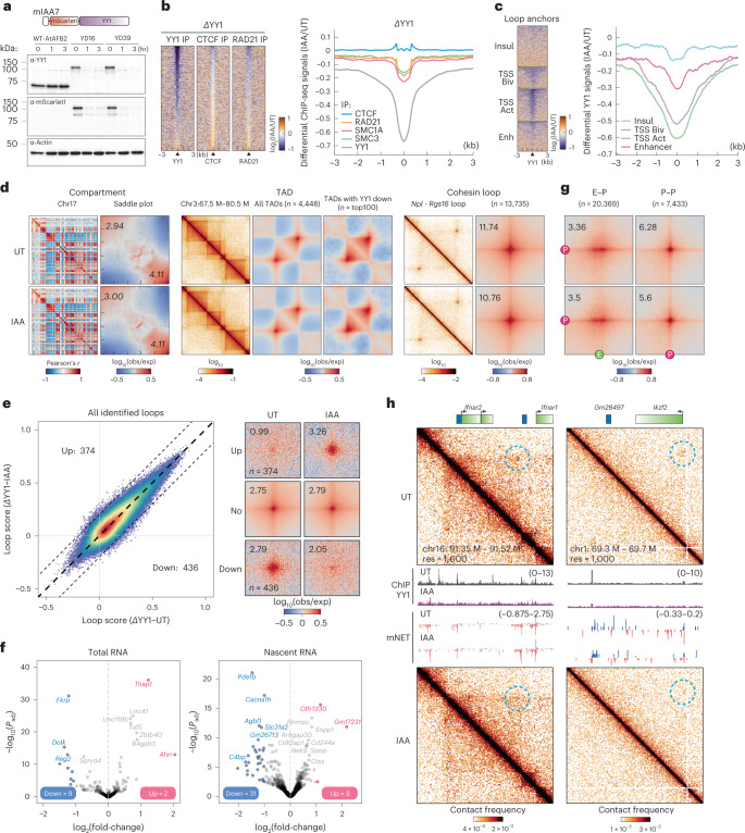
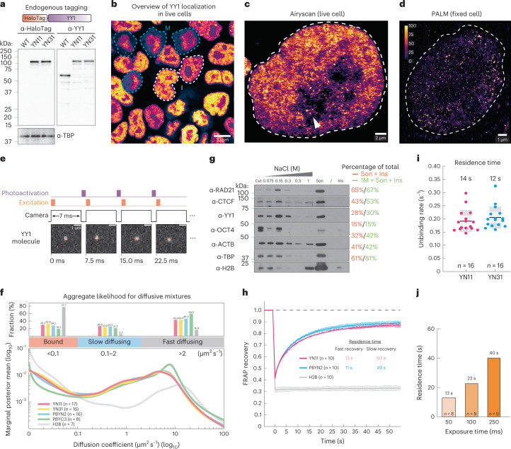
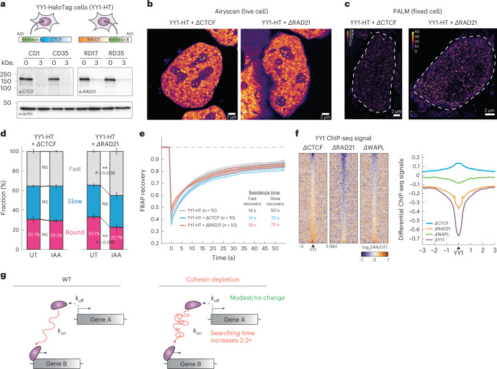
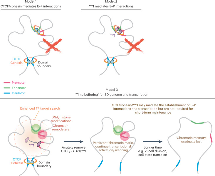
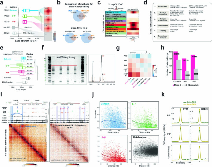
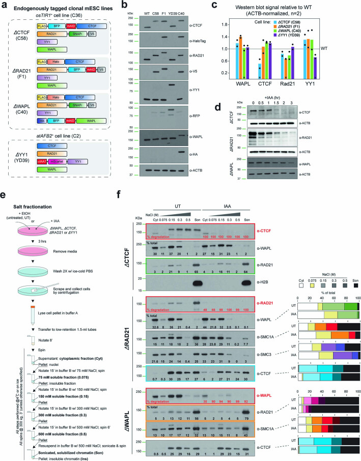
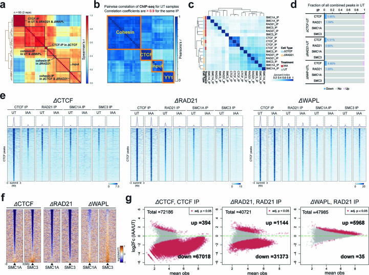
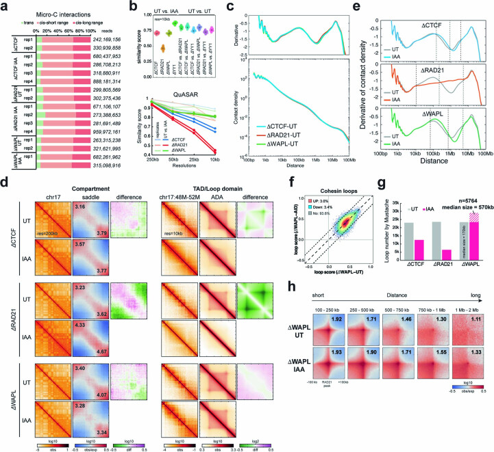
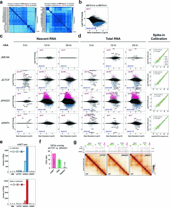
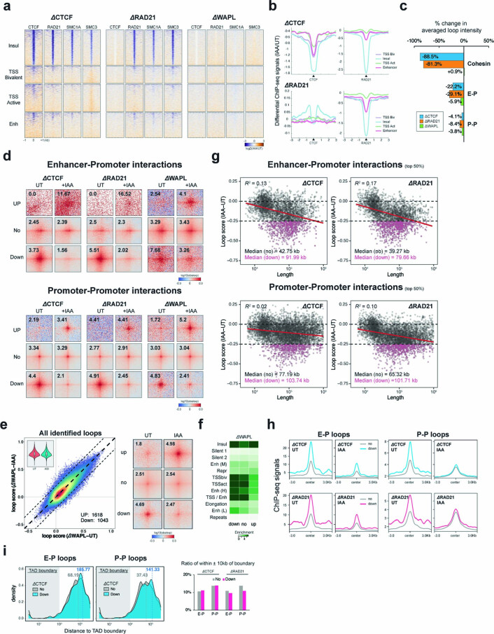
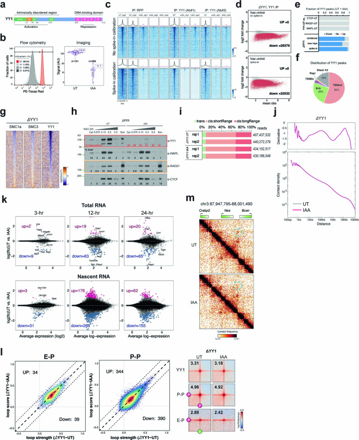
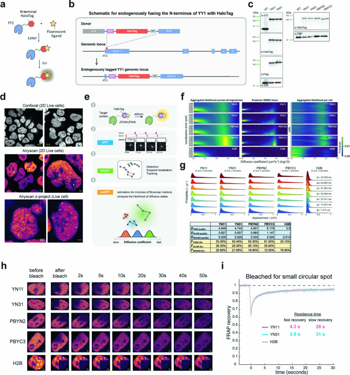
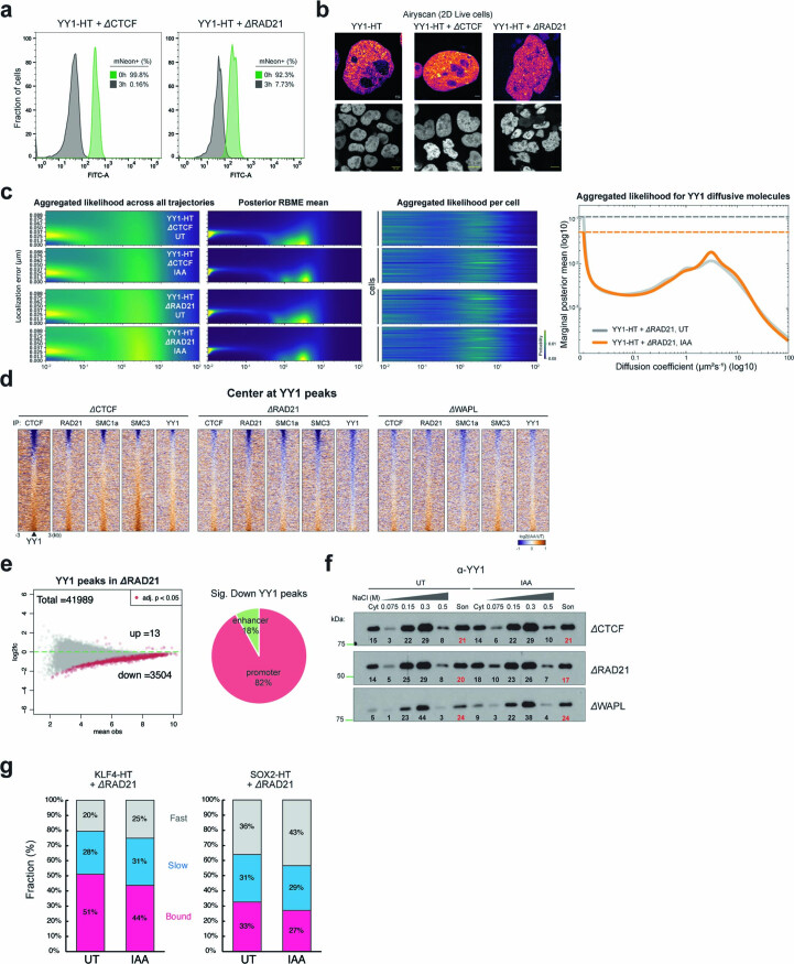
It remains unclear why acute depletion of CTCF (CCCTC-binding factor) and cohesin only marginally affects expression of most genes despite substantially perturbing three-dimensional (3D) genome folding at the level of domains and structural loops. To address this conundrum, we used high-resolution Micro-C and nascent transcript profiling in mouse embryonic stem cells. We find that enhancer-promoter (E-P) interactions are largely insensitive to acute (3-h) depletion of CTCF, cohesin or WAPL. YY1 has been proposed as a structural regulator of E-P loops, but acute YY1 depletion also had minimal effects on E-P loops, transcription and 3D genome folding. Strikingly, live-cell, single-molecule imaging revealed that cohesin depletion reduced transcription factor (TF) binding to chromatin. Thus, although CTCF, cohesin, WAPL or YY1 is not required for the short-term maintenance of most E-P interactions and gene expression, our results suggest that cohesin may facilitate TFs to search for and bind their targets more efficiently.


Conflict of interest statement

The authors declare no competing interests.

Figures

Fig. 1
Fig. 1. Genome-wide identification of transcription-linked chromatin loops.
a, Micro-C identified >75,190 chromatin dots/loops, subclassified into four primary types (Mustache loop caller; see Methods and Supplementary Note). b, Probability distribution of loop strength for cohesin, E–P, P–P and random loops. Chromatin loop numbers are shown on the left. The box plot indicates the quartiles for the loop strength score distribution (min. = lower end of line, Q1 = lower bound of box, Q2 = line in box, Q3 = higher bound of box and max. = higher end of line). Genome-wide averaged contact signals (aggregate peak analysis (APA)) are plotted on the right. The contact map was normalized by matrix balancing and distance (Obs/Exp), with positive enrichment in red and negative signal in blue, shown as the diverging color map with the gradient of normalized contact enrichment in log10. The ratio of contact enrichment for the center pixels is annotated within each plot. This color scheme and normalization method are used for normalized matrices throughout the manuscript unless otherwise mentioned. Loop anchors are annotated as ‘C’ for CTCF/cohesin, ‘P’ for promoter and ‘E’ for enhancer. Asterisks denote a P < 10−16 using two-sided Wilcoxon’s signed-rank test. The data are presented in the same format and color scheme throughout the manuscript unless otherwise indicated (n = 37 biological replicates). c, Genome-wide averaged transcript counts for nascent transcript profiling. Genes are grouped into high, medium and low expression levels based on nascent RNA-seq data (gene body) and rescaled to the same length from TSS (transcription start site) to poly(adenylation) cleavage site (PAS) or TES (transcription end site) on the x axis. d, Rank-ordered distribution of loop strength against gene expression for cohesin, E–P and P–P loops. Gene expression levels for the corresponding chromatin loop were calculated by averaging the genes with TSSs located ±5 kb around the loop anchors. Loop strength was obtained from the same analysis shown in b. The distribution for each loop type was fitted and smoothed by LOESS (locally estimated scatterplot smoothing) regression. Error bands indicate fitted curve ± s.e.m. with 95% confidence interval (CI). e, APAs are plotted by paired E–P/P–P loops and sorted by the level of nascent transcription into high, mid and low levels.
Fig. 2
Fig. 2. E–P/P–P loops can cross TAD boundaries.
a, Snapshots of Micro-C maps of an ~300-kb region plotted with 800-bp resolution (left) and an ~150-kb region plotted with 200-bp resolution (zoomed-in, right). Micro-C data are reanalyzed from our previous study. The standard heatmap shows the gradient of contact intensity for a given pair of bins. This color scheme is used for Micro-C maps throughout the manuscript. Contact maps are annotated with gene boxes and 1D chromatin tracks show the signal enrichment in the same region. Features such as cohesin loops (blue arched lines and circles) and E–P/P–P loops (purple arched lines and circles) enriched at stripe intersections are highlighted. The CTCF and cohesin ChIP-seq peaks show strong contact signals between the Ap1m1 and Eps15l1 genes (blue arched lines and circle), which insulate the Klf2 gene from communicating with regions outside the loop domain. However, multiple weak interactions within the downstream 150-kb region around the Med26 gene still occur without apparent cohesin residency at their anchors (purple arched lines and circles), and these contacts sharply correlate with nascent transcription signals at promoters and enhancers. b, Schematic (top) showing two adjacent TADs insulated by CTCF boundaries and E–P/P–P interactions either within a TAD (intra-TAD, solid arched line) or across TADs (inter-TAD, dashed arched line). E–P/P–P contact intensity was quantified with the Micro-C data at 2-kb or 4-kb resolution. TADs called by Cooltools and Arrowhead returned similar results for the ratio of boundary-crossing E–P/P–P (see Methods). APA (bottom) is plotted for paired E–P/P–P that either cross (inter-TAD) or do not cross (intra-TAD) a TAD boundary. c, Nascent transcription (± strand) at the loop anchors of intra- (green) or inter-TAD (yellow) E–P/P–P loops. TPM, transcripts per million. d, Heatmap and histogram profile of insulation scores at 20-kb resolutions spanning the 1-Mb window for intra- (green) or inter-TAD (yellow) E–P/P–P loops. Color map shows strong insulation in red and weak insulation in blue in log10.
Fig. 3
Fig. 3. Acute depletion of loop extrusion factors affects a small set of genes.
a, Experimental design for CTCF, RAD21 or WAPL degradation. b, Western blots showing CTCF, RAD21 and WAPL degradation levels, and β-actin loading control 3 h after IAA treatment. c, CTCF and RAD21 differential ChIP-seq signals in cells depleted of CTCF, RAD21 or WAPL. MACS2 (model-based analysis of ChIP-seq 2)-called peaks are plotted at the center ± a 3-kb region. The color map shows increased signal (log2) in orange and decreased signal in purple after IAA treatment. Data are not normalized with a spike-in control. d, Histogram profile of differential CTCF or RAD21 ChIP-seq signals in CTCF-, RAD21- or WAPL-depleted cells. e, Summary of differential ChIP-seq peak analysis. The chart shows the fraction of downregulated, upregulated or unchanged peaks after IAA treatment. The total number of peaks for each protein was summed from all peaks in untreated and IAA-treated cells. f, Scatter plots of loop scores for cohesin loops in untreated and IAA-treated cells. The loop score was quantified by using 2-kb Micro-C data. The overlaid heatmap indicates dot density (red, highest; blue, lowest). Dashed lines along the diagonal delimit unchanged loops. The pie chart (inset) shows the fraction of increased, decreased or unchanged loop intensity after IAA treatment. Scatter plots comparing loop intensities between two conditions are plotted in this format throughout the manuscript unless noted. g, APAs plotted for paired cohesin peaks for untreated and IAA-treated cells. h,i, Volcano plots of nascent (h) or total (i) RNA-seq for CTCF or RAD21 depletion. DEGs with q value <0.01 and twofold change are labeled pink (up) or blue (down). The statistical tests for all RNA-seq and mNET-seq in the present study are obtained from the statistical model derived from DEseq2 unless otherwise indicated. j, Micro-C maps comparing chromatin interactions in untreated (top right) and IAA-treated (bottom left) cells surrounding Enc1. Contact maps are annotated with gene boxes and 1D chromatin tracks showing the ChIP-seq signal enrichment in the same region. k, Bar graph with log2(enrichment) of unaffected genes (No) or DEGs ±5 kb around loop anchors (left) or TAD boundaries (right). Source data
Fig. 4
Fig. 4. E and P proximity persists after the acute loss of loop extrusion factors.
a,b, Scatter plots of loop scores for the loops called in untreated and IAA-treated ΔCTCF (a) and ΔRAD21 (b) degron cell lines (left). The loop score was quantified using Micro-C data at 2-kb resolution. The violin chart (inset) shows the distribution of loop scores for the untreated and IAA-treated conditions. The box plot distribution is described in Fig. 1b. APAs are plotted with loops sorted by upregulated (Up), downregulated (Down) or unchanged (No) loops (right; control = 2; IAA = 4 biological samples). c, Enrichment of ChromHMM states at loop anchors grouped by upregulated, downregulated or unchanged after IAA treatment. d, Scatter plots of loop scores plotted for paired E–P (top) or P–P (bottom) loops in the untreated and IAA-treated cells. Pairwise loops are limited to distances between 5 kb and 2 Mb. The loop score was quantified using Micro-C data at 2-kb resolution. The pie chart (inset) shows the fraction of loops with intensity increased, decreased or unchanged after IAA treatment. Note that the average contact intensity of unchanged loops decreased by ~2.4% and ~8.0% after CTCF and cohesin depletion, respectively. e, APAs for E–P (top) or P–P (bottom) loops plotted for the indicated untreated and IAA-treated cell lines. When CTCF/cohesin is depleted, the contact intensity is decreased by ~22.2% or ~29.1% for E–P loops, but only ~4.1% or ~8.4% for P–P loops. f, Length distribution of the unchanged or downregulated E–P/P–P loops relative to TAD boundaries in the RAD21 degron line. g, Ratio of the unchanged or downregulated E–P/P–P loop anchors located within ±1 kb of TAD boundaries (left) or that can cross TAD boundaries (right). h, Cumulative distribution (CDF) curves as a function of differential loop score (IAA, untreated) for all loops or loop anchors within 1 kb of the promoter of unchanged genes (No) or DEGs in CTCF and RAD21 degron lines. A CDF curve shift to the left indicates a greater reduction in interaction frequency on IAA treatment.
Fig. 5
Fig. 5. YY1 depletion does not immediately alter global gene expression and E–P/P–P proximity.
a, Schematic for endogenous tagging for YY1 depletion and the results of western blots for YY1 and β-actin. b, Heatmaps (left) and histogram profiles (right) of differential ChIP-seq signals for YY1, CTCF and cohesin after YY1 depletion. c, Heatmaps (left) and histogram profiles (right) of differential ChIP-seq signals for YY1 around the four types of loop anchors. d, Overview of Micro-C contact maps at specific regions or genome-wide scale across multiple resolutions in the untreated and IAA-treated cells. Left to right, examples of Pearson’s correlation matrices showing plaid-like chromosome compartments; saddle plots showing overall compartment strength (A-A: bottom right; B-B: top left); contact matrices showing TADs along the diagonal; aggregate domain analysis (ADA) showing all TADs; ADA showing TADs with downregulated YY1 ChIP-seq signals; contact matrices showing cohesin loops off the diagonal; and APAs showing overall loop intensity for cohesin loops. e, Scatter plots of loop scores for the called loops in the untreated and IAA-treated cells (left). The loop score was quantified by using Micro-C data at 2-kb resolution. APAs are plotted with loops sorted by upregulated, downregulated or unchanged. f, Volcano plot of total RNA-seq (left) or nascent RNA-seq (right) for YY1 depletion. DEGs (q value <0.01 and twofold change) are colored in pink (up) or blue (down). g, APAs showing overall loop intensity for E–P/P–P loops in untreated and IAA-treated YY1 degron cells. h, Snapshots of Micro-C maps comparing chromatin interactions in the untreated (top) and IAA-treated (bottom) cells surrounding the Ifnar2 or Ikzf2 gene. Contact maps are annotated with gene boxes and genome browser tracks showing YY1 ChIP-seq signal enrichment and mNET-seq signals, with the plus strand in blue and the negative strand in red. Source data
Fig. 6
Fig. 6. YY1 binding dynamics.
a, Endogenously tagging YY1 with HaloTag and YY1 and TATA-box-binding protein (TBP) western blots. HaloTag is covalently conjugated with cell-permeable dyes for single-molecule imaging in live cells. b, HaloTag-YY1 live-cell confocal imaging after staining with 500 nM TMR Halo ligand. The white dashed lines show interphase cells and the blue dashed lines mitotic cells. Scale bar, 10 μm. c, YY1 Airyscan-resolved, live-cell confocal imaging (n = 13). The arrow shows sporadic loci within the nucleolus. Scale bar, 2 μm. d, YY1 PALM imaging (n = 30). The color map shows signal ranging from 0 to 100. Scale bar, 1 μm. e, The spaSPT illumination pattern and representative YY1 raw images with tracking overlaid. HaloTag-YY1 molecules were detected and tracked to form trajectories. The SASPT analysis package infers diffusion coefficient distributions from spaSPT data. Two major apparent diffusion states are a bound population (diffusion coefficient Dbound < 0.1 µm2 s−1) and a mixture of freely diffusing molecules (Dfree > 0.1 µm2 s−1), which can be separated further into slow (Dslow ~0.1–2 µm2 s−1) and fast moving (Dfast > 2 µm2 s−1). Scale bar, 1 μm. f, Aggregate likelihood of diffusive YY1 molecules. Top, bar graph showing fractions of YY1 binned into bound, slow- and fast-diffusing subpopulations. Bottom, YY1 diffusion coefficient estimation by regular Brownian motion with marginalized localization errors. g, Western blots of cytoplasmic (Cyt) and nuclear proteins dissociating from chromatin at increasing salt concentrations (Extended Data Fig. 2b). A subpopulation (~30%) of YY1 stays on chromatin, resisting 1 M washes. Ins, insoluble pellet after sonication; Son, sonicated, solubilized chromatin. Percentage of total shows the signal intensity of the indicated fractions divided by the total signal intensity. Anti-histone 2B controls for chromatin integrity during fractionation. h, FRAP analysis of YY1 bleached with a square spot. Error bars are fitted curve ± s.e.m. with 95% CI. i, Slow-SPT measuring YY1 residence time. Individual molecules were tracked at 100-ms exposure time to blur fast-moving molecules into the background and capture stable binding. The unbinding rate is obtained by fitting a model to the molecules’ survival curve. Each datapoint indicates the unbinding rate of YY1 molecules in a single cell. The box plot shows quartiles of data. Error bars are mean ± s.d. j. Slow-SPT measures YY1’s residence time at multiple exposure times. Source data
Fig. 7
Fig. 7. Cohesin depletion alters YY1’s target search efficiency.
a, Schematics for endogenously tagging CTCF/cohesin with AID in the HaloTag-YY1 cell line (YY1-HT, clone YN11) and western blots of CTCF, RAD21 and β-actin. b, Airyscan-resolved, live-cell confocal imaging for HaloTag-YY1 stained with 500 nM TMR Halo ligand in CTCF- or RAD21-depleted cells (n = 6 for each depletion). Scale bar, 1 μm. c, PALM imaging for YY1 (n = 13 for each depletion). Color maps color the signal ranging from 0 to 40. Scale bar, 1 μm. d, Stacked bar graph showing the fractions of bound, slow- and fast-diffusing YY1 in the untreated and IAA-treated cells, obtained by SASPT analysis (n = 8 cells examined over three independent experiments). The statistical test used was the two-sided Student’s t-test. NS, not significant. Error bars indicate mean ± s.d. e, FRAP analysis of YY1 in the control, CTCF-depleted or RAD21-depleted cells. f, Heatmaps (left) and histogram profiles (right) of differential ChIP-seq signals for YY1 after CTCF, RAD21 or WAPL depletion. Error bars indicate mean ± s.d. g, Dynamic model of how cohesin or cohesin-mediated structures may accelerate TF target search. Source data
Fig. 8
Fig. 8. Models of E–P interactions and transcription in the context of 3D genome organization.
Our findings exclude CTCF, cohesin or YY1 being required short term to maintain E–P interactions. Instead, we propose a time-buffering model to link 3D genome organization and gene expression. Once established, E–P interactions can temporarily sustain gene expression in the absence of architectural proteins, perhaps through an epigenetic molecular memory. We also propose that cohesin facilitates TF binding to chromatin.
Extended Data Fig. 1
Extended Data Fig. 1. Genome-wide identification of chromatin loops.
a. Loop strengths. Paired loci quantified using Chromosight (results comparable to Mustache in Fig. 1b). Loop numbers shown on the left. Box plot: quartiles for the loop strength score distribution as in Fig. 1b. Right: genome-wide averaged contact signals. Contact map normalized by matrix balancing and distance, shown as a diverging colormap with the gradient of normalized contact enrichment in log10 (red: positive enrichment; blue: negative signal). Ratio of contact enrichment for the center pixels annotated within each plot. Asterisks: P < 10−16, two-sided Wilcoxon test. n = 37 biological replicates. b. Comparison of Mustache and Hiccups loop calling algorithms on Micro-C data (top) and Micro-C vs. Hi-C loops called by different algorithms (bottom). c. Enrichment of mESC ChromHMM states at loop anchors. Heatmap: log2 enrichment of each state ± 5-kb around loop anchors. Loops = 75,190; loop anchors = 118,733 after removing duplicates. d. Loop analysis pipeline. e. Loop length distributions. Colored box: 2-kb resolution Micro-C data; white box: 4-kb resolution data. Box plot: quartiles for the loop length distribution as in Fig. 1b. Median size of loops annotated on the right. Median lengths are larger than our previous analysis with the insulation score due to the high computational expense to quantify the short-range loops with Micro-C data finer than 1-kb resolution. Asterisks: P < 10−16, two-sided Wilcoxon test. n = 37 biological replicates. f. Left: gel image of the mNET-seq library size (6% PAGE). Right: resolved bands on a Fragment Analyzer electropherogram. g. Heatmap of Pearson’s correlation between sequencing data and chromatin structures by Micro-C or Hi-C. Compartment, TAD and loop scores obtained from Cooltools, Arrowhead and Chromosight, respectively. h. Micro-C or Hi-C loop numbers. Contacts surrounding the intersections of targets quantified with data at 4-kb resolution using Chromosight. i. Snapshots of Hi-C data in the same region as Fig. 2a. j. Rank-ordered distribution of loop length against loop strength. Distributions fitted and smoothed by LOESS regression. Error bands: fitted curve ±SEM with 95% confidence interval. k. CTCF and RAD21 ChIP-seq signal at TAD boundaries grouped by intra-TAD/inter-TAD cohesin, E-P, or P-P loops.
Extended Data Fig. 2
Extended Data Fig. 2. Cell lines generation, validation, and biochemical fractionation assay.
a. Schematics for endogenously tagging CTCF, RAD21, WAPL with the mAID degron and for endogenously tagging YY1 with miniIAA7. b. Immunoblots of CTCF, RAD21, WAPL, YY1, and their tags (HaloTag for CTCF, V5 for RAD21, RFP (mScarletI) for YY1, and HA for WAPL) for the protein expression levels and sizes in wild type mESCs and degron clones C58 (ΔCTCF), F1 (ΔRAD21), YD39 (ΔYY1), and C40 (ΔWAPL). c. Quantification of the levels of WAPL, CTCF, Rad21 and YY1 proteins in the degron clones C58 (ΔCTCF), F1 (ΔRAD21), C40 (ΔWAPL) and YD39 (ΔYY1) relative to wild type mESCs by immunoblotting (n = 2 independent immunoblots ran on the same cell lysates). Black asterisks point to the basal degradation level of each degron-tagged factor in the corresponding cell line. d. Immunoblots of CTCF, RAD21 and WAPL proteins across a degradation time course from 0 (untreated) to 3 hr (IAA treatment) in ΔCTCF, ΔRAD21, and ΔWAPL degron clones. e. Schematic for biochemical salt fractionation experiment in mock-treated (UT) or IAA-treated degron clones. f. Immunoblots of cytoplasmic (Cyt) and nuclear proteins dissociating from chromatin at increasing salt concentrations (75, 150, 300 and 500 mM NaCl) as schematized in g, probed with the indicated antibodies (α). Son: sonicated, solubilized chromatin; % of total: signal intensity of each fraction divided by the total signal intensity across all fractions; % of degradation: 1 – (signal intensity of each fraction in the IAA treated condition divided by the untreated condition), after normalization for total protein amounts (normalizer for ΔWAPL degron: total CTCF; normalizer for ΔRAD21 degron: total YY1). A blot with anti-histone 2B antibody (almost exclusively found in the solubilized chromatin) controls for chromatin integrity during the fractionation steps. Source data
Extended Data Fig. 3
Extended Data Fig. 3. ChIP-Seq analysis.
a. Heatmap of ‘all-by-all’ Spearman’s correlation for all ChIP-seq replicates samples (n = 96). b. Pairwise correlation of ChIP-seq data for all UT samples. c. Heatmap of Jaccard’s index for the ratio of co-enriched peaks between the ChIP-seq replicates. d. Summary of differential ChIP-seq peak analysis for all UT degron cell clones. The chart shows the fraction of down-regulated, up-regulated, or unchanged peaks in the UT condition. The total number of peaks for each protein was summed from all peaks in UT cells. e. Heatmaps of CTCF and cohesin (RAD21, SMC1A, and SMC3 subunits) ChIP-seq signal around WT-CTCF peaks called by MACS2 in the CTCF-, RAD21-, or WAPL-degron cells. The peaks called by MACS2 are plotted at the center across a ±3-kb region. The colormap shows the maximum signal (log2) in blue and the minimum signal in white. f. Heatmaps of differential ChIP-seq signals for SMC1A and SMC3 in cells depleted of CTCF, RAD21, or WAPL. The peaks called by MACS2 are plotted at the center across a ±3-kb region. The colormap shows an increased signal (log2) in orange and a decreased signal in purple after IAA treatment. g. MA plots show the differential ChIP-seq peaks between the UT and IAA-treated cells. The significantly changed peaks (Padj < 0.05) are colored in red. X-axis: mean observations of UT and IAA cells. Y-axis: log2 fold-change comparing the UT and IAA-treated cells. The statistical test for all ChIP-seq in this study are obtained from the statistical model derived from MAnorm2 unless otherwise indicated.
Extended Data Fig. 4
Extended Data Fig. 4. Micro-C analysis.
a. Summary of Micro-C experiments in the degron cell lines. Total unique reads annotated for each replicate on the right, consisting of trans-interactions (inter-chromosome), short-range cis-interactions (<20 kb), and long-range cis-interactions (>20 kb). b. Micro-C reproducibility tests. Top: pairwise similarity scores measured by GenomeDisco between UT vs. IAA and UT vs. UT samples using 10-kb resolution of Micro-C matrices. Bottom: similarity scores measured by QuASAR between replicates (light lines) or comparing the UT and IAA-treated samples (dark lines) using Micro-C matrices at 250-kb, 50-kb, 25-kb, and 10-kb resolutions. c. Genome-wide contact decaying P(s) analysis (bottom) and slope distributions of the P(s) curves (top) for UT cells. d. Micro-C contact maps at specific regions or at genome-wide scale across multiple resolutions in the UT and IAA-treated cells. Left to right: examples of Pearson’s correlation matrices showing plaid-like chromosome compartments; saddle plots showing overall compartment strength (A-A: bottom-right; B-B: top left); differential saddle plots showing changes in compartment strength; contact matrices showing TADs along the diagonal; ADA showing all TADs; differential ADA showing TAD strength changes. e. Slope distribution of P(s) curves for UT and IAA-treated cells. Dashed lines highlight the range of genome distances affected by CTCF, RAD21, or WAPL depletion. CTCF depletion had minimal impact on overall interactions across the genome. RAD21 depletion reduced contact frequencies in the range of 10–200 kb but increased interactions at 300 kb – 5 Mb. WAPL depletion showed the opposite trend, with increased contacts at 70–700 kb but reduced contacts at 1–5 Mb. f. Scatter plot of cohesin loops scores in UT and IAA-treated cells. The overlaid heatmap indicates dot density (red: highest, blue: lowest). Dashed lines along the diagonal delimit unchanged loops. g. Loop numbers called by Mustache for UT and IAA-treated cells. The additional loops (n = 5764) identified after WAPL depletion show longer lengths, with a 570-kb median. h. APA for loops across multiple ranges of genomic distance in UT and IAA-treated cells.
Extended Data Fig. 5
Extended Data Fig. 5. RNA-seq and mNET-seq analysis.
a. Pairwise correlation of RNA-seq (left) and nascent RNA-seq (right) data for all UT samples. b. MA plots of nascent RNA-seq comparing UT wild type JM8.N4 mESCs with cells treated for 6 hours with the BRD inhibitor dBET6. Differentially expressed genes (DEGs) with q-value < 0.01 and 2-fold change are highlighted in pink (up) or blue (down). c. MA plot of nascent RNA-seq comparing wild-type JM8.N4 mESCs with ΔCTCF, ΔRAD21, or ΔWAPL degron cell lines after IAA treatment for 3, 12, and 24 hours. DEGs (q-value < 0.01 and 2-fold change) are highlighted in pink (up) or blue (down). d. MA plot of total RNA-seq comparing wild-type JM8.N4 mESCs with ΔCTCF, ΔRAD21, or ΔWAPL degron cell lines after IAA treatment for 3, 12, and 24 hours. DEGs (q-value < 0.01 and 2-fold change) are highlighted in pink (up) or blue (down). Quality of spike-in control (ERCC spike-in) for each condition is plotted in the right panel. e. Bar graph showing the summary of DEGs identified by nascent RNA-seq with (bottom) or without (top) spike-in calibration. f. Overlap of DEGs between different depletions and assays. Bar graph shows the odds ratio on the y-axis and is annotated with the corresponding p-value. Many DEGs are consistent between CTCF and cohesin depletion (Odd ratio > 10), suggesting that while CTCF and cohesin are required for the transcriptional maintenance of only a small subset of genes, those genes tend to require the presence of both factors. Statistical test: Fisher’s exact test. g. Snapshots of Micro-C maps comparing chromatin interactions in the UT (top-right) and IAA-treated (bottom-left) cells surrounding Klf4 locus. Contact maps are annotated with gene boxes and 1D chromatin tracks showing the ChIP-seq signal enrichment in the same region.
Extended Data Fig. 6
Extended Data Fig. 6. Analysis of E-P/P-P interactions.
a. Heatmaps of differential ChIP-seq signals for CTCF, RAD21, SMC1A, and SMC3 comparing UT and IAA-treated degron cell lines. Heatmaps were plotted across a ±3-kb region around four major types of loop anchors. The colormap shows an increased signal (log2) in orange and a decreased signal in purple after IAA treatment. b. Profiles of differential ChIP-seq signals for CTCF or RAD21 comparing the UT and IAA-treated degron cell lines across the same regions as in a. c. Bar graph showing the changes in loop intensity quantified from Fig. 4e. d. APA is plotted for E-P (top) or P-P (bottom) loops that are grouped by up-regulated, down-regulated, or unchanged loops (right) in untreated and IAA-treated cells. e. Scatter plot of loop scores for the called loops in the UT and IAA-treated cells (left). The violin chart (inset) shows the distribution of loop scores for the UT and IAA-treated conditions. The box plot indicates the quartiles for the loop strength score distribution (see Fig. 1b). The pile-up contact maps are plotted with loops grouped by up-regulated, down-regulated, or unchanged loops (right). (control = 2; IAA = 3 biological replicates). f. Enrichment of the ChromHMM states at loop anchors grouped by up-regulated, down-regulated, or unchanged after IAA treatment. g. Scatter plot shows the relationship between loop length (x-axis) and the changes in loop intensity (y-axis) for E-P (top) and P-P (bottom) loops. h. Profiles of ChIP-seq signals for CTCF (top) or RAD21 (bottom) across a ±3-kb region around the anchors of E-P or P-P loops that are either unchanged (gray) or reduced after CTCF (blue) or RAD21 (pink) depletion. i. Length distribution of the unchanged or down-regulated E-P/P-P loops relative to TAD boundaries (left). Ratio of the unchanged (gray) or down-regulated (pink) E-P/P-P loop anchors located within ±10 kb of TAD boundaries (right).
Extended Data Fig. 7
Extended Data Fig. 7. Analysis of ChIP-seq, RNA-seq, mNET-seq, and Micro-C in YY1-AID cells.
a. YY1 protein domains. b. mScarletI signal in HaloTag-YY1 cells (YN11) treated with IAA by flow cytometry (left) and confocal imaging (right). c. YY1 ChIP-seq signal around YY1 peaks with or without spike-in calibration. Peaks called by MACS2 in the YY1-degron cells with antibodies against RFP or two different YY1 epitopes. Final YY1 peaks used throughout this manuscript summed from all peaks. Colormap: blue: maximum signal (log2), white: minimum signal. d. MA plots showing differential ChIP-seq peaks between UT and IAA-treated cells. Significantly changed peaks (Padj < 0.05) in red. X-axis: mean observations of UT and IAA-treated cells. Y-axis: log2 fold-change (UT/IAA-treated). e. Differential ChIP-seq peak analysis. Fraction of down-regulated, up-regulated, or unchanged peaks after IAA treatment. Total number of peaks for each protein summed from all peaks in UT and IAA-treated cells. f. Percentage of YY1 peaks enriched with four primary types of ChromHMM states and silent chromatin. g. Heatmaps of differential YY1, SMC1A, and SMC3 ChIP-seq signals after YY1 depletion. h. Immunoblots of cytoplasmic and nuclear proteins dissociating from chromatin at increasing salt concentrations (Extended Data Fig. 2f), probed with various antibodies (α). Son: solubilized chromatin; % of total: signal of each fraction / total signal; % of degradation: 1 – (signal of each fraction in IAA-treated / UT), normalized by total CTCF protein. i. Micro-C of UT and YY1-depleted cells. Right: total unique reads annotated for each replicate, consisting of trans- (inter-chromosome), short-range cis- (<20 kb), and long-range cis- (>20 kb) interactions. j. Genome-wide contact decaying P(s) analysis (bottom) and slope distributions of the P(s) curves (top) for UT cells. k. MA plot of total RNA-seq and nascent RNA-seq for YY1 degron 3 to 24 hours after IAA treatment. l. Scatter plots of loop scores (quantified using 2-kb-resolution Micro-C data) plotted for E-P or P-P loops in UT and IAA-treated cells. APA for YY1, E-P, or P-P anchored loops plotted for the ΔYY1 degron cell line in UT and IAA-treated cells. m. Micro-C maps comparing chromatin interactions in UT and IAA-treated ΔYY1 cells surrounding Nes gene. Source data
Extended Data Fig. 8
Extended Data Fig. 8. Dynamic analysis of YY1 protein.
a. Schematic for conjugating a fluorescent dye with the HaloTag-YY1 fusion protein, which emits fluorescence upon excitation by a specific wavelength. b. Schematic for endogenously fusing the N-terminus of YY1 with HaloTag. c. Immunoblots of wild-type (WT), HaloTag-YY1 knock-in (YN11 and YN31), and stably expressing Halotag-YY1/YY1-HaloTag (PBYN2 and PBYC3) mESC lines for YY1, HaloTag, and FLAG proteins. TBP was used as a loading control. We either added a HaloTag to the N-terminus of the endogenous YY1 via CRISPR-Cas9-mediated genome editing or ectopically expressed YY1 fused with HaloTag using a minimal L30 promoter via PiggyBac transposition. d. Confocal or Airyscan-resolved live-cell imaging for HaloTag-YY1 stained with 500 nM TMR Halo ligand. Arrow points to sporadic loci within the nucleolus. Images at the bottom panel are a z-projection with the mean signal. e. Schematic for the spaSPT experiment and the analysis pipeline with Quot and SASPT. f. Heatmaps of localization errors obtained by aggregated likelihood across all trajectories (left) or posterior marginalized localization error (middle) for clones YN11, YN31, PBYN2, PBYC3 and H2B. The distribution of the likelihood of diffusion coefficients (x-axis) for single cells (each row at the y-axis) is plotted on the right panel. g. spaSPT displacement histograms for YN11, YN31, PBYN2, PBYC3, and H2B. Raw displacement data for seven different lag times are shown with a three-state Spot-On model fit overlaid. The inferred fractions and diffusion coefficients for each cell are shown in the table in the bottom panel. h. Snapshots of FRAP experiments for multiple time points from ‘before bleach’ to ‘50 sec after bleach’. i. FRAP analysis of YY1 bleached with a small circular spot. Error bars indicate the standard deviation of each acquired data point. (n = 8 cells examined over 2 independent experiments; error bars: the fitted curve ±SEM with 95% confidence interval). Source data
Extended Data Fig. 9
Extended Data Fig. 9. YY1 dynamics after CTCF or cohesin loss.
a. Histogram of mNeonGreen intensity of HaloTag-YY1 CTCF or RAD21 degron cells (clones CD1 and RD35) treated with IAA for 0 or 3 hours. b. Airyscan-resolved live-cell imaging of HaloTag-YY1 stained with 500-nM TMR Halo ligand in wild type, CTCF-, or RAD21-depleted cells. c. Localization error heatmaps obtained by aggregated likelihood across all trajectories (first panel on the left) or posterior marginalized localization error (second panel) for UT or IAA-treated HaloTag-YY1 CTCF or RAD21 degron cells. Third panel: distribution of the diffusion coefficients likelihood (x-axis) for single cells (each y-axis row). Fourth panel: estimation of YY1 diffusion coefficients by regular Brownian motion with marginalized localization errors. d. Heatmaps of differential CTCF, RAD21, SMC1A, SMC3, and YY1 ChIP-seq signals in CTCF-, RAD21-, and WAPL-depleted cells. Peaks are centered on wild-type YY1 peaks across a ±3-kb region. Colormap: increased signal (log2) in orange and decreased signal in purple after IAA treatment. e. MA plot showing the differential ChIP-seq peaks between UT and IAA-treated cells (left). Significantly changed peaks (Padj < 0.05) colored in red. X-axis: mean observations of UT and IAA cells. Y-axis: log2 fold-change comparing UT and IAA-treated cells. Pie chart: percentages of downregulated YY1 peaks enriched at promoters and enhancers (right). f. Immunoblots of cytoplasmic (Cyt) and nuclear YY1 protein dissociating from chromatin at increasing salt concentrations (75-, 150-, 300- and 500-mM NaCl, Extended Data Fig. 2f) in CTCF, RAD21 or WAPL degron lines UT or treated with auxin (IAA). Son: sonicated, solubilized chromatin. Numbers represent the signal intensity of each fraction divided by the total signal intensity across all fractions (% of total). Red highlights the percent of YY1 retained on chromatin after all salt washes. g. Stacked bar graph of bound, slow, and fast diffusing KLF4 (left) or SOX2 (right) populations in UT and IAA-treated RAD21 degron cells, obtained by spaSPT analysis. Source data

References

    1. Jerkovic, I. & Cavalli, G. Understanding 3D genome organization by multidisciplinary methods. Nat. Rev. Mol. Cell Biol.10.1038/s41580-021-00362-w (2021). - PubMed
    1. Beagan JA, Phillips-Cremins JE. On the existence and functionality of topologically associating domains. Nat. Genet. 2020;52:8–16. doi: 10.1038/s41588-019-0561-1. - DOI - PMC - PubMed
    1. Lieberman-Aiden E, et al. Comprehensive mapping of long-range interactions reveals folding principles of the human genome. Science. 2009;326:289–293. doi: 10.1126/science.1181369. - DOI - PMC - PubMed
    1. Nora EP, et al. Spatial partitioning of the regulatory landscape of the X-inactivation centre. Nature. 2012;485:381–385. doi: 10.1038/nature11049. - DOI - PMC - PubMed
    1. Dixon JR, et al. Topological domains in mammalian genomes identified by analysis of chromatin interactions. Nature. 2012;485:376–380. doi: 10.1038/nature11082. - DOI - PMC - PubMed

Publication types