. 2023 Jan;29(1):236-246.
doi: 10.1038/s41591-022-02107-4. Epub 2022 Dec 8.

Molecular states during acute COVID-19 reveal distinct etiologies of long-term sequelae

Collaborators, Affiliations

Molecular states during acute COVID-19 reveal distinct etiologies of long-term sequelae

Ryan C Thompson et al. Nat Med. 2023 Jan.

Abstract

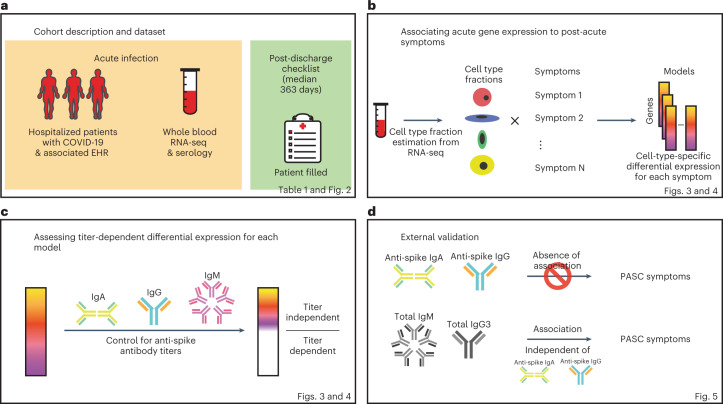
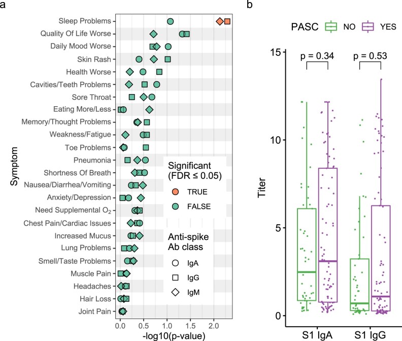
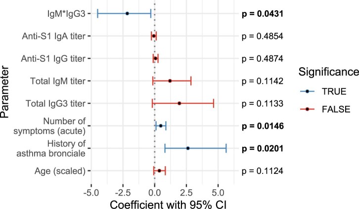
Post-acute sequelae of severe acute respiratory syndrome coronavirus 2 (SARS-CoV-2) infection are debilitating, clinically heterogeneous and of unknown molecular etiology. A transcriptome-wide investigation was performed in 165 acutely infected hospitalized individuals who were followed clinically into the post-acute period. Distinct gene expression signatures of post-acute sequelae were already present in whole blood during acute infection, with innate and adaptive immune cells implicated in different symptoms. Two clusters of sequelae exhibited divergent plasma-cell-associated gene expression patterns. In one cluster, sequelae associated with higher expression of immunoglobulin-related genes in an anti-spike antibody titer-dependent manner. In the other, sequelae associated independently of these titers with lower expression of immunoglobulin-related genes, indicating lower non-specific antibody production in individuals with these sequelae. This relationship between lower total immunoglobulins and sequelae was validated in an external cohort. Altogether, multiple etiologies of post-acute sequelae were already detectable during SARS-CoV-2 infection, directly linking these sequelae with the acute host response to the virus and providing early insights into their development.


Conflict of interest statement

S.G. reports other research funding from Regeneron, Genentech, Boehringer Ingelheim, EMD Serono, Takeda, Bristol Myers Squibb and Celgene. The remaining authors declare no competing interests.

Figures

Fig. 1
Fig. 1. Study workflow.
Schematics of the study design, analysis workflow and validation. a, Summary of the cohort studied and data collected. b, Strategy for CTS differential expression testing for PASC symptoms. c, Strategy for distinguishing DEGs by whether or not their differential expression is dependent on anti-spike antibody titers. d, Validation strategies employed using independent external datasets.
Fig. 2
Fig. 2. Description of PASC symptoms.
a, Histogram of the timing of blood sampling and PASC checklist completion. The x and y axes are the number of days since discharge and a count of observations, respectively. The green bars are counts of RNA-seq samples, and the orange bars represent the number of days between COVID-19 hospitalization discharge (black dashed line) and PASC checklist completion (dashed orange line is the median). b, Prevalence of PASC symptoms in our cohort. The y axis is symptoms, and the upper and lower x axes are the number of positive answers and percentage of individuals from the entire cohort with a positive answer, respectively. The blue line represents the subset of individuals with RNA-seq who completed the checklist. The dashed black line is the cutoff used for inclusion in follow-up analyses. c, PASC checklist item correlations. The axes are representative of the symptoms of interest (Methods), and the color is the Pearson correlation of their coincidence. Correlations with FWER (Holm’s method) adjusted P < 0.05 (two-sided Fisher’s exact test) are indicated with a star. Rows and columns are ordered to minimize distance between adjacent symptoms. Source data
Fig. 3
Fig. 3. CTS DE for PASC symptoms.
a,b, Anti-spike antibody titer-dependent (a) and titer-independent (b) CTS expression signatures. The x axes are PASC symptoms, and the y axes are the number of upregulated (up arrow) and downregulated (down arrow) DEGs at Benjamini–Hochberg FDR < 0.05. Symptoms are arranged in order of descending prevalence. Each facet presents DE results for the indicated cell type. The dashed gray lines provide a visual reference for the 100 DEG mark. The color of the bars indicates whether the signatures have been adjusted for anti-spike antibody titers. Only cell types and symptoms with more than 100 dependent/independent DEGs, respectively, are shown. c, GO term enrichments for plasma cell DEGs (one-sided Fisher’s exact tests, Benjamini–Hochberg adjustment for multiple testing). The x and y axes are the symptoms with more than 100 DEGs and GO terms, respectively. The union of the top three GO terms for all selected symptoms are shown. The color indicates the direction of the DEGs enriched for that term. Shading of color is representative of the FDR, and only FDRs < 0.05 are colored. The facets represent before (left) and after (right) controlling for anti-spike antibody titers. NK, natural killer.
Fig. 4
Fig. 4. Shared plasma cell DEGs between PASC symptoms.
The x and y axes are the PASC symptoms associated with more than 100 DEGs. The numbers in each box are the numbers of shared DEGs between the two symptoms defined in the axes, and the color and position represent whether they are same-direction (blue, upper left), opposite-direction (red, lower right) or the total number of DEGs for that checklist item (gray, diagonal). The shadings of red and blue are the ORs of the one-sided Fisher’s exact tests for the enrichment of overlapping genes in that box and are shown only if the associated enrichment adjusted P < 0.05 (FWER, Holm’s method). The left and right facets represent the shared DEGs before and after adjustment for anti-spike antibody titers, respectively. Symptoms in rows and columns are ordered by hierarchical clustering and optimal leaf ordering based on the shared same-direction DEGs. Source data
Fig. 5
Fig. 5. Independent dataset validation of lower antibody production in PASC.
Plot of linear model coefficients and P values (two-sided t-test, d.f. = 126, no adjustment for multiple testing) for prediction of the product of total IgM and total IgG3 (n = 134 individuals, 85 with PASC). The y axis lists all non-intercept coefficients, including presence of PASC, titers of antibodies against the S1 domain of the spike protein, severity, ICU admission, sex and age. The x axis shows the coefficient values, with the black center point showing the fitted value and the error bars showing the 95% confidence interval (CI) about this value. CIs that include 0 are colored red, whereas those that indicate a significant difference from 0 (P < 0.05) are colored blue.
Extended Data Fig. 1
Extended Data Fig. 1. Correlation of occurrences of PASC checklist items, comorbidities, demographics, and acute disease metrics.
The axes are representative of the symptoms, comorbidities, demographics, and acute disease metrics, and the color represents the Pearson correlation of their coincidence. Comorbidities present before COVID-19 hospitalization are defined with the prefix ‘prior’ in the axis label. Correlations with family wise error rate (FWER, Holm’s method) adjusted P values < 0.05 (2-sided Fisher’s exact test) are indicated with a star. Rows and columns are ordered by hierarchical clustering and optimal leaf ordering. Source data
Extended Data Fig. 2
Extended Data Fig. 2. Relationship between acute anti-spike antibody titers and PASC with independent validation.
a) Association of acute anti-spike antibody titers to PASC symptoms in Mount Sinai cohort. The y axis is the symptom assessed, and the x axis is the P value (-log10) for the association of the anti-spike antibody titers to the symptoms (linear mixed model, 2-sided t-test). The shape indicates the class of anti-spike antibody tested, and the color indicates whether the association is significant (BH FDR ≤ 0.05). b) Independent dataset validation of the non-association of acute anti-spike antibody titers to PASC. The x axis is the anti-spike antibody class and the y axis the titer measured for antibodies against the S1 domain of the spike protein during acute COVID-19. Each point represents a subject (n = 134 subjects, 85 with PASC). The color indicates the presence and absence of PASC and is defined in the legend. Two sided Mann-Whitney test unadjusted P values are shown between groups indicated by the brackets. Distributions are shown using box-and-whiskers plots (thick bar, median; box, 25th to 75th percentile, whiskers reach to the largest/smallest observations within 1.5 box-heights of the box.
Extended Data Fig. 3
Extended Data Fig. 3. Cell-type fraction estimations and interaction model.
a) Validation heatmap of estimated cell-type fractions with clinical complete blood counts. The x axis shows the literature reference dataset used for the deconvolution procedure and the y axis is the cell-type fractions validated. The colors represent the Pearson correlation (rho) values between the estimated cell-type fractions and the corresponding complete blood count from the clinical data. The correlation values and associated 2-sided P values adjusted for multiple testing (FWER, Holm’s method) and are noted in each box. Some reference data sets did not include neutrophils (indicated by gray boxes). b) Estimated cell-type fraction variance explained by biological and technical variables. The x axis is the percent of variance of the cell-type fractions explained by covariates (colors) and the y axis the cell type assessed. Cell types are ordered by the decreasing percent of their variance explained by COVID-19 severity. The black dashed line represents the cutoff for inclusion in the cell-type-specific analyses. c) Schematic of interaction model for mock genes A and B. The x axis is the cell-type fraction of a specific cell-type of interest and the y axis the gene expression in log2(counts per million). The color represents the presence (red) and absence (blue) of a symptom. The left and right facets show a gene not differentially expressed (same slope) and a differentially expressed gene (different slopes) respectively.
Extended Data Fig. 4
Extended Data Fig. 4. Cell-type-specific differential expression for PASC checklist items (full).
The x axes are PASC checklist items (arranged in order of descending prevalence) and the y axes are the number of upregulated (above 0) and downregulated (below 0) DEGs at FDR≤0.05. Each row presents DE results for the indicated cell type. The dashed grey lines indicate the 100 DEG mark. The colors of the bars (defined in the legends) indicate (a) DE results for the specified anti-spike antibody titer adjustment (or no adjustment for titers, ‘None’), and (b) DE results when eliminating the specified term from the original model (shown as ‘None’). Note: ‘None’ and ‘IgA+IgG+IgM’ bars from Figure 3 are included here for ease of comparison.
Extended Data Fig. 5
Extended Data Fig. 5. GO enrichments for DEGs for other PASC checklist items.
Box sizes are relative to the -log10(adjusted P values) of the GO term enrichments for the corresponding DEGs and the term is noted in each box. Related terms are grouped by similarity and groupings are indicated by proximity and shared color. Consensus terms are indicated in bold for each group. a) Upregulated genes in memory resting CD4+ T cells for cavities/teeth problems. b) Downregulated genes in CD8+ T cells for quality of life. c) Upregulated genes in M1 macrophages for need supplemental O2. d) Upregulated genes in memory B cells for anxiety/depression. e) Upregulated genes in memory activated CD4+ T cells for memory/thought problems.
Extended Data Fig. 6
Extended Data Fig. 6. Shared PASC checklist DEGs between cell-types.
The x and y axes are the cell types associated with more than 100 DEGs. The numbers in each box are the numbers of shared DEGs between the two checklist items defined in the axes, and the color represents whether they are same-direction (blue), opposite direction (red) or the total number of DEGs for that checklist item (grey). The shadings of red and blue are the ORs of the 1-sided Fisher’s exact tests for the enrichment of shared DEGs in that box, and are shown only if the associated enrichment adjusted P value < 0.05 (FWER, Holm’s method). The left and right facets represent the shared DEGs before and after adjustment for anti-spike antibody titers respectively. Symptoms in rows and columns are ordered by hierarchical clustering and optimal leaf ordering based on the shared same-direction DEGs. a) Quality of life shared DEGs. b) Cavities and teeth problems shared DEGs. Source data
Extended Data Fig. 7
Extended Data Fig. 7. Delta-MA plot of anti-spike antibody titer effect on differential expression log (fold change).
The x and y axes represent the average normalized gene expression and the differential expression log fold change (logFC) respectively. Each arrow shows a single DEG. The arrow colors indicate the anti-spike antibody titer dependent (red) and independent (blue) DEGs. The contours show the distribution of all logFC values before controlling for antibody titers. The effect of controlling for antibody titers on DEGs is shown by the arrows, with the arrow tail being the logFC before adjustment and the arrow head the logFC after adjustment. LogFC values in each panel are scaled such that the root mean square logFC before adjustment is equal to 1. a) Lung problems in plasma cells. b) Skin rash in plasma cells. c) Pneumonia in plasma cells. d) Sleep problems in plasma cells. e) Nausea/diarrhea/vomiting in plasma cells. f) Smell/taste problems in plasma cells. g) Anxiety/depression in memory B cells. h) Need Supplemental O2 in M1 macrophages.
Extended Data Fig. 8
Extended Data Fig. 8. PASC prediction by total Ig in independent data set is independent of anti-spike Ig.
Plot of logistic regression model and P values (2-sided likelihood ratio test, no adjustment for multiple testing) for prediction of PASC (n = 134 subjects, 85 with PASC). The y axis lists all non-intercept coefficients, and the x axis shows the coefficient values, with the black center point showing the fitted value and the error bars showing the 95% confidence interval (CI) about this value. CIs that include 0 are colored red, while those that indicate a significant difference from 0 (p < 0.05) are colored blue.

References

    1. Logue JK, et al. Sequelae in adults at 6 months after COVID-19 infection. JAMA Netw. Open. 2021;4:e210830. doi: 10.1001/jamanetworkopen.2021.0830. - DOI - PMC - PubMed
    1. Tenforde MW, et al. Characteristics of adult outpatients and inpatients with COVID-19—11 academic medical centers, United States, March–May 2020. MMWR Morb. Mortal. Wkly Rep. 2020;69:841–846. doi: 10.15585/mmwr.mm6926e3. - DOI - PMC - PubMed
    1. Groff D, et al. Short-term and long-term rates of postacute sequelae of SARS-CoV-2 infection: a systematic review. JAMA Netw. Open. 2021;4:e2128568. doi: 10.1001/jamanetworkopen.2021.28568. - DOI - PMC - PubMed
    1. Nalbandian A, et al. Post-acute COVID-19 syndrome. Nat. Med. 2021;27:601–615. doi: 10.1038/s41591-021-01283-z. - DOI - PMC - PubMed
    1. Bell ML, et al. Post-acute sequelae of COVID-19 in a non-hospitalized cohort: results from the Arizona CoVHORT. PLoS ONE. 2021;16:e0254347. doi: 10.1371/journal.pone.0254347. - DOI - PMC - PubMed

Publication types

Substances