

Evaluation of a public COVID-19 dashboard in the Western Cape, South Africa: a tool for communication, trust, and transparency
- PMID: 36581823
- PMCID: PMC9797888
- DOI: 10.1186/s12889-022-14657-w
Evaluation of a public COVID-19 dashboard in the Western Cape, South Africa: a tool for communication, trust, and transparency
Abstract
Background: Public health dashboards have been used in the past to communicate and guide local responses to outbreaks, epidemics, and a host of various health conditions. During the first year of the COVID-19 pandemic, dashboards proliferated but the availability and quality differed across the world. This study aimed to evaluate the quality, access, and end-user experience of one such dashboard in the Western Cape province, South Africa.
Methods: We analysed retrospective aggregate data on viewership over time for the first year since launch of the dashboard (30 April 2020 - 29 April 2021) and conducted a cross-sectional survey targeting adult users of the dashboard at one year post the initial launch. The self-administered, anonymous questionnaire with a total of 13 questions was made available via an online digital survey tool for a 2-week period (6 May 2021 - 21 May 2021).
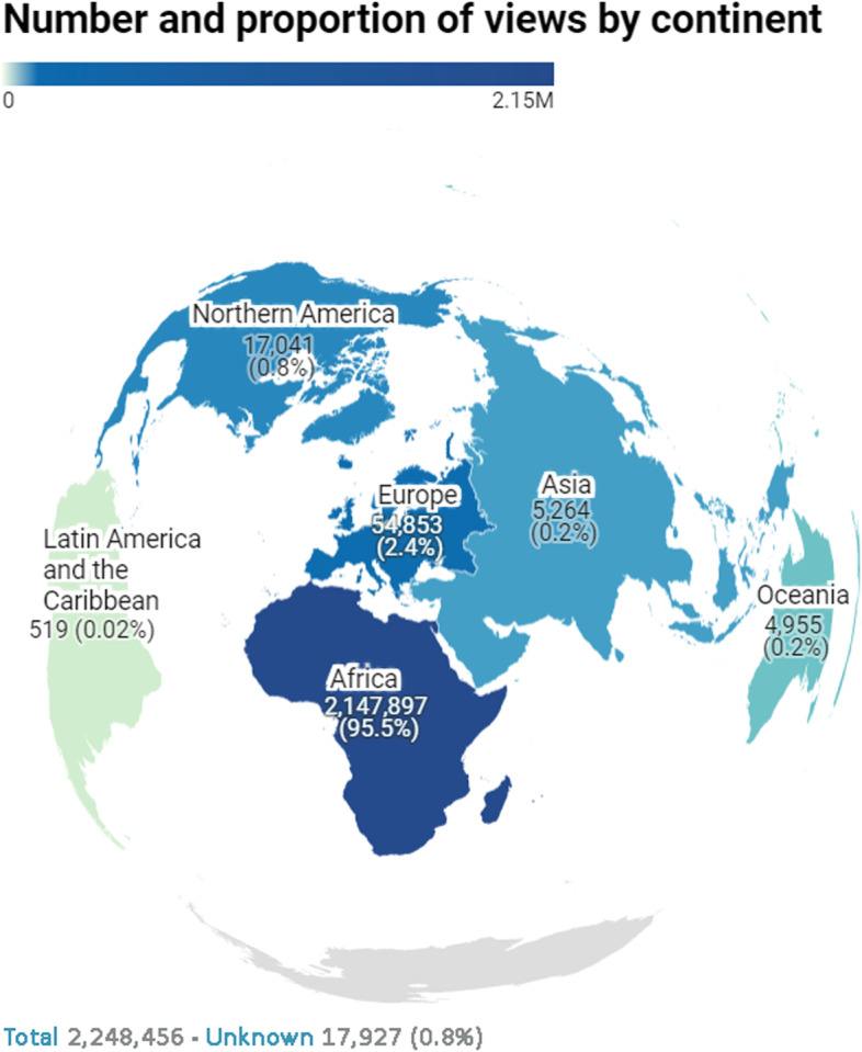
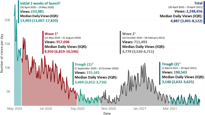
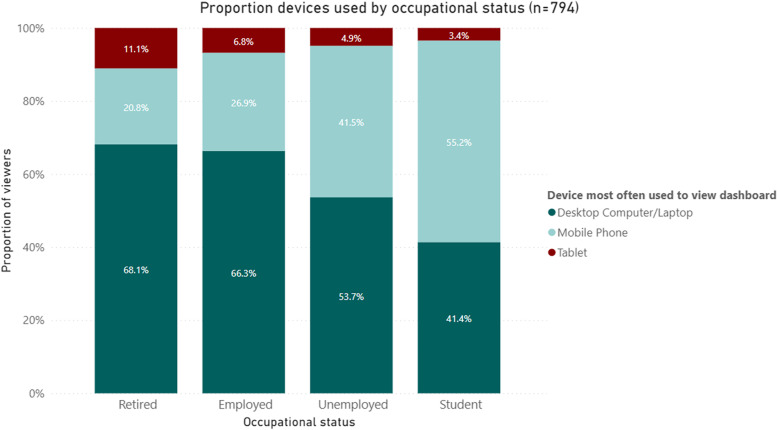
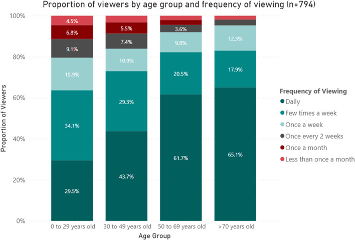
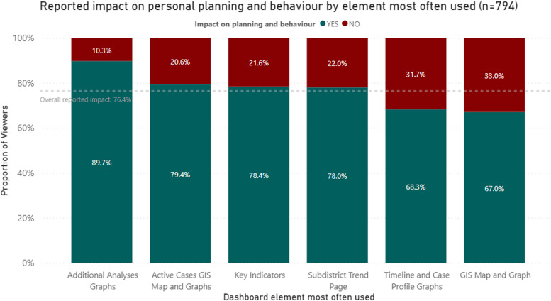
Results: After significant communication by senior provincial political leaders, adequate media coverage and two waves of COVID-19 the Western Cape public COVID-19 dashboard attracted a total of 2,248,456 views during its first year. The majority of these views came from Africa/South Africa with higher median daily views during COVID-19 wave periods. A total of 794 participants responded to the survey questionnaire. Reported devices used to access the dashboard differed statistically between occupational status groups with students tending toward using mobile devices whilst employed and retired participants tending toward using desktop computers/laptops. Frequency of use increases with increasing age with 65.1% of those > 70 years old viewing it daily. Overall, 76.4% of respondents reported that the dashboard influenced their personal planning and behaviour. High Likert score ratings were given for clarity, ease of use and overall end-user experience, with no differences seen across the various age groups surveyed.
Conclusion: The study demonstrated that both the availability of data and an understanding of end-user need is critical when developing and delivering public health tools that may ultimately garner public trust and influence individual behaviour.
Keywords: COVID-19; Dashboard; Data; Digital; Evaluation; Impact; Pandemic; South Africa; Western Cape.
© 2022. The Author(s).
Conflict of interest statement
The authors declare that there are no known competing interests as it pertains to the research submitted.
Figures
References
-
- Lechner B, Fruhling A. Towards public health dashboard design guidelines. In International Conference on HCI in Business 2014 Jun 22. Springer, Cham. pp. 49–59. Available at: 10.1007/978-3-319-07293-7_5. Accessed 12 Dec 2021
-
- Brooks JC. Incident management systems and building emergency management capacity during the 2014–2016 Ebola epidemic—Liberia, Sierra Leone, and Guinea. MMWR Suppl. 2016;65. Available at: https://www.cdc.gov/mmwr/volumes/65/su/su6503a5.htm. Accessed 12 Dec 2021 - PubMed
-
- Braunstein SL, Coeytaux K, Sabharwal CJ, Xia Q, Robbins RS, Obeng B, Daskalakis DC. New York City HIV care continuum dashboards: Using surveillance data to improve HIV care Among people living With HIV in New York City. JMIR Public Health Surveill. 2019;5(2):e13086. doi: 10.2196/13086. - DOI - PMC - PubMed
Publication types
MeSH terms
Grants and funding
LinkOut - more resources
Full Text Sources
Medical
Miscellaneous
