. 2023 Apr 3;220(4):e20220538.
doi: 10.1084/jem.20220538. Epub 2023 Feb 8.

Remodeling of colon plasma cell repertoire within ulcerative colitis patients

Affiliations

Remodeling of colon plasma cell repertoire within ulcerative colitis patients

Johannes F Scheid et al. J Exp Med. .

Abstract

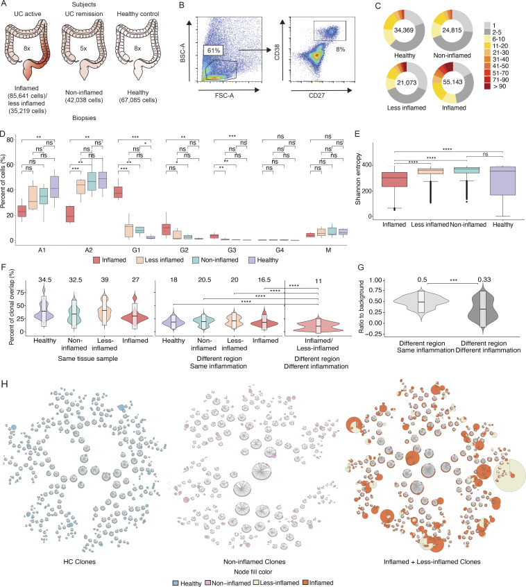
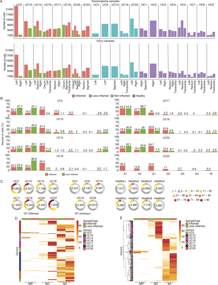
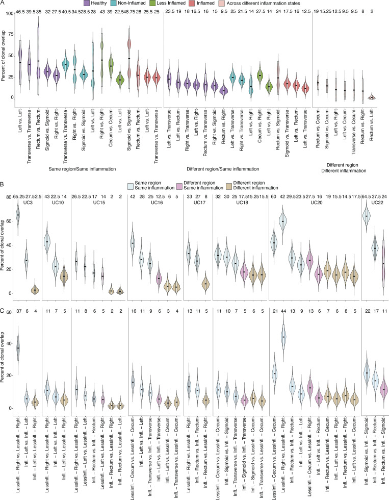
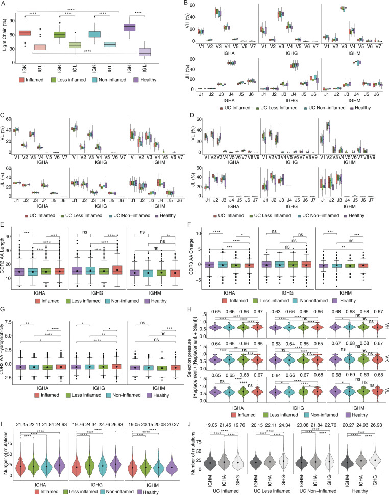
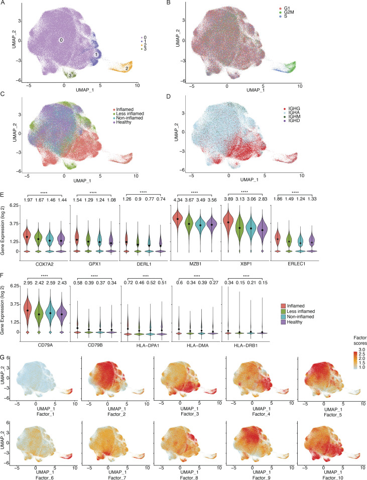
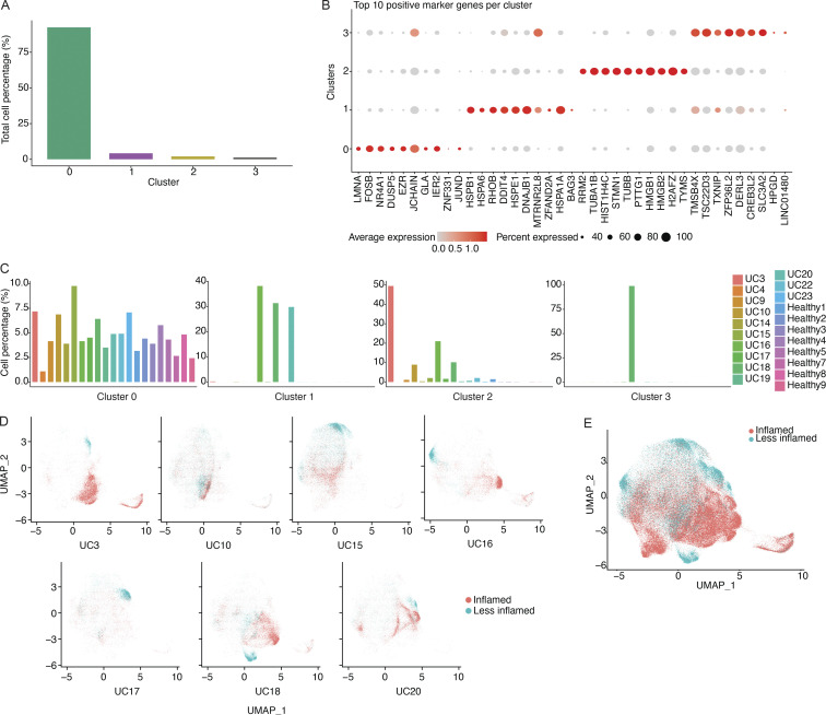
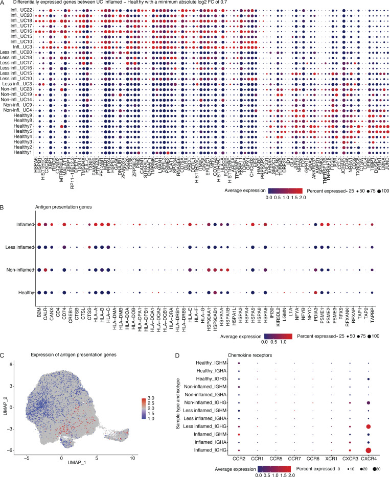
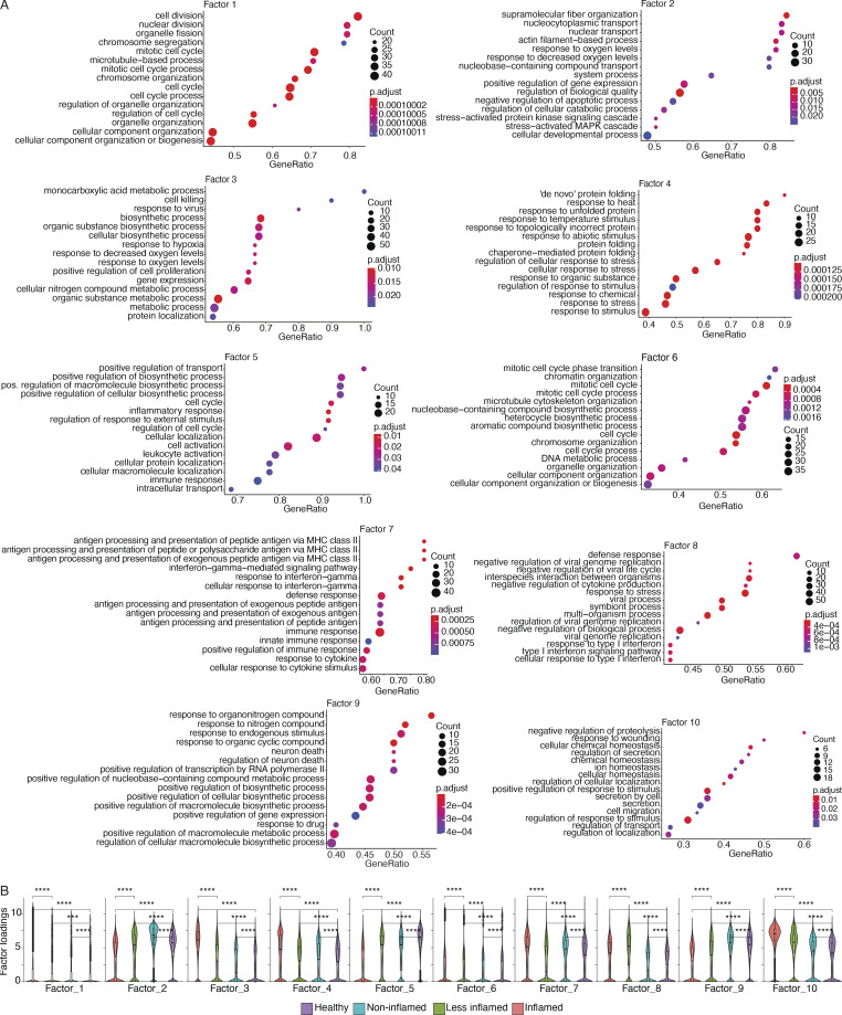
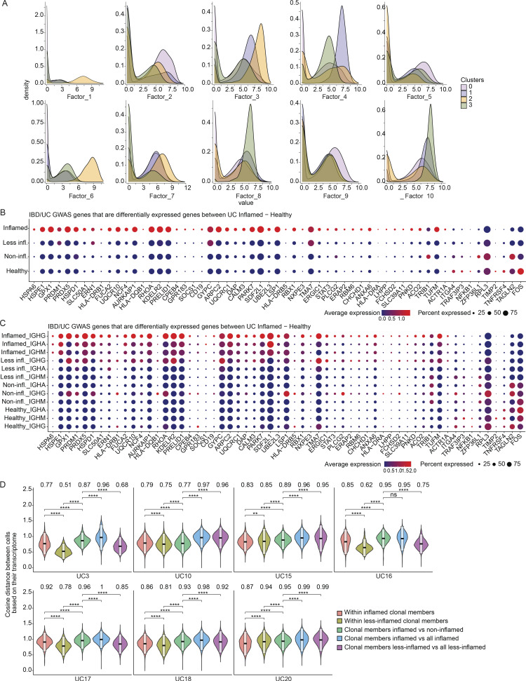
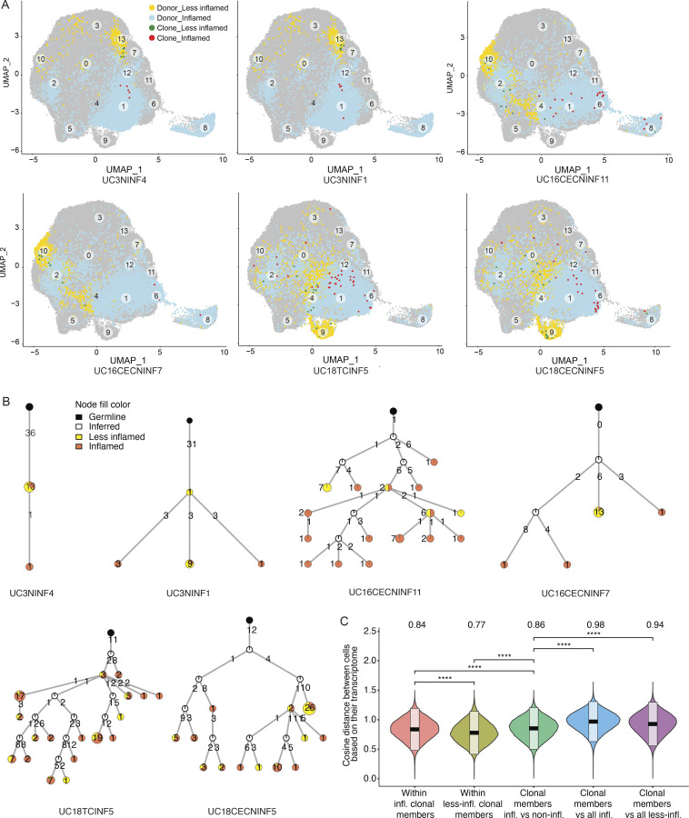
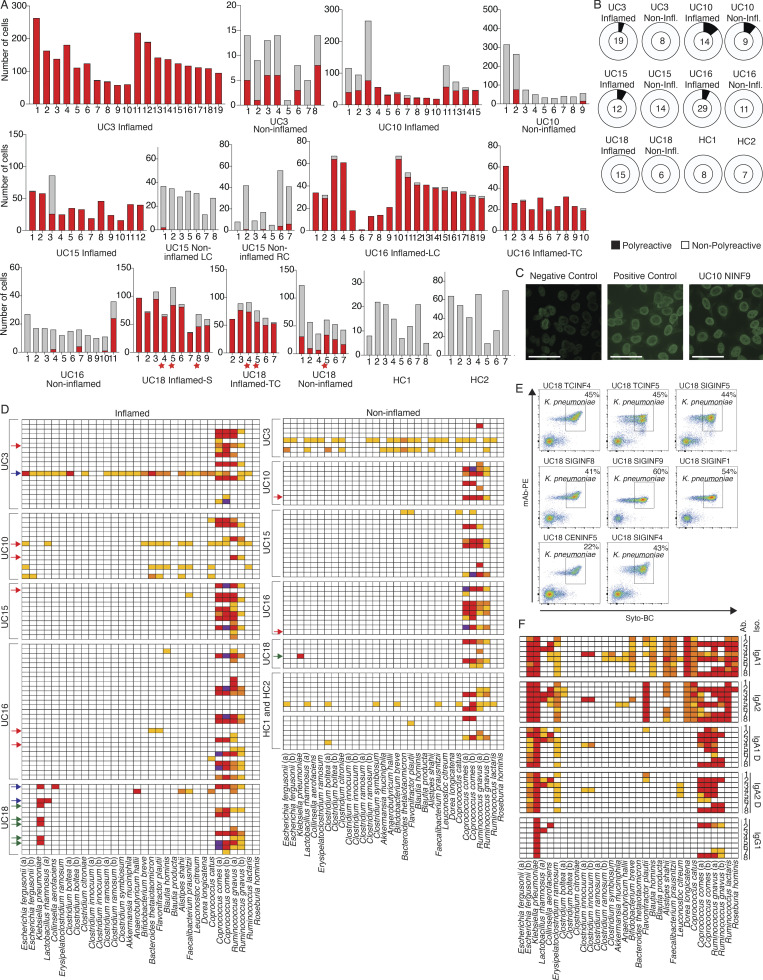
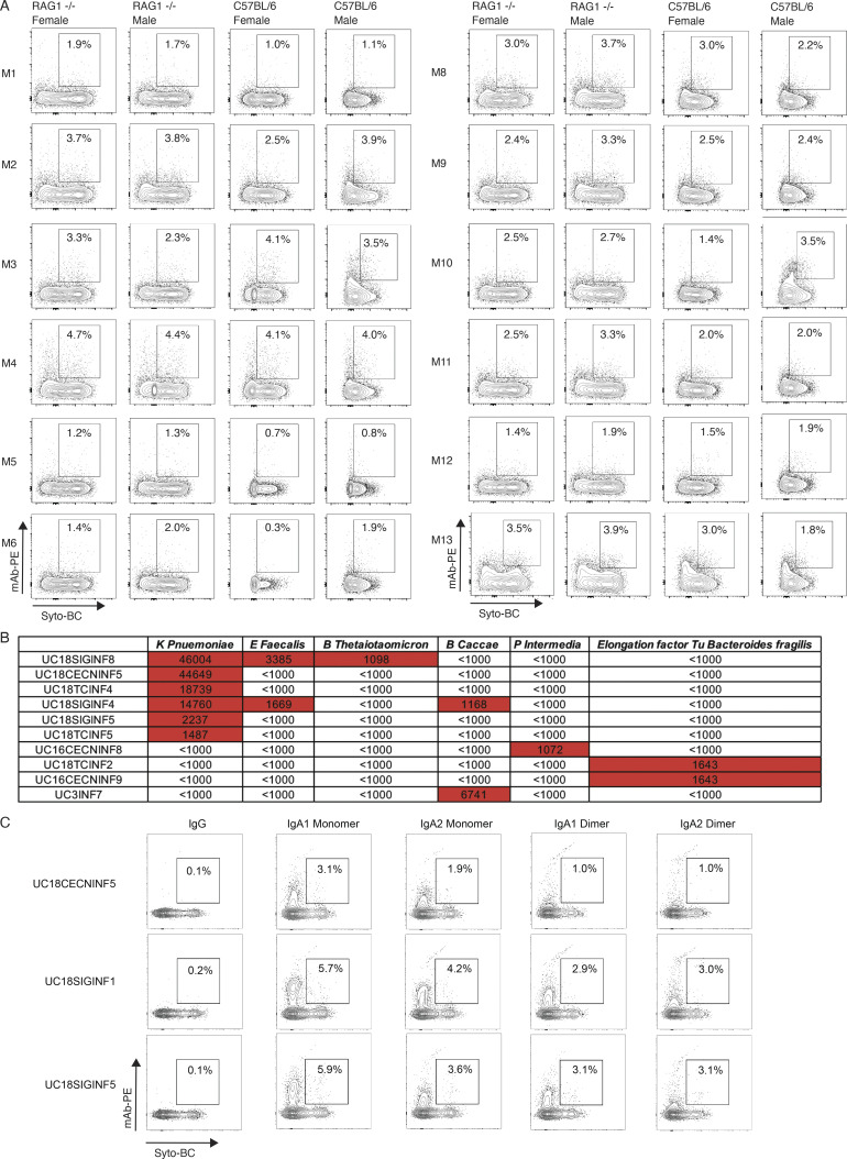
Plasma cells (PCs) constitute a significant fraction of colonic mucosal cells and contribute to inflammatory infiltrates in ulcerative colitis (UC). While gut PCs secrete bacteria-targeting IgA antibodies, their role in UC pathogenesis is unknown. We performed single-cell V(D)J- and RNA-seq on sorted B cells from the colon of healthy individuals and patients with UC. A large fraction of B cell clones is shared between different colon regions, but inflammation in UC broadly disrupts this landscape, causing transcriptomic changes characterized by an increase in the unfolded protein response (UPR) and antigen presentation genes, clonal expansion, and isotype skewing from IgA1 and IgA2 to IgG1. We also directly expressed and assessed the specificity of 152 mAbs from expanded PC clones. These mAbs show low polyreactivity and autoreactivity and instead target both shared bacterial antigens and specific bacterial strains. Altogether, our results characterize the microbiome-specific colon PC response and how its disruption might contribute to inflammation in UC.


Conflict of interest statement

Disclosures: A.N. Ananthakrishnan reported personal fees from Menten AI and Iterative Scopes outside the submitted work. A. Regev reported “other” from Genentech, Roche, Immunitas, and Celsius Therapeutics; and personal fees from ThermoFisher Scientific and Syros outside the submitted work. In addition, A. Regev had various patents related to single cell genomics issued. R.J. Xavier reported non-financial support from Jnana Therapeutics, Celsius Therapeutics, and MoonLake Immunotherapeutics outside the submitted work. No other disclosures were reported.

Figures

Figure 1.
Figure 1.
Patient selection, PC sorting, isotype analysis, and clonal landscape. (A) Three patient categories recruited in this study with the number of subjects indicated in the center, respectively. Left: UC patients with inflammation; center: UC patients in remission; and right: HCs. The number of cells included in transcriptome analysis is indicated for each sample type. (B) Representative FACS plots with the gating strategy for the sorting of colon PCs. Cells isolated from digestion of colon biopsies and resection samples were gated on live cells based on their appearance in side scatter (BSC) and forward scatter (FSC). Of these, CD38-FITC and CD27-PE double-positive cells were selected for sorting and sequencing. (C) Pie charts show the expansion of differently sized PC clones for all samples grouped based on their inflammation status. Numbers in the center of the pie charts stand for the total number of cells analyzed in that particular plot. (D) Box plots displaying the distribution of the percentage of immunoglobulin isotypes (y axis) across samples grouped by their inflammation status (xaxis). Brackets indicate statistical significance using a one-sided non-parametric Wilcoxon test with *P ≤ 0.05, **P ≤ 0.01, ***P ≤ 0.001, ****P ≤ 0.0001, and ns indicating no statistical significance. Different samples taken from the same donor and with the same disease status are merged and represented as one data point in the distribution. (E) Box plots displaying the distribution of the Shannon entropy values of the PCs stratified by their inflammation status as indicated. Shannon entropy is a measure of population diversity, which is reversely related to the clonal expansion (Materials and methods). Brackets indicate statistical significance using a one-sided t test with ****P ≤ 0.0001, and ns indicating no statistical significance. (F) Violin plots displaying the distribution of the percentage of the shared clones between randomly sampled sets of PCs (n = 100; Materials and methods). Here, the two random samples of a specific donor that are to be evaluated for clonal overlap can belong to (i) same tissue sample (left), (ii) different colon regions with the same inflammation status (center), and (iii) different colon region with different inflammation status (right). The overlap between random samples that belong to different colon regions with the same inflammation status is significantly smaller (P value ≤ 0.0001, one-sided t test) than the random samples that belong to the same colon regions for all healthy, non-inflamed, less-inflamed, and inflamed groups. The overlap reduces significantly (P value ≤ 0.0001, one-sided t test) when the compared samples differ in their inflammation status. The boxes represent −2 SD, mean, and +2 SD. The values above each violin plot represent the median values of the distribution. (G) Distribution of the clonal overlap between randomly sampled PCs (n = 100) that are collected from different colon regions corrected for the background overlap percentages of the parent regions (Materials and methods). Bracket indicates statistical significance using a one-sided t test with ***P ≤ 0.001. The boxes represent −2 SD, mean, and +2 SD. The values above each violin plot represent the median values of the distribution. (H) Schematic representation of the B cell clones in healthy, non-inflamed, and inflamed samples, as indicated, show the clonal expansion and the isotype change in UC patients. Up to 50 of the largest clones from each donor are displayed. Each ring shows one distinct clone where the cells of the clone are depicted as individual nodes lined at the border of the clone ring and connected to each other by lines. The sizes of the nodes correspond to the number of the cells with the identical VDJ heavy chain sequence. The fill colors of the nodes indicate the inflammation status of the samples these particular cells belong to.
Figure 2.
Figure 2.
Isotype analysis and clonal expansion. (A) Bar plots displaying the number of cells used in the downstream analysis (y axis) from various colon regions (x axis) of each subject. The upper graph shows the number of cells for which transcriptome profiling information was obtained and the lower graph shows the number of cells for which productive V(D)J sequence were obtained (Materials and methods). (B) Bar plots displaying the median percentage of each immunoglobulin isotype within the samples (y axis) of each donor with at least one area of inflammation stratified by the sample inflammation status as indicated (x axis). (C) Pie charts show the expansion of differently sized PC clones for each donor among UC patients with inflammation (left), UC patients in remission (middle), and HCs (right). Numbers in the center of the pie charts represent the total number of cells analyzed in that particular plot. (D and E) Heatmaps showing isotypes of expanded clones that are shared between inflamed and less-inflamed colon areas. The heatmaps display the percentage of each immunoglobulin isotype–inflammation status pair within each expanded clone with more than nine cells. The threshold of 10 cells was arbitrarily chosen to capture larger clones. Each row sums up to 100% and represents one expanded clone. Each column stands for the isotype–inflammation status pair. Heatmaps are organized based on donor (D) or enrichment in isotype–inflammation status pair (E).
Figure S1.
Figure S1.
Clonal overlap between PCs from different colon regions. (A and B) Violin plots display the distribution of the percentage of the shared clones between randomly sampled sets of PCs (n = 100; Materials and methods). In A, the two random samples of a specific donor that are to be evaluated for clonal overlap can belong to (i) same colon region (left), (ii) different colon regions with the same inflammation status (center), and (iii) different colon regions with different inflammation status (right) as indicated. In contrast to Fig. 1 F, each colon region is analyzed separately. Purple violin plots represent HC samples, turquoise plots represent non-inflamed samples from subjects in remission, green plots represent less-inflamed samples, and red plots represent inflamed samples in a UC patient with inflammation as indicated. Pink violins indicate samples that are being compared across different inflammation states. In B, samples are separated by the donor with blue violin plots representing overlap within the same colon region, pink different regions with the same inflammation status, and beige different regions with different inflammation status. For x-axis labeling, see C. (C) Violin plots displaying the distribution of the percentage of the shared clones between randomly sampled sets of 100 PCs (Materials and methods). As opposed to Fig. S1 B, expanded clones in each sample are collapsed into one cell. The two random samples of a specific donor that are to be evaluated for clonal overlap can belong to the same tissue sample (blue), different colon regions with same inflammation status (pink), and different colon regions with different inflammation statuses (beige). The boxes represent −2 SD (lower portion), mean (black line), and +2 SD (upper portion). The values above each violin plot represent the median values of the distribution.
Figure 3.
Figure 3.
Colon PC antibody repertoire. Statistically significant differences are indicated with brackets. (A) Box plots display antibody light chain usage with kappa light chains shown in dark and lambda light chains in light colors. Antibodies are stratified by the disease state of the source tissue as indicated. Brackets indicate statistical significance using a one-sided non-parametric Wilcoxon rank-sum test, ****P ≤ 0.0001. (B–D) Box plots showing the V- and J-gene usage of antibody heavy chains (B), kappa light chains (C), and lambda light chains (D) as indicated. Red plots represent antibodies derived from PCs in inflamed tissue, green plots represent antibodies from less-inflamed tissue of UC patients with inflammation, turquoise plots represent antibodies from non-inflamed tissue in UC patients in remission, and purple plots represent antibodies from HCs. (E–G) Box plots displaying the CDRH3 amino acid length (E), CDRH3 amino acid charge (F), and CDRH3 amino acid hydrophobicity (G) of antibody heavy chains from PCs isolated from HCs (purple), non-inflamed tissue from UC patients in remission (turquoise), less-inflamed tissue from UC patients with inflammation (green), and inflamed tissue (red). Sequences were stratified based on antibody isotype. Brackets indicate statistical significance using a two-sided t test with **P ≤ 0.01, ***P ≤ 0.001, ****P ≤ 0.0001, and ns, non-significant. (H) Violin plots showing selection pressure (nucleotide replacement mutation/nucleotide replacement + silent mutation) in antibody heavy chain V-genes (top row), kappa light chain V-genes (middle row), and lambda light chain V-genes (bottom row). Data are stratified based on the disease state of the source tissue and antibody isotype as indicated. Brackets indicate statistical significance using a one-sided Wilcoxon rank-sum test with *P ≤ 0.05, **P ≤ 0.01, ****P ≤ 0.0001, and ns, non-significant. (I and J) Violin plots showing the distribution of the number of mutations in IgM, IgA, and IgG isotypes, stratified by the disease states. Black dots and lines display the mean values which are also written as text and ±1 SDs, respectively. Brackets display the P values obtained by two-sided Wilcoxon rank-sum test with ***P ≤ 0.001 and ****P ≤ 0.0001.
Figure 4.
Figure 4.
Transcriptional characteristics of PCs from inflamed colon areas. (A) UMAP plot showing the cell embeddings based on the transcriptome. PCs are grouped into four clusters based on their transcriptomes. (B) Same UMAP as in A, but cells are colored based on their cell cycle phase G1 (red), G2M (green), or S (blue), as predicted by the cellular expression levels of the cell cycle genes (Butler et al., 2018; Stuart et al., 2019). (C and D) UMAP plots showing the cell embeddings colored by the (C) inflammation status of the tissue the cells were isolated from and (D) the antibody isotype of the cells. (E and F) Selected example genes involved in oxidative stress and UPR pathway (E) and antigen presentation (F) that are significantly differentially expressed (pseudobulk DE analysis, FDR < 0.05) between UC-inflamed and healthy samples. The violin plots display the distribution of the gene expression values per cell. Stars indicate the statistical significance of the non-parametric Wilcoxon rank sum test (****P ≤ 0.0001). The values above each violin plot and dots in each violin plot indicate the mean value of the distribution. (G) Latent factors that generate the main sources of variation in the transcriptome. We identified 10 latent factors that generate the variation in the transcriptome of the investigated colon PCs (Fig. S4). The 10 UMAP plots display the cells colored by the factor scores (Materials and methods) for each of the 10 factors.
Figure S2.
Figure S2.
Transcriptional clusters of colon PCs. (A) Bar diagram displaying the fraction of all cells (in %) represented in each of the four transcriptional clusters. (B) Dot plot showing the relative expression of the top marker genes of each cluster (x axis) across all clusters (y axis). Each dot encodes both the detection rate and average gene expression in detected cells for a gene in a cluster. Darker color indicates higher average gene expression from the cells in which the gene was detected, and larger dot diameter indicates that the gene was detected in a greater proportion of cells from the cluster. (C) Bar diagram showing the representation of each of the four transcriptional clusters among all study subjects (x axis) as indicated. Each plot represents the indicated cluster and the fractions add up to 100% in each plot. (D) UMAP plots showing the cell embeddings colored by the inflammation status of the tissue the cells were isolated from for all subjects that had both inflamed and less-inflamed tissue. (E) UMAP plot showing all the cell embeddings shown in D but merged into one plot.
Figure S3.
Figure S3.
Genes that are higher expressed among PCs from inflamed tissue. (A) Dot plot showing the relative expression of the significantly differentially expressed genes when comparing PCs derived from inflamed tissue with PCs from HCs (x axis) across all subjects and disease states (y axis; pseudobulk DE analysis, FDR < 0.05). Each dot encodes both the detection rate and average gene expression in detected cells for a gene in a cluster. As indicated, dark red color indicates higher average gene expression from the cells in which the gene was detected, and larger dot diameter indicates that the gene was detected in a greater proportion of cells from the cluster. (B) Dot plot showing the relative expression of the antigen presentation genes (x axis) in PCs derived from tissue in different disease states as indicated (y axis). Color and size coding as in A. (C) UMAP plot showing the cell embeddings based on the transcriptome. Cells are colored based on their antigen presentation genes’ expression scores (Materials and methods), where PCs highlighted in dark red show the highest levels of expression. (D) Dot plot showing the relative expression of chemokine receptor genes (x axis) in PCs derived from tissue in different isotypes and disease states as indicated (y axis). Color and size coding as in A and B.
Figure S4.
Figure S4.
Latent factor analysis. (A) Dot plots showing the top 15 gene ontology biological processes with the highest gene ratios in each of the 10 latent factors that were identified (Materials and methods). The size of the dots represents the number of genes in the significant gene list associated with the gene ontology term and the color of the dots represent the P-adjusted values. (B) Violin plots comparing the factor loadings between PCs from inflamed, less-inflamed, non-inflamed, and HC samples for 10 latent factors. ***P ≤ 0.001 and ****P ≤ 0.0001 using a one-sided t test.
Figure 5.
Figure 5.
Expression levels of genes that are associated with IBD or UC through GWAS. (A) Stacked density plots displaying the distribution of cell factor scores stratified by the expression clusters. (B and C) Dot plots showing the relative expression of the selected genes (Buckner et al., 2014; Huang et al., 2017; de Lange et al., 2017; Liu et al., 2015) when comparing PCs derived from inflamed tissue with PCs from less-inflamed, non-inflamed, and HCs (y axis). In C, each disease state is stratified by antibody isotype. Each dot encodes both the detection rate and average gene expression in detected cells for a gene in a cluster. As indicated, the dark red color indicates higher average gene expression from the cells in which the gene was detected, and a larger dot diameter indicates that the gene was detected in a greater proportion of cells from the cluster. (D) Comparison of the pairwise cosine distances between PCs based on their transcriptome for each subject with inflamed and less-inflamed samples. Groups from left to right display the PC pair distance distributions between (i) inflamed clone members, (ii) less-inflamed clone members, (iii) inflamed and less-inflamed clone members, (iv) inflamed clone members and 100 randomly selected PCs of the donor that are inflamed and are not clone members, (v) clone members of less-inflamed samples and 100 randomly selected PCs of the donor that are less-inflamed and are not clone members. Brackets indicate statistical significance using a one-tailed t test with **P ≤ 0.01, **P ≤ 0.001, ****P ≤ 0.0001, and ns, non-significant.
Figure 6.
Figure 6.
Transcriptomics of selected PC clones. (A) UMAP plots highlighting clonal members of six selected PC clones from three different subjects as indicated (Table S5). PCs from inflamed and less-inflamed colon areas from the respective subject are highlighted in blue and yellow, respectively. Red dots indicate clonal members belonging to the selected clone from inflamed colon areas and green dots from less-inflamed colon areas. (B) Phylogenetic trees summarize the clonal relationship of all members within the selected clones. Trees are rooted on a theoretical germline member (black node), uncolored nodes indicate inferred intermediates, and yellow and orange node colors indicate clonal members from less-inflamed or inflamed colon areas, respectively. Numbers on the connecting lines indicate the number of heavy chain mutations separating two nodes. (C) Comparison of the pairwise cosine distances between PCs based on their transcriptome. Groups from left to right display the PC pair distance distributions between (i) inflamed clone members, (ii) less-inflamed clone members, (iii) inflamed and less-inflamed clone members, (iv) inflamed clone members and 100 randomly selected PCs of the donor that are inflamed and are not clone members, (v) clone members of less-inflamed samples and 100 randomly selected PCs of the donor that are less-inflamed and are not clone members. There is a significant difference between transcriptional distances between clone members based on their inflammation type. Brackets indicate statistical significance using a one-tailed t test with ****P ≤ 0.0001.
Figure 7.
Figure 7.
Functional testing of selected mAbs. (A) Bar plots showing the clone size (number of cells, y axis) of each selected and tested mAb (x axis, Table S5) as well as its expansion in inflamed (red bar) or less-inflamed (gray bar) colon areas. mAbs are grouped based on the donor and colon area they were isolated from. The numbers below each clone correspond to the antibody names in Table S5. LC, left colon; RC, right colon; TC, transverse colon; S, sigmoid colon. Red stars indicate clones from which K. pneumoniae–binding mAbs were isolated (see below). (B) Pie charts summarizing the polyreactivity of all selected and tested mAbs. The number in the center of each pie indicates the number of mAbs tested and mAbs are grouped based on the donor and if they were isolated from an inflamed or less-inflamed colon area (Table S6). Polyreactivity was assessed by ELISA (Materials and methods) and experiments were repeated twice. (C) Representative HEP-2 cell IFA staining patterns of positive control and negative control serum as well as reactive mAb UC10NINF9 are shown. Scale bars represent 20 μm. (D) Heatmap showing the binding of all 152 selected mAbs against a panel of 32 bacterial strains in FACS. Each row represents one mAb and mAbs are sorted based on the donor and inflammation status of the colon region they were isolated from as indicated. White, <1% reactivity; light orange, 1–5% binding; dark orange, 5.1–10% binding; red, 10.1–50% binding; and purple, >50% binding. Red arrows indicate polyreactive mAbs (see above), blue arrows indicate mAbs with strong binding (>10%) to at least two different bacterial strains, and green arrows indicate mAbs only binding to K. pneumoniae. FACs experiments were repeated twice. (E) Representative FACS plots show the binding of reactive mAbs against bacterial strains used in D. Antibody binding was detected using a mouse anti-human IgG antibody coupled to PE, and bacteria were stained with SYTO-BC to exclude dead bacteria (Materials and methods). (F) Heatmap showing the binding of mAbs UC18CECNINF5 (1), UC18SIGINF1 (2), UC18SIGINF4 (3), UC18SIGINF5 (4), UC18SIGINF8 (5), UC18SIGINF9 (6), UC18TCINF4 (7), and UC18TCINF5 (8) in their IgG1, IgA1, and IgA2 forms as indicated against a panel of 32 bacterial strains in FACS. Color coding as in D. FACs experiments were repeated twice.
Figure S5.
Figure S5.
Binding of mAbs and mAb mixes to stool from RAG1-deficient and C57BL/6 mice and bacterial proteins and extracts. (A) FACS plots display SYTO-BC (x axis) and mAb mix staining (y axis) of stool from female and male RAG1-deficient and C57BL/6 mice with the double-positive population indicated through gating. Antibody binding was detected through a mouse anti-human IgG antibody coupled to PE (Materials and methods). The composition of each antibody mix used is summarized in Table S5 and bacterial staining was conducted so that each mAb was present at a concentration of 10 μg/ml. FACs experiments were repeated twice. (B) Table summarizing the fluorescence intensity values as measured on a GenePix 4000B imager (Axion) for the mAbs that showed binding in a screen of all 152 mAbs for binding to 50 bacterial lysates and antigens (Table S7 and Materials and methods). Values above 1,000 are considered positive and highlighted in red. (C) FACS plots display SYTO-BC (x axis) and mAb staining (y axis) of stool from RAG1-deficient mice with the double-positive population indicated through gating. K. pneumoniae–binding mAbs UC18CECNINF5, UC18SIGINF1, and UC18SIGINF5 in IgG1, IgA1, and IgA2 forms were used for staining as indicated and their binding was detected with mouse anti-human IgG or mouse anti-human IgA antibody coupled to PE (Materials and methods). FACs experiments were repeated twice.

References

    1. Baklien, K., and Brandtzaeg P.. 1975. Comparative mapping of the local distribution of immunoglobulin-containing cells in ulcerative colitis and Crohn’s disease of the colon. Clin. Exp. Immunol. 22:197–209 - PMC - PubMed
    1. Benckert, J., Schmolka N., Kreschel C., Zoller M.J., Sturm A., Wiedenmann B., and Wardemann H.. 2011. The majority of intestinal IgA+ and IgG+ plasmablasts in the human gut are antigen-specific. J. Clin. Invest. 121:1946–1955. 10.1172/JCI44447 - DOI - PMC - PubMed
    1. Bessissow, T., Lemmens B., Ferrante M., Bisschops R., Van Steen K., Geboes K., Van Assche G., Vermeire S., Rutgeerts P., and De Hertogh G.. 2012. Prognostic value of serologic and histologic markers on clinical relapse in ulcerative colitis patients with mucosal healing. Am. J. Gastroenterol. 107:1684–1692. 10.1038/ajg.2012.301 - DOI - PubMed
    1. Bonifati, V., Rizzu P., Squitieri F., Krieger E., Vanacore N., van Swieten J.C., Brice A., van Duijn C.M., Oostra B., Meco G., and Heutink P.. 2003. DJ-1( PARK7), a novel gene for autosomal recessive, early onset parkinsonism. Neurol. Sci. 24:159–160. 10.1007/s10072-003-0108-0 - DOI - PubMed
    1. Buckner, C.M., Moir S., Kardava L., Ho J., Santich B.H., Kim L.J.Y., Funk E.K., Nelson A.K., Winckler B., Chairez C.L., et al. . 2014. CXCR4/IgG-expressing plasma cells are associated with human gastrointestinal tissue inflammation. J. Allergy Clin. Immunol. 133:1676–1685.e5. 10.1016/j.jaci.2013.10.050 - DOI - PMC - PubMed

Publication types