. 2023 Feb 14;14(1):822.
doi: 10.1038/s41467-023-36310-9.

Single-cell sequencing of ascites fluid illustrates heterogeneity and therapy-induced evolution during gastric cancer peritoneal metastasis

Affiliations

Single-cell sequencing of ascites fluid illustrates heterogeneity and therapy-induced evolution during gastric cancer peritoneal metastasis

Xuan-Zhang Huang et al. Nat Commun. .

Abstract

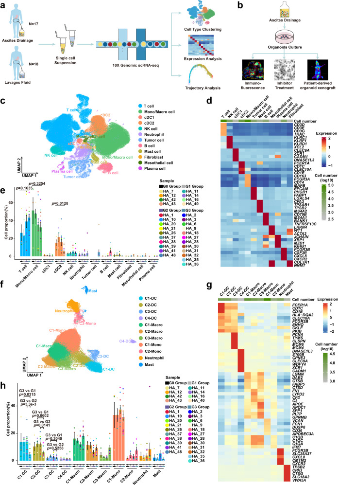
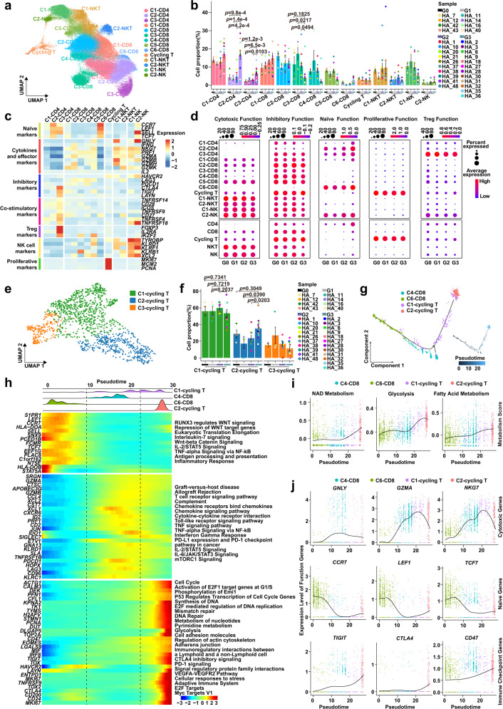
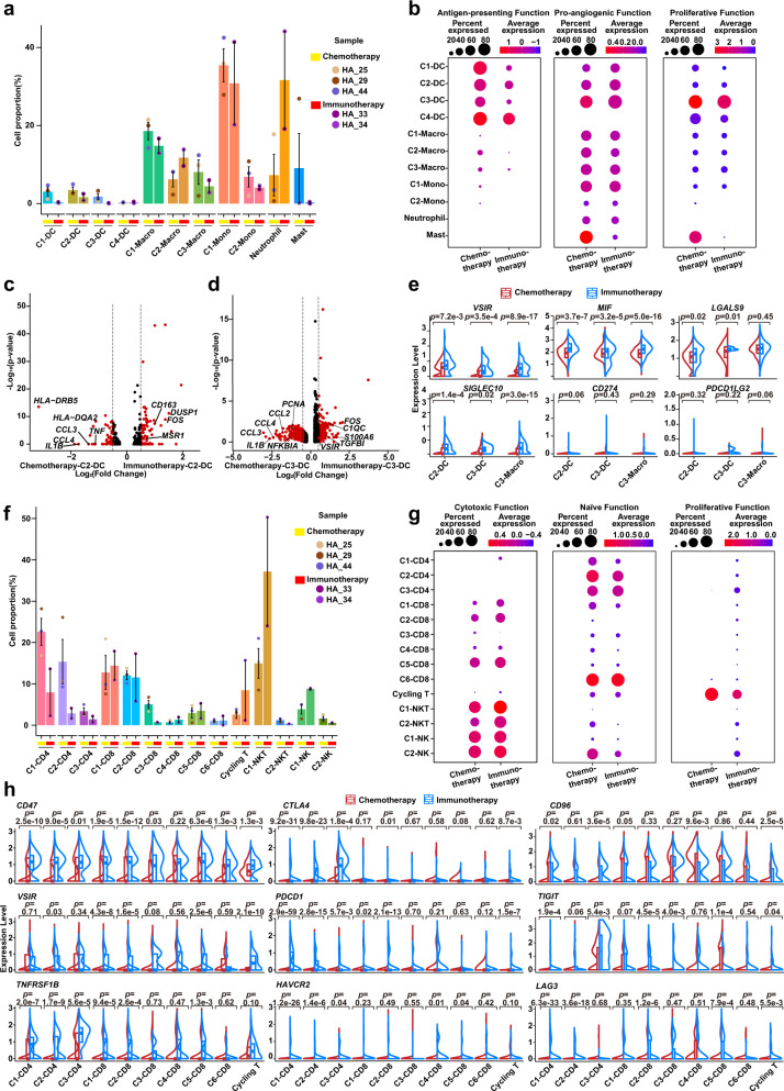
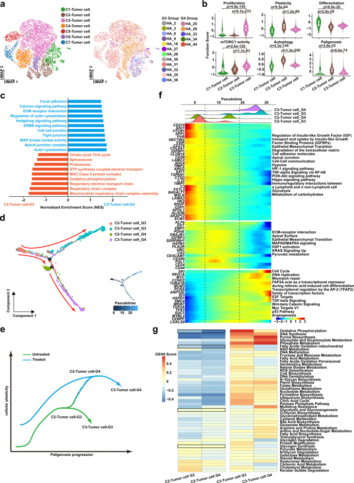
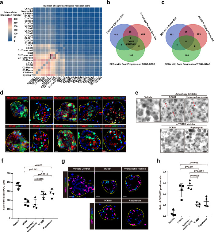
Peritoneal metastasis is the leading cause of death for gastrointestinal cancers. The native and therapy-induced ascites ecosystems are not fully understood. Here, we characterize single-cell transcriptomes of 191,987 ascites cancer/immune cells from 35 patients with/without gastric cancer peritoneal metastasis (GCPM). During GCPM progression, an increase is seen of monocyte-like dendritic cells (DCs) that are pro-angiogenic with reduced antigen-presenting capacity and correlate with poor gastric cancer (GC) prognosis. We also describe the evolution of monocyte-like DCs and regulatory and proliferative T cells following therapy. Moreover, we track GC evolution, identifying high-plasticity GC clusters that exhibit a propensity to shift to a high-proliferative phenotype. Transitions occur via the recently described, autophagy-dependent plasticity program, paligenosis. Two autophagy-related genes (MARCKS and TXNIP) mark high-plasticity GC with poorer prognosis, and autophagy inhibitors induce apoptosis in patient-derived organoids. Our findings provide insights into the developmental trajectories of cancer/immune cells underlying GCPM progression and therapy resistance.


Conflict of interest statement

The authors declare no competing interests.

Figures

Fig. 1
Fig. 1. scRNA-seq profiles of dynamic changes in the peritoneal ecosystem.
a Scheme of the experimental design and analytical workflow of this study for scRNA-seq. b Validation experiment based on patient-derived organoids from ascites. c Uniform Manifold Approximation and Projection (UMAP) plot showing the main cell types from all samples. Each cluster is colored and annotated according to cell type. Mono/Macro, monocyte/macrophage; cDC1, type 1 conventional dendritic cells; cDC2, type 2 conventional dendritic cells. d Heatmap showing z-score normalized mean expression of selected marker genes in each cell type. e The proportion of each cell type in different groups from G0 (n = 4 samples), G1 (n = 4 samples), G2 (n = 10 samples) and G3 (n = 12 samples) Group. Histogram colors correspond to cell type colors in c; point colors correspond to samples. Data are presented as mean values ± SEM (error bars); the p-values are calculated by one-way ANOVA test. f UMAP plot representing myeloid cell clusters colored by cluster. DC dendritic cell, Macro macrophage, Mono monocyte. g Heatmap showing z-score normalized mean expression of selected genes in each cluster of myeloid cells. h The proportion of each cluster of myeloid cells from G0 (n = 4 samples), G1 (n = 4 samples), G2 (n = 10 samples) and G3 (n = 12 samples) Groups. Histogram colors correspond to cell type colors in f; point colors correspond to samples. Data are presented as mean values ± SEM (error bars); the p-values are calculated by two-sided unpaired Student’s t-test. Source data are provided as a Source Data file.
Fig. 2
Fig. 2. Monocyte-like dendritic cells exhibit high diversity and a pro-angiogenic phenotype during GCPM.
a Dotplot showing antigen-presenting, pro-angiogenic, phagocytotic, pro-inflammatory, anti-inflammatory, and proliferative function scores of myeloid-derived cell clusters in G0-G3 Groups. Dot size represents percent of expressing cells in each cluster, color represents z-score of normalized mean expression level of selected gene signatures. DC dendritic cell, Macro macrophage, Mono monocyte. b Violin plot showing expression levels of selected antigen-presenting and pro-angiogenic genes in dendritic cell (DC) clusters among G0 (n = 4 samples), G1 (n = 4 samples), G2 (n = 10 samples) and G3 (n = 12 samples) Group, color-coded by cell type. Horizontal dotted line represents mean value, and colored dotted curve line indicates changes in expression level of selected genes. Box represents median ± interquartile range; whiskers represent 1.5x interquartile range; p-values are calculated by two-sided unpaired Wilcoxon test. c Developmental trajectory plot of dendritic cell (DC) clusters, color-coded by cluster (left) and pseudotime (right). Each dot represents a single cell. d Curve plots showing metabolism score changes related to glycolysis, fatty acid metabolism, and oxidative phosphorylation in dendritic cells (DCs) along pseudotime. Point colors correspond to cell type colors in c. e The cell distribution of each dendritic cell (DC) cluster along with the pseudotime (upper panel), color-coded by DC clusters. Heatmap showing dynamic expression changes of genes in DC clusters (lower panel). f Curve plots showing expression level changes of function-related genes related to antigen-presentation, pro-angiogenesis, proliferation, plasticity, and immune checkpoint along pseudotime in dendritic cells (DCs). Point colors correspond to cell type colors in c. Source data are provided as a Source Data file.
Fig. 3
Fig. 3. T cell inhibitory states are differentially remodeled in GCPM progression.
a Uniform Manifold Approximation and Projection (UMAP) plot representing clusters of T/NK cells, colored by cluster. b The proportion of T/NK cells clusters in different groups from G0 (n = 4 samples), G1 (n = 4 samples), G2 (n = 10 samples) and G3 (n = 12 samples) Groups. Data are presented as mean values ± SEM (error bars); p-values are calculated by two-sided unpaired Student’s t-test. c Heatmap showing expression levels of selected genes of naïve, cytokines and effectors, inhibitory, co-stimulatory, Treg, NK cells, and proliferative markers in each T/NK cell cluster. d Dotplot showing the cytotoxic, inhibitory, naïve, proliferative, and Treg function scores of T/NK cells clusters in G0-G3 Groups. Dot size represents percent of expressing cells in each cluster and color represents z-score of normalized mean expression level of selected gene signatures. e Uniform Manifold Approximation and Projection (UMAP) plot of three clusters of cycling T cells, colored by cell cluster. f Histogram plot indicating the cell proportions of cycling T clusters in G0 (n = 4 samples), G1 (n = 4 samples), G2 (n = 10 samples), and G3 (n = 12 samples) Groups. Data are presented as mean values ± SEM (error bars); the p-values are calculated by two-sided unpaired Student’s t-test. g Developmental trajectory of cycling T cells inferred by Monocle 2 analysis, color-coded by cluster (left) and pseudotime (right). Each dot represents a single cell. h The distribution of cycling T cells is shown along pseudotime (upper panel), color-coded by T cell clusters. Heatmap showing dynamic expression changes of selected genes and related pathways along pseudotime (lower panel). i Curve plots showing dynamic changes of metabolism scores in cycling T cells along pseudotime. Point colors correspond to cell type colors in g. j Curve plots showing expression changes of function genes related to cytotoxic, naïve, and immune checkpoint genes in cycling T cells along pseudotime. Point colors correspond to cell type colors in g. Source data are provided as a Source Data file.
Fig. 4
Fig. 4. Therapy-induced evolution of monocyte-like DC and cycling T cell immune phenotype.
a Histogram plot showing cell proportions of myeloid cell clusters in the G3 (n = 12 samples) and G4 Groups (n = 5 samples) colored by cell type. DC, dendritic cell; Macro, macrophage; Mono, monocyte. Point colors correspond to samples. Data are presented as mean values ± SEM (error bars); p-values are calculated by two-sided unpaired Student’s t-test. b Split violin plots showing the antigen-presenting, pro-angiogenic, and proliferative function scores of myeloid cells in the G3 (n = 12 samples, red) and G4 Groups (n = 5 samples, blue) groups. Box represents median ± interquartile range; p-values are calculated by two-sided unpaired Wilcoxon test. c Gene Set Enrichment Analyses (GSEA) analysis showing distinct enrichment pathways of C3-DC in the G3 (red) and G4 Groups (blue). Bar chart showing normalized enrichment scores (NES) of specific pathways. d Heatmap plot representing the activity of metabolism pathways of C2/C3-DCs in the G3 and G4 Groups. Color indicates the activity score of each metabolism pathway calculated by Gene Set Variation Analysis (GSVA) analysis. e Histogram plot representing the cell proportion of T/NK clusters in the G3 (n = 12 samples) and G4 Groups (n = 5 samples), colored by cell type. Point colors correspond to samples. Data are presented as mean values ± SEM (error bars); p-values are calculated by two-sided unpaired Student’s t-test. f Split violin plots showing the cytotoxic, inhibitory, naïve, and proliferative function scores of T cells in the G3 (n = 12 samples, red) and G4 Groups (n = 5 samples, blue). Box represents median ± interquartile range; p-values are calculated by two-sided unpaired Wilcoxon test. g Similar to d, the metabolism pathway activity score of C3-CD4 and cycling T cells in the G3 and G4 Groups shown in a heatmap plot. Pathway activity scores were calculated by Gene Set Variation Analysis (GSVA) analysis. Source data are provided as a Source Data file.
Fig. 5
Fig. 5. Immune checkpoint evolution of monocyte-like DC and cycling T cells.
a Cell proportions of myeloid cell clusters after Chemotherapy (n = 3 samples) and Immunotherapy (n = 2 samples) shown in histogram plot. DC, dendritic cell; Macro, macrophage; Mono, monocyte. Histogram colors correspond to cell clusters; point colors correspond to samples. Data are presented as mean values ± SEM (error bars). b Dotplot showing the antigen-presenting, pro-angiogenic, and proliferative function scores of myeloid cell clusters in Chemotherapy (n = 3 samples) and Immunotherapy (n = 2 samples) Groups. Dot size represents percent of expressing cells in each cluster, and color represents mean expression level of selected gene signatures. c, d Volcano plots showing differentially expressed genes (DEGs) of C2-DC (c) and C3-DC (d) between Chemotherapy (three patients) and Immunotherapy (two patients) Groups. e Split violin plots showing expression levels of immune checkpoints of C2/C3-DC and C3-Macro in Chemotherapy (n = 3 samples, red) and Immunotherapy (n = 2 samples, blue) Groups. The comparisons and statistical analyses are conducted between cell clusters (three cell clusters: C2-DC, C3-DC, and C3-Macro) of Chemotherapy and Immunotherapy groups, and the total cells number of all clusters are >3. Box represents median ± interquartile range; p-values are calculated by two-sided unpaired Wilcoxon test. f The same histogram plot as in a for T/NK clusters in Chemotherapy (n = 3 samples) and Immunotherapy (n = 2 samples) Groups. Histogram colors correspond to cell clusters; point colors correspond to samples. Data are presented as mean values ± SEM (error bars). g Dotplot showing the cytotoxic, naïve, and proliferative function scores of T/NK cell types in Chemotherapy (three patients) and Immunotherapy (two patients) Groups. Dot size represents percent of expressing cells in each cluster, and color represents z-score of normalized mean expression level of selected gene signatures. h The same split violin plots as in (e) for T/NK cell types in Chemotherapy (n = 3 samples, red) and Immunotherapy (n = 2 samples, blue) Groups. The comparisons and statistical analyses are conducted between T cell clusters (10 cell clusters: C1-3 CD4, C1-6 CD8, and Cycling T) of Chemotherapy and Immunotherapy groups, and the total cells number of all clusters are >3. Box represents median ± interquartile range; p-values are calculated by two-sided unpaired Wilcoxon test. Source data are provided as a Source Data file.
Fig. 6
Fig. 6. High-plasticity GC evolves to high-proliferative GC through a conserved cellular program.
a Uniform Manifold Approximation and Projection (UMAP) visualization of tumor cells by cell types (Left, colors correspond to cell clusters) and samples (Right, colors correspond to samples). b Violin plot showing function scores of proliferation, plasticity, differentiation, mTORC1, autophagy, and paligenosis in tumor cells (C1-Tumor cell: n = 713 cells; C2-Tumor cell: n = 549 cells; C3-Tumor cell: n = 2545 cells). Box represents median ± interquartile range; whiskers represent 1.5x interquartile range; p-values are calculated by two-sided unpaired Wilcoxon test. c Gene Set Enrichment Analyses (GSEA) analysis showing distinct enrichment pathways of C2-Tumor cells in the G3 (red) and G4 Groups (blue). Bar chart showing the normalized enrichment score (NES) of specific pathways in specific tumor cells. d The trajectory plot of C2/C3-tumor cells in the G3 and G4 Groups (left), and the transition trajectories along pseudotime (right) in a two-dimensional state-space inferred by Monocle 2 analysis. e Two-dimensional schematic diagram showing cellular plasticity changes in C2/C3-tumor cells in the G3 and G4 Groups along paligenosis progression. f The 3-phase distribution of C2/C3-tumor cells along pseudotime color-coded by cell cluster (upper panel). Heatmap showing dynamic expression changes of genes and related pathways of C2/C3-tumor cells in the G3 and G4 Groups along pseudotime (lower panel). g Heatmap plot indicating the activity of metabolism pathways in C2/C3-tumor cells between the G3 and G4 Groups. Color represents the activity score of metabolism pathways calculated by Gene Set Variation Analysis (GSVA) analysis. Source data are provided as a Source Data file.
Fig. 7
Fig. 7. Autophagy inhibition blocks paligenosis and induces apoptosis in GC PDOs.
a Heatmap showing the intercellular interaction by CellPhoneDB analysis. Color represents the number of significant ligand-receptor pairs among different cell subtypes. DC, dendritic cell; Macro, macrophage; Mono, monocyte. b, c Venn diagram showing the number of overlapping signature genes between differentially expressed genes (DEGs) of C2-tumor cell, poor prognostic DEGs of The Cancer Genome Atlas Stomach Adenocarcinoma (TCGA-STAD) database, and autophagy-related gene sets (b) and mTORC1-related gene sets (c). d Immunofluorescence staining for MARCKS (red, upper panel) and TXNIP (red, lower panel), early paligenosis markers DDIT4 (green) and ATF3 (green), late paligenosis markers KI67 (green) and pS6 (green), progenitor-related marker SOX9 (green), and nuclei marker DAPI (blue) in 15th generation patients-derived organoids from ascites. Scale bar, 100 μm. The experiment was repeated with 4 independent experiments, with similar results. e Fifteenth generation organoids generated as clones from single cells dissociated from 14th generation organoids after addition of inhibitors or vehicle when single cell suspensions were replated. Red arrows indicate application of autophagy and mTORC1 inhibitors promoting organoids death. Scale bar, 400 μm. The experiment was repeated with four independent experiments, with similar results. f Quantification of the size of 15th generation organoids as in (e) after 7-day treatment with autophagy or mTORC1 inhibitors (n = 4 independent experiments). Each datapoint represents the mean of mean values of organoids in all wells. Every well included the means of 25+ counts. Data are presented as mean values ± SEM (error bars); p-values are calculated by one-way ANOVA with Tukey post hoc test. g Immunofluorescence staining for apoptosis marker CC3 (green), proliferation marker KI67 (pink), and nuclei marker DAPI (blue) in 15th generation organoids as in (e) after 7-days treatment with autophagy or mTORC1 inhibitors. Scale bar, 100 μm. h The ratio of CC3/KI67 positive cells as in (g) (n = 4 independent experiments). Data are presented as mean values ± SEM (error bars); p-values are calculated by one-way ANOVA with Tukey post hoc test.

References

    1. Sung H, et al. Global Cancer Statistics 2020: GLOBOCAN estimates of incidence and mortality worldwide for 36 cancers in 185 countries. CA: Cancer J. Clin. 2021;71:209–249. - PubMed
    1. Kus T, et al. Prediction of peritoneal recurrence in patients with gastric cancer: a multicenter study. J. Gastrointest. Cancer. 2021;52:634–642. doi: 10.1007/s12029-020-00419-7. - DOI - PubMed
    1. Nakamura M, et al. Conversion surgery for gastric cancer with peritoneal metastasis based on the diagnosis of second-look staging laparoscopy. J. Gastrointest. Surg. 2019;23:1758–1766. doi: 10.1007/s11605-018-3983-7. - DOI - PubMed
    1. Mizrak Kaya D, et al. Risk of peritoneal metastases in patients who had negative peritoneal staging and received therapy for localized gastric adenocarcinoma. J. Surg. Oncol. 2018;117:678–684. doi: 10.1002/jso.24912. - DOI - PMC - PubMed
    1. Takahashi Y, et al. Real-world effectiveness of nivolumab in advanced gastric cancer: the DELIVER trial (JACCRO GC-08) Gastric Cancer. 2022;25:235–244. doi: 10.1007/s10120-021-01237-x. - DOI - PubMed

Publication types