. 2023 Feb 24;24(1):62.
doi: 10.1186/s12931-023-02364-y.

Targeted plasma proteomics reveals signatures discriminating COVID-19 from sepsis with pneumonia

Affiliations

Targeted plasma proteomics reveals signatures discriminating COVID-19 from sepsis with pneumonia

Laura M Palma Medina et al. Respir Res. .

Abstract

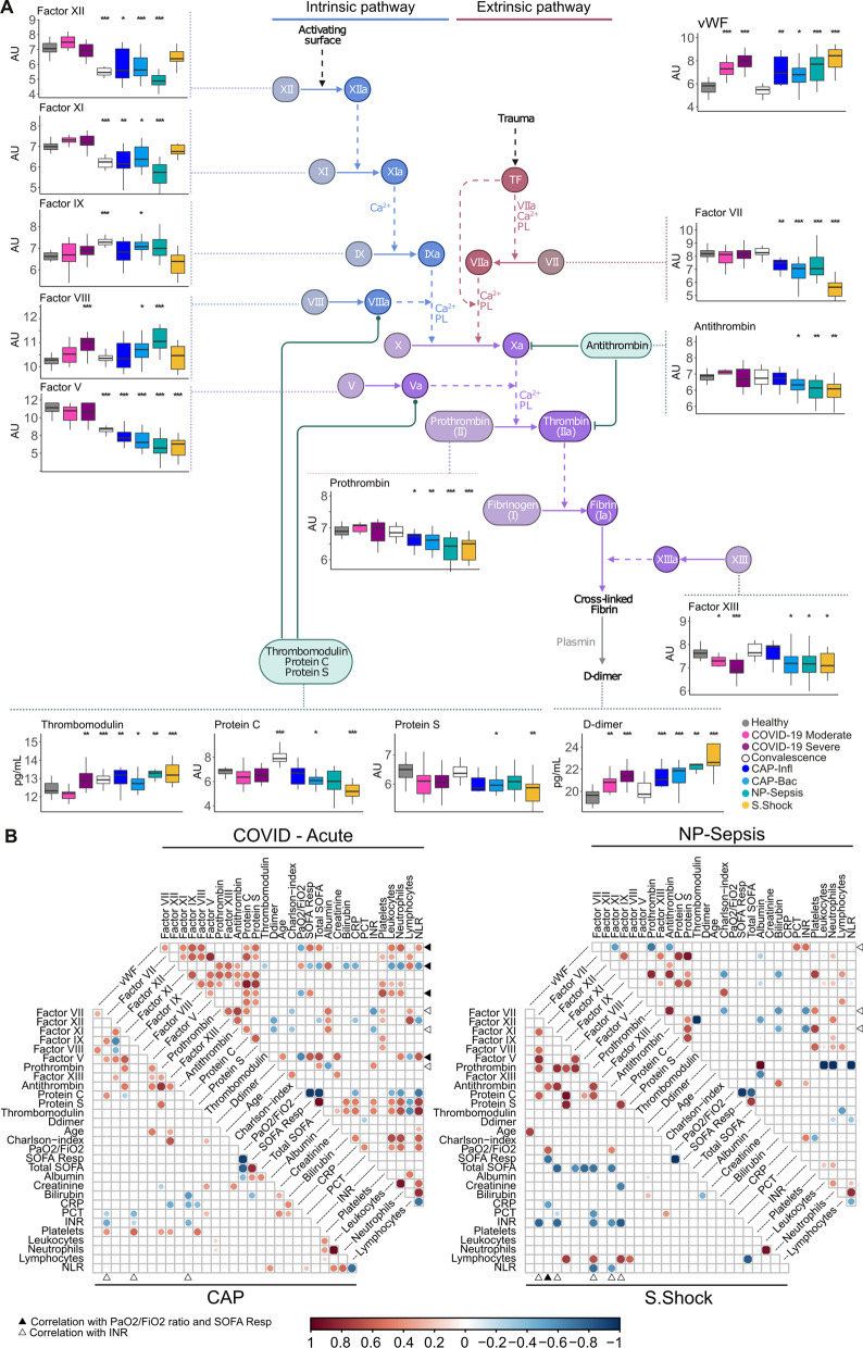
Background: COVID-19 remains a major public health challenge, requiring the development of tools to improve diagnosis and inform therapeutic decisions. As dysregulated inflammation and coagulation responses have been implicated in the pathophysiology of COVID-19 and sepsis, we studied their plasma proteome profiles to delineate similarities from specific features.

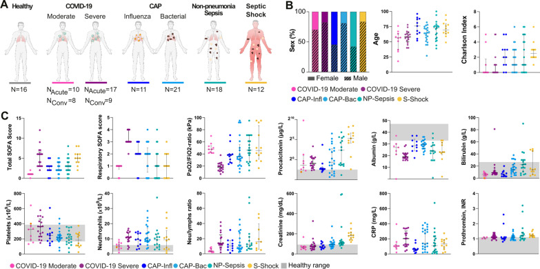
Methods: We measured 276 plasma proteins involved in Inflammation, organ damage, immune response and coagulation in healthy controls, COVID-19 patients during acute and convalescence phase, and sepsis patients; the latter included (i) community-acquired pneumonia (CAP) caused by Influenza, (ii) bacterial CAP, (iii) non-pneumonia sepsis, and (iv) septic shock patients.

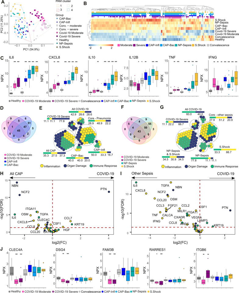
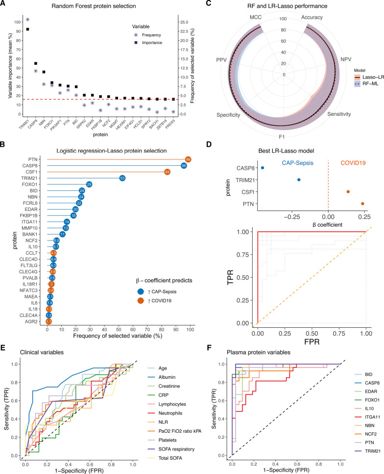
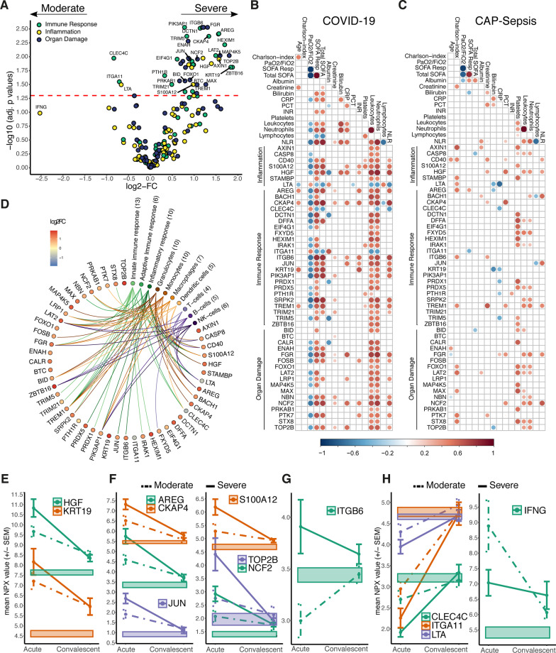
Results: We identified a core response to infection consisting of 42 proteins altered in both COVID-19 and sepsis, although higher levels of cytokine storm-associated proteins were evident in sepsis. Furthermore, microbiologic etiology and clinical endotypes were linked to unique signatures. Finally, through machine learning, we identified biomarkers, such as TRIM21, PTN and CASP8, that accurately differentiated COVID-19 from CAP-sepsis with higher accuracy than standard clinical markers.

Conclusions: This study extends the understanding of host responses underlying sepsis and COVID-19, indicating varying disease mechanisms with unique signatures. These diagnostic and severity signatures are candidates for the development of personalized management of COVID-19 and sepsis.

Keywords: COVID-19; Community acquired pneumonia; Olink proximity extension assays; Sepsis; Septic shock.


Conflict of interest statement

The authors declare that they have no competing interests.

Figures

Fig. 1
Fig. 1
Baseline characteristics of the study cohorts. A Number of healthy individuals and patients per group. B Distribution of sex, age, and Charlson comorbidity index per group. Colors depict patient subgroups, as indicated. C Clinical biomarkers of disease severity at sampling. The grey shadowed areas represent the reference values of the corresponding biomarkers. Significant differences between groups in Additional file 2: Tables S1 and S2. CAP-Infl CAP caused by influenza virus, CAP-Bac CAP caused by bacteria, NP-Sepsis Non-pneumonia sepsis, S. Shock Septic shock. NAcute Number of samples in acute COVID-19. NConv Number of samples during convalescence. NLR Neutrophil-to-lymphocyte ratio
Fig. 2
Fig. 2
Disease-specific plasma protein signatures in COVID-19 and sepsis. A Principal component (PC) analysis based on the levels of all proteins. The PAM clusters are shown by the dashed lines and encompass the samples closest to the cluster’s medoid. B Heatmap of mean expression (z scores) of all proteins (x axis) per group with hierarchical clustering (distance: Spearman’s ρ). The color-coded boxes denote statistically significant differences in comparison to healthy controls. C Plasma levels of classical sepsis-associated cytokines. D Venn diagram showing the number of proteins altered in the indicated patient groups compared to healthy controls. E Proteins from D color-coded based on their PEA panel. The adjacent bars represent the percentage of each PEA panel. Intersections (∩) between groups are denoted as: CAP-Infl ∩ CAP-Bac, “ALL CAP”; severe COVID-19 ∩ moderate COVID-19, “All COVID-19”; all COVID-19 ∩ all CAP, “Core—Pneumonia”; F Venn diagram showing the number of proteins altered in the indicated patient groups compared to healthy controls. G Proteins from F color-coded based on their PEA panel. The adjacent bar represents the percentage of each PEA panel. The “Core—other sepsis” group includes proteins with significantly different levels in the two COVID-19 groups, NP-sepsis, and septic shock; H, I Volcano plot depicting the difference in plasma levels of the Core-Pneumonia (H) and Core-other sepsis sets (I); color-coded based on the PEA panel. The horizontal dashed line indicates adjusted p values = 0.05; J Plasma proteins unique to COVID-19. Boxplots are labeled with gene names and stars represent significance in comparison to healthy controls: *Adj. p-value < 0.05, **Adj. p-value < 0.01, ***Adj. p-value < 0.005. PAM partitioning around medoids, PEA proximity extension assays
Fig. 3
Fig. 3
Machine learning models for differentiating COVID-19 from CAP-sepsis. A Proteins above the 90th percentile of variable importance (dashed line) selected more frequently in the random forest models (RF-ML). B Lollipop plot showing the most frequently selected proteins in the logistic regression models with lasso regularization (LR-Lasso). C Accuracy radar plot comparing performance metrics of each model type calculated on testing datasets. The lines represent the mean value of the metric in position and the shadows represent the 95% CI (± 1.97 × SD) of the metric’s mean. D The LR-lasso model that had 100% accuracy in both training and testing data, which consisted of the smallest panel of proteins. Colors refer to the β coefficient as in B, and the ROC curve shows the model accuracy. The orange dashed line represents chance, the grey dotted lines represent AUCs for different values of lambda. E ROC curves demonstrating the diagnostic potential of existing clinical biomarkers in differentiating COVID-19 from CAP-sepsis. The dashed line represents chance. F ROC curves for the intersecting most frequently selected proteins in both RF and LR-Lasso models. Additional ROC curves of proteins, see Additional file 1: Fig. S4B, C
Fig. 4
Fig. 4
Plasma proteins associated with COVID-19 severity in relation to immune response, clinical variables, and convalescence. A Volcano plot depicting the plasma proteome alterations in severe versus moderate COVID-19. The horizontal dashed line indicates the adjusted p values = 0.05. Colors indicate proteins’ PEA panel. B, C Heatmaps showing statistically significant correlations (Spearman’s, p < 0.05) between the 47 differentially altered plasma proteins in severe COVID-19 and clinical biomarkers of severity in (B) COVID-19 patients or (C) all CAP-sepsis patients. The bigger circle size and higher colour intensity represent higher correlations. D Diagram of the differentially altered plasma proteins in severe COVID-19 annotated by GO terms related to immune responses (based on STRING annotations [23]) and cell types (based on Human Protein Atlas [24]). EG Average protein expression (± SEM) during acute and convalescence phases of selected proteins that had higher levels in severe COVID-19 compared to moderate. Proteins were labelled with gene names. E The only two proteins that had higher levels in severe COVID-19 in both acute and convalescence phases, as compared to healthy. F Proteins correlated (Spearman’s ρ > 0.7) with both KRT19 and HGF. G The only protein among the COVID-19-unique proteins (see Fig. 2J) that was higher in severe COVID-19. H Proteins that had lower levels in severe versus moderate (COVID-19)
Fig. 5
Fig. 5
Coagulation cascade-related proteins altered in COVID-19 and sepsis. A Coagulation cascade diagram displaying associated protein levels, boxplots are labeled with protein names and stars represent significance in comparison to healthy controls: *Adj. p-value < 0.05, **Adj. p-value < 0.01, ***Adj. p-value < 0.005. B Heatmap showing statistically significant correlations (Spearman’s ρ, Adj. p-value < 0.05) between clinical characteristics and coagulation-related proteins. The bigger circle size and higher colour intensity represent higher correlations. The arrows indicate correlation of a coagulation protein with SOFA respiratory and PaO2/FiO2 ratio (black), or INR (white). The coagulation cascade sketch was adapted from BioRender.com (2022), https://app.biorender.com/biorender-templates. AU arbitrary units

References

    1. Osuchowski MF, Winkler MS, Skirecki T, Cajander S, Shankar-Hari M, Lachmann G, et al. The COVID-19 puzzle: deciphering pathophysiology and phenotypes of a new disease entity. Lancet Respir Med. 2021;9:622–642. doi: 10.1016/S2213-2600(21)00218-6. - DOI - PMC - PubMed
    1. Bateman RM, Sharpe MD, Jagger JE, Ellis CG, Solé-Violán J, López-Rodríguez M, et al. 36th International Symposium on Intensive Care and Emergency Medicine : Brussels, Belgium. 15–18 March 2016. Crit Care. 2016. p. 94. - PMC - PubMed
    1. Hotchkiss RS, Moldawer LL, Opal SM, Reinhart K, Turnbull IR, Vincent J-L. Sepsis and septic shock. Nat Rev Dis Prim. 2016;2:16045. doi: 10.1038/nrdp.2016.45. - DOI - PMC - PubMed
    1. Gyawali B, Ramakrishna K, Dhamoon AS. Sepsis: the evolution in definition, pathophysiology, and management. SAGE Open Med. 2019;7:2050312119835043. doi: 10.1177/2050312119835043. - DOI - PMC - PubMed
    1. Cavaillon J-M, Singer M, Skirecki T. Sepsis therapies: learning from 30 years of failure of translational research to propose new leads. EMBO Mol Med. 2020;12:e10128. doi: 10.15252/emmm.201810128. - DOI - PMC - PubMed