. 2023 Feb 9:14:1123724.
doi: 10.3389/fimmu.2023.1123724. eCollection 2023.

Detailed characterization of SARS-CoV-2-specific T and B cells after infection or heterologous vaccination

Affiliations

Detailed characterization of SARS-CoV-2-specific T and B cells after infection or heterologous vaccination

Domenico Lo Tartaro et al. Front Immunol. .

Abstract

The formation of a robust long-term antigen (Ag)-specific memory, both humoral and cell-mediated, is created following severe acute respiratory syndrome coronavirus 2 (SARS-CoV-2) infection or vaccination. Here, by using polychromatic flow cytometry and complex data analyses, we deeply investigated the magnitude, phenotype, and functionality of SARS-CoV-2-specific immune memory in two groups of healthy subjects after heterologous vaccination compared to a group of subjects who recovered from SARS-CoV-2 infection. We find that coronavirus disease 2019 (COVID-19) recovered patients show different long-term immunological profiles compared to those of donors who had been vaccinated with three doses. Vaccinated individuals display a skewed T helper (Th)1 Ag-specific T cell polarization and a higher percentage of Ag-specific and activated memory B cells expressing immunoglobulin (Ig)G compared to those of patients who recovered from severe COVID-19. Different polyfunctional properties characterize the two groups: recovered individuals show higher percentages of CD4+ T cells producing one or two cytokines simultaneously, while the vaccinated are distinguished by highly polyfunctional populations able to release four molecules, namely, CD107a, interferon (IFN)-γ, tumor necrosis factor (TNF), and interleukin (IL)-2. These data suggest that functional and phenotypic properties of SARS-CoV-2 adaptive immunity differ in recovered COVID-19 individuals and vaccinated ones.

Keywords: B cells; SARS-CoV-2; T cells; antigen-specific response; cytokine; polyfunctionality.


Conflict of interest statement

The authors declare that the research was conducted in the absence of any commercial or financial relationships that could be construed as a potential conflict of interest. The reviewer AC declared a past co-authorship with some of the authors to the handling editor.

Figures
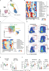
Figure 1
Figure 1
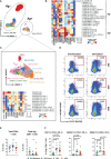
Immune phenotyping of antigen-specific CD4+ T cells. (A) Uniform Manifold Approximation and Projection (UMAP) plot shows the 2D spatial distribution of 8,436,275 cells from nine donors who recovered from SARS-CoV-2 infection (REC, severe = 4 and moderate = 5) and 23 vaccinated donors (MIX = 11 and RNA = 12) embedded with FlowSOM clusters. Ag+, antigen-specific CD4+ T cells; Ag, non-antigen-specific CD4+ T cells. (B) Heatmap of the median marker intensities of the 12 lineage markers across the 19 cell populations obtained with FlowSOM algorithm after the manual metacluster merging. The colors of cluster_id column correspond to the colors used to label the UMAP plot clusters. The color in the heatmap is referred to the median of the arcsinh marker expression (0–1 scaled) calculated over cells from all of the samples. Blue represents lower expression, while red represents higher expression. Light gray bar along the rows (clusters) and values in brackets indicate the relative sizes of the clusters. N, naive; TSCM, T stem cell memory; CM, central memory; TM, transitional memory; EM, effector memory; EMRA, effector memory reexpressing the CD45RA; cTfh, circulating T follicular helper cells. The black bar on the right is used to group Ag+ or Ag subpopulations. (C) UMAP and heatmap visualization of 10 manually merged antigen-specific CD4+ T-cell clusters. (D) Representative dot plots showing manual gating analysis of Ag-specific (CD137+CD69+) CD4+ T cells after overnight stimulation with spike protein compared to unstimulated control [activation-induced marker assay (AIM assay)]. Numbers in the dot plots indicate the percentage of cells identified by manual gating. (E) Dot plots show the total percentage of antigen-specific CD4+ T cells. Kruskal–Wallis test with Benjamini–Hochberg correction for multiple comparisons was used to test the differences among the three groups. (F) Dot plots show the cell percentage of the antigen-specific CD4+ T cells. The central bar represents the mean ± SEM. Generalized linear mixed model (GLMM) test was used for the statistical analysis. Adjusted P-values are reported in the figure. ns, not significant.
Figure 2
Figure 2
Immune phenotyping of antigen-specific CD8+ T cells. (A) UMAP plot shows the 2D spatial distribution of 3,723,899 cells from nine donors who recovered from SARS-CoV-2 infection (REC, severe = 4 and moderate = 5) and 23 vaccinated donors (MIX = 11 and RNA = 12) embedded with FlowSOM clusters. Ag+, antigen-specific CD8+ T cells; Ag, non-antigen-specific CD8+ T cells. (B) Heatmap of the median marker intensities of the 12 lineage markers across the 21 cell populations obtained with FlowSOM algorithm after the manual metacluster merging. The colors of cluster_id column correspond to the colors used to label the UMAP plot clusters. The color in the heatmap is referred to the median of the arcsinh marker expression (0–1 scaled) calculated over cells from all of the samples. Blue represents lower expression, while red represents higher expression. Light gray bar along the rows (clusters) and values in brackets indicate the relative sizes of the clusters. N, naive; CM, central memory; TM, transitional memory; EM, effector memory; EMRA, effector memory reexpressing the CD45RA. The black bar on the right is used to group Ag+ or Ag subpopulations. (C) Uniform Manifold Approximation and Projection UMAP and heatmap visualization of 11 manually merged antigen-specific CD8+ T cell clusters. (D) Representative dot plots showing manual gating analysis of Ag-specific (CD137+CD69+) CD8+ T cells after overnight stimulation with spike protein compared to unstimulated control [activation-induced marker assay (AIM assay)]. Numbers in the dot plots indicate the percentage of cells identified by manual gating. (E) Dot plots show the total percentage of antigen-specific CD8+ T cells. Kruskal–Wallis test with Benjamini–Hochberg correction for multiple comparisons was used to test the differences among the three groups. (F) Dot plots show the relative cell percentage of the antigen-specific CD8+ T-cell clusters of nine donors who recovered from SARS-CoV-2 infection (REC, severe = 4 and moderate = 5) and 23 vaccinated donors (MIX = 11 and RNA = 12). The central bar represents the mean ± SEM. Generalized linear mixed model GLMM test was used for the statistical analysis. Adjusted P-values are reported in the figure. ns, not significant.
Figure 3
Figure 3
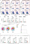
Cytokine production and polyfunctionality of antigen-specific CD4+ T cells. (A) Representative dot plots showing manual gating analysis of intracellular cytokine production of CD4+ T lymphocytes after overnight stimulation with spike protein compared to unstimulated control. Numbers in the dot plots indicate the percentage of cells identified by the gates. (B) Comparison between the total production of IFN-γ, TNF, IL-17, IL-2, CD107a, and GZMB by CD4+ T cells after in vitro stimulation with 15-mer peptides, covering the complete sequence of Wuhan SARS-CoV-2 spike glycoprotein. Data represent individual values from nine healthy subjects who recovered from SARS-CoV-2 infection (REC, severe = 4 and moderate = 5) and 23 vaccinated donors (MIX= 11 and RNA = 12). Mean (center bar) ± SEM (upper and lower bars). Kruskal–Wallis test with Benjamini–Hochberg correction for multiple comparisons was used to test the differences among the three groups. (C) Pie charts representing the proportion of responding CD4+ T cells producing different combinations of CD107a, IL-2, IL-17, IFN-γ, and TNF after in vitro stimulation with 15-mer peptides, covering the complete sequence of Wuhan SARS-CoV-2 spike glycoprotein. Frequencies were corrected by background subtraction as determined in non-stimulated controls using SPICE software. Pie arches represent the total production of different cytokines. (D) Percentage of polyfunctional population within CD4+ T cells. Kruskal–Wallis test with Benjamini–Hochberg correction for multiple comparisons was used to test the differences among the three groups. Adjusted P-values are indicated in the figure.
Figure 4
Figure 4
Immune phenotyping of antigen-specific CD19+ B cells. (A) Dot plots show the total percentage of CD19+ B cells. Kruskal–Wallis test with Benjamini–Hochberg correction for multiple comparisons was used to test the differences among the three groups. (B) Dot plots show the total percentage of antigen-specific CD19+ B cells (left); representative dot plots showing manual gating analysis of Ag+ B cells from REC, MIX, and RNA. Numbers in the dot plots indicate the percentage of cells identified by the gates (right). Kruskal–Wallis test with Benjamini–Hochberg correction for multiple comparisons was used to test the differences among the three groups. (C) UMAP plot shows the 2D spatial distribution of 3,057,659 cells from nine donors who recovered from SARS-CoV-2 infection (REC, severe = 4 and moderate = 5) and 23 vaccinated donors (MIX = 11 and RNA = 12) embedded with FlowSOM clusters. Ag+, antigen-specific CD19+ B cells; Ag, non-antigen-specific CD19+ B cells. (D) Heatmap of the median marker intensities of the 10 lineage markers across the 15 cell populations obtained with FlowSOM algorithm after the manual metacluster merging. The colors of cluster_id column correspond to the colors used to label the UMAP plot clusters. The color in the heatmap is referred to the median of the arcsinh marker expression (0–1 scaled) calculated over cells from all of the samples. Blue represents lower expression, while red represents higher expression. Light gray bar along the rows (clusters) and values in brackets indicate the relative sizes of the clusters. N, naive; TrB, transitional B cells; MBC, memory B cell; atBC, atypical B cell. (E) Dot plots show the percentage of 15 Ag+ B cell clusters among nine donors who recovered from SARS-CoV-2 infection (REC, severe = 4 and moderate = 5) and 23 vaccinated donors (MIX = 11 and RNA = 12). The central bar represents the mean ± SEM. GLMM test was used for the statistical analysis. Adjusted P-values are reported in the figure. (F) Anti-spike and anti-RBD IgG concentrations in plasma samples from REC, MIX, and RNA individuals. Kruskal–Wallis test with Benjamini–Hochberg correction for multiple comparisons was used to test the differences among the three groups. Adjusted P-values are indicated in the figure.
Figure 5
Figure 5
Principal component analysis and correlogram reveal that REC is different from MIX and RNA. (A) (Left) Principal component analysis (PCA) using the plasma level of anti-SARS-CoV-2 IgG antibodies, Ag-specific T, B-cell percentages, and the fraction of polyfunctional CD4+ T cells from REC, MIX, and RNA subjects. REC, green circles (n = 9); MIX, blue circles (n = 11); RNA, orange circles (n = 12). (Right) Contribution of the different variables to PCA. The color of the arrows underlines the contribution level, while the position underlines the positive or negative contribution. Negatively correlated variables are positioned on opposite sides of the plot origin (opposed quadrants). (B) Correlogram of REC. Spearman R (ρ) values are shown from brown (−1.0) to green (1.0); color intensity and areas of square are proportional to correlation coefficients R. Spearman rank two-tailed P-value was indicated by *P < 0.05, **P < 0.01, and ***P < 0.001. Additional XY scatter plots that specifically show the relationship between the variables that are most correlated are displayed. Each scatter plot reports the regression line (blue), the Spearman R (ρ) value, the exact two-tailed P-value, and the 95% confidence bands (light gray).

References

    1. Moss P. The T cell immune response against SARS-CoV-2. Nat Immunol (2022) 23(2):186–93. doi: 10.1038/s41590-021-01122-w - DOI - PubMed
    1. Cohen KW, Linderman SL, Moodie Z, Czartoski J, Lai L, Mantus G, et al. . Longitudinal analysis shows durable and broad immune memory after SARS-CoV-2 infection with persisting antibody responses and memory b and T cells. Cell Rep Med (2021) 2(7):100354. doi: 10.1016/j.xcrm.2021.100354 - DOI - PMC - PubMed
    1. Rha MS, Jeong HW, Ko JH, Choi SJ, Seo IH, Lee JS, et al. . PD-1-Expressing SARS-CoV-2-Specific CD8(+) T cells are not exhausted, but functional in patients with COVID-19. Immunity (2021) 54(1):44–52 e43. doi: 10.1016/j.immuni.2020.12.002 - DOI - PMC - PubMed
    1. Jung JH, Rha MS, Sa M, Choi HK, Jeon JH, Seok H, et al. . SARS-CoV-2-specific T cell memory is sustained in COVID-19 convalescent patients for 10 months with successful development of stem cell-like memory T cells. Nat Commun (2021) 12(1):4043. doi: 10.1038/s41467-021-24377-1 - DOI - PMC - PubMed
    1. Paolini A, Borella R, Neroni A, Lo Tartaro D, Mattioli M, Fidanza L, et al. . Patients recovering from severe COVID-19 develop a polyfunctional antigen-specific CD4+ T cell response. Int J Mol Sci (2022) 23(14):8004. doi: 10.3390/ijms23148004 - DOI - PMC - PubMed

Publication types