. 2023 Jun 1;44(8):3023-3044.
doi: 10.1002/hbm.26259. Epub 2023 Mar 10.

High spatial overlap but diverging age-related trajectories of cortical magnetic resonance imaging markers aiming to represent intracortical myelin and microstructure

Affiliations

High spatial overlap but diverging age-related trajectories of cortical magnetic resonance imaging markers aiming to represent intracortical myelin and microstructure

Olivier Parent et al. Hum Brain Mapp. .

Abstract

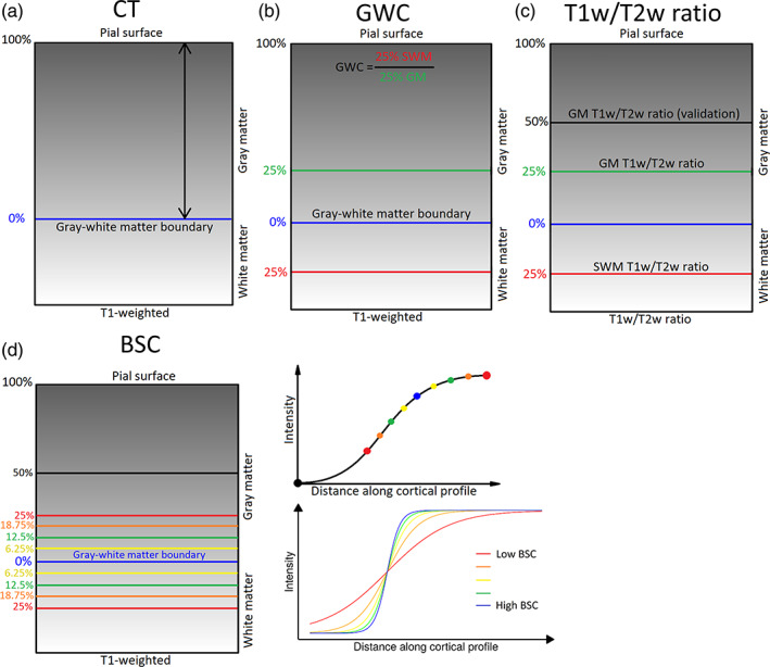
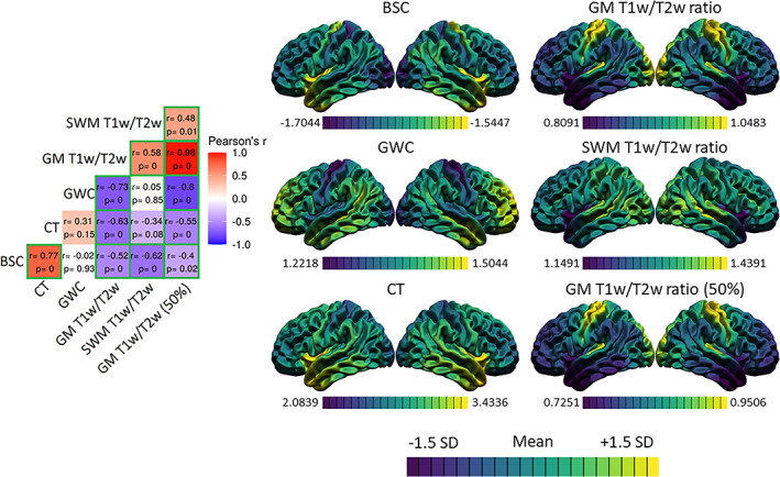
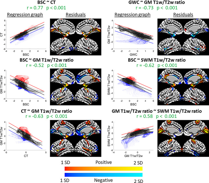
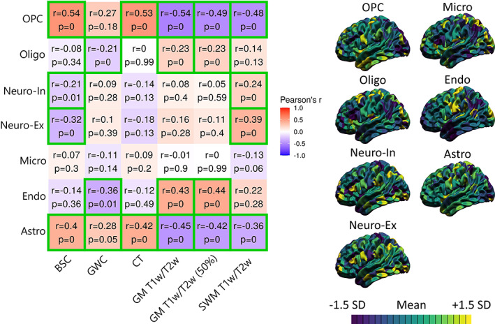
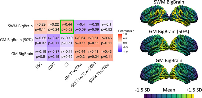
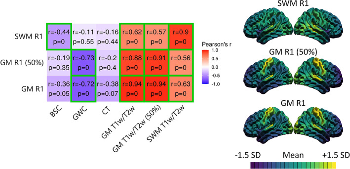
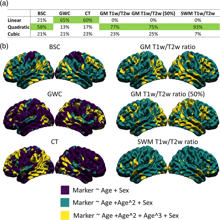
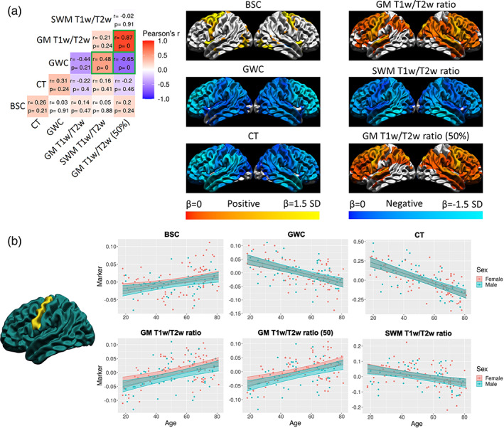
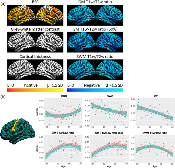
Statistical effects of cortical metrics derived from standard T1- and T2-weighted magnetic resonance imaging (MRI) images, such as gray-white matter contrast (GWC), boundary sharpness coefficient (BSC), T1-weighted/T2-weighted ratio (T1w/T2w), and cortical thickness (CT), are often interpreted as representing or being influenced by intracortical myelin content with little empirical evidence to justify these interpretations. We first examined spatial correspondence with more biologically specific microstructural measures, and second compared between-marker age-related trends with the underlying hypothesis that different measures primarily driven by similar changes in myelo- and microstructural underpinnings should be highly related. Cortical MRI markers were derived from MRI images of 127 healthy subjects, aged 18-81, using cortical surfaces that were generated with the CIVET 2.1.0 pipeline. Their gross spatial distributions were compared with gene expression-derived cell-type densities, histology-derived cytoarchitecture, and quantitative R1 maps acquired on a subset of participants. We then compared between-marker age-related trends in their shape, direction, and spatial distribution of the linear age effect. The gross anatomical distributions of cortical MRI markers were, in general, more related to myelin and glial cells than neuronal indicators. Comparing MRI markers, our results revealed generally high overlap in spatial distribution (i.e., group means), but mostly divergent age trajectories in the shape, direction, and spatial distribution of the linear age effect. We conclude that the microstructural properties at the source of spatial distributions of MRI cortical markers can be different from microstructural changes that affect these markers in aging.

Keywords: T1-weighted/T2-weighted ratio; aging; boundary sharpness coefficient; cortical myelin; cortical thickness; gray-white matter contrast; magnetic resonance imaging.


Conflict of interest statement

The authors have no actual or potential conflicts of interest.

Figures

FIGURE 1
FIGURE 1
Methods for generating markers. (a) Cortical Thickness (CT) estimates were calculated as the Laplacian distance between the pial surface and the gray–white matter boundary surface at each vertex on the T1‐weighted volume in native space. (b) Gray‐white matter contrast (GWC) was calculated by dividing the intensity at 25% of CT translated into superficial white matter (SWM) by the intensity at 25% of CT into gray matter (GM) at each vertex on the T1‐weighted volume in MNI space. (c) The T1w/T2w ratio measures were generated by sampling the T1w/T2w ratio volume in native space at various distances. GM T1w/T2w ratio was sampled at 25% of CT. SWM T1w/T2w ratio was sampled at 25% of CT translated into SWM. Additionally, a second GM T1w/T2w ratio measure was sampled at 50% of CT in GM (referred to as GM T1w/T2w ratio at 50% of CT). (d) The boundary sharpness coefficient (BSC) was calculated by first sampling 10 T1‐weighted intensities in MNI space around the gray‐white matter boundary (between 50% of CT in GM and 25% of CT in SWM), then fitting a sigmoid curve to the resulting intensity profile at each vertex. The BSC represents the growth parameter of the sigmoid curve, with a higher BSC indicating a sharper gray–white matter transition and a lower BSC representing a more gradual transition.
FIGURE 2
FIGURE 2
Spatial distributions of the markers and correlations. For each marker, the mean and standard deviation of the surface were calculated and used to threshold the colors. Purple areas indicate lower values relative to the mean of that marker, while yellow areas indicate higher values. The correlation matrix includes Pearson's correlation coefficients (r) and FDR‐corrected p‐values. The color of each correlation block is linked to the correlation coefficient: positive coefficients are red and negative coefficients are blue, high coefficients are more saturated and low coefficients tend toward white. Significant correlations at the FDR 0.05 level are highlighted with a green outline.
FIGURE 3
FIGURE 3
Spatial distribution relationships: graphs and residuals. For each significant correlation, the left figure is the spatial regression in graph form, where the x‐axis is the Z‐scored values of the first marker, the y‐axis is the Z‐scored values of the second marker, the regression line is shown in black, and the +1 SD and −1 SD lines are shown in red and blue, respectively (representing the thresholds set for values that are far from the regression line and exhibit less the observed relationship). The right figure is the vertex‐wise residuals from the regression thresholded at ±1 SD (cold colors indicate vertices below the regression line in blue in the left graph and warm colors indicate vertices above the regression line in red in the left graph, and lighter colors indicate higher residual values and darker colors indicate lower residual values). For example, the relationship between GWC and GM T1w/T2w ratio (top right) is linear in most areas, as seen in the graph on the left, except for a group of vertices below the regression line which we can locate in the residual figure on the right (in this case, in the insula and medial temporal pole).
FIGURE 4
FIGURE 4
Correlations between MRI markers and gene‐expression‐derived densities of seven canonical cell types. For each marker, the mean and standard deviation were calculated and used to threshold the colors. More specifically, purple areas indicate lower values relative to the mean of that marker, while yellow areas indicate higher values. The correlation matrix includes Pearson's correlation coefficient (r) and FDR‐corrected p‐values. The color of each correlation block is linked to the correlation coefficient: positive coefficients are red and negative coefficients are blue, high coefficients are more saturated and low coefficients tend toward white. Significant correlations at the FDR 0.05 level are highlighted with a green outline.
FIGURE 5
FIGURE 5
Correlations between MRI markers and histologically derived overall cell density from the BigBrain dataset. For each marker, the mean and standard deviation were calculated and used to threshold the colors. More specifically, purple areas indicate lower values relative to the mean of that marker, while yellow areas indicate higher values. The correlation matrix includes Pearson's correlation coefficient (r) and FDR‐corrected p‐values. The color of each correlation block is linked to the correlation coefficient: positive coefficients are red and negative coefficients are blue, high coefficients are more saturated and low coefficients tend toward white. Significant correlations at the FDR 0.05 level are highlighted with a green outline.
FIGURE 6
FIGURE 6
Correlations between the spatial distributions of MRI markers and quantitative R1 maps. For each marker, the mean and standard deviation were calculated and used to threshold the colors. More specifically, purple areas indicate lower values relative to the mean of that marker, while yellow areas indicate higher values. The correlation matrix includes Pearson's correlation coefficient (r) and FDR‐corrected p‐values. The color of each correlation block is linked to the correlation coefficient: positive coefficients are red and negative coefficients are blue, high coefficients are more saturated and low coefficients tend toward white. Significant correlations at the FDR 0.05 level are highlighted with a green outline.
FIGURE 7
FIGURE 7
Vertex‐wise best age trajectory shape between linear, quadratic, and cubic for each marker. (a) Table illustrating the proportion of vertices best fitted by each age model for each marker according to the Akaike Information Criterion (AIC), with the age model best fitting the highest proportion of vertices highlighted in green. (b) Spatial distribution of the AIC results. Purple areas indicate a better fit of the linear age trajectory, green areas indicate a better fit of the quadratic age trajectory, and yellow areas indicate a better fit of the cubic age trajectory.
FIGURE 8
FIGURE 8
Spatial distribution of the linear age effect of the markers and correlations. (a) For each marker, the mean and standard deviation of the age betas were calculated and used to threshold the colors. Cortical maps are thresholded for significance at the FDR 0.05 level. Cold colors indicate negative age betas and warm colors indicate positive age betas. Light colors indicate higher age betas and dark colors indicate lower age betas. The correlation matrix includes Pearson's correlation coefficient (r) and FDR‐corrected p‐values. The color of each correlation block is linked to the correlation coefficient: positive coefficients are red and negative coefficients are blue, high coefficients are more saturated and low coefficients tend toward white. Significant correlations at the FDR 0.05 level are highlighted with a green outline. (b) Example of the age trajectory of each marker at one vertex in the precentral gyrus where the age beta of each marker was significant at the FDR 0.05 level. Blue observations represent male participants and red observations represent female participants. The x‐axis is age and the y‐axis is the marker value residualized for mean curvature.
FIGURE 9
FIGURE 9
Quadratic age trajectories. (a) For each marker, the mean and standard deviation of the age betas were calculated and used to threshold the colors. Cortical maps are thresholded for significance at the FDR 0.05 level. Cold colors indicate negative age betas and warm colors indicate positive age betas. Light colors indicate higher age betas relative to the marker mean, and dark colors indicate lower age betas. (b) Example of the age trajectory of each marker at one vertex in the precentral gyrus. Blue observations represent male participants and red observations represent female participants. The x‐axis is age and the y‐axis is the marker value residualized for mean curvature.

References

    1. Alexander‐Bloch, A. F. , Shou, H. , Liu, S. , Satterthwaite, T. D. , Glahn, D. C. , Shinohara, R. T. , Vandekar, S. N. , & Raznahan, A. (2018). On testing for spatial correspondence between maps of human brain structure and function. NeuroImage, 178, 540–551. 10.1016/j.neuroimage.2018.05.070 - DOI - PMC - PubMed
    1. Amunts, K. , Lepage, C. , Borgeat, L. , Mohlberg, H. , Dickscheid, T. , Rousseau, M.‐É. , Bludau, S. , Bazin, P.‐L. , Lewis, L. B. , Oros‐Peusquens, A.‐M. , Shah, N. J. , Lippert, T. , Zilles, K. , & Evans, A. C. (2013). BigBrain: An ultrahigh‐resolution 3D human brain model. Science, 340(6139), 1472–1475. 10.1126/science.1235381 - DOI - PubMed
    1. Arevalo‐Rodriguez, I. , Smailagic, N. , Roqué, I. , Figuls, M. , Ciapponi, A. , Sanchez‐Perez, E. , Giannakou, A. , Pedraza, O. L. , Bonfill Cosp, X. , & Cullum, S. (2015). Mini‐mental state examination (MMSE) for the detection of Alzheimer's disease and other dementias in people with mild cognitive impairment (MCI). Cochrane Database of Systematic Reviews, 2015, CD010783. 10.1002/14651858.cd010783.pub2 - DOI - PMC - PubMed
    1. Avino, T. A. , & Hutsler, J. J. (2010). Abnormal cell patterning at the cortical gray–white matter boundary in autism spectrum disorders. Brain Research, 1360, 138–146. 10.1016/j.brainres.2010.08.091 - DOI - PubMed
    1. Bedford, S. A. , Park, M. T. M. , Devenyi, G. A. , Tullo, S. , Germann, J. , Patel, R. , Anagnostou, E. , Baron‐Cohen, S. , Bullmore, E. T. , Chura, L. R. , Craig, M. C. , Ecker, C. , Floris, D. L. , Holt, R. J. , Lenroot, R. , Lerch, J. P. , Lombardo, M. V. , Murphy, D. G. M. , Raznahan, A. , … Chakravarty, M. M. (2019). Large‐scale analyses of the relationship between sex, age and intelligence quotient heterogeneity and cortical morphometry in autism spectrum disorder. Molecular Psychiatry, 25, 614–628. 10.1038/s41380-019-0420-6 - DOI - PubMed

Publication types