. 2022 Dec 5;2(12):e0000557.
doi: 10.1371/journal.pgph.0000557. eCollection 2022.

The evolving roles of US political partisanship and social vulnerability in the COVID-19 pandemic from February 2020-February 2021

Affiliations

The evolving roles of US political partisanship and social vulnerability in the COVID-19 pandemic from February 2020-February 2021

Justin Kaashoek et al. PLOS Glob Public Health. .

Abstract

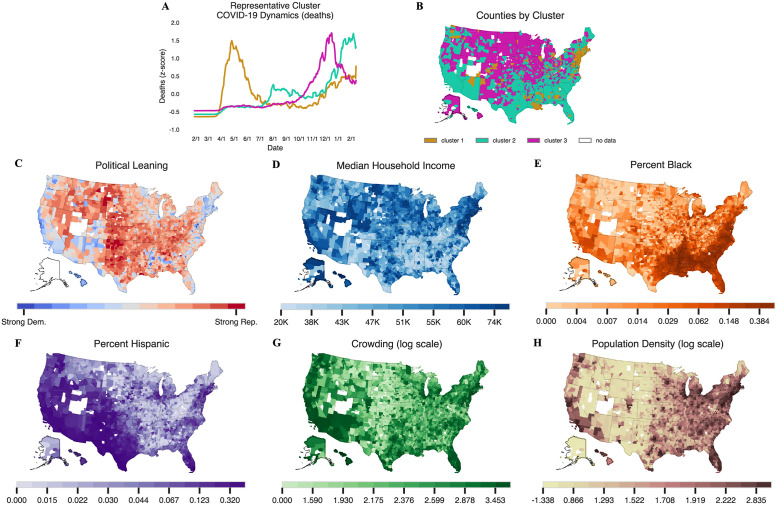
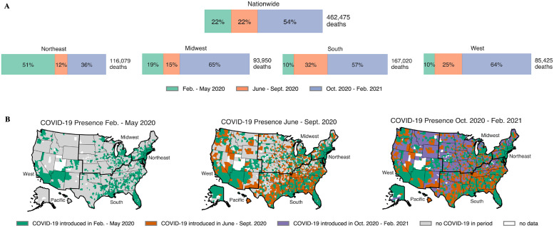
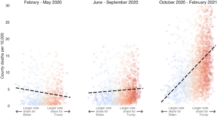
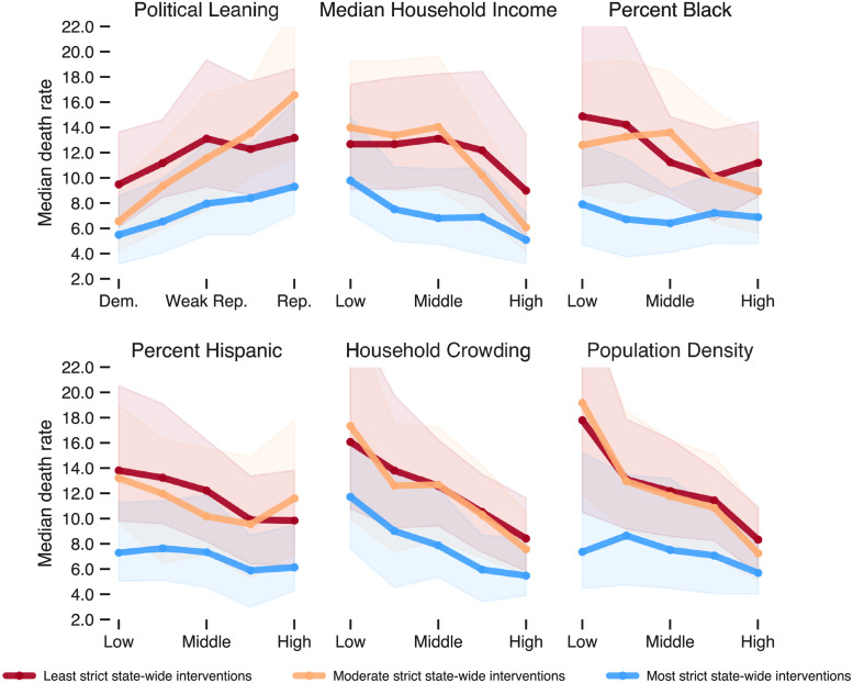
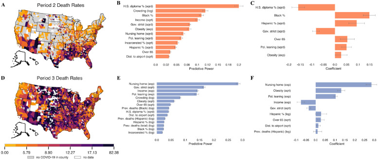
The COVID-19 pandemic has had intense, heterogeneous impacts on different communities and geographies in the United States. We explore county-level associations between COVID-19 attributed deaths and social, demographic, vulnerability, and political variables to develop a better understanding of the evolving roles these variables have played in relation to mortality. We focus on the role of political variables, as captured by support for either the Republican or Democratic presidential candidates in the 2020 elections and the stringency of state-wide governor mandates, during three non-overlapping time periods between February 2020 and February 2021. We find that during the first three months of the pandemic, Democratic-leaning and internationally-connected urban counties were affected. During subsequent months (between May and September 2020), Republican counties with high percentages of Hispanic and Black populations were most hardly hit. In the third time period -between October 2020 and February 2021- we find that Republican-leaning counties with loose mask mandates experienced up to 3 times higher death rates than Democratic-leaning counties, even after controlling for multiple social vulnerability factors. Some of these deaths could perhaps have been avoided given that the effectiveness of non-pharmaceutical interventions in preventing uncontrolled disease transmission, such as social distancing and wearing masks indoors, had been well-established at this point in time.


Conflict of interest statement

WPH declares compensation for expert witness testimony during the pandemic, and is a member of the Scientific Advisory Board of Biobot Analytics.

Figures

Fig 1
Fig 1. A summary of 3-means clustering and maps of counties included in the analysis shaded by the six different population variables of interest.
(B) A map of cluster assignments for all US counties with data and at least 1 death. Northeastern counties and counties surrounding New Orleans largely comprise the first cluster, while southern counties generally comprise the second cluster, and the remaining counties comprise the third cluster. (C-H) show counties shaded according to six different population and socio-economic variables. (G) and (H) show the log of crowding and population density, respectively. Counties without any color are those with missing data. Counties are plotted using the U.S. Census Bureau’s 2019 shapefiles [24].
Fig 2
Fig 2. A breakdown of COVID-19 presence across the periods of interest.
(A) In the top half of the figure, we present the percentage of deaths in the nation by period, both nationwide and by Census region. Other than the Northeast, which was hit hard in the first period, the nation was hit hardest in period 3, as pointed out in [25]. This fact motivates a closer lens on period 3. (B) COVID-19 onset at the county level. A county is treated as infected once it has experienced at least 5 COVID-related deaths. We see the movement of COVID from the cities and coastal areas to the center of the county over the course of the year. Counties and regions are plotted using the U.S. Census Bureau’s 2019 shapefiles [24].
Fig 3
Fig 3. Evolution of COVID-19 deaths vs political leaning.
COVID-19 attributed deaths (per 10,000) at the county level as a function of vote share in favor of J. Biden (Democratic) vs. D.J. Trump (Republican), 2020 presidential candidates, during the three periods of interest. The dashed black line on each figure indicated a line of best fit. Inspiration for this figure comes from David Leonhardt’s New York Times article, “Red COVID” [26].
Fig 4
Fig 4. Median death rate in period 3 for each of the six sociodemographic variables broken down by the stringency of state mandates.
For each variable, counties are grouped into quintiles. For instance, in the first plot, the leftmost three points represent the median death rate for the 20% of counties with the highest Democratic vote share in lax-, moderate-, and strict-mandate states, respectively. Shaded bands represent the IQR. The differences in each vertically stacked set of three medians are different at the p < 0.001 level (Mood’s median test).
Fig 5
Fig 5. A summary of model results in periods 2 and 3.
(A, D) distributions of death rates in period 2 and 3, respectively. (B-C) feature importance and coefficients for the random forest and LASSO model, respectively, when predicting period 2 death rates. (E-F) the same plots for period 3 death rates. Any variables that have a coefficient of zero in the LASSO model are excluded from the plot. Error bars indicate one standard deviation (random forest models) and one standard error (LASSO models). Counties are plotted using the U.S. Census Bureau’s 2019 shapefiles [24].

References

    1. Allcott H, Boxell L, Conway J, Gentzkow M, Thaler M, Yang D. Polarization and public health: partisan differences in social distancing during the coronavirus pandemic. J Public Econ. 2020;191:104254. doi: 10.1016/j.jpubeco.2020.104254 - DOI - PMC - PubMed
    1. Kahane LH. Politicizing the mask: political, economic and demographic factors affecting mask wearing behavior in the USA. East Econ J. 2021;47(2):163–183. doi: 10.1057/s41302-020-00186-0 - DOI - PMC - PubMed
    1. Neelon B, Mutiso F, Mueller NT, Pearce JL, Benjamin-Neelon SE. Associations Between Governor Political Affiliation and COVID-19 Cases, Deaths, and Testing in the U.S. Am J Prev Med. 2021;0(0):1–5. doi: 10.1016/j.amepre.2021.01.034 - DOI - PMC - PubMed
    1. Prasad S, Hswen Y. Political affiliation and human mobility under stay-at-home orders: a difference-in-difference analysis with county and time fixed effects. Harv Public Health Rev (Camb). 2020;26.
    1. The Racial Time Bomb in the COVID-19 Crisis. The New York Times. 2020 Apr 01 [Cited 2020 Dec 17]. Available from: https://www.nytimes.com/2020/04/01/opinion/coronavirus-black-people.html.

LinkOut - more resources