. 2023 Mar 27;14(1):1681.
doi: 10.1038/s41467-023-37211-7.

Epigenetic and transcriptomic characterization reveals progression markers and essential pathways in clear cell renal cell carcinoma

Affiliations

Epigenetic and transcriptomic characterization reveals progression markers and essential pathways in clear cell renal cell carcinoma

Yige Wu et al. Nat Commun. .

Erratum in

Abstract

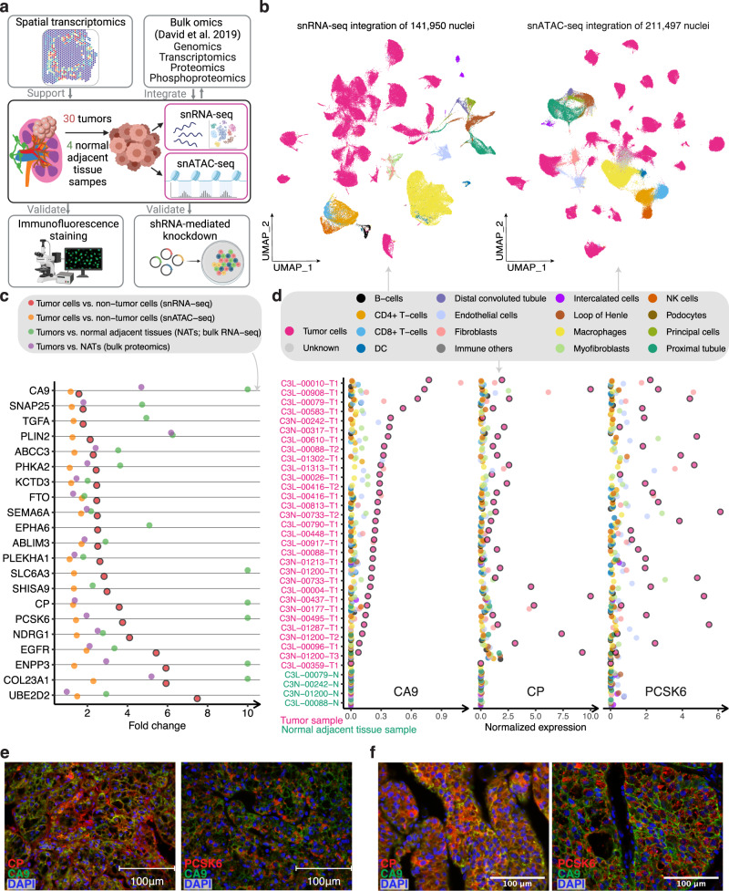
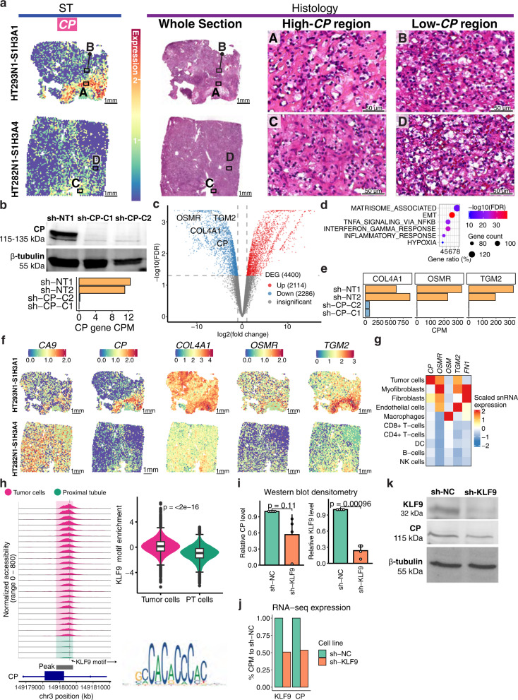
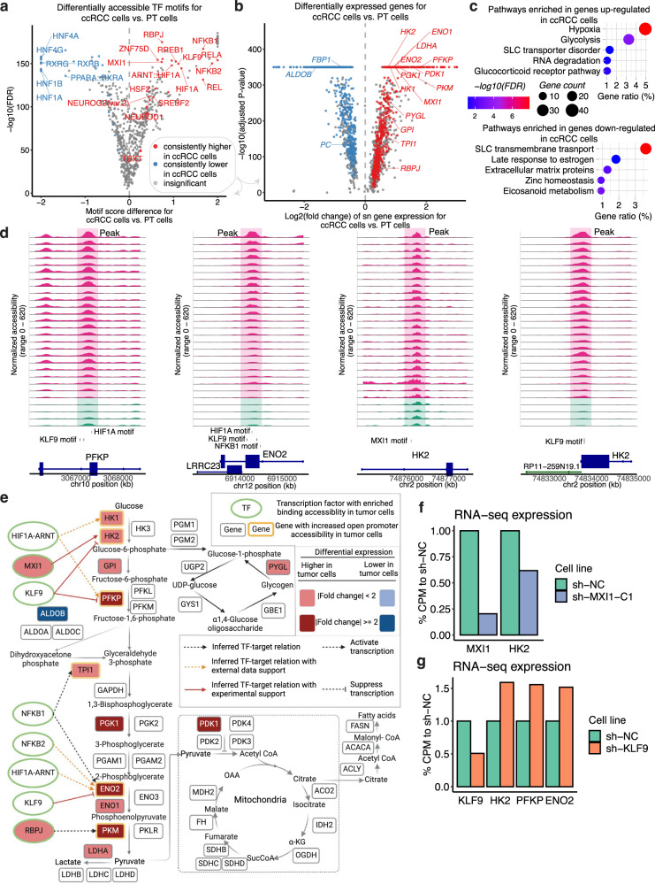
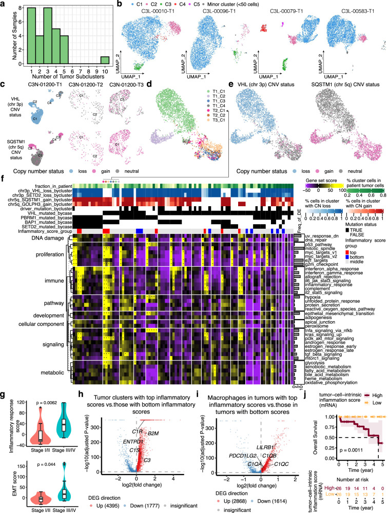
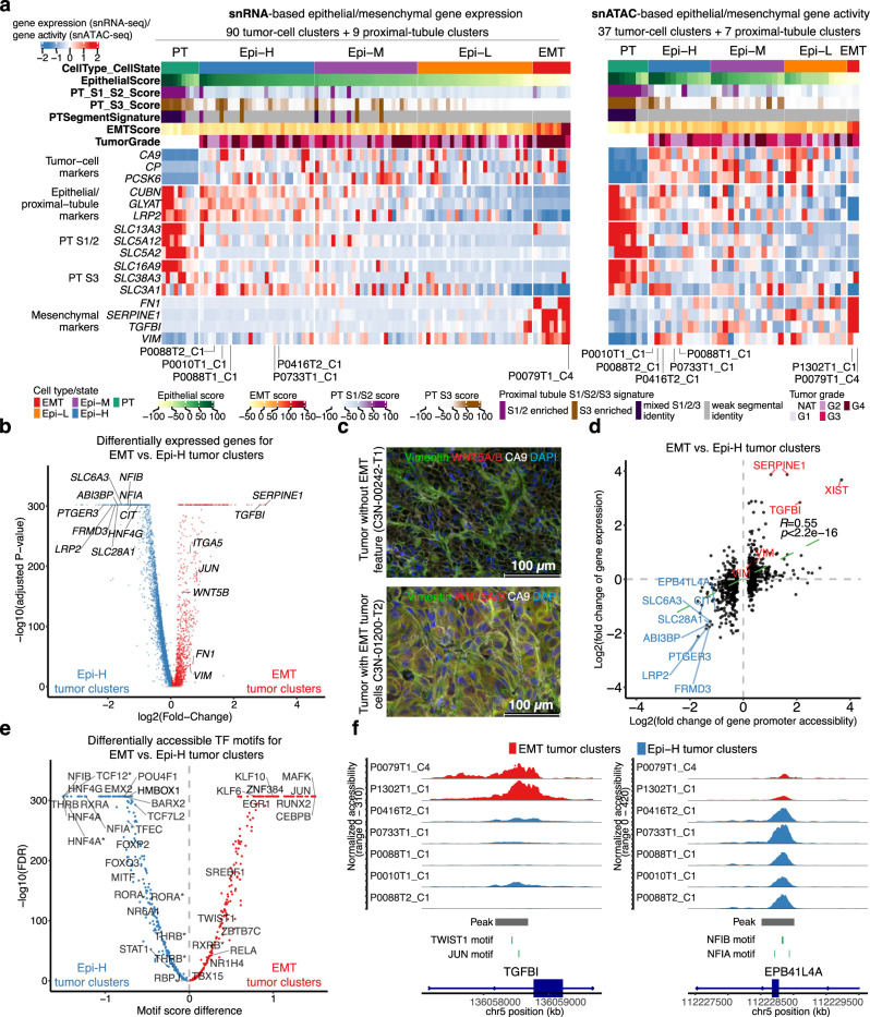
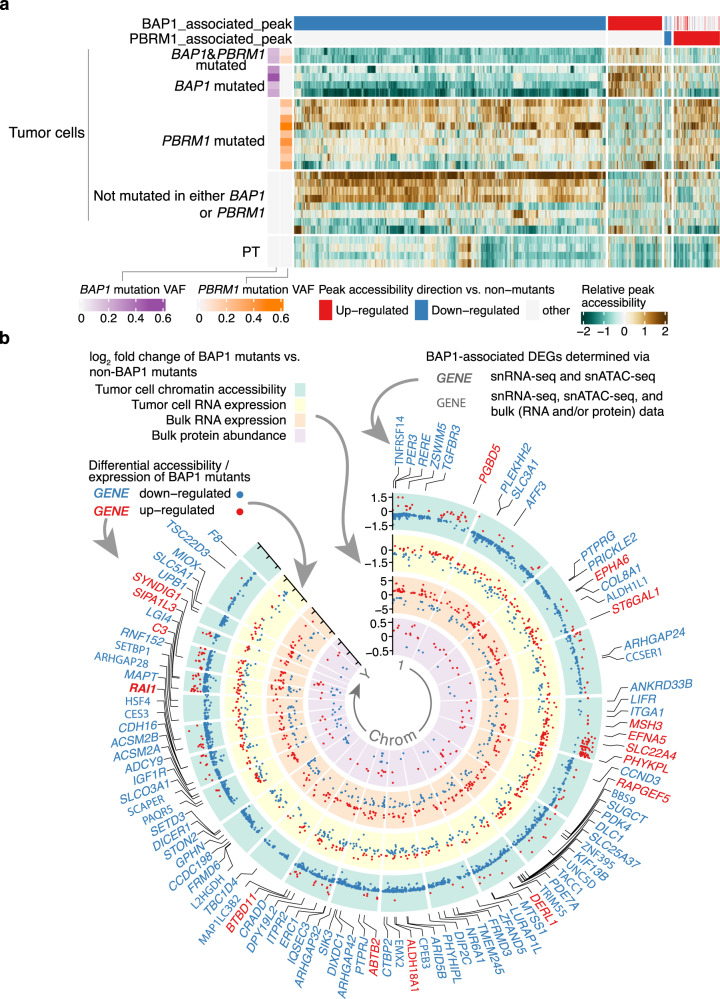
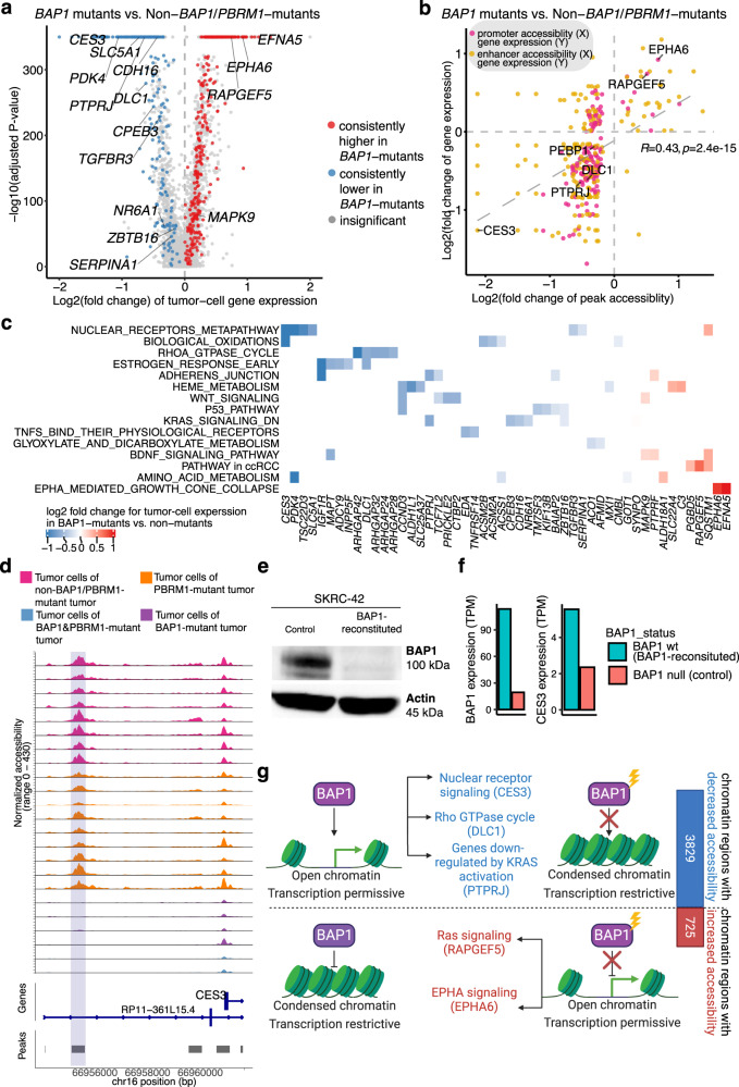
Identifying tumor-cell-specific markers and elucidating their epigenetic regulation and spatial heterogeneity provides mechanistic insights into cancer etiology. Here, we perform snRNA-seq and snATAC-seq in 34 and 28 human clear cell renal cell carcinoma (ccRCC) specimens, respectively, with matched bulk proteogenomics data. By identifying 20 tumor-specific markers through a multi-omics tiered approach, we reveal an association between higher ceruloplasmin (CP) expression and reduced survival. CP knockdown, combined with spatial transcriptomics, suggests a role for CP in regulating hyalinized stroma and tumor-stroma interactions in ccRCC. Intratumoral heterogeneity analysis portrays tumor cell-intrinsic inflammation and epithelial-mesenchymal transition (EMT) as two distinguishing features of tumor subpopulations. Finally, BAP1 mutations are associated with widespread reduction of chromatin accessibility, while PBRM1 mutations generally increase accessibility, with the former affecting five times more accessible peaks than the latter. These integrated analyses reveal the cellular architecture of ccRCC, providing insights into key markers and pathways in ccRCC tumorigenesis.


Conflict of interest statement

The authors declare no competing interests.

Figures

Fig. 1
Fig. 1. snRNA-seq analysis identifies tumor-cell-specific markers.
a Schematic for integrating snRNA-seq, snATAC-seq, bulk omics, and spatial transcriptomics data, and validating the omics findings with immunofluorescence staining and shRNA-mediated knockdown experiments (image is created with BioRender.com. b UMAP visualization of 141,950 nuclei and 211,497 nuclei profiled by snRNA-seq and snATAC-seq, respectively, colored by major cell groups. The cell group named “immune others” includes basophils, mast cells, lymphoid lineage immune cells with proliferating signature, and immune cells with ambiguous myeloid/lymphoid identity. c Dot plot showing the fold changes of expression of tumor-cell markers in ccRCC (capped at 10). Red dots denote the gene expression fold changes between tumor cells vs. non-tumor cells using snRNA-seq data. Orange dots denote the gene accessibility fold changes between tumor cells vs. non-tumor cells using snATAC-seq data. Green dots denote the gene expression fold changes between bulk tumor and normal adjacent tissue (NAT) samples using bulk RNA-seq data. Purple dots denote the bulk protein level changes (spectrum intensity) between tumors vs. NAT samples. d Dot plot showing the expression levels of CA9, CP, and PCSK6 in each cell type and each sample (non-log space). Expression levels for tumor cells are highlighted by black outlined circles. Immunofluorescence (IF) staining of a ccRCC e patient tumor sample (ID: 293) and f patient-derived xenograft tumor (ID: RESL5). Left panel, markers CP (red), CA9 (green), and DAPI (nucleus, blue). Right panel, markers PCSK6 (red), CA9 (green), and DAPI (nucleus, blue). Scale bars in the (e, f) are 100 μm. Three independent experiments were performed with similar results. Scale Source data are provided as a Source data file.
Fig. 2
Fig. 2. Ceruloplasmin (CP) spatial expression pattern and CP knockdown effect on the transcriptome in ccRCC cells.
a Spatial transcriptomics and H&E histology of two ccRCC specimens. Regions showing high-CP (regions A and C) and low-CP (regions B and D) expression were indicated. Scale bars are 1 mm. b Top: Western blot of CP and β-tubulin on proteins from Caki-1 cells expressing CP shRNA (sh-CP-C1, sh-CP-C2) and non-transduced Caki-1 cells (sh-NT1). Three independent experiments were performed that showed similar results. Bottom: Bar plot showing normalized bulk gene expression of CP. c Volcano plot showing differentially expressed genes between Caki-1 cells with CP knockdown (sh-CP-C1 and sh-CP-C2) vs. cells without CP knockdown (sh-NT1 and sh-NT2). Statistical evaluation was performed using two-sided edgeR analysis with glmQLFTest followed by multiple testing correction (Benjamini–Hochberg). d Bubble plot showing the pathways over-represented in genes downregulated (top) in the CP-knockdown lines (sh-CP-C1 and sh-CP-C2) vs. controls (sh-NT1 and sh-NT2). The p.adjust represents Benjamini–Hochberg adjusted P-value from one-sided Fisher’s exact test. e Bar plot showing normalized bulk gene expression of COL4A1, OSMR, and TGM2 in sh-CP-C1, sh-CP-C2, sh-NT1, and sh-NT2. f Spatial transcriptomics for CA9, CP, COL4A1, OSMR, and TGM2. g Heatmap showing scaled snRNA-seq expression of CP, OSMR, OSM, TGM2, and FN1 across cell types. h Left: Genomic region near CP gene promoter (in ccRCC cells). The plots show the normalized accessibility by snATAC-seq around these regions in proximal tubule cells (green; n = 123,35) from NAT samples and tumor cells (pink; n = 119,191) from tumor samples. Top right: Violin plot showing the distribution of KLF9 motif enrichment scores in tumor cells (n = 119,191) and PT cells (n = 123,35). The box bounds the interquartile range divided by the median, with the whiskers extending to a maximum of 1.5 times the interquartile range beyond the box. Outliers are shown as dots. Student’s T-test; P value is two-sided. Bottom right: position weight matrix for KLF9 motif. i Bar plot showing western blot densitometry of KLF9 and CP proteins in RCC4 cells expressing KLF9 shRNA (sh-KLF9) and RCC4 cells expressing scrambled control (sh-NC). The error bar represents the standard deviation of the mean from four independent experiments performed. Wilcoxon rank-sum tests; P values are two-sided. j Bar plot showing % of normalized gene expression of KLF9 and CP compared to the control. k Western blot showing KLF9, CP, and β-tubulin protein levels in sh-NC and sh-KLF9. Four independent experiments were repeated and showed similar results (as shown in i). Source data are provided as a Source data file.
Fig. 3
Fig. 3. The glycolysis pathway displays significant changes in ccRCC tumor cells compared to the proximal tubule cells.
a Volcano plot showing differentially enriched TF motifs between ccRCC (tumor) cells (n = 118,409) from 30 tumor samples and the combined proximal tubule (PT) cells from the four NATs (n = 9676). The X-axis shows the motif score difference, while the Y-axis shows the −log10(adjusted P-value). Statistical evaluation was performed using a two-sided Wilcoxon rank-sum test, applying Benjamini–Hochberg correction for the resulting P-values. Color denotes whether a motif is consistently higher or lower in tumor cells when tumor cells from individual tumor samples were compared to the PT cells or if it has insignificant or inconsistent fold changes (“Methods”). The motifs that have consistent higher/lower TF binding accessibilities in all comparisons of individual tumor vs. PT cells are highlighted. b Volcano plot showing differentially expressed genes between ccRCC cells (n = 88,536) and the combined PT cells from the NATs (n = 4269). The X-axis shows the log2(fold change) of the sn gene expression of the ccRCC cells compared to PT cells; the Y-axis shows the −log10(adjusted P-value). Statistical evaluation was performed using a two-sided Wilcoxon rank-sum test, applying Bonferroni correction for the resulting P-values. Color denotes whether a gene is consistently expressed higher or lower in tumor cells, or has insignificant or inconsistent fold changes (“Methods”). Genes for ccRCC-specific TFs and selected metabolic genes with significant fold changes are highlighted. c Bubble plot showing the pathways over-represented in genes upregulated (top) and downregulated (bottom) in ccRCC cells compared to the PT cells. The FDR represents Benjamini–Hochberg adjusted P-value from one-sided Fisher’s exact test. d Genomic regions near three upregulated genes in ccRCC cells compared to PT cells. The plots show the normalized accessibility by snATAC-seq around these regions in proximal tubule cells (green) from NAT samples and ccRCC cells (pink) from tumor samples. e When viewed in the context of important metabolic pathways in ccRCC, ccRCC cells displayed an overall upregulation of genes encoding glycolysis enzymes as well as other metabolic proteins (rounded rectangle) at sn gene expression level (red and blue filled colors represent significantly increased or decreased sn expression in ccRCC cells vs. proximal tubule cells). Among them, genes showing increased promoter accessibility are highlighted by the yellow border. Ellipses with green borders represent transcription factors with significantly enriched accessibility binding in ccRCC cells vs. PT cells. Lines connecting TFs and genes represent TF-target relations inferred by the presence of the TF motif in the more accessible promoter region of the genes using snATAC-seq. Black dotted lines denote inferred TF-target relation based on the snATAC-seq data in this study. Orange dotted lines denote those relations with literature support. Red solid lines denote those relations with experimental validation done in this study. Created with BioRender.com. f Bar plot showing the bulk RNA-seq expression of RCC4 cells with and without MXI1 knockdown. g Bar plot showing the bulk RNA-seq expression of RCC4 cells with or without KLF9 knockdown. Source data are provided as a Source data file.
Fig. 4
Fig. 4. Intratumor signaling heterogeneity revealed by single-cell tumor subclustering.
a Bar plot showing the number of tumor-cell clusters per sample. b UMAP illustration of the tumor-cell clusters for four tumor samples, colored by the cluster name. c UMAP showing tumor clusters of three tumor samples from the same patient, colored by the copy number status of VHL and SQSTM1. d UMAP showing merged data for tumor cells from the above three tumor samples, colored by the original tumor cluster name. e UMAP showing the copy number status of VHL and SQSTM for the merged data shown in (d). f Heatmap showing the gene set scores for 90 tumor subclusters (columns). Tumor subclusters are grouped by patient and separated by white lines. g Violin plot showing maximum inflammatory response score (top) and EMT score (bottom) per tumor sample, grouped by tumor stage (stage I/II: n = 12; stage III/IV: n = 22). The box bounds the interquartile range divided by the median, with the whiskers extending to a maximum of 1.5 times the interquartile range beyond the box. Outliers are shown as dots. Wilcoxon rank-sum tests; P values are two-sided. h Volcano plot showing differentially expressed genes between tumor clusters with top 10% quantile inflammatory scores vs. those with the bottom 10% quantile inflammatory scores (annotated in f). i Volcano plot showing differentially expressed genes between macrophages in tumors with top 10% quantile inflammatory tumor-cluster scores vs. macrophages in tumors with the bottom 10% quantile inflammatory tumor-cluster scores (annotated in f). j Kaplan–Meier survival analysis showing overall survival after initial pathological diagnosis. Statistical evaluation was performed using a two-sided log-rank test. Patients with high tumor-cell-intrinsic inflammation score (n = 26, top 25% percentile) displayed significantly lower chance of survival compared to patients with low inflammation score (n = 26, bottom 25% percentile) using bulk RNA-seq data. In h and i, statistical evaluation was performed using a two-sided Wilcoxon rank-sum test, applying Bonferroni correction for the resulting P-values. Source data are provided as a Source data file.
Fig. 5
Fig. 5. Four tumor subgroups with distinct epithelial and mesenchymal features.
a Left: Heatmap showing gene expression of the epithelial and mesenchymal marker genes for tumor clusters and proximal tubule (PT) clusters (>50 cells) using snRNA-seq data. Right: Heatmap showing gene activity of the epithelial and mesenchymal marker genes for tumor clusters and PT clusters (>50 cells) using snATAC-seq data. b Volcano plot showing differentially expressed genes between the EMT tumor clusters and Epi-H tumor clusters highlighted in (a). Labels on the right denote known mesenchymal markers, while those on the left denote known markers for PT cells. Statistical evaluation was performed using a two-sided Wilcoxon rank-sum test, applying Bonferroni correction for the resulting P-values. c Immunofluorescence staining of vimentin (VIM), CA9, WNT5A/B, and DAPI, showing VIM and WNT5A/B in CA9 + cells in the cross-sections of the tumor with EMT tumor cells (C3N-01200-T2), but not in the control tumor (C3N-00242-T1). Two independent experiments were performed with similar results. Scale bar, 100 μm. d Scatter plot displaying the log2 transformed fold change for gene promoter accessibility versus log2 transformed fold change for gene expression in EMT tumor clusters vs. Epi-H tumor clusters (shown in b). The P-value is derived from a two-sided Spearman rank correlation test (P-value = 9.2e−72). e Volcano plot showing differentially accessible TF motifs between the EMT tumor clusters and Epi-H tumor clusters. Asterisks denote the var.2 version of the TF motif based on the JASPAR database. Statistical evaluation was performed using a two-sided Wilcoxon rank-sum test, applying Benjamini–Hochberg correction for the resulting P-values. f Genomic regions near TGFBI (upregulated in EMT tumor clusters) and EPB41L4A (upregulated in Epi-H tumor clusters). The plots show the normalized accessibility by snATAC-seq around these regions in EMT tumor clusters (red) and Epi-H tumor clusters (blue). Source data are provided as a Source data file.
Fig. 6
Fig. 6. Chromatin accessibility landscape of BAP1 and PBRM1 mutant tumors.
a Heatmap showing the relative changes in ATAC-peak accessibility for peaks differentially accessible between the tumor cells of BAP1-mutated tumors (6 tumors, including 2 BAP1- and PBRM1-mutated tumors, 29,366 cells) vs. non-BAP1/PBRM1-mutated tumors (8 tumors; non-mutants) and peaks differentially accessible between tumor cells of PBRM1-mutated tumors (9 tumors, 32,255 cells) vs. non-BAP1/PBRM1-mutated tumors (non-mutants). Each column is an ATAC peak, and only significantly and consistently changed peaks are plotted (FDR < 0.05, “Methods”). Only samples with >8% mutation VAF in BAP1 or PBRM1 are shown (1 sample excluded). b Circos plot showing the genome-wide chromatin accessibility, gene expression, and protein abundance changes associated with BAP1 mutation. The green circle contains significantly different ATAC peaks in BAP1-mutated vs. non-BAP1-mutated tumors, with each dot representing one ATAC peak. The labeled y-axis represents the fold changes of the peak accessibility change. Red and blue dots denote peaks with higher and lower accessibility peaks in BAP1-mutated vs. non-BAP1-mutated tumors, respectively. The yellow circle plots the fold changes of the differentially expressed genes (DEGs) associated with BAP1 mutation discovered by snRNA-seq data (FDR < 0.05), with each dot representing one gene. The orange circle displays the fold changes of the DEGs associated with BAP1 mutation (FDR < 1e−04, |log2FC| > 1) discovered by the CPTAC bulk RNA-seq data (n = 103). The innermost purple circle plots the fold changes of differentially expressed proteins associated with BAP1 mutation (FDR < 0.05) discovered by the CPTAC bulk proteomics data (n = 103). Similarly, the red and blue colors for the dots denote higher and lower expression for the genes/proteins in BAP1-mutated vs. non-BAP1-mutated tumors. The gene symbols highlighted outside the circles represent genes showing the consistent direction of snRNA-seq and snATAC-seq changes in BAP1 mutants vs. non-mutants (absolute log2 fold change >= 0.3). Red gene symbols represent genes with increased promoter/enhancer accessibility and gene expression in BAP1 mutants. Blue gene symbols represent genes with decreased promoter/enhancer accessibility and gene expression in BAP1 mutants. Gene symbols in bold font represent the genes mentioned above with consistent expression change in either bulk RNA-seq or bulk protein data. Source data are provided as a Source data file.
Fig. 7
Fig. 7. Impact of BAP1 mutations on chromatin accessibility and transcriptional networks.
a Volcano plot displaying the differentially expressed genes (DEGs) between the tumor cells of BAP1-mutated tumors (26,806 cells) vs. tumor cells of non-BAP1/PBRM1-mutated tumors (31,002 cells) by snRNA-seq data. Statistical evaluation was performed using a two-sided Wilcoxon rank-sum test, applying Bonferroni correction for the resulting P-values. Dots are colored by whether the genes showed significant and consistent fold changes in individual comparisons of each BAP1-mutated tumor vs. non-BAP1/PBRM1-mutated tumors. b Scatter plot showing the positive correlation of chromatin accessibility and transcriptional changes. The log2(fold change) of the snRNA-seq expression for each gene (mRNA) is plotted against the log2(fold change) in the relative snATAC-seq peaks (for all the genes or promoter/enhancer peaks with significant fold change in over 50% of the comparisons for individual BAP1-mutated tumor vs. non-BAP1/PBRM1-mutated tumors). The P-value is derived from a two-sided Spearman rank correlation test (P-value = 2.4e−15). Each dot represents a gene-peak pair. Dots are colored by whether the peak overlaps the gene promoter or is a potential enhancer (co-accessible with the promoter peak). c Heatmap showing the pathways associated with the BAP1-associated DEGs with promoter/enhancer accessibility change (represented in b). d Genomic regions near the CES3 gene in BAP1-mutated tumors vs. non-BAP1-mutated tumors. The plots show the normalized accessibility signal by snATAC-seq around these regions in tumor cells of BAP1-mutant tumors (purple), tumor cells of PBRM1-mutant tumors (orange), tumor cells of non-BAP1/PBRM1-mutant tumors (pink). e Western blot showing BAP1 and Actin protein levels in the BAP1-reconstituted and control SKRC-42 cells. Three independent experiments were performed that showed similar results. f Bar plot showing BAP1 and CES3 gene expression in the BAP1-reconstituted and control SKRC-42 cells. g Schematic diagram showing the differential effects of BAP1 mutations on chromatin accessibility. Created with BioRender.com. Source data are provided as a Source data file.

Similar articles

Cited by

References

    1. Ljungberg B, et al. EAU guidelines on renal cell carcinoma: 2014 update. Eur. Urol. 2015;67:913–924. - PubMed
    1. Oosterwijk E, et al. Monoclonal antibody G 250 recognizes a determinant present in renal-cell carcinoma and absent from normal kidney. Int. J. Cancer. 1986;38:489–494. - PubMed
    1. Young AN, Master VA, Amin MB. Current trends in the molecular classification of renal neoplasms. ScientificWorldJournal. 2006;6:2505–2518. - PMC - PubMed
    1. Ye H, et al. CD70 is a promising CAR-T cell target in patients with advanced renal cell carcinoma. J. Clin. Oncol. 2022;40:384–384.
    1. Ji F, et al. Targeting the DNA damage response enhances CD70 CAR-T cell therapy for renal carcinoma by activating the cGAS-STING pathway. J. Hematol. Oncol. 2021;14:152. - PMC - PubMed

Publication types

MeSH terms

Substances