[Preprint]. 2023 Mar 20:rs.3.rs-2070975.
doi: 10.21203/rs.3.rs-2070975/v1.

Multiomics integration of 22 immune-mediated monogenic diseases reveals an emergent axis of human immune health

Affiliations

Multiomics integration of 22 immune-mediated monogenic diseases reveals an emergent axis of human immune health

Rachel Sparks et al. Res Sq. .

Update in

  • A unified metric of human immune health.
    Sparks R, Rachmaninoff N, Lau WW, Hirsch DC, Bansal N, Martins AJ, Chen J, Liu CC, Cheung F, Failla LE, Biancotto A, Fantoni G, Sellers BA, Chawla DG, Howe KN, Mostaghimi D, Farmer R, Kotliarov Y, Calvo KR, Palmer C, Daub J, Foruraghi L, Kreuzburg S, Treat JD, Urban AK, Jones A, Romeo T, Deuitch NT, Moura NS, Weinstein B, Moir S, Ferrucci L, Barron KS, Aksentijevich I, Kleinstein SH, Townsley DM, Young NS, Frischmeyer-Guerrerio PA, Uzel G, Pinto-Patarroyo GP, Cudrici CD, Hoffmann P, Stone DL, Ombrello AK, Freeman AF, Zerbe CS, Kastner DL, Holland SM, Tsang JS. Sparks R, et al. Nat Med. 2024 Sep;30(9):2461-2472. doi: 10.1038/s41591-024-03092-6. Epub 2024 Jul 3. Nat Med. 2024. PMID: 38961223 Free PMC article.

Abstract

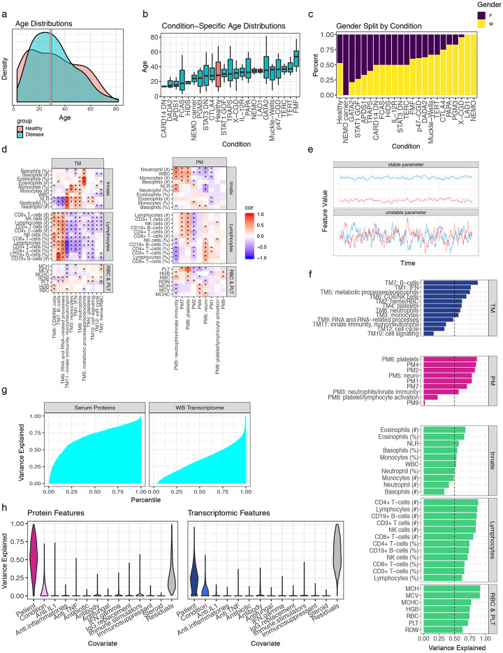
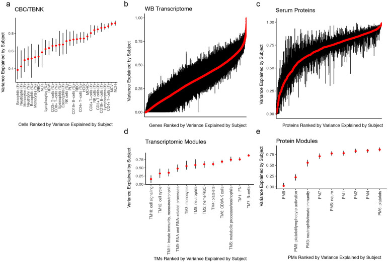
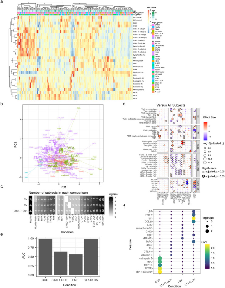
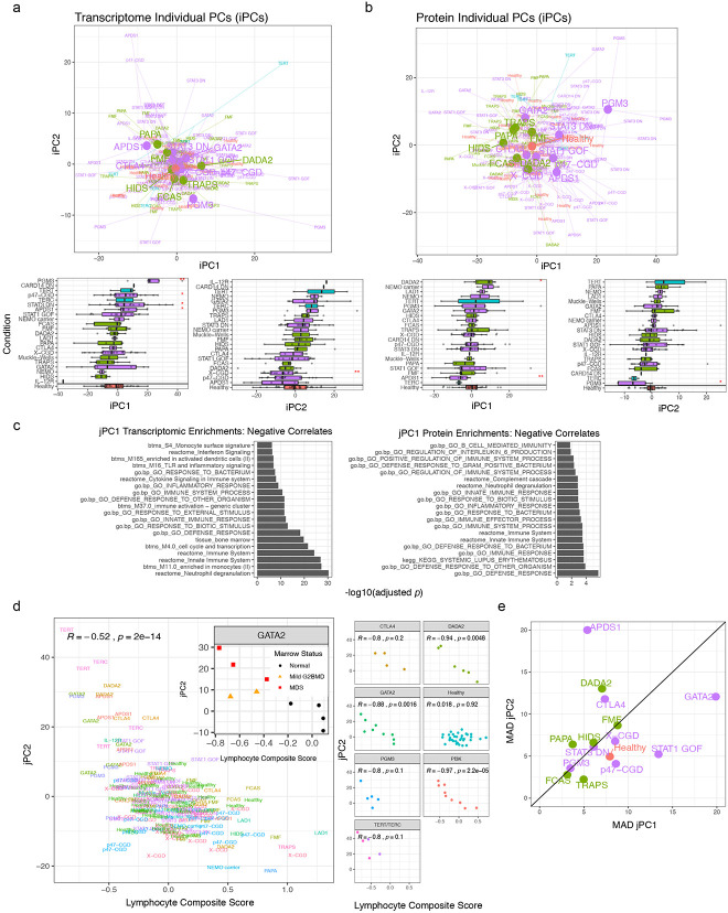
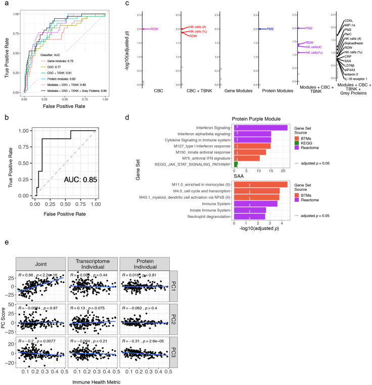
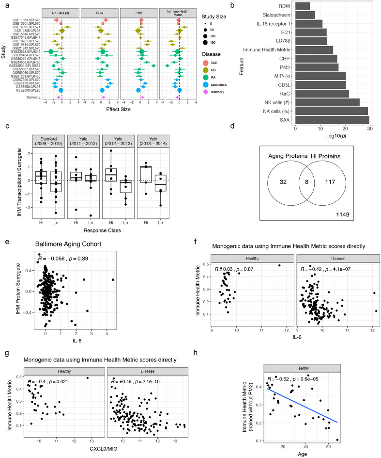
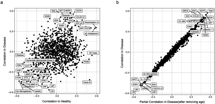
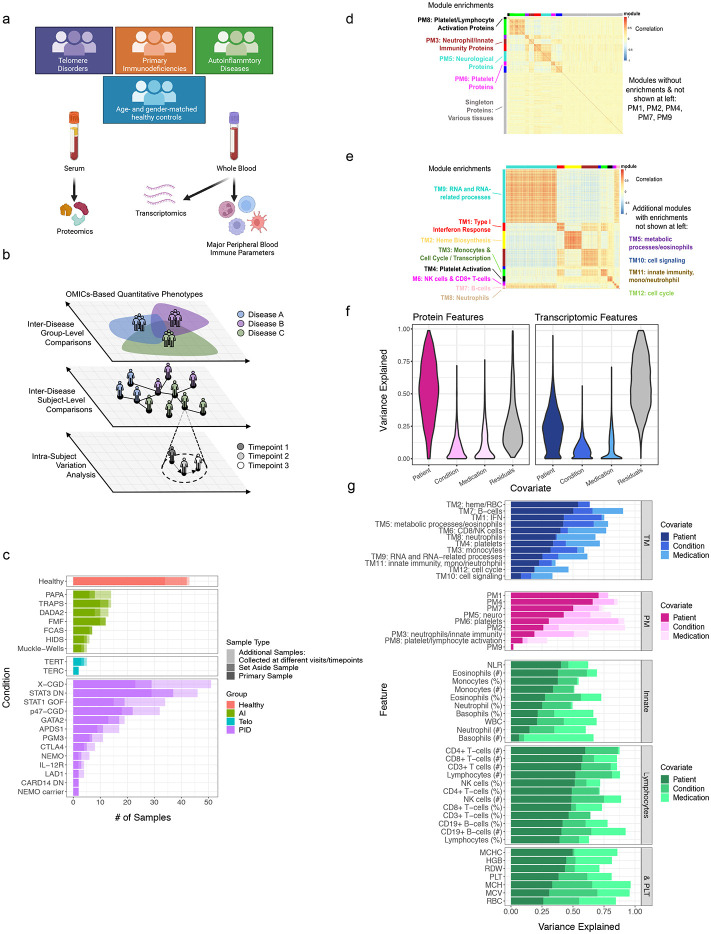
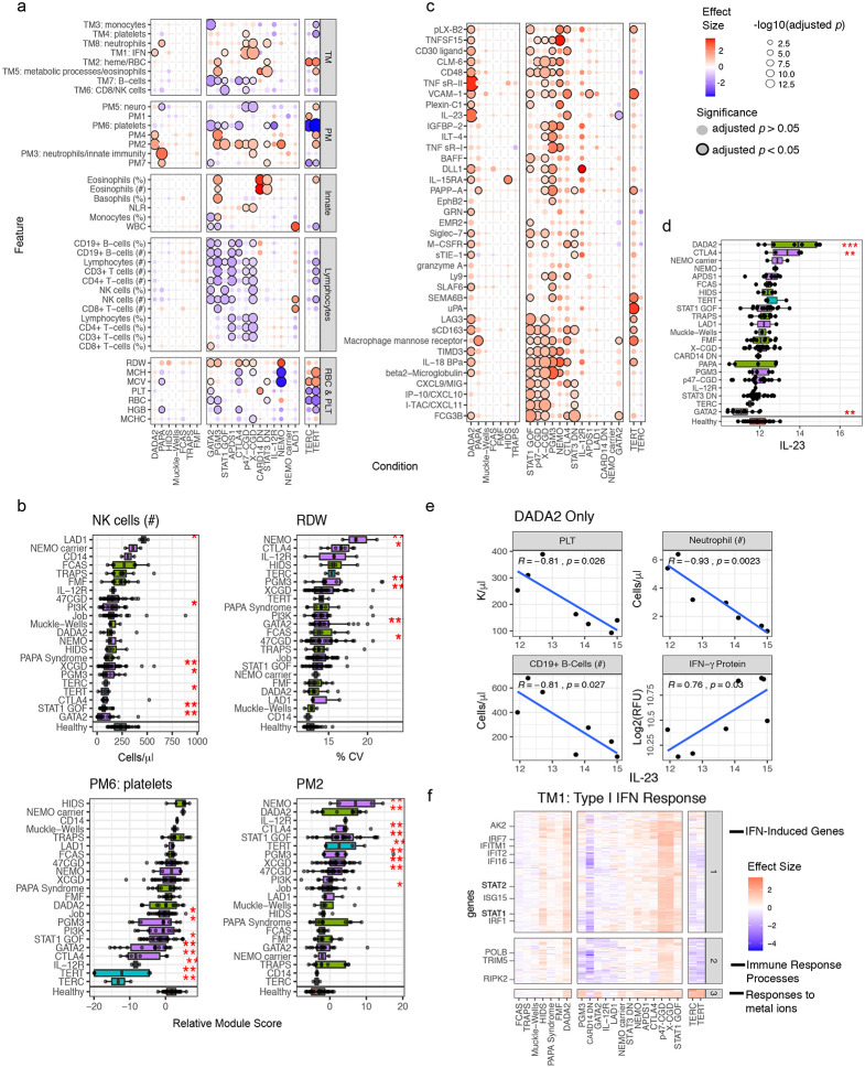
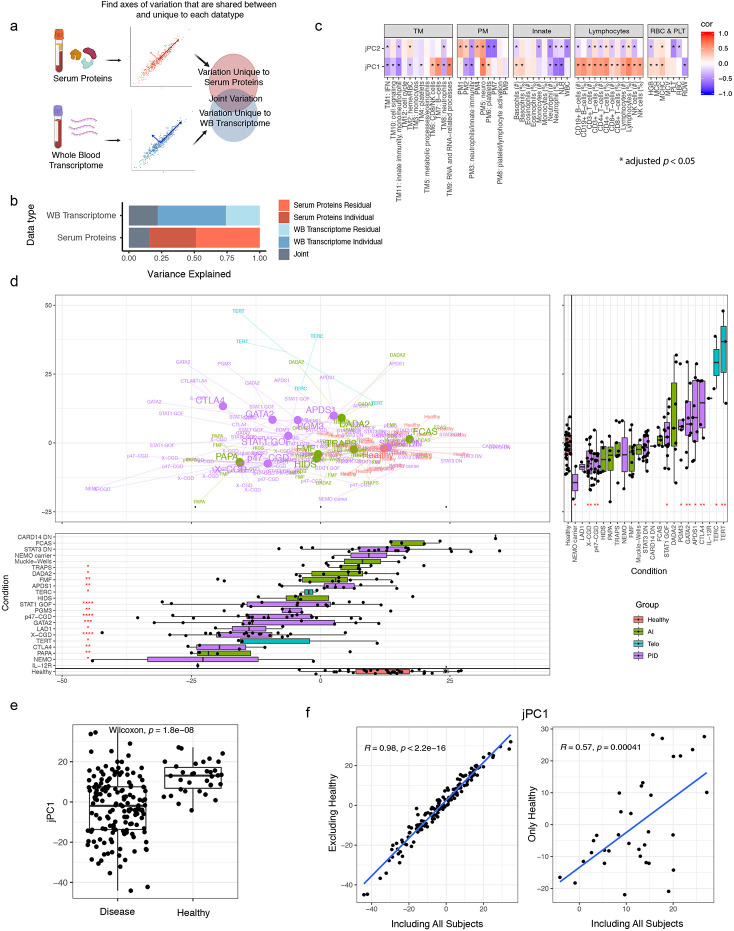
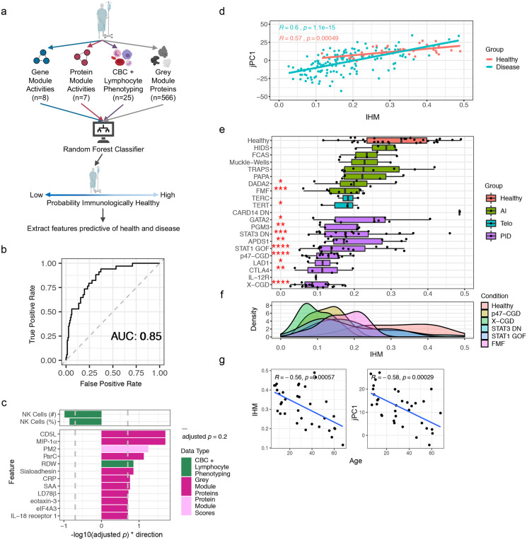
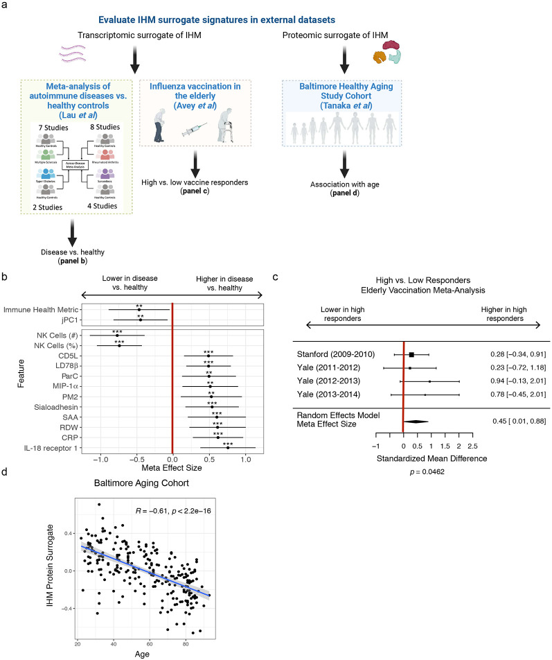
Monogenic diseases are often studied in isolation due to their rarity. Here we utilize multiomics to assess 22 monogenic immune-mediated conditions with age- and sex-matched healthy controls. Despite clearly detectable disease-specific and "pan-disease" signatures, individuals possess stable personal immune states over time. Temporally stable differences among subjects tend to dominate over differences attributable to disease conditions or medication use. Unsupervised principal variation analysis of personal immune states and machine learning classification distinguishing between healthy controls and patients converge to a metric of immune health (IHM). The IHM discriminates healthy from multiple polygenic autoimmune and inflammatory disease states in independent cohorts, marks healthy aging, and is a pre-vaccination predictor of antibody responses to influenza vaccination in the elderly. We identified easy-to-measure circulating protein biomarker surrogates of the IHM that capture immune health variations beyond age. Our work provides a conceptual framework and biomarkers for defining and measuring human immune health.


Conflict of interest statement

Declaration of Interests The authors declare no competing interests.

Figures

Extended Data Figure 1.
Extended Data Figure 1.. Subject demographics and further characterization of the serum protein and transcriptomic modules.
a, Density plot of patient and healthy subjects’ age distributions (Kolmogorov-Smirnov test assessing difference between the two distributions, p = 0.41). Extended Data Fig. 1a-c only show data for subjects in primary set of subjects; data for set-aside subjects not shown but included in Table 1. b, Boxplots of subject ages in each subject group with healthy in red. Box plot center lines correspond to the median value; lower and upper hinges correspond to the first and third quartiles (the 25th and 75th percentiles), and lower and upper whiskers extend from the box to the smallest or largest value correspondingly, but no further than 1.5X inter-quantile range. c, Barplots depicting sex distribution within each group shown as male/female proportions. d, Pearson correlation between the protein (left) or transcriptomic (right) WGCNA modules (columns) and cellular [complete blood count (CBC) and lymphocyte (T, B, NK cell) phenotyping (TBNK)] parameters (rows). *adjusted p value < 0.05. Computed with 198 subjects with both whole blood transcriptome and CBC/TBNK data, and 197 subjects with both serum protein and CBC/TBNK data. TM = whole blood transcriptomic modules. PM = serum protein modules. IFN = interferon. NLR = neutrophil-to-lymphocyte ratio. WBC = white blood cell count. MCHC = mean corpuscular hemoglobin concentration. HGB = hemoglobin. RDW = red cell distribution width. PLT = platelet count. MCH = mean corpuscular hemoglobin. MCV = mean corpuscular volume. RBC = red blood cell count. NK = natural killer. e, Conceptual illustration of parameter temporal stability, defined by low intra-subject variation relative to inter-subject variation. f, Barplots of variance assigned to the subject term in the variance partition analysis fit using only a subject random intercept (see Methods), run across each CBC parameter, protein module, and transcriptomic module. TM = whole blood transcriptomic modules. PM = serum protein modules. RBC = red blood cell parameters. PLT = platelets. g, Percent variation explained by the subject term in the variance partition model in the protein and transcriptomic features using the variance partition model with only a subject random intercept (see Methods) as in (f). Proteins (left) and genes (right) are ordered on the x-axis by the percent variation explained by the subject term. WB = whole blood. h, Percent variation explained by the patient and medication covariate (showing effect of each medication individually) for each protein (left) and gene (right) measured. Medications were included in the model if they were used by many patients and not highly confounded with one of the condition groups.
Extended Data Figure 2.
Extended Data Figure 2.. Jackknife resampling shows robustness of variation explained by subject covariate in mixed effect model
A jackknife was performed subsampling 80% of subjects with repeat samples and 80% of subjects without repeat samples to assess robustness of intra-patient stability estimates for cell frequencies (a), gene expression (b), serum protein data (c), gene expression modules (d), serum protein modules (e). 100 replicates of subsampling were performed. Points represent mean variance explained by subject across all replicates and error bars denote 95% confidence intervals (2.5 % and 97.5 % quantiles across jackknife replicates). CBC = complete blood count. TBNK = lymphocyte (T, B, NK cell) phenotyping.
Extended Data Figure 3.
Extended Data Figure 3.. Supporting data for the disease-associated molecular and cellular signatures.
a, Heatmap of complete blood count (CBC) and lymphocyte (T, B, NK cell) phenotyping (TBNK) parameters (rows) across patients and healthy subjects (columns); columns and rows are ordered by hierarchical clustering. Top annotation row shows the age of the subject, middle row shows the large condition groups (n > 10 subjects), and third row shows all condition groups regardless of number of subjects. b, Patients and healthy subjects shown in PC1 and PC2 space of CBC and TBNK parameters. Each parameter was standardized to unit variance and mean of zero prior to computation of the principal components. The text denotes the subject’s condition, and the color denotes larger condition groups. Large dots and text denote the centroid of that disease group. Only conditions with greater than three subjects have a centroid shown. AI = autoinflammatory diseases. Telo = telomere disorders. PID = primary immunodeficiencies. c, Table of sample sizes for each data modality-condition group combination. TM: whole blood transcriptomic modules; PM: protein modules. d, Similar to Fig. 2a but comparing each condition to all other conditions (healthy subjects are removed from the analysis). e, Barplot of Receiver Operating Characteristic Area Under the Curve (AUC) for conditions-versus-all-other-conditions Random Forest classifiers using all features as input. Classifiers were trained only for the four condition groups with the most subjects (healthy subjects were removed from the analysis); however, subjects from all other disease groups were used as the negative samples for each classifier. f, Plot of −log 10 adjusted p values and global variable importance (GVIs from the Random Forest models) of features in the classifiers for the four most represented disease groups. The plot is subset to the union of the top five predictive features for each condition.
Extended Data Figure 4.
Extended Data Figure 4.. Characteristics of the individual and joint PCs from the JIVE analysis.
a, Top panel: patients and healthy subjects shown in transcriptomic individual PC (iPC) 1 vs. iPC2 space. Large dots and text denote the centroid of that disease group. Only conditions with greater than three subjects have a centroid shown. Bottom panels: boxplots of individual transcriptomic iPC1 and iPC2. The rows correspond to the conditions and the color denotes larger condition groups. Box plot center lines correspond to the median value; lower and upper hinges correspond to the first and third quartiles (the 25th and 75th percentiles), and lower and upper whiskers extend from the box to the smallest or largest value correspondingly, but no further than 1.5X inter-quantile range. AI = autoinflammatory diseases. Telo = telomere disorders. PID = primary immunodeficiencies. b, Similar to (a) but showing the serum protein iPCs. c, Gene set enrichment of transcriptomic (left) and serum protein (right) features negatively correlated with jPC1 (enrichment calculated using CameraPR; genes/proteins ranked by the Spearman correlation with the JIVE PCs). Gene sets from KEGG pathways, GO biological process gene sets, Reactome pathways, and the blood transcriptomic modules and Human Protein Atlas tissue gene sets. d, Scatterplot of a hematopoietic composite score (see Methods) vs. jPC2. Left panel displays the trend across all patients including healthy subjects and the right set of panels focus on individual disease groups whose clinical presentation may include marrow failure or lymphopenia. Inset focuses on GATA2 patients, highlighting those with abnormal bone marrow biopsies. Spearman correlation and associated p values are shown. G2BMD = GATA2 deficiency-associated bone marrow disorder. MDS = myelodysplastic syndrome. e, Scatterplot of Median Absolute Deviation (MAD) of jPC1 and jPC2 scores for each condition in the study. A higher MAD corresponds to greater variation within a disease for that jPC.
Extended Data Figure 5.
Extended Data Figure 5.. Supporting data for the development and characterization of the Immune Health Metric (IHM).
a, Receiver Operating Characteristic (ROC) curves for Random Forest classifiers from LOOCV (leave-one-out-cross-validation) using temporally stable features of individual or the indicated combinations of data modalities. CBC = complete blood count. TBNK = lymphocyte (T, B, NK cell) phenotyping. b, ROC curve for the Random Forest classifier (the one trained on all data modalities in the primary dataset) applied to the set of unseen, independent set-aside patients and healthy subjects. c, Negative log10 adjusted p values (FDR) of Global Variable Importance of features in each Random Forest classifier. P values were determined through permutation (see Methods). Labels are shown for parameters passing an FDR cutoff of 0.2 for each classifier. FDR adjustment was performed on p values for parameters within a classifier. Features used in classifier are shown on x-axis. NK = natural killer. RDW = red cell distribution width. d, Enrichment of transcriptional surrogate signatures for the predictive features identified by the Random Forest classifier in Fig. 4b; gene sets from KEGG pathways, GO biological processes, Reactome pathways, and the blood transcriptomic modules (BTMs) were included for the enrichment analysis. SAA = serum amyloid A. e, Scatterplots with regression lines and associated Pearson correlations and p values of subjects’ Immune Health Metric (IHM) scores vs. the first 3 PC scores from the jPCs, transcriptomic individual PCs (transcriptomic iPCs), and serum protein individual PCs (proteomic iPCs). N = 182 subjects with both jPC and IHM scores. Pearson correlation and associated p value are shown.
Extended Data Figure 6.
Extended Data Figure 6.. Supporting data for assessing the Immune Health Metric (IHM).
a, Forest plot showing the effect sizes and associated standard errors in each study in the meta-analysis for a selection of the transcriptional surrogate signatures capturing the status of the indicated parameters (e.g., NK cell number). Summary meta-effect sizes shown at the bottom. Size of circles indicates the relative sample numbers of each study. Effect sizes correspond to average differences between disease and healthy, thus a positive effect size indicates that the parameter was elevated in disease compared to healthy on average. Error bars show the 95% confidence interval (1.96 * standard error) in the meta-analysis. b, Barplot of −log10 p value (two-sided Wilcoxon rank sum test) to assess whether genes in a given transcriptional surrogate signature had significantly lower p values in the meta-analysis results compared with genes not in the signature. c, Boxplots showing the transcriptional IHM scores of high and low responders in individual studies from elderly vaccine meta-analysis. d, Venn Diagram showing the overlap between proteins in the IHM protein surrogate signature and the original aging signature reported in the Baltimore Aging Study (odds ratio and p value from the one-sided Fisher’s exact test used to test the significance of the overlap). e, Scatterplot displaying the relationship between the IHM protein surrogate score and serum IL-6 relative serum protein concentration (as measured by the Somalogic platform) in the Baltimore Aging study (Spearman correlation and associated p value shown; n = 240). f, Scatterplots showing the relative serum level of IL-6 (as measured by the Somalogic platform) and the IHM in healthy subjects (left) and patients (right) in this study (Spearman correlation and associated p values shown). n = 148 and 34 disease and healthy subjects, respectively. g, Scatterplots showing association between the relative serum level of CXCL9/monokine induced by gamma (MIG; as measured by the Somalogic platform) and the IHM in the healthy subjects (left) and patients only (right) in our study (with Spearman correlation and p value shown). n = 148 and 34 disease and healthy subjects, respectively. h, The IHM was re-derived but without including PM2 (which contains CXCL9/MIG and correlated proteins) during training or testing. Scatterplot shows the correlation between age and this alternative IHM (without PM2) in the healthy subjects only (with Spearman correlation and p value shown; n = 34).
Extended Data Figure 7.
Extended Data Figure 7.. Supporting data for assessing the Immune Health Metric (IHM).
a, Scatterplot showing the Spearman correlation of serum proteins with the IHM transcriptional surrogate signature within healthy individuals (x-axis) vs. disease individuals (y-axis) from the monogenic cohort. The names of the 20 proteins with the highest absolute correlations on the x or y axes are shown. Correlations were computed with n = 34 healthy and n = 154 for disease individuals. b, Similar to Fig. 6g but showing the correlation and partial correlation computed in subjects with disease only (n = 154).
Figure 1.
Figure 1.. Study and data overview.
a, Patient groups and data collected. Individual disease groups are shown in (c). b, Conceptual overview of the study and analysis approaches. Both disease group centric (top-down, disease label based) and individual subject based (bottom-up, unbiasedly starting from subject-subject similarities) analyses are pursued. c, Breakdown of cohort by disease and sample type. Data are broken down into the number of “primary” samples (equal to the number of subjects analyzed in this study), subjects reserved (“set aside”) up front immediately after data generation and before any data analyses for potential independent follow-up analyses (see Methods), and samples from the primary subjects (“repeat”) but collected at additional timepoints. AI = autoinflammatory diseases. Telo = telomere disorders. PID = primary immunodeficiencies. d, Gene-gene correlation heatmap of whole blood transcriptomic data. Modules of correlated genes [or “transcriptional modules” (TMs); k = 12] are annotated by color at the top and left. Modules were created using all transcriptional features; however, only the temporally stable genes are shown in the heatmap (see (f) and (g) below). Only modules with significant enrichments are labeled/annotated. e, Similar to (d) but for serum protein data. Modules of correlated proteins (PMs; k = 10) are annotated by color at the top and left. The serum protein data contains a large, weakly correlated set of proteins (grey module). Modules were created using all features; however, only the temporally stable proteins are shown in the heatmap [see (f) and (g) below]. Only modules with significant enrichments are labeled/annotated. f, Violin plots showing the distribution, across all measured proteins (1,305) and transcripts (15,729), of the percent of variance assigned to each variable in the variance partition analysis. The transcriptomic data had 276 samples with 62 subjects with repeated sampling. The serum protein data consisted of 271 samples with 64 subjects with repeated sampling. g, Barplots of the percent of variance assigned to each variable in the variance partition analysis, run across each transcriptomic module (blue), serum protein module (magenta), and CBC parameter (green). This analysis used subjects with repeat samples collected at different timepoints. The CBC/TBNK data consisted of 271 samples with 63 subjects with repeated sampling. TM = whole blood transcriptomic modules. PM = serum protein modules. IFN = interferon. NLR = neutrophil-to-lymphocyte ratio. WBC = white blood cell count. MCHC = mean corpuscular hemoglobin concentration. HGB = hemoglobin. RDW = red cell distribution width. PLT = platelet count. MCH = mean corpuscular hemoglobin. MCV = mean corpuscular volume. RBC = red blood cell count. NK = natural killer.
Figure 2.
Figure 2.. Molecular and cellular signatures of individual monogenic diseases.
a, A bubble plot of temporally stable (>50% variance explained by subject) complete blood count (CBC) and lymphocyte (T, B, NK cell) phenotyping (TBNK) parameters, and serum protein and transcriptomic module scores (rows) vs. the disease groups (columns). Columns and rows are ordered by hierarchical clustering (columns/diseases were clustered within major groups, i.e. primary Immunodeficiencies, autoinflammatory diseases, and telomere disorders). The bubble color corresponds to the effect size (estimated difference between patients in the disease group vs. matching healthy subjects via a linear model) for each group while controlling for age, gender, and whether the patient was acutely ill during sampling. The size of the bubble reflects the adjusted p value associated with the fitted t-statistic and the presence of black outlines around the bubble denotes an adjusted p value < 0.05. Red boxes highlight specific parameters discussed in the text. TM = whole blood transcriptomic modules. PM = serum protein modules. IFN = interferon. NLR = neutrophil-to-lymphocyte ratio. WBC = white blood cell count. MCHC = mean corpuscular hemoglobin concentration. HGB = hemoglobin. RDW = red cell distribution width. PLT = platelet count. MCH = mean corpuscular hemoglobin. MCV = mean corpuscular volume. RBC = red blood cell count. NK = natural killer. b, Boxplots of NK cell count, RDW, and module scores of PM2, and PM6 (enriched for platelet-related factors) across all disease and healthy groups in the study. The healthy subject group is shown separately at the bottom. P values computed from linear models used in (a). *adjusted p value < 0.05, **adjusted p value < 0.01, ***adjusted p value < 0.001. Box plot center lines correspond to the median value; lower and upper hinges correspond to the first and third quartiles (the 25th and 75th percentiles), and lower and upper whiskers extend from the box to the smallest or largest value correspondingly, but no further than 1.5X inter-quantile range. c, Similar to (a) but limited to the PM2 member proteins (rows). The red box highlights IL-23, the distribution of which is shown in boxplot in (d). d, Similar to (b) but for IL-23 relative serum protein level (as measured by the Somalogic platform) across all disease conditions and healthy subjects in the study. e, Scatterplots showing the correlation between the relative serum protein level of IL-23 (as measured by the Somalogic platform) and the indicated peripheral blood cell frequencies/counts and the IFN-γ relative serum protein level (lower right plot) for DADA2 patients in the study. Pearson correlation coefficient and associated p value shown. f, Heatmap of effect sizes from linear models of individual transcripts (rows) from TM1 (enriched for interferon-stimulated genes) transcriptomic module. All transcripts in the module are shown without filtering based on significance. The cell color corresponds to the effect size (estimated log fold-change relative to healthy subjects) for each disease group (columns) while controlling for age, sex, and whether the patient was acutely ill during sampling. The genes are clustered into three groups as indicated on the right. Example gene names are highlighted on the left. IFN = interferon.
Figure 3.
Figure 3.. Bottom-up integration of transcriptomic and serum protein personal immune profiles reveals an emergent axis of immune health.
a, Conceptual overview of JIVE analysis integrating whole blood transcriptome and serum protein data. JIVE was performed using the subject-level data (n=188 subjects who had both serum protein and whole blood transcriptomic data). b, Variation explained by the joint (grey – shared by both data types), individual data type (darker blue and red for transcriptome and protein data, respectively), and residual latent factors (lighter blue and red for transcriptome and protein data, respectively) in JIVE analysis. c, Heatmaps showing Pearson correlation between jPCs (rows) and major peripheral immune parameters and module scores (columns). Red denotes positive correlation and blue denotes negative correlation (*adjusted p value < 0.05, FDR adjustment performed across all comparisons together). Correlation was computed using the subject-level data (n = 182 subjects who had serum protein, whole blood transcriptomic, and CBC/TBNK data). TM = whole blood transcriptomic modules. PM = serum protein modules. IFN = interferon. NLR = neutrophil-to-lymphocyte ratio. WBC = white blood cell count. MCHC = mean corpuscular hemoglobin concentration. HGB = hemoglobin. RDW = red cell distribution width. PLT = platelet count. MCH = mean corpuscular hemoglobin. MCV = mean corpuscular volume. RBC = red blood cell count. NK = natural killer. d, Projection of patients and healthy subjects onto the jPC1 vs. jPC2 space. N = 154 and 34 disease and healthy subjects, respectively. Text label shows the disease group to which the patient belongs. Colors denote disease categories involving larger groups of conditions. Large dots and text denote the centroid (mean jPC1 and jPC2 values) of the indicated disease group. Only conditions with greater than three subjects have a centroid shown. Boxplots show projections onto single PC dimensions with patients grouped by disease condition (jPC1 below the centroid plot; jPC2 to the right of the centroid plot). Each subject’s score is represented as a single point. The healthy subject group is shown in red. (* p < 0.05, ** p < 0.01, *** p < 0.001, p values from two-sided Wilcoxon test). Box plot center lines correspond to the median value; lower and upper hinges correspond to the first and third quartiles (the 25th and 75th percentiles), and lower and upper whiskers extend from the box to the smallest or largest value correspondingly, but no further than 1.5X inter-quantile range. The healthy subject group is shown in red. (*p < 0.05, **p < 0.01, ***p < 0.001, p values from two-sided Wilcoxon test). AI = autoinflammatory diseases. Telo = telomere disorders. PID = primary immunodeficiencies. e, Boxplot of jPC1 scores comparing patients (all disease conditions combined) with healthy subjects [p value computed using two-sided Wilcoxon test; same set of subjects in panel (d)]. Box plot center lines correspond to the median value; lower and upper hinges correspond to the first and third quartiles (the 25th and 75th percentiles), and lower and upper whiskers extend from the box to the smallest or largest value correspondingly, but no further than 1.5X inter-quantile range. f, Scatterplot of JIVE PCs derived using all subjects vs. JIVE PCs derived using patients only by removing healthy subjects (left) or only healthy subjects alone (right). Spearman correlation and associated p value shown [n = 154 and 34 patients and healthy subjects, respectively; same as in panels (d) and (e)].
Figure 4.
Figure 4.. Top-down supervised machine learning classification analysis independently reveals an immune health metric highly concordant with that from unsupervised analysis.
a, Conceptual overview of the supervised machine learning analysis of healthy vs. disease patients using Random Forest classifiers to obtain a probability score of immunological health [the Immune Health Metric (IHM)]. The number of temporally stable features used from each data modality is shown. Models were trained using the subject-level data (n = 182 subjects with serum protein, whole blood transcriptomic, and CBC/TBNK data). b, Receiver Operating Characteristic (ROC) curve for distinguishing healthy subjects vs. patients using the approach shown in (a). c, Barplot of the −log10 adjusted p values for features passing a 0.2 FDR significance cutoff (grey dashed line; p values estimated through permutation testing of Global Variable Importance from the Random Forest classifiers); these are top features contributed to the classifier used to derive the IHM. Direction was determined as the sign of the average difference between heathy subjects and patients from all disease groups. d, Scatterplot showing correlation between IHM score and the jPC1 scores across subjects. Least squares regression lines included for healthy subjects with correlation statistics shown. 95% confidence interval of the estimated conditional mean is shown. N = 148 and 34 disease patients and healthy subjects, respectively. e, Boxplots of IHM scores of individual subjects grouped by condition (disease and healthy groups). The healthy group (top row) is shown in red; the statistical significance of the comparison between the condition and the healthy groups is shown for conditions that tested significant (*p < 0.05, **p < 0.01, ***p < 0.001, p values from two-sided Wilcoxon test). Box plot center lines correspond to the median value; lower and upper hinges correspond to the first and third quartiles (the 25th and 75th percentiles), and lower and upper whiskers extend from the box to the smallest or largest value correspondingly, but no further than 1.5X inter-quantile range. AI = autoinflammatory diseases. Telo = telomere disorders. PID = primary immunodeficiencies. f, Similar to (e), but here showing smoothed density of IHM scores for each of the groups with at least 10 subjects. g, Scatterplots with trendlines showing the age dependence of the IHM and jPC1 in healthy individuals only (Spearman correlation and p values shown; n = 34 healthy subjects with serum protein, whole blood transcriptomic, and CBC/TBNK data).
Figure 5.
Figure 5.. Assessing the IHM in independent datasets
a, Graphical depiction of the creation of blood transcriptional and protein surrogate signatures followed by (from left to right): 1) meta-analysis of four common, non-monogenic autoimmune/inflammatory diseases across 21 independent studies, 2) meta-analysis comparing high vs. low responders in influenza vaccination in the elderly, and 3) validation of the IHM and healthy aging association using an independent cohort. b, Plot of meta effect sizes (average difference between disease and healthy groups) for each surrogate gene signature tested using the meta-analysis, including the IHM itself with a statistically significant negative effect size (i.e., it is lower in disease than healthy). The point shows the estimated effect across all studies used in the meta-analysis and error bars show the 95% confidence interval (1.96 * standard error) in the meta-analysis. c, Forest plot of effect sizes from the meta-analysis across four independent influenza vaccination cohorts of elderly subjects testing whether the IHM transcriptional surrogate signature evaluated at baseline before vaccination was associated with antibody titer responses to seasonal influenza vaccination in elderly individuals (i.e., whether those with better immune health according to the IHM had higher antibody responses.) Effect sizes in each study (squares), their 95% confidence interval (1.96 * standard error, error bars around square), the overall meta effect size (diamond) combining evidence across the four cohorts and the standard error of the meta-effect (width of diamond) are shown. Size of square denotes the relative number of subjects in that study. d, Scatterplot with trendline showing the negative correlation between chronological age and the circulating protein-based IHM surrogate signature scores (see Methods – the circulating protein IHM surrogate was developed using data from our cohorts only) in healthy subjects from the independent Baltimore Aging Study (Tanaka et al., 2018). N = 240 subjects.
Figure 6.
Figure 6.. Cellular origin and circulating protein correlates of the IHM blood transcriptional surrogate signature
a, Graphical overview of our analysis strategy for assessing 1) the differential expression of the IHM’s transcriptional surrogates between healthy and autoimmune disease, and 2) association with age, in each of 28 cell types from Ota et al. b, Bubble plot showing the effect sizes and statistical significance from the comparison of autoimmune diseases vs. healthy for the IHM and jPC1 transcriptional signature scores in 28 cell types from Ota et al. Effect sizes are denoted with the color scale shown. Significance is denoted by the size of the bubble and the presence of an outline. A negative effect size represents a decrease in the signature score in individuals with autoimmune disease relative to healthy. CD8+ TEMRA = CD8+ T effector memory CD45RA+ cells. c, Boxplots of IHM transcriptional surrogate signature scores comparing healthy controls vs. disease subjects from Ota et al. highlighting selected cell types from (b) CL_Mono: classical monocytes, Neu: neutrophil, pDC: plasmacytoid dendritic cells. Effect size (Δ) and p value are shown. d, Bubble plot showing Pearson correlation between age and the IHM (and jPC1) transcriptional signature scores in healthy individuals only, assessed separately for each one of the 28 cell types from Ota et al. Correlation strength is denoted by the color scale shown. Significance is denoted by the size of the bubble and the presence of an outline. A negative correlation represents a decrease in the signature score with older age. A higher signature score is associated with higher immune health. e, Scatterplots of IHM transcriptional surrogate signature scores vs. age in healthy controls from Ota et al highlighting selected cell types from (d) Fr_I_nTreg: Fraction I naive regulatory T–cells (Ota et al), LDG: low density granulocytes, Th2: T helper cells type 2. Pearson correlation and associated p value are shown. f, Graphical overview of the analyses behind the results shown in panel (g). We aim to identify circulating proteins that are correlated with the IHM whole blood transcriptional surrogate signature in our monogenic patients and assess whether the correlation (and thus the resulting protein correlates/surrogates) depends on age (thus without or with age effects removed). The age-dependent correlation is simply the correlation between the protein levels and the IHM transcriptional surrogate, whereas the age-independent refers to the partial correlation between these values after removing the effect of age with a linear regression model. g, Scatterplot showing the Spearman correlation values of serum proteins with the IHM transcriptional surrogate signature within healthy individuals only from the monogenic cohort. Raw Spearman correlations are shown on the y-axis, and partial correlations after removing the effect of age from the protein data and IHM transcriptional signature score are shown on the x-axis. The names of the 20 proteins with the highest absolute correlations on the x or y axes are shown. Neurotrophin-3 is highlighted in red. Correlations were computed with n = 34 healthy subjects only. h, Scatterplot of IHM transcriptional surrogate signature score vs. Neurotrophin-3 in healthy controls from this study (n=34). Spearman correlation and associated are p value shown.

References

    1. Aksentijevich I., and Schnappauf O. (2021). Molecular mechanisms of phenotypic variability in monogenic autoinflammatory diseases. Nat. Rev. Rheumatol. 17, 405–425. - PubMed
    1. Almarza Novoa E., Kasbekar S., Thrasher A.J., Kohn D.B., Sevilla J., Nguyen T., Schwartz J.D., and Bueren J.A. (2018). Leukocyte adhesion deficiency-I: A comprehensive review of all published cases. J. Allergy Clin. Immunol. Pract. 6, 1418–1420.e10. - PubMed
    1. Arnold D.E., and Heimall J.R. (2017). A Review of Chronic Granulomatous Disease. Adv. Ther. 34, 2543–2557. - PMC - PubMed
    1. Bergerson J.R.E., and Freeman A.F. (2019). An Update on Syndromes with a Hyper-IgE Phenotype. Immunol. Allergy Clin. North Am. 39, 49–61. - PubMed
    1. Bustamante J., Boisson-Dupuis S., Abel L., and Casanova J.-L. (2014). Mendelian susceptibility to mycobacterial disease: Genetic, immunological, and clinical features of inborn errors of IFN-γ immunity. Semin. Immunol. 26, 454–470. - PMC - PubMed

Methods References

    1. Candia J. et al. Assessment of Variability in the SOMAscan Assay. Sci. Rep. 7, 14248 (2017). - PMC - PubMed
    1. Carvalho B. S. & Irizarry R. A. A framework for oligonucleotide microarray preprocessing. Bioinforma. Oxf. Engl. 26, 2363–2367 (2010). - PMC - PubMed
    1. Klaus B. & Reisenauer S. An end to end workflow for differential gene expression using Affymetrix microarrays. (2018) doi: 10.12688/f1000research.8967.2. - DOI - PMC - PubMed
    1. Templeton A. J. et al. Prognostic Role of Neutrophil-to-Lymphocyte Ratio in Solid Tumors: A Systematic Review and Meta-Analysis. JNCI J. Natl. Cancer Inst. 106, (2014). - PubMed
    1. Russell C. D. et al. The utility of peripheral blood leucocyte ratios as biomarkers in infectious diseases: A systematic review and meta-analysis. J. Infect. 78, 339–348 (2019). - PMC - PubMed

Publication types

LinkOut - more resources