. 2022 Nov;13(11):547.
doi: 10.3390/info13110547. Epub 2022 Nov 19.

SOCRAT: a Dynamic Web Toolbox for Interactive Data Processing, Analysis and Visualization

Affiliations

SOCRAT: a Dynamic Web Toolbox for Interactive Data Processing, Analysis and Visualization

Alexandr A Kalinin et al. Information (Basel). 2022 Nov.

Abstract

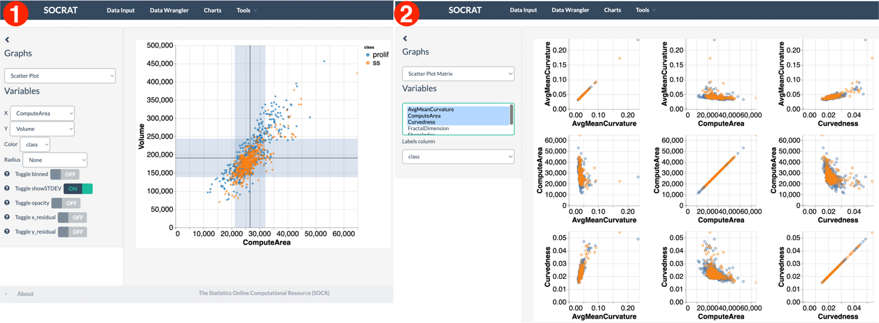
Many systems for exploratory and visual data analytics require platform-dependent software installation, coding skills, and analytical expertise. The rapid advances in data-acquisition, web-based information, and communication and computation technologies promoted the explosive growth of online services and tools implementing novel solutions for interactive data exploration and visualization. However, web-based solutions for visual analytics remain scattered and relatively problem-specific. This leads to per-case re-implementations of common components, system architectures, and user interfaces, rather than focusing on innovation and building sophisticated applications for visual analytics. In this paper, we present the Statistics Online Computational Resource Analytical Toolbox (SOCRAT), a dynamic, flexible, and extensible web-based visual analytics framework. The SOCRAT platform is designed and implemented using multi-level modularity and declarative specifications. This enables easy integration of a number of components for data management, analysis, and visualization. SOCRAT benefits from the diverse landscape of existing in-browser solutions by combining them with flexible template modules into a unique, powerful, and feature-rich visual analytics toolbox. The platform integrates a number of independently developed tools for data import, display, storage, interactive visualization, statistical analysis, and machine learning. Various use cases demonstrate the unique features of SOCRAT for visual and statistical analysis of heterogeneous types of data.

Keywords: exploratory analysis; statistical visualization; visual analytics; web toolkits.


Conflict of interest statement

Conflicts of Interest: The authors declare no conflict of interest.

Figures

Figure A1.
Figure A1.
An example of a basic SOCRAT UI-less Database module configuration and initialization: (1) Core component parses the module list containing a link to the Database module config file; (2 Core loads module configuration that implements an instance of a SOCRAT module with a unique module identifier; (3) Core invokes an initialization method of the Database module and passes an instance of the Sandbox component that serves as a proxy to access pub-sub functionality of the Mediator; (4) Using Sandbox, the Database module passes a list of messages that it can send out or listen to.
Figure A2.
Figure A2.
An example of the D3 chart implemented within the SOCRAT platform. Visual elements: (1) sidebar and (2) main area are two main UI components of any SOCRAT module; (3) additional control shows an interactive slider that allows to easily extend the standard D3 graphing capabilities within the application, (4) D3 histogram chart generated within the main area of the SOCRAT application. Corresponding SOCRAT module specification consists of (6) a config definition of the Charts module that includes (5) the module state, with url and main menu name components, as well as controllers and templates for (1) sidebar and (2) main area. D3 is also: (7) included as a global SOCRAT dependency and (8) injected directly into a service component.
Figure 1.
Figure 1.
SOCRAT UI implementing an example of a high-level general VA workflow: (1) Main menu, automatically generated from the declarative configuration with active modules, including (2) Data Input module for loading and entering data; (3) Data Wrangler module for cleaning and transforming raw data; (4) Charts module for creating interactive visualizations; (5) Tools sub-menu for visually supported data analyses, including clustering, modeling and analytical tools; (6) Project management capability that will allow take snapshots of data, save visualizations and report analysis results.
Figure 2.
Figure 2.
An exemplar scenario demonstrating SOCRAT module interaction mechanism: (1) The user analyst requests to view a current data table via DataInput module UI; (2) DataInput module sends out a message requesting the data table; (3) Mediator via Core uses MessageMap to look up modules that are listening to this message and automatically subscribes DataInput to the response message (with “OK” suffix); (4) Database module upon receiving message calls internal database storage to retrieve the current data table; (5) Database storage returns the data table in the internal format, e.g. column-wise; (6) DataAdapter component of the Database module implements data conversion to the standard row-oriented DataFrame format; (7) Database module sends the response with DataFrame object; (8) Mediator sends out a response message to the request initiating module; (9) DataInput module received the response and calls it’s own DataAdapter component to convert DataFrame into the format needed by the UI component to display the data table to the analyst.
Figure 3.
Figure 3.
Overview of DataInput module: (1) user interface includes sidebar with various data sources and central area panels with data view; (2) data sources include data grid, a number of predefined SOCR datasets, ability to load data from the World Bank using web API; (3) central panel includes source-specific secondary controls, including links to dataset description; (4) dynamic, editable spreadsheet-like data grid contains raw data values view and also allows to drag-and-drop CSV/TSV file to load the data; and (5) summary information panel below the data grid shows histogram and reports summary statistics for for each variable in the famous Iris flower dataset.
Figure 4.
Figure 4.
Data Wrangler module overview: (1) it features original Wrangler interface integrated into SOCRAT; (2) all original Wrangler operations are included; (3) Data Wrangler hides standard SOCRAT sidebar to free up space for Wrangler transformation suggestions panel; (4) Wrangler data diagnostic shows indicators of missing and erroneous values and inferred data types for dataset loaded from Database.
Figure 5.
Figure 5.
An example of the D3 chart implemented within the SOCRAT platform. Visual elements: (1) sidebar and (2) main area are two main UI components of any SOCRAT module; (3) additional control shows an interactive slider that allows to easily extend the standard D3 graphing capabilities within the application, (4) D3 histogram chart generated in the main area of (5) the Charts module.
Figure 6.
Figure 6.
Exploratory visualizations of a SOCR dataset [52] obtained from a neuroimaging study of 27 Alzheimer’s disease (AD) subjects, 35 normal controls (NC), and 42 mild cognitive impairment subjects (MCI) [54]: (1) patient sex ratio; (2) total brain volume in males vs females; (3) relationship of total brain volume with age, sex, and diagnosis; (4) results of k-Means clustering total brain volume and age by sex (k = 2).
Figure 7.
Figure 7.
An example of the third-party interactive EDA solution running inside the SOCRAT plat-form on user-defined data. This module integrates the Embedding Projector [53] that demonstrates a dynamic 3D visualization of PCA decomposition of the SOCR country ranking dataset on political, economic, health, and quality-of-life factors [52].
Figure 8.
Figure 8.
Examples of interactive tools for statistical analysis: (1) Analyses provide visually supported two-sample t-test with power analysis to compare mean of variable stratified by category (sex); (2) Modeler provides univariate normal distribution fitting that utilizes interactive histogram and overlapping line plot for fitted probability distribution and reports its parameters.
Figure 9.
Figure 9.
Interactive visualizations of cell morphology measures: (1) bar chart showing proportions of cells in the dataset per cell phenotypic class; (2) box plot showing the volume distributions of cell nuclei per treatment class.
Figure 10.
Figure 10.
Multivariate interactive visualizations of cell morphology measures: (1) scatter plot demonstrating linear relationship between cell nucleus volume and surface area; (2) scatter plot matrix showing relationship between various nuclear morphology features.
Figure 11.
Figure 11.
Interactive analysis of cell morphometry dataset: (1) unsupervised nonlinear dimensionality reduction using the t-SNE algorithm; (2) supervised classification using the SVM algorithm.
Figure 12.
Figure 12.
Reliability evaluation module: (1) Metric selection, (2) computed result and interpretation, (3) Cronbach’s alpha confidence intervals.

References

    1. McAfee A; Brynjolfsson E Big data: the management revolution. Harv. Bus. Rev 2012, 90, 60–6, 68, 128. - PubMed
    1. Dinov ID Data Science and Predictive Analytics: Biomedical and Health Applications using R; Springer, 2018. 10.1007/978-3-319-72347-1. - DOI
    1. Dinov ID; Velev MV Data science: Time complexity, inferential uncertainty, and spacekime analytics; De Gruyter STEM, De Gruyter: Berlin, Germany, 2021. 10.1515/9783110697827. - DOI
    1. Keim D; Andrienko G; Fekete JD; Görg C; Kohlhammer J; Melançon G Visual Analytics: Definition, Process, and Challenges. In Lecture Notes in Computer Science; pp. 154–175. 10.1007/978-3-540-70956-5_7. - DOI
    1. Liu S; Cui W; Wu Y; Liu M A survey on information visualization: recent advances and challenges. Vis. Comput 2014, 30, 1373–1393. 10.1007/s00371-013-0892-3. - DOI

LinkOut - more resources