[Preprint]. 2023 Jan 28:2023.01.24.23284913.
doi: 10.1101/2023.01.24.23284913.

Longitudinal home self-collection of capillary blood using home RNA correlates interferon and innate viral defense pathways with SARS-CoV-2 viral clearance

Affiliations

Longitudinal home self-collection of capillary blood using home RNA correlates interferon and innate viral defense pathways with SARS-CoV-2 viral clearance

Fang Yun Lim et al. medRxiv. .

Abstract

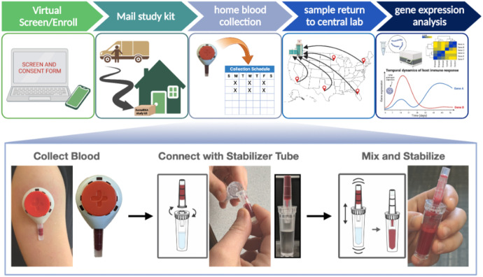
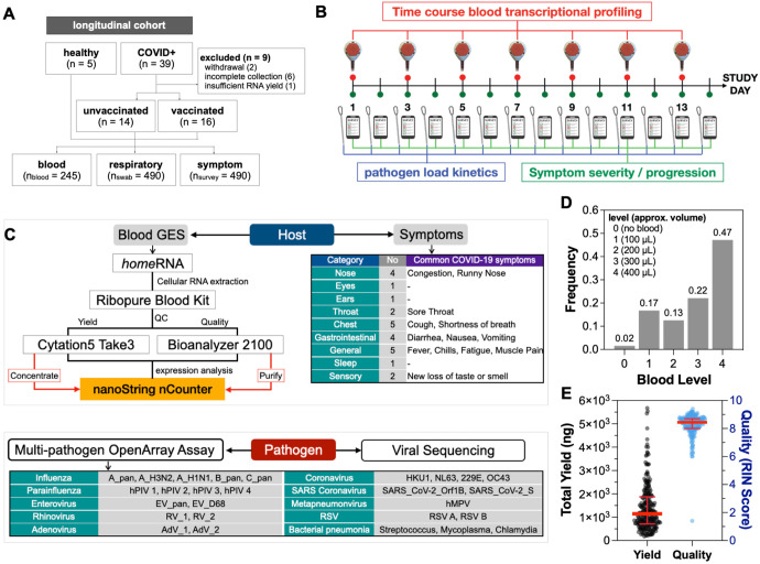
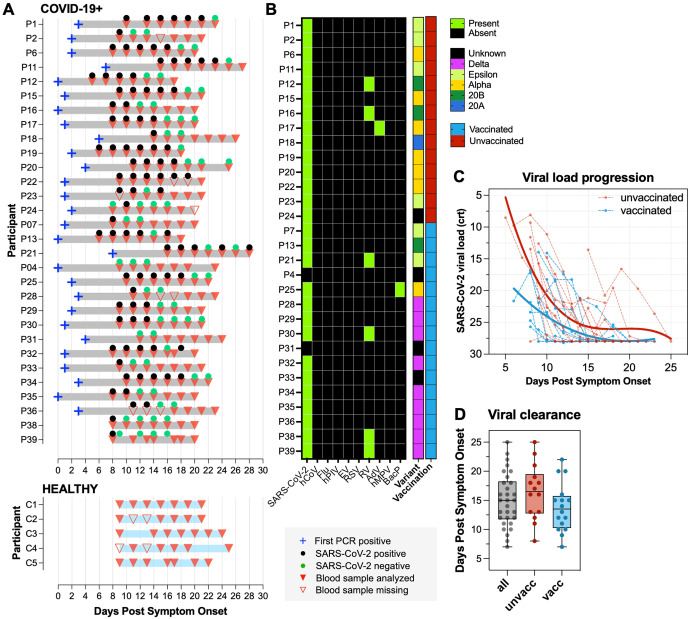
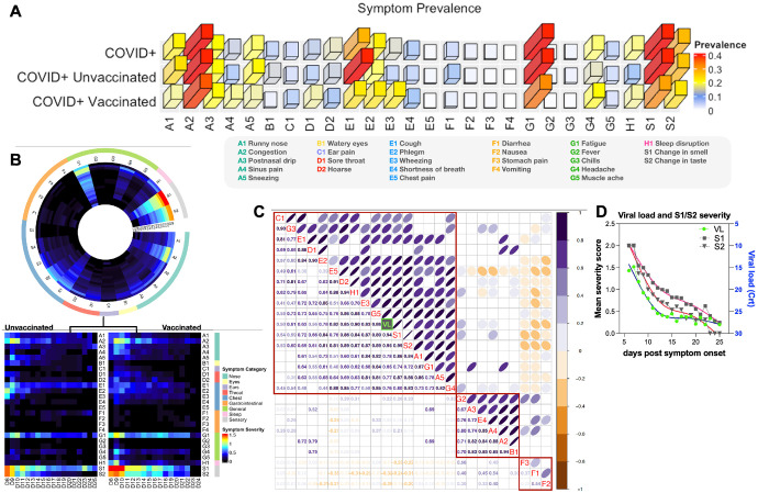
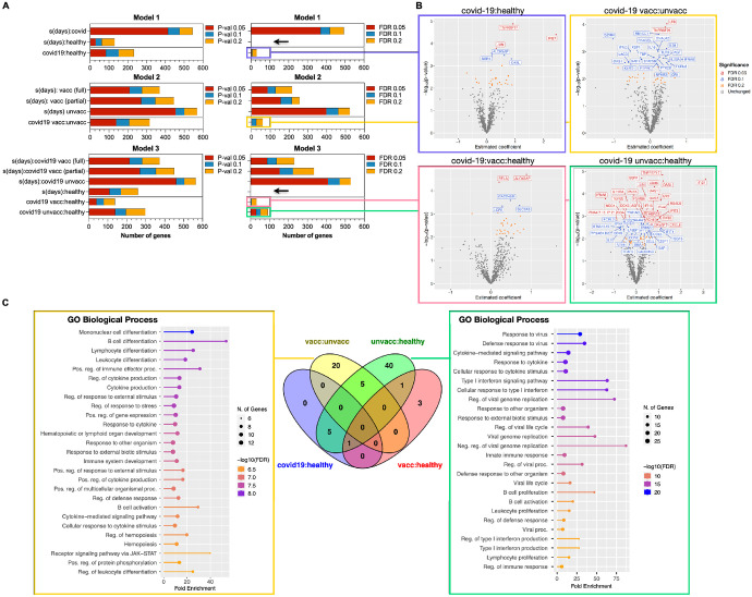
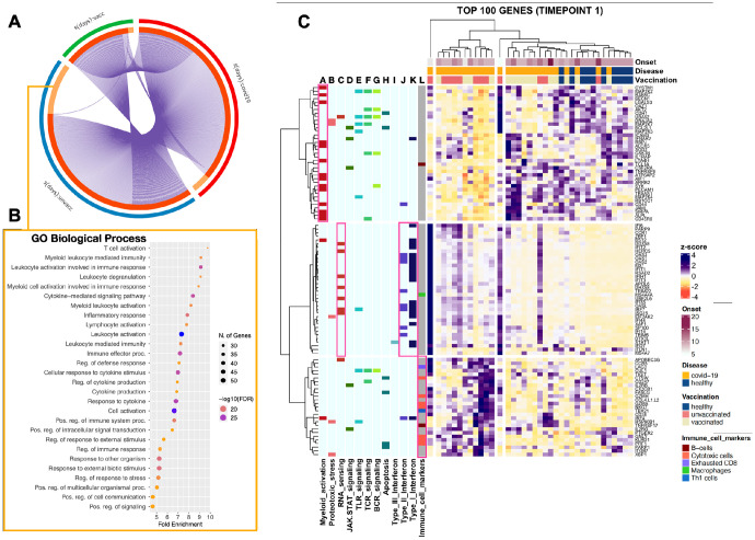
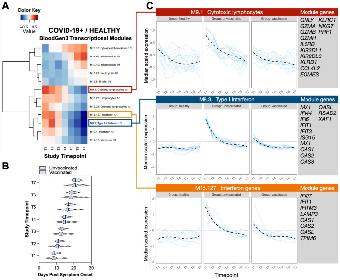
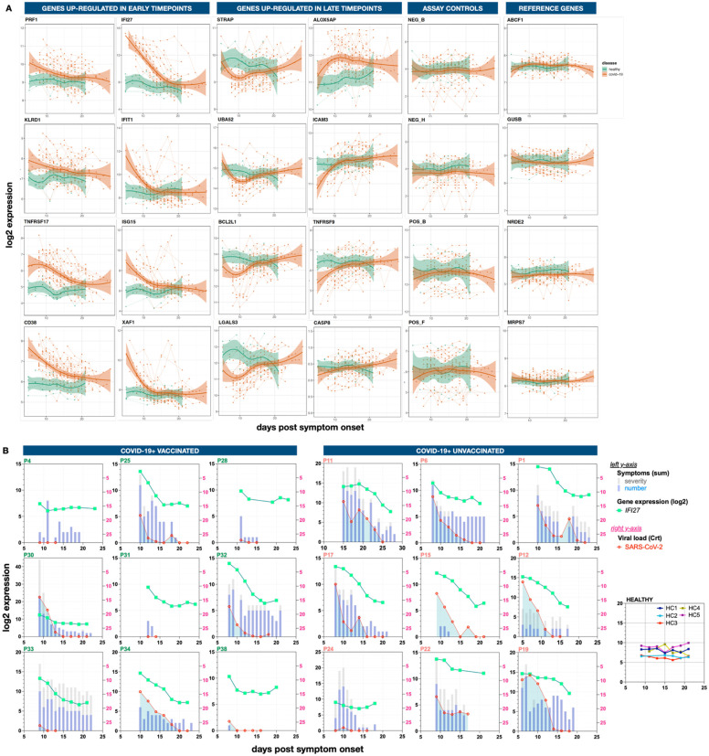
Blood transcriptional profiling is a powerful tool to evaluate immune responses to infection; however, blood collection via traditional phlebotomy remains a barrier to precise characterization of the immune response in dynamic infections (e.g., respiratory viruses). Here we present an at-home self-collection methodology, homeRNA, to study the host transcriptional response during acute SARS-CoV-2 infections. This method uniquely enables high frequency measurement of the host immune kinetics in non-hospitalized adults during the acute and most dynamic stage of their infection. COVID-19+ and healthy participants self-collected blood every other day for two weeks with daily nasal swabs and symptom surveys to track viral load kinetics and symptom burden, respectively. While healthy uninfected participants showed remarkably stable immune kinetics with no significant dynamic genes, COVID-19+ participants, on the contrary, depicted a robust response with over 418 dynamic genes associated with interferon and innate viral defense pathways. When stratified by vaccination status, we detected distinct response signatures between unvaccinated and breakthrough (vaccinated) infection subgroups; unvaccinated individuals portrayed a response repertoire characterized by higher innate antiviral responses, interferon signaling, and cytotoxic lymphocyte responses while breakthrough infections portrayed lower levels of interferon signaling and enhanced early cell-mediated response. Leveraging cross-platform longitudinal sampling (nasal swabs and blood), we observed that IFI27, a key viral response gene, tracked closely with SARS-CoV-2 viral clearance in individual participants. Taken together, these results demonstrate that at-home sampling can capture key host antiviral responses and facilitate frequent longitudinal sampling to detect transient host immune kinetics during dynamic immune states.


Figures

Figure 1.
Figure 1.. homeRNA blood collection sampling and stabilization.
Remote study design and self-blood collection from home enables decentralized sampling. homeRNA allows the user to collect up to 0.5 mL of capillary blood (without needing to milk the collection site as is common for finger stick blood collection) using the Tasso-SST blood collection device and perform RNA stabilization themselves within minutes of collection. Part of this figure is reprinted (adapted) with permission from (11) Copyright 2021 American Chemical Society.
Figure 2.
Figure 2.. Longitudinal transcriptional profiling of the SARS-CoV-2 acute phase response.
A) Flow chart of cohort characteristics. B) Study design depicting frequency of blood and nasal swab collection and symptom burden assessment. C) Flowchart depicting both host- and pathogen-associated outcomes measured in the study and their respective sample analysis workflows. D) Collected blood volume using Tasso-SST. E) Total RNA yield and quality of isolated RNA. Red error bars denote median with interquartile range of both RNA yield and RIN scores.
Figure 3.
Figure 3.. SARS-CoV-2 viral load kinetics in unvaccinated and vaccinated COVID-19+ participants.
A) Disease timeline and participant blood and nasal swab samples aligned to days PSO (Day 0) in both COVID-19+ participants and healthy controls. Blue cross denotes first PCR positive day; black and green circles denote SARS-CoV-2 positive and negative nasal swab samples respectively; solid red triangles denote blood samples used in gene expression analysis while transparent red triangles denote missing blood samples. B) Heatmap depicting presence of SARS-CoV-2 and other respiratory pathogens in participants’ nasal swab samples. Right annotation columns depict sequenced SARS-CoV-2 variants and participants’ vaccination status. C) SARS-CoV-2 viral load progression. Dotted lines represent individual viral load trajectory. Solid lines represent the loess smooth function of viral load within each vaccination subgroup. D) Box and whisker plot depicts viral clearance in unvaccinated versus vaccinated COVID-19+ participants.
Figure 4.
Figure 4.. Correlation between viral load and symptom severity in COVID-19+ participants.
A) 3D bar plot depicts symptom prevalence (relative abundance) of 26 surveyed symptoms across 9 broad categories (A-S). B) Circos heatmap depicts mean symptom severity score for each symptom type from days 8-25 PSO (rows) in COVID-19+ participants. Red denotes high symptom severity score while black denotes no experienced symptoms. Outer circle depicts broad categories of individual symptoms. Linear heatmap stratifies symptom severity scores by participants’ vaccination status. C) Spearman correlation analysis of SARS-CoV-2 viral load and symptom severity. Mean viral load for each day PSO and mean symptom severity score for each symptom type in COVID-19+ participants were analyzed. Purple and yellow denotes positive and negative correlation respectively. Width of the circle in the upper right matrix denotes the strength of the association with strongest association depicted by a thin line. Bottom left matrix depicts the Spearman correlation coefficient. Blank cells denote no statistical significance for that particular association. D) Mean viral load and S1/S2 severity scores across all COVID-19+ participants aligned to days PSO.
Figure 5.
Figure 5.. Differentially expressed genes (DEGs) in COVID-19+ vaccinated and unvaccinated participants.
A) Stacked bar plots depict number of DEGs from all three fitted GAMMs. Left and right plots depict the number of genes with raw and adjusted (FDR) p-values < 0.05, 0.1, and 0.2 respectively. Gray lines within each plot separate results of smooth function of days PSO [s(days):group of interest] and pairwise contrasts [test group:reference group]. Black arrow highlights lack of significant dynamic genes identified in healthy uninfected participants. B) Volcano plots depict significant DEGs from pairwise contrast groups shown in A). Genes are colored based on FDR cutoffs. Significant genes (FDR < 0.1) are labeled. x-axis depicts the estimated coefficient fitted from its respective GAMM while y-axis depicts the -log10(raw p-value). C) Venn diagram depicts gene overlap of significant DEGs in each pairwise contrast groups. Lollipop plots depict GO functional enrichment of genes unique to the [vacc:unvacc] and [unvacc:healthy] contrast groups.
Figure 6.
Figure 6.. The COVID-19 response repertoire of mild-to-moderate outpatient infections.
A) Circos plot showing overlap of significant genes identified from GAMM smooth function analysis between unvaccinated and breakthrough infections. Purple lines link identical genes between each group. The inner circle represents gene lists, where hits are arranged along the arc (dark orange denotes genes that hit multiple lists; light orange denotes genes unique to a particular list). B) Dot plot showing functional enrichment of genes unique to the COVID-19 unvaccinated response. The size of the dot represents number of enriched genes. C) Heatmap depicting hierarchical clustering (Euclidean Ward D2) of top 100 ranked dynamic genes identified from the COVID-19 unvaccinated response repertoire, where rows represent genes and columns represent the first timepoint sample from each participant. Top horizontal bars represent clinical characteristics of the corresponding samples. Left vertical bars represent select Host Response pathway annotation (light blue columns) and annotated immune cell markers (gray column). Various solid colors depict positive membership of a particular gene within that pathway.
Figure 7.
Figure 7.. Time-course geneset analyses (TcGSA) reveals higher interferon response intensity in unvaccinated individuals.
A) Heatmap depicting expression kinetics of significant genesets identified from TcGSA. Chaussabel BloodGen3 modules were used to query all genes within our dataset. Columns represent sampling timepoints 1-7 while rows represent significant geneset modules. B) Violin plot compares median days PSO between unvaccinated and vaccinated subgroup in each sampling timepoint. C) Spaghetti plots depict expression kinetics (median scaled gene expression) of individual genes (blue line) within each module in healthy, unvaccinated, and breakthrough COVID-19 infections. Gene memberships are listed to the right of each module.
Figure 8.
Figure 8.. IFI27 expression tracks with SARS-CoV-2 viral load.
A) Temporal trends of select response genes upregulated in early and late timepoints in COVID-19+ participants. Dotted lines connecting each analyzed sample (solid circles) represent expression kinetics in individual participants. Solid lines represent estimated loess smooth function in COVID-19+ participants (red) and healthy infected controls (green). Shaded area depicts confidence intervals. B) Correlation between IFI27 gene expression, viral load, and symptoms in individual participants. Total symptom number (blue columns), total symptom severity (gray columns), and IFI27 gene expression kinetics are plotted on the left y-axis. SARS-CoV-2 viral load is plotted on the right y-axis. IFI27 expression kinetics of all healthy uninfected controls are displayed on the far-right plot. Scale for left y-axis adjusted to symptom number and severity.

References

    1. McClain MT, Constantine FJ, Nicholson BP, Nichols M, Burke TW, Henao R, et al. A blood-based host gene expression assay for early detection of respiratory viral infection: an index-cluster prospective cohort study. Lancet Infect Dis. 2021;21(3):396–404. Epub 20200924. doi: 10.1016/S1473-3099(20)30486-2. - DOI - PMC - PubMed
    1. Sweeney TE, Wong HR, Khatri P. Robust classification of bacterial and viral infections via integrated host gene expression diagnostics. Sci Transl Med. 2016;8(346):346ra91. doi: 10.1126/scitranslmed.aaf7165. - DOI - PMC - PubMed
    1. Rinchai D, Deola S, Zoppoli G, Kabeer BSA, Taleb S, Pavlovski I, et al. High-temporal resolution profiling reveals distinct immune trajectories following the first and second doses of COVID-19 mRNA vaccines. Sci Adv. 2022;8(45):eabp9961. Epub 20221111. doi: 10.1126/sciadv.abp9961. - DOI - PMC - PubMed
    1. Soliman H, Shah V, Srkalovic G, Mahtani R, Levine E, Mavromatis B, et al. MammaPrint guides treatment decisions in breast Cancer: results of the IMPACt trial. BMC Cancer. 2020;20(1):81. Epub 20200131. doi: 10.1186/s12885-020-6534-z. - DOI - PMC - PubMed
    1. Cohen S, Wells AF, Curtis JR, Dhar R, Mellors T, Zhang L, et al. A Molecular Signature Response Classifier to Predict Inadequate Response to Tumor Necrosis Factor-alpha Inhibitors: The NETWORK-004 Prospective Observational Study. Rheumatol Ther. 2021;8(3):1159–76. Epub 20210619. doi: 10.1007/s40744-021-00330-y. - DOI - PMC - PubMed

Publication types