. 2023 Apr 10;16(1):14.
doi: 10.1186/s13040-023-00331-3.

Automated quantitative trait locus analysis (AutoQTL)

Affiliations

Automated quantitative trait locus analysis (AutoQTL)

Philip J Freda et al. BioData Min. .

Abstract

Background: Quantitative Trait Locus (QTL) analysis and Genome-Wide Association Studies (GWAS) have the power to identify variants that capture significant levels of phenotypic variance in complex traits. However, effort and time are required to select the best methods and optimize parameters and pre-processing steps. Although machine learning approaches have been shown to greatly assist in optimization and data processing, applying them to QTL analysis and GWAS is challenging due to the complexity of large, heterogenous datasets. Here, we describe proof-of-concept for an automated machine learning approach, AutoQTL, with the ability to automate many complicated decisions related to analysis of complex traits and generate solutions to describe relationships that exist in genetic data.

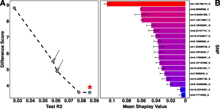
Results: Using a publicly available dataset of 18 putative QTL from a large-scale GWAS of body mass index in the laboratory rat, Rattus norvegicus, AutoQTL captures the phenotypic variance explained under a standard additive model. AutoQTL also detects evidence of non-additive effects including deviations from additivity and 2-way epistatic interactions in simulated data via multiple optimal solutions. Additionally, feature importance metrics provide different insights into the inheritance models and predictive power of multiple GWAS-derived putative QTL.

Conclusions: This proof-of-concept illustrates that automated machine learning techniques can complement standard approaches and have the potential to detect both additive and non-additive effects via various optimal solutions and feature importance metrics. In the future, we aim to expand AutoQTL to accommodate omics-level datasets with intelligent feature selection and feature engineering strategies.

Keywords: Automated; Dominance; Epistasis; Evolutionary algorithms; GWAS; Genetic programming; Inheritance; Machine learning; QTL.


Conflict of interest statement

The authors declare no competing interests.

Figures

Fig. 1
Fig. 1
Conceptual image of AutoQTL’s workflow. A A genotype/phenotype matrix is read into AutoQTL. B An optional feature encoding step recodes the data into five possible and distinct genetic inheritance models (File S1). C An optional feature selection step where features (loci) are removed by a selection operator and hyperparameter. Note that feature encoding and feature selection steps are optional and can occur more than once in any order. D A root regressor and hyperparameters (in machine learning regressors) are selected. E Examples of pipelines that are scored through GP
Fig. 2
Fig. 2
A Final Pareto front of an example AutoQTL run from 18 QTL dataset. Pipelines (blue dots) with arrows are those that are optimized for both scoring metrics. The pipeline marked with a star is the pipeline with a test R2 matching the test R2 before GP was executed. B Mean SHAP feature importance scores across the five pipelines from the example AutoQTL run from 18 QTL dataset for each locus. Black error bars represent S.E.M. Red-blue gradient denotes higher (red) and lower (blue) mean feature importance scores
Fig. 3
Fig. 3
A Final Pareto front of an example AutoQTL run from XOR (9 interaction) dataset. Pipelines (blue dots) with arrows are those that are optimized for both scoring metrics. B Waffle plot of final Pareto front root regressor diversity across 10 AutoQTL runs of the XOR dataset (n = 284 total Pareto optimal pipelines). Each square of the plot represents one Pareto optimal pipeline. C Waffle plot of final encoding state of loci across the same 10 runs (284 pipelines) in B
Fig. 4
Fig. 4
A Mean test R2 of machine learning regression (DT and RF; blue dots and lines) and LR (orange dots and lines) for final Pareto optimal pipelines using dataset with random variables replaced by increasing XOR interactions. Gray shading around lines represents S.E. B Mean test R2 of machine learning regression (DT and RF; blue dots and lines) and LR (orange dots and lines) for final Pareto optimal pipelines using datasets with putative QTL (main effects) replaced by increasing XOR interactions. Gray shading around lines represents S.E. C Stacked bar graphs illustrating the proportion of root regressors in final Pareto fronts with increasing number of epistatic pairs for datasets with random variables replaced by increasing XOR interactions. Orange bars = LR pipelines. Purple bars = DT pipelines. Blue bars = RF pipelines. Numbers inside bars represent respective proportions of each root regressor in that run. D Stacked bar graphs illustrating proportion of root regressors in final Pareto fronts for datasets with putative QTL (main effects) replaced by increasing XOR interactions. Colors of bars and numbers in bars represent the same features as in C. E Stacked bar graphs illustrating the proportion of encoder type in final Pareto fronts for datasets with random variables replaced by increasing XOR interactions. Pink bars = 2-level encoders. Green bars = 3-level encoders. Yellow = no encoder selected (Additive encoding). Numbers inside bars represent respective proportions of encoder in that run. F Stacked bar graphs illustrating the proportion of encoder type in final Pareto fronts for datasets with putative QTL (main effects) replaced by XOR epistatic interactions. Colors of bars and numbers in bars represent the same features as in E
Fig. 5
Fig. 5
Boxplots illustrating the absolute value of the difference between Shapley feature importance values for loci while main effects are retained (Non-Interacting; red boxplots) and when they are part of an XOR interaction (Interacting; blue boxplots). Each boxplot (A-I) represents one of the nine possible interaction pairs. Locus names are in the title of each boxplot

Update of

References

    1. Miles CM, Wayne M. Quantitative Trait Locus (QTL) Analysis. Nat Educ. 2008;1:208.
    1. Wei W-H, Hemani G, Haley CS. Detecting epistasis in human complex traits. Nat Rev Genet. 2014;15:722–733. doi: 10.1038/nrg3747. - DOI - PubMed
    1. Matsui T, Mullis MN, Roy KR, Hale JJ, Schell R, Levy SF, et al. The interplay of additivity, dominance, and epistasis on fitness in a diploid yeast cross. Nat Commun. 2022;13:1463. doi: 10.1038/s41467-022-29111-z. - DOI - PMC - PubMed
    1. Hallin J, Märtens K, Young AI, Zackrisson M, Salinas F, Parts L, et al. Powerful decomposition of complex traits in a diploid model. Nat Commun. 2016;7:13311. doi: 10.1038/ncomms13311. - DOI - PMC - PubMed
    1. Adams SM, Feroze H, Nguyen T, Eum S, Cornelio C, Harralson AF. Genome wide epistasis study of on-statin cardiovascular events with iterative feature reduction and selection. J Pers Med. 2020;10:212. doi: 10.3390/jpm10040212. - DOI - PMC - PubMed