Multisite assessment of reproducibility in high-content cell migration imaging data
- PMID: 37063090
- PMCID: PMC10258559
- DOI: 10.15252/msb.202211490
Multisite assessment of reproducibility in high-content cell migration imaging data
Abstract
High-content image-based cell phenotyping provides fundamental insights into a broad variety of life science disciplines. Striving for accurate conclusions and meaningful impact demands high reproducibility standards, with particular relevance for high-quality open-access data sharing and meta-analysis. However, the sources and degree of biological and technical variability, and thus the reproducibility and usefulness of meta-analysis of results from live-cell microscopy, have not been systematically investigated. Here, using high-content data describing features of cell migration and morphology, we determine the sources of variability across different scales, including between laboratories, persons, experiments, technical repeats, cells, and time points. Significant technical variability occurred between laboratories and, to lesser extent, between persons, providing low value to direct meta-analysis on the data from different laboratories. However, batch effect removal markedly improved the possibility to combine image-based datasets of perturbation experiments. Thus, reproducible quantitative high-content cell image analysis of perturbation effects and meta-analysis depend on standardized procedures combined with batch correction.
Keywords: batch effect removal; cell migration; high-content imaging; reproducibility; variability.
© 2023 The Authors. Published under the terms of the CC BY 4.0 license.
Conflict of interest statement
The authors declare that they have no conflict of interest.
Figures
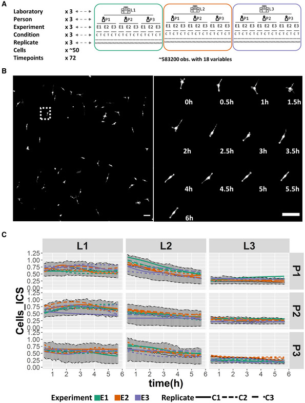
Schematic of the study design. The study involved three independent laboratories, three persons in each laboratory, three independent experiments by each person, two conditions (control or ROCK inhibitor) in each experiment, and three replicates in each condition. For each replicate, around 50 cells were imaged for 6 h in 5‐min time intervals. Eighteen variables were quantified from each image series.
Example of acquired time lapse images. Left: stitched large image; right: cropped images of one cell at different time points. Scale bar: 100 μm.
Quantification results of Instantaneous Cell Speed (ICS) over time for each laboratory (L1‐3), person (P1–3), experiment (E1–3), and technical replicate (C1–3) in the control condition. The different colors of the lines represent the data from three different experiments. Different style of the lines with the same color represent the mean value of the data from three different technical replicates within one experiment. The error bar indicates the first and third quartiles of the data from all the three experiments at each time point.
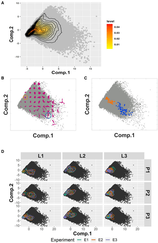
Principal component analysis results of all variables extracted from the entire data. Gray dots show the position of the first and second principal components for all of the observations from the control condition (untreated cells). Each observation is the status of one cell at one time point. Inset marks the density of the observation dots.
Visualization of cell shapes at different locations of the PCA space. Gray dots show the position of the first and second principal components for each observation. Representative cell shapes at specific locations in the PCA plot are shown in magenta.
The locations of the same cell at different time points within the PCA plot. Gray dots show the position of the first and second principal components for all of the observations from the control condition (untreated cells). Orange and blue dots show the locations of two different cells (dash circled in b) in the PCA space at different time points.
Principal component analysis results shown for each person (P) in each laboratory (L). Black dots show the position of the first and second principal components for all of the observations from the control condition (untreated cells). Each observation is the status of one cell at one time point. Colored lines show the 2D density plots of the technical replicates, where lines with different colors in the same plot represent different experiments. The principal component space is identical in all the plots.

- A, B
Variance components of each variable from all technical levels based on the Linear Mixed Effect (LME) model analysis. (A) absolute value; (B) relative value.
- C
Boxplot of the absolute variance components of all the variables from technical replicate, experiment, person, and laboratory levels based on the LME model analysis. Each dot represents one variable within the corresponding variance level. All of the 18 variables are plotted at each level.
- D, E
Cumulative variability of Instantaneous Cell Speed (ICS) (D) and first principal component (E) at the levels of technical replicate, experiment, person, and laboratory. Boxplots show variances with two or three replicates, experiments, persons, or laboratories, calculated at each level. Red dots show the mean value of the cumulative variance that are linked with red lines. As a control, cyan dots and lines show the cumulative variance of the same data after randomization.
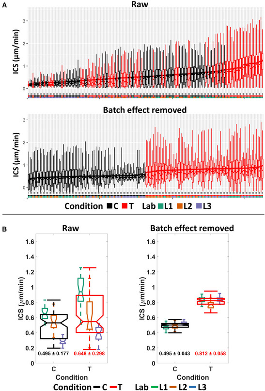
ICS distribution before (top) and after (bottom) batch effect removal on control (C – black) and perturbed (ROCK inhibition; T – red). Boxplots display ICS observations for each replicate, sorted by increasing value of the mean. Control and perturbation conditions are shown in black and red respectively. Laboratories in which each replicate was performed are color coded below the boxplots. Each replicate includes results from ~50 cells, and each cell has results from 72 time points.
ICS values and variance before (left) and after (right) batch effect removal. Boxplots are based on mean ICS of each technical replicate from control and perturbed conditions in different laboratories. Laboratories are color coded, while the aggregate results from all labs are shown in black (control) and red (perturbed). The numbers below the corresponding boxplot show mean ± standard deviation of the aggregated control/treated results from all labs. The experiments were repeated in three labs, three persons in each lab, three experiments by each person, and three technical replicates in each experiment.
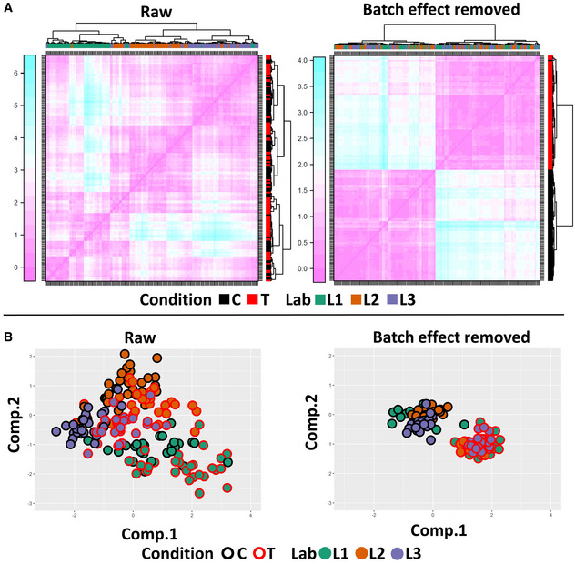
Heatmap of the distance matrix before and after batch effect removal at technical replicate level. The heatmaps show average values of the distance matrix between 1st and 2nd Principal Components per lab, person, experiment, condition, and technical replicate before (left) and after (right) batch effect removal. Each row/column corresponds to one technical replicate. Sorting based on hierarchical clustering.
Batch effect removal in principal component data of 2D cell migration data at the technical replicate level. Technical replicate of first and second Principal Component average values before (left) and after (right) batch effect removal are shown in the same PCA space. Each dot represents one technical replicate. Results from different laboratories/conditions are color coded as indicated.

Sample images of the produced 3D cell migration datasets by Lab 4 and Lab 5. HT1080 cells were seeded in the collagen condition 2.5 vs. 6.0 mg/ml. Bar: 100 μm.
Batch effect removal in 3D cell migration (3D spheroid invasion) data. Boxplots are based on the mean 3D cell migration distance of the technical replicates of the HT1080 cells embedded in different concentrations of collagen before (left) and after (right) batch effect removal. Different ECM concentrations are shown in black (2.5 mg/ml) or red (6 mg/ml) and data from different laboratories are indicated with green (Laboratory #4) and magenta (Laboratory #5). The aggregated 2.5 or 6 mg/ml results from both laboratories are shown with the corresponding boxplots. In each laboratory, the experiments were repeated three times with three technical replicates in each experiment. Each technical replicate contains at least three different spheroids. For the boxplots, in each box, the central mark indicates the median, and the bottom and top edges of the box indicate the first quartile and third quartile, respectively. The whiskers extend to the most extreme data points not considered outliers. Data between the first quartile −1.5*interquartile range and third quartile +1.5*interquartile range are considered not outliers.
References
-
- Addona TA, Abbatiello SE, Schilling B, Skates SJ, Mani DR, Bunk DM, Spiegelman CH, Zimmerman LJ, Ham AJL, Keshishian H et al (2009) Multi‐site assessment of the precision and reproducibility of multiple reaction monitoring‐based measurements of proteins in plasma. Nat Biotechnol 27: 633–641 - PMC - PubMed
-
- Bates D, Machler M, Bolker BM, Walker SC (2015) Fitting linear mixed‐effects models using lme4. J Stat Softw 67: 1–48
-
- Boutros M, Heigwer F, Laufer C (2015) Microscopy‐based high‐content screening. Cell 163: 1314–1325 - PubMed
Publication types
MeSH terms
Grants and funding
LinkOut - more resources
Full Text Sources