. 2023 May;4(5):734-753.
doi: 10.1038/s43018-023-00544-9. Epub 2023 Apr 20.

Ex vivo drug response heterogeneity reveals personalized therapeutic strategies for patients with multiple myeloma

Affiliations

Ex vivo drug response heterogeneity reveals personalized therapeutic strategies for patients with multiple myeloma

Klara Kropivsek et al. Nat Cancer. 2023 May.

Abstract

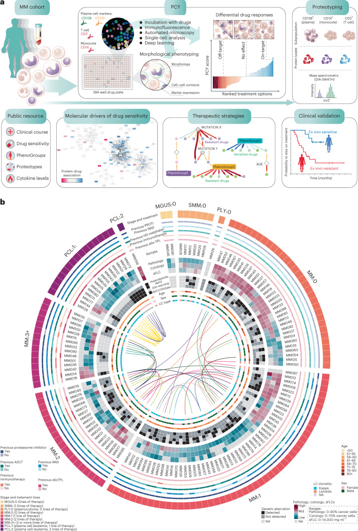
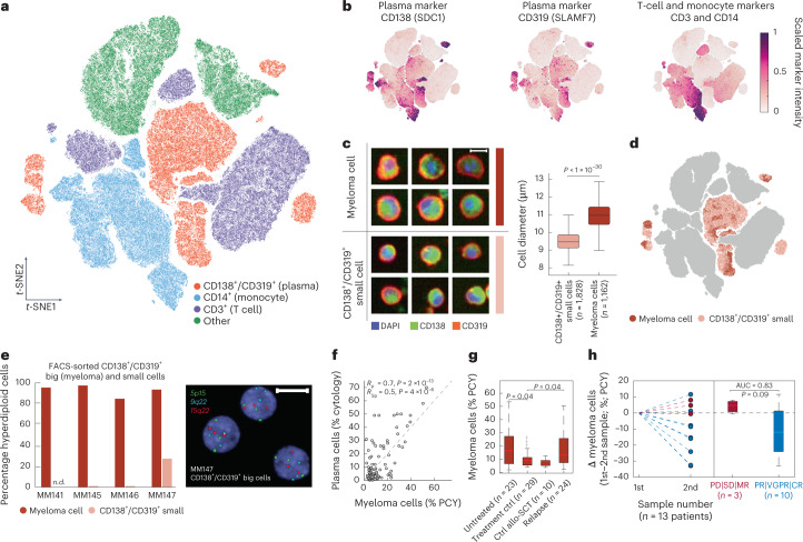
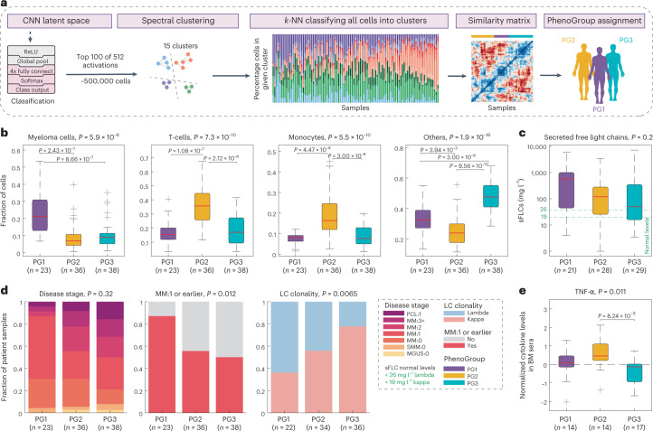
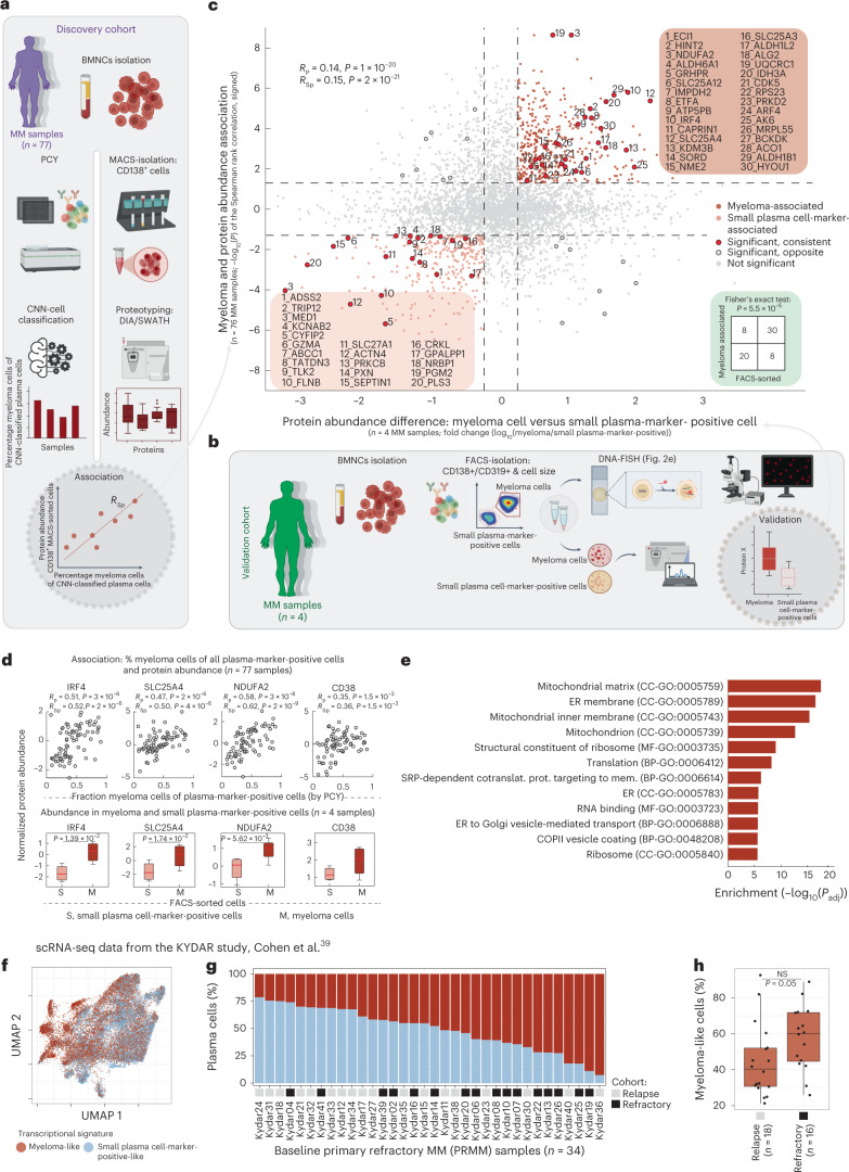
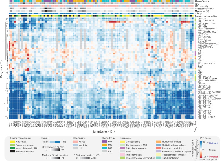
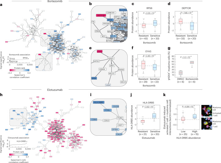
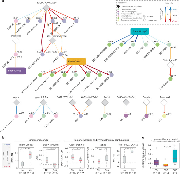
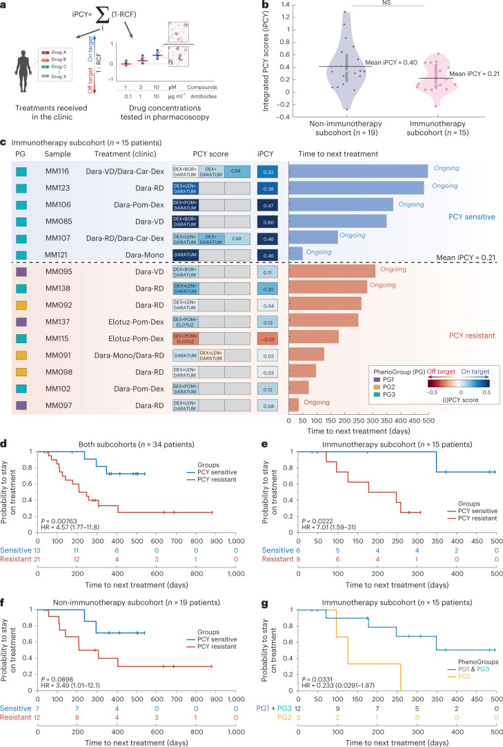
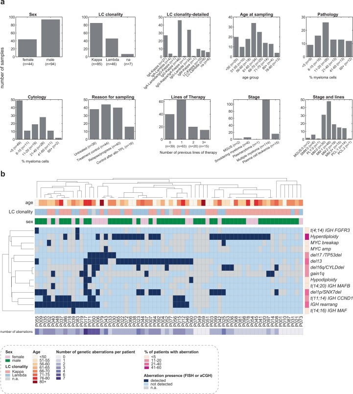
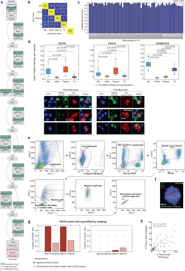
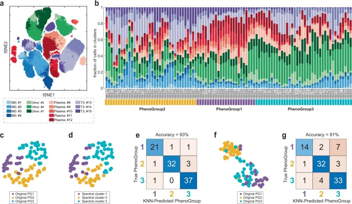
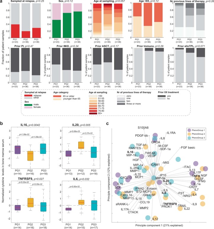
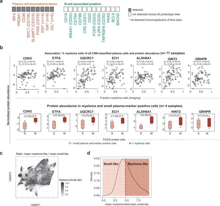
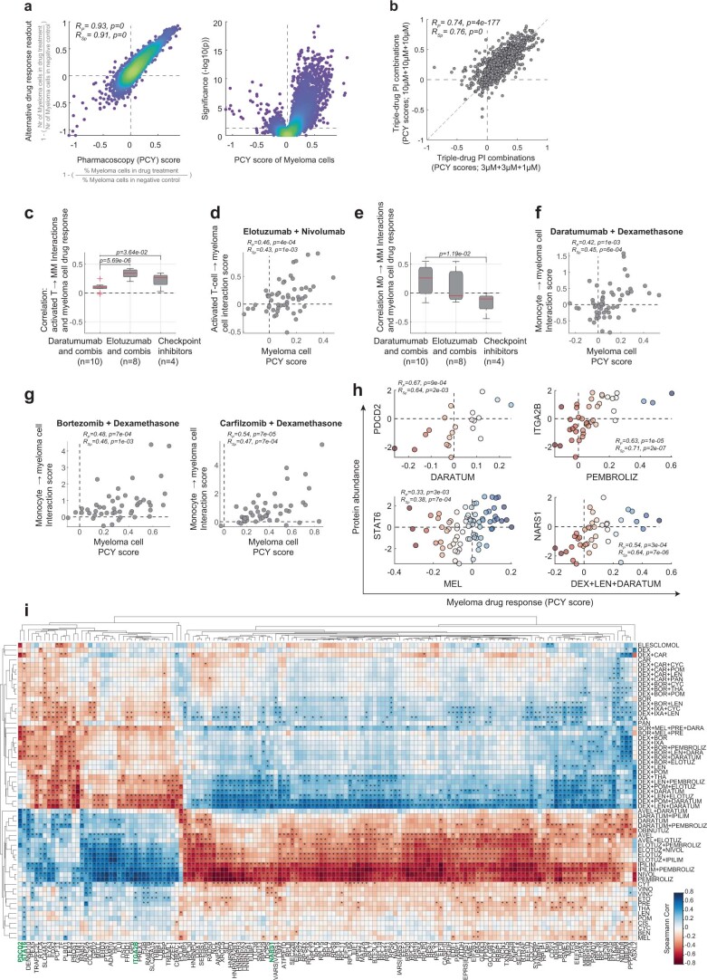
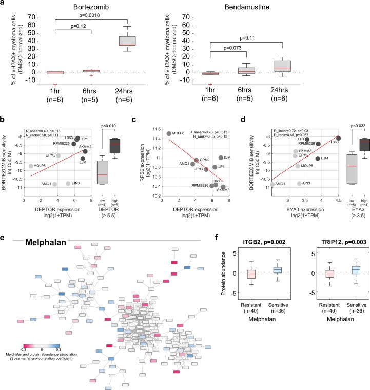
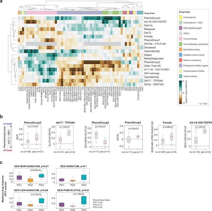
Multiple myeloma (MM) is a plasma cell malignancy defined by complex genetics and extensive patient heterogeneity. Despite a growing arsenal of approved therapies, MM remains incurable and in need of guidelines to identify effective personalized treatments. Here, we survey the ex vivo drug and immunotherapy sensitivities across 101 bone marrow samples from 70 patients with MM using multiplexed immunofluorescence, automated microscopy and deep-learning-based single-cell phenotyping. Combined with sample-matched genetics, proteotyping and cytokine profiling, we map the molecular regulatory network of drug sensitivity, implicating the DNA repair pathway and EYA3 expression in proteasome inhibitor sensitivity and major histocompatibility complex class II expression in the response to elotuzumab. Globally, ex vivo drug sensitivity associated with bone marrow microenvironmental signatures reflecting treatment stage, clonality and inflammation. Furthermore, ex vivo drug sensitivity significantly stratified clinical treatment responses, including to immunotherapy. Taken together, our study provides molecular and actionable insights into diverse treatment strategies for patients with MM.


Conflict of interest statement

B.S. was a scientific co-founder of Allcyte, which has been acquired by Exscientia. B.S. is a shareholder of Exscientia and a co-inventor on US patent application 15/514,045 relevant to the study. B.S. declares research funding from Roche and speaker fees from Novartis, GSK and AbbVie. All other authors declare no competing interests.

Figures

Fig. 1
Fig. 1. Workflow and cohort details for the integrative functional, molecular and clinical analysis of patients with MM.
a, Schematic indicating the study workflow and derived results. Data are available as described in the Data Availability section, as well as at https://myelomics.com. b, Circos plot representing the multiple myeloma cohort and samples collected during the observational clinical study. A total of 138 patient samples from 89 unique patients are shown, with the follow-up samples from recurring patients connected with the lines in the inner part of the circos plot (unique color per patient). sFLC, serum-free light chain; NA, not available. For further details see legend, Extended Data Fig. 1 and Supplementary Table 1.
Fig. 2
Fig. 2. A clinically concordant morphological signature of malignant myeloma cells.
a, t-Stochastic neighbor embedding (t-SNE) of the CNN latent space of high-confidence cells colored by CNN class (n = 489,753 cells from 97 patient samples). b, Marker expression levels per cell projected onto the embedding of a. c, Example cropped microscopy images showing representative morphologies of myeloma cells (top) and small CD138+/CD319+ plasma cell-marker-positive cells (bottom). Scale bar, 10 µm. Box-plots of cell diameter of myeloma cells (n = 1,828 cells from 55 patient samples) and small plasma cell-marker-positive cells (n = 1,162 cells from 55 patient samples) (right). Box-plots indicate the median (horizontal line) and 25% and 75% ranges (box) and whiskers indicate the 1.5 × interquartile range above or below the box. Outliers beyond this range are shown as individual data points. In this case no outliers are present. P values from unpaired two-tailed Student’s t-test. d, Plasma cell class morphology projected onto the embedding of a. e, DNA-fluorescence in-situ hybridization (FISH) results assessing hyperdiploidy of FACS-sorted plasma cells (CD138+ or CD319+) that were further subdivided by size (see also Extended Data Fig. 2e). Bar graphs represent 100 cells per class for four patient samples. Example FISH-image of sample MM147 indicating hyperdiploidy for three nuclei (right). Blue indicates 4,6-diamidino-2-phenylindole (DAPI) stain. Scale bar, 10 µm. f, Scatter-plot of percentage myeloma cells by PCY compared to evaluation by clinical cytology (n = 82 patient samples). Spearman’s rank and Pearson’s correlations and P values are indicated. g, Box-plot of percentage myeloma cells by PCY stratified by treatment stage (n = 86 patient samples). P values from multiple pairwise comparison of the group means using Tukey’s honestly significant difference criterion. Data are not adjusted for multiple comparisons. Box-plots as in c. h, Difference in percentage myeloma cells in longitudinal patient samples, normalized to the first sampling. Red indicates patients with less than PR; blue shows patients with PR or better. Box-plots as in c. P values from paired two-tailed t-test. AUC, area under the receiver operating characteristic curve; PD, progressive disease; SD, stable disease; MR, minimal response; VGPR, very good partial response; CR, complete remission, as defined by the International Myeloma Working Group. Source data
Fig. 3
Fig. 3. Bone-marrow composition reflects clinical stage, disease clonality and inflammation.
a, Scheme for determining the PGs. Top 100 activations from the ResNet CNN latent space for the 489,753 cells depicted in Fig. 2a are analyzed by spectral clustering (k = 15; Extended Data Fig. 3a) and the remainder of cells were k-NN-classified into respective spectral clusters. Sample composition (based on dimethylsulfoxide (DMSO) control cells) is calculated (Extended Data Fig. 3b) and a sample similarity matrix is calculated by correlating spectral cluster abundance per sample. The sample similarity matrix reveals three predominant PhenoGroups revealed by dendrogram cutting (PG1 = purple, PG2 = yellow, PG3 = blue). b, Box-plots indicating the fraction of cells per sample, split by cell class and sample PG (for a total of n = 97 patient samples). Box-plots as in Fig. 2c. P values were calculated using ANOVA. Pairwise P values derived from multiple pairwise comparison of the group means using Tukey’s honestly significant difference criterion. c, Box-plots showing the clinically measured sFLCs matched to each sample, shown per PG (n = 78 patient samples). Green dashed lines represent normal levels (<26 mg l−1 for Lambda and <19 mg l−1 for Kappa). The P value depicted was calculated as in b, box-plots as in Fig. 2c. d, Distribution of selected clinical parameters across PhenoGroups: fraction of patient samples with selected features are shown as stacked bar graphs. P values are calculated using a chi-squared test of independence. For disease stage abbreviations, see legend in Fig. 1b (n = 97 patient samples). e, Box-plot of z score normalized cytokine levels of TNF-α in patient BM sera per PG. The P values depicted were calculated as in b. Box-plots as in Fig. 2c (n = 45 patient samples). Source data
Fig. 4
Fig. 4. The molecular proteotype of myeloma cells.
a, Work scheme for the integration of proteotype and PCY data on the discovery cohort (n = 77 patient samples). b, Work scheme for validation cohort (n = 4 patient samples; also analyzed in Fig. 2e). c, Scatter-plot. The y axis represents myeloma and protein abundance associations calculated as in a as signed P values of Spearman’s rank correlations. The x axis represents the difference in protein abundance between FACS-sorted myeloma and small plasma cell-marker-positive cells from four myeloma samples (scheme b). Top-right quadrant shows proteins positively associated with myeloma cells across the discovery cohort (n = 77) and upregulated in myeloma cells in the validation cohort (n = 4). Lower-left quadrant contains negatively associated with and downregulated proteins in myeloma cells. Gray dashed line represent the cutoffs for y axis (P < 0.05) and x axis (absolute fold change > 0.3). Fisher’s exact test insert indicates significance in overlap of proteins, significant in both discovery and validation cohorts (P < 5.47 × 10−5). Selected proteins are numbered and protein identifiers reported in the respective quadrants. Proteins formatted in bold letters are shown in d (see also Supplementary Table 4). Spearman’s rank and Pearson’s correlations and P values are indicated (top left). d, Example data for myeloma-associated proteins IRF4, SLC25A4, NDUFA2 and CD38. Top scatter-plots indicate protein abundance (y axis) against percentage myeloma by PCY (x axis) (n = 77 patient samples). Bottom box-plots (as in Fig. 2c) show protein abundance (y axis) per FACS-sorted myeloma (M) and small plasma cell-marker-positive cells (S) cells of the validation cohort (n = 4 patient samples). P values from a paired two-tailed Student’s t-test. Pearson’s and Spearman’s rank correlation and associated P values are provided under the title of each upper plot. P values not corrected for multiple testing. e, Gene Ontology enrichment analysis of the myeloma protein signature. P value by hypergeometric test, false discovery rate (FDR)-adjusted for multiple comparisons. SRP, signal recognition particle. f, Uniform Manifold Approximation and Projection representation of scRNA expression levels colored by their myeloma-like and small plasma cell-marker-like transcriptional signature (n = 31,305 cells from 34 patients). g, Bar-plots of the percentage plasma cells colored as in f (n = 34 patients). h, Box-plots (as in Fig. 2c) show percentage myeloma-like cells per relapse (n = 18 patients) and refractory (n = 16 patients) disease stages. Indicated P value (not significant) is from an unpaired two-tailed Student’s t-test. Source data
Fig. 5
Fig. 5. The single-cell drug response landscape of MM.
Myeloma cell drug responses (PCY scores) bi-clustered across the cohort of 101 patient samples (columns) and 61 unique drugs and drug combinations (rows). Additional sample and drug annotations are provided at the top and right of the drug response matrix (see legend). For visualization purposes, 21% (1,292 of 6,161) of shown drug responses have been imputed by LASSO regression on either measured drug responses or matching myeloma proteotype data. Imputed drug responses are indicated by a dashed outline. LC, light chain, AVEL, avelumab; BEN, bendamustine; BOR, bortezomib; CAR, carfilzomib; CIS, cisplatin; CYC, cyclophosphamide; CYT, cytarabine; DARA, daratumumab; DEX, dexamethasone; ELOTUZ, elotuzumab; ETO, etoposide; IPILIM, ipilimumab; IXA, ixazomib; LEN, lenalidomide; MEL, melphalan; NIVOL, nivolumab; OBINUTUZ, obinutuzumab; PAN, panobinostat; PEMBROLIZ, pembrolizumab; POM, pomalidomide; PRE, prednisone; THA, thalidomide; VINC, vincristine; VINO, vinorelbin. Source data
Fig. 6
Fig. 6. The protein network underlying MM drug sensitivity.
a, STRING-db interaction network for the proteins whose abundance in myeloma cells most strongly correlates with myeloma drug responses across all proteins and drugs. Unconnected nodes in the network are not shown for simplicity. Node color represents the Spearman’s rank correlation with bortezomib response across the discovery cohort. More details are at https://myelomics.com. b, Zoom into the network region around RPS6 and DEPTOR. Legend shows signed −log10(P) per protein, sorted by their Spearman’s rank correlation coefficients. No adjustments for multiple comparisons were made. c, Box-plots (as in Fig. 2c) showing RPS6 abundance as a function of bortezomib sensitivity (n = 76 patient samples). d, Box-plots (as in Fig. 2c) showing DEPTOR abundance as a function of bortezomib sensitivity (n = 53 patient samples). e, Zoom into the network region around EYA3. f, Box-plots (as in Fig. 2c) showing EYA3 abundance as a function of bortezomib sensitivity (n = 51 patient samples). g, Box-plots showing the percentage of γH2AX-positive myeloma cells after 24 h of DMSO or bortezomib treatment across six newly diagnosed myeloma samples (n = 6 patient samples). Box-plots as in Fig. 2c. P values shown are from a two-tailed paired Student’s t-test. h, STRING-db interaction network colored by their elotuzumab drug response associations, as in a. i, Zoom into the network region around HLA-DRB5. j, Box-plots (as in Fig. 2c) showing HLA-DRB5 abundance as a function of elotuzumab sensitivity (n = 41 patient samples). k, Box-plots (as in Fig. 2c) showing the elotuzumab-induced activated T cell interactions with myeloma cells as a function of HLA-DRB5 abundance (n = 40 patient samples). Example images on the right of the plot show an activated T cell with close contact to a myeloma cell (top) and a conventional T cell without cell–cell contact to a myeloma cell (bottom). Scale bar, 10 μm. All P values depicted on box-plots (c,d,f,g,j,k) are from unpaired two-tailed Student’s t-tests. The tests were not adjusted for multiple comparisons. All box-plots (c,d,f,g,j,k) as in Fig. 2c. Source data
Fig. 7
Fig. 7. Therapeutic strategies for clinically defined myeloma subcohorts.
a, Network representing clinical and morphological features associated with myeloma drug sensitivity both by ANOVA analysis as well as by a two-tailed Student’s t-test across n = 67 patient samples. Drugs are represented as circles, colored by their respective drug class. Numbers next to the arrows indicate fraction of times the association is significant in cross-validation. Mutations and other clinical parameters are represented in rhombus shapes and PGs in rectangular shapes in their respective colors. Edge color shows better (blue) or worse (red) sensitivity toward a drug or a drug combination for a group of patients. Drugs and drug combinations are indicated by shortened drug names concatenated by a + symbol (Supplementary Table 5). b, Box-plots (as in Fig. 2c) showing example differences in PCY scores for distinct patient subsets and drugs, associated with a. Indicated P values are from an unpaired two-tailed Student’s t-test; n values indicate number of samples with a selected feature and a measured PCY response. c, Box-plots (as in Fig. 2c) showing the distribution of mean PCY responses per sample across six drugs in the immunotherapy combinations class, grouped by PG (n = 24 patient samples). One-way ANOVA P value is reported, the asterisk indicates a P value from multiple pairwise comparison of the group means using Tukey’s honestly significant difference criterion. Source data
Fig. 8
Fig. 8. Ex vivo drug sensitivity stratifies clinical responses.
a, A schematic representation of the iPCY scores: the sum of ex vivo drug responses (1 − relative cell fraction) matching the treatments the patient subsequently received in the clinic. b, Violin plots with a depicted median and kernel density estimate of the data of iPCY scores for the non-immunotherapy subcohort (left; n = 19 patients) and immunotherapy subcohort (right; n = 15 patients). Additionally, mean iPCY of each subcohort is depicted (horizontal black lines) and used as threshold to separate more sensitive (‘PCY-sensitive’) from less sensitive (‘PCY-resistant’) patients. Difference was not significant by unpaired two-tailed Student’s t-test. c, A graphic representation of the clinical immunotherapy subcohort (n = 15 patients). Patients are included based on receiving either daratumumab or elotuzumab-containing treatment following PCY testing and having evaluable response. PG, sample identifier and clinical treatment per patient are reported. Heat map shows the individual PCY scores matching to the treatments given, with their respective iPCYs on the right. Finally, time to next treatment is reported per patient, with blue indicating PCY-sensitive and red PCY-resistant samples as in b. d, Kaplan–Meier curve for the probability to stay on treatment for both subcohorts combined (n = 34 patients) stratified by PCY sensitivity, using the mean iPCY for their matched clinical treatments as a cutoff. P value from log-rank (Mantel–Cox) test and HR of the respective groups including the 95% CIs are reported. Ongoing responses are indicated as vertical tick marks on the Kaplan–Meier curves. Table below reports the number of patients at risk at different time points. e, As in d but for the immunotherapy subcohort (n = 15 patients). f, As in d but for the non-immunotherapy subcohort (n = 19 patients). g, As in e but stratified for the PGs of the corresponding patient samples. Stratification is PG2 versus (PG1 and PG3). Source data
Extended Data Fig. 1
Extended Data Fig. 1. Patient cohort details and genetics.
a, Histograms of patient clinical features, for 138 patient samples. Ns represent the number of patient samples for which the clinical feature measurement exists. b, Heatmap of genetic aberrations, as measured in the clinic at the time of patient’s diagnosis by fluorescence in situ hybridization (FISH) or Microarray-based Comparative Genomic Hybridization (aCGH). Rows correspond to individual mutations, and columns to individual patients (only shown for those that such data was measured; n = 66). Additionally, age, light chain clonality, and sex per patient are shown (see legend). On the right, the % of patients with the mutation detected in the cohort is indicated (see legend). Below the patient labels, the number of detected mutations per patient is indicated (Supplementary Table 1). Source data
Extended Data Fig. 2
Extended Data Fig. 2. Single-cell image analysis of primary myeloma samples.
a, Convolutional neural network architecture (ResNet) of the 4-class classifier used in the study to classify each imaged cell into either a monocyte, plasma cell, T cell, or other cell class. b, Confusion matrix showing the ResNet classification accuracy on cells from 71 samples used in the training set, calculated on cells that were not part of the CNN training data. Overall classification accuracy across the training samples was 95.7%, with the highest accuracy for the plasma cell class (98.5% accuracy). c, Overall classification accuracy per patient sample, calculated on cells that were not part of the CNN training data (n = 71 samples). Red dashed line indicates average accuracy across all samples. d, Boxplots of mean marker intensities per sample (n = 97 patient samples) of each respective subpopulation marker (n = 1260 cells on average per subpopulation and marker and sample). Boxplots as in Fig. 2c. P-values calculated by unpaired two-tailed Student’s t-test. d, below, Image examples of normal and green monocytes. Scale bar: 10 μm. e, Exemplary FACS-gating for sorting of myeloma and small plasma cell-marker-positive cells. First, FSC-A and SSC-A gates are used to select the lymphocytes that are further enriched in viable cells. CD14 and CD3 cells are excluded, and only plasma cell-marker (CD138 and/or CD319) positive cells are kept. Finally, plasma cell-marker-positive cells are separated based on SSC-A and FSC-A gates into big cells (myeloma cells) and small plasma cell-marker-positive cells. Singlets of each subpopulation are chosen and sorted out for further downstream processing. f, Example FISH-image of a small plasma cell-marker-positive cell of MM147 sample, showing normal chromosomal copy numbers (diploidy) for the tested probes. Picture is representative of 100 cells analyzed for this sample and class, see quantification in Fig. 2e. Scale bar: 10 µm. g, Barplots showing fraction of myeloma (big) and small FACS-sorted CD138+/CD319+ cells positive by immunofluorescence and imaging for either CD38 (plasma cell marker) or CD19 (B-cell marker) (n = 10,000 cells). h, Scatterplot of the percentage of plasma cells infiltrated into the bone marrow measured on matching samples by either clinical pathology (x-axis) or clinical cytology (y-axis) (n = 50 samples). Spearman’s rank and Pearson’s correlations and p-values are reported. Source data
Extended Data Fig. 3
Extended Data Fig. 3. Discovery and robustness of PhenoGroups.
a, left t-SNE embedding of 489,753 cells (as in Fig. 2a), colored by their respective spectral cluster IDs as detected in top-100 activations of the last fully connected layer of the CNN architecture (‘activation space’). b, Stacked barplot showing fraction of cells from DMSO conditions in each spectral cluster per patient sample. Lower colors indicate the corresponding PhenoGroups, as identified by hierarchical tree-cutting. c, t-SNE embedding of the 15-class abundance correlation matrix per patient sample. Each dot represents a patient sample colored by their original PG as in b. d, t-SNE embedding as in c, but colored by their Spectral cluster number after spectral (graph) clustering the 15-class abundance correlation matrix with k = 3. e, Confusion matrix depicting the accuracy of the KNN-prediced PG of each sample in the 15-class correlation matrix space. The KNN prediction accuracy is 93%. f, As in c, but calculating the embedding of the 4-class (plasma cells, monocytes, T cells, others) abundance correlation matrix. g, As in e, but calculating the KNN-predicted PGs in the 4-class abundance correlation matrix space. The KNN prediction accuracy is 81%. c-g, N = 97 patient samples. Source data
Extended Data Fig. 4
Extended Data Fig. 4. PhenoGroup-associated clinical and cytokine parameters.
a, Fraction of patient samples per PhenoGroup for not significantly associated clinical features. P-values were calculated using a Chi-square test of independence. Color-coded grouping variables are explained in the legend. b, Normalized cytokine levels of additional selected pro-, and anti-inflammatory cytokines measured in patient bone marrow sera. Boxplots (as in Fig. 2c) with normalized cytokine abundance across samples per PhenoGroup are shown. P-values depicted in the titles are calculated using one-way ANOVA, the asterisks indicate p-values from multiple pairwise comparisons of the group means using Tukey’s honestly significant difference criterion. c, A principle component analysis (PCA) biplot showing scores of samples (colored by their representative PhenoGroup) with projected loadings (cytokines). a-b, N listed in each panel indicates the number of patient samples. Source data
Extended Data Fig. 5
Extended Data Fig. 5. Molecular investigation of the myeloma signature.
a, Detected plasma cell associated proteins, and not-detected B-cell associated proteins, as measured by DIA-SWATH proteomics in the MACS-sorted CD138+ plasma cell samples across the entire cohort (N = 77 patient samples). b, Scatterplots of additional example proteins showing high association with the percentage of myeloma cell morphology of CNN-detected plasma cells in the discovery cohort (n = 77 samples) (upper panel), which are confirmed in FACS-sorted cells of the validation cohort (lower panel; boxplots as in Fig. 2c). Dots represent measurements from individual patient samples. Spearman’s rank and Pearson’s correlations and p-values are indicated. Below, p-values indicated from a paired two-tailed t-test (n = 4 patient samples), not adjusted for multiple testing. c, UMAP representation of the KYDAR study’s single-cell transcriptional profiles of sorted plasma cells. Dots are colored by the expression ratio of myeloma-associated over small plasma cell-marker-positive-associated genes as identified in the upper right and lower left quadrants of Fig. 4c. d, Density histogram of transcriptional signature ratios across cells, with a threshold for transcriptional signature at the median myeloma-to-small ratio of 5. Source data
Extended Data Fig. 6
Extended Data Fig. 6. Molecular network underlying the single-cell drug response landscape of myeloma.
a, left, Scatter plot showing the similarity between PCY scores of myeloma cells as used throughout this study (x-axis; calculated as (1 - (% of myeloma cells in drug treatment divided by % myeloma cells in matched control conditions))) and drug response scores based on the number of myeloma cells relative to their number in matched control conditions (y-axis; thus independent of the drug response of healthy monocytes, T cells and other cells in each sample). The scatter plot shows all measured patient samples and drug conditions. Spearman’s rank and Pearson’s correlations and p-values are indicated. (N = 6161, that is 61 drug perturbations times 101 patient samples). a, right, Volcano plot of all measured myeloma PCY scores and their corresponding significance as measured by Student’s t-test against the relevant control wells. b, Scatter plot showing the consistency in ex vivo drug responses to the lowest (x-axis) and highest (y-axis) concentrations of the triple-drug proteasome inhibitor regimes tested across the cohort (N = 6161, that is 61 drug perturbations times 101 patient samples). Spearman’s rank and Pearson’s correlations and p-values are indicated. c, Boxplots showing the distribution of Spearman’s rank correlations (RSp) between the activated T cell to myeloma cell Interaction score and the myeloma cell drug responses across all measured samples (N = 56). RSp values are aggregated across Daratumumab containing treatments (n = 10 treatments), Elotuzumab containing treatments (n = 8 treatments), and the four individually tested immune checkpoint inhibitors (n = 4 treatments). Boxplots as in Fig. 2c. d, Example scatter plot of the activated T cell to myeloma cell interaction score (y-axis) and the myeloma cell drug responses (x-axis) across all measured samples (n = 55) for the combination of Elotuzumab and Nivolumab. Spearman’s rank and Pearson’s correlations with p-values are indicated. e, as in c, but for monocyte to myeloma cell interactions. f, as in d, but for monocyte to myeloma cell interactions for the combination of Daratumumab and Dexamethasone (n = 56 patient samples). Spearman’s rank and Pearson’s correlations with p-values are indicated. g, as in f, but for either Bortezomib and Dexamethasone in combination (left) (n = 47 patient samples), or Carfilzomib and Dexamethasone in combination (right) (n = 48 patient samples). Spearman’s rank and Pearson’s correlations with p-values are indicated. h, Examples of four associations between myeloma drug response (PCY score; x-axis) and myeloma protein abundance as measured by DIA-SWATH proteomics (y-axis). Spearman’s rank and Pearson’s correlations with p-values are indicated. DARATUM to PDCD2 association: n = 21 patient samples; PEMBROLIZ to ITGA2B association: n = 41 patient samples; MEL to STAT6 association: n = 76 patient samples; DEX + LEN + DARATUM to NARS1 association: n = 41 patient samples. i, Clustergram of protein-drug associations (Spearman’s rank coefficients across the cohort) for the 150 proteins with most variable associations across the drug library. Stars indicate RSp with p < 0.05. Source data
Extended Data Fig. 7
Extended Data Fig. 7. Molecular determinants of myeloma drug sensitivity.
a, Boxplots showing percentage of ɣH2AX-positive myeloma cells, normalized to levels in DMSO (by subtraction), after different incubation times with 1 μM Bortezomib (a, left), or 1 μM Bendamustine (a, right) (n in each panel indicates the number of patient samples). Boxplots as in Fig. 2c. P-values of paired two-sided t-tests between condition and DMSO are shown. b, Scatter plot of Bortezomib sensitivity (ln(IC50)) versus Deptor transcript abundance (log2(1+TPM)) for MM cell lines analyzed in, data accessed through DepMap portal (https://depmap.org) (b, left). R_linear is Pearson’s linear, and R_rank is Spearman’s rank correlation coefficient, with indicated p-values. MM cell line names are labeled (n = 9 cell lines). b, right, Boxplots comparing Bortezomib sensitivity for Deptor low and high MM cell lines. P-value by unpaired two-tailed Student’s t-test. Boxplots as in Fig. 2c. (n = 4 DEPTOR-low cell lines, n = 5 DEPTOR-high cell lines). c, Scatterplot comparing Deptor and Rps6 expression levels in MM cell lines of b. Spearman’s rank and Pearson’s correlations with p-values are indicated. d, As in b, but comparing Bortezomib sensitivity to Eya3 transcript abundance. Spearman’s rank and Pearson’s correlations with p-values are indicated. The p-value on boxplot is by unpaired two-tailed Student’s t-test. e, STRING-db network of top drug-associated proteins as in Fig. 4b colored by Melphalan drug response association. Color represents the sign and strength of association (color code as legend in Fig. 4b). Please see https://myelomics.com for more network details. f, Protein abundance of ITGB2 (left) and TRIP12 (right), positively associated with Melphalan sensitivity, are shown. The depicted p-value is by unpaired two-sided Student’s t-test (n = 76 patient samples). Boxplots as in Fig. 2c. Source data
Extended Data Fig. 8
Extended Data Fig. 8. Clinical parameters associated with drug sensitivity.
a, Heatmap showing signed F-values from one-way ANOVAs on drug responses for different clinical and morphological features across the cohort, calculated on clonal patient samples (n = 67). Positive values indicate a feature contributing to a better PCY outcome (sensitivity), whereas negative values indicate association with worse PCY score (resistance). * indicate p-values lower than 0.05. Drug classes are annotated by color above the heatmap, see legend. b, Boxplots showing differences in Pharmacoscopy scores in patients with a selected clinical or morphological feature. P-values indicate significances out of unpaired two-sided Student’s t-tests. No adjustments for multiple comparisons were made. Boxplots as in Fig. 2c. See figure for numbers of patient samples used. c, Selected Pharmacoscopy scores for immunotherapy combinations frequently given in the clinic, shown per PhenoGroup. Numbers of patient samples included in each test are reported. Boxplots as in Fig. 2c. Source data
Extended Data Fig. 9
Extended Data Fig. 9. Clinical utility of pharmacoscopy for multiple myeloma.
a, Graphic representation of the non-immunotherapy subcohort (n = 19 patients), similar to Fig. 8c. Patients with their respective PhenoGroups are reported, followed by the sample IDs, and treatments given in the clinic. A heatmap reports individual PCY scores for the treatments given, with their respective integrated PCY (iPCY) scores on the right. Finally, each patient’s time to the next treatment is reported, with blue indicating PCY-sensitive and red PCY-resistant samples. Ongoing treatments are indicated. b, Kaplan-Meier curves showing the time to next treatments in days for all 34 patients (combining both the non-immunotherapy and immunotherapy subcohorts). Thick lines represent cohort stratification by PCY-sensitivity (determined as in Fig. 8b) of myeloma cells. In comparison, dashed lines represent equivalently-calculated cohort stratification by PCY-sensitivity of all plasma cells (as detected by the 4-class CNN classifier). Plasma cell drug responses do not stratify clinical responses. Relevant p-values from the log-rank (Mantel-Cox) test are indicated on the right, with a table reporting the number of patients at risk at different time points below the plot. c, Scatter plot showing similarity in subpopulation abundances identified across MM samples by PCY (x-axis) and flow cytometry (y-axis) (n = 5 patient samples across n = 4 subpopulations). Spearman’s rank and Pearson’s correlations and p-values are indicated. d, ROC curve on the false (x-axis) and true (y-axis) positive rate of inference of samples belonging to PG1 based on the clinical flow-based abundance of plasma cells in each sample. PG1 inference was performed by thresholding on the plasma cell abundances. Area under the characteristic curve is indicated. ROC curve includes data on 67 patient samples for which the clinical flow data was available. Source data

References

    1. Kumar SK, et al. Multiple myeloma. Nat. Rev. Dis. Primers. 2017;3:1–20. doi: 10.1038/nrdp.2017.46. - DOI - PubMed
    1. van de Donk NWCJ, van de, Pawlyn C, Yong KL. Multiple myeloma. Lancet. 2021;397:410–427. doi: 10.1016/S0140-6736(21)00135-5. - DOI - PubMed
    1. Nutt SL, Hodgkin PD, Tarlinton DM, Corcoran LM. The generation of antibody-secreting plasma cells. Nat. Rev. Immunol. 2015;15:160–171. doi: 10.1038/nri3795. - DOI - PubMed
    1. Lam WY, Bhattacharya D. Metabolic links between plasma cell survival, secretion, and stress. Trends Immunol. 2018;39:19–27. doi: 10.1016/j.it.2017.08.007. - DOI - PMC - PubMed
    1. Manier S, et al. Genomic complexity of multiple myeloma and its clinical implications. Nat. Rev. Clin. Oncol. 2017;14:100–113. doi: 10.1038/nrclinonc.2016.122. - DOI - PubMed

Publication types

Substances