. 2023 May;169(5):001323.
doi: 10.1099/mic.0.001323.

Distribution of mutation rates challenges evolutionary predictability

Affiliations

Distribution of mutation rates challenges evolutionary predictability

T Anthony Sun et al. Microbiology (Reading). 2023 May.

Abstract

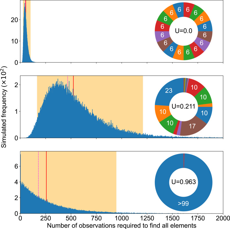
Natural selection is commonly assumed to act on extensive standing genetic variation. Yet, accumulating evidence highlights the role of mutational processes creating this genetic variation: to become evolutionarily successful, adaptive mutants must not only reach fixation, but also emerge in the first place, i.e. have a high enough mutation rate. Here, we use numerical simulations to investigate how mutational biases impact our ability to observe rare mutational pathways in the laboratory and to predict outcomes in experimental evolution. We show that unevenness in the rates at which mutational pathways produce adaptive mutants means that most experimental studies lack power to directly observe the full range of adaptive mutations. Modelling mutation rates as a distribution, we show that a substantially larger target size ensures that a pathway mutates more commonly. Therefore, we predict that commonly mutated pathways are conserved between closely related species, but not rarely mutated pathways. This approach formalizes our proposal that most mutations have a lower mutation rate than the average mutation rate measured experimentally. We suggest that the extent of genetic variation is overestimated when based on the average mutation rate.

Keywords: Pseudomonas; coupon collector's problem; distribution of mutation rates; mutation bias; mutation rate; predicting evolution.


Conflict of interest statement

The authors declare no competing interests.

Figures

Fig. 1.
Fig. 1.
Approaches used. Graphical abstract of the approaches used in this article, showing the interpretation of the mutation rate for mutational elements defined on a molecular basis, the corresponding mutation pie chart (MPC) with relative mutation rates, as well as a conceptual distribution of mutation rates (DMR) considering absolute rates.
Fig. 2.
Fig. 2.
Completion experiments. Summary of completion experiments run on three examples of mutation pie charts (MPC) with different mutation rates in the even 16-case (top), the 16 pathways of the SBW25 WS data (middle) and a 2-pathways case focusing on the rarest one in the SWB25 WS data (bottom). The smallest number of replicates needed to find all mutational elements follows a skewed distribution (blue bars), with the highest simulated value being respectively 225, 3360 and 2906 out of 105 experiments for each MPC. The average simulated value is shown as a solid red line (55, 524 and 257), the median as a dashed magenta line (52, 468, 178) and 95 % of the experiment fell within the orange area ([29, 101], [169, 1208], [8, 950]).
Fig. 3.
Fig. 3.
Completion experiments along unevenness values. Summary of completion experiments in mutation pie charts (MPCs) with different unevenness values and varying number of mutational elements. For a fixed number of mutations, each unevenness value gives an average (solid line), a median (dashed line) and the 95 % most common (coloured area) completion experiment results. We computed the median values from 100 random MPCs with the same unevenness, each value for a single MPC being a median over 100 replicated completion experiments.
Fig. 4.
Fig. 4.
Convergence of MPC estimations. Impact of the real 16-MPC’s unevenness on the expected convergence of its estimations. Out of 105 replicates for each unevenness value U to estimate, central estimation errors are shown (top), with the average (solid) and median (dashed), as well as the 95 % most commonly observed estimation errors (bottom). Absolute error is shown with a sign to represent underestimation (<0) and overestimation (>0).
Fig. 5.
Fig. 5.
Log-normal DMR calibration approach. A 95 %-confidence interval (CI) for a log-normal DMR based on the experimentally informed assumption of average E obs=5×10⁻¹¹ gen−1 and aws unevenness U obs=0.315. Top: maximum likelihood (white star) for parameter σ and CI (blue band) constructed from the quantile curve crosses and the 95 % range. In total, 106 12-MPCs (aws setup) were sampled from the log-normal distribution with mean E obs corresponding to each candidate value for σ. Bottom: maximum likelihood estimation (solid red) for the DMR, corresponding to the parameters shown in Table 1; lower (dotted blue) and upper (dashed blue) boundaries of the CI assuming the same mean E obs (dashed orange line).The bottom panel makes it clear that the bulk of the DMR could be different from the mean to an unintuitive extent.
Fig. 6.
Fig. 6.
DMR’s impact on potential MPCs. From a log-normal DMR with maximum likelihood estimated parameters μ^ = −25.15 and σ^ = 1.69, sampling 106 MPCs of 500 mutations distributed among ten pathways as in the [145, 50, 50, 240, 2, 2, 2, 3, 3, 3]-setup corresponding to the wrinkly spreader data in Appendix B (Table 2) gives an unevenness distribution (blue) with median 0.212 (dashed magenta line) and 95 % between 0.163 and 0.334 (shaded orange area). MPCs are shown for those three quantiles. Each colour accounts for a pathway and each colour shade accounts for a mutation. In the wrinkly spreader system, blue corresponds to the aws pathway, orange to dgcH, green to mwsR, and red to wsp.
Fig. 7.
Fig. 7.
Robustness of MPC against DMR stochasticity. Consider two mutational pathways A and B of respective target sizes n and n/r. Parameter σ of the log-normal DMR (and therefore its coefficient of variation) determines the threshold ratio r thresh under which >5 % of cases challenge the robustness of the MPC-setup: in the region strictly below the curves, r is too low to ensure at 95 % that A will have a higher mutation rate than B. The average (solid coloured lines) and median (superimposed dotted white lines) cut-off r thresh was measured out of 106 simulations. The coloured area indicates the 95 %-confidence interval for σ based on the aws data and the unevenness metric, with the maximum likelihood as a solid red line.
Fig. 8.
Fig. 8.
Impact of DMR on potential MPCs’ unevenness. Effect of the number of mutations and of the DMR’s coefficient of variation (CV) on the MPCs’ unevenness distribution. The average simulated value is shown as a solid red line, the median as a dashed magenta line and 95 % of the experiments fell within the orange area. The examples shown use a log-normal DMR model to simulate 106 replicated random MPCs in each panel. The unevenness average and median increase when CV increases (from left to right). An increased number of mutations dampens this effect when CV is low (from top to bottom).
Fig. 9.
Fig. 9.
Distribution of the total mutation rate to the phenotype. Effect of the number of mutation sites on the total mutation rate, presented as a distribution centred around its mean and divided by its standard deviation (which would standardize a normal distribution). The examples shown use a log-normal DMR model to simulate 106 for each number of mutation sites.
Fig. 10.
Fig. 10.
MPC metrics. Comparison of different metrics summarizing an MPC showing, for different numbers of mutations, the variation of the Gini coefficient G and of the sum of the two largest mutation rates SLS2 depending on the unevenness U, as to their mean (coloured lines), which is very close to their median, and their 95 %-interval (coloured areas). The maximum Gini coefficient depends on the number of mutations (grey dotted lines).
Fig. 11.
Fig. 11.
Log-normal DMR versus gamma DMR. Effect of the mathematical shape of the DMR (blue curves) on the distribution of the unevenness values (blue histograms) of 12-MPCs sampling them following the aws data setup. The DMRs have the same mean (solid red line) and standard deviation (dashed orange line), which was based on the aws calibrated log-normal DMR.
Fig. 12.
Fig. 12.
Completion experiments. Summary of completion experiments run on three examples of mutation pie charts (MPC) with different mutation rates. The smallest number of replicates needed to find all mutational elements follows a skewed distribution (blue bars), with the highest simulated value being respectively 67, 301 and 2012 out of 106 experiments for each MPC. The average simulated value is shown as a solid red line, the median as a dashed magenta line and 95 % of the experiments fell within the orange area.
Fig. 13.
Fig. 13.
Completion experiments, variability under same unevenness. Summary of completion experiments run on three examples of 16-MPCs with different mutation rates but the same unevenness U. The average simulated value is shown as a solid red line, the median as a dashed magenta line and 95 % of the experiments fell within the orange area. The smallest number of replicates needed to find all mutational elements follows a skewed distribution (blue bars), with the highest simulated value being respectively 4940, 5196 and 1886 out of 105 experiments for each MPC, which had Gini coefficient 0.568, 0.529 and 0.569; SS1LC 0.018, 0.044 and 0.038 (proof that the rarest is not key); SS2LC 0.010, 0.017 and 0.017; SS2MC 0.514, 0.496 and 0.445 respectively (the latter seems to correlate with the order of medians).
Fig. 14.
Fig. 14.
Completion experiments, variable unevenness. Summary of completion experiments run on three examples of 16-MPCs with different mutation rates and increasing unevenness. The average simulated value is shown as a solid red line, the median as a dashed magenta line and 95 % of the experiments fell within the orange area. The smallest number of replicates needed to find all mutational elements follows a skewed distribution (blue bars), with the highest simulated value being respectively 1057, 3358 and 18 535 out of 105 experiments for each MPC.

Similar articles

Cited by

References

    1. Cano AV, Gitschlag BL, Rozhonova H, Stoltzfus A, McCandlish DM, et al. Mutation bias and the predictability of evolution. Phil. Trans. R. Soc. B 2023. 378:20220055 doi: 10.32942/X2QG67. - DOI - PMC - PubMed
    1. Cano AV, Rozhoňová H, Stoltzfus A, McCandlish DM, Payne JL. Mutation bias shapes the spectrum of adaptive substitutions. Proc Natl Acad Sci. 2022;119:e2119720119. doi: 10.1073/pnas.2119720119. - DOI - PMC - PubMed
    1. Monroe JG, Srikant T, Carbonell-Bejerano P, Becker C, Lensink M, et al. Mutation bias reflects natural selection in Arabidopsis thaliana . Nature. 2022;602:101–105. doi: 10.1038/s41586-021-04269-6. - DOI - PMC - PubMed
    1. Stoltzfus A. Mutation, Randomness, and Evolution. Oxford University Press; 2021. - DOI
    1. Stoltzfus A, McCandlish DM. Mutational biases influence parallel adaptation. Mol Biol Evol. 2017;34:2163–2172. doi: 10.1093/molbev/msx180. - DOI - PMC - PubMed

Publication types

LinkOut - more resources