. 2024 Mar;42(3):470-483.
doi: 10.1038/s41587-023-01782-z. Epub 2023 May 11.

Comparative analysis of cell-cell communication at single-cell resolution

Affiliations

Comparative analysis of cell-cell communication at single-cell resolution

Aaron J Wilk et al. Nat Biotechnol. 2024 Mar.

Abstract

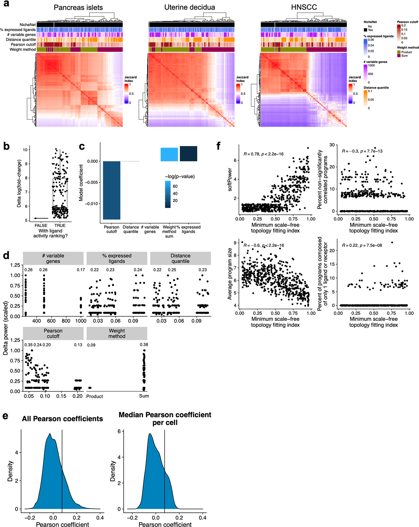
Inference of cell-cell communication from single-cell RNA sequencing data is a powerful technique to uncover intercellular communication pathways, yet existing methods perform this analysis at the level of the cell type or cluster, discarding single-cell-level information. Here we present Scriabin, a flexible and scalable framework for comparative analysis of cell-cell communication at single-cell resolution that is performed without cell aggregation or downsampling. We use multiple published atlas-scale datasets, genetic perturbation screens and direct experimental validation to show that Scriabin accurately recovers expected cell-cell communication edges and identifies communication networks that can be obscured by agglomerative methods. Additionally, we use spatial transcriptomic data to show that Scriabin can uncover spatial features of interaction from dissociated data alone. Finally, we demonstrate applications to longitudinal datasets to follow communication pathways operating between timepoints. Our approach represents a broadly applicable strategy to reveal the full structure of niche-phenotype relationships in health and disease.


Conflict of interest statement

Competing interests

A.K.S. reports compensation for consulting and/or scientific advisory board (SAB) membership from Merck, Honeycomb Biotechnologies, Cellarity, Repertoire Immune Medicines, Ochre Bio, Third Rock Ventures, Hovione, Relation Therapeutics, FL82, Empress Therapeutics, IntrECate Biotherapeutics, Senda Biosciences and Dahlia Biosciences. C.A.B. reports compensation for consulting and/or SAB membership from Catamaran Bio, DeepCell, Immunebridge and Revelation Biosciences. The remaining authors declare no competing interests.

Figures

Extended Data Fig. 1 |
Extended Data Fig. 1 |. Additional analyses of exhausted intratumoral SCC T cells.
a) UMAP projection of all T cells from the dataset published by Ji, et al., colored by author-annotated T cell subtype. b) Dot plot depicting average and percent expression of the exhaustion signature score by author-annotated T cell subtypes. c) ROC curves depicting the ability of each cluster from the single-cell T cell object (left) or Scriabin generated T cell-CD1C+ DC CCIM (right) to be classified as exhausted or non-exhausted. Each line corresponds to a single cluster. The diagonal black line corresponds to an AUC = 0.5, where there is no predictive power of classification. AUC = 0, the cluster can be perfectly classified as non-exhausted; AUC = 1, the cluster can be perfectly classified as exhausted.
Extended Data Fig. 2 |
Extended Data Fig. 2 |. Comparison of Scriabin to agglomerative CCC analysis techniques and validation with spatial transcriptomic data.
a) Runtime of Scriabin and five published CCC methods on the 10X PBMC 5k dataset. For each dataset size, the dataset was randomly subsampled to six different indicated sizes and the same subsampled dataset was used for all methods. b) Runtime of Scriabin and Connectome comparative workflows. The 10X PBMC 5k and 10k datasets were merged into a single dataset which was subsampled as in (a), and the comparative workflows performed between cells from the 5k vs. 10k dataset. Six different dataset sizes were compared. c) Jaccard index heatmaps depicting the degree of overlap in the top 1,000 ligand–receptor CCC edges from each method-resource pair for four datasets: 10X PBMC 5k, Fluidigm C1 pancreas islets,, Smart-seq2 uterine decidua, and Smart-seq2 HNSCC. d, e) The procedure described in Fig. 3a was repeated for 11 datasets, and the median distance quantile of a percentile of the most highly interacting cell–cell pairs was calculated using real cell distances relative to randomly permuted cell distances. d) Each facet shows the median distance quantile of the top 0.1%, 0.5%, 2.5%, 5%, 10%, and 20% most highly interacting cell–cell pairs. e) Each facet shows the median distance quantile of cell–cell pairs within the range of interaction quantile shown. In each facet, an exact two-sided p-value from the Wilcoxon rank-sum test is shown.
Extended Data Fig. 3 |
Extended Data Fig. 3 |. Flow cytometry and transcriptional analysis of B and NK cell transfection and co-culture.
a) Flow cytometry gating scheme used to identify B and NK cells. b) Scatter plots of flow cytometry data showing expression of CD40 and CD40L by B cells and NK cells. Left: B cells and NK cells transfected with GFP-encoding mRNA at start of co-culture. Middle: B cells transfected with CD40-encoding mRNA and NK cells transfected with CD40Lencoding mRNA at start of co-culture. Right: B cells transfected with CD40encoding mRNA and NK cells transfected with CD40L-encoding mRNA at end of co-culture. For (a-b), percentages of the parent gate are shown for each gate. c) UMAP projections of full dataset colored by cell condition of origin (left) or annotated cell type (right). d) Dot plot depicting average and percent expression of exogenous mRNAs in the four co-cultures.
Extended Data Fig. 4 |
Extended Data Fig. 4 |. Analysis of CCC between CD40LG-transfected NK cells and CD40-transfected B cells with Connectome and NicheNet.
a) Circos plot summarizing Connectome’s results of significantly differentially-expressed ligand–receptor pair edges between the CD40LG-CD40 transfected condition (shades of red) and GFP-GFP transfected condition (shades of blue). CCC is analyzed between ligands expressed by sender NK cells (bottom) and receptors expressed by receiver B cells (top). b) Dot plot depicting percentage and average expression of differentially-expressed receptors by B cells (top) and ligands by NK cells (bottom) returned by Connectome’s DifferentialConnectome workflow. c) NicheNet was applied to predict ligand activities in B cells between the CD40LG-CD40 transfected condition and the GFP-GFP transfected condition. The bar plot depicts pearson coefficient outputs of NicheNet for this analysis. d) Dot plot depicting percentage and average expression of potentially-active ligands shown in (c) by NK cells.
Extended Data Fig. 5 |
Extended Data Fig. 5 |. Additional analyses of the scRNA-seq dataset of leprosy granulomas.
a) Bar graph depicting cell proportions per granuloma in the dataset of Ma, et al.. Author-provided cell type annotations are used for analysis. b) Subclustering resolutions of T cells (left) and myeloid cells (right) required for comparative CCC analysis by agglomerative methods. Pink bars indicate the percentage of subclusters containing at least one cell from an LL granuloma and one cell from an RR granuloma. Blue bars indicate the percentage of subclusters containing at least one cell from all nine analyzed granulomas. c) NicheNet was applied to predict ligand activities in myeloid cells between RR granulomas relative to LL granulomas. The bar plot depicts pearson coefficient outputs of NicheNet for this analysis. d) UMAP projections of T cells (top) and myeloid cells (bottom) colored by author-generated subcluster cell type annotation (left), granuloma type (middle), or if the cell falls into a cluster 2 perturbed bin (right; see Fig. 4f). e) We applied a binomial test to determine if cells from a cluster 2 perturbed bin were significantly enriched or depleted in any T cell or myeloid cell subcluster. The bar plot depicts the -log(p-value) of the exact binomial test. When p < 0.05, the bars are colored to indicate if perturbed cells are either enriched (red) or depleted (blue) from the cluster. The dotted line indicates the point at which p = 0.05. Calculated p-values are two-sided.
Extended Data Fig. 6 |
Extended Data Fig. 6 |. Co-expressed interaction programs in intestinal development.
a) Scatter plot depicting expression of LEC marker LYVE1 and RSPO3. Shown are Pearson’s r, and an exact two-sided P value. b) UMAP projections of ligand (shades of purple) or receptor (shades of green) expression in 3 gut endothelial cell-specific modules. c) UMAP projection of gut endothelial cells colored by expression of ligands in the interaction programs depicted in (b). d) Dot plot depicting the expression fold-change and Bonferroni-corrected Wilcoxon rank-sum test 2-sided p-values of interaction program expression in each anatomical location. e) Intramodular connectivity scores for each ligandreceptor pair in each anatomical location for the module indicated by the arrow in (d). The black arrow in (e) indicates the genes whose average and percent expression are plotted to the right. Shown is an exact two-sided Bonferroni-corrected p-value from the Wilcoxon rank-sum test as described in panel (d). f-g) Connectome was used to analyze CCC in the human intestinal development dataset using author-annotated cell types for aggregation. Results are plotted for communication between gut endothelial cells (senders) and intestinal epithelial cells (receivers; f) or between fibroblasts (senders) and intestinal epithelial cells (receivers; g).
Extended Data Fig. 7 |
Extended Data Fig. 7 |. scRNA-seq dataset of SARS-CoV-2 infected HBECs.
UMAP projections of 64,008 cells from the dataset published by Ravindra, et al. colored by time point (a), annotated cell type (b), or the percentage of UMIs per cell of SARS-CoV-2 origin (c).
Extended Data Fig. 8 |
Extended Data Fig. 8 |. Parameter tuning for ligand activity ranking and interaction program discovery workflows.
a) Heatmaps depicting Jaccard overlap index between DE testing results from CCIMs constructed with 217 different combinations of ligand activity ranking parameters. Three different datasets were used for testing: a pancreas islet dataset,, a uterine decidua dataset, and a dataset of HNSCC. b-d) 217 different parameter combinations were used to analyze CCC between NK cells transfected with CD40Lencoding mRNA and B cells transfected with CD40-encoding mRNA. Ligand activity-weighted CCIMs were calculated from each of these combinations and differential expression testing performed to identify which parameter combinations returned CD40L-CD40 as a differential edge with the highest specificity. b) Box plot depicting the difference between the log(fold-change) for CD40L-CD40 and the mean log(fold-change) for all other ligand–receptor pairs, with and without application of ligand activity ranking. n = 1 for analysis without ligand activity ranking; n = 216 for with ligand activity ranking. c) β coefficients and p-values from multiple regression analysis modeling the impact of each ligand ranking parameter on relative predictive power for the CD40L-CD40 edge. d) Scatter plots depicting relative predictive power for the CD40L-CD40 edge for all combinations of ligand ranking parameters. The mean for each parameter is shown within the plot. e) Example ligand activity distributions to aid in selection of the appropriate Pearson coefficient threshold. Generally, ligand activity coefficients form a right-skewed distribution, similar to the distributions shown here. The right tails of these distributions represent the putative biological activity and are the coefficients that should be used for CCIM weighting. We therefore encourage users to consider the number of ligands that are expected to display biological activity and the number of cells that are expected to have downstream signaling induced by those ligands. If there are very few ligands expected to be biologically active, and only a subset of cells responding to them, this threshold should be increased to include less of the right tail of the distribution. f) The interaction program discovery workflow was repeated on 35 random subsamples of the inDrop panc8 dataset,, using 19 different R2 thresholds to define the appropriate softPower parameter. Scatter plots depict association between R2 threshold and (clockwise from top left): recommended softPower, percentage of identified programs that failed significance testing, percentage of programs composed of only 1 ligand or receptor, and the average number of ligands and receptors composing a program. Shown are Pearson’s r, and an exact two-sided P value.
Extended Data Fig. 9 |
Extended Data Fig. 9 |. Highly perturbed samples require a higher degree of aggregation for dataset alignment.
A toy dataset of peripheral blood monocytes from a longitudinal dataset was analyzed. a) UMAP projection colored by time point. b-d) UMAP projections (left) colored by cluster identity, and bar plot depicting per timepoint cluster membership in the cluster principally occupied by sample Week 04 (right). Cluster resolutions: 1 (default, b), 0.3 (c), 0.05 (d).
Extended Data Fig. 10 |
Extended Data Fig. 10 |. Robustness analysis of Scriabin’s binning workflow.
a-d) Mouse and human PBMC scRNA-seq datasets from 10X Genomics were analyzed. a) UMAP projections of mouse and human PBMCs colored by the sample of origin (left) and by manually-annotated cell types (right). b) Heatmap depicting overlap between bin identity and cell type annotations. Each row sums to 100%, and the annotations at left show the number of cells within each bin and maximum degree of overlap of each bin with a given cell type identity (ie. the highest value in each row). c) UMAP projection highlighting cells in bin #191. d) Bar plot depicting differentially-expressed genes in bin #191 relative to other B cells shared between the human and mouse cells in bin #191. Differential expression tests were run individually for human and mouse cells. e-g) A toy dataset of ~14,000 peripheral blood mononuclear cells (PBMCs) with nine subdatasets was analyzed. e) Density plot depicting the number of cells in each bin. The median bin size in this analysis is 25 cells. f) As in (b) An SNN graph was used to assess cell–cell connectivity for the binning workflow. Cell type annotations are transferred from a reference dataset and are thus orthogonal to the data used to generate the bins. g) Dot plot depicting the cell type annotations and scores for the anchor pairs used to generate the bins depicted in (f).
Fig. 1 |
Fig. 1 |. Schematic overview of cell-resolved communication analysis with Scriabin.
Scriabin consists of multiple analysis workflows depending on dataset size and the user’s analysis goals. a, At the center of these workflows is the calculation of the CCIM M, which represents all ligand–receptor expression scores for each pair of cells. b, CCIM workflow. In small datasets, M can be calculated directly, active CCC edges predicted using NicheNet and the weighted cell–cell interaction matrix used for downstream analysis tasks, such as dimensionality reduction. M is a matrix of N × N cells by P ligand–receptor pairs, where each unique cognate ligand–receptor combination constitutes a unique P. c, Summarized interaction graph workflow. In large comparative analyses, a summarized interaction graph S can be calculated in lieu of a full dataset M. After high-resolution dataset alignment through binning, the most highly variable bins in total communicative potential can be used to construct an intelligently subsetted M. d, Interaction program (IP) discovery workflow. IPs of co-expressed ligand–receptor pairs can be discovered through iterative approximation of the ligand–receptor pair TOM. Single cells can be scored for the expression of each IP, followed by differential expression and modularity analyses.
Fig. 2 |
Fig. 2 |. Benchmarking and robustness analysis of cell-resolved communication analysis.
a, UMAP projections of 1,624 intratumoral T cells from the SCC dataset from Ji et al., colored by cluster identity (top left), sample of origin (tumor or matched normal; bottom left) and T cell exhaustion score (middle) (Methods). The dot plot at right depicts the percent and average expression of the T cell exhaustion score in each cluster. b, UMAP projections of 202,708 T cell–CD1C+ DC cell–cell pairs from Scriabin’s CCIM workflow. Points are colored by sample of origin (left) and the T cell exhaustion score of the T cell in the cell–cell pair (right). c, Bar plot depicting differentially expressed ligand–receptor pairs among T cell–CD1C+ DC cell–cell pairs between exhausted and non-exhausted T cell senders. Individual bars are colored by the power from Seurat’s implementation of a ROC-based differential expression (DE) test. d, Schematic illustrating the workflow to evaluate the impact of technical noise on the robustness of cell–cell communication analyses with Scriabin. e, Left: box plot depicting the ability of downsampled CCIMs to recapitulate the GT CCIM. The y axis depicts the proportion of GT cell–cell pairs that are recapitulated by a query cell–cell pair (LISI score >1), and points are colored by the mean LISI score for GT cell–cell pairs. Each experimental condition was repeated on 12 different random subsamples of 300 cells from three independent datasets. Right: bar plot depicting the degree of downsampling required for each dataset to reach inDrop coverage.
Fig. 3 |
Fig. 3 |. Scriabin accurately recovers expected CCC edges.
a, Left: description of workflow to validate Scriabin using spatial transcriptomic datasets; right: density plots showing the distribution of cell–cell distances within the top 1% of highly interacting cell–cell pairs predicted by Scriabin. The vertical black lines denote the median distance of all cell–cell pairs. b, The procedure depicted in a was repeated for 11 biologically independent datasets, and the median distance quantile of the top 1% interacting cell–cell pairs was calculated using real cell distances relative to randomly permuted cell distances. Shown is an exact two-sided P value from the Wilcoxon rank-sum test. c, ROC plots depicting Scriabin’s ability to correctly predict the gRNA with which a single cell was transduced based on its communicative profile. Each of the n = 15 lines represents a different gene target by gRNAs in a CRISPRa dataset of stimulated T cells. d, Experimental scheme to validate Scriabin through transfection of exogenous CCC edges. In total, 21,538 cells from NK cell–B cell co-cultures were profiled by scRNA-seq. Specific sample sizes for the four transfection conditions are as follows: 4,934 (GFP–GFP), 5,665 (GFP–CD40), 4,908 (CD40L–GFP) and 6,031 (CD40L–CD40).e, CCIMs were generated by Scriabin for each co-culture condition with or without ligand activity ranking. The bar plot depicts the top differentially expressed ligand–receptor pairs between cell–cell pairs from control (GFP/GFP) versus transfected (CD40L/CD40) samples. f, Box plot depicting CD40LGCD40 cell–cell pair interaction scores in each co-culture condition. The CD40LGCD40 interaction score is derived from CCIMs generated with ligand activity ranking. The interaction scores are calculated from the sample sizes for each condition noted in Fig. 3d. g, Scatter plot depicting the relationship between the CD40LGCD40 interaction score and the CCC perturbation Dunn z-test statistic for each of 311 bin–bin pairs (Methods). Pearson correlation coefficient, exact two-sided P value and a 95% confidence interval are shown. h, Bar plot depicting the Pearson correlation coefficient between bin perturbation and CD40LGCD40 interaction score using a full-transcriptome SNN graph for binning compared to a reference-based weighted SNN (WSNN) that does not contain structure related to transfection.
Fig. 4 |
Fig. 4 |. Scriabin reveals communicative pathways obscured by agglomerative techniques.
a, Schematic of the scRNA-seq dataset of leprosy granulomas published by Ma et al.. Sample sizes for each profiled granuloma are shown in Supplementary Table 1. b, Ligands prioritized by Scriabin’s implementation of NicheNet as predicting target gene signatures in granuloma myeloid cells. Points are colored and sized by the number of granulomas in which the ligand is predicted to result in the downstream gene signature. c, Circos plot summarizing RR versus LL differential CCC edges between T cells (senders) and myeloid cells (receivers) generated by Connectome. Blue: edges upregulated in RR; red: edges upregulated in LL. The two black arrows mark T-cell-expressed ligands IL1B and CCL21, which are further analyzed in d and e. d, Percentage and average of expression of IL1B by T cells per granuloma (left) and total number of T cells per granuloma (right). e, Percentage and average expression of CCL21 by T cells per granuloma (left); percentage and average expression of CCR7- and CCL21stimulated genes by myeloid cells per granuloma. f, RR versus LL differential interaction heat map between T cell bins (senders; rows) and myeloid cell bins (receivers; columns) generated by Scriabin, colored by the t-statistic between the mean summarized interaction scores of n = 4 RR granulomas relative to n = 5 LL granulomas. In blue are the bins more highly interacting in RR; in red are the bins more highly interacting in LL. The black box indicates groups of bins predicted to be highly interacting in RR granulomas relative to LL. g, UMAP projection of 74,437 perturbed T cell–myeloid cell sender–receiver pairs indicating changes in ligand–receptor pairs used for T cell–myeloid communication in LL versus RR granulomas. h, Scatter plot depicting differential gene expression by T cells. The average log(fold change) of expression by cluster 2 bins is plotted on the x axis; the average log(fold change) of expression by RR granulomas is plotted on the y axis. i, Target genes predicted to be upregulated by IFNG in RR granuloma myeloid cells in cluster 2 bins. Points are sized and colored by the number of cells in which the target gene is predicted to be IFNG responsive. j, Alluvial plot depicting the RR granuloma cell types that are predicted to receive the IFNG-responsive target genes from cluster 2 myeloid cells. DEG, differentially expressed gene.
Fig. 5 |
Fig. 5 |. Cell–cell interaction programs of the developing fetal gut.
a, UMAP projections of the dataset of Fawkner-Corbett et al. with 76,592 individual cells colored by author-provided cell type annotations (left) or by anatomical sampling location (right). b, Heat map depicting average expression of interaction program (IP) ligands (left) or IP receptors (right) by each cell type. c, UMAP projections of 25,969 intestinal epithelial cells, colored by expression of stem cell markers LGR5 and SOX9 as well as by the receptor expression score for IP1. d, UMAP projection of all cells colored by ligand (shades of blue) or receptor (shades of red) expression of IP1. e, Intramodular connectivity scores for each ligand–receptor pair in each anatomical location for IP1. The black arrows mark ligand–receptor pairs that include RSPO3. f, Heat map of two-dimensional bin counts depicting the correlation between IP1 sender score and the sender score for the IP module that contains the ligand GREM1. Shown are Pearson r and a two-sided P value. g, UMAP projection of all cells colored by ligand (shades of blue) or receptor (shades of red) expression of the GREM1 IP. h, UMAP projections of 4,447 gut endothelial cells colored by expression of LEC markers LYVE1 (top) and PROX1 (bottom). i, Bar plot depicting predicted active ligands for intestinal epithelial cells and correlation of predicted ligand activity with expression of ISC markers LGR5 and SOX9. Bars are colored by the average log(fold change) in expression of each ligand by LECs relative to other gut endothelial cells. j, Alluvial plot depicting target genes predicted to be upregulated in ISCs in response to CCL21 and NTS.
Fig. 6 |
Fig. 6 |. Longitudinal circuits of CCC in acute SARS-CoV-2 infection.
a, Schematic representing a longitudinal communicative circuit. Four cells participate in a longitudinal circuit if an interaction between S1 and R1 is predicted to result in the upregulation of ligand LA by R1, if R1 and S2 share a bin and if expression of LA by S2 participates in an active communication edge with R2. b, Alluvial plot depicting longitudinal communicative circuits. Stratum width corresponds to the number of cells in each cell grouping participating in the circuit corrected for the total number of cells in that group. Red strata are infected with SARS-CoV-2; blue strata are composed of uninfected cells. c, Dot plot depicting percent and scaled average expression of IL1B by club, basal and ciliated cells at 1 dpi. d, Volcano plot depicting log(fold change) (x axis) and −log(P value) (y axis) of IL1B+ basal cells relative to IL1B basal cells at 1 dpi. Positive log(fold change) indicates that the gene is more highly expressed by IL1B+ basal cells. P values are calculated from Seurat’s implementation of the Wilcoxon rank-sum test (two-sided, adjusted for multiple comparisons using Bonferroni correction). e, Each point represents a ligand predicted to be active and participating in circuits at 1 dpi. The size of each dot represents the number of unique circuits in which that ligand participates. The y axis represents the log(fold change) of expression of each ligand between 1 dpi (positive y axis) and mock (negative y axis). The color represents the log(fold change) of expression of each ligand at 1 dpi between infected (red) and uninfected (blue) cells. f, Target genes predicted by Scriabin’s implementation of NicheNet to be upregulated in the receiver cells at the ends of the longitudinal communicative circuits at 3 dpi. Points are colored by the active ligand and sized by the number of cells in which the target is predicted to be upregulated by the active ligand. DEG, differentially expressed gene; NS, not significant.

Update of

References

    1. Almet AA, Cang Z, Jin S & Nie Q The landscape of cell–cell communication through single-cell transcriptomics. Curr. Opin. Syst. Biol. 26, 12–23 (2021). - PMC - PubMed
    1. Armingol E, Officer A, Harismendy O & Lewis NE Deciphering cell–cell interactions and communication from gene expression. Nat. Rev. Genet. 22, 71–88 (2020). - PMC - PubMed
    1. Tanay A & Regev A Scaling single-cell genomics from phenomenology to mechanism. Nature 541, 331–338 (2017). - PMC - PubMed
    1. Yosef N & Regev A Writ large: genomic dissection of the effect of cellular environment on immune response. Science 354, 64–68 (2016). - PMC - PubMed
    1. Ramilowski JA et al. A draft network of ligand–receptor-mediated multicellular signalling in human. Nat. Commun. 6, 7866 (2015). - PMC - PubMed