. 2023 May;3(5):e763.
doi: 10.1002/cpz1.763.

PhAT: A Flexible Open-Source GUI-Driven Toolkit for Photometry Analysis

Affiliations

PhAT: A Flexible Open-Source GUI-Driven Toolkit for Photometry Analysis

Kathleen Z Murphy et al. Curr Protoc. 2023 May.

Abstract

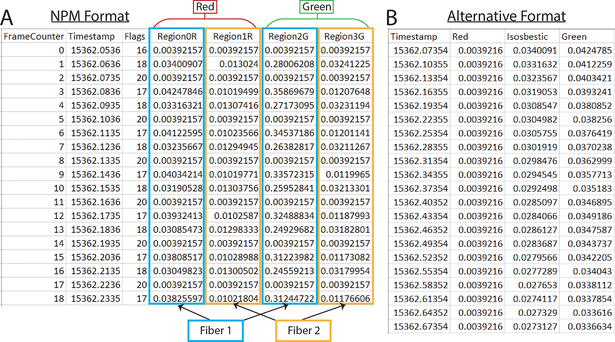
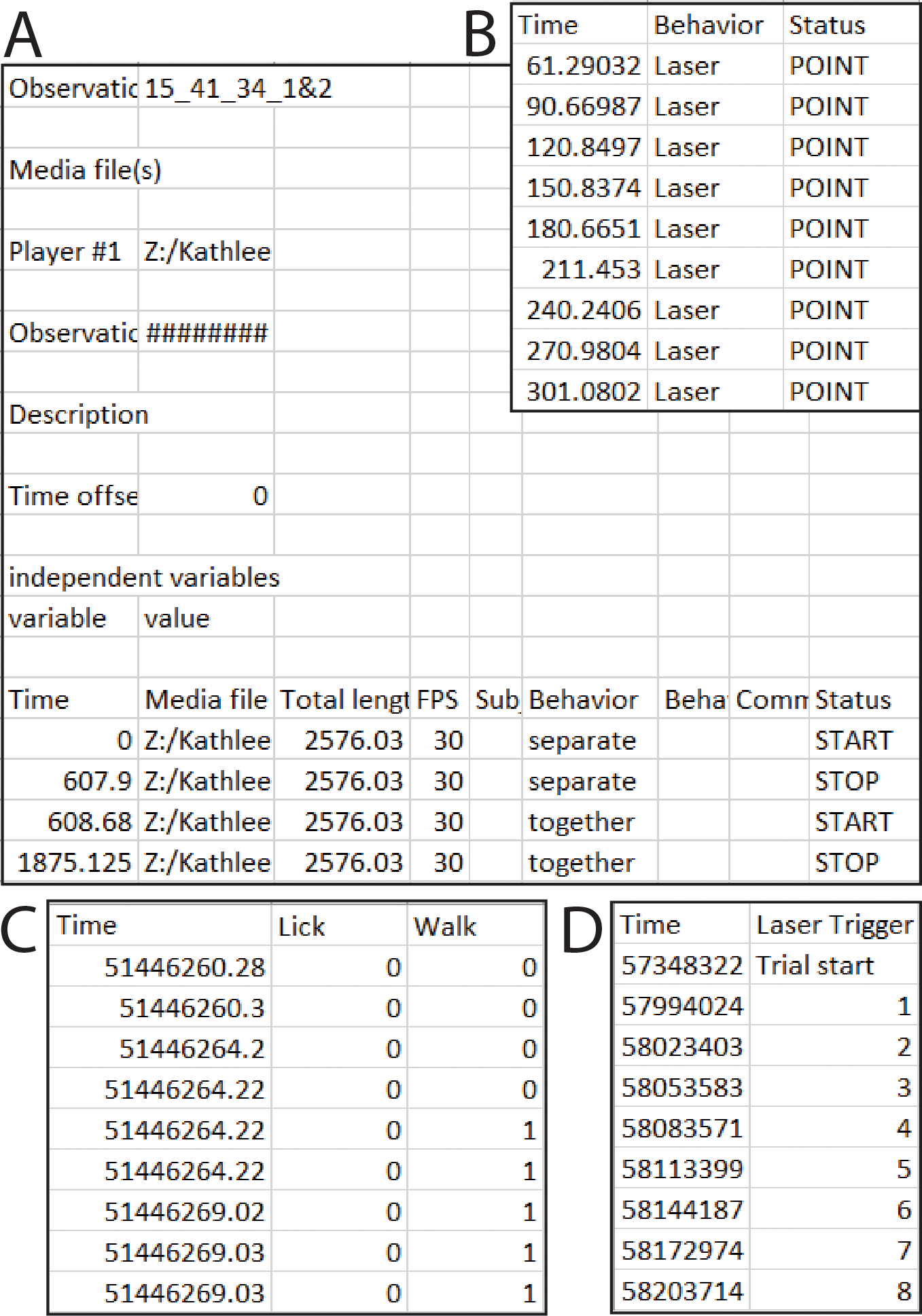
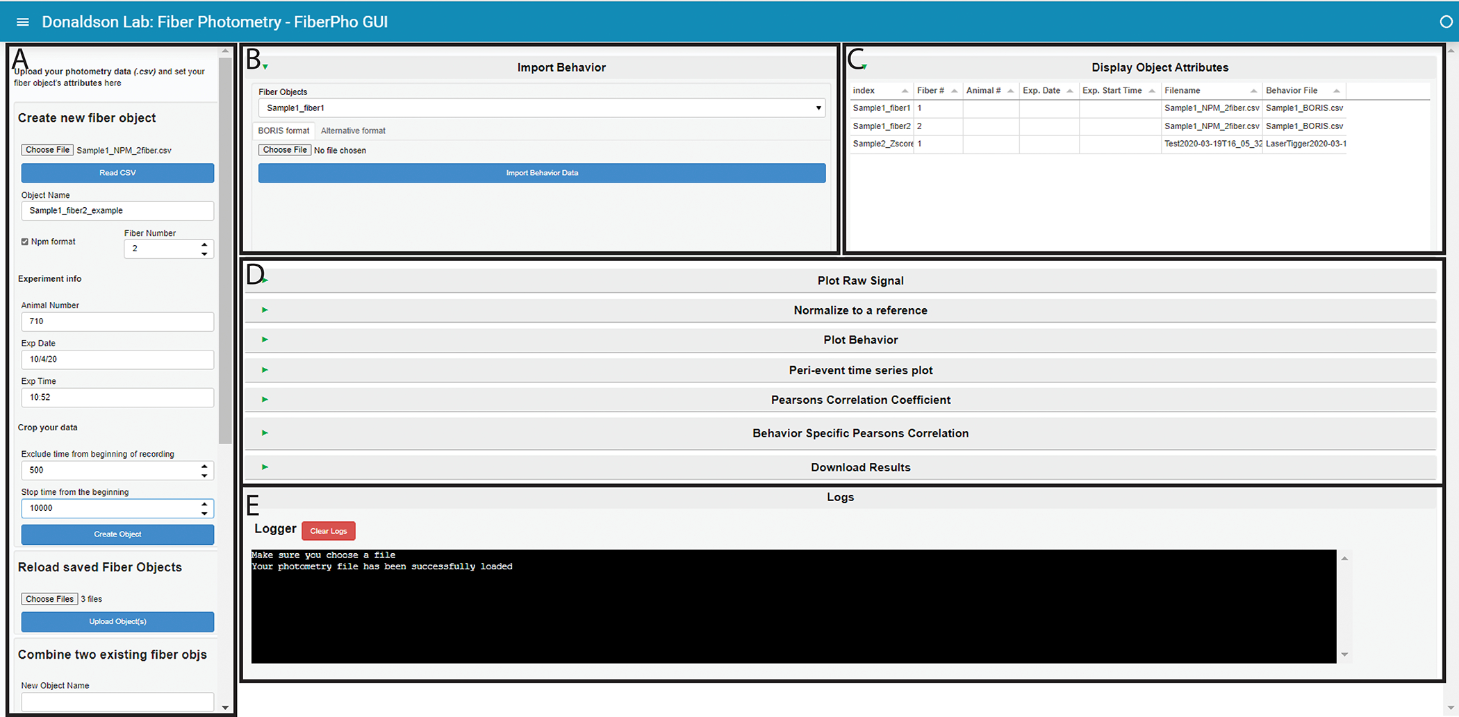
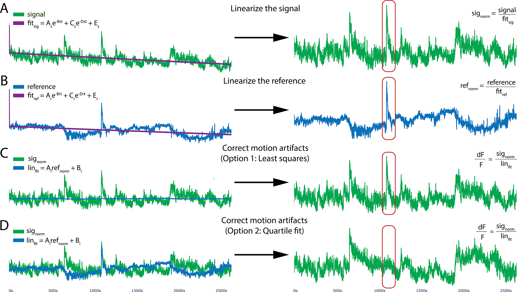
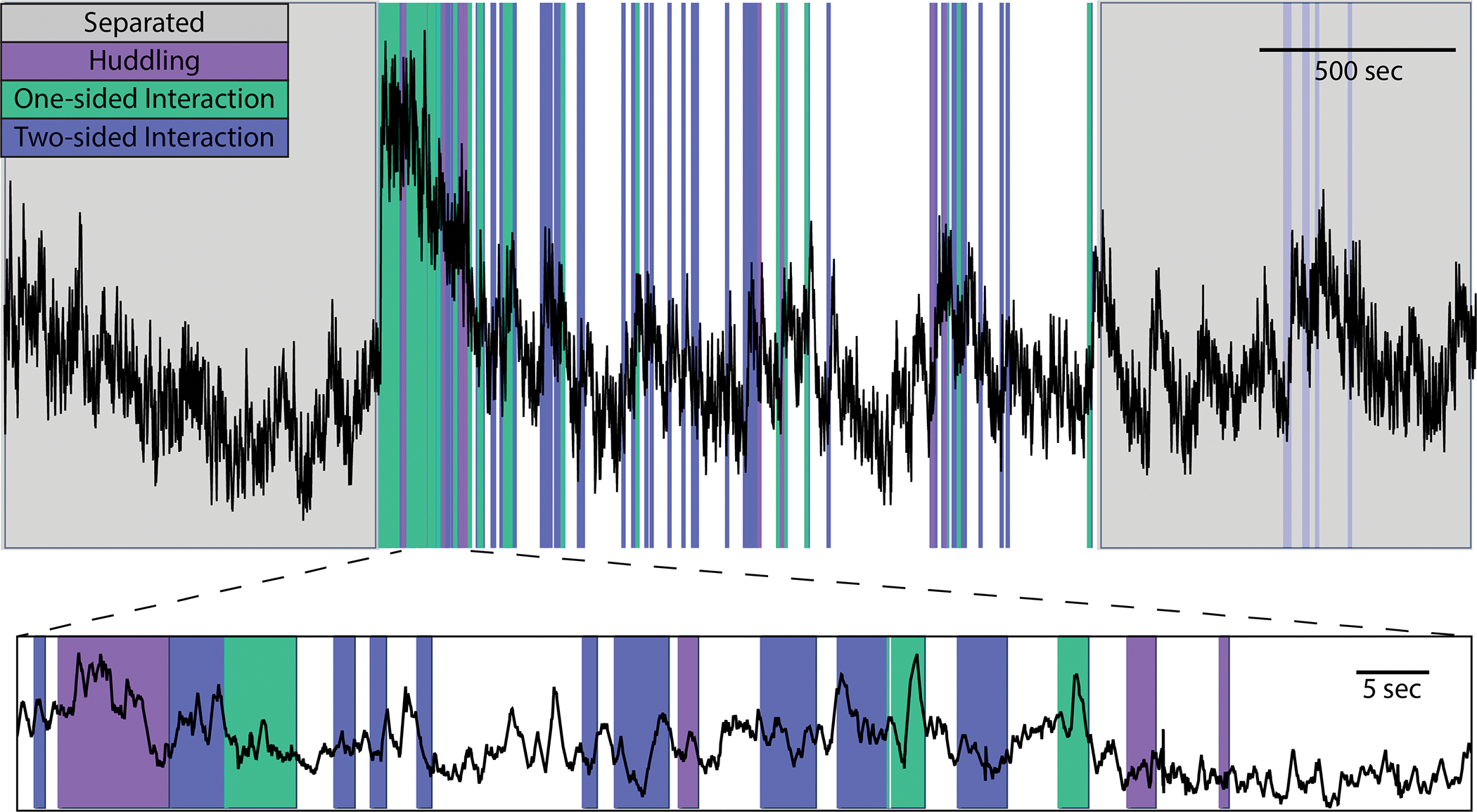
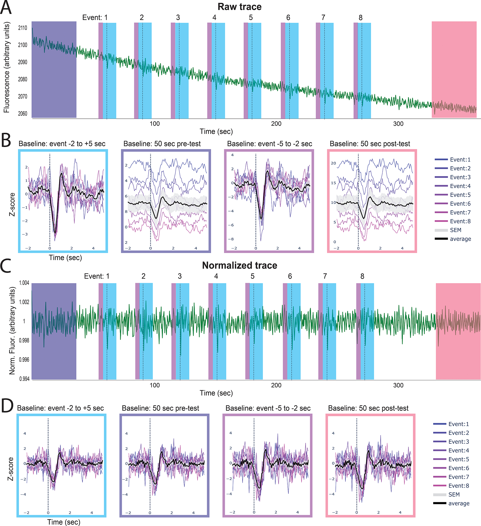
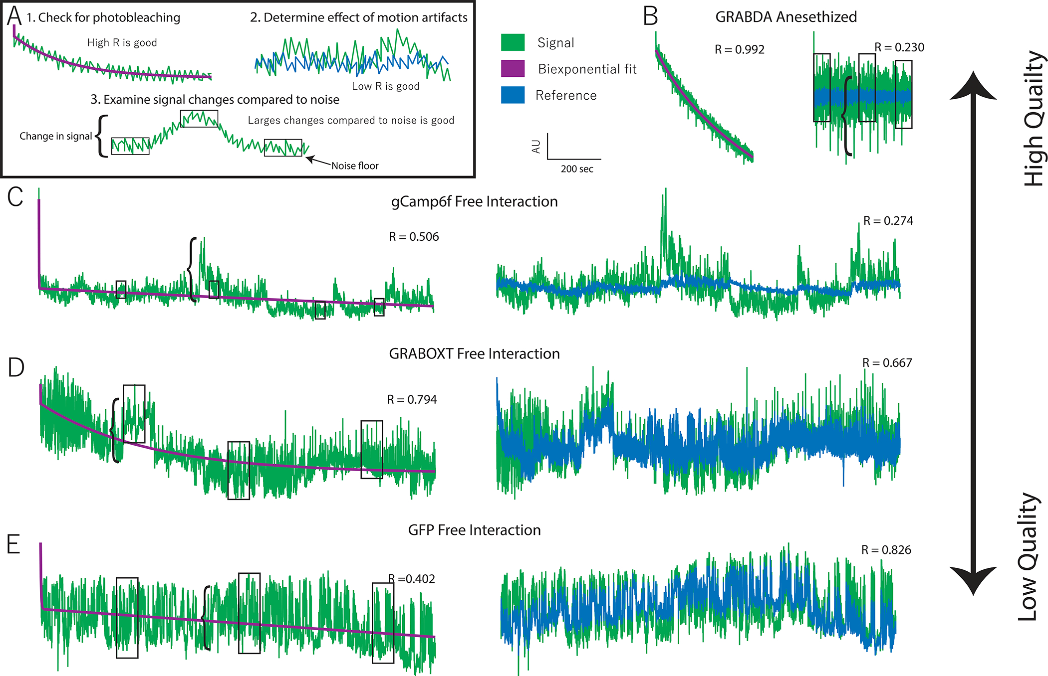
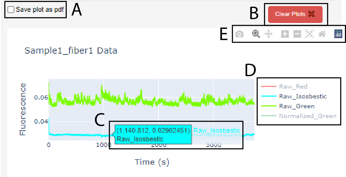
Photometry approaches detect sensor-mediated changes in fluorescence as a proxy for rapid molecular changes within the brain. As a flexible technique with a relatively low cost to implement, photometry is rapidly being incorporated into neuroscience laboratories. Yet, although multiple data acquisition systems for photometry now exist, robust analytical pipelines for the resulting data remain limited. Here we present the Photometry Analysis Toolkit (PhAT)-a free open-source analysis pipeline that provides options for signal normalization, incorporation of multiple data streams to align photometry data with behavior and other events, calculation of event-related changes in fluorescence, and comparison of similarity across fluorescent traces. A graphical user interface (GUI) enables use of this software without prior coding knowledge. In addition to providing foundational analytical tools, PhAT is designed to readily incorporate community-driven development of new modules for more bespoke analyses, and enables data to be easily exported to enable subsequent statistical testing and/or code-based analyses. In addition, we provide recommendations regarding technical aspects of photometry experiments, including sensor selection and validation, reference signal considerations, and best practices for experimental design and data collection. We hope that the distribution of this software and protocols will lower the barrier to entry for new photometry users and improve the quality of collected data, increasing transparency and reproducibility in photometry analyses. © 2023 Wiley Periodicals LLC. Basic Protocol 1: Software and environment installation Alternate Protocol 1: Software and environment update Basic Protocol 2: GUI-driven fiber photometry analysis Support Protocol 1: Examining signal quality Support Protocol 2: Interacting with graphs Basic Protocol 3: Adding modules to PhAT Alternate Protocol 2: Creating functions for use in Jupyter Notebook.

Keywords: analysis; open-source; photometry; software.


Conflict of interest statement

CONFLICT OF INTEREST STATEMENT:

Authors declare no conflicts of interest.

Figures

Figure 1.
Figure 1.. PhAT accepts two formats for photometry data.
A. Example of an output csv file from Neurophotometrics (NPM). B. Example of alternate format photometry data csv file.
Figure 2.
Figure 2.. PhAT accepts two formats for event and/or behavior data.
A. Example of an output csv file from BORIS. B. Example of a simpler format that will also work with the BORIS option in PhAT. C. One example csv file that will work with the Alternative format input option. In this example the user would enter “0” in the “value where behavior is not occurring” widget. D. A second example csv file that would work with the alternative format option. In this example “Trial start” would be entered for “value where the behavior is not occurring.”
Figure 3.
Figure 3.. PhAT’s GUI layout.
A. The sidebar. This houses all the cards that create, save, or delete fiber objects. Use the respective scroll bar to access all the cards. B. The Import Behavior card. C. The Display Object Attributes table. This table will hold information on all the objects currently available in the GUI. D. This area holds all the cards available for analysis. They are all minimized in this figure, as denoted by the sideways green triangle. E. The Logger. This area is where information is shared with the user. It is also where all print statements will be output as well as in the terminal in the last output cell of the jupyter notebook.
Figure 4.
Figure 4.. Motion reduction in PhAT.
PhAT’s normalization card allows users to linearize their signal by removing the effects of photobleaching and reducing motion artifacts using one of two fitting algorithms. A, B. To optionally remove photobleaching, the program will fit a biexponential decay to your signal and reference traces and then divide by that fitted curve, resulting in the linearized signal (signorm) shown on the right. C. The linearized reference (B) will then be fit to the linearized signal (A) to remove motion artifacts. This subfigure shows the reference (in blue) being fit to the signal using python’s built-in least squares algorithm. D. Reference fit using the alternative quartile fit algorithm, which in this specific case is more effective at removing the large motion artifact circled in red.
Figure 5.
Figure 5.. Example behavior plot generated by PhAT.
PhAT’s plot behavior card allows you to visually represent any event data (colors) over your photometry traces (black). The interactive graphs allow the user to zoom in on regions of interest on the trace (a shown on bottom) to visually examine data and look for oddities and patterns before determining the best analysis strategies.
Figure 6.
Figure 6.. Identifying event-related changes in fluorescence.
The peri-event time series (PETS) card allows the user to choose an ideal baseline for Z-scoring data. The above example shows GRABDA-mediated fluorescence following optogenetic inhibition of the VTA (dotted line) A. The full trace with each individual event denoted by the dashed line. B. The peri-event time series plots with the z-scored trace using different baselines (indicated above each plot). The average fluorescence across events is shown in black with standard error in gray. C. The same data as in A but linearized and motion corrected. D. Peri-event time series on linearized trace using different baselines. Summary. These two examples show how choosing different baselines can affect the outcome of this analysis and the importance of linearization when using a baseline from the beginning or end of a session but not for event-adjacent baselines.
Figure 7.
Figure 7.. Data quality assessment.
A. Examples of three features that indicate data quality shown with hypothetical data. 1. Evidence of photobleaching, which indicates presence of a fluorophore near that ferrule terminal. You can use the Pearson’s R value of a biexponential fit as an indicator of photobleaching. 2. Deviation in signal that is not present in the reference (i.e. a low signal:reference R value) indicates the presence of signal-based variation independent of variation due to motion artifacts. 3. Larger signal changes (bracket) relative to the noise floor (boxes) indicate good signal:noise ratio. B. Very high-quality data obtained from an animal expressing GRABDA in the nucleus accumbens and receiving optogenetic inhibition of the ventral tegmental area. C. High quality data collected from a vole expressing GCaMP6f during social interaction. Evidence of photobleaching is moderate but other quality indicators are strong. D. Low quality data recorded from a vole expressing GRABOXT during social interaction. High signal:reference R-value indicates most variation is due to motion. E. Negative control data recorded from a vole expressing GFP in the prefrontal cortex during social interaction. Signal size: noise floor indicates low signal to noise and high r-vale for signal: reference indicate lack of signal independent of motion.
Figure 8.
Figure 8.. The graphs produced in PhAT are interactive.
A. Checkbox widget used to save a graph as a pdf. Note: it must be checked before creating the graph. B. Clear plots widget used to delete the oldest/top graph in the corresponding card. C. Dialog box that appears when cursor hovers over a trace; values indicate x- and y-values for the trace at the cursor location. D. Graph Legend. E. Graph toolbar.
Figure 9.
Figure 9.. Data flow diagram of PhAT.
Much of the software is comprised of a series of modules denoted here as 1–4. Each module includes a section of GUI design, a GUI function, and a main function. The gray box indicated components in the GUI files. The blue box indicates components in the FiberClass.py file. A. The GUI driver creates and displays the GUI. B. The fiber object dictionary is called fiber_obj and holds all available object using the object name as the key. C. The fiber info data frame holds some key attributes of each available fiber object to be displayed in the “Display Fiber Attributes” table. D. For an example of a GUI design section see “”#Plot raw signal Card” in PhAT_GUI_script.py. E. For an example of a GUI function see run_plot_traces found on lines 273–294 in PhAT_GUI_script.py. F. For an example of a main function see plot_traces found on lines 420–459 in FiberClass.py.

Update of

References

LITERATURE CITED:

    1. Adelsberger H, Garaschuk O, and Konnerth A 2005. Cortical calcium waves in resting newborn mice. Nature Neuroscience 8:988–990. - PubMed
    1. Akerboom J, Calderón NC, Tian L, Wabnig S, Prigge M, Tolö J, Gordus A, Orger MB, Severi KE, Macklin JJ, et al. 2013. Genetically encoded calcium indicators for multi-color neural activity imaging and combination with optogenetics. Frontiers in Molecular Neuroscience 6:2. - PMC - PubMed
    1. Akerboom J, Chen TW, Wardill TJ, Tian L, Marvin JS, Mutlu S, Calderón NC, Esposti F, Borghuis BG, Sun XR, et al. 2012. Optimization of a GCaMP Calcium Indicator for Neural Activity Imaging. Journal of Neuroscience 32:13819–13840. - PMC - PubMed
    1. Bruno CA, O’Brien C, Bryant S, Mejaes JI, Estrin DJ, Pizzano C, and Barker DJ 2021. pMAT: An open-source software suite for the analysis of fiber photometry data. Pharmacology, biochemistry, and behavior 201:173093. - PMC - PubMed
    1. Chen T-W, Wardill TJ, Sun Y, Pulver SR, Renninger SL, Baohan A, Schreiter ER, Kerr RA, Orger MB, Jayaraman V, et al. 2013. Ultrasensitive fluorescent proteins for imaging neuronal activity. Nature 499:295–300. - PMC - PubMed

INTERNET RESOURCES:

    1. To access our code base visit: https://github.com/donaldsonlab/PhAT
    1. For information on how to install python and relevant download links visit: https://www.python.org/downloads/ or https://wiki.python.org/moin/BeginnersGUIde/Download
    1. For information on how to install anaconda and the relevant download links visit: https://docs.anaconda.com/anaconda/install/
    1. For information on how to install pip and the relevant download links visit: https://pip.pypa.io/en/stable/installation/
    1. For information and tutorials on how to use jupyterlab or jupyter notebook visit: https://www.tutorialspoint.com/jupyter/jupyterlab_overview.htm or https://www.tutorialspoint.com/jupyter/jupyter_notebook_introduction.htm