. 2023 Apr 25;13(1):6726.
doi: 10.1038/s41598-023-33890-w.

Compound climate-pollution extremes in Santiago de Chile

Affiliations

Compound climate-pollution extremes in Santiago de Chile

Sarah Feron et al. Sci Rep. .

Abstract

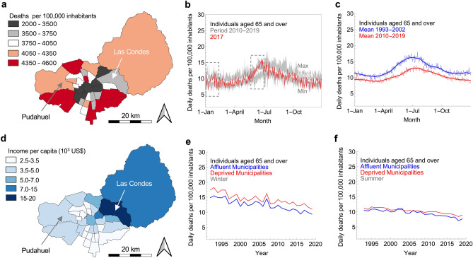
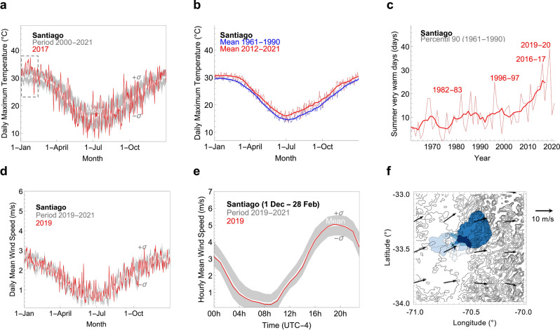
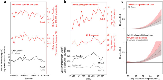
Cities in the global south face dire climate impacts. It is in socioeconomically marginalized urban communities of the global south that the effects of climate change are felt most deeply. Santiago de Chile, a major mid-latitude Andean city of 7.7 million inhabitants, is already undergoing the so-called "climate penalty" as rising temperatures worsen the effects of endemic ground-level ozone pollution. As many cities in the global south, Santiago is highly segregated along socioeconomic lines, which offers an opportunity for studying the effects of concurrent heatwaves and ozone episodes on distinct zones of affluence and deprivation. Here, we combine existing datasets of social indicators and climate-sensitive health risks with weather and air quality observations to study the response to compound heat-ozone extremes of different socioeconomic strata. Attributable to spatial variations in the ground-level ozone burden (heavier for wealthy communities), we found that the mortality response to extreme heat (and the associated further ozone pollution) is stronger in affluent dwellers, regardless of comorbidities and lack of access to health care affecting disadvantaged population. These unexpected findings underline the need of a site-specific hazard assessment and a community-based risk management.


Conflict of interest statement

The authors declare no competing interests.

Figures

Figure 1
Figure 1
While socioeconomic inequalities generally drive disparities in the mortality rate, the gap between rich and poor considerably narrows during summer. (a) Annual mortality rate (number of annual deaths per 100,000 population) in individuals aged 65 and over across Santiago, averaged over the period 2010–2019. Mortality from all causes was used in this study. Among the more than 50 municipalities of Santiago, central and northeastern municipalities generally exhibit considerably fewer annual deaths than other municipalities on city outskirts. Despite the larger share of older population in affluent municipalities, deaths of adults (aged 65 + years) per 100,000 population are on an annual basis considerably larger in deprived municipalities. (b) Daily mortality rate in inhabitants (aged ≥ 65 years) of Santiago. The gray shading indicates the highest and lowest rates for each day of year (DOY) over the period 2010–2019 while the white line indicates the mean over the same period. The daily mortality rate for 2017 is also shown (red line). The dotted rectangular boxes highlight two periods of considerable excess deaths in 2017, that are likely related to the extremely warm January 2017 and to an outbreak of Influenza A (H3N2) Variant Virus. (c) Daily mortality rate in inhabitants (aged ≥ 65 years) of Santiago, averaged over two periods: 1993–2002 (blue line) and 2010–2019 (red line). Bold lines correspond to the 30-day centered moving averages. (d) Annual income per capita (2017 US$) across Santiago. Inhabitants of central and northeastern municipalities are considerably wealthier than inhabitants of municipalities on city outskirts. (e) Progress of winter mortality rate in inhabitants (aged ≥ 65 years) of affluent (blue line) and deprived (red line) municipalities over the period 1992–2019. Although mortality rates in adults (aged ≥ 65 years) have been reduced by about 30% over the last three decades, the gap between wealthy and disadvantaged adults (aged ≥ 65 years) remains during winter. (f) Progress of summer mortality rate in inhabitants (aged ≥ 65 years) of affluent (blue line) and deprived (red line) municipalities over the period 1992–2019. The gap between wealthy and disadvantaged adults (aged ≥ 65 years) narrows considerably during summer. Annual household income data are from the National Socioeconomic Characterization Survey. The mortality rate is based on data from the Department of Statistics and Health Information and the National Statistical Institute. In the case of Figs. e–f, municipalities of Santiago were clustered into two groups according to the socioeconomic status of their inhabitants (Table S1). Inhabitants of affluent municipalities are about 15% of the total population. Plots were generated using Python’s Matplotlib library.
Figure 2
Figure 2
While rising temperatures affect all inhabitants, wind direction makes the ozone pollution burden heavier for wealthy northeastern communities. (a) Daily maximum temperature in Santiago. For each day of year (DOY), we formed datasets using daily maximum temperatures over the period 2000–2021. The mean (white line) and standard deviation (bounds of the gray shading) of these datasets are shown in the plot. The daily maximum temperature for 2017 is also shown (red line). The dotted rectangular box highlights a period of very warm days in January 2017. (b) Daily maximum temperature in Santiago averaged over two periods: 1961–1990 (blue line) and 2012–2021 (red line). Bold lines correspond to the 30-day centered moving averages. (c) Progress of summer ‘very warm” days in Santiago over the period 1961–2021. Bold line corresponds to the 7-year centered moving averages. We consider a summer day to be “very warm” if the corresponding maximum temperature falls above the 90th percentile of the daily base climatology (built up by using daily maximum temperatures measured over a 30-year base period 1961–1990; see “Methods”). (d) Daily average wind speed in Santiago. For each day of year (DOY), we formed datasets using values of the daily average wind speed over the period 2019–2021. The mean and standard deviation (σ) of these datasets are shown in the plot. The daily average wind speed for 2019 is also shown (red line). (e) Hourly average wind speed in Santiago. For each hour, we formed datasets using values of the hourly average wind speed over the period 2019–2021. The mean (white line) and standard deviation (bounds of the gray shading) of these datasets are shown in plots. (f) Vector array map showing 10-m summer wind speed and direction averaged from 13 to 20 h UTC over the period 2011–2020. Air temperature and wind speed are from the weather station that the Chilean Weather Service (DMC) operates since early twentieth century downtown Santiago; measurements are available at https://climatologia.meteochile.gob.cl/application/diario/visorDeDatosEma/330020. In the case of the vector array map, data from ERA5 were used. Plots were generated using Python’s Matplotlib library.
Figure 3
Figure 3
Ground-level ozone burden is considerably lower at Pudahuel (located on the deprived west side of the city) than at Las Condes (located in the affluent northeastern Santiago). (a) Daily maximum 8-h mean ozone concentration at Pudahuel station (33.44° S, 70.75° W, 460 m a.s.l., western Santiago). For each day of year (DOY), we formed datasets using daily maximum 8-h mean ozone concentrations over the period 2000–2021. The mean (white line) and standard deviation (bounds of the gray shading) of these datasets are shown in the plot. The daily maximum 8-h mean ozone concentration for 2017 is also shown (red line). (b) Progress of daily maximum 8-h mean ozone concentration at Pudahuel station (western Santiago) averaged over the period 1 April–30 Sep (red line) and over the period 1 Oct–31 March (blue line). Bold lines correspond to the 3-year centered moving averages. The dotted gray line indicates the 6-month peak season safe level (60 µg/m) according to the air quality guidelines (AQG) by the World Health Organization (WHO). (c) Number of days at Pudahuel station (western Santiago) with a daily maximum 8-h mean ozone concentration higher than 100 µg/m3 (which is the daily maximum 8-h mean safe level according to the WHO. Bold lines correspond to the 3-year centered moving averages. (d) Daily maximum 8-h mean ozone concentration at Las Condes station (33.38° S, 70.52° W, 795 m a.s.l., northeastern Santiago). For each day of year (DOY), we formed datasets using daily maximum 8-h mean ozone concentrations over the period 2000–2021. The mean (white line) and standard deviation (bounds of the gray shading) of these datasets are shown in the plot. The daily maximum 8-h mean ozone concentration for 2017 is also shown (red line). No measurements were conducted in February 2017 due to maintenance of the station. (e) Progress of daily maximum 8-h mean ozone concentration at Las Condes station (northeastern Santiago) averaged over the period 1 April–30 Sep (red line) and over the period 1 Oct–31 March (blue line). Bold lines correspond to the 3-year centered moving averages. The dotted gray line indicates the 6-month peak season safe level (60 µg/m3) according to the WHO. (f) Number of days at Las Condes station (northeastern Santiago). with a daily maximum 8-h mean ozone concentration higher than 100 µg/m3 (which is the daily maximum 8-h mean safe level according to the WHO. Bold lines correspond to the 3-year centered moving averages. Ozone measurements are from the air quality monitoring network operated by the Chilean Ministry of Environment (MMA) available at: https://sinca.mma.gob.cl/index.php/region/index/id/M. Plots were generated using Python’s Matplotlib library.
Figure 4
Figure 4
The rise in the mortality risk associated with heat-ozone compound extremes is larger in affluent communities than in deprived communities in Santiago. (a) Progress of daily excess deaths in adults (aged ≥ 65 years, all socioeconomic strata; upper red line), daily maximum temperature anomalies (dotted red line), and the anomalies of daily maximum 8-h mean ozone concentration at Las Condes station (black line) and at Pudahuel station (gray line). For detrend purposes, daily anomalies and daily excess deaths were computed using the summer average of each year as a reference. Then, daily anomalies and daily excess deaths were averaged over the 30-day warmest period (20 Dec–18 Jan) of the year. The correlation coefficients (R) between the temperature anomaly and the excess deaths (as well as the ozone concentration anomalies) are shown in the plot. (b) Progress of the daily mortality rate in adults (aged ≥ 65 years, all socioeconomic strata; upper red line), the daily maximum temperature (dotted red line), and the daily maximum 8-h mean ozone concentration at Las Condes station (black line) and at Pudahuel station (gray line), over the period 17 Jan 2019 and 30 Jan 2019. The correlation coefficients (R) between the temperature and the mortality rate (as well as the ozone concentration) are shown in the plot. Santiago hit its all-time heat record (38.3 °C) on 26 Jan 2019. (c) Heat-mortality associations for two age strata (upper plot) and for two socioeconomic strata (lower plot). Mortality from all causes was used in this study. Exposure–response associations are estimated as best linear unbiased predictions (see “Methods”) and reported as Relative Risks. Bold lines represent the risks (shading indicates 95% confidence intervals) of exposure to a daily maximum temperature, relative to the risk corresponding to the temperature of minimum mortality (which in Santiago is about 27 °C). In Santiago, the 99th percentile of the daily maximum temperature (summer) is 35 °C. Plots were generated using Python’s Matplotlib library.

References

    1. Fischer EM, Sippel S, Knutti R. Increasing probability of record-shattering climate extremes. Nat. Clim. Change. 2021;11(8):689–695. doi: 10.1038/s41558-021-01092-9. - DOI
    1. Perkins-Kirkpatrick SE, Gibson PB. Changes in regional heatwave characteristics as a function of increasing global temperature. Sci. Rep. 2017;7(1):1–12. doi: 10.1038/s41598-017-12520-2. - DOI - PMC - PubMed
    1. Feron S, et al. Observations and projections of heat waves in South America. Sci. Rep. 2019;9(1):1–15. doi: 10.1038/s41598-019-44614-4. - DOI - PMC - PubMed
    1. Kephart JL, et al. City-level impact of extreme temperatures and mortality in Latin America. Nat. Med. 2022;28:1700–1705. doi: 10.1038/s41591-022-01872-6. - DOI - PMC - PubMed
    1. Vicedo-Cabrera AM, et al. The burden of heat-related mortality attributable to recent human-induced climate change. Nat. Clim. Change. 2021;11(6):492–500. doi: 10.1038/s41558-021-01058-x. - DOI - PMC - PubMed