. 2023 May-Jun;43(3):94-101.
doi: 10.1109/MCG.2023.3250680.

Changing Aesthetics in Biomolecular Graphics

Changing Aesthetics in Biomolecular Graphics

Laura A Garrison et al. IEEE Comput Graph Appl. 2023 May-Jun.

Abstract

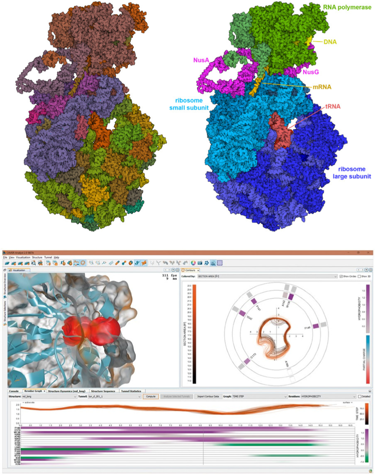
Aesthetics for the visualization of biomolecular structures have evolved over the years according to technological advances, user needs, and modes of dissemination. In this article, we explore the goals, challenges, and solutions that have shaped the current landscape of biomolecular imagery from the overlapping perspectives of computer science, structural biology, and biomedical illustration. We discuss changing approaches to rendering, color, human-computer interface, and narrative in the development and presentation of biomolecular graphics. With this historical perspective on the evolving styles and trends in each of these areas, we identify opportunities and challenges for future aesthetics in biomolecular graphics that encourage continued collaboration from multiple intersecting fields.


Figures

FIGURE 1.
FIGURE 1.. Biomolecular Graphics Development.
Images created over a span of three decades. (A) Dot surface and wireframe for a complex of DNA with an inhibitor, displayed interactively on an Evans and Sutherland MultiPicture System with custom software (PDB ID 6bna). (B) Wireframe with extra lines to depict lattice contacts, created with a modified version of ORTEP. Printed using a pen plotter and presented in publication as a stereo pair for 3D viewing (PDB ID 126d). (C) Raster space-filling image of DNA (atomic colors) and inhibitor (cyan) with Phong shading, created with several hours of computation with custom software (PDB ID 6bna). (D) Non-photorealistic rendering of tRNA and elongation factor created with custom software (PDB ID 1ttt). (E) Natural language scripting of Jmol allows nimble, interactive access to multiple rendering options, as seen in this fanciful image of hemoglobin in four styles created with ten minutes of effort (PDB ID 2hhb). (F) Mol* is leading a new generation of web-based biomolecular viewers, here providing interactive exploration of faustovirus (PDB ID 5j7v), currently the largest structure in the Protein Data Bank. (G) Predicted structure of PleC, a protein involved in formation of a bacterial microdomain, with most confident regions in dark blue and least confident regions in orange (AlphaFold2 ID AF-P37894-F1).
FIGURE 2.
FIGURE 2.
Demonstration of three common historical and contemporary biomolecular graphics rendering styles on a basic biomolecular scene with a ligand bound to a receptor on the interior of a membrane: (Left) “Scanning electron microscope (SEM)-look” material, (Middle) Ambient occlusion (AO) layered with a matte material, and (Right) Subsurface-scatter and clearcoat layers applied to a physics-based rendering material.
FIGURE 3.
FIGURE 3.. Adaptive multiscale representation and coloring.
Model of an insulin secretory granule (blue, green and orange) and cytoplasm (magenta) is displayed with subunit colors and coarse surfaces at left. As the user zooms in, the view progressively changes to a full atomic representation with atomic color (right). Images by Ludovic Autin.
FIGURE 4.
FIGURE 4.. Large-scale narratives and personal aesthetics.
Work from four contemporary artists shows state-of-the-art design decisions in complex biomolecular systems. Notice in each case how the approach to color and lighting is tuned for the audience, and representations are chosen to depict complexity at a level appropriate for the scene. (Upper left) Drew Berry creates groundbreaking video animations for general audiences with station WEHI.TV, such as this still image from a video animation of the kinetochore. (Lower left) Gaël McGill of Digizyme and Harvard Medical School creates dynamic editorial images and animations for textbooks and commercial clients, such as this complex image of the interior of a living cell created with Digizyme team member Evan Ingersoll. (Upper right) Janet Iwasa is a pioneer in the creation of data-rich animations for dissemination of information in research settings, such as this animation of budding of HIV-1 from an infected cell. (Lower right) Veronica Falconieri Hays is a Certified Medical Illustrator who creates captivating editorial and educational imagery and animations with beautiful interplay of color and light, as in this SARS-CoV-2 illustration.
FIGURE 5.
FIGURE 5.. (Top) Hierarchical nature of large biomolecular assemblies.
The expressome (PDB ID 6×9q) includes RNA polymerase and a ribosome tethered together by two processivity factors, NusA and NusG. This cryo-EM structure also includes a small fragment of DNA, a messenger RNA, and two tRNA molecules. Both figures are rendered interactively with Mol* at the RCSB PDB website, with user-tunable options for ambient occlusion, outlines, and flat shading. The left figure is colored using a default option based on chain instances in the coordinate file. The right figure is colored manually by selecting individual chains and choosing colors to highlight the structural hierarchy of biologically-relevant sub-assemblies. (Bottom) CAVER Analyst 2.0 software application [2]. This system enables real-time visualization of tunnels and channels in biomolecular structures. The upper left panel depicts a molecular structure with a highlighted region of interest, in this case, a tunnel, with the accompanying right panel showing a cross-cut contour of the highlighted tunnel. Each contour indicates a time step from the underlying long MD trajectory. The bottom panel depicts the tunnel radius in profile along its length, with variation over time (each line is one time step) and the amino acids that form the boundary of the tunnel, ranked according to their influence on the tunnel’s boundary. A consistent color design is used throughout to help researchers understand connections between data in the separate panels.

References

    1. Kouril D, Strnad O, Mindek P, et al., “Molecumentary: Adaptable narrated documentaries using molecular visualization,” IEEE Transactions on Visualization and Computer Graphics, 2021. - PubMed
    1. Jurčík A, Bednar D, Byška J, et al., “Caver analyst 2.0: Analysis and visualization of channels and tunnels in protein structures and molecular dynamics trajectories,” Bioinformatics, vol. 34, no. 20, pp. 3586–3588, 2018. - PMC - PubMed
    1. Olson AJ, “Perspectives on structural molecular biology visualization: From past to present,” Journal of Molecular Biology, vol. 430, no. 21, pp. 3997–4012, 2018. - PMC - PubMed
    1. Martinez X, Krone M, Alharbi N, et al., “Molecular graphics: Bridging structural biologists and computer scientists,” Structure, vol. 27, no. 11, pp. 1617–1623, 2019. - PubMed
    1. Kozlíková B, Krone M, Falk M, et al., “Visualization of biomolecular structures: State of the art revisited,” in Computer Graphics Forum, Wiley Online Library, vol. 36, 2017, pp. 178–204.

Publication types